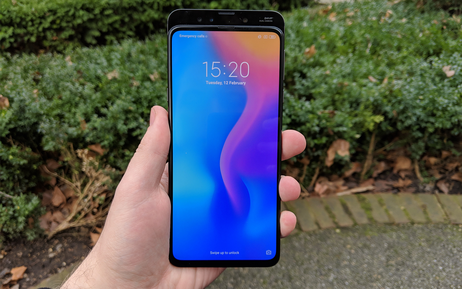
Tom's Guide Verdict
The Xiaomi Mi Mix 3 is another worthy challenger to the Android establishment, though its divisive design choices won't be for everyone.
Pros
- +
Display looks great
- +
No notch thanks to slider
- +
Strong gaming performance
- +
Captures good photos in low light
- +
Wireless charging out of the box
Cons
- -
Heavy
- -
Selfie camera is unimpressive
- -
Not available in US
Why you can trust Tom's Guide
For smartphones, this is shaping up to be the year of the wandering selfie camera. After the controversial Age of the Notch, lots of phone makers are trying to find ways to keep the front-facing camera's utility without resorting to bezels or sacrificing other areas of prime display real estate.
You've got the Honor View 20 punch-hole approach, the Oppo Find X motorized pop-up camera, as well as some phones for which the manufacturers doubled down on the notch, like the Google Pixel 3 XL. But could there be another way? Xiaomi thinks so.
The Chinese phone maker has decided to redevelop the slider design from the pre-smartphone era of cell (mobile) phones and use it to give you a completely clean display that still allows a dual selfie camera. Combined with another twin camera array on the back, some powerful memory and processing within and a large screen, the resulting Mi Mix 3 offers great performance for a comparatively paltry £499 ($640). Xiaomi's new midrange phone is largely successful, but because of some of the Mi Mix 3's features, it won't be for everyone.
Xiaomi Mi Mix 3 Cheat Sheet
- The phone's most unusual feature is the slider. In exchange for an increase in weight, you get a completely clean, 6.39-inch AMOLED display — plus the mechanism is quite fun to play with!
- The Mi Mix 3 has two cameras on the front and two more on the back. The rear ones yield impressive images night or day, while the selfie cameras seem to struggle a bit under certain circumstances.
- You can use either USB-C or wireless charging to power up the phone, and it comes with a wireless charger.
Price and Availability
Apologies to our U.S. readers: The Mi Mix 3 isn't on sale in your country, at least outside of imports (and buying imports carries its own set of risks). In the U.K., you get only one model for now: one with 6GB of RAM and 128GB of storage, in either Sapphire Blue or Onyx Black, all for £499.
A version featuring 5G compatibility, plus up to 10GB RAM of RAM and 256GB of storage, is promised down the road, but those specs are not available in the current lineup.
Design: An uncompromising monolith
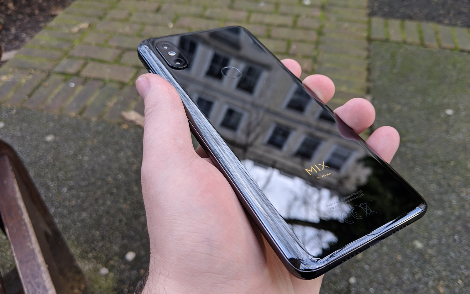
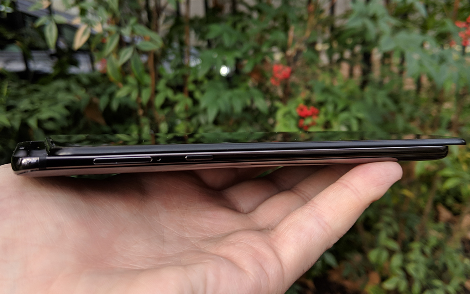
When you first see the Mi Mix 3, you'll struggle to find a defining feature. The front is flat, apart from a tiny cutout for the speaker, and even the side buttons have slim profiles, so they don't complicate the clean design.
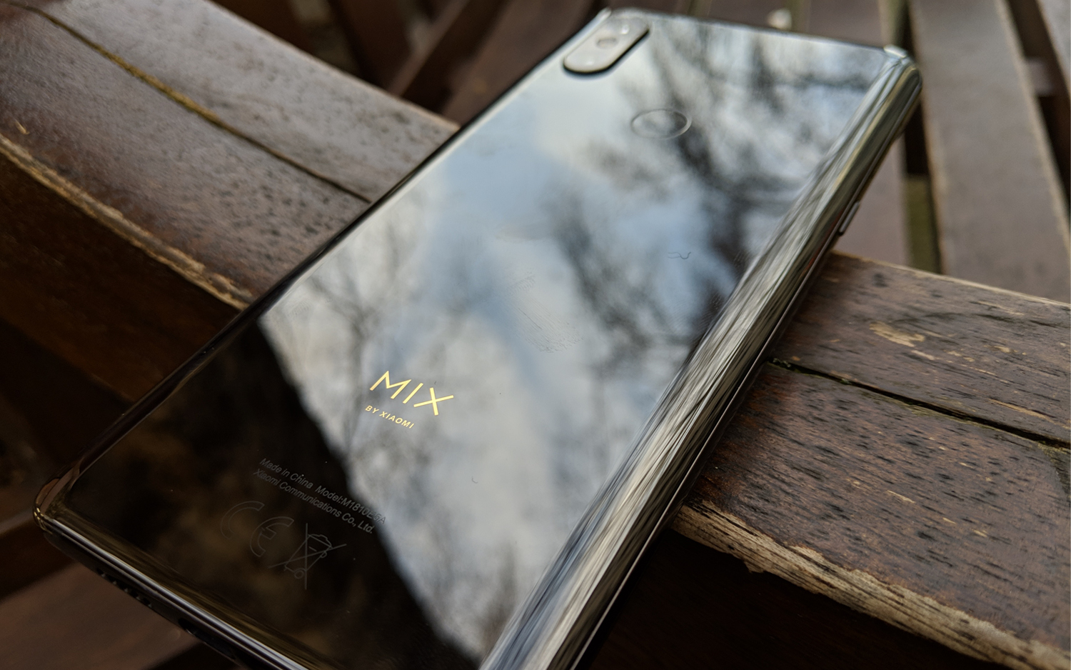
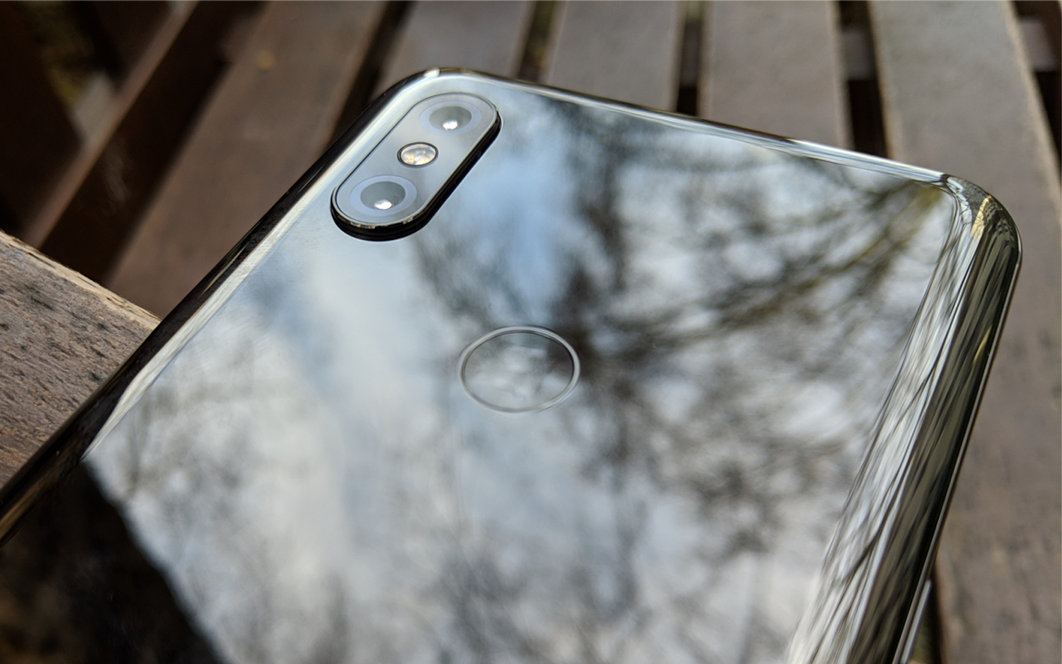
Once in your hand, this device gives you the smartphone equivalent of a frosty reception, thanks to the Mi Mix 3's cool ceramic back plate. It looks and feels like a high-quality device, but you might feel a little uneasy holding such a slippery-feeling phone.
If you're not a fan of the ceramic back, then you could use the thin plastic case that comes in the box and clips over the phone's back and top and side edges. This won't protect the device from any fall damage, but it will give you a different texture. More importantly, you can still use the wireless charging feature while the case is on.
To reveal the selfie cameras with the slider, push the front downward while holding the back in place. The combination of the sliding mechanism and large display makes the Mi Mix a little heavy, at 218 grams (7.7 ounces). That's not going to make your wrists ache like a brick phone from the 1980s would do, but this device is heavier than the 206-gram iPhone XS Max and the 201-gram Samsung Galaxy Note 9. The similarly sized Honor View 20 weighs 180 grams, so the Mi Mix 3 clearly has some heft.
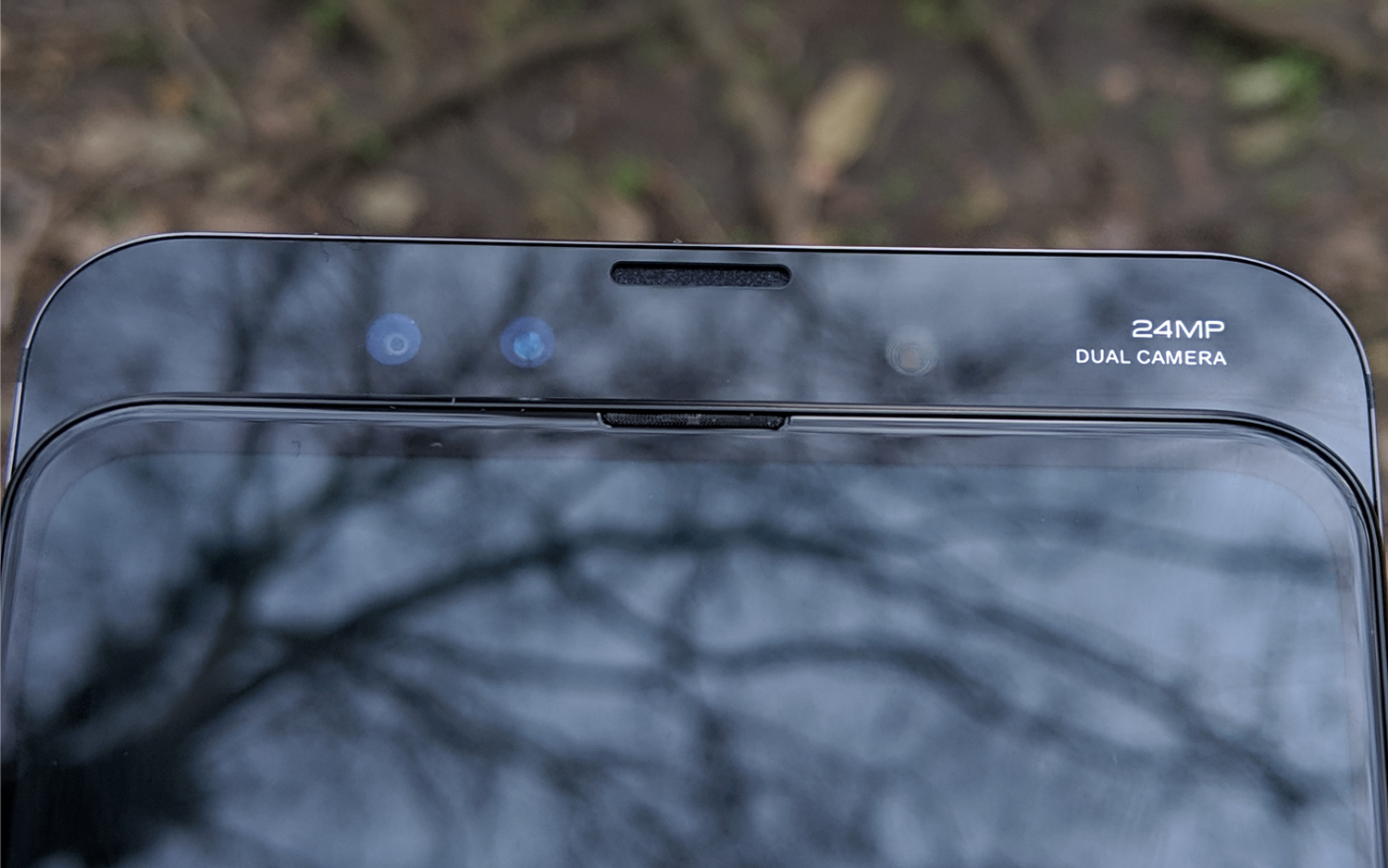
Getting the slider to move can be a bit tricky, thanks to a tough spring. However, that means you won't accidentally use the slider. You will have to grip the phone or press down with greater force than you might be used to doing.
This feature is certainly fun to play with, just like sliders always were. But the entertainment value alone doesn't mean a slider is a good idea for modern smartphones. It's excellent that you can watch videos on the Mi Mix 3's display without anything covering parts of the screen, but I prefer the punch-hole approach found in the View 20 and likely coming to Samsung's Galaxy S10. The Mi Mix's slider isn't simply bad, unless you are focused on having a very light phone. But I still prefer having an instantly accessible selfie camera even if it means losing a little screen space.
The Mi Mix 3 slides downward into your hand, which means you have to relearn how to hold the phone to use the camera.
The slider feels counterintuitive, at least to me. The slider phones that I and others used many years ago slid upward, revealing the keypad underneath the main body of the phone. The Mi Mix 3 slides downward into your hand, which means you have to relearn how to hold the phone to use the camera.
Still, the Mix 3's design isn't completely alien. You've got volume and lock controls on the right-hand edge, a lonely USB-C port on the bottom and the AI button on the side, which gives you a direct line to Google Assistant. The fingerprint sensor is on the back, once again keeping the screen clear but still putting the sensor in a useful position. There's no headphone jack, but Xiaomi includes an adapter to plug into the USB-C port if you're not a Bluetooth-audio convert.
Display: Bright screen, accurate colors
The 6.39-inch AMOLED screen on the Mi Mix 3 is made by Samsung, and it's the same size as the panel on Huawei's Mate 20 Pro. The screen covers almost all of the front of the Mi Mix 3 except for small bezels around the edge, of which you’ll notice the bottom one is slightly thicker than the rest. That's an inherited feature from previous Mi Mix phones, which placed the selfie camera at the bottom of the screen to avoid the need for a notch.
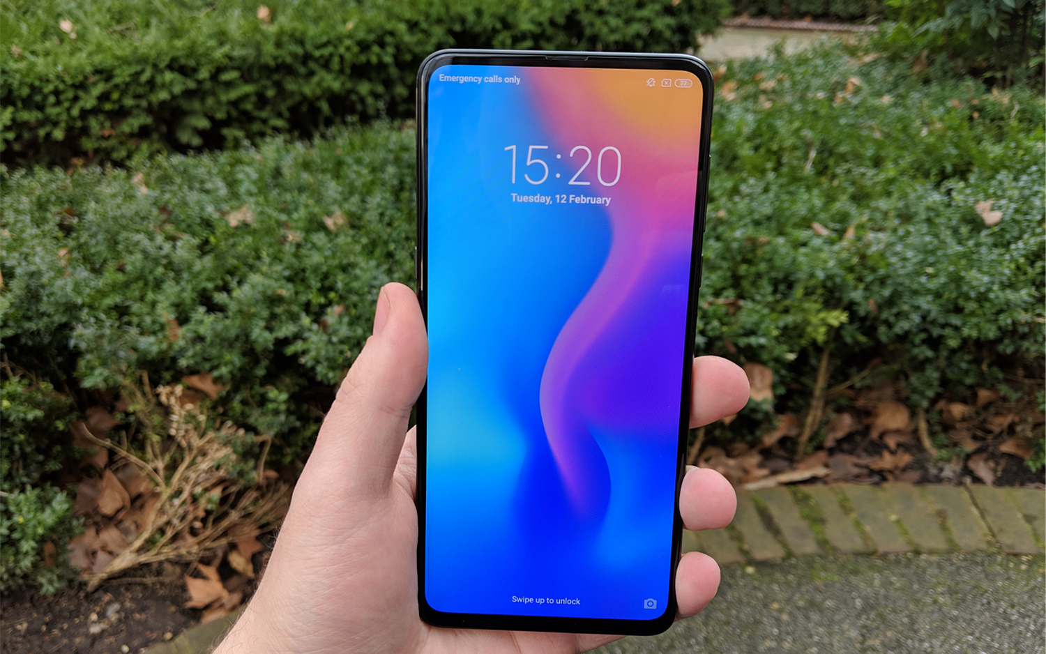
Having a bezel act as a call back to previous phones in the series is a cute bit of design work. But surely, most users would prefer having as little unused space on their phone as possible over seeing some family resemblance to the phone's predecessors.
Thanks to the Mi Mix 3's FHD+ resolution (2340 x 1080), everything shows up nicely without forcing you to crank up the brightness. This is a slight improvement on the Pixel 3 (2160 x 1080) and View 20 (2310 x 1080), but the result can't compete with the 1440p resolution featured in Samsung's flagship phones.
The colors are well-balanced on the Mi Mix 3's display, as shown in how it displayed the Captain Marvel trailer’s Earth and space locations with equal fidelity. And if you do turn up the screen to its maximum brightness, you'll have no trouble watching the display even in bright sunlight.
Our test results back this up. The Mi Mix 3's maximum brightness level was 525 nits, topping results from the View 20 (375 nits) and Pixel 3 (401). The Galaxy S9 is brighter, at 603 nits, but the Mi Mix 3 is still one of the more-vivid Android screens.
MORE: Best Smartphones on the Market Now
The Mi Mix 3's display depicts colors fairly accurately, as shown by its Delta E score of 0.36. That tops the View 20's mark (3.98) by a lot and just edges out the Pixel 3's score (0.44). (Numbers closer to 0 are better.) The Mi Mix 3 displays 191 percent of the sRGB color gamut, which again beats the View 20's 174 percent but doesn't quite reach the 200 percent-plus range where the Galaxy S9, Pixel 3 and OnePlus 6T sit.
Audio: Strong sound, but not a standout feature
The Mi Mix 3's speaker, found on the phone's bottom edge, is pretty good. Listening to some movie trailers, board game reviews and mid-2000s indie rock revealed a nice, crisp sound that picks out voices, bass notes and percussion above the other elements. It's a strong sound, too, so you'll likely want to hook it up to separate speakers only if you have a large space or other loud sounds to overcome. In combination with that large, uninterrupted display, it makes for an enjoyable portable viewing experience with or without headphones.
Audio isn't really this phone's focus, though. There are no special options to mess around with. And while the phone's MIUI 10 interface comes with the Mi Music and Mi Video apps to play the content you have saved on your phone, these apps don't offer any surprising settings either.
Cameras: Strong rear cameras, inconsistent selfies
Xiaomi crows about the quality of its rear-facing cameras, because its photo capabilities are some of the best ever scored by DxO. The duet of 12-megapixel shooters is a potent setup already, but post-processing magic and AI assistance, which gives the Mi Mix 3 the ability to detect 27 different scenarios and choose the best settings for each, really help the cameras shine.
In these pictures of the foot of Nelson's Column and The National Gallery in Trafalgar Square, the AI puts a check on the brightness of the major light sources and brings out the contrast. This way, you can appreciate the details in the stone and metal of the bottom of the column and in the faces of the buildings.
Traveling north to Oxford Street, I compared the Mi Mix 3's night mode with the Google Pixel 3's Night Sight feature. This test threatened to be a no contest in favor of the Pixel, as the low-light mode on Google's phone has been widely acclaimed for getting great images from difficult-to-capture situations. However, the Mi Mix equaled the Pixel in quality and, to my eye, produced a better photo. You can read the shop signs next to the light sources on its picture, while the Pixel has far less control of the light, which costs its photos a significant amount of detail (Note: the bluish tinge to the Mi Mix image is not the phone's fault. An ambulance happened to drive past as I was taking the photo.)
In this shot taken in the daylight (or as close as one can get to it on a rainy British morning) at Hyde Park, you again see the Mi Mix doing a great job. This phone can't compare to the raw detail of the View20's 48-MP sensor, but in a side-by-side comparison at the same resolution, the Xiaomi does a better job of making the same scene look attractive.
The Mi Mix 3's selfie camera, once deployed via the slider, features a 24-MP main lens, aided by a 2-MP depth-of-field sensor. I was very impressed with how I looked as I lined up a shot and then realized that the camera had the AI beautification mode already enabled, surreptitiously trimming down the shape of my lower jaw.
In low light, the Mi Mix equaled the Pixel 3 in quality, and to my eye, produced a better photo.
With that feature disabled, I found that the images I took did not stack up well compared to those from the other phones. The gray but bright sky behind me made the trees in the background muddy, while I looked washed-out. You can see in the comparison how the Pixel was able to capture both me and the scenery in much better detail and color.

It just goes to show how important the processing is for getting the best out of a phone's cameras. Xiaomi's pride in its low-light photography is well-founded, but this phone doesn't quite match its rivals when you change from the rear cameras to the front ones.
Performance: Heavyweight phone, heavyweight performance
The Snapdragon 845 processor and 6GB of RAM mean the Mi Mix 3 doesn't lack for performance oomph. Opening up and using memory-heavy apps is a snappy and uninterrupted experience. If you're after the maximum possible output, though, Xiaomi's phone isn't a class leader.
The Mi Mix 3 scored 8,964 on Geekbench 4, which measures overall performance. That mark trailed results from the View 20 (9,545) and OnePlus 6T (9,098), which both use the Snapdragon 845 (though the OnePlus 6T model tested included 8GB of RAM). However, the Mi Mix 3 still beat out the Galaxy S9+ (8,295), an older phone running on the Snapdragon 845.
Running 3DMark's Slingshot Extreme test to measure graphics, we recorded a score of 4,836 for the Mi Mix 3. That's an impressive result that beats those from the Galaxy S9 and S9+, Galaxy Note 9, and iPhone XS Max. This mark is even better than the Asus ROG Phone's 4,757 score, and that phone is specifically built for mobile gaming.
For mobile gaming, the Mi Mix 3 delivers comparable performance to other brands' most souped-up models, but at a lower cost.
Real-life testing with Hitman: Sniper confirmed these scores. Other than a slightly warmer back plate, you'd barely notice that the Mi Mix 3 was processing and displaying an entire snow-covered mansion with multiple characters moving around it. And combined with that big, notchless and punch-holeless display, you get an stunning uninterrupted view of the action.
If you're a mobile-gaming fan, you may want to reconsider your next handset, as the Mi Mix 3 delivers comparable performance to other brands' most souped-up models, but at a lower cost.
Battery: Small battery, but long life
The Mi Mix 3 features a 3,200-mAh battery, which is actually 200 mAh less than the Mi Mix 2S that came before this phone. Don't worry, though, because Xiaomi's new phone uses its smaller-than-average capacity wisely.
In the Tom's Guide battery test (continuous web surfing over LTE until the fully charged phone runs out of power), the Mi Mix 3 lasted 12 hours, 12 minutes, which is well above the 9-hour, 48-minute average. It also beats the View 20's 11:34 time, even though Honor's phone has a 4,000-mAh battery.
MORE: Smartphones With the Longest Battery Life - A Comparison
When the battery on the Mi Mix 3 eventually drains, you can try out the 10-watt wireless charging pad that comes with the Mi Mix 3. It is a little slow to fill the battery, but that's a common issue with charging pads.
Software: Useful additions to Android Pie
The Mi Mix 3's MIUI 10 interface is an Android 9.0 Pie skin, as you'd hope to see in a freshly made Android flagship. I do enjoy how clean this version is. All the basic icons are simple but stylish and easy to read. There's no app drawer, something that won't surprise Xiaomi fans, as this hasn't appeared on any version of MIUI so far.
That wasn't a problem during testing, since I didn't have that many apps installed, but I could see that if I had the number of apps I keep on my personal Samsung Galaxy S7 phone on the Mi Mix 3, then things could easily become chaotic. It's a choice that will make some think twice about this phone, particularly if they are unwilling to download and configure a different Android launcher to get an app drawer.
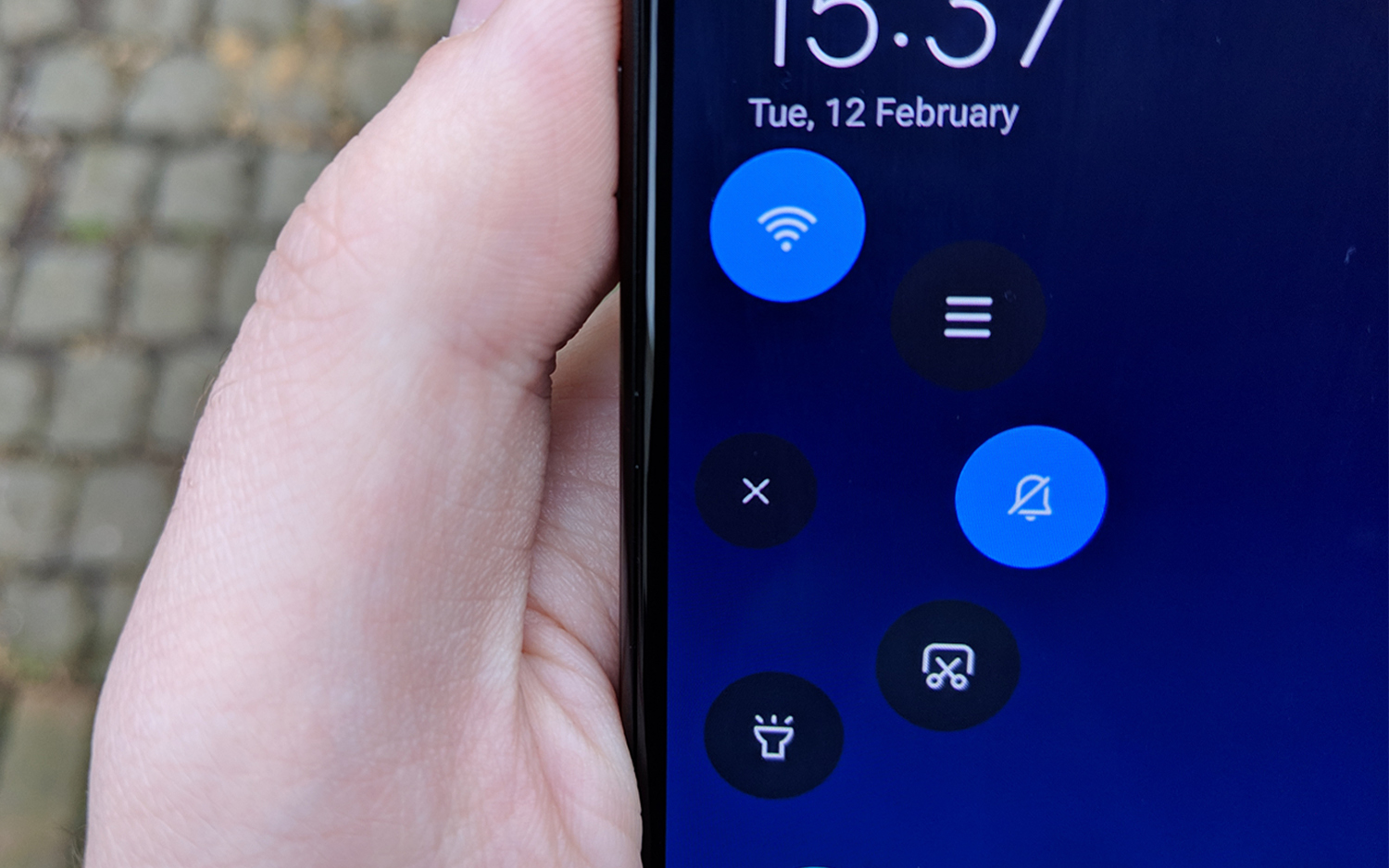
The Mi Mix's OS has its pluses, though. You have the choice of either virtual menu/home/back buttons or gestures to navigate the menus, which can only be a good thing. I personally became quite attached to the Quick Ball, a quickly accessible menu for five options or apps. This acts like a stripped-down Control Center from iOS or a settings-based version of the Chat Heads function from the Android Facebook Messenger app. When not in use, the Quick Ball becomes a small, translucent arc nestling against whichever edge of the phone you position the menu, so it doesn't detract from that big screen. But you can find it quickly if you're looking for it.
Additionally, you can change the function of the Mi Mix 3's slider. By default, activating the slider launches the camera app, as it reveals the selfie camera. But you can tweak that function in the settings to display a handy tools menu instead, one that features a calculator, a timer, weather info, a voice recorder and similar accessories.
You can also set the slider to open another app altogether, or nothing at all if you just want to play with the mechanism without consequence. You can change the sound that the phone plays when you open the slider, including to that of a sword being drawn and sheathed. It's shameful how enjoyable I found that to be once I discovered the option.
MORE: Best Cheap Unlocked Smartphones
Second Space is a twist on the existing Users feature available on current Android phones. With the tap of an icon, you can switch between two "desktops," with a separate password for each space. There are lots of possible uses for this, like keeping the work and play sides of your life separate. Or, you could fill one desktop with games and no communications apps to keep your children occupied without fearing they're going to call anyone from the office. You could have always technically accomplished this on any Android phone since Android 5.0 Lollipop came out in 2014, but other phones require fiddling in the options menu rather than accessing the feature right from the home screen as you can on the Mi Mix.
Bottom Line
The Mi Mix 3 seems like a very deliberate attempt by Xiaomi to make a smartphone with a unique design that stands out from its rivals. That's an understandable impulse, but modern smartphone design and usage has become very standardized, especially in hardware, and users can get attached to certain features. Some people may balk at a phone with a slider and prefer similarly priced handsets like the Honor View 20 or OnePlus 6T, which have less idiosyncratic designs.
If you don't mind the slider — or even prefer it, since it means an uninterrupted screen — the Mi Mix 3 is great. All your basic hardware and software needs are met and, in the case of graphics and photography, very much exceeded. The Mi Mix 3 will be perfect only for someone with a very specific set of requirements for their phone, or for users who are not fazed by the bold and sometimes ingenious ideas that come from Xiaomi. But if you're willing to be a little flexible, there's no reason why that someone couldn't be you.
Specs
| Price | £499 |
| Operating System | Android 9.0 Pie with MIUI 10 |
| Display | 6.39-inch, (2340 x 1080 px, FHD+) |
| Cameras | 12MP SONY IMX363, 1.4μm-large pixels, f/1.8-large aperture, dual pixel autofocus; Samsung S5K3M3+, 1.0μm pixels |
| Front Cameras | SONY IMX 576, 4-in-1 Super Pixel, 1.8μm large pixels; OC0A10, 1.75μm-large pixels |
| CPU | Qualcomm Snapdragon 845 |
| RAM | 6GB |
| Storage | 128GB |
| Battery | 3200 mAh |
| Colors | Sapphire Blue, Onyx Black |
| Size | 157.89mm x 74.69mm x 8.46mm |
| Weight | 218 grams |
Credit: Tom's Guide

Richard is based in London, covering news, reviews and how-tos for phones, tablets, gaming, and whatever else people need advice on. Following on from his MA in Magazine Journalism at the University of Sheffield, he's also written for WIRED U.K., The Register and Creative Bloq. When not at work, he's likely thinking about how to brew the perfect cup of specialty coffee.
