Living with Windows 10: The Best and Worst So Far
After using Windows 10 Technical Preview as my main OS for over a month, I've found a lot to like about the new operating system, but more than a few bugs and disappointing problems.
It's official: Windows 10 will officially launch this summer. However, the next version of Microsoft's operating system has been in "technical preview" mode for a couple of months now, so it's available to anyone willing to install beta-level software. I've been using the new platform as my main OS for the past several weeks and have experienced more than my fair share of bugs, but I also appreciated some of the new features. Here are five pros and five cons to consider before you upgrade.
The Good
Snap is better than ever.
I've been a big fan of Microsoft's snap feature, which makes it easy to split the screen between different applications, since it launched in Windows 7. In Windows 10, I can snap applications to the corners of the display, allowing me to divide each screen into quarters. On my dual-monitor setup, I can fit eight applications on-screen at once if I really want to.
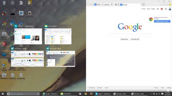
I also love Snap Assist, which shows a list of other open apps right after I've snapped a window to one side of the screen. Clicking one of these thumbnails fills the other half of the screen.
MORE: How to Snap 4 Windows at Once in Windows 10
Notifications are finally catching up to Android.
Every serious operating system has some way for your applications and services to alert you when something important happens — for instance, when an email arrives, your Dropbox account is done syncing or your software finishes downloading. Windows 8's notification system is worthless because it quickly flashes alerts on the right side of the screen and then lets them disappear into the ether. Windows 10's Action Center is quite a bit better, giving you a place to see all of your notifications after they disappear from the screen.
Apps are (mostly) created equal.
The biggest problem with Windows 8 is that it created two classes of apps: Modern apps that run in full-screen mode, and desktop apps that run in windows on the desktop. In Windows 8/8.1, the desktop itself is treated as a Modern app, which is really confusing because individual desktop apps can't be used in split-screen mode and don't appear on the task menu, which opens when you swipe in from the left.
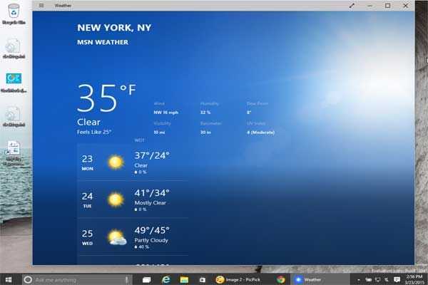
In Windows 10, any application can run in a window, or open at full or split screen in the new "tablet mode," which replaces the Modern UI. I particularly appreciate having the ability to split the screen between two different browser windows, even in this touch-friendly interface.
However, it's also clear that many "Modern" apps weren't made to run in resizable windows. For example, Rhapsody was really hard to navigate until I maximized it. I look forward to seeing what developers do with the upcoming Windows 10 SDK that will allow them to create Universal Apps that adapt to touch and nontouch navigation.
Fast boots and wakes
The jury's still out on whether Windows 10 improves overall performance and battery life from Windows 8, makes it worse or stays the same. With the technical preview, my ThinkPad T440s laptop seems a bit slower overall than it was with Windows 8.1. However, I'll withhold judgment until I try the final build and get Windows 10-specific device drivers.
What is certain, however, is that Windows 10 boots and wakes from sleep at least as fast as it does with Windows 8.1. It can wake my SSD-enabled laptop in about 2 seconds and cold boot it in just 10 seconds. Many users who are upgrading from Windows 7 will notice a huge difference.
Virtual desktops expand your screen real estate.
If showing four evenly sized windows on one screen isn't enough, Windows 10 lets you create virtual desktops for more windows. While I haven't used this feature a lot yet, I can see how it would be really helpful for creating different work states. For example, I could switch from a "work" desktop with Word, Outlook and Photoshop open to a "play" desktop with a game and a social media feed open.
Unfortunately, you can't save the desktops, so when you reboot your computer, they are gone. I would love to be able to come back to these different work states over and over again.
The Bad
The technical preview can be really buggy.
I experienced a number of really annoying bugs on my laptop that would have led a lot of people to legitimately run away screaming. For a while, the Start menu disappeared, until I forced a Windows update. For about a week, I was unable to launch the Chrome browser. (It would run in the background but would not be visible.) More recently, my Firefox windows have appeared blacked out at random when I wake the computer, and Internet Explorer won't open at all. Microsoft just released a new build of Windows 10 that's supposed to fix some of the bugginess, but the update process has failed on my laptop several times. (It worked on my desktop the first time.)
However, despite these annoyances, the operating system has been stable overall. I haven't experienced a crash, a lockup or a blue screen.
MORE: Windows 10 (Finally) Gives Power to the People
Start menu acts a lot like start screen.
Much has been made of Microsoft's decision to bring back the Start menu, which it infamously removed in Windows 8. However, the new Start menu is actually more like a miniaturized version of Windows 8's Start screen than the traditional pop-up list of icons and folders from Windows 7 and earlier versions of the OS.
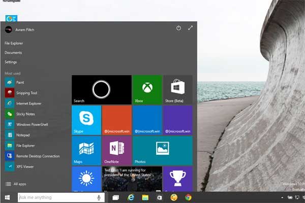
The right side of the new Start menu looks exactly like the Start screen, complete with groups of colorful live tiles that you can launch, resize or move around. When you maximize the Start menu — a capability the old one never had — the screen looks even more like Windows 8.1.
Unfortunately, the left side of the Start menu — which has icons, rather than tiles — is not user-configurable, making it nearly useless. Instead of your hand-selected shortcuts and folders, the small icons show an immutable list of "most used" applications and another of "recently added" apps. Clicking the All Apps button reveals a scrollable, alphabetical list of all your programs. You can't pin, reorder or control these lists in any way.
On the bright side, the main benefit of the Start menu — the ability to see a list of apps and launch them without switching to a whole new full-screen environment — is back. And you can always install a Start-menu replacement like Start8 (they work).
Web results slow down search.
My favorite traditional Start-menu feature in Windows 7 is the search box, which I use 100 times a day to launch both apps and individual documents, without having to roll my mouse around looking for their icons. Windows 8 buried the search box in the awful Charms menu. In Windows 10, the search box isn't directly on the Start menu, but rather right next to it, on the taskbar. Unfortunately, this search function queries both the Web and Cortana, Windows 10's new digital assistant.
If you just want to quickly find and launch apps on your computer, you'll want to disable Cortana, because she starts loading herself and her content the moment you click on the search box. Unfortunately, even if you turn her off, a set of news headlines loads, making you wait a second or two before you can begin a query.
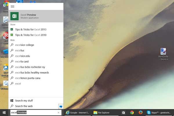
The search box also wastes time, screen real estate and network resources when grabbing search results from the Web. For example, when I entered "Excel" in the search box, in addition to giving me the app shortcut I wanted, the menu suggested I visit the Excelsior College website or query Bing for the "excella" Visa card. Grabbing this data from the Internet wasn't a huge drain when I had a good Internet connection, but it still was slower than performing the same search in Windows 7.
Cortana's not very bright (yet).
Imagine if you hired a research assistant, and most of the time when you asked her for help, she said, "Why don't you just go search the Web and find the answer yourself? Here. Do I have to open the browser for you too?" That assistant would be named Cortana, because Microsoft's digital companion does little more right now than shuffle you off to Bing results pages when you ask for help.
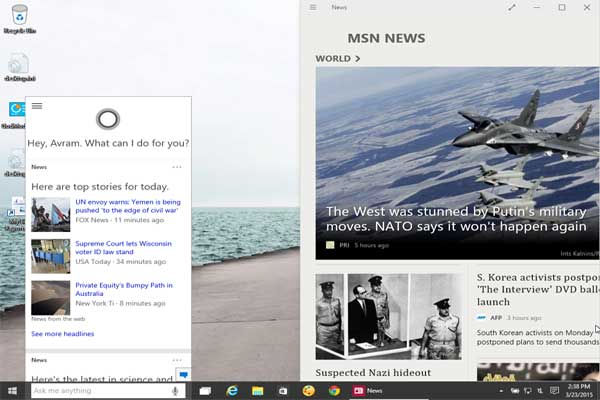
Like Google Now, Cortana on Windows 10 can provide direct answers to some questions, showing small graphical cards and speaking a few words aloud. For example, when I asked, "What's the weather?" Cortana showed a five-day forecast and correctly said, "It's 33 degrees and snowing." However, in most cases, it quietly popped up an Internet Explorer window with my words as a query.
Trying the same questions on both Cortana and the Web-based Google voice search showed the latter's superiority. For example, when I asked Cortana who the second person to walk on the moon was, the digital assistant popped up the browser, which quietly had a sentence about Buzz Aldrin at the top. However, in the case of Google Now, the software had a large card with a picture, and it read me two sentences from the Wikipedia entry on Buzz Aldrin.
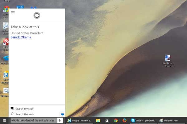
Unlike Google Now, Cortana doesn't take follow-up questions. When I asked who the president of the United States is, she correctly answered "Barack Obama." But when I asked, "What's his age?", Cortana just popped a Bing search for the term "age" with no reference to Obama. On Google, I was able to keep asking questions using just the pronoun "him," such as, "How old is he?" and "Who are his children?" and, in all cases, I got correct answers with cards and audio responses.
Cortana in Windows is supposed to be able to send emails for you at some point, but that feature does not yet work. It's also supposed to set appointments in your calendar, and when I asked Cortana to "remind me to go to the doctor at 5 p.m.," she showed me a confirmation screen where I had to say "yes" to save the appointment. When I said "yes," Cortana said she couldn't save at this time, and that happened several times. Cortana should get smarter as we get closer to the official launch of Windows 10, but we'll see if she's smart enough to be a real help rather than a gimmick.
You still need both the Control Panel and Settings menu.
One complaint about Windows 8 is the way it uses two different settings menus: the Modern UI-based PC settings menu and the old-school desktop Control Panel. With Windows 10, Microsoft has launched a revamped Settings menu that has more detailed controls for things like notifications and networks. However, a lot of the applications I use — like the Disk Management tool, the Fonts folder and the User Account Control — still live in the Control Panel.
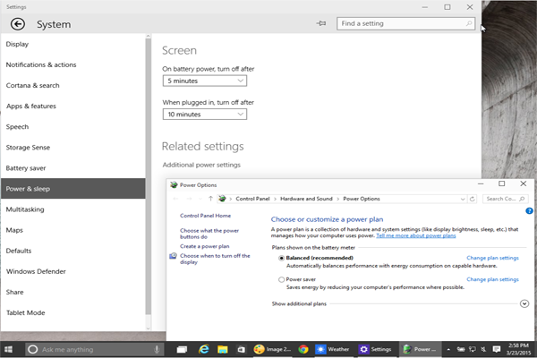
In other cases, there's a very basic set of options in the Settings menu and a button that pops open the more serious Control Panel menu. For example, the Power & Sleep section of Settings only gives you the ability to control the screen and sleep timer, but when you click Additional Power Settings, a Control Panel window opens with the full power profiles. So much for clearing up the confusion.
Bottom Line
If you are willing to deal with some bugs and quirks, the Windows 10 technical preview is stable enough to use every day and already provides a better UI than Windows 8 and faster boots than Windows 7. Some of the improvements don't go as far as they should — for example, the hobbled Settings menu and the tile-laden Start menu — but Microsoft's new operating system will definitely be worth the upgrade whether you jump now or wait for the final build this summer.
Sign up to get the BEST of Tom's Guide direct to your inbox.
Get instant access to breaking news, the hottest reviews, great deals and helpful tips.
-
soldier44 Fast boots should be standard these days regardless of which OS is used because of SSDs. If you still don't have at least one SSD you don't deserve Win 10.Reply -
TechyInAZ Been running windows 10 in a VM and it works ok (slow).Reply
I do agree with Cortana, it's like trying to talk to a person that doesn't know most of the English alphabet. -
Fr33Th1nk3r Yeah, I'm going to linux. I don't have a touch screen monitor, nor the desire to touch my 23" monitor. Thanks windows, but you lost me for good. R.I.P.Reply -
lorribot The first Win 10 had a usable menu then they changed to pointless. What is the point of live tiles on the start menu? Tiles as shortcuts maybe but Live ones on something that is not visible 95% of the time, really? They should be able to be put on the desktop.Reply
The interfaces are still very a confusing mix of styles as they were in Windows 8, with settings in old and difficult to find locations, MS needs to go one way or other, old school or new wave and stick with it.
As a test of simplicity, try and work out how to enable the enhanced keyboard on the touch screen keyboard, the option is there but greyed out for me and enabling it took an hour to find the location, this is just dumb. -
ATL_Tech_Guy Meh, work in progress. If you don't like something, speak up in the feedback app.Reply -
ATL_Tech_Guy Meh, work in progress. Chances are if you don't like something, it's already been reported in the Feedback app. I think they're bringing back some more start menu lists like recent items and possibly favorites.Reply -
dstarr3 I think it's slightly unfair to say the tech preview is buggy. That should be assumed because of its title as tech preview. This is the one opportunity Windows has where it can put a buggy OS into the hands of anyone willing to put up with it. Once we reach launch day, that's a different story, but for now, I think it can be forgiven.Reply -
Merry_Blind "For example, I could switch from a "work" desktop with Word, Outlook and Photoshop open to a "play" desktop with a game and a social media feed open.Reply
Unfortunately, you can't save the desktops, so when you reboot your computer, they are gone. I would love to be able to come back to these different work states over and over again."
That sounds great and I hope they do what you suggest! -
kawininjazx I wish they would stick to the windows explorer control panel. Also, the windows store apps suck.Reply -
Charles3rd Thats interesting. Cortana had Conversational Search before Google did. Maybe you aren't using it right?Reply
