Tom's Guide Verdict
Although it's one of the nicest-looking fitness trackers, the Wellograph doesn't offer enough features for the money.
Pros
- +
Good battery life
- +
Attractive design
- +
Heart-rate monitor
Cons
- -
Not many features for the price
- -
Basic interface
- -
No sleep tracking
Why you can trust Tom's Guide
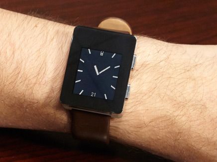
What's the problem with fitness wristbands? They look like fitness wristbands. With its sapphire crystal display, aluminum and stainless-steel case, and leather band, the Wellograph doesn't look like something you'd find at the gym or on someone's sweaty wrist. But don't be deceived by its elegance; this device can measure your heart rate, steps and mileage — or even how long you've been sitting on your duff. But at $350, the Wellograph's beauty isn't much more than skin deep.
Design
Wellograph wanted to make its fitness device look and feel like a premium timepiece, and it succeeded, to an extent. I really like the sapphire screen and the two-toned stainless-steel and aluminum body, which paired nicely with the brown leather wristband. It felt a bit more high-end than the Basis Peak, which has a sportier look, and had the same minimalist vibe as the Moto 360, whose round face is even more elegant.
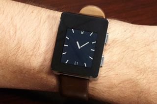
At a small 1.65 x 1.30 x 0.5 inches and 1.8 ounces, the Wellograph didn't feel too chunky on my wrist, but the squared sides makes it more conspicuous than its dimensions would suggest. In addition to its ability to withstand abuse, the Wellograph is water-resistant to roughly 160 feet.

The biggest issue I have with the Wellograph's design is that the bezel above the display is a lot wider than the bezel on the other three sides, which are fairly substantial themselves. This takes away from the premium look.
Display
The 1.26-inch LCD screen on the Wellograph was easy to view both in direct sunlight and at night, via the automatic backlighting. The Pebble Steel has a similarly sized 1.26-inch, 144 x 168-pixel LED-backlit display, as does the Basis Peak. All three did their job well, and none stood out more than the others.
Interface
Kudos to Wellograph for actually including an always-on watch face — a feature that not all fitness bands include. It's a very minimalist watch face, too. You can choose between three different faces. The first is an analog clock dial with no numbers for the hours; in the spot where the "6" would go, it shows the date, and instead of a "12," there's a small battery icon.
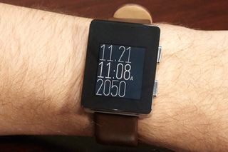
An alternate watch face shows the time in digital form, with the battery icon on the bottom left and a heart on the bottom right. The third option is the most modern, with the date taking up the upper third of the screen, the time in the middle and the number of steps you took that day in the bottom third.
For $350, though, I wish there were more than three options. The Moto 360, for instance, has eight faces, all of which can be customized.
MORE: Best Fitness Trackers to Buy Now
Two physical buttons on the right side of the Wellograph are the only method of navigating the device's interface. The upper button is used to access the top-level sections (Activity, BPM, Steps, Timer and Settings), and the lower button is used to open additional screens within each section.
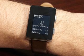
Pressing the upper button from the Watch screen launches the Activity screen, which has two bars: One on the right, which shows your active time, and one on the left, which shows your idle time. Depressingly, the latter is usually much larger. Other activity views (accessed by pressing the lower button) show when during the current day you were active, with a readout of calories burned and a chart of your weekly activity.
The BPM screen displays your current heart rate in an EKG-style readout, which looks cool as it scrolls by. The Exercise screen shows how many minutes of cardio you've done (a heart fills as you meet your requirements), and a Fitness screen displays a bell curve showing your overall fitness level as it relates to the national average.
The main section of the Steps screen displays the number of steps you've taken and how many miles you've traveled. A press of the upper button compares the current day with the previous one.
Overall, the Wellograph's interface is easy to read, but it's a little too basic for something that costs as much as it does. The monochrome LCD may save battery life, but all the icons and text feel like something from Asteroids.
App
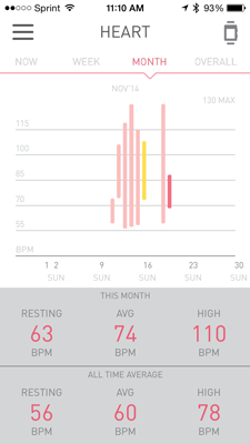
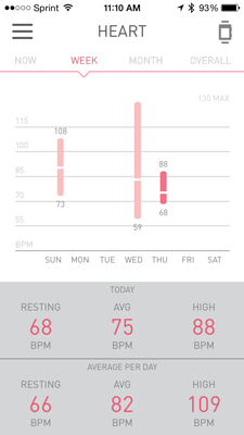
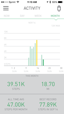
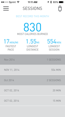
Wellograph's iOS app (it's also available for Android) resembles most other fitness apps, in that the main portion of the home screen shows your stats at a glance, and a hidden menu to the left lets you drill down into more detail: Activity, Heart and Sessions. Below that are options for User Profile, Device, Sync and Sign Out.

At the top of the home screen is Activity, which shows how many steps you've taken that day. Below that is Heart, which displays your amount of cardio time — how long you've engaged in moderate to vigorous physical activity. And at the bottom is Sessions, which shows when you were active, how far you traveled and your pace.
MORE: 15 Best Fitness Apps
All three screens — Activity, Heart and Sessions — also show your stats in day, week and month views. In all, it's not the most comprehensive app I've used, but it presents all the data in an easy-to-read format. However, unlike other apps such as those from Basis, Misfit and Jawbone, there's no sleep tracking and no way to share your progress with others.
Performance
For the most part, I enjoyed wearing the Wellograph. It was small enough that it felt like a real watch, and blended in to whatever I was wearing. Ironically, though, I felt least comfortable wearing it while exercising. I didn't want to damage the leather band by sweating on it too much. (The company also offers a cloth Nato strap for $49).

If the watch has been inactive for a while — for example, when you take it off at night — it doesn't automatically go back to tracking your movements once you put it back on your wrist. I had to press a button on the watch in order to wake it; otherwise, it wouldn't record any of my activities.
I like that the watch always shows the time — something every smartwatch or fitness watch with a display should do — but frustratingly, as I was walking, the Wellograph's screen would switch from the watch face to the steps counter. If I wanted to see what time it was, I had to press one of the buttons on the side.
Heart-Rate Monitor
The Wellograph's heart-rate monitor worked fairly well. Initially, it wouldn't pick up my heart rate while I was moving, but a firmware update resolved this issue.
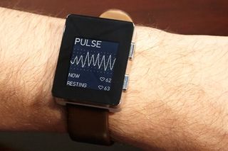
Unlike other devices with heart-rate monitors that merely show a number, Wellograph displays your heart rate EKG-style, as a line graph that scrolls across the screen. Below the chart, it shows your current and resting heart rate as numbers, which is helpful for knowing how much you're exerting yourself.
Battery Life
The one thing I really liked about the Wellograph was its staying power. The watch lasted for about seven days on a charge, which is longer than most fitness bands with a display. The Basis Peak lasted about five days, and the Microsoft Band only two days.
Bottom Line
I've often said that the only way people will want to wear smartwatches and fitness bands on a more regular basis is if the devices are more attractive. The Wellograph — with its sapphire screen, metal body and leather strap — hits that mark. However, the rest of this $350 device left me underwhelmed. While I liked its heart-rate monitor, it tracks less data and has fewer features than devices that cost less.
For instance, the $200 Microsoft Band offers GPS and smartphone notifications. And while it may not be as fancy, the $199 Basis Peak has sleep tracking and can provide notifications from your smartphone. The Wellograph looks great, and provides useful health information, but you can get more for your money elsewhere.
Follow Michael A. Prospero @mikeprospero and on Google+. Follow us @TomsGuide, on Facebook and on Google+.

Michael A. Prospero is the U.S. Editor-in-Chief for Tom’s Guide. He oversees all evergreen content and oversees the Homes, Smart Home, and Fitness/Wearables categories for the site. In his spare time, he also tests out the latest drones, electric scooters, and smart home gadgets, such as video doorbells. Before his tenure at Tom's Guide, he was the Reviews Editor for Laptop Magazine, a reporter at Fast Company, the Times of Trenton, and, many eons back, an intern at George magazine. He received his undergraduate degree from Boston College, where he worked on the campus newspaper The Heights, and then attended the Columbia University school of Journalism. When he’s not testing out the latest running watch, electric scooter, or skiing or training for a marathon, he’s probably using the latest sous vide machine, smoker, or pizza oven, to the delight — or chagrin — of his family.
