Tom's Guide Verdict
The Sony X690E (KD-70X690E) 70-inch TV gives you a huge picture for a reasonable price, but its performance, smart TV functions and remote don't measure up.
Pros
- +
Sleek design
- +
Great price-to-size ratio
- +
Decent 10-watt speakers
Cons
- -
Opera TV is only so-so
- -
Remote control design is confusing
- -
Sound quality drops off at higher volumes
- -
App selection is limited
Why you can trust Tom's Guide
The Sony X690E (KD-70X690E) is big — it's more than 5 feet across and offers a whopping amount of viewable real estate. As Ultra HD resolution makes larger displays more watchable thanks to a higher pixel density, the price of 4K panels has dropped very quickly, making extra-large TVs more affordable than ever. And this size makes for a more immersive viewing experience.
But there's more to a TV than size, and the X690E left us wanting higher performance, more smart TV functions and a better overall experience.
Sony X690E (KD-70X690E) 70-Inch Specs
| Price | $1,299.99 |
| Screen Size | 70 inches |
| Resolution | 3840 x 2160 |
| HDR | HDR10 |
| Refresh Rate | 60 Hz |
| Ports | HDMI 3, USB |
| Audio | 2 Channel 10W |
| Smart TV Software | Opera TV |
| Size | 61.7 x 35.5 x 3.7 inches |
| Weight | 61pounds |
Design
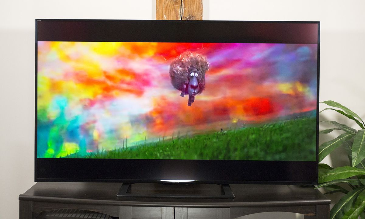
The 70-inch Sony looks very nice, with fairly slim, black bezels around the display and an understated design. The TV chassis has a glossy, black finish around the bezel, and a flat, black finish on the backside. The whole thing is made of black plastic that's serviceable but isn't particularly premium.
At a full 70 inches (measured diagonally, from corner to corner), the X690E is the largest TV we've ever brought into our labs and offers even more viewable real estate than the 65-inch Vizio SmartCast M-Series M65-E0 and the 65-inch Samsung MU7000.

But it does bring some challenges of its own. Measuring 61.7 x 35.5 x 3.7 inches, the 70-inch X690E can't go just anywhere. Wall mounting is an option — the TV supports mounting with a 400 x 400-millimeter VESA mount — but if you want to put it on an entertainment unit or table, you'll need to make sure you have the necessary clearance.
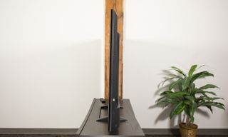
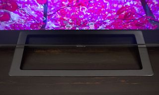
The included stand is made of a sturdy black plastic with a matte finish and has a U-shaped footprint with a squared-off design measuring 25 inches wide and 12 inches deep. That's small enough to fit on a normal entertainment unit, but you'll still need to ensure you have plenty of clearance on both sides to accommodate the 62-inch width of the TV.
You'll also want to be sure you have room for comfortable viewing, since such a large TV can overwhelm a smaller apartment or living room and make you feel like you're sitting in the front row of a movie theater. According to our guide to TV screen size, the ideal viewing distance for a 70-inch display is 6 feet.
Ports and Connections
The TV's connections can be found on two connector panels on the rear left-hand side of the set.
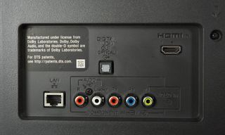
The more accessible of the two is set roughly 8 to 10 inches in from the edge of the display and includes two HDMI ports (one with ARC), an RF connector for an antenna and three USB ports.
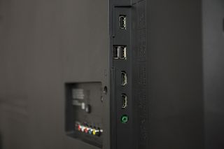
Another rear-facing panel on the back has connections for a third HDMI port, composite video and Ethernet for network connectivity. The set also has built-in 802.11ac Wi-Fi, which allows you to get your smart TV on your network without a wired connection.
Performance
The X690E's good-enough picture quality doesn't quite match the expectations you might have for the cinema-like display. Colors are clear and bright, but they're also oversaturated and ever-so-slightly skewed. And the overall color reproduction isn't quite as vibrant as it could be, due to a slightly lower color gamut.
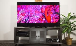
When watching the trailer for Solo: A Star Wars Story, I was impressed with the flashes of color, whether from Lando Calrissian's yellow shirt, a villain's blood-red cape, or the red-and-blue glow of sci-fi jets.
MORE: Google's 4K Android TV Dongle Looks Ready to Battle Apple TV
More specific performance checks showed realistic skin tones in movies like Arrival, where much of the film centers on human faces. Whether it was Amy Adams or Forest Whitaker on-screen, the faces looked clear and lifelike.
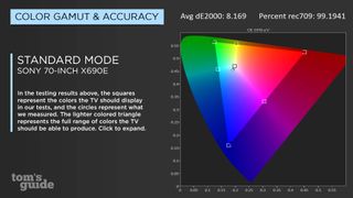
Oddly, the X690E has only three main display settings: Standard, Vivid and Custom. Additional modes, such as Cinema and Game modes, are available, but they're under a separate menu in the settings, called Scene Select.
The set's good-enough picture quality doesn't quite match the expectations you might have for the cinema-like display.
Most TVs have poor color accuracy in Standard mode but offer much better accuracy in Cinema mode. In the case of the X690E, however, the performance was the best in the Standard mode, with a Delta-E score of 8.2 (closer to zero is better). This actually isn't out of line for this mode; the Vizio M65-E0 had a Delta-E of 10.4 under similar settings, and the Sony XBR-X900E registered 8.7. However, those two sets also had much better numbers in different display modes (1.4 and 2.1, respectively).
The color gamut, on the other hand, is good but not great, with the X690E reproducing 99.2 percent of the Rec 709 color space. While other sets edge ahead with higher percentages — the 65-inch Samsung MU7000 had 99.8, and the Vizio M65-E0 scored a solid 100 — it's still high enough to be acceptable.
MORE: TV - News, Reviews and Television Buying Guides - Tom's Guide
Viewing angles are fairly wide, with minor color shifting occuring at roughly 45 degrees off-center, which isn't bad. Even smaller panels, like the 55-inch Samsung MU6300, are large enough to induce some color shifting even if you don't change the viewing angle, yet that doesn't happen with the 70-inch Sony.
Low-light environments were sufficiently dark but not so inky black as to render shadowy scenes hard to watch. A shadowy alleyway in Deadpool, for example, was dark, but details like bricks on the wall and small touches on characters' costumes could still be seen clearly. In contrast, most OLED displays offer the deepest blacks available on a display but often crush the blacks in shadowy images, leaving muddy details and near-black elements that are difficult to distinguish. The backlight does have some shadowing in the corners of the panel. But they're fairly minor, and I was actually expecting them to be worse.
Audio
The X690E's audio quality was pretty good, thanks to a pair of 10-watt speakers. The overall volume was strong, easily filling our testing lab whether we were watching The Price Is Right or the trailer for Avengers: Infinity War.
Audio quality on the X690E was pretty good, thanks to a pair of 10- watt speakers.
When we listened to Deadmau5's "Seeya," the clarity was very good, with ideal performance between 20 and 70 percent volume. In this range, the bass levels were about as good as you'll get without a subwoofer, and the treble was crisp and clear, with Colleen D'Agostino's vocals coming through with no distortion.
MORE: Our Favorite Soundbars for Small and Big TVs
Anything over 70 percent started to sound distorted. Bass lost its bounce, vocals sounded tinny and distant and, when pushed up to 85 percent, the TV chassis started to reverberate, causing a slight buzz.
Smart TV Features
The X690E's menus are fairly opaque, and while basic adjustments to the picture mode and brightness are easy to find, other settings are not. We've already touched on the difficulty of finding the various picture modes, where some modes are available right in the display settings, and others — including Cinema, Game and Sports modes — require finding a separate settings menu, under the confusing name Scene Select. But that's far from the only point of confusion or irritation in these menus.
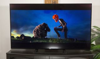
To turn HDR functionality on and off, for example, we first had to go into the settings for each HDMI port and then enable HDR input from an external device. If you don't enable this feature first, you will be able to get HDR content only from streaming sources, even if it's your HDR-enabled, Sony-made PlayStation 4 Pro. That's an extraordinarily clunky way to handle one of the main selling points of the set.
Compared to the Android TV options offered on Sony's other Bravia sets, the Opera OS on this smart TV is a real letdown.
Then there's the choice of smart TV platform. This model line uses the Sony Internet TV platform, which is a very bland name for Opera's smart TV platform with a custom skin. Compared with the Android TV options offered on Sony's other sets, this is a real letdown. The tile-icon layout is usable, but to get additional apps, you have to go through the Opera TV app first.
MORE: Your Guide to Cable TV Cord-Cutting
The app selection is not great. While the TV comes with well-known apps like Amazon Video, Crackle, Hulu, Netflix and YouTube preinstalled, you'll be hard-pressed to find any other apps you might hope for. The selection drops off sharply in quality, and you'll rapidly find yourself sifting through apps that consist entirely of public-domain films, foreign-language content and amateur comedy shows better suited to YouTube. Mainstream viewing options from networks and studios you'd know are almost entirely absent.
Opera does boast some games content, but it's got the same lackluster options. Among the highlighted apps promoted in Opera's app selector are games like Rock Swapper and Pentominoes — low-rent knockoffs of Bejeweled and Tetris, respectively.
Remote Control
While it may not have the Android TV interface we liked so much on the Sony XBR65X900E, the X690E does have the same remote control. Unfortunately, Sony's chunky remote design is our least favorite from any major manufacturer. The rectangular shape isn't particularly comfortable to hold, but the bigger sin is that the layout is confusing.
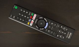
The remote has 49 buttons crammed onto its rectangular face, and while some of these are straightforward — like channel and volume controls, and basic number input — others aren't. Most frustrating is the directional pad, which is surrounded by six navigational buttons. I can't figure out why, but I don't think I've encountered the same selection of navigation buttons on any Sony remote. Here, the buttons are labeled Home, Options, Wide (for wide-screen aspect ratio), Display, Sleep and Return.
MORE: Our Favorite Streaming Media Players and Sticks
Not only is the layout unintuitive, but the proximity of the Sleep button to the Return button means that when navigating through Netflix or YouTube, you might accidentally activate the TV's sleep timer. That's just bad design, and it's strange to see a company like Sony struggle with such a basic element of the TV experience.
Bottom Line
If you're looking for a huge TV, the Sony X690E is an OK midrange 4K set. The picture quality and sound are fairly good and the feature selection is less exciting than what other Sony models offer, but it's usable. The large 70-inch display is the source of much of this set's cost, and $1,299 isn't half bad for a TV that stretches more than 5 and half feet from corner to corner.
But even with the big screen and decent performance, this Sony TV suffers from some curiously poor decisions in its remote design and menu layout, which make it difficult to use some of the features that may have sold you on the display in the first place. For a screen that's nearly as big but without the irritating menus and lackluster performance, consider the 65-inch Samsung MU7000 or Sony's own XBR-65X900E. Both of those sets offer superior performance and a more polished user experience for a similarly affordable price.
Credit: Tom's Guide
Brian Westover is currently Lead Analyst, PCs and Hardware at PCMag. Until recently, however, he was Senior Editor at Tom's Guide, where he led the site's TV coverage for several years, reviewing scores of sets and writing about everything from 8K to HDR to HDMI 2.1. He also put his computing knowledge to good use by reviewing many PCs and Mac devices, and also led our router and home networking coverage. Prior to joining Tom's Guide, he wrote for TopTenReviews and PCMag.
