Tom's Guide Verdict
While it has a new focus on the in-home experience, SlingTV’s remote-viewing capabilities remain as strong as ever.
Pros
- +
Intuitive app
- +
Works with Chromecast
- +
Good on-screen interface
- +
Lets you watch your TV anywhere
Cons
- -
Requires both HDMI and component cables for all features
- -
Can only favorite shows and channels using mobile apps
- -
Remote lacks features
Why you can trust Tom's Guide
Until now, the Slingbox has been focused on users being able to watch their TV while they’re away from home. With the new SlingTV ($299), however, the company is looking at how to better deliver an experience when watching from your living room, as its revamped on-screen interface makes it easier to see what’s on TV. At the same time, Sling beefed up its mobile apps, adding more social components and the ability to use it with a Chromecast device, which makes it even easier to replicate your living room on the road. Is this device the still the best way for peripatetic couch potatoes to watch TV?
Design
While the less expensive Slingbox M1 looks markedly different from its predecessor, the Slingbox 350, the SlingTV has the exact same design and hardware as the older Slingbox 500. In fact, if you have a Slingbox 500, you can upgrade its firmware to have the same capabilities as the SlingTV.

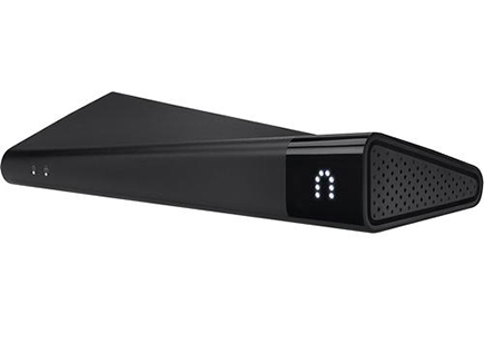
As with the Slingbox 500, the SlingTV is rectangular, measuring 11.4 x 4.9 x 2.2 inches, but one corner on each end is higher than the other, creating a wavelike shape on the top. It's striking, but ensures that you can't place any other devices on top of it. The front right corner is made of translucent black plastic, underneath which glows the Slingbox logo when the device is on and streaming.
The back has Ethernet, an IR blaster input, composite and component inputs and outputs, plus HDMI in and out. The device also has a USB port, to which you can connect an external drive.

Also included is a small black plastic remote control (batteries too), and, to our delight, an HDMI cable. Other cables include are one pair of component, composite, Ethernet, and an IR blaster. Fortunately, you don't necessarily have to use the latter two: Not only does the SlingTV have built-in Wi-Fi, but the device is also dotted with a few IR transmitters, eliminating the need to connect a separate IR blaster and place it in front of the cable box. Of course, you can still attach one, if you so choose.
Setup
Like the older Slingbox 500, the SlingTV is designed as a pass-through device, so you must connect your cable or satellite box to the SlingTV, and then connect the SlingTV to your TV.
In order to use both the Slingbox features and the smart TV features, you have to connect the Slingbox to your cable box using both component and HDMI cables. (You only need HDMI to connect the Slingbox to your TV.)
MORE: Best Soundbar
After plugging the Slingbox into our TV and cable box, we turned on our set, and the Slingbox setup screen appeared. Using the included remote control, the setup process let us choose between Ethernet and Wi-Fi. We then selected our cable provider and set-top box model. It was a little annoying using the included remote to select letters and numbers from a virtual keyboard, but Sling does its best to limit the number of times you have to use it. Still, we had to manually enter our Slingbox user account name and password. It would be nice if we could do this via the mobile app.
While the Slingbox has HDMI, some protected content can't be streamed via HDMI; Sling recommended we also connect the Slingbox using component cables, too.
TV Interface
Although the Slingbox 500 had an on-screen interface, it’s been greatly modified for the SlingTV. Pressing the Sling button on the remote launches the on-screen menu, which has five large squares running across the middle: Live TV, Gallery, Apps, What’s New, and Settings.
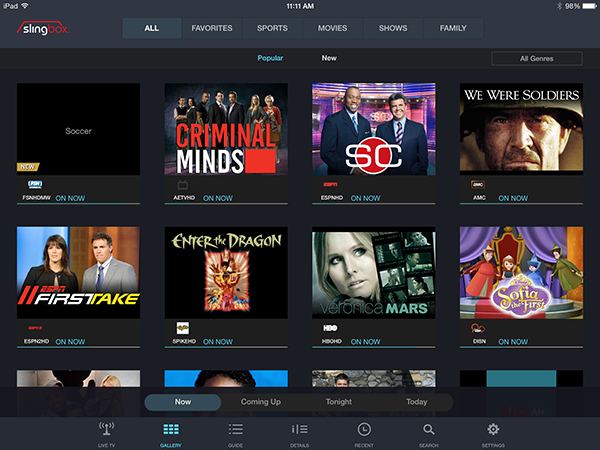
Live TV is just that, letting you watch whatever’s on TV. Gallery brings up an on-screen tile interface that displays what’s currently playing on each channel. I like that each show is represented by big square icon, but a blue bar underneath lets you know how much time remains for that program. Highlight a particular program, and additional information appears at the bottom of the screen, such as a plot synopsis, original air date, and actors. From here, you can watch that show of favorite that channel. However, you have to access your own cable box’s interface if you want to record something.

Along the top of the Gallery screen are options for filtering the channels: All, Favorites, Sports, Movies, Shows and Family. In each, you can see what’s currently playing, or look forward in time to what’s coming up.
“All” is a bit misleading: It doesn’t show all your available channels, only the most popular shows based on a Twitter algorithm. So, if you want to populate Favorites with shows that you like, you’ll have to favorite them using the Sling mobile or web apps. It feels rather backwards.
Sports not only shows what games are on, but the score of each, along with pertinent info. For a baseball game, for example, it shows who the starting pitchers are. Press the Details button--the same button used to favorite a channel--and you can get additional information about the game. At the top of the screen, it shows balls, strikes and outs, and below are player and team stats. It was pretty neat, but I thought the text was spaced out too much, and required too much scrolling.
Currently, you can view sports scores from the NFL, MLB, NHL, NBA, and NCAA football and basketball. Sling said it was looking at adding the Premier league and other soccer leagues in the future. I wish there were a way to select your favorite teams, and have their scores show up in a ticker along the bottom of the display regardless of what channel you’re watching.
MORE: Best TVs Available Now
The Apps screen has three options: Blockbuster on Demand, Dishworld, and My Media. Dishworld, which costs $14.95 per month for the first three months, includes more than 180 international channels in 15 languages, and is perhaps best suited for those who can’t get enough Premier League football (or soccer as it’s known in the U.S.). It’s also available as an app for Android, iOS, Roku, Windows, Mac OS X, and Samsung Smart TVs.
My Media lets you connect a USB or hard drive to the Slingbox and view content on your TV or remotely on your phone or tablet. However, during the course of my testing, Sling said it would be removing this feature in the near future.

What’s New simply shows you the new features of SlingTV at a glance.
Overall, SlingTV’s on-screen interface is a good start--I especially like the sports score updates--but it needs more work before I would choose it over my traditional cable box’s interface. For example, there’s no way to view what’s on your DVR, or create custom favorite lists for individual family members. Also, you can only favorite channels, not individual shows.
The other weakness of SlingTV is its remote control. The same as the previous generation, the small black remote is comfortable to hold, but is far more limited than a standard remote you’d get with your cable box. It doesn’t even have volume controls.
Mobile Apps
Sling has mobile apps for just about every platform: Windows and Mac desktop, iPhone, iPad, Android tablets, Android phones, Windows tablets, Windows phones, and the Amazon Fire tablet and phone. There’s even apps for Apple TV and Roku. Still not enough? You can also watch Sling though Firefox, Internet Explorer, Chrome, and Safari. While apps for tablets and smartphones cost $15 each, the desktop apps for Macs and PCs are free.
iPad App
The iPad Sling app offers three different methods for changing the channels and controlling your your cable box on the upper right of the screen. The first option, represented by four arrow buttons around a circle, give you basic controls--channel up/down, volume up/down, a d-pad, and buttons to open the Menu and DVR.

Next to this is a small grid-like icon that’s a simple number pad, and lets you type in a channel number. On the far right is a mini remote control that when pressed, shows an on-screen remote that looks and acts like the real thing. It takes up a quarter of the display, but was really useful for navigating through my DVR.
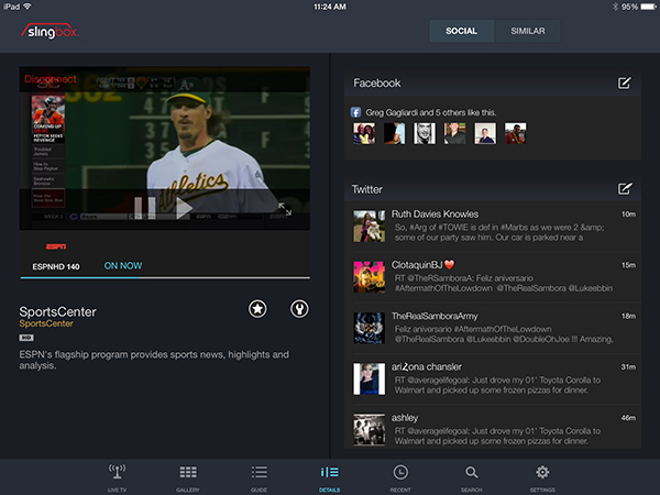
Along the bottom of the screen are icons for Lie TV, Gallery, Guide, Details, Recent, Search, and Settings. Chances are, you’ll most likely use the Gallery and Guide to find the show you’re looking for, as it presents channel information in the most informative and economical manner.
All the controls will disappear after a few seconds, leaving the screen only with the show you’re watching. Just tap the screen to have the controls reappear.
When watching a show, clicking the Details button minimizes the program on the left side of the screen and brings up Facebook and Twitter feeds on the right. Here, you can also favorite that show, too.
iPhone App
On the iPhone, controls are a bit more compressed, but navigating is still fairly simple.
When you launch the app, there are four options at the bottom: Connect, Guide, Directory, and My Media.
When you’re watching a show on your phone, you can simply swipe up or down on the screen to change channels. Tapping on the screen brings up several options including Favorites, Remote, Guide, DVR and Quality.
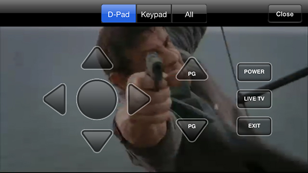
Instead of an on-screen remote that looks like the real thing, as with the iPad app, the app gives you four transparent arrow buttons around a circle, with page up/page down buttons to the right. This is handy if you quickly want to jump up and down, but you’ll be doing a lot of scrolling.
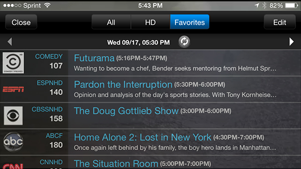
I found it a lot easier to find what I was looking for using Guide and Favorites. The former brought up an overlay of all my channels, with information showing what was on, and a plot synopsis. You can simply press on a show to change the channel to that program, and see what’s on next, but you can’t set a DVR recording from here.
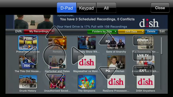
Speaking of DVR, it was nice that I could access my recordings, but, as it brings up the interface as you’d see it on your TV, icons were small and hard to read. It’s better than nothing, though.
Chromecast compatibility
If you have a Chomecast device, you can also stream content from the Sling app to a big-screen TV. This is useful not only if you’re in a far-away hotel room, but it could also serve as an ad-hoc cable box in your own home.
Performance
Streaming both live and recorded TV from my apartment to several devices (an iPad Air, iPhone 5s, and a desktop PC and a MacBook Air) in my office via Wi-Fi was a fairly good experience. Picture quality was great, and there was only about a half second of lag between the time I entered a command and the channel changed.
Of course, the quality of the image is dependent on your connection speed, not just from your home, but to whatever device you’re using. The Slingplayer app will automatically adjust the fidelity of the image, and even drop to audio only, if you can’t get strong enough wireless throughput.
Pricing and Value
The SlingTV costs $299, and each app--iOS, Android, etc--costs $15 each. You can’t use the iPhone app on the iPad, so you’ll have to purchase them separately.
Since the Slingbox was initially released 9 years ago, cable and satellite companies are catching up. For example, Dish Network purchased Sling and incorporated all of its features into its services. Comcast and Time Warner also have apps that let you stream live TV to your phone or tablet, as well as download shows to your mobile device.
However, there are limitations to their services, such as the ability to access content stored on your DVR, as well as watching your TV from international locations as well as over a wireless broadband connection.
Bottom Line

The renamed and reinvented SlingTV adds some nice in-home features and beefs up its mobile offerings. For those who desperately want to be able to watch their hometown teams from afar, SlingTV is pretty much the only game in town. The in-home features, such as showing sports scores and stats, are nice, but the interface as a whole needs work before I would reach for the Sling remote.
Those who care mainly about accessing their content from afar might be fine with the Slingbox M1, which costs just $150. The in-home features of SlingTV are interesting, but they aren’t compelling yet.
Follow Michael A. Prospero @mikeprospero and on Google+. Follow us @TomsGuide, on Facebook and on Google+.

Michael A. Prospero is the U.S. Editor-in-Chief for Tom’s Guide. He oversees all evergreen content and oversees the Homes, Smart Home, and Fitness/Wearables categories for the site. In his spare time, he also tests out the latest drones, electric scooters, and smart home gadgets, such as video doorbells. Before his tenure at Tom's Guide, he was the Reviews Editor for Laptop Magazine, a reporter at Fast Company, the Times of Trenton, and, many eons back, an intern at George magazine. He received his undergraduate degree from Boston College, where he worked on the campus newspaper The Heights, and then attended the Columbia University school of Journalism. When he’s not testing out the latest running watch, electric scooter, or skiing or training for a marathon, he’s probably using the latest sous vide machine, smoker, or pizza oven, to the delight — or chagrin — of his family.
