Samsung Just Reinvented the Galaxy Interface
The new OneUI user experience was first announced for the Galaxy S9 and Note 9, but now Samsung tells us it's coming to older flagships as well.
Editors' Note: Updated on Nov. 9 with Samsung's clarification that OneUI will release on the Galaxy S8 and Note 8.
Samsung’s recent smartphones have been beautiful on the outside, but the company’s industrial design advances have always been at odds with its somewhat cluttered UI design.
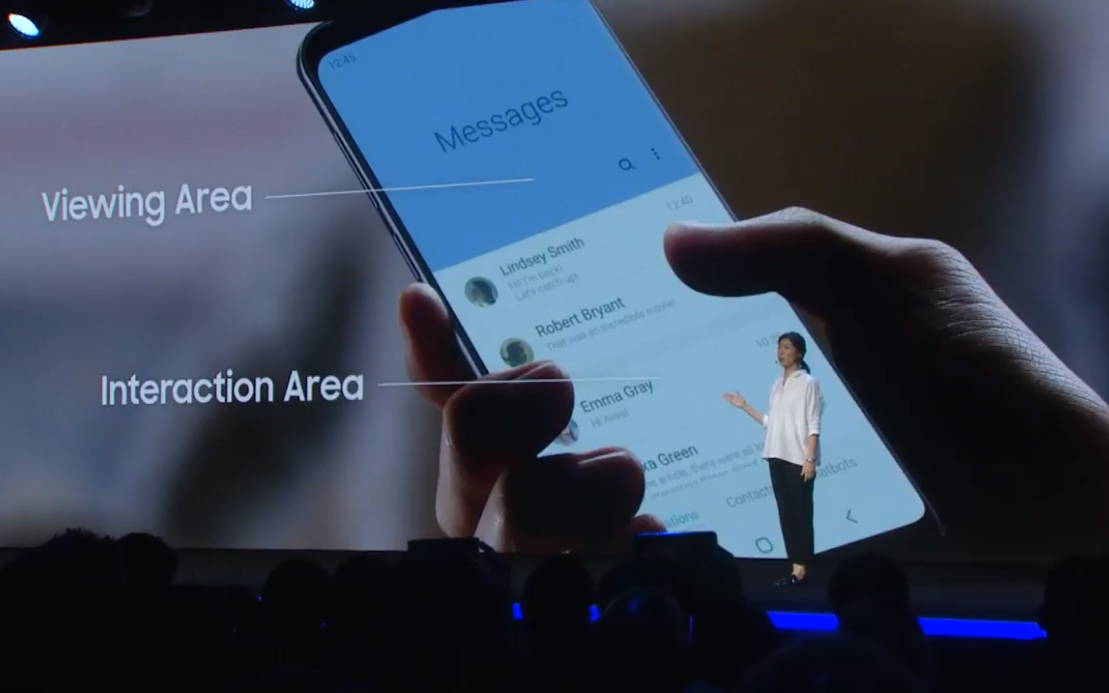
Not anymore. At Samsung’s Developer Conference in San Francisco on Nov. 7, the company introduced an entirely new software experience called OneUI. Based around promoting simplicity and ease of use, OneUI is designed to address problems specific to the increasing size and complexity of today's smartphones.
Built on Android 9 Pie, OneUI will launch beginning January of next year for the Galaxy S9, S9+ and Note 9. Initially, a spokesperson from the company told Tom's Guide that the software wouldn't arrive on the Galaxy S8, S8+ and Note 8, but since then the company has clarified and confirmed to us that those older flagships will get OneUI — just not the beta. It's a relief too, as owners of Samsung's 2017 premium handsets must have felt pretty burned after those first announcements.
But, back to the software itself. Evidently Samsung has put a lot of thought into delivering an interface that perfectly complements the look and feel of its devices. OneUI heavily features rounded corners to buttons and graphics that evoke the Galaxy series’ curved edges, and comes with colorful themes so that the phones’ software matches the color of the hardware.
Presumably OneUI will also be the interface for Samsung phones launched in the coming year, including the Galaxy S10 which is likely to debut in Spring 2019. It's also going to be the interface for the new foldable smartphone Samsung also showed off at its developer conference.
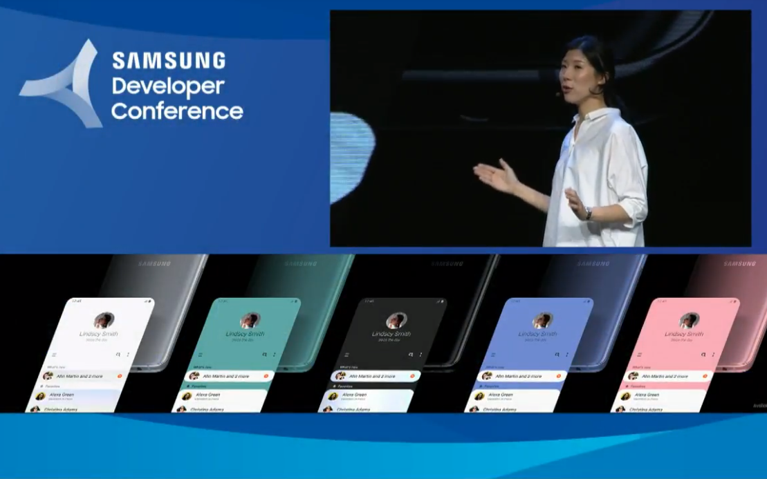
It’s also dynamic, responding real time to users’ needs while stripping actions and features from the display that are nonessential to the task at hand. For example, OneUI’s dialer removes the contact search bar once you begin typing a number. Additionally, settings inside submenus are now grouped together in categories for similar functions, and reordered so that the most commonly adjusted settings always appear at the top.
Sign up to get the BEST of Tom's Guide direct to your inbox.
Get instant access to breaking news, the hottest reviews, great deals and helpful tips.
But what makes OneUI truly distinctive from Samsung Android skins of old is that everything you see has been shuffled around to exist within reach of your fingers. Jee Won Lee, Samsung’s Senior Designer of UX Design, noted on stage that the increasing size of smartphone displays have complicated one-handed use.
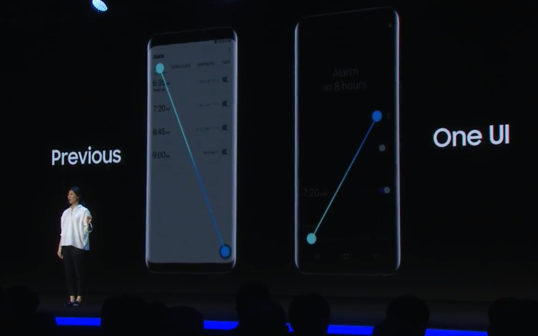
To address that, the actionable area of most OneUI screens lives within the center of the display. For example, the new Messages app puts the first and latest thread about two-thirds of the way up the display, while the Clock app does the same for alarms.
MORE: Samsung Opens Up Bixby to Developers But Fails to Excite
That means you don’t have to stretch your thumb all the way to the upper corners to interact with icons and menus. Additionally, pop-up elements now consume only the bottom portion of the display, so that they too are easier to reach and don’t completely obscure critical content.
We had a chance to play around with a beta version of OneUI at the Samsung Developer Conference in San Francisco today. And while the interface definitely feels like a beta that will go through some tweaks between now and next year, we like much of what we've seen so far.
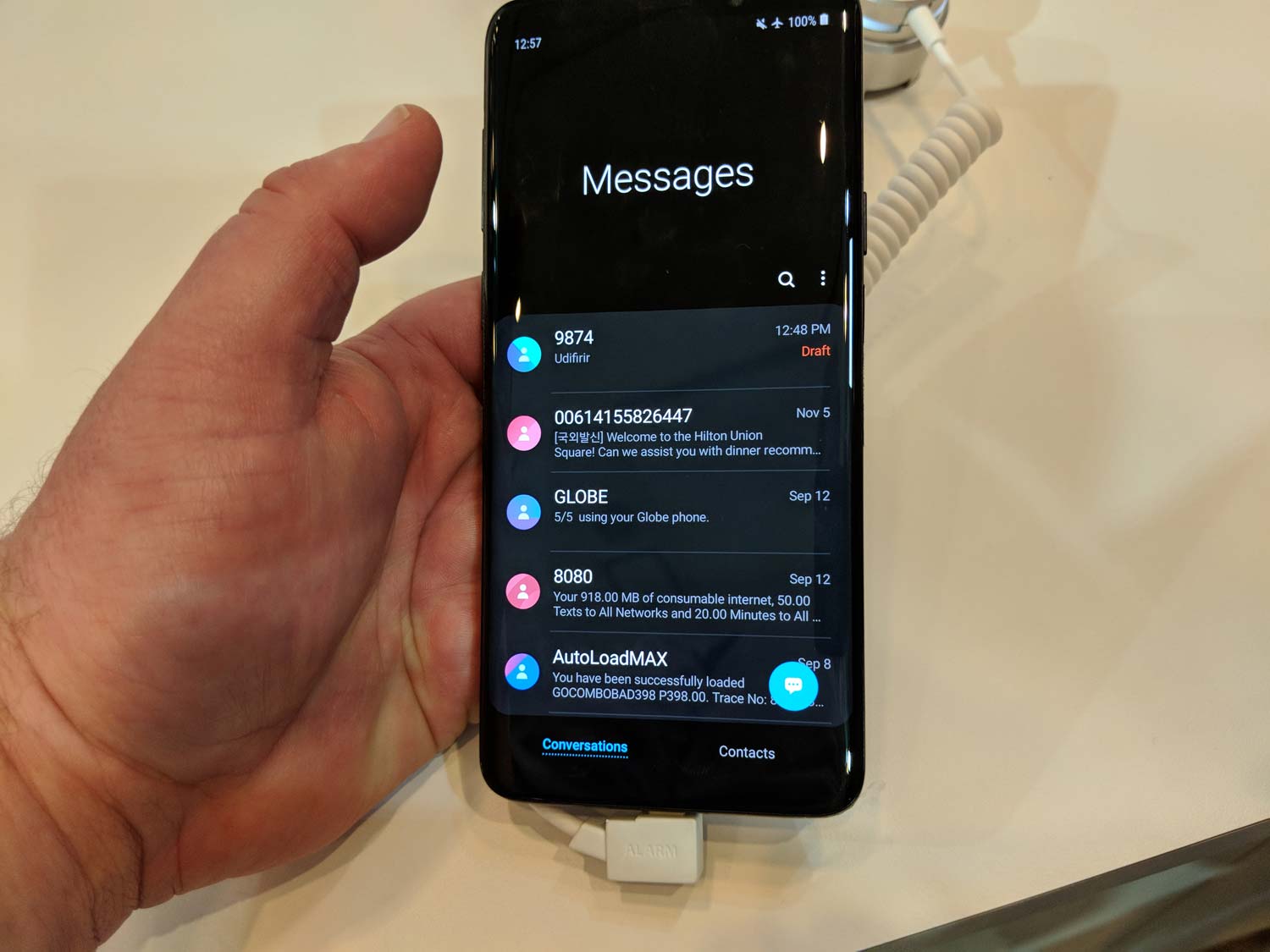
Take the Messages app. Instead of a list of message starting at the top of the phone's screen and scrolling downward, the messages started in the lower half of the screen, within easy reach of our thumb. The tradeoff is a lot of unused space at the top of the screen, but we imagine getting used to that (assuming Samsung doesn't further refine that area.) When we tapped on the message, it would appear starting in the top part of the screen, giving us a clear view of the message to read, while our thumb was able to scroll below.
Likewise, we appreciated how the Clock app grouped together functions like World Clock and Stopwatch at the bottom of the screen within easy reach of the fingers on our lone hand gripping the phone. And poking around Settings, it was easy to find items in OneUI's streamlined groupings.
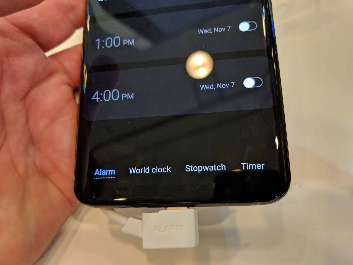
The Galaxy S9+ running OneUI isn't the easiest phone to use one-handed, especially if your hands are on the small sized. But it was definitely more manageable with OneUI.
OneUI looks to be a comprehensive and radical change for Samsung’s software and visual language, the likes of which the company’s smartphones have never seen before. And seeing as how Samsung’s flavor of Android is the only flavor most Android users around the world ever experience, OneUI’s existence bears wide-reaching implications.
While it won’t launch until early next year, Samsung says it will distribute a OneUI beta later this month for Galaxy S9 and Note 9 users and developers in the U.S., Germany and Korea first, with other countries to follow.
Senior editor Philip Michaels contributed to this report from San Francisco.
Adam Ismail is a staff writer at Jalopnik and previously worked on Tom's Guide covering smartphones, car tech and gaming. His love for all things mobile began with the original Motorola Droid; since then he’s owned a variety of Android and iOS-powered handsets, refusing to stay loyal to one platform. His work has also appeared on Digital Trends and GTPlanet. When he’s not fiddling with the latest devices, he’s at an indie pop show, recording a podcast or playing Sega Dreamcast.
