Tom's Guide Verdict
The $249 Pebble Time Steel is the company's most luxurious smartwatch to date, but it's a better choice for Android users.
Pros
- +
Sophisticated design
- +
Always-on display
- +
Long battery life
Cons
- -
Cannot reply to notifications from watch
- -
Microphone functionality limited
Why you can trust Tom's Guide
You want a smartwatch, and you're not afraid to drop a couple of hundred dollars to get notifications, apps and more on your wrist. So which one should you get? If you're intrigued by Pebble's keep-it-simple approach, the Time Steel (starting at $249) combines a stylish all-metal body with an always-on display and a battery that lasts longer than a week on a charge. (Take that, Apple Watch.) But while the Time Steel is an attractive option, it suffers from limited features and compatibility issues that can't be ignored.
Editor's Note (12/7/16): After being acquired by Fitbit, Pebble is discontinuing its entire product line, and is no longer selling or supporting its smartwatches. As such, we cannot recommend purchasing any Pebble smartwatch.
Design
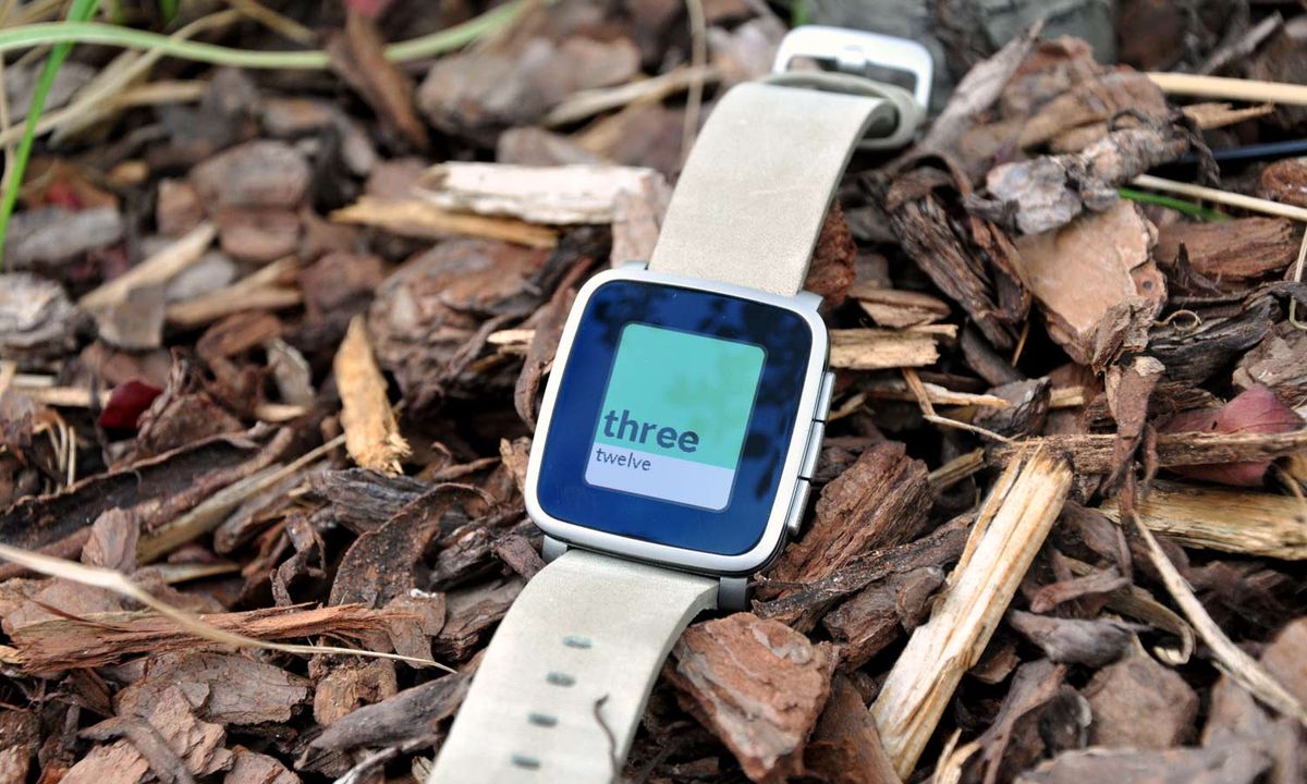
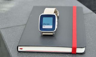
Unlike the all-plastic Time, you won't mistake the Pebble Time Steel for a child's toy. Made of marine-grade stainless steel, this smartwatch is the Pebble Time's sharper, suit-and-tie wearing brother. It's available in black, gold and silver, and you can accessorize with either genuine leather bands (one included in each order, in either black, gray or beige) or stainless steel bands ($50 extra).


My review unit came with a faded beige leather band, which appeared worn out rather than vintage or antique. I much prefer the stainless steel bands, as they complement the body of the Time Steel better, giving it a polished timepiece look.
The right side of the Time Steel has three physical buttons: up, down and select. The opposite side has the power button, and these four slightly textured rectangles control the entire smartwatch. The Time Steel's display isn't a touch screen, and the whole device is water-resistant up to 30 meters.
I much prefer the stainless steel bands, as they give the smartwatch a polished timepiece look.
The Time Steel is the same size as the Time, measuring 1.6 x 1.5 x 0.37 inches, making it similar in size to both Apple Watch models (1.5 x 1.3 x 0.41 inches and 1.7 x 1.4 x 0.41 inches). It doesn't overwhelm even small wrists like mine, and it's much smaller than the LG Watch Urbane (2.0 x 1.7 x 0.43 inches), which has a distinctly different, more traditional, timepiece look.
Display
The Time Steel has the same 1.25-inch e-ink display as the Time smartwatch. It's always on and has an LED backlight that activates when you move your wrist. At any point, you can glance down at the display to check the time just as you would a normal watch, or check the most recent page you had up on the screen. Sometimes, I would leave the weather or my activity stats from the LetsMuv app open so I could monitor them throughout the day.
The display was easy to read in sunlight as well as in the dark corners of my office. While it isn't as sharp or as vivid as those on the Apple Watch or the LG Watch Urbane, it does have an e-reader feel to it. As a Kindle user, I appreciated this and it makes the Time Steel easy on the eyes in a different way.
Interface
The interface of the Pebble Time Steel has two main areas: the timeline and the menu. Pressing the up button when you're on the watch face brings you to the timeline, specifically the last event to have passed in your day. Pressing the down button will give you a glimpse into the future, showing titles, times and locations of events or meetings scheduled on your calendar. I used the timeline a lot - it let me keep my phone locked and still see which meetings I had that day and where I had gaps of free time.
I used the timeline a lot - it let me keep my phone locked and still see which meetings I had that day and where I had gaps of free time.
Separate from the timeline is the app menu, accessible by pressing the select button from the watch face. Here you can use the up and down buttons to scroll through your installed apps; the Time Steel comes pre-loaded with Settings, Notifications, Alarms, Watch faces and Music. This is also where any third-party apps you've downloaded will appear.
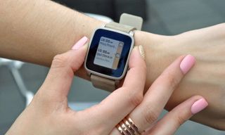
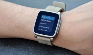
I spent most of my time in the notification drawer, recapping any alerts I missed. I also set a few alarms to remind me when to take medicine throughout the day. Settings came in handy when I needed to check my Bluetooth connection and when I wanted to change the strength of the watch's vibrations or turn them off entirely. In Settings, I set a Do Not Disturb window from 11 p.m. to 6 a.m., so I wouldn't be jolted awake by the Time Steel's loud vibrations on my wood bedside table.
Notifications
The Pebble Time Steel delivers all the notifications your Android or iOS phone receives to your wrist, without leaving much room for customization. You cannot choose which alerts you want to go to your Time Steel, so it's all or nothing. I contemplated going into my iPhone 6's settings and turning off notifications for certain apps, but that would take too much time. I stuck with my wrist vibrating every 10 minutes.
MORE: Smartwatch Buying Guide: Everything You Need to Know
When a new alert arrives, the Time Steel jolts with a vibration and its display lights up. You can then use the up and down buttons to scroll through the longer notifications, like emails and texts messages. The Time Steel keeps the most recent notification up on the display until you do something with it - which, in most cases, is either hide it or dismiss it.
I wasn't able to reply to texts with canned or voice messages, since that feature is currently reserved for Android users.
Pressing the power button with an alert on the display will bring you back to the watch face and store that alert in your archive, which lives under Notifications in the menu. You can also press the select button when an alert pops up to see a menu of other available actions. There will always be a "dismiss" option, which removes the notification from your Time Steel, but certain alerts like emails and SMS-messages will let you respond with a canned reply or a voice message.
I wasn't able to reply to texts with canned or voice messages, since that feature is currently only available for Android smartphone users. It's similar to the feature that Android Wear watches have, which brings up a list of quick responses that you can shoot off as a reply when you are otherwise tied up. On the Time Steel, you can only reply directly when you receive an alert - there's no going into the archive to reply later.
Like most smartwatches, the Time Steel suffers from a lack of actionable options for notifications. Even if you can send a canned text message, you can't compose a new message or dictate a Tweet or Facebook post, nor can you forward an email to a colleague.
Pebble App
The Pebble companion app for Android and iOS devices is the home base for your Time Steel. Upon opening the app, you see all your installed watch faces and you can select which one you want to use. You can also view all your apps and rearrange the order in which they appear on the watch.
You tap the menu icon on the top left corner of the app to access both the watch face store and the app store. In both stores, you can browse different watch faces and apps, and download them to your Time Steel. The changes are nearly immediate - whenever I downloaded something new, the Time Steel would emit a short vibration to let me know that it had received the new watch face or the app.
Besides getting new watch faces and rearranging apps, there's not much to do in the Pebble app. The most I used it at one time was when I initially set up the Time Steel, because you pair the device via Bluetooth from within the app.
Third-Party Apps
Pebble has more than 8,000 apps and watch faces available to download for the Time Steel. Some of them, like the LetsMuv fitness app, make use of the full-color display, but others like Yelp remain black and white. We're still waiting for Facebook and Twitter apps for Pebble, but you do get notifications from those sources if you receive them on your smartphone.
My favorite watch face was Pantone, which spelled out the time and had Pantone chiplike color blocking in the background. Every few minutes, the color of the top square changed, which made it fun for me to check the time.
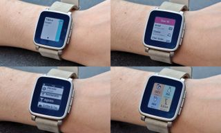
Although it's monochrome, I liked the Yelp app for looking up nearby restaurants and bars on the fly. It gives you all the necessary information to pick a good place for dinner, including the name of the place, star rating, address and reviews. However, I would have liked a tiny map to see where the restaurant was in relation to my location.
MORE: Pebble Time Smartwatch Review
There are third-party apps that turn your Time Steel into a mini iPod for music control, but Pebble's own music app worked well for me. It turns the three side buttons into pause/play buttons, and a rocker for skipping songs and changing the volume.
Battery Life
The Pebble Time Steel is designed to last at least 10 days on a change, which is three days more than the Time. That's better than the day or two of life you'll get from any Android Wear smartwatch or the Apple Watch. After two full days of use, my Time Steel's battery was down to 70 percent. As with the Pebble Time, the Time Steel will likely last longer when connected to an iPhone, since it uses Bluetooth Low Energy rather than regular Bluetooth.
Bottom Line
Although it doesn't do as many things as the Apple Watch or Android Wear watches, the $249 Pebble Time Steel is a formidable competitor. Its stylish design, intuitive Timeline interface and long battery life make it a reliable wrist-worn assistant. The regular $199 Pebble Time does everything the Time Steel does for less, but those who want to look at their smartphone less and don't want to compromise style will want to invest in the Time Steel.
Valentina is Commerce Editor at Engadget and has covered consumer electronics for a number of publications including Tom's Guide, Wired, Laptop Mag and Ars Technica, with a particular focus on wearables, PCs and other mobile tech.
