Tom's Guide Verdict
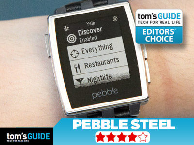
The Pebble Steel marries an elegant new design with an intuitive app store for a premium price.
Pros
- +
Premium, elegant design
- +
Pebble appstore makes it easy to load and manage apps
- +
Improved notification handling
Cons
- -
Not much new functionality for higher price
- -
Still imited to 8 apps at one time
Why you can trust Tom's Guide
The smartwatch that started it all is going high-end. The $249 Pebble Steel places the familiar features and intuitive interface of the original model in an elegant design that you'll want to wear during your next business meeting or special occasion. With a brand-new Pebble appstore, apps from partners such as ESPN and Yelp, and a classier look, the Pebble Steel could be the smartwatch to wear in 2014. Here's why.
Design
The Pebble Steel is a more premium alternative — rather than a successor — to the original, sportier watch. As its name implies, the device is composed of slick, injection-molded CNC-machined 316 stainless steel, which is resistant to corrosion and can withstand elevated temperatures.
The Steel's watch face is paired with an equally attractive band. Buyers can choose between brushed-stainless and black-matte color options, and each device comes with a steel wristband installed and a leather band in the box.
The Pebble Steel has a Corning Gorilla Glass 2 1.26-inch, 144 x 168-pixel, LED-backlit e-paper screen that's sturdy and resists fingerprints, and renders text and images just as crisply as the original model. As on the first Pebble, you'll find three navigational buttons along one side for scrolling and selecting. The button on the other side of the watch's face allows users to move back within the interface.
MORE: Smartwatch Face-Off: Pebble vs. Sony Smartwatch 2 vs Galaxy Gear
Pebble has also added more branding to its newer model. The company's name is stamped just below the display and also on its metal clasp.
Measuring 1.5 x 1.4 x 0.4 inches, the Pebble Steel is slightly slimmer and narrower than the 1.6 x 1.6 x 0.35-inch Sony Smartwatch 2. It's also noticeably sleeker than the 2.2 x 1.4 x 0.43-inch Samsung Galaxy Gear. At 1.95 ounces, the new Pebble with its leather band is slightly heavier than the 1.7-ounce Sony Smartwatch 2 but is lighter than the 2.6-ounce Samsung Galaxy Gear. It's also slimmer than the original Pebble, which measures 2 x 1.2 x 0.4 inches. The Pebble Steel paired with its metal band, however, is heavier than its competitors, at 3.44 ounces.
The metal band comes with extra links in the box, and Pebble says the final version will come with a screwdriver for switching out the bands. The Pebble Steel also comes with a new charger that features smaller magnetic pins than the previous model's power cord.
Waterproof
The Pebble Steel may look like a gadget that wouldn't take kindly to water, but the premium model can endure just as much moisture as its predecessor. The watch can withstand 5 ATM, which means it can be submerged in water up to 165 feet deep before breaking. To test this waterproof functionality, we dropped our Pebble Steel in 6 inches of water for 10 seconds while the device was turned on. The unit worked just fine, with no noticeable lag when we removed it.
Setup
Setting up the new Pebble is just as simple as it was on the original model. Pebble cautioned us that the device's hardware and software were preproduction versions, but the setup process ran smoothly. The Pebble is compatible with both Android and iOS devices, but we were told to use an iPhone during our testing.
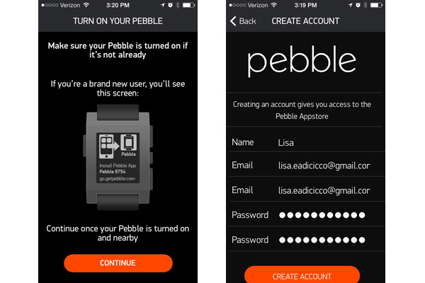
After updating your existing Pebble app or downloading it from the iOS App Store or Google Play store, you'll be prompted to allow the app to make Bluetooth data available to nearby devices. After tapping OK, you'll need to press Start when prompted to do so and select "I'm a new Pebble user" to create an account for the appstore. This involves entering an email address and creating a password. After allowing the app to use our location, we selected the Pebble from the list of accessories and pressed Pair to sync it with our phone.
Once the watch was paired to our iPhone, we tapped Continue and then Check Now to make sure the Steel's firmware was up-to-date. The app will then prompt you to Enable Notifications, which we tested by sending sample texts and phone calls through the app.
After your watch is successfully paired, you're all set to check out the Pebble appstore to load watch faces and apps. If you're a first-time Pebble user, note that you must enable your notifications to appear in your phone's lock screen in order for them to show up on the Pebble. And, of course, always make sure Bluetooth on your phone is turned on.
Interface
The Pebble Steel maintains all of the characteristics of its predecessor, including the simple and minimalist user interface. Unlike other tech timepieces, such as the Samsung Galaxy Gear and Sony Smartwatch 2, the Pebble Steel isn't designed to look like a smartphone on your wrist. Instead, it features a single menu that houses options such as Music, Notifications, Alarms, Watch Faces and Settings. Any apps you upload to the Pebble are also listed in this menu underneath these choices.
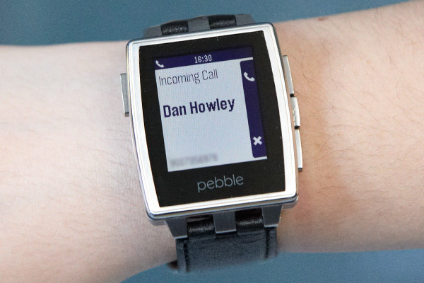
By default, the watch displays the time, unless you press the middle navigation button to launch the menu. You can cycle through different watch faces by pressing the keys above and below this button.
The Settings menu allows you to check your Bluetooth connection, adjust the date and time, turn the Pebble off and adjust notification settings. The Alarm section and the Do Not Disturb feature under the Settings menu are both newer additions to the Pebble platform. As its name implies, the alarm function lets you set an alert directly on your wrist, while the Do Not Disturb feature lets you turn off notifications for a period of time. We could see this coming in handy at the movies or during business meetings.
Overall, we'd like to see an e-paper touch screen, a color display or both at this price, but overall, the Pebble Steel is easy to use.
Notifications
Good news for Pebble owners: Your notifications will no longer disappear once you've checked them. Among the most notable improvements to come with the Pebble v.2.0 firmware is the Notifications menu, which lists emails, social notifications and texts that are forwarded to your watch. (The original Pebble will also get this firmware update.) The menu breaks down your alerts by the day you received them and even bolds items that are unread. Unfortunately, however, there's no way to delete these alerts, but the watch only stores about 50 recent notifications at a time.
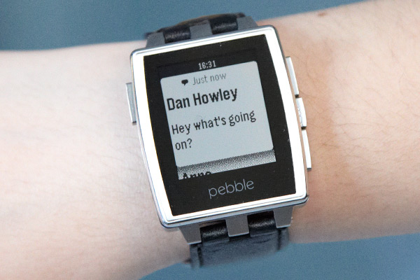
Still, the Notifications menu fills a much-needed void that was missing from the platform's previous version. For instance, if you don't want others around you to see messages as they appear, you can now check them and view them at a more suitable time without reaching for your phone.
Pebble Appstore
One of the most significant changes to the Pebble platform isn't its hardware, but the addition of the new Pebble appstore. The recently announced appstore already boasts nearly 1,000 published apps, which is much more than the 300 apps compatible with the Sony Smartwatch 2 and the 75 available for the Galaxy Gear. Qualcomm's Toq smartwatch doesn't even have its own app store yet and is limited to the eight applets that come with the watch. Pebble also says that more than 6,000 developers have registered in its appstore.
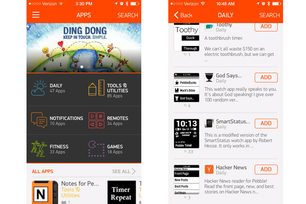
Until now, Pebble wearers needed to browse various third-party app stores, such as Pebble Barn and MyPebbleFaces, to install apps. Soon, users can put apps directly onto the Pebble through the existing app used to pair the watch with a phone.
The store is broken down into a section for Apps and a separate page for Watchfaces. The App page sports an attractive, colorful interface that sorts apps into categories, including Daily, Tools & Utilities, Notifications, Remotes, Fitness and Games.
Underneath these subgenres, which are presented in a tiled format, apps are divided into Most Loved Apps, Weekly Top Picks and Pebble Essentials. If you're particularly fond of an app, you can press the heart icon to show your approval, similar to the way you would like a status update or photo on Facebook. The Watchfaces section of the Pebble appstore isn't sorted into categories, but it does feature the same All Apps, Most Loved Apps and Pebble Picks sections.
Overall, the Pebble appstore provides a quick, convenient and enjoyable way to browse and load apps onto the watch. It's much more seamless than the previous method. However, while we are pleased with the overall app selection, the Daily section is a bit too vague. The category includes apps that would be used on a daily basis, hence the name, and include news, transportation, weather and stock apps. This seemed like too many sections to cram into one general category.
Apps and Pebble Locker
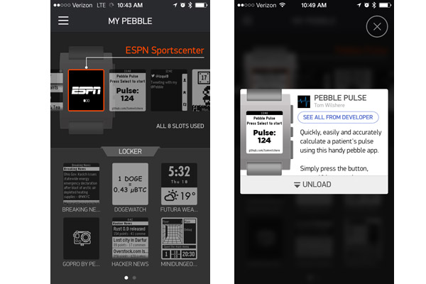
The Pebble Steel is still limited to only eight apps and watchfaces at once, but the company has made it easier to manage and exchange those apps with the Pebble Locker. The My Pebble section in the new version of the app neatly displays the apps currently loaded on your Pebble and the Locker, which houses the extra apps that don't fit on your watch.
To unload an app, simply tap the app from the list, and press Unload to store it in your locker. Once you have a free slot, you can add another app or watch face by selecting it from your locker and pressing the Load button. The app will tell you if your Pebble is too full for a new app, and you can also delete apps from your Locker by pressing the red trash-can icon.
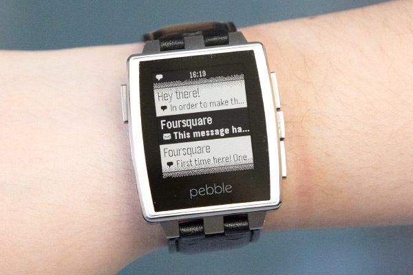
One of our favorite characteristics of the Pebble is its robust developer community and selection of apps. Until now, many of those apps were niche watch faces and games created by independent developers, but Pebble has struck some major partnerships that add more credibility and substance to its burgeoning platform. ESPN, Foursquare, Yelp and GoPro are among the new apps and services that are now compatible with the Pebble.
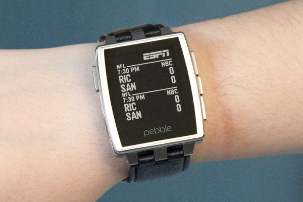
ESPN's app lets you view sports scores right on your wrist. You can choose among leagues such as the NFL, MLB, NBA, NHL, NCAA football and NCAA basketball. Wearers can also select how often the app refreshes, with intervals ranging from 15 seconds to 1 minute. The app is fairly bare-bones, however, since it's limited to scores and you can't follow specific teams.
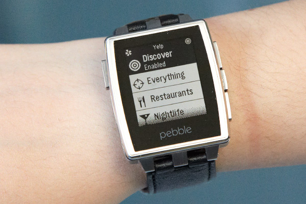
The Yelp app makes it easy to find local venues without having to dig for your smartphone. With the Discover feature enabled, we simply had to shake our wrist to find a nearby restaurant with a high rating. Once we found a restaurant, we simply tapped the Select button to cycle through reviews.
If you'd like to narrow down your options, you can also browse through various categories, such as Coffee and Tea, Restaurants, and Nightlife. We enjoyed using the Pebble app overall but wish we could call vendors directly from the watch. Pressing a button to prompt your phone to call the number listed on Yelp would be much quicker than typing it into your phone's keypad.
The Foursquare app provided an accurate, quick method of checking into nearby locations. Upon launching the app, we were provided with local stores, restaurants and office locations. Checking in is as simple as pressing the Select button when viewing your desired location. We also browsed through nearby areas by pressing the up and down buttons.
GoPro's app allows the Pebble to act as a remote control for its camera. This means you won't have to whip out your phone to use the wearable camera as you're skiing down the slopes.
Pebble said that its new iOS app will automatically scan your Pebble for watch faces already installed to find SDK 2.0 equivalents. So, if you're worried about losing your old apps and watch faces after updating, don't worry: The Pebble will scan its appstore for similar apps to replace those that aren't compatible with the SDK 2.0.
If some of your apps are compatible with Pebble 2.0, you can choose Load Now to immediately put them on your Pebble, or Skip and Load Later when setting up the watch.
Music
The Pebble not only receives notifications from your phone, but it can also act as a controller for your smartphone. This means that you can skip through tracks when listening to music, without having to reach for your smartphone. We pressed the top and bottom navigational buttons to switch songs, and used the middle button to play and pause. As is the case with the previous software version, you can only control the playlist that is currently open on your phone, which means you won't be able to browse other parts of your phone's music library or change the volume.
With the Pandora app, you'll be able to give tracks a thumbs-up or thumbs-down, so you can fine-tune your stations without having to pick up your phone. We're hoping Spotify develops an app as well.
Battery Life
The Pebble Steel features the same e-paper display as the original version, and its 130-mAh battery is rated to last between five and seven days, with a two-hour charge time. This runtime will vary depending on how many notifications you receive and the types of watch faces used. At the time of writing, we had been using our Pebble for about four days with a mix of stationary and animated watch faces. We also received anywhere between two and 20 notifications per day.
Verdict
The Pebble Steel's beautiful stainless-steel design, combined with the new appstore, make it our favorite smartwatch yet. We love that Pandora, Yelp and ESPN have made their way to the Pebble platform. The ability to see all of your most recent notifications is another plus. We just wish we could store more apps at once.
The $249 Pebble Steel costs $100 more than the original model, but otherwise, its functionality is exactly the same as its less-expensive sibling. The $199 Sony Smartwatch 2 offers a color touch screen and waterproof functionality for less, but it doesn't look as classy as the Steel and there is a smaller selection of apps. For $50 more, the Samsung Galaxy Gear adds voice functionality and a camera, though it's clunkier and more complicated than the Pebble Steel.
Those looking to save money may find the original Pebble the more compelling choice because it will get the same appstore and software updates. But if you want a smartwatch that doesn't look like a smartwatch, the Pebble Steel will satisfy.
| PROS | CONS |
| Premium, elegant design | Not much new functionality for higher price |
| Pebble appstore makes it easy to load and manage apps | Still imited to 8 apps at one time |
| Improved notification handling | Row 3 - Cell 1 |
Follow Lisa Eadicicco @LisaEadicicco and on Google+. Follow us @tomsguide, on Facebook and on Google+.
Lisa Eadicicco was a staff writer and editor for Laptop Mag and Tom's Guide. Her articles have also appeared in MSN, AOL, The Independent, Time Magazine, and many more. She is now Senior Tech Correspondant for Business Insider, covering Apple products and other gadgets.
