This Nintendo Phone Concept Beats Any Foldable Piece of Crap
An industrial designer has re-imagined the Switch as a stylish designer smartphone, and we love everything about it.
2019 has barely begun, and I'm already exhausted by the parade of samey-looking smartphones we'll probably see this year. Alas, if only one of them could be this clever concept for a Nintendo-branded handset that is currently making the rounds on Twitter.
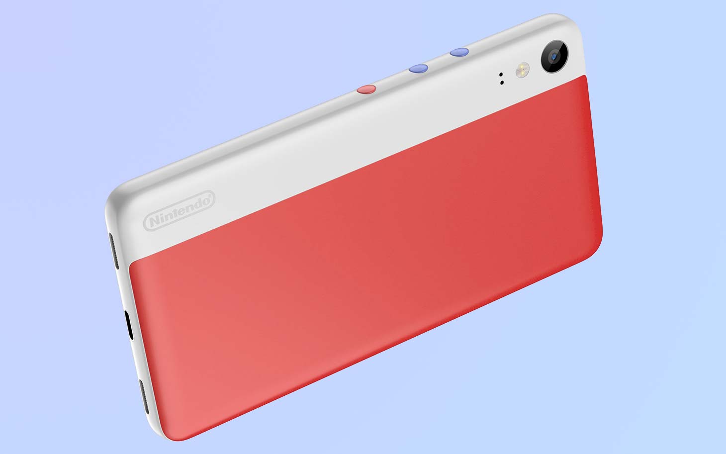
Nintendo would probably never lend its name to a smartphone. But if it did, it should really be this proposal from Shenzhen, China-based industrial designer Lee Huang. Huang has functionally re-imagined the Switch as an even more compact handset that can optionally be used with controllers for a complete gaming experience on the go. And I love literally everything about it.
Today, phone makers appear to be expending all of their efforts into exactly one thing — finding a way to cut out speakers, cameras and bezels to deliver a truly full-screen experience. It's a neat idea, but they simply don't quite have the manufacturing capability yet to deliver that featureless slab of glass they're so convinced customers want.
Mercifully, Huang takes a different approach. If a smartphone can't just be this ethereal, formless window to content, why not make the most out of those physical constraints? Tech companies are running away from their limitations, offering awkward, unpleasant half measures like notches, in-display fingerprint sensors that don't work reliably and janky stabs at flexibility. But Huang's concept doesn't reject the realities — it embraces them.
For example, take a look at the bezels on this mockup. The desperation to disguise bezels on modern smartphones has led to a variety of approaches with ugly consequences, from weirdly misshapen displays to, more recently, holes in screens for front-facing cameras. Yet Huang's device isn't ashamed of its bezels at all. In fact, they're softly raised — almost like the screen is sitting comfortably in a tiny pillow.
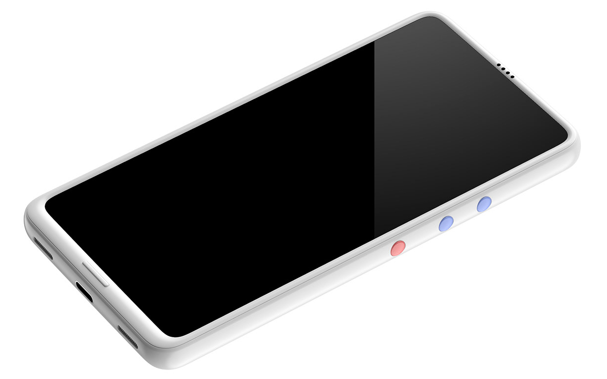
Presumably, this wouldn't only make the phone more rounded and therefore easier to hold, but would also ensure the glass wouldn't get scuffed when placing the device face down. Plus, it looks fantastic. I'm in love with the quartet of drilled holes at the top for the earpiece, and the ultra-slim home button at the bottom that also, cunningly, accommodates just enough room to fit the display driver.
We haven't even touched on the back yet, which equals the front in its elegance yet also offers the freedom of customization. Here you'll find not two, three or four cameras but only one — because if you build your camera right, that's all you need. The Nintendo logo is stashed vertically along the bottom left, a keen branding trick that fosters interest, and a trend Huawei arguably started with the P20 Pro. It looked great then, and it looks fantastic now.
Sign up to get the BEST of Tom's Guide direct to your inbox.
Get instant access to breaking news, the hottest reviews, great deals and helpful tips.
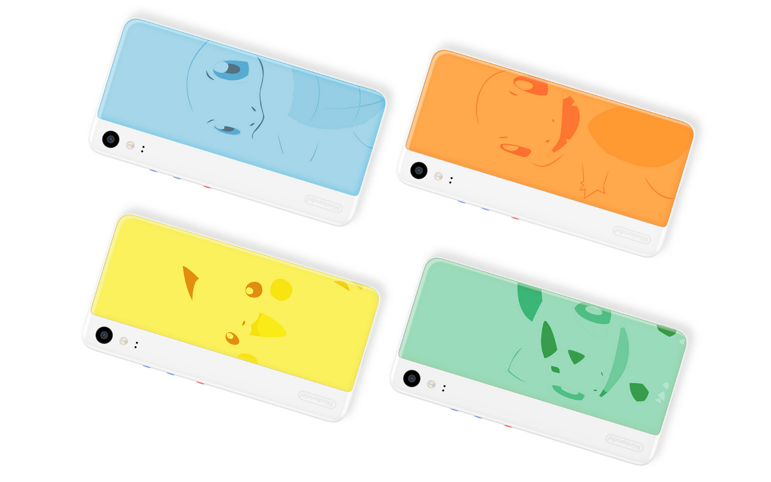
The right two-thirds is dominated by a splash of solid color that presents a refreshing change of pace from the status quo of unambitious black slabs or gaudy and obnoxious eye-searing gradients. Theoretically, this component could even be swapped out and exchanged for other plates as well, like the Pokémon art in some of the renders. (A good portion of Huang's background for the device is handwritten in Chinese, so it's unclear whether he intended for this aspect to be modular or not. Nevertheless, I think it'd be pretty cool if it were!)
Finally, three circular buttons on the right edge for volume and power complement the handset's bright and pleasant motif. It's yet another playful touch Huang has added here that feels very Nintendo, and rebels against the convention that everything must be so sleek and so flashy all of the time.
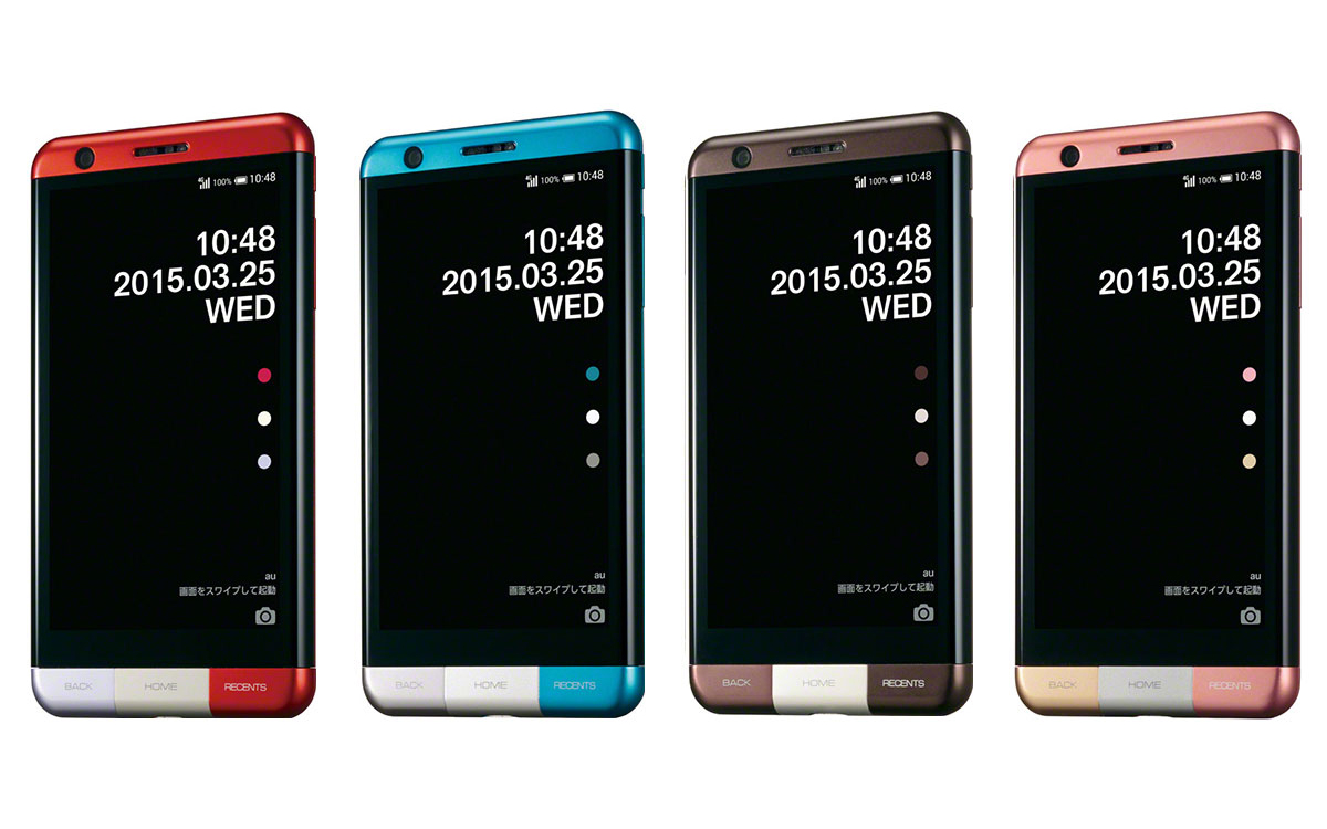
Huang's concept is endearing in a way phones rarely are these days. Though it does remind me of one device in particular that always piqued my interest: the Japan-exclusive Infobar A03. Manufactured by Kyocera and exclusively sold on the nation's KDDI network, the Infobar A03 was a designer handset that, much like what Huang's produced here, borrowed more cues from modern art than tech circles. Now, at a time when enthusiasm for smartphones has dwindled to its nadir, perhaps the industry could use something like that again.
Adam Ismail is a staff writer at Jalopnik and previously worked on Tom's Guide covering smartphones, car tech and gaming. His love for all things mobile began with the original Motorola Droid; since then he’s owned a variety of Android and iOS-powered handsets, refusing to stay loyal to one platform. His work has also appeared on Digital Trends and GTPlanet. When he’s not fiddling with the latest devices, he’s at an indie pop show, recording a podcast or playing Sega Dreamcast.
