Tom's Guide Verdict
This smartwatch has a digital face with traditional analog hands, but it lacks third-party apps.
Pros
- +
Elegant design
- +
Hybrid watch with both mechanical hands and a touch screen
- +
Range of fitness apps and heart-rate monitor
- +
Long battery life
- +
Durable construction
Cons
- -
Music app is glitchy
- -
Hand calibration procedure is confusing
- -
Shows European-style date/time formats for various functions
- -
Lacks third-party apps
Why you can trust Tom's Guide
Old-school meets new with the MyKronoz ZeTime hybrid smartwatch. The ZeTime features traditional analog mechanical hands layered on top of a full-service color touch screen. This innovative smartwatch variation has a proprietary operating system, touch-screen controls, an accelerometer and Bluetooth smartphone connectivity. While there are a few kinks in the interface and operation, overall, the ZeTime successfully combines aesthetics and tech into a rewarding $200 package.
Configurations
The ZeTime comes in three models, priced according to the band. The ZeTime ($199.90) features a silicone band with only black and white color options; the Premium ($229.90) features a leather band with brown, pink gold, brushed silver carbon, and silver color options; and the Elite ($249.90) features a metal band and additional colors like gold and pink gold.
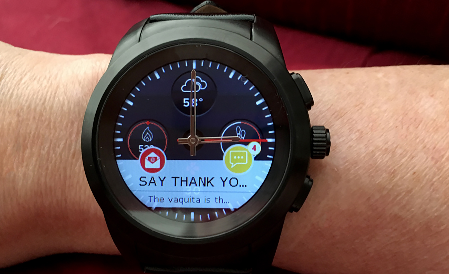
All pack the same technology inside. I tested the Premium with a black case and a stylish, businesslike, black leather band.
Design and Comfort
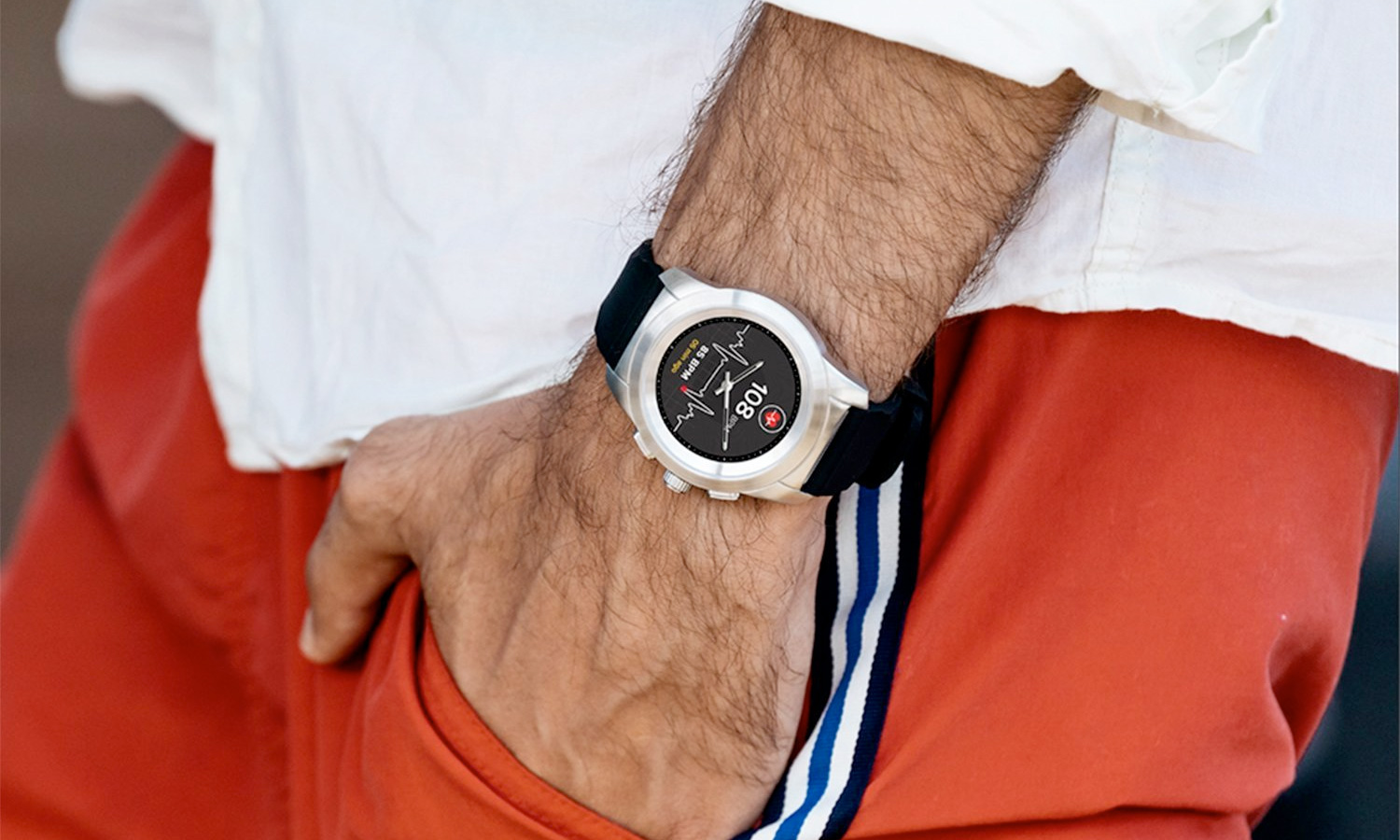
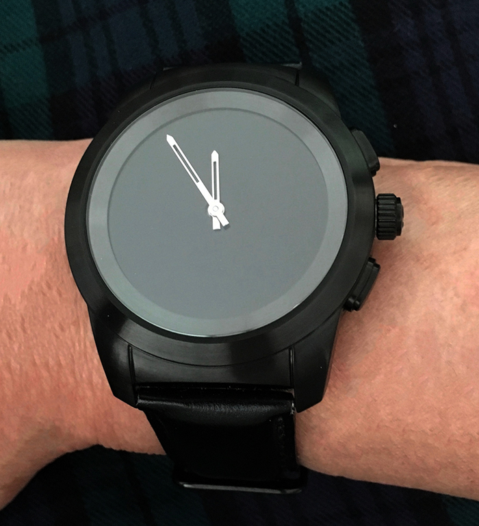
The ZeTime is a handsome watch. Its big, bright face is covered in sapphire glass and encased in stainless steel, with prominent golden hands that tell time just like a traditional watch — no poking, prodding, tapping or fiddling.
It is available in two sizes: a standard 1.22-inch model with a 240 x 240 high-resolution TFT display, and a 1.05-inch petite model with the same resolution display.
The larger of the two models weighs 3 ounces, which is on the heavy side, but it was comfortable enough for me to forget I was wearing it most of the time as I went about my daily activities, such as commuting, working at my desk, running errands, hiking, doing jumping jacks, and trekking up and down the stairs from my desk to the kitchen for coffee.
I found the process of syncing the ZeTime''s mechanical hands using a companion smartphone app confusing.
That said, I found the ZeTime a tad thick, as I kept bumping it and getting it caught on things. Luckily, the sapphire glass is super hard and durable, and my watch emerged unscathed — none the worse after weeks of fairly constant wear, including sleeping.
The ZeTime is water-resistant to 5 ATM, which translates to 50 meters (164 feet), so it will not be damaged by going out in the rain, showering or swimming in shallow water. Still, you should avoid wearing it while doing water sports like scuba diving, ocean swimming and water skiing. While I did not go out of my way to submerge the watch in water during testing — I did not swim or dunk it in water because of the leather band — I did get caught in rain a couple of times, and the ZeTime suffered no damage from that or from water splashing on my wrist.
MORE: Smartwatch Buying Guide: Everything You Need to Know
Activation: Somewhat Easy
I was encouraged by how easy it was to get the ZeTime through its initial setup. Using its Bluetooth connection, I easily paired the watch with both my iPhone and Samsung Galaxy S6 Edge+. Even through a couple of OS updates, there were no connectivity glitches.
However, I found the process of syncing the mechanical hands using a companion smartphone app confusing. The app's sync instructions pictured double-sided arrows around the dial, despite an instructional video showing only a clockwise movement. After I consulted the company on the proper setting technique, the hands worked as advertised. The process could have been a lot more intuitive, though.
Because the ZeTime runs MyKronoz's proprietary OS, there are no third-party apps for the watch.
After the ZeTime's hands are properly set, a mechanism automatically moves the hands out of the way of text as you read messages, emails and reminders. When you're done reading text, the hands automatically return to the correct time. A left-handed mode accommodates those who wear the watch on their right wrist.
Bands and Faces
The ZeTime's band measures 22 millimeters for the standard model and 18 mm for the petite version. The strap has a tiny lever that lets you easily disengage the band to replace it.
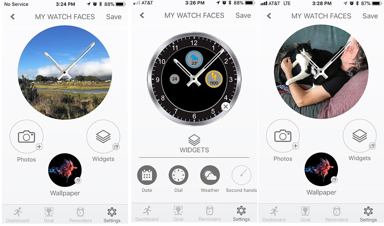
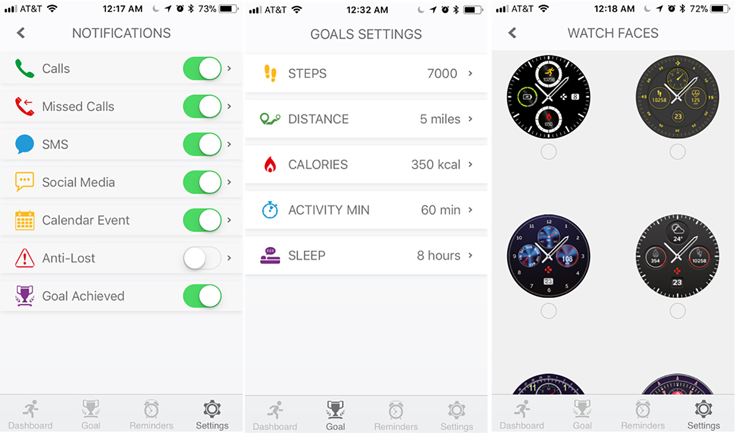
There aren't a ton of electronic faces for this watch, but there are enough attractive and decorative ones, including some that concentrate on just the date and time, some that are decorative and others that include at-a-glance fitness information. You can keep the face as simple or elaborate as a small screen can accommodate. You can also custom-design your own watch face by importing a photo, superimposing up to five widgets and adding several interchangeable dial styles.
The watch faces sync almost immediately via the app, and you can save faces to the watch to swap them out directly from your wrist.
MORE: The Most Stylish Hybrid Smartwatches, Ranked from Best to Worst
Fitness Features
ZeTime's fitness calculations are accomplished via a built-in three-axis accelerometer that lets you track your activity, daily routine, sleep pattern and heart rate. Using your profile information, the watch calculates the number of steps, walking distance, minutes of activity and calories burned. An inactivity alert detects if you have been too sedentary and alerts you at the interval you set.
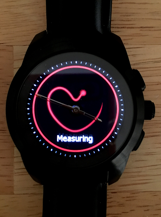
You can adjust fitness goals within the watch or via the smartphone app. However, you can't sync your data with any other fitness apps, such as MapMyFitness.
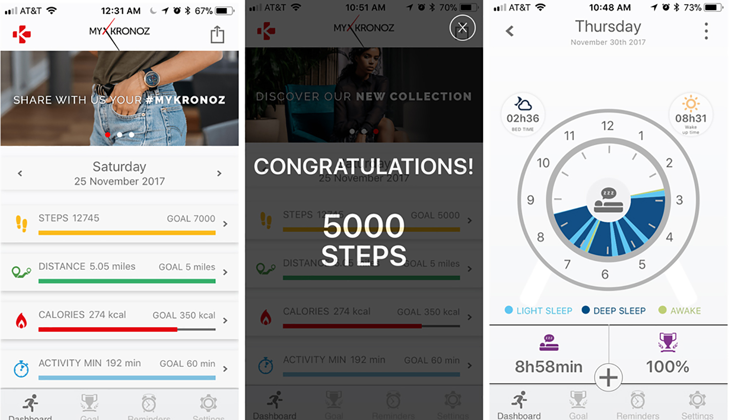
To access fitness data, just swipe to the right to reveal the four fitness trackers of the Activity menu: pedometer, distance traveled, calories burned and minutes of activity.
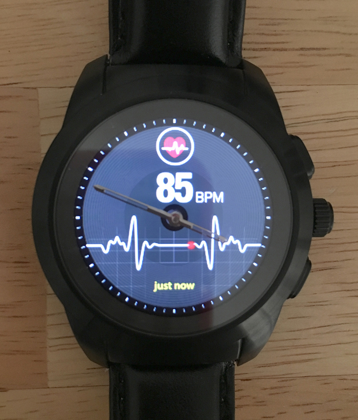
You can view all of the color-coded measurements at the same time, or cycle through them one by one, by swiping up or down within the module. You set and sync goals with the smartphone app; the watch can store up to 10 days' worth of data.
Interface: Functional But Limited
The ZeTime's operations are governed by a digital crown and two flanking buttons. Pressing the crown button serves up an elegant-looking night-mode digital clock, while the bottom button displays calls, notifications, calendars and emails. The crown itself offers no tactile feedback — not even a satisfying click — and feels mushy, but it works.
You can also swipe on the watch face to access various menus. If you swipe to the left, you can use the crown to rotate among main-menu watch utilities, though I found it simpler to just tap on the function I wanted.
Swiping right on the watch face leads to all the built-in apps, like weather, heart rate monitor, incoming and missed phone calls, messages, notifications and pedometer. A second screen of apps includes the alarm, music, remote camera, sleep tracker, stopwatch, iPhone search and more.
Navigation conventions mostly make sense; a double-tap on any screen conveniently takes you back to the previous screen. Still, it took a while to get used to it. For example, if you tap open a piece of mail in the Mail app, another swipe takes you back to the menu, rather than to the next message.
The ZeTime is a handsome watch.
The watch vibrates when you get a notification, and you can specify vibrations or audible signals or a combination of the two. While notifications worked reliably, they were fairly subtle; I could barely feel the lower level of vibration. A Do Not Disturb feature lets you disable all signaling while you sleep.
Most of ZeTime's supporting apps function as expected: Calls, emails, appointments and reminders show up reliably on-screen over the watch face. You cannot respond directly from the watch, through the Android app lets you load in a stock auto response.
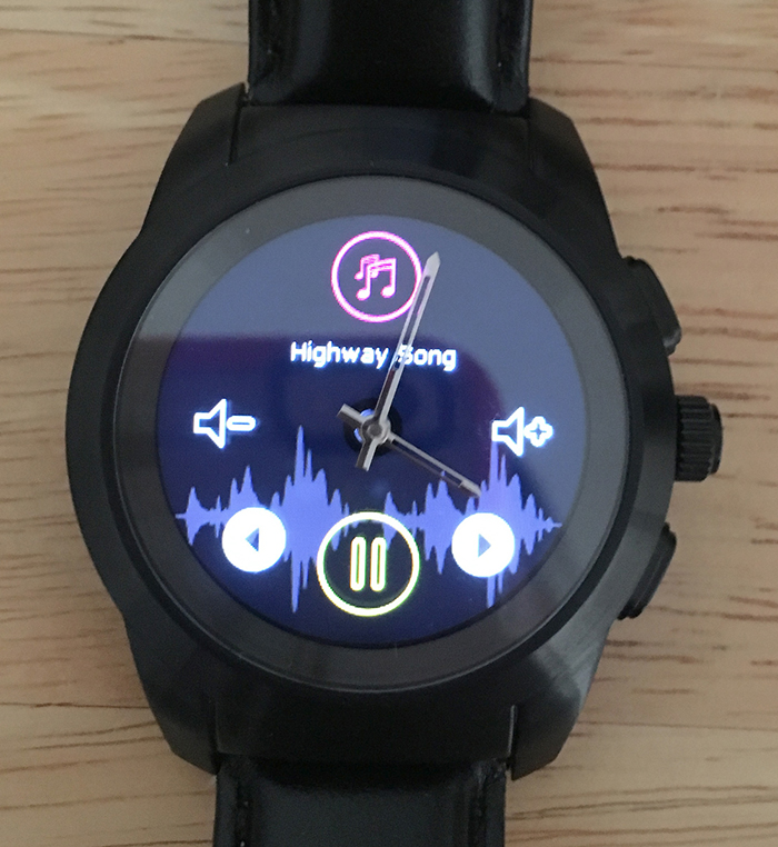
The in-watch apps perform as advertised, with a notable exception: The music app works only with Deezer, Spotify and Apple Music. It lets you sign in to the music player to control the volume and song selection from the watch. Even though I don't have an Apple Music account, the app identified the song I selected and let me control the volume. For Spotify, I signed in to a free account, and tried numerous times to access it through the watch utility. Even though the iPhone app acknowledged the link, the watch app did not recognize or play a song or playlist.
Some utilities recognize only the 24-hour clock (i.e., military time) and European-style dates (day-month-year) even though the settings say otherwise. Reminders can be set only with the European-style date.
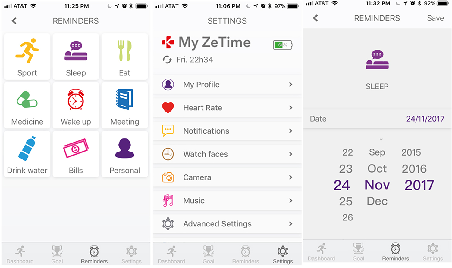
There is a separate section for specific reminders, like Sport, Sleep, Eat, Medicine, Wake Up, Meeting, Drink Water, Bills, and Personal. The watch faithfully beeped or flashed for these events, and you can set them to recur at any time and interval you want.
One limitation of creating your own operating system is that the ZeTime runs MyKronoz's proprietary OS, so there are no third-party apps for the watch.
MORE: Best Smartwatches 2018
Battery Life: Better Than Average
I have to hand it to MyKronoz: I am impressed with the ZeTime's longevity. The 200-mAh battery is rated to last three days in smartwatch mode, and it was as good as its word — probably better.
When you do have to charge the ZeTime, you can set it directly on a tiny magnetic charger connected to power and leave it there; 90 minutes gets it started for the first time. The charger is diminutive — the size of the watch face — so you can just throw it into your pocket or backpack in case you forget to charge it. However, even if you don't do that, you still have a functional watch for 30 days in analog mode, as the mechanical hands will still keep local time.
Bottom Line
The MyKronoz ZeTime hybrid smartwatch is an elegant and versatile timepiece that combines traditional watch functionality with a high-tech touch screen in a fairly organic fashion. I appreciate that the company offers two models, to accommodate different wrist sizes. Paired with an iOS or Android app, the ZeTime delivers a long list of smartwatch functions without overwhelming the user.
Its weakest link is the software, particularly its use of European rather than North American formats, the confusing hand setup instructions and a glitchy music app. Also, the lack of third-party apps, compared with similarly priced Android Wear watches, limits its usefulness. Also in this price range is the $199 Garmin Vivomove HR, which also has analog hands and a smaller digital readout but isn't great when it comes to fitness features. While the ZeTime has some flaws, the combination of analog and digital is a compelling idea.
Credit: Tom's Guide
Jackie is an obsessive, insomniac tech writer and editor in northern California. A wildlife advocate, cat fan, and photo app fanatic, her specialties include cross-platform hardware and software, art, design, photography, video, and a wide range of creative and productivity apps and systems. Formerly senior editor at Macworld and creativity editor at The Next Web, Jackie now writes for a variety of consumer tech publications.
