Tom's Guide Verdict
The Motorola Moto 360 is the most customizable smartwatch yet, and it's a little smarter than your typical Android Wear device.
Pros
- +
Design is elegant and stylish
- +
Highly customizable
- +
Bright, crisp display
- +
Useful Live Dial watch faces
- +
Gesture controls and Wi-Fi connectivity
Cons
- -
A little heavy
- -
App selection lacking compared to Apple Watch
- -
Wireless charging dock sold separately
Why you can trust Tom's Guide
Confession time: Before I wrote this review, I wasn't a fan of smartwatches. Tethered to your smartphone, a smartwatch seemed to be simply a gadget for your gadget. I wasn't a fan of the constant need to charge yet another device, either. While these complaints apply to the Motorola Moto 360 (starting at $299, reviewed at $439), I couldn't overlook its customizable and elegant design, pretty display, easy-to-master interface, and heart-rate monitor. The concept of the smartwatch might be a work in progress, but the second-generation Moto 360 is a huge step in the right direction.
Design: Built for a man, smart enough for a woman
It seems that what's good for the smartphone is good for the smartwatch. Similar to the Motorola Moto X Pure, you can configure several design aspects of your Moto 360 to your liking, making this the most customizable smartwatch on the market.
The first choice you have to make is the style. Unlike the original Moto 360, which came in only one size, the second generation lets you choose either a men's or women's watch. Men's watches come in two sizes (42 or 46 millimeter), while women have only the 42mm option. Guys opting for the larger watch face should be prepared to fork over an additional $50 for the pleasure.
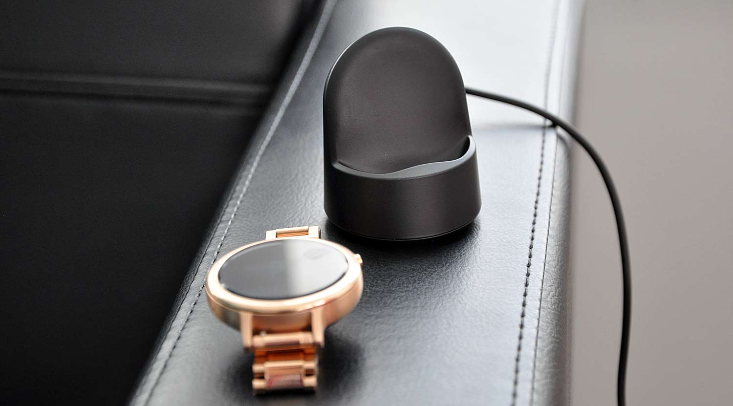
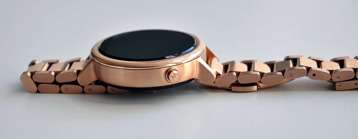
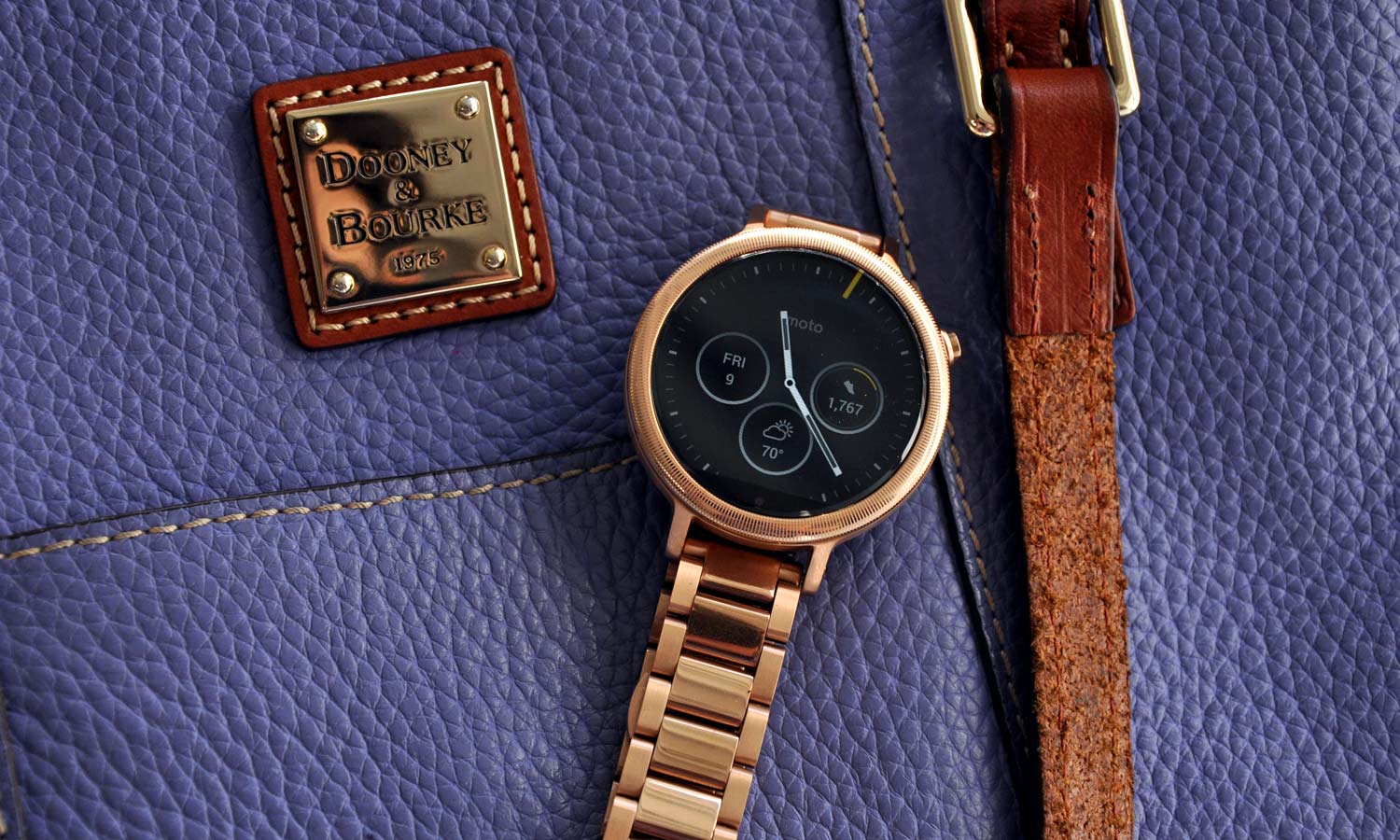
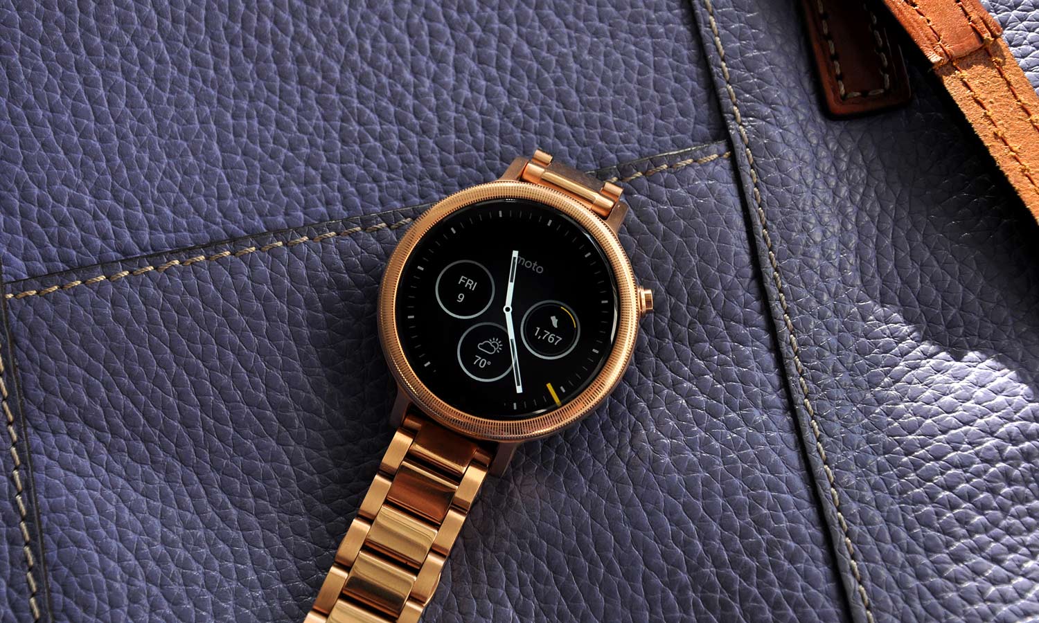
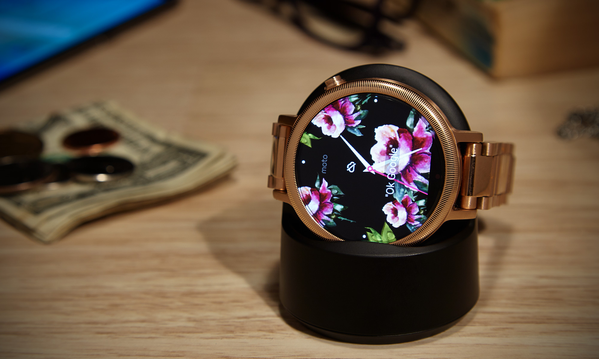
From there, it's time to pick out a bezel. Women can decide between the smooth Peak bezel and the delicate Micro Cut, which is an additional $20. Each ladies' bezel has three metal options (Silver, Gold and Rose Gold) while the men have Silver, Gold and Black to choose from, with smooth Chamfer bezels or the cross-hatched Micro Knurl ($20). The case offers the same metallic choices, however each gold option tacks on another $30.
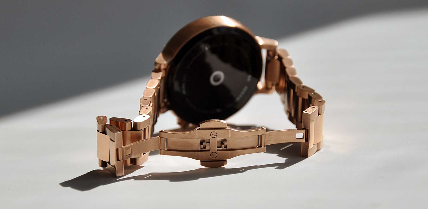
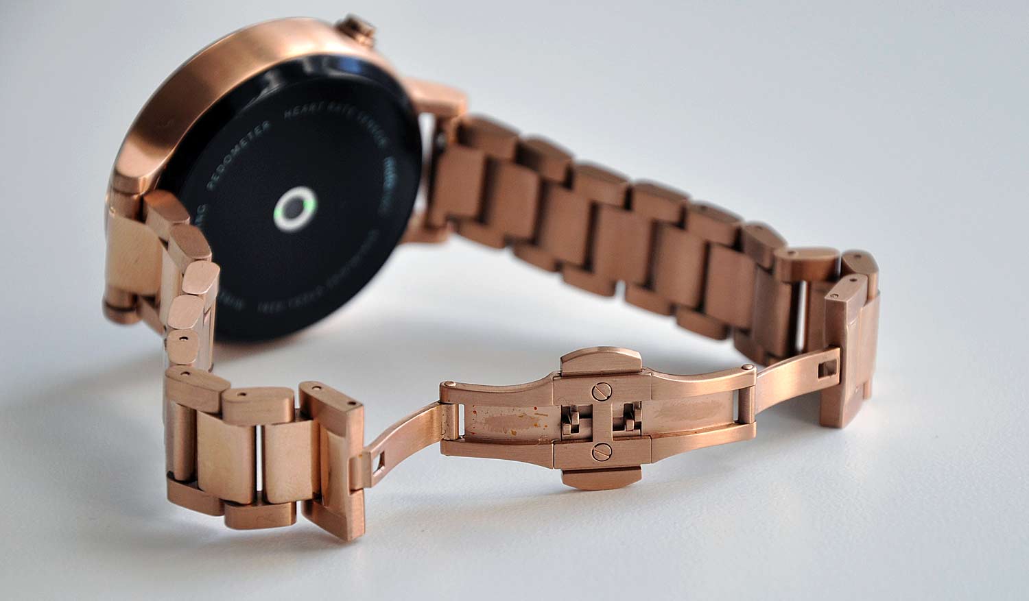
The band is where things get interesting, at least for the ladies. There are several style options, such as Leather, Double Wrap Leather ($10) or Metal ($50). Available in Stone Gray and Blush, the regular leather bands are soft and supple. The Blush Double Wrap looked interesting on my arm, but I ultimately went with the rose gold metal band. The men's options include a Cognac or Black leather and $50 Silver, Gold or Black metal bands.
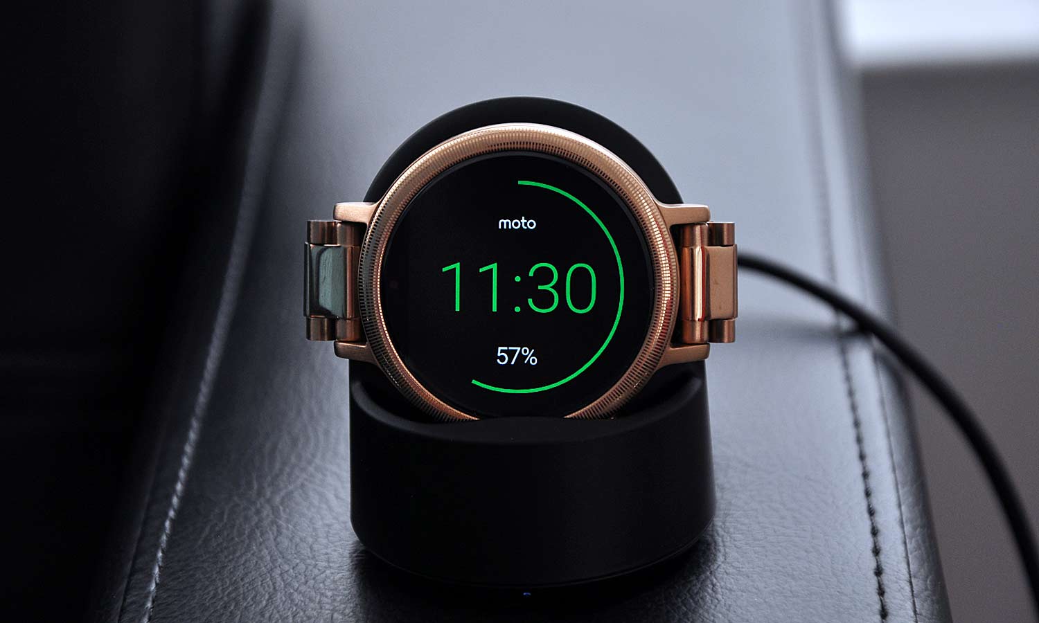
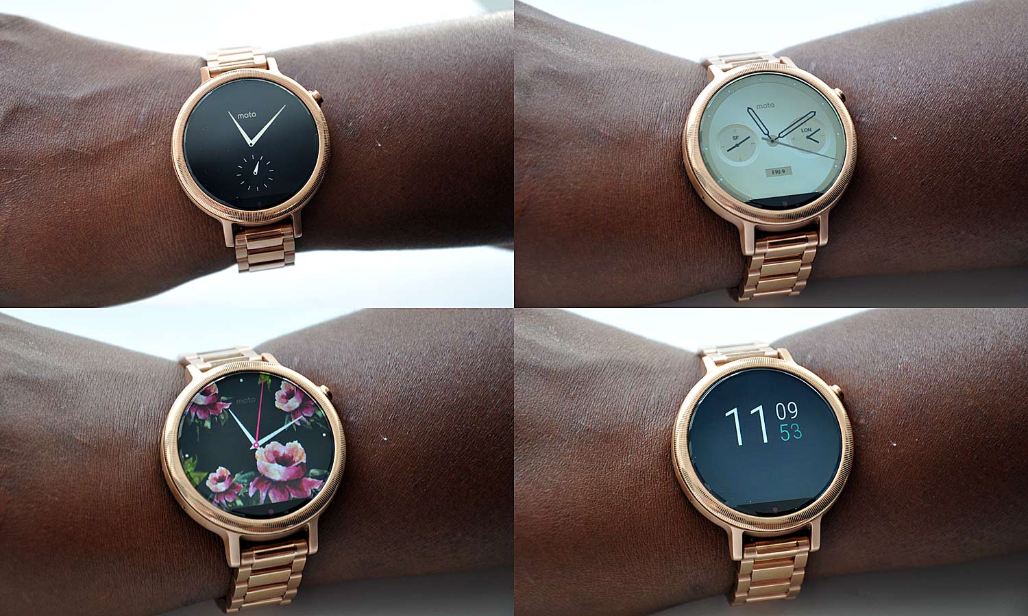
The final step of the process is settling on one of the 18 digital watch faces. I stuck with the default Refined option, with the black face and rose gold hands, knowing I could swap it out later. Annoyingly, I also had to cough up $39.99 for the second-gen wireless charging dock, which is necessary to power the watch. That brought the grand total to $439.98. Once the order was placed, it took three weeks to arrive.
I have to say that design-wise, it was worth the wait.
One Size Doesn't Fit All
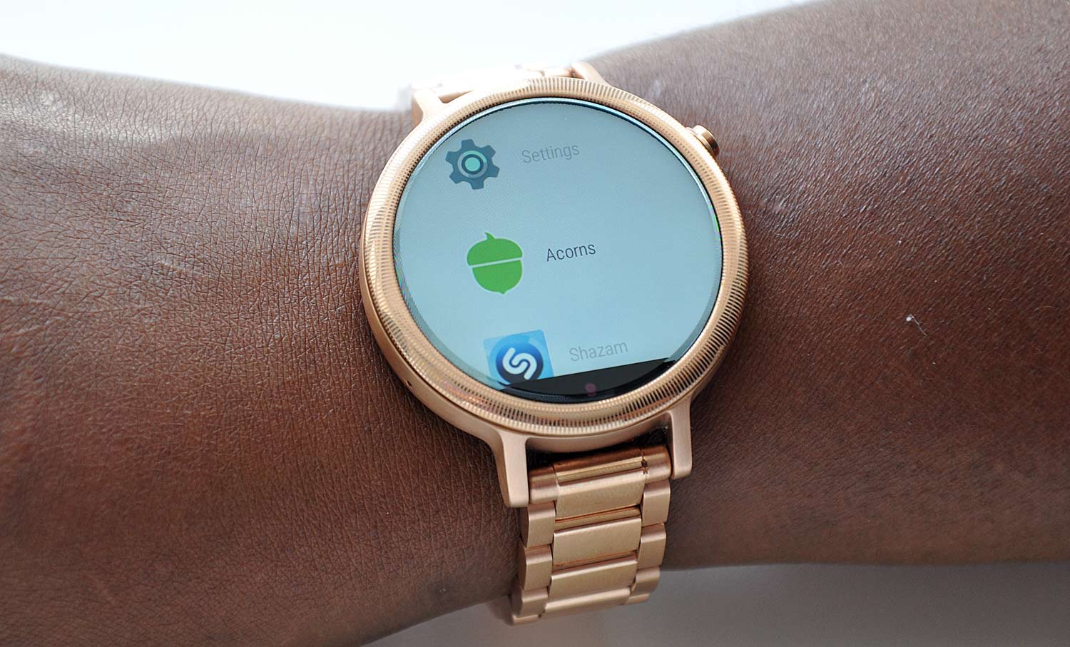
The Moto 360 is at once elegant and modern. The rounded face with the tiny etching along the bezel looked and felt good against my finger. I could see that Motorola left no detail to chance, making sure to imprint the knob with the company's telltale "M" emblem. Despite the watch's pretty appearance, it is IP67 rated, making it dust- and water-resistant. The rose gold shone against my chocolate complexion, once I could actually get the watch on my wrist.

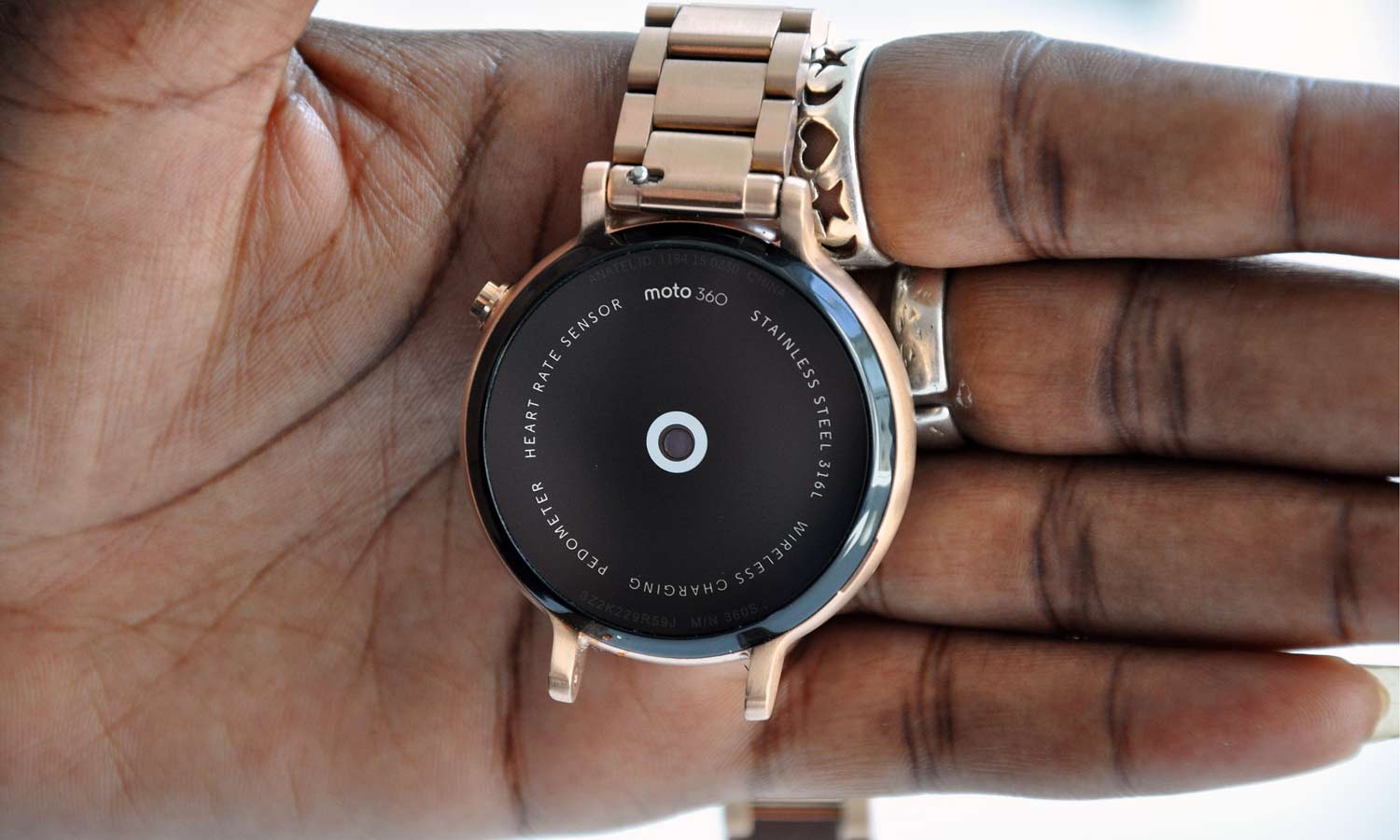
I used to think I had dainty, feminine wrists. Motorola and its teeny-tiny watchband quickly disabused me of that notion. Thankfully, Motorola shipped the watch with four additional links and two pins to extend the band. All I had to do was take a trip to the jewelers and fork out another $8. It was annoying to say the least, but money well spent once the Moto 360 was gleaming on my wrist.

With its metal band, the Moto 360 weighs in at 3.2 ounces, which is hefty compared to the Apple Watch (1.76 ounces), Huawei Watch (2.13 ounces) and LG Watch Urbane (2.3 ounces). I preferred the extra weight, as it felt more like a traditional timepiece.
Display
The rose gold finish wasn't the only glossy aspect of the watch. The Moto 360's backlit LCD display is lovely and readable in direct sunlight, which I soon discovered on the way back to the office. The touch-screen panel is also very durable, thanks to the Corning Gorilla Glass 3.
At 1.37-inches, the Moto 360's display is larger than those of both the Urbane and the Apple Watch (1.3 inches, respectively), but smaller than the 1.4-inch Huawei Watch. However the Moto 360 loses a little bit of screen real estate to the ambient-light sensor located along the bottom of the screen — the same "flat tire" effect as on the original.
The Moto 360's 360 x 330 display is crisper than the panels on the Apple Watch (272 x 340) and the Urbane (320 x 320), but was no match for the Huawei Watch's 400 x 400 screen. In a side-by-side comparison with the Huawei Watch, I found that the Moto 360's display wasn't as sharp. Text and images of my contacts on the Moto 360 looked a little fuzzy.
Like most Android Wear devices, the Moto 360 has an always-on feature, which will give you the time or any other information at a glance. However it will definitely affect the battery life.
Live Dials
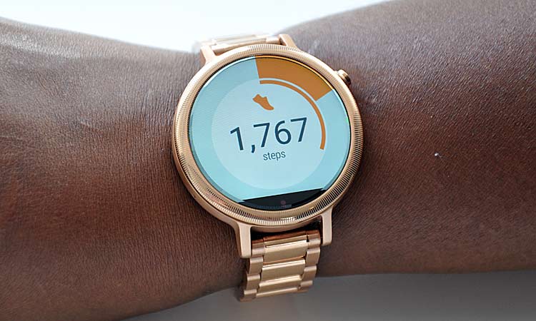
Motorola offers 18 digital watch faces for an extra touch of customization. Sixteen of those dials can be modified, creating some sort of Inception-like customization, dubbed Live Dials. In addition to changing background colors and clock-hand animations, you can add helpful information, such as day and date. Others, like the Dials and Dials II faces, offer that same capability plus the current weather, calories burned and steps taken.

Some third-party apps can be activated in a Live Dial in order to receive specialized information. This functionality is unique to Motorola's watch, which proves that you can innovate on top of Android Wear. Shazam and IFTTT are currently available for use. I inserted Shazam, the music-recognition app, into one of the slots on the Dials II face and IFTTT on another. Instead of fumbling in my purse for my smartphone, I simply pressed the Shazam dial on the watch face to quickly identify Wale's "Lotus Flower Bomb."
When it launches, the myFord app provides diagnostics on your car's battery as well as tire condition. Kevo, the smart-lock company, will also have Live Dial functionality that allows homeowners to unlock their doors without having to fumble for keys or a smartphone. Other partners include Spotify, IFTTT and Shazam.
Motorola's Live Dials prove that you can innovate on top of Android Wear.
Customizing Live Dials is a fairly simple process. After accessing the Change Watch Face option under Settings on the watch, you click on a face with a little icon underneath to launch the customization page. For most customizations, all you'll have to do is toggle your desired features on or off. But the My Design face forces you to turn on your smartphone to choose an image, color scheme, brightness and clock-hand style, among other things.
Specs and Android Wear
The Moto 360 is outfitted with a 1.2-GHz quad-core Qualcomm Snapdragon 400 processor with 512GB of RAM, a 450-MHz Adreno 305 GPU and 4GB of onboard storage. It runs the latest version of Android Wear 5.1.1, which implements gesture controls and Wi-Fi support.

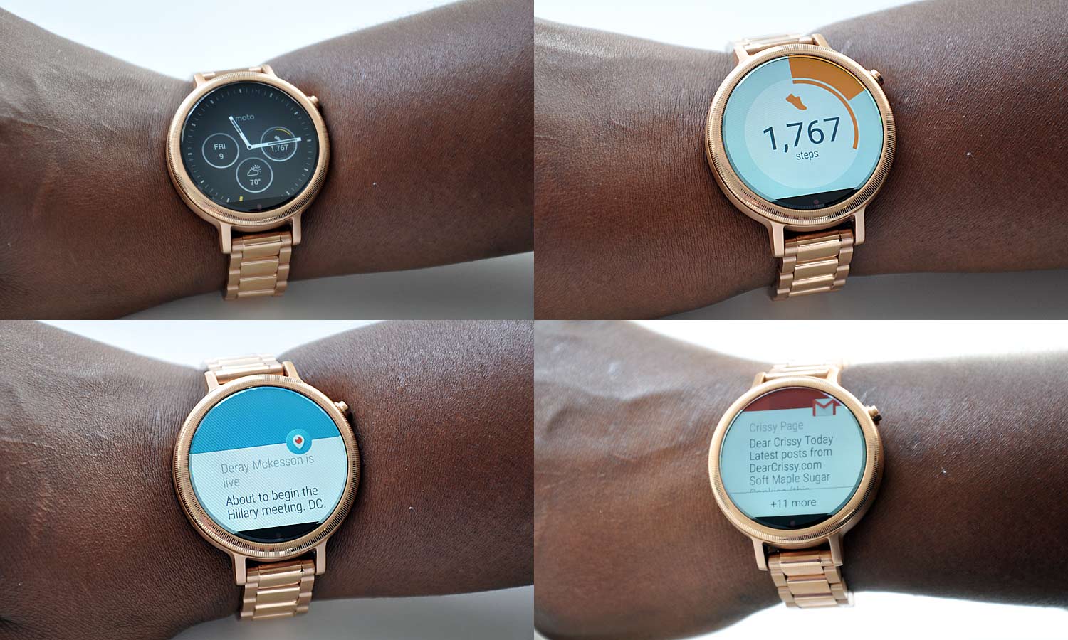
The watch's interface is bright and colorful, and relies on large info cards to deliver notifications. The interface closely resembles the mobile-centric Android 5.1 (Lollipop), which utilizes Google's Material design. However, the watch's biggest draw is Live Dials. As it grows, this feature will add another level of functionality to the experience.
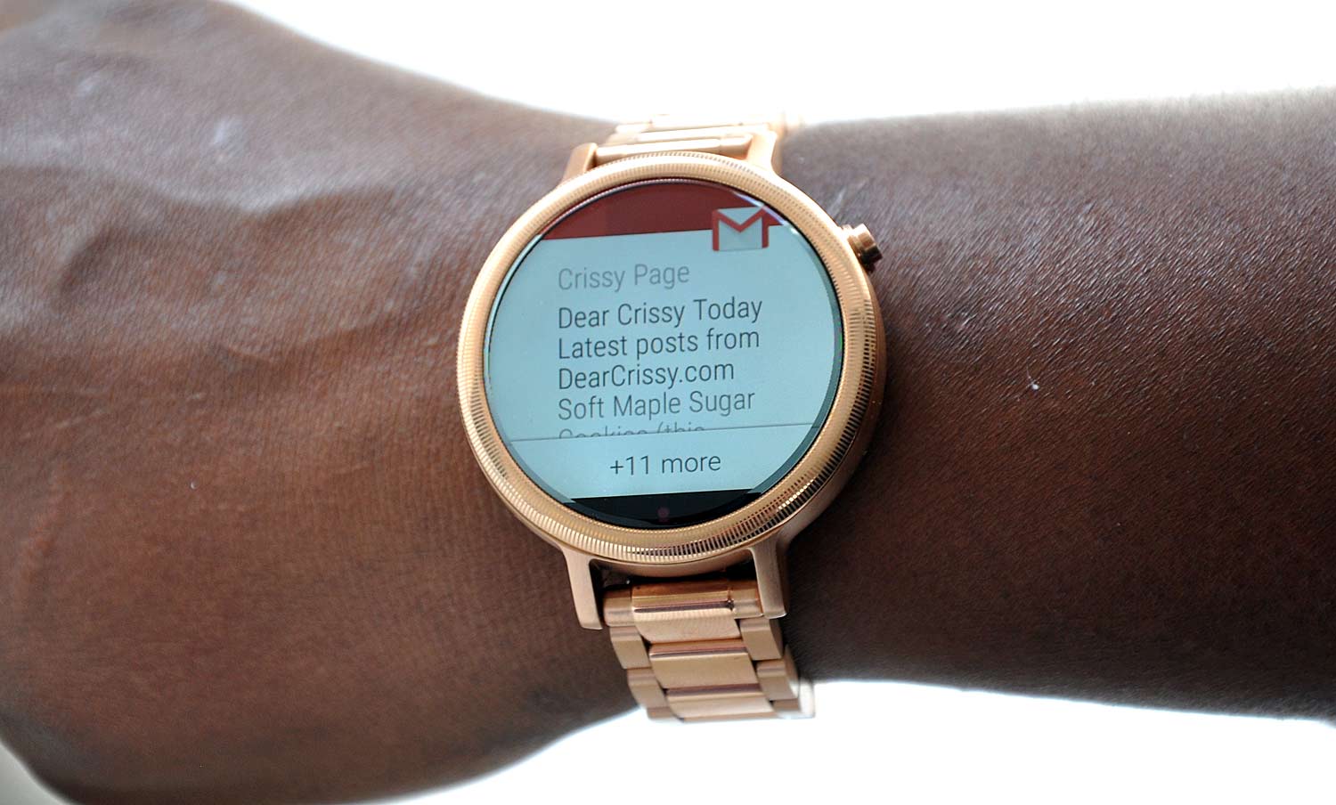
Despite the watch's good looks, the way you interact with the device continues to be a fly in the ointment. Nearly all navigation on the Moto 360 involves a swipe or two or three. Once you start receiving notifications (tendered by a gentle, soothing buzz), a quick upward swipe reveals the full message. While I appreciated the vibration alert, I quickly had to disable notifications for Facebook and Twitter, as my wrist was constantly stealing my attention.
You'll encounter options to open your phone or block an app after a couple swipes, depending on the app. A right swipe will dismiss notifications, while a downward stroke lets you access menus for notifications, brightness and theater mode. Swiping left reveals the app list; two swipes call up your contact list, while three strokes summon the voice-command window (or you could just say, "OK, Google." It would be nice to have the ability to tap on an email or text to respond instead of swiping through a series of screens to reach the appropriate action.
The rose gold shone against my chocolate complexion — once I could actually get the watch on my wrist.
Incessant swiping aside, Android Wear did a good job of decreasing the number of times I actually had to touch my phone. I could just look at the Moto 360 whenever I received a tweet, email or text message. Thanks to Google Now, helpful information, such as weather and commute time, was just a glance away. And I could quickly parse through which notifications deserved my immediate attention. The watch also allowed me to adjust the volume on my music or skip tracks and even hit the snooze button on my alarm in the morning.
Similar to other Android Wear devices, the Moto 360 is also compatible with iOS, but in limited capacity. iPhone owners won't have the ability to use voice responses for messages or take screenshots. The iOS version of the Android Wear app also lacks the ability to view complementary apps.
Twist and Shout: Gestures and voice actions
If you ever get tired of all that swiping, you can switch over to gestures and voice commands. To scroll through my myriad of notifications, I quickly flicked my wrist away from my body and then slowly rotated it back to scroll upwards, and performed the reverse to scroll down. It takes a bit of getting used to, and I found myself going the wrong direction on more than one occasion. I don't see wrist-flicking becoming the default option for checking notifications.
Voice search, however, is another story. Similar to on an Android smartphone, simply uttering the phrase "OK, Google" will let you use the Moto 360 to search for an elusive recipe or tell you the score from last night's game. Soon, I was directing the Moto 360 to set reminders, send text messages, reply to emails and perform a number of other tasks simply with the sound of my voice. The dictation wasn't always perfect, but it worked at least 95 percent of the time.
Fitness
Like most wearables on the market, the Moto 360 has a built-in heart-rate monitor and pedometer to help folks keep track of their progress for the day. In conjunction with the Moto Body app (which the watch prompts you to install) the smartwatch relays calories burned and steps taken, and provides spontaneous motivation throughout the day.

Halfway through my day at New York Comic Con, the Moto 360 reported that I had trekked 4,500 steps and burned 240 calories with an average heart rate of 135 beats per minute.
I was directing the Moto 360 to set reminders, send texts, reply to emails and more with the sound of my voice.
Thanks to its water-resistant chassis and Gorilla Glass 3 display, the Moto 360 should be able to withstand the rigors of a strenuous workout. But it looks so pretty, I wouldn't have the heart to use it in the gym. I'd rather use the Motorola Moto 360 Sport (pricing TBD), whose silicone frame and special coating prevent moisture build-up while keeping your wrist cool. That watch is targeted to gym rats. As for the Moto 360, it can keep track of my movements as I go about my daily activities.
Battery Life: Going, going, gone
Battery life continues to be the albatross around most smartwatches' necks, and the Moto 360 is no exception.

With Ambient Mode enabled, the watch fell short of Motorola's claims for full day of use. I started wearing the fully charged device at 5 p.m., and by 1:30 p.m. the next day, the battery registered 10 percent.
That's on a par with the Apple Watch, which claims 18 hours, but it’s nowhere near the LG Urbane's two days.
Apps
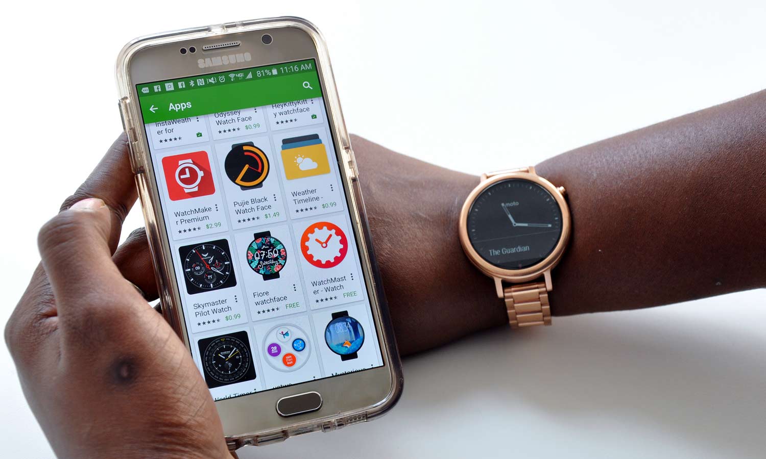
According to Google, there are currently more than 4,000 Android Wear apps. To access an app on the Moto 360, that app must first be installed on the connected phone. Once I connected my Samsung Galaxy S6 to the smartwatch, icons for Level, Shazam, Foursquare, Acorn and Amazon Shopping appeared on the watch's app page.
Some apps, like Spotify, don't have an icon. Instead, the music app launches a card, which lets you play or pause a track, and you swipe left to access a panel with buttons for volume and skipping tracks. One last swipe reveals a Browse menu, where you can access your music in addition to the service's many playlists. Unfortunately, you have to have Spotify loaded on your phone to access this functionality on the Moto 360.
While Android Wear does have third-party apps for Tinder, RunKeeper, Uber, CityMapper, Endomondo, Duolingo and Evernote, it's still missing support from CNN and ESPN, to name a few.
Bottom Line
I'm still not completely sold on the idea of wearables, but the Motorola Moto 360 is a great ambassador for the category and the best Android Wear device yet. The design is elegant and looks like a traditional luxury timepiece, rather than some hokey plastic toy. Even better, you can customize the device for a relatively unique look. The Android Wear interface is easy to use, although all that swiping can become a bit tedious. However, the wrist and voice-search functionality are solid methods to interact with apps and menus, and Motorola's Live Dial feature brings more info to you at a glance.
Battery life continues to be a sticking point, especially when compared to the Huawei Watch's two-day power supply. That $350 device also offers a sharper display compared to the Moto 360. On the app front, Google still has a ways to go before it can go toe to toe with Apple. And I'm none too pleased that Motorola is selling the wireless charging dock separately. Still, the Motorola Moto 360 is a great watch for techies looking for a device that's functional and stylish.
Sherri L. Smith has been cranking out product reviews for Laptopmag.com since 2011. In that time, she's reviewed more than her share of laptops, tablets, smartphones and everything in between. The resident gamer and audio junkie, Sherri was previously a managing editor for Black Web 2.0 and contributed to BET.Com and Popgadget.

