Tom's Guide Verdict
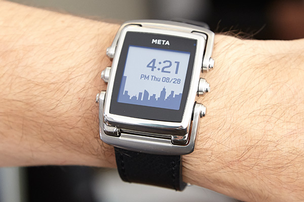
The Meta M1 is one of the most stylish smartwatches yet and does a nice job with notifications, but it's lacking in features.
Pros
- +
Beautiful design
- +
Easy-to-read display
- +
Intuitive interface
Cons
- -
Limited features
- -
Expensive
- -
Short battery life
Why you can trust Tom's Guide
The smartwatch is going upscale. Until now, most — if not all — smartwatches have looked like geeky appendages.The Meta M1 is the first smartwatch that's as luxurious as a traditional timepiece. Starting at $249 ($299 as reviewed), it's as expensive as a low-end Tissot, but the same price as the Pebble Steel and the Moto 360. But is there substance behind the style?
Design
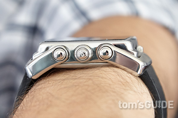
We're still waiting for the iWatch to arrive, so I'll come out and declare the Meta M1 as the most attractive smartwatch yet. While it has the same basic shape as the Pebble Steel — a rectangular body that bows out slightly along the long edges — the M1 looks more high-end, and the preponderance of buttons along both sides gives it an almost Steampunk vibe.
The circular and more svelte Moto 360 and Withings Activite could arguably be considered more elegant, but for now, the M1 holds the crown.
MORE: Smartwatch Buying Guide: Everything You Need to Know
The black face of the M1 is ringed by a brushed stainless-steel bezel. Six circular buttons — three on each side — are used to navigate the M1's interface. The four buttons on each corner also act as hinges for the articulating lugs, U-shaped pieces of stainless steel that help the watch better match the contour of your wrist. Small Meta logos are imprinted on the middle buttons — a subtle but elegant touch.
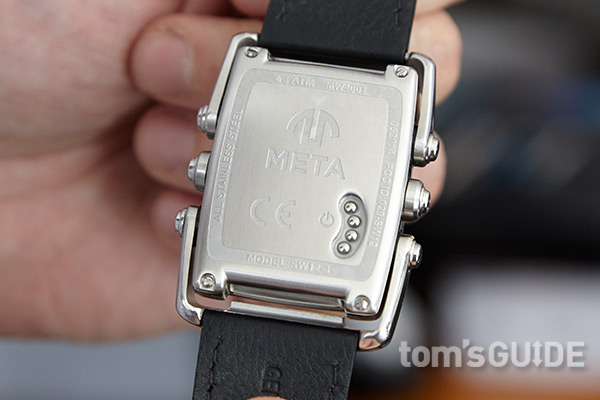
Despite its all-steel construction, the M1 weighs 3.15 ounces, making it lighter than the 3.44-ounce Pebble Steel but heavier than the 2.1-ounce Samsung Gear Live.
Display
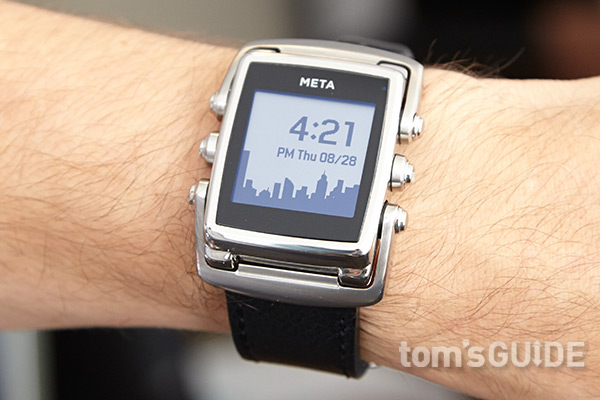
The 128 x 128-pixel display uses an E Ink-like technology, so it's monochrome like the Pebble Steel. The display was very easy to read in direct sunlight, but a lot harder to see in dim settings. Our pre-productionunit had a fairly dim backlight, which the company said would be fixed when the device is released widely.

Other Versions
My review unit, the $299 M1 Core, came with a black leather wristband. Meta offers seven other variants of the watch. A stainless silver version ($349) has a solid-core stainless-steel wristband. The M1 Core black rubber ($249) has black plastic lugs and a black plastic wristband; white and red versions are also available for $249.
There are also three limited-edition versions. The $399 brown leather watch has a tan leather wristband and a matte black metal face and lugs. A $399 rose gold model is truly stunning — the metal parts are plated with rose gold and are complemented by a blue leather "crocodile" strap.
Finally, the $449 black stainless version looks similar to the stainless silver version, just in matte black.
Interface
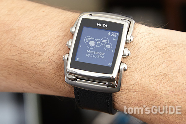
The M1 has six home screens: Clocks, Weather, Notifications, Calendar, Music and Time. You can navigate among them by pressing either the left or right-middle buttons. According to the company, additional screens, such as Sports and an activity tracker, will be added in the future. However, the watch will only be able to show six screens at a time; you can use the smartphone app to set which ones appear.
Within each home screen, you can use the top and bottom buttons on the right to cycle through content within that screen. For example, on the Clocks screen, you can select from eight watch faces. On the Calendar screen, these buttons let you see upcoming appointments.
MORE: Will Wearables Replace Your Smartphone?
The Notifications screen has five little overlapping bubbles, each of which corresponds to a different type of notification: Calendar, Messaging, Phone, Phone Battery Life and Email. When you select a bubble, it shows the time and source of the most recent notification beneath it. For example, if you select the Messaging bubble, it might show "Facebook 1:27p" at the bottom, indicating that you had a Facebook message at 1:27 p.m. From there, you can choose to view the entire message.
The button on the lower right opens the M1's Settings menu, where you can turn Bluetooth on or off, activate vibration for alerts and invert the display colors (black-on-white or white-on-black). Strangely, you can also launch the music player from this menu, as well as view your notifications. These latter two functions seem redundant, as they're offered as home screens.
The top left button activates the M1's backlight.
App
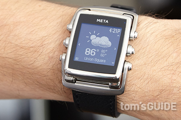
Unlike the Pebble, which has an app store with more than 1,000 titles, the Meta M1 has much more limited functionality. You can receive notifications from a number of sources — Facebook, FaceTime, email, Passbook, Calendar, etc. — see the weather or who's calling, and change your music.
Future updates will include personalized sports scores, as well as an activity tracker, turn-by-turn directions, camera control and stock information. But even then, that's a lot less functionality than the Pebble Steel offers.
Within the app, you can rearrange the order of the home screens on the M1, as well as decide which alerts get sent to the watch. For example, if you only want to receive notifications from email and your calendar, you can disable all the other alerts. This is much better than what you'll see on the Android Wear, which delivers all notifications fire-hose style.
Within the Meta app, you can see how much battery life is remaining, and set calendar preferences and weather locations.
Performance
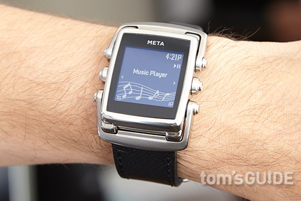
Even though I was testing a pre-production Meta M1 with unfinished firmware, the watch generally performed well. It buzzed every time I received a notification, displaying the text on-screen at the same instant it appeared on my iPhone.
When a call came in, it showed the name and number of the person calling. I had the option to reject the call or mute the alert. Since the M1 lacks a speaker or microphone, you'll have to dig your phone out of your pocket to answer the call.
On the watch, you can read the first few lines of email messages and calendar appointments, but you can't view your inbox or open attachments.
Music controls worked well. I was able to play, pause and advance tracks, as well as raise and lower the volume. The M1 worked with Pandora as well as the native Music app on my iPhone, but I already had that app open on my phone. When I used the Music app, the track's name and artist appeared on the M1's display.
MORE: Android Wear vs Pebble Steel
The only issue I had was a finicky Bluetooth connection between the watch and my phone. On several occasions, the two would disconnect, and I had trouble reestablishing a link. I was usually able to resolve the issue by resetting the network connection on my iPhone.
Battery Life
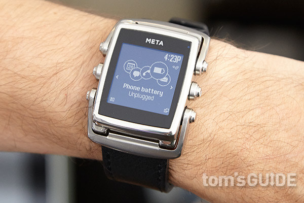
The Meta watch is rated to last about five to seven days on a charge. Over the course of my testing, I was able to get about three days out of the device before I needed to plug it back in. On the underside of the M1 are four metal contacts that connect to a proprietary micro USB dongle.
Bottom Line
The Meta M1 isn't designed to be a do-all, be-all smartwatch. Instead, it's meant to be a stylish accessory that will let you determine when it's important to take your phone out of your pocket. Coughing up $299 — or more — for a watch that looks better but offers fewer features than the $249 Pebble Steel is essentially choosing beauty over brains. I'd rather wear the Meta M1 than the Steel, but I'd rather have access to the Steel's much larger app selection.
Follow Michael A. Prospero @mikeprospero and on Google+. Follow us @TomsGuide, on Facebook and on Google+.

Michael A. Prospero is the U.S. Editor-in-Chief for Tom’s Guide. He oversees all evergreen content and oversees the Homes, Smart Home, and Fitness/Wearables categories for the site. In his spare time, he also tests out the latest drones, electric scooters, and smart home gadgets, such as video doorbells. Before his tenure at Tom's Guide, he was the Reviews Editor for Laptop Magazine, a reporter at Fast Company, the Times of Trenton, and, many eons back, an intern at George magazine. He received his undergraduate degree from Boston College, where he worked on the campus newspaper The Heights, and then attended the Columbia University school of Journalism. When he’s not testing out the latest running watch, electric scooter, or skiing or training for a marathon, he’s probably using the latest sous vide machine, smoker, or pizza oven, to the delight — or chagrin — of his family.
