iPhone X Notch a Fail? What Designers Really Think
As we get closer to the iPhone X launch, the notch that dips down into the phone's OLED screen is garnering a lot of attention. But some designers are ready to embrace the phone's new look.
We knew a change was coming to the iPhone’s design, but that didn’t make it any less shocking when it happened.
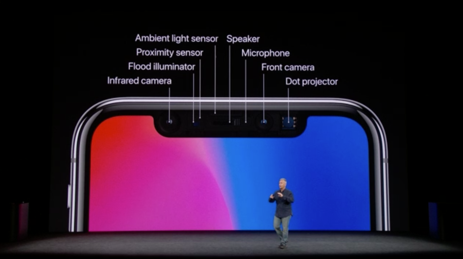
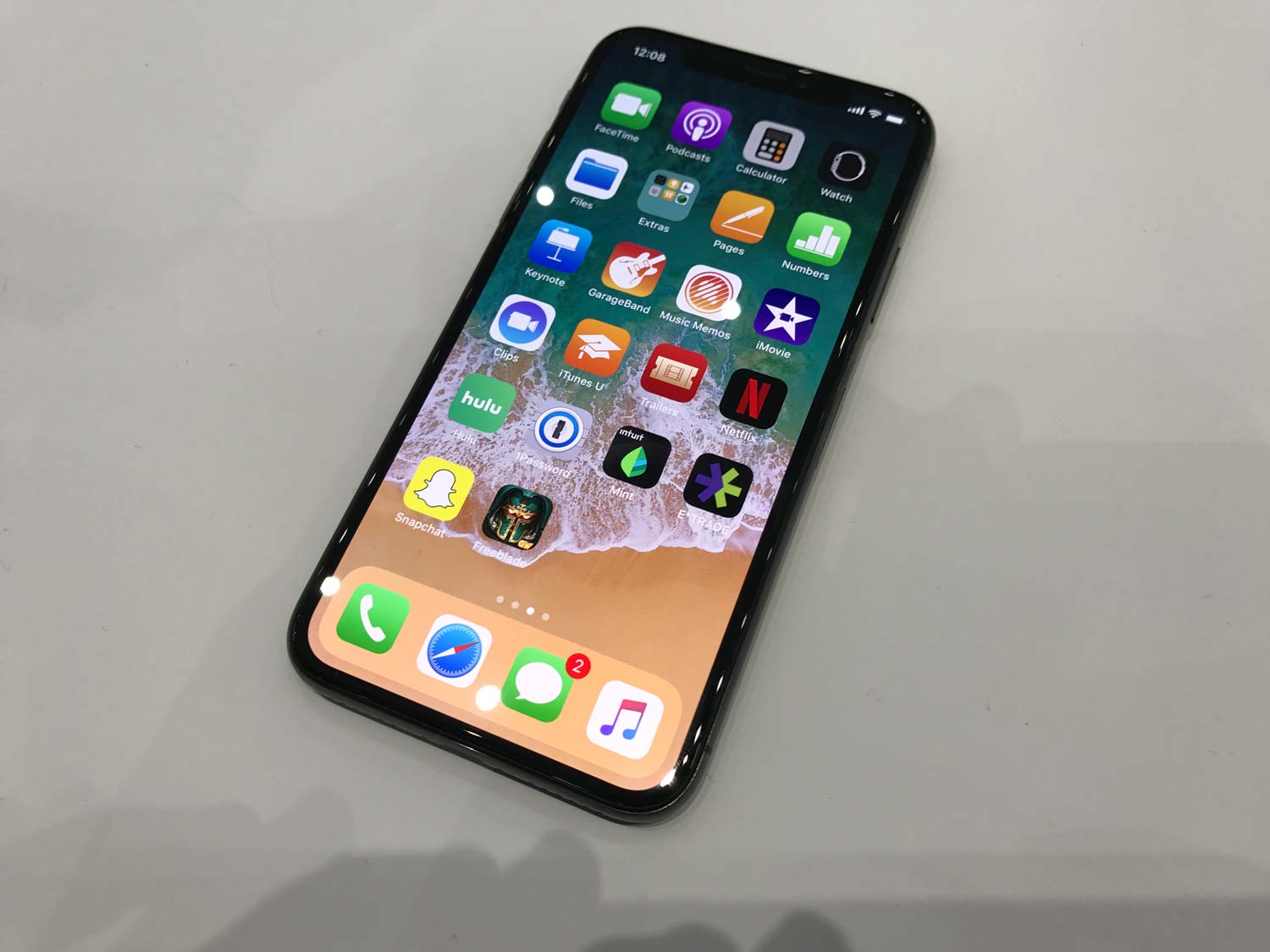
The notch — you know the one. We’re just a week away from the iPhone X going on sale, and so much of the phone’s fate rests in the tiny little housing jutting into the phone’s 5.8-inch OLED display. That space contains Apple’s new True Depth camera system, a cluster of cameras and sensors that work in concert to enable facial recognition and three-dimensional visibility.
The True Depth camera was one of Apple’s worst-kept secrets about the iPhone X, and in the weeks leading up to the September iPhone reveal, we learned exactly the shape it would take. Early impressions were less than glowing, to say the least. To many, the notch’s mere existence was the most un-Apple move the company had made in the better part of two decades.
MORE: 9 Reasons iPhone X Beats the Pixel 2 XL
In a way, the critics were right; Apple’s products have a language of design we all understand by now — or at least thought we did. Call it minimalism, simplicity, or putting the user first. However you frame it, Cupertino’s ethos is as ubiquitous as its products. And apparently, that ethos taught us that giving a screen ears is a bad look.
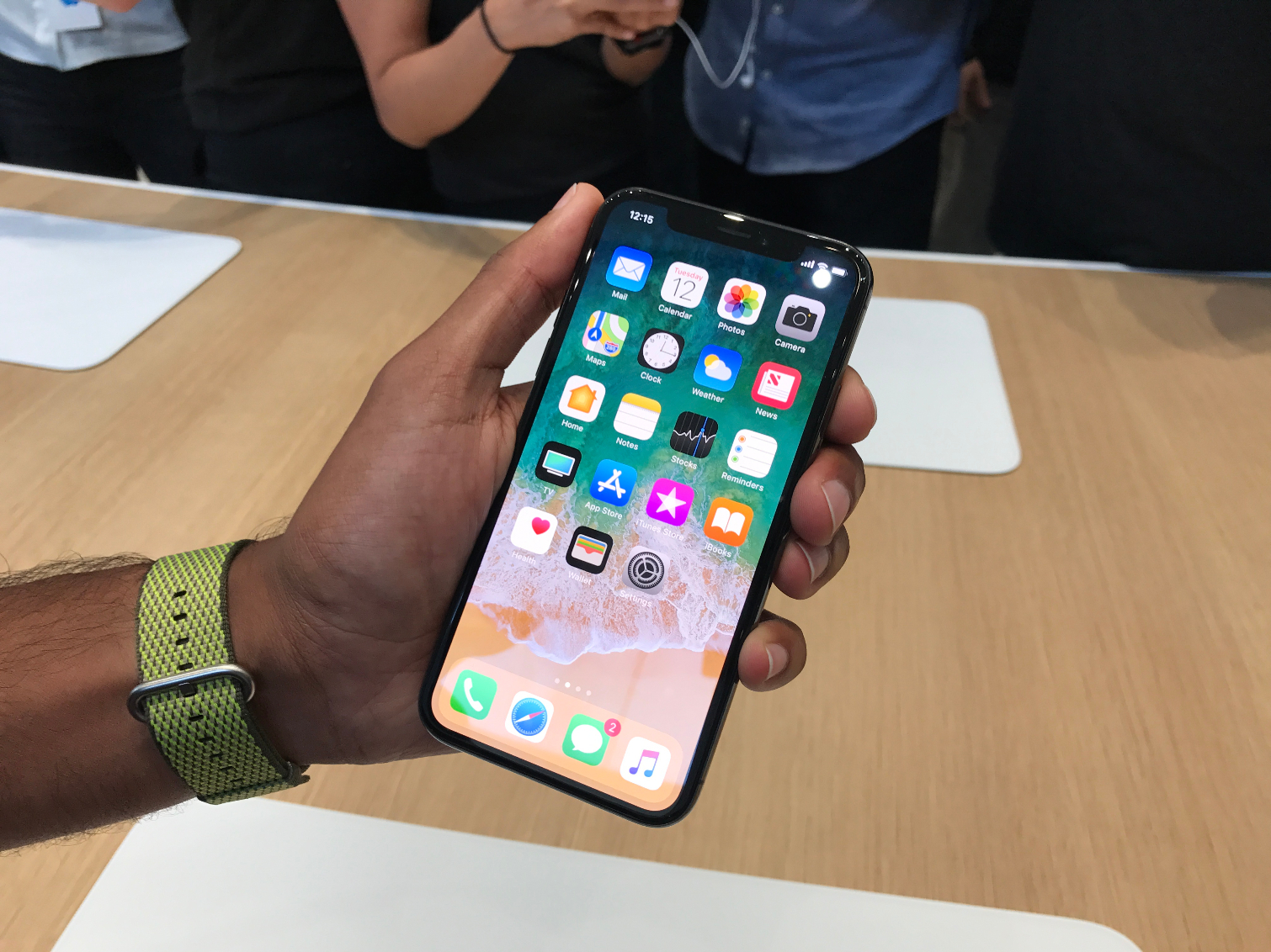
But then, Apple didn’t play down the notch; it embraced it. It told app makers to embrace it. The notch became the defining silhouette of the iPhone X, the same way the rectangle with a circle underneath came to define previous iPhones. And inevitably, the world is beginning to embrace it too.
Why? It’s a matter of trust, according to designer Ian Lee of Brooklyn-based firm Frog Design.
Sign up to get the BEST of Tom's Guide direct to your inbox.
Get instant access to breaking news, the hottest reviews, great deals and helpful tips.
“Past history of great products means that the majority of consumers expect Apple to have already have made the best design decisions, whether or not that is the actual reality,” Lee said.
What's happening with bezels
It seemed like Samsung had struck the way forward for smartphone design when it introduced its Galaxy S8 last April. Bezels have been shrinking for years, giving users larger displays in more compact packages. Yet the technology to embed cameras, earpieces, and microphones within screens hasn’t matured yet — we’re just barely on the verge of stuffing fingerprint sensors underneath them.
“The notch serves as a way to differentiate when all phones are moving to minimal bezels." — Ian Lee, Frog Design
So it seemed that we’d have to accept a phone’s top bezel would remain thick, to accommodate those components. So too would the bottom one, because above all else, symmetry must be maintained at all costs. Right?
“The notch serves as a way to differentiate when all phones are moving to minimal bezels, thus making it hard to distinguish a brand when viewing the smartphone at first glance” Lee said. “You instantly recognize the iPhone X is Apple, but the same cannot be said of Android smartphones that are adopting the minimal bezel display technology.”
How Apple thought different
Ugly or not, the notch is how Apple thrusts itself into the consciousness of every smartphone buyer. Still, as beneficial as it is from a branding perspective, the notch could have an adverse impact on usability if it’s executed poorly in apps, as some developers have amusingly pointed out.
“Constraints breed creativity, and I'm excited to see what software designers do with the unique shape butting into the frame.” — Ben Guttmann, Digital Natives Group
“When it comes to app design with the notch, I think the areas that are going to be most pinched are the ones that routinely use full-screen content, such as games or video streaming apps,” said Ben Guttmann, design partner and co-founder at Digital Natives Group and adjunct professor of Digital Marketing at Baruch College. “My initial assessment is that this is less of an issue for those of us that make news, information, utility, and marketing apps that are more typically used in portrait mode.”
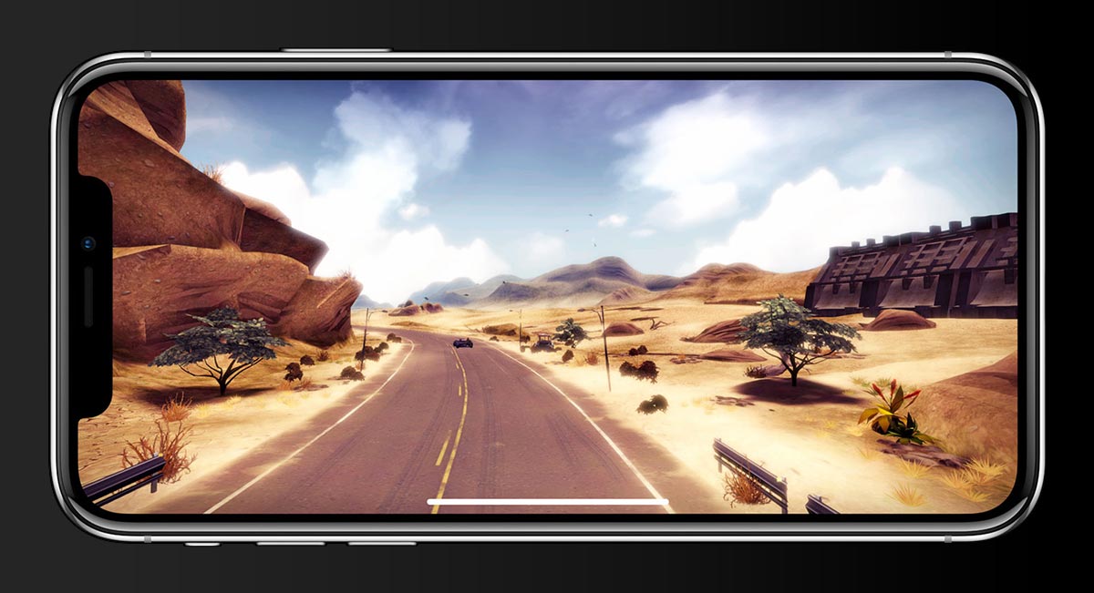
Even so, Guttmann doesn’t see the notch as a limitation, but an opportunity.
“Constraints breed creativity, and I'm excited to see what software designers do with the unique shape butting into the frame.”
And there’s a lot they can do. The split status bar calls attention to a new method of interaction iPhone users never had before. No, not Face ID — but those ears.
“To a certain degree, I think [the notch adds] functionality,” Lee said, “as the spaces to the left and right of the notch are now recognized by the system and provide two gestures instead of the previous one.”
And if Lee could have it his way, he’d throw in another notch.
“It may sound counter-intuitive, but having two smaller notches — one on the top and one on the bottom of the display — may have been better than one large notch,” Lee said. “Splitting some of the components at top and bottom could help reduce the visual weight of the one top notch whilst also potentially allowing Apple to retain an identity differentiator and open up interesting functional opportunities at the bottom of the screen.”
Lee says a second notch could be used to remedy the lack of room for a Touch ID fingerprint sensor, or provide space for a second front-facing speaker. It’s an idea we wonder if Apple explored, and how differently it might have been received.
The iPhone X's outlook
Then again, maybe it doesn’t matter. Because the notch was ridiculous until it wasn’t — just like nixing the headphone jack, or replacing the physical home button with a simulated one.
“If you look at the consumer comments on social media during the early leaks and rumors of the iPhone X, the majority couldn’t believe what Apple was doing or why,” Lee said. “But as the rumors firmed up closer to the keynote, consumer sentiment changed dramatically to positive acceptance.
“This is part innovation, part marketing, part brand trust and loyalty, and part consumer acceptance loop. That’s Apple’s winning formula.”
Sounds like exactly what Steve Jobs would have done.
Adam Ismail is a staff writer at Jalopnik and previously worked on Tom's Guide covering smartphones, car tech and gaming. His love for all things mobile began with the original Motorola Droid; since then he’s owned a variety of Android and iOS-powered handsets, refusing to stay loyal to one platform. His work has also appeared on Digital Trends and GTPlanet. When he’s not fiddling with the latest devices, he’s at an indie pop show, recording a podcast or playing Sega Dreamcast.
-
robbieadams1969 This design is a huge fail no matter how much this site wants to praise Apple as it always does. If this design was put on an Android phone first, you can BET TOM'S GUIDE would be bashing it along with other sites like BGR, CENT and the VERGEReply
And if this design is so great and functional, it will be interesting to see it dissappear when the next iPhone is released because we all know it will be. -
cromer985 ?If you ask me it's a fail. Even if they find a way to get rid of it in the future?, the ugly "memory" will remain, like the sun-burned outline of your watch on your wrist.Reply -
stonecold316thegame I think the notch is brilliant design, apple are masterminds at working out what will work and what wont, not just now but for the future too! The notch is is great, because if it wasnt there then we would have the same status bar as seen in previous iphones taking up a small part of every screen, but now with the notch there they can remove the status bar from the screen and leave any status bar elements in the empty space on the sides of the notch, thus freeing up more real estate on the screen! Its perfect!Reply -
khsharpe "Take the S8 and LG’s G6, which also came out earlier this year. Both phones offer extra-wide displays featuring virtual similar aspect ratios. You’d be able to tell the two devices apart after a bit, but it would take more than a quick glance."Reply
for you to write this, it's hard to believe you've actually seen the two handsets in real life - because No, it's not -
carl_diaz I don't buy Apple iPhones to show other people I own one, I buy it for the best technology and to please myself. The ears are absolutely terrible, I'll wait and see if by this time next year they will have a better design, and if they don't, I'll keep by 7 plus and still be happy with it and $1,000.00 bucks better off....Reply -
grojeans Xiaomi says you are very welcome and that it is fine that you decided to pretend it doesn't exist because it won't stop your steady decline in the markets. Huawei's already beaten you and Oppo's catching up with Xiaomi seeing huge growth year on year. Also Mi MIX fans are still laughing their butts off over the bunny ears.Reply -
grojeans For a product review site to be this biased though that's really bad. It's like when you find out your news source is actually very biased when it reports events. But usually when it comes to biased news you are aware enough to change sources. People don't put that much attention into product reviews sites so places like tom's guide can skew the truth to their hearts content.Reply
Just to do a little damage just look up the Xiaomi Mi MIX and its release date. 2016 was when bezelless smartphones started. Everybody's been riding that trend ever since.
