The One iPhone X Fix Apple Should Make Now
Given the death of the Home button, it's understandable that the iPhone X has a learning curve, but Apple could make things easier with a simple change.
As the editor of Tom's Guide, I need to know how well our articles are doing traffic-wise. And I almost spit out my Snapple when I looked at the numbers for a recent tutorial we published on how to close apps on the iPhone X.

It's by far the most successful how-to we've done for a phone — at least out of the gate. And that's actually a problem for Apple.
Why do people need to research how to do something that should be so simple on a new, $1,000 flagship phone?
To be fair, there was bound to be a learning curve with the iPhone X, as Apple decided to ditch the Home button. With an edge-to-edge display, the iPhone X introduces Face ID for unlocking the phone, plus a new series of gestures to navigate.
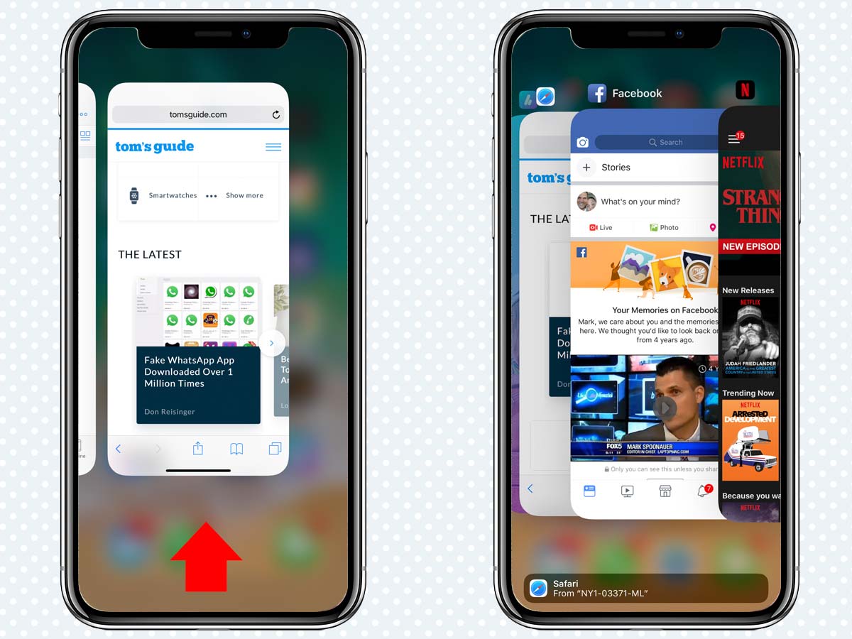
This includes swiping up from the bottom of the screen to close apps, and Apple wisely chose to include a little bar at the bottom of the display as a subtle cue. This bar also appears when the screen is in landscape mode. It's a nice little guide, but after my first week with the phone, I wished I could make the bar go away.
Want to open Control Center? Now, you swipe down from the top right. No big deal, really, though I wish you didn't need to swipe down just to see the battery percentage. (Blame "the notch.")
The real issue is force quitting apps, something that used to be as simple as double pressing the Home button and simply swiping up on the app you wanted to banish.
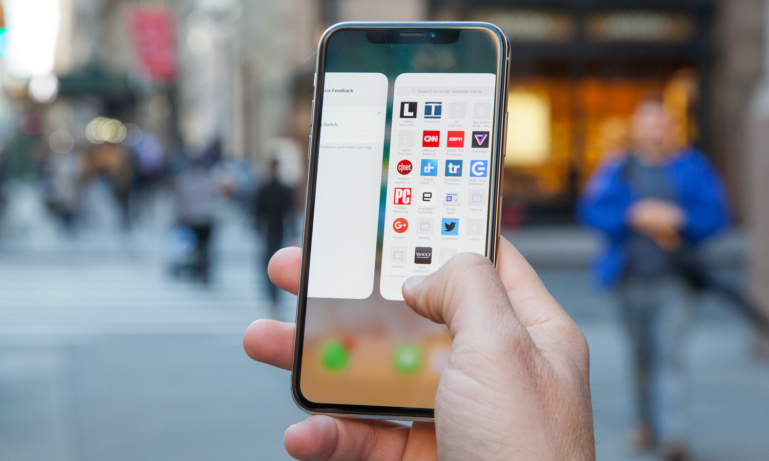
The new way involves an extra step and more time. Now, to force quit an app, you need to swipe your finger up from the bottom of the screen and briefly pause your finger on the display to summon the deck of apps, called the App Switcher. So that adds a bit of lag where there was zero before.
MORE: Help How to Bring the Home Button Back to iPhone X
From there, you might think that you would just swipe up on an app thumbnail to make it disappear. Nuh-uh. You need to press and hold on the screen until little minus signs appear on the apps. Then, you can finally swipe up on the apps to force quit them, or if you prefer, tap on the small minus icons themselves.
Now, I know why Apple made this decision. The company didn't want people to accidentally quit apps they didn't mean to close. After all, you swipe up to enter the App Switcher, and you could easily just keep swiping up. But the worst-case scenario is that you close an app you didn't mean to close. So what?

I assume that once folks closed one or two apps inadvertently, they would learn not to keep swiping up. Pressing and holding the display just seems like a needless extra step.
The good news is that iOS is so efficient, and the A11 Bionic chip in the iPhone X so powerful, that you won't need to force quit apps often. There's also plenty of RAM on board; it's 3GB, according to iPhone X teardowns. But If I were Apple, I would still change the default behavior so that you could just keep swiping up to banish an app.
I'll be looking for that capability in iOS 11.3, even if it means less traffic for us here at Tom's Guide.
Sign up to get the BEST of Tom's Guide direct to your inbox.
Get instant access to breaking news, the hottest reviews, great deals and helpful tips.
Mark Spoonauer is the global editor in chief of Tom's Guide and has covered technology for over 20 years. In addition to overseeing the direction of Tom's Guide, Mark specializes in covering all things mobile, having reviewed dozens of smartphones and other gadgets. He has spoken at key industry events and appears regularly on TV to discuss the latest trends, including Cheddar, Fox Business and other outlets. Mark was previously editor in chief of Laptop Mag, and his work has appeared in Wired, Popular Science and Inc. Follow him on Twitter at @mspoonauer.
-
bigtruckseriesreview I just got iPhone X 256GB. Upgraded from iPhone 7 Plus 256GB.Reply
While I like that it's more comfortable in my hand and LOVE THE CAMERA, I don't like the lack of a tactile home button. There was nothing more intuitive than double tapping the Home button towards closing apps. It took me time to figure out how to close apps and I don't like that aspect at all. -
jusher7281 Why would anyone give Apple $1,000 of your hard-earned money for a phone that just came out, and clearly needs more development? Granted, some of that money goes to the retailer just like it does with any other phone, but it's still too much in my book for a phone. Have we really become that narcissistic?Reply -
christopher.andrew.carr Hmm. Maybe they should go with 3 software buttons on the bottom. The one on the right could give you an overview of recent apps, and in that mode, you could tap a little 'x' to kill it. A home button in the middle, that you could long-press for your assistant. And then -- here's an innovation -- you could have the button on the left be a universal 'back' button. Genius!Reply -
Harvey_14 "Pressing and holding the display just seems like a needless extra step."Reply
Agree. A simpler method would be to just lift your thumb/finger after the swipe up, and immediately place it down and swipe up to remove apps.


