iOS 10 Hands-On: The Good, the Bad, the Buggy
From a completely revamped Messages to more useful controls, there's plenty to be excited about with iOS 10. Find out what we liked and what we didn't with the iOS 10 public beta.
Installing the beta of a new operating system is a lot like walking into a familiar home right after someone's moved around the furniture. If everything goes well, you find yourself saying, "I love what they've done with the place," more frequently than you wind up tripping over chairs.
Fortunately, that's the feeling I've gotten after poking around the public beta of iOS 10 for the last few days. Apple's updated mobile operating-system does have the sort of not-ready-for-prime-time features you'd expect from a beta. However, many of the changes and enhancements Apple is introducing to iOS should get you excited about using the shipping version of iOS 10 when it debuts this fall.
We'll get to what's working and what still needs some work with iOS 10 in a moment. But first, let's tackle the question that probably entered your mind the moment Apple released this beta.
Should I Install the iOS 10 Beta on My iPhone?
That all depends on how adventurous you're feeling and how many spare iPhones you have lying around.
MORE: How to Install the iOS 10 Beta
I recommend you avoid putting the public beta on any iPhone that you depend on daily. Betas, by their nature, are unstable beasts, and if you install on a phone you need in order to stay connected with the wider world, you could run into a showstopping bug. Not every app is going to work smoothly with a beta OS — though I've yet to run into any that flat-out quit on me in my iOS 10 use — and I have noticed my battery draining a little faster than usual. This is something Apple historically resolves in later betas. (All that said, I have the iOS beta running on a couple of devices, including the iPhone SE I use as my main phone. That's because I'm a professional ... or a dummy who doesn't listen to his own advice.)
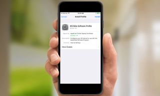
If you've got a secondary iOS device that's capable of running iOS 10 and you'd like to explore some of iOS 10's new features, your curiosity will be rewarded. (iOS 10-supporting devices include iPhone 5s or later, sixth-generation iPod touches or any iPad released since October 2013.) Just be warned that not every feature Apple promised during June's Worldwide Developers Conference has been baked into this release.
So what can you expect from the iOS 10 beta? Here's a running list of what I like about Apple's new mobile operating system and what still needs some tinkering.
What We Like
A much more useful lock screen: iOS 9's lock screen can be a pretty limited place. You can see notifications, access the control panel and jump to the camera, but most of the time, taking action requires you to unlock the phone. The iOS 10 beta changes that, giving you the ability to do a lot more from that once fairly lifeless lock screen.
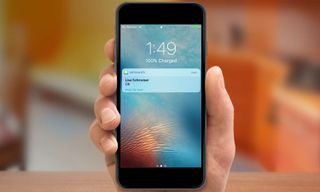
When my wife texts me, I can reply just by tapping on the message, which is a heck of a lot more convenient then having to slide to unlock my phone before tapping out my reply in Messages. The camera's easier to access, too: Instead of having to slide up from a very specific corner of the screen, I just swipe left, and I'm ready to take pictures. If the iPhone's strength is its ability to help you do more things from just one device, then iOS 10 is going to help you do all these things more easily and more quickly, particularly from the lock screen.
Wake up your phone by lifting it: Here's another iOS 10 time saver: Each day when I drop my daughter off at her preschool, I sign into a log book with the time we've arrived. Normally, that means digging into my pocket and pressing my iPhone's home button to look at the time, since my phone doubles as my watch. With the iOS 10 beta on my phone, however, all I have to do is lift the phone up out of my pocket, and the iPhone's lock screen springs to life.
This trick, which mirrors what the Apple Watch can do, may seem like small improvement, but it's a valuable one. I particularly like that it lets me get a quick glance at incoming notifications just by lifting up my phone instead of having to physically press a button. I just have to remember that raise-to-wake now exists on the iPhone, so that I don't absentmindedly unlock my phone using Touch ID and blow right past the notifications I wanted to look at.
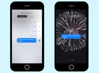
Messages adds flash, some substance: I'm not the intended audience for most of the major changes in Messages, as the next unironic emoji I text to someone will be the first. Still, if you've dreamed of adding a little pizzazz to your texts, iOS 10's version of Messages was made with you in mind. You can add effects to the text bubble, making it larger or smaller, or making it appear in invisible ink that your recipient has to swipe to read.
In a feature straight from the Apple Watch, you summon up a Digital Touch feature that lets you tap out sketches. There's even a handwriting mode for sending handwritten text as well as easier access to photos and GIFs. And a tapback feature lets you respond quickly with an emoji just by pressing the message you just received.
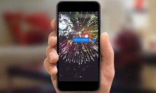
Apple has also added screen effects, five in this beta, where graphics like floating balloons, exploding fireworks and falling confetti accompany your text. So now your birthday greetings can feature little on-screen special effects. (In fact, if you text "Happy Birthday" or "Happy New Year" to anyone running the iOS 10 beta, those graphics will appear automatically in their Messages app, even if you're sending the text from an iOS 9 device. This discovery has delighted my wife, who enjoys sending random birthday greetings to turn my iPhone screen into a balloon-fest.)
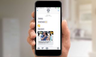
Most of these changes are fun, if a little frivolous, but there are a few things I like in the new messages. Now, when someone texts me a URL, I get a rich preview right in messages of what I'm about to tap on. This is a terrific time saver that removes the mystery of tapping on unknown links.
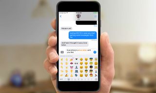
As an emoji-phobic, I appreciate that all I have to do is type out a message and switch to the emoji keyboard: Text that can be emoji-fied turns orange, and I can turn it into a graphic with a tap. This is not going to turn me into an emoji-texting maven anytime soon, but at least I no longer have to scroll through pages of graphics to find the right one.
A more engaging photos app: In past iOS versions, I haven't spent a lot of time in Photos, in part because it wasn't always easy to find what I was looking for. That's changing in iOS 10, due to a couple of key additions, although not every feature is fully functional in the first public beta.
The marquee addition is Memories, which groups together photos from a particular time or place into a pre-assembled album. That's not a particularly groundbreaking feature — Google Photos has done much the same thing for more than a year — but iOS 10 implements it nicely All the photos of a weeklong trip I took to London in 2009 were grouped together in an attractive package.
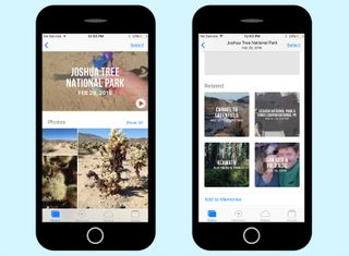
More impressive is a related Memories feature that pulls up similar photos, which were also taken on that date, were taken in the same location, feature the same people or cover the same themes. My family tries to take a trip to a new national park each year, and at the bottom of the album for this year's Joshua Tree trek were past visits to other parks. You can really fall down a wormhole, clicking on related photos, making the Photos app a much more welcoming place to spend some time.
Some features aren't fully functional in this beta. Each Memory is topped by a pre-assembled video that cobbles together your images into a musical slide show. It's impressive when it works, as the software has an uncanny knack for picking appropriate background music. But some slide shows last just a couple of seconds, a bug I'm sure Apple will address between now and the fall.
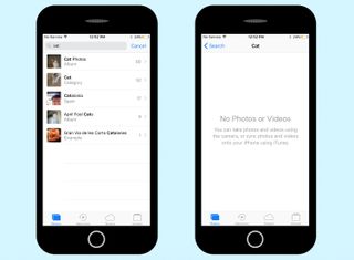
A search feature is similarly flawed right now. You can type in a search term — "baseball," say, or "cats" — and Photos will pull up images containing what it recognizes as those words. But the search functionality just doesn't work right now. A search for "cat" turned up 52 photos in my library, but tapping on the search results turned up an error message. Hopefully, Apple will iron out the kinks here, as better search tools will make Photos an even more valuable app.
A better Today with widgets: iOS 10 splits the Today view — that list of upcoming appointments and headlines, which come from the News app — from sharing a screen with Notifications Center. Instead, Today has a new home, which you find by swiping right from the lock screen or home screen. There, you'll find a lot more useful information: By default, Today shows you weather information, the day's calendar events, stock prices and Siri app suggestions, along with news headlines and your next appointment.

But you don't have to stick with that view. iOS 10 lets you configure the order in which widgets appear on the Today screen, and what widgets you want to appear. Even more significantly, you can add third-party widgets, even in this initial beta release. I added an ESPN widget that features my favorite teams and a Google Maps widget that displays public-transit schedules for the routes nearest to me. Supported widgets appear automatically on the configuration screen, and I'd expect more to pop up between now and iOS 10's fall release.
Having a Today screen that contains more relevant information — in large part because you're the one who picks it — makes a phone running iOS 10 feel more personalized. It's not a game-changing feature by any means, but it's certainly a welcome one.
A better night's sleep: I use the alarm feature on the iPhone's clock app to wake me up each morning. But Apple wants to make sure I'm going to bed at a decent hour, too, adding a Bedtime tab to the Clock app.

With Bedtime, you tell the phone what time you want to go to bed at night and when you want to wake up. You can also set the phone to remind you when it's approaching your bedtime. For your wake-up call, your iPhone will play a gentle sound of your choosing that gradually gets louder. And you can customize what days Bedtime wakes up, so your iPhone isn't trying to get you out of bed at 6 a.m. on a lazy weekend.
I'm interested in seeing what my sleep data looks like when it's logged in the Health app. And I'm also curious to find out if I sleep through Bedtime's gentle alarms after using a klaxon sound to get me out of bed the last few years.
A better look for Music: Apple promised a more streamlined look for its Music app, and the iOS 10 beta certainly delivered. I felt that Music in iOS 9 put fairly limited features like recently added songs and albums front and center in its cluttered interface. It also felt to me as if Apple was more interested in pushing its music-streaming service rather than letting me enjoy my own library of songs.
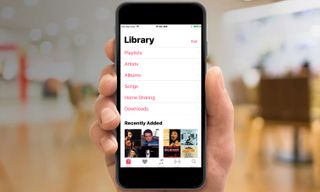
iOS 10 does not make that mistake. Links to my playlists, songs and artists are prominently displayed when I launch the app. If I want to listen to Apple Music, the service is easy enough to find, but Music now recognizes that my Library is the star of the show.
MORE: Apple Music FAQ: Everything You Need to Know
One thing I don't like about the beta is that my Library mixes songs I've specifically downloaded onto my iPhone with tracks stored in iCloud. I disabled that feature in iOS 9 because I don't want streaming songs eating up my cellular data and I've got a bunch of holiday music back on my computer that I don't care to listen to in the middle of July.
The ability to disable music in the cloud seems to have disappeared from the Settings app in iOS 10. At least the Music menu offers a separate download option for listening only to the songs stored on my phone, but that seems like an unnecessary step when toggling a setting could achieve the same functionality.
There's more to find in Maps: The best addition to Maps — at least among the new features I'm able to test — is the app's newfound ability to find things like gas stations and coffee shops along my route. Even better, Maps calculates how much time will be added to my trip if I stop to fill up. Other mapping apps offer that capability, but I'm glad Apple is now including it in iOS 10.

I would have liked to test another marquee addition to Maps, in which the app will now automatically pin where you've parked. But that requires me to either have a CarPlay system in my car or connect my phone to my car via Bluetooth.
Farewell to Apple's built-in apps: I'm not going to say that removing the rarely used Stocks app from my iPhone was the first thing I did once I had iOS 10 installed. But I didn't waste any time doing it, either.
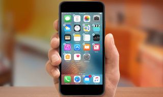
Long-time iPhone users, who've likely chafed at having to keep Apple's preinstalled apps on their phones, can probably appreciate the sentiment. So they'll really like the newfound ability to remove unused or unwanted apps from Apple in iOS 10. Apple lets you get rid of 23 built-in apps — only Phone, App Store, Clock, Safari, Messages, Camera, Photos and Health have to stick around.
MORE: Apple Lets You Remove Built-In iOS 10 Apps: Here's How
You're not fully deleting the apps, by the way — just removing them from view and getting rid of any hooks to other parts of the OS. When I got rid of Stocks, for instance, it not only disappeared from my home screen but from the Today view as well, where a Stock widget exists by default when you first install iOS 10.
Removing a built-in app is as simple as deleting a third-party app. Just press down on the iPhone's screen until the apps start to jiggle and tap the X in the upper left corner of the offending app's icon. Should absence make the heart grow fonder, you can always reinstate the removed Apple app by downloading it from the App Store.
What We Don't Like
Messages can be frustrating: iOS 10 may have added more fun effects to Messages, but it also makes the texting app a little more difficult to use. Tap the arrow to access GIFs, digital-touch features or photos, and the text-entry field shrinks. And this field was never the most spacious part of the app to begin with. On my iPhone SE, it's hard to make out the details of Messages' GIF library, as the thumbnails are pretty tiny.
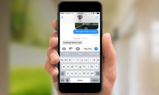
It's not always clear how to access some of the new features in Messages either. To find those bubble and screen effects, you've got to press and hold the blue arrow in the text field, which is not the most intuitive of actions. To send a handwritten text, you've got to flip your iPhone into landscape mode, and even then, the feature performs inconsistently from phone to phone. On the larger-screen iPhones, like the iPhone 6s, the handwriting canvas appears automatically; on the iPhone SE, you've got to tap a squiggle icon in the lower right corner of the keyboard.
Apple has earned a reputation for making software that's intuitive and easy to get a feel for after just a few moments of use. That quality is not on display in this beta version of Messages.
An unnecessary Home button press: You pick up your iPhone, waking the phone up with that useful raise-to-wake feature. You put your finger on top of the Home button since you've set up your phone's TouchID feature to unlock the phone using your fingerprint. And all iOS 10 will do is flash a message that you then have to press the Home button to completely unlock your phone.

Is it a productivity killer? Certainly not, especially if you get used to the behavior. But it feels like an unnecessary step that slows down your ability to unlock your phone. I wish Apple had taken a more elegant approach.
Smarter predictive typing isn't fully baked yet: Apple has promised that QuickType — the predictive typing feature that suggests words based on the context to save you from tapping out every last letter — will be able to tap into Siri's smarts in iOS 10. Thus, it will be able to pull up information like your contact info or times for appointments on your calendar when appropriate.

When the feature works, it's a real time saver. Chatting with my wife in Messages, I was able to supply my location with a tap of the QuickType menu when she asked me where I was. Tapping on her suggestion that we go see a movie gave me the option of creating a Calendar event without having to enter all that data in myself.
Other times, Siri's contextual smarts and QuickType weren't on speaking terms. I would tap out emails suggesting people reach me on the phone, but my contact info never appeared as a QuickType option. I'm going to chalk this up to the predictive engine still learning what I have to say and when, and I'm hopeful that it will improve as Apple fine-tunes iOS 10.
Bring back the better back button: My favorite iOS 9 addition was the back button, which appears when you jump from one app to another — say you tap a website link in an email that takes you from Mail to Safari. The back button gives you a quick way of returning to the app you were previously working in, without having to muck around on the home screen.

The back button's still there in iOS 10, but it's now in an easy-to-miss black font that seems smaller to my eye. It's possible I'll get used to it the more I use iOS 10, but I'm not sure why Apple made this tweak.
You'll long for 3D Touch: I'm testing iOS 10 on two phones: an iPhone 6s that offers 3D Touch functionality and an iPhone SE that doesn't. And the experience of running iOS 10 on a 3D Touch capable phone is exponentially better.
MORE: Best 3D Touch Apps
Part of that is because Apple has added new quick commands to its built-in apps. When I hard-press on the Mail icon, for example, I can now get a quick glance of unread messages from people whom I've marked as VIPs.
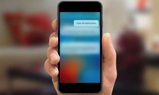
An even better feature of 3D Touch is the ability to dismiss all notifications with a single tap: All I have to do is hard-press on the X icon from the Notifications screen to summon up a Clear All Notifications option. That's something I can't do on my iPhone SE, and that missing capability gives me a pang of regret for not buying a 3D Touch-capable device — which I assume is part of Apple's devious plan. (To be fair, the Notifications pane on my iPhone SE lets me dismiss notifications by day, just by tapping on an X, but the 3D Touch shortcut feels much more elegant.)
What's missing in the beta
iOS 10 offers other features as well, but I've been unable to try them out, simply because they're not ready for this beta. Siri, for example, is now open to a select group of third-party apps. But for me to be able to use Apple's voice-powered assistant to summon an Uber ride or send a text through a third-party chat app, those apps are going to need to be updated with Siri support. However, they're not available as of this writing.

Similarly, Maps' integration with third-party apps doesn't look like it's live yet. By the time iOS 10 is released for good, I should be able to line up a ride-sharing service or book a restaurant reservation directly from Maps. Those features don't appear to be available yet, though.
Music is supposed to include lyrics when you play a song, but I didn't notice any lyrics pop up in the half-dozen or so songs I checked. I suspect that feature will appear in a future version of iOS 10, as Apple inks more deals with rights holders.
Finally, I've held off on filling my home with too many smart devices, as I've waited for a single place to both manage them and get them to work in concert. iOS 10's new Home app promises to be that place, but with no devices to test it on yet, I haven't had a chance to put it through its paces.
Bottom line
As you might expect from a public beta, iOS 10 is a work in progress. Apple has a lot to do in the fall, whether it's adding the full functionality it promised or working the kinks out of some of the features already added to the OS. I've got a lot to do, as I get more familiar with the changes Apple's made, so that sending texts in the new Messages app or unlocking my phone become muscle memories.
But iOS 10 is off to a good start with this beta. The update's very best features get rid of hassles, speed up the things you use your phone for and generally simplify tasks. You're going to be a more efficient iPhone user come this fall, and iOS 10 is going to be a major reason why.
Sign up to get the BEST of Tom's Guide direct to your inbox.
Get instant access to breaking news, the hottest reviews, great deals and helpful tips.
Philip Michaels is a Managing Editor at Tom's Guide. He's been covering personal technology since 1999 and was in the building when Steve Jobs showed off the iPhone for the first time. He's been evaluating smartphones since that first iPhone debuted in 2007, and he's been following phone carriers and smartphone plans since 2015. He has strong opinions about Apple, the Oakland Athletics, old movies and proper butchery techniques. Follow him at @PhilipMichaels.


-
Gregory_22 I'm finding it so hard to agree with any of this. As a person who's been using an iPhone since 2007 and has more than generally been excited with every iOS release... to me iOS 10 falls flat on its face. The "bigger is better" theme is not working for me (and obviously that's just me). It feels like a clunky mess, the music app is horrible. The new notifications leave a lot to be desired as far as aesthetics go. I feel like Apple has finally run short on Steve Jobs' and Scott Forstalls' brilliance. This entire update wreaks of Android influence and that's just not a good thing. Sorry. I hope iOS 11 gets back to a more streamlined and functional experience.Reply -
Amy_27 Under Settings>General>Accessibility>Home Button you can turn on a function allowing you to open the phone by resting your finger on the home button instead of pressing it!Reply


