11 Best Improvements in iOS 9
Here are the most important enhancements (big and small) that we're happy to see in Apple's new mobile OS.
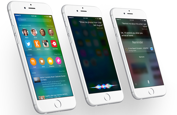
iOS 9 is designed to gives iPhone and iPad users more stability when it comes to performance as well as up to an hour of longer battery life. You'll also want to spend some time with such marquee additions as the News app and iOS's new Proactive Assistant. But there are plenty of smaller, unheralded changes that make iOS easier to use.
After spending some time using iOS 9, here are the enhancements and additions — some that Apple has talked up, some that have flown under the radar — that have impressed us the most.
Easier App Switching
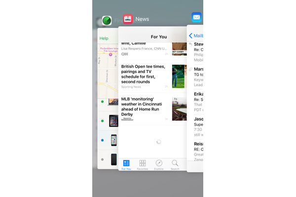
Cover Flow makes a comeback of sorts with the latest iteration of the App Switcher. Press the Home button twice in iOS 8, and windows of all your recently opened apps line up one after the other in a scrollable list. IOS 9 changes things around: When you launch the App Switcher now, open apps fan out to the left in a carousel-like view, which you flip through to find the app you want.
It's likely to be a controversial change on the iPhone, since you can see only three apps at a time in this view. (Apple also did away with the recent contacts that used to appear at the top of the App Switcher; those have moved to the Search screen.) Personally, I like the look and don't feel as if it cramps my navigational style.
MORE: iPhone 6s and 6s Plus: Top New Features
Battery Saver
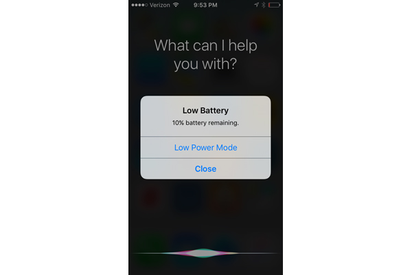
Previous versions of iOS have always warned you when your device is about to run out of juice; iOS 9 helps you do something about. When those low battery warnings pop up at 20 percent and 10 percent of battery life left, they'll be accompanied by a command that lets you switch to Low Power Mode.
When Low Power Mode is enabled, activities like mail fetching, automatic downloads and updates to apps running in the background are curtailed until you can fully charge your device. You may recognize this feature from the Apple Watch, which also lets you switch into Low Power Mode when battery life is growing short.
You don't have to wait for the battery warning to pop up to turn Low Power Mode on. Just head to Settings and find the Battery setting -- there's a search function that lets you do that easily now, you know. From the Battery setting, you can enable Low Power Mode with the flick of a switch.
A More Conversational Siri
I shy away from using my iPhone’s built-in assistant in large part because I've found past versions of Siri to be unforgiving when it comes to how you phrase a request. Ask Siri for some information in an imprecise way, and she'll return an unhelpful page of Safari search results… if she bothers to feign any understanding at all. And as someone with a slight stammer, I've found Siri to be a little impatient with any sort of verbal tic.
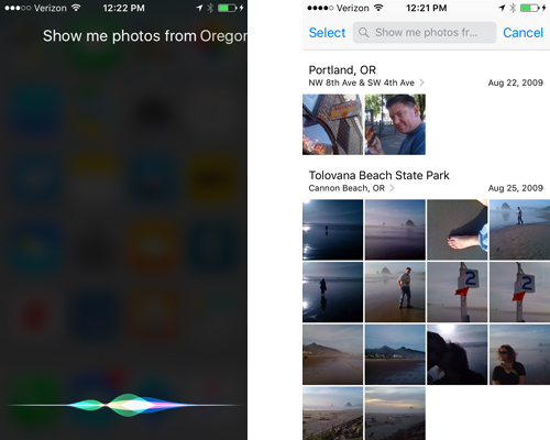
But Siri has gotten smarter over time, understanding things like context. (If I ask Siri what the Oakland A's record currently is, for example, she'll tell me; if I follow up with "When's their next game?", she knows that I’m still asking about Oakland and presents me with a schedule.) In iOS 9, Siri can now bring up photos keyed to specific times and places.
I asked Siri to show me photos of Oregon and nearly instantly see a bunch of shots I took during a 2009 road trip through the state. It's a helpful change that allows Siri to get information you need more quickly. Now if she could only be more tolerant of my stammer.
Better Navigation Via Back Buttons
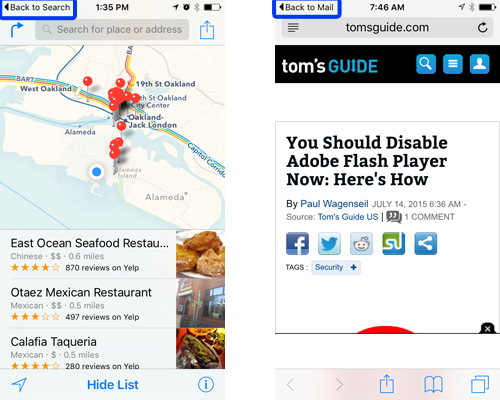
One of the biggest complaints people have about the iPhone -- especially Android switchers -- is that Apple doesn't offer a dedicated Back button. That's still the case in iOS 9, but a handy software-based Back is available in certain situations.
Say someone sends me an email with a link to a website. Naturally, I tap on that URL and Safari immediately launches. Prior to iOS 9, if I wanted to return to that email, I would have to hit the home button and find my way back to the app. In iOS 9, though, there's a small "Back to Mail" link that appears at the very top of the Safari screen. Tap that link, and I go back to the same message in Mail. The same Back to Mail button appears when you jump to events in Calendar from an email message. And I've also spotted similar Back buttons for Notes and the Search feature. I suspect as developers get the chance to update their offerings for iOS 9, you'll see similar navigational shortcuts cropping up in third-party apps.
Multimodal Maps
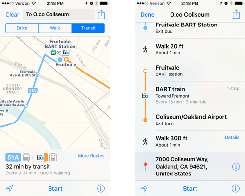
As with Siri, Apple is making a big deal of the newfound support for public transit in Maps. Still, it's nice to see the details of that support in action, especially since I live in one of the six U.S. cities that will offer this feature out of the gate.
Multimodal trips, in which you transfer between different forms of public transit, are color-coded for each stage. A trip from my house to the local ballpark used a blue line for the bus, an orange one for the train I’d transfer to and a dotted black line whenever I had to walk anywhere. Speaking of walking, Maps is smart enough to tell you where you need to walk in between transit stops -- it directed me to the closest bus stop to my house, even if that meant doubling back a little bit -- and can even calculate how long it thinks you'll need to walk from Point A to Point B.
Apple Maps is still a little flawed. It estimated that I'd be able to cross a 300-foot pedestrian walkway from the train station to the stadium in a minute. The bridge is actually closer to 600 feet in the physical world, so that minute estimate is a generous assessment of my footspeed. (Since the stadium is my stopping point, this could be a case where Maps assumes I’ve reached my destination before I actually have.) Still, public transit directions are presented in a clear, easy-to-follow manner.
Searchable Settings
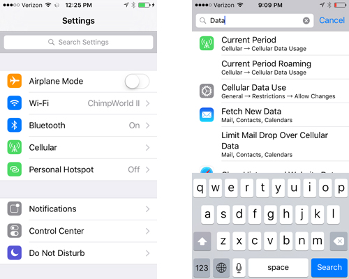
For me, any activity that involves adjusting anything within the Settings app involves at least two steps: 1) Tapping on Settings; and 2) Staring at the long list of settings options and trying to remember where I'm supposed to go next.
iOS 9 simplifies this somewhat by adding a search bar. Now when I launch settings, I can pull down to reveal a search field where I'm able to type in the specific setting I want to adjust. Start typing "data," for example, and Settings gives me the option of doing anything from looking up how much data I've used on my cellular plan, to clearing the history website data in Safari, to deciding whether I want to use cellular data to update iOS 9's new News app. Like many of the more welcome changes in iOS 9, this one figures to help me find the things I need much more quickly than I could in previous versions.
A Place for Your Selfies
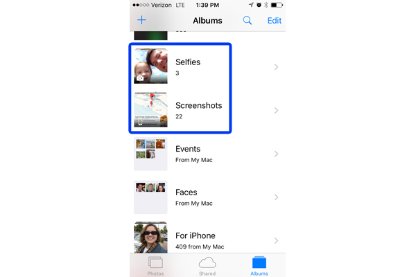
I'm not the world’s most aggressive selfie-taker, but I'm not above the occasional self-snapshot of myself, particularly when I'm on a trip I want to commemorate. For those times when I do take a self-portrait, iOS 9's Photos app will create a special place for them -- a Selfies album.
What makes a selfie? IOS 9 seems to think it's anything shot with your phone's front-facing camera, as a photo of a coffee mug that I took with my front-facing camera wound up in the Selfie photo while a self-portrait I took with the rear-facing camera was not. Oh, and if you’re wondering whether Siri's newfound ability to bring up specific photos extends to selfies, it does not in this version of the iOS 9 beta. Every time I asked Siri to show me my selfies, she apologized that she couldn't open Photos. I suspect between now and iOS 9's fall launch that may change, however.
Does it matter that selfies get their very own place in Photos? In the greater scheme of things, probably not. But it does make for a handy organizational feature. (Incidentally, screenshots -- which you take by pressing the Home and Power button simultaneously -- also get grouped in their own album, which will come in handy for separating screens from actual photos.)
MORE: 10 Reasons the iPhone Beats Android
Faster Finds in Safari
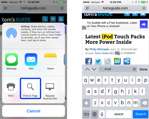
When we search the Web, it's often to find a very specific piece of information about a particular topic instead of reading through an entire webpage. On a desktop browser, it's relatively simple to scan for the information you want -- just hit Command-F and type in the search term you want to locate. On the iPhone, that's been a much trickier task. You need to go to Safari's menu bar, type in what you're looking for and then scroll down to the On This Page listings to jump to portions of the Web page that are relevant to your search term.
iOS 9 simplifies this process. The Share button -- the same icon you tap when you want to copy a link, tweet it or bookmark it among other tasks -- now has a Find on Page option that performs the same search capability in a more streamlined way. It's not an earth-shattering feature, but for those of us whose Web browsing includes research, it can be a welcome time-saver.
A Better Built-In Keyboard
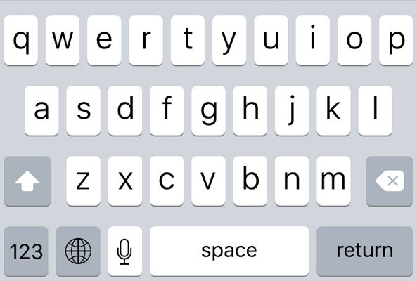
It shouldn't be that difficult to tell when you're about to type a capital letter with the default keyboard in iOS. Nevertheless, previous iterations of Apple's mobile operating system haven’t offered much in the way of visual cues, save for a lone Arrow key that's either highlighted or not to indicate when Caps Lock is in play.
iOS 9 makes this even more obvious so that even the most unobservant dullard -- I'm looking in the mirror as I type this sentence -- knows when he's going to type a capital letter or not. If the Shift key is engaged, the iOS 9 keyboard will show capital letters; if it's not, you'll see lowercase characters. It's a visual cue that couldn't be more simple and -- when it comes to typing in passwords -- more welcome.
The iPad keyboard in iOS 9 is even better, with formatting options across the top and the ability to drag two fingers across the layout to move the cursor.
A Proactive Assistant That Learns
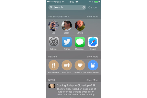
After installing iOS 9, an initial glance of the new search screen -- which you reach by swiping left from the Home screen -- did not deliver the contextualized app and search recommendations I was expecting. What I saw instead was a search bar and a few commonly used apps.
Give the search assistant time. Within 24 hours -- time that the proactive search feature doubtlessly spent combing through my behavior on the iPhone -- the search screen was soon populated with frequently used contacts, apps I tend to launch, and recommendations for nearby businesses. What’s more, those recommendations were tailored to the time of day -- around noon, the search feature was keen on suggesting nearby lunch spots while, after the sun went down,
I got a few suggestions about local nightlife. This suggests to me that the feature will study your use of the iPhone and tailor its recommendations accordingly. And that means more powerful search tools the more you use iOS 9.
The Best Change in Notes
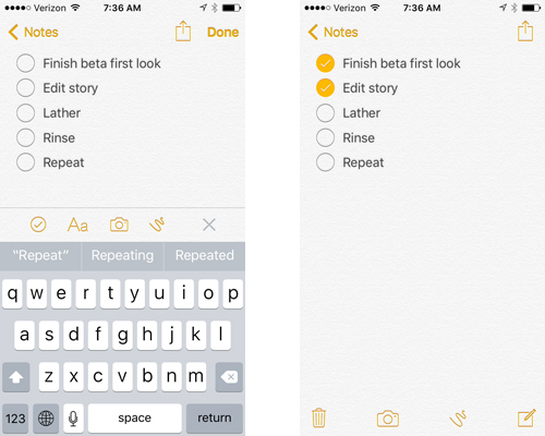
The built-in Notes app introduces a lot of new features -- you can now insert photos, paste in Maps and Web links, and even draw in your note using your finger. But since I primarily use Notes as a list-maker, I like the new formatting features the best.
To make your Notes into a to-do list, simply tap the gray plus button (+) that now appears just above the keyboard. A strip of options will appear that let you format text, insert photos or sketch on a note, but you'll want to select the circled checkmark on the far left. Once selected, circles will appear at the start of each line in your note, allowing you to create a list for tasks, groceries or to-dos. Once you're done editing the list, you'll be able to check off items just by tapping the circle.
Even with these additions, Notes is far from the most complete note-taker available for iOS. (I'm a fan of Notability from Ginger Labs myself.) But for the people who use Notes because it's there, the formatting improvements and other additions to iOS's default note-taker make it a more full-featured app.
- 25 iOS Tips, Tricks and Secrets You Need to Know
- Best iOS Action Games
- 12 Best iOS Apps You're Not Using
Philip Michaels is a senior editor at Tom's Guide. Follow him at @PhilipMichaels. Follow Tom's Guide at @tomsguide, on Facebook and on Google+.
Sign up to get the BEST of Tom's Guide direct to your inbox.
Get instant access to breaking news, the hottest reviews, great deals and helpful tips.
Philip Michaels is a Managing Editor at Tom's Guide. He's been covering personal technology since 1999 and was in the building when Steve Jobs showed off the iPhone for the first time. He's been evaluating smartphones since that first iPhone debuted in 2007, and he's been following phone carriers and smartphone plans since 2015. He has strong opinions about Apple, the Oakland Athletics, old movies and proper butchery techniques. Follow him at @PhilipMichaels.
-
Vlad Rose About time they add the improved keyboard; or the battery saver; features available since my old Samsung Note 2 and now Edge. I'm guessing the next IOS version will have Samsung's ultra power savings mode.Reply
I know the wife will love the battery saver option as she has a tendency to kill the battery on her iPhone in less than a day; she does use it constantly though. -
jakjawagon ReplyThe Share button -- the same icon you tap when you want to copy a link, tweet it or bookmark it among other tasks -- now has a Find on Page option
It may be faster than the previous way of doing things, but it sounds far less intuitive. Want to find some text on a web page? press the search button. Because obviously that's where people will look first for that function. -
turkey3_scratch Well, undeniably these are good updates, but I hope performance is improved for devices like my original iPad Mini which is quite slow on IOS8.Reply

