7 iPhone Features I'd Like to See in iOS 12
Rumor has it that iOS 12, due to be announced at Apple's annual Worldwide Developers Conference on June 4, will have a reduced scope as Apple tries to focus on improved security and reliability. Still, hope springs eternal — and for those of us who are dr
Rumor has it that iOS 12, due to be announced at Apple's annual Worldwide Developers Conference on June 4, will have a reduced scope as Apple tries to focus on improved security and reliability. Still, hope springs eternal — and for those of us who are dreaming of new iPhone features, this is prime hoping season. So, before my hopes get dashed, here's a wish list of items I'd like to see when Apple announces the next version of iOS in a few weeks.

Always-on lock screen for iPhone X
The iPhone X has an OLED screen and a robust battery, so it's time for Apple to let users opt to have their iPhones display the current time (and possibly some other basic information) on the screen at all times. We shouldn't have to pick up the device, tap the screen or push a button to get this information.
MORE: How to Use the iPhone X - A Guide to New (or Improved) Features
This could be a simple mode with just the date and time in white text on a black background — OLED pixels don't use power when they're set to black — but it would save me a gesture every single time I want to glance at my phone to see what's going on. Perhaps, optionally, we could add some other small amounts of information to that screen, like the number of notifications we have, a weather report, or even the most recent notification or two. (And yes, this mode should be optional, and you should be able to turn it off at night via Do Not Disturb.)
Improved Do Not Disturb
Speaking of Do Not Disturb, which lets you change iPhone behavior to be less obtrusive when you're asleep or driving, I'd like to see this feature become more powerful and flexible. When I'm driving, how about filtering out calls that aren't from an approved list, the behavior that's already available in the overnight version of Do Not Disturb? How about allowing notifications from certain apps to break through, while suppressing others?
And this is a larger issue, but I don't want my phone to make noise during the day — though it needs to make noise at night if there's an emergency when I'm sleeping. So, how about a feature that allows the phone to make noise even when the ringer is off and volume is turned down when someone from an approved list calls me late at night?
I'd also love it if the iPhone's motion sensors allowed it to make some guesses about when I'm asleep, based on movement and plugged-in status. I'm rarely out and about at 11:30 p.m., but if I am, and my iPhone's in my pocket, I'd like it to keep Do Not Disturb off until I get home, lay the device down and start charging it.
Improved Notification Center
Notification Center on iOS is kind of a mess. It's time for an overhaul. App notifications should be grouped together, with more opportunities to act on notifications directly from the notifications list. Clearing all notifications should be an obvious feature, and one that's available even on devices without 3D Touch.
I don't think iOS users are demanding all the tweaky possibilities that Android offers, but some moves in Android's direction would be welcome.
I'd also like a better interface to allow me to take control of my notifications, preferably by being able to adjust notification settings on a per-app basis from the notification screen itself. When I'm confronted with a notification of a kind that I don't want to see anymore, I'd like to be able to tap a settings icon and unsubscribe from that notification right then and there.
If this sounds like I'm asking for Android-style notifications on iOS, that's basically the truth — this is an area where Android has much more power than iOS. I don't think iOS users are demanding all the tweaky possibilities that Android offers, but some moves in Android's direction would be welcome.
A redesigned Control Center
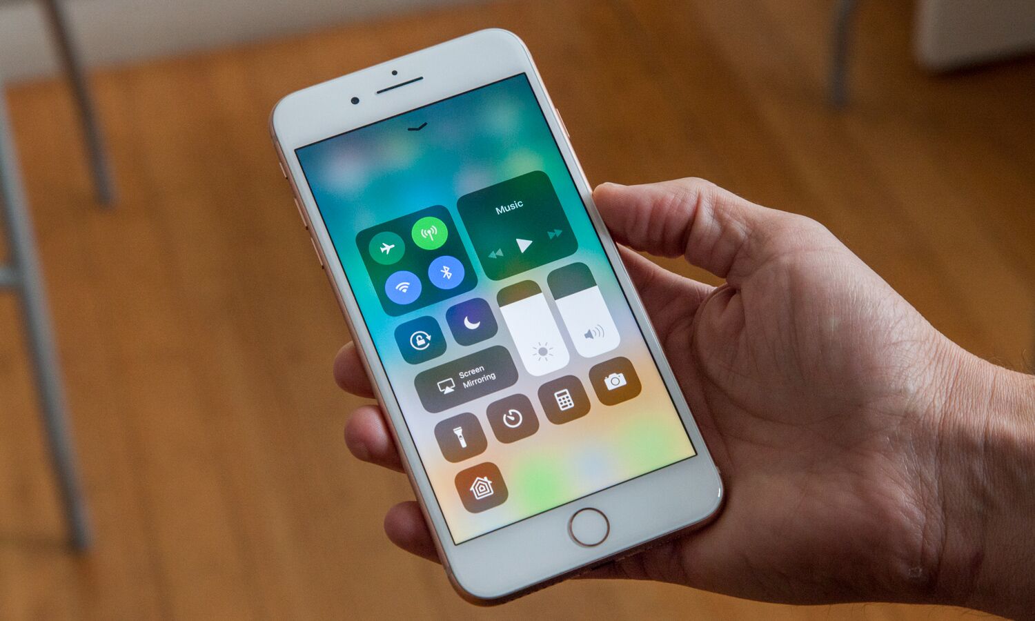
When the iPhone X added the swipe-up gesture to go to the home screen, something had to give — and it was Control Center, which was relocated into the upper right corner of the display. This placement is both confusing and frustrating. There's got to be a better way. Maybe Apple should meld Control Center and Notification Center into a single pull-down interface; maybe Control Center could share space with app switching when you swipe and hold. Maybe it could appear when you swipe up from the home screen.
I don't know what the right answer is here, but the current one seems wrong. Time to try something different.
More fun in Photos

Photos is a functional app, but it's boring. It's got to do the heavy lifting of showing you all your photos and albums, including those in your iCloud Photo Library if you're syncing with that service. It's such an important app that I get why Apple is reluctant to turn it into something that feels more like Instagram. Likewise, the Camera app serves a vital purpose, so it sort of makes sense that this app is all business.
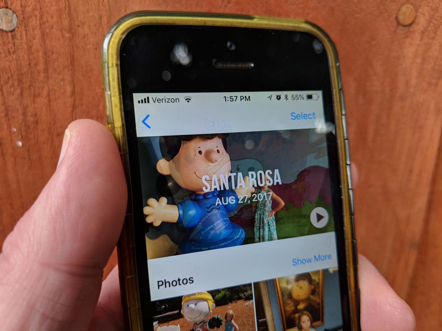
But Apple needs to do something more aggressively fun with photography. Photos creates algorithm-generated albums all the time, and they're pretty good, but if you never hit the Memories tab, you never see them. Maybe the solution is for Photos to crib from the App Store and launch in a Today view that includes quick access to recent photos, highlights of auto-generated memories and plenty of sharing options.
Or maybe there needs to be a third Apple app, something that's neither Photos nor Camera, but more geared toward exposing filters and camera effects, unearthing old pictures and sharing stuff with friends. The Photos app is probably the right place for that makeover, but if Apple wants to break this stuff out to create something more like Clips, the company's video-creation app, that works for me too. Photos on your phone shouldn't be boring. Apple's apps are a snooze.
More workflows in more places

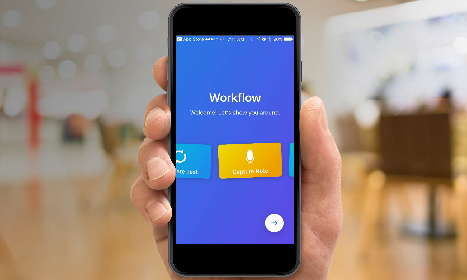
Apple bought the indispensable Workflow app a few years ago, and in a lucky break for those of us who like to get the most out of our iOS devices, the app hasn't vanished but instead continues to work and be very good. Still, where are the fruits of that purchase? iOS could use ground-up support for robust scripting, automation and inter-app communication. The community (including that for Workflow) has spent a lot of effort to make its own solutions, from URL schemes to embedded JavaScript scripting. But for this to really take hold, Apple needs to make a commitment.
Augmented reality in Maps
I'm standing on a street corner wondering which way I need to go to get to my destination. Do I tap the Maps app to rotate so that forward is up? Do I read the arrow on my blue dot and figure out which way I'm oriented? I've got an idea: Apple should add an augmented-reality feature to Maps so that I can stand somewhere and see what's near me, what I'm looking at and where I need to go. Apple's high on augmented reality, and Maps seems like the best place for the company to integrate AR into the core set of iOS apps. (Google has already announced plans to do this with its Maps app.)
But who am I kidding? The company will probably add an AR mode that lets you take a selfie with an Animoji instead. We'll love it and make videos with it, and then after a couple of weeks, we'll get tired of it and stop using the feature. That's not something from my wish list ... it just seems inevitable.
Sign up to get the BEST of Tom's Guide direct to your inbox.
Get instant access to breaking news, the hottest reviews, great deals and helpful tips.
Jason Snell was lead editor of Macworld for more than a decade and still contributes a weekly column there. He's currently running the Six Colors blog, which covers all of Apple's doings, and he's the creative force behind The Incomparable, a weekly pop culture podcast and network of related shows.
