A Month with iOS 12 Beta: These 2 Features Changed Everything
After using Apple's iOS 12 beta for a month, we've found that some new additions have been stellar, while others have us scratching our heads.
Apple announced iOS 12 in June, and since then, we've seen several updates to the pre-release version of the software, both for developers and the public. (If you're daring, you can sign up for Apple's public beta program yourself.)

We're still likely two months from the initial broad release of iOS 12, but I've been able to make some first impressions after having spent more than a month with the beta software, including several weeks with it installed on my primary iPhone and iPad. Here’s what I’ve discovered so far.
Notifications are better, but there are fewer of them
There are two primary ways we interact with our phones: voluntarily, by picking them up to see what's going on or to perform a task, and in response to a buzz, chime or other sort of notification. The new Screen Time feature may modify that first set of behaviors, but in my first few weeks of using iOS 12, I've noticed the most changes around how I interact with notifications.
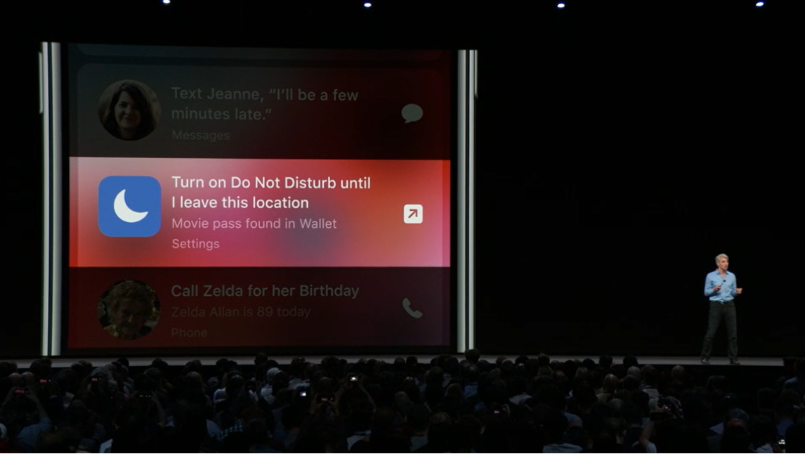
These changes span a few different features of iOS 12. First, there's the new Do Not Disturb at Bedtime feature, which prevents me from being distracted by notifications on my device's lock screens during hours when I should be sleeping. Then, there's the ability to enable Do Not Disturb until I leave my current location or for as long as a current calendar event is going on. All of these features make it much easier to block out your phone when you're focused on something else.

Of course, you can still pick up your phone and check Twitter — but it's not going to act as an interruption, and I think that's a huge benefit.
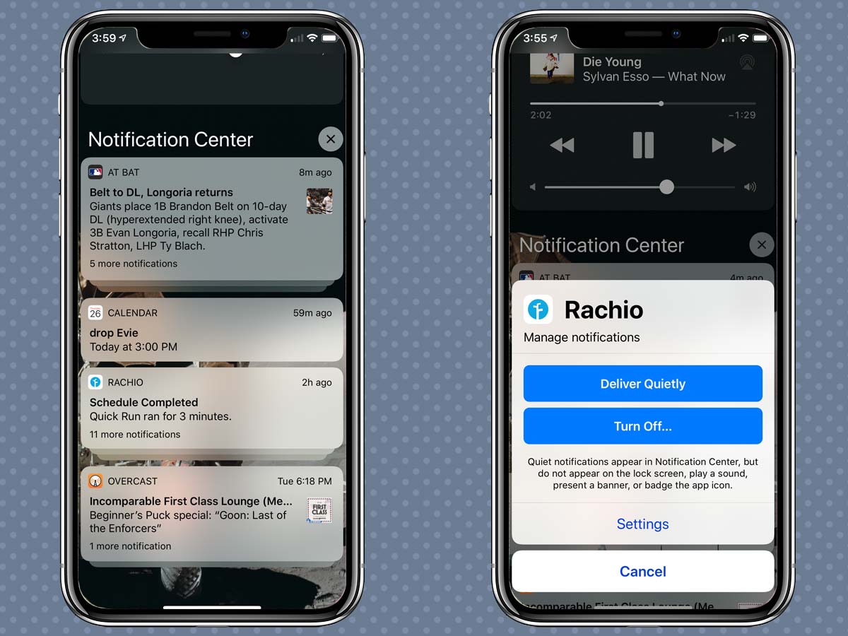
Even more powerful has been the ability to take control of which notifications I see and hear. Now, when I receive a notification, I can swipe to the left and tap the Manage button, which allows me to quickly turn off all notifications of that type, or the Deliver Quietly button, which lets the notifications accumulate in the Notification Center but not interrupt me with a noise or vibration, or appear on my phone's lock screen.
Over a few weeks, this has made a huge difference, because every single time I've gotten an alert that seemed unnecessary, I've either silenced it or turned it off completely. It took a little time — you have to wait for that first notification to come in and bother you, which can take a while — but my phone is now a dramatically quieter place, and I'm all the better for it.

Even though I knew how to turn off notifications for specific apps in previous versions of iOS, I almost never got around to it. Giving me an immediate "unsubscribe" button has made a huge difference. (I suspect the ease of turning off notifications will also encourage apps that spam the user with pointless notifications to change their behavior — or risk losing their communication pathway with their users entirely.)
MORE: iOS 12 Beta Complete Guide: Tips, Tricks and How-Tos for Your ...
Finally, one small touch that's made my interactions with notifications better: the grouping of all the notifications for a single app into a stack. My Notification Center is far less cluttered than it used to be, which not only allows me to navigate it more easily but also makes me more inclined to keep some noisier apps around because they don't fill up my Notification Center with minutiae.
The Siri Shortcuts feature is going to be big
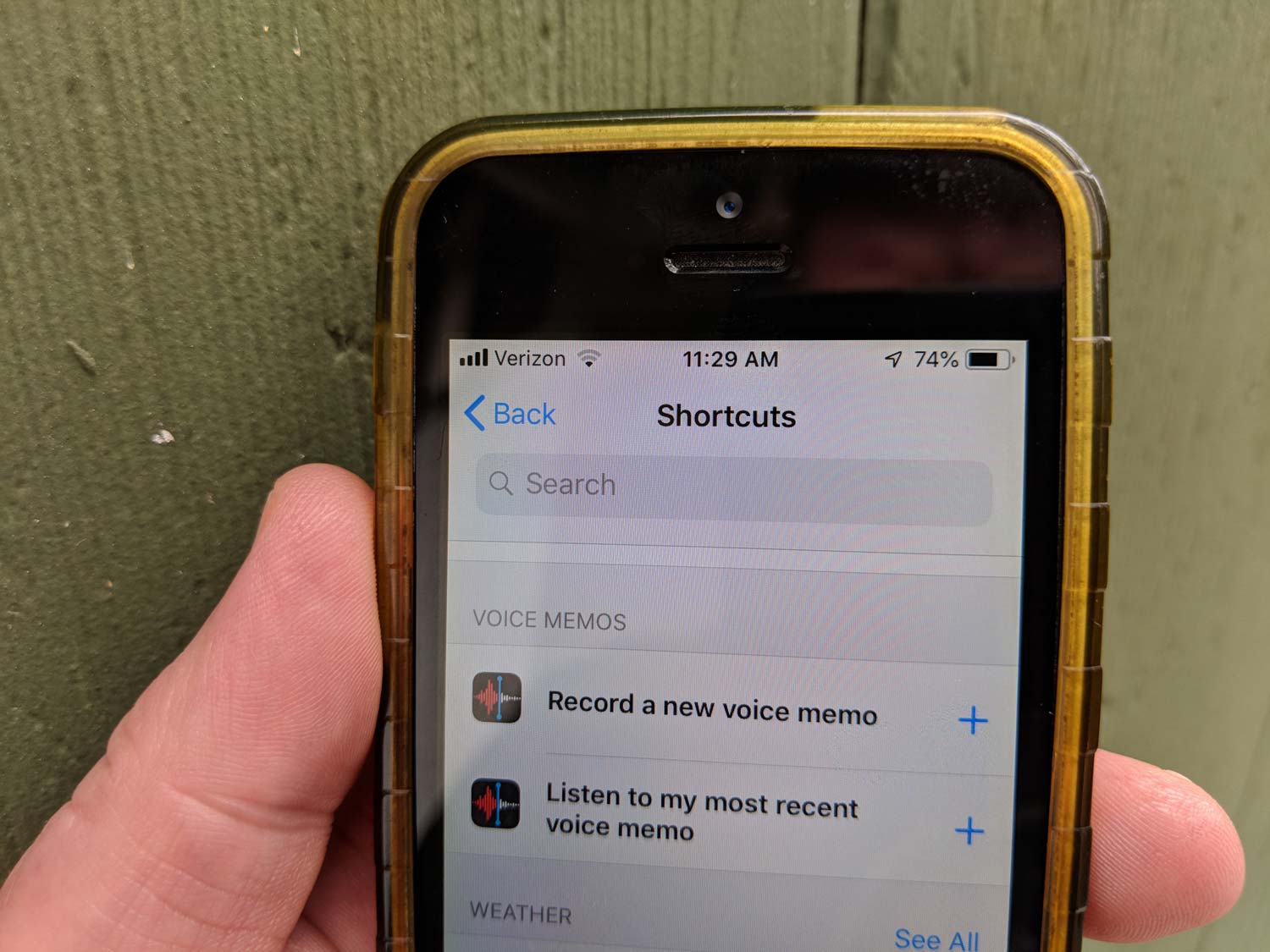
Apple's Siri assistant is frequently the punch line of jokes, and for good reason. As an AI assistant, it's lagged behind a bunch of its competitors. But with iOS 12, Siri is going to make life easier for iOS users, thanks to the new Siri Shortcuts feature, which watches what regular tasks you perform on your devices and then suggests that you create quick shortcuts to perform those tasks.

The feature is still in its early days, but imagine having your phone pop up a button that places a FaceTime call to your mom on Sunday afternoons, since that's generally when you call her. That's useful, and Siri Shortcuts will eventually be able to do that sort of thing.
If you're more ambitious, you'll be able to open the Settings app and directly assign voice triggers to various shortcuts, letting you build your own personal rapport with Siri. It's one way to be sure that Siri will do what you want when you tell it to.
The Shortcuts app will let you create amazingly powerful shortcuts by chaining system and app features together to execute them with a single voice command.
And for the most ambitious power users, the new Shortcuts app — now also in beta testing by Apple — will allow the creation of amazingly powerful shortcuts by chaining various system and app features together and letting them be executed by a single tap or voice command.
Last week, I built a shortcut that helped me generate a couple of dozen charts for my website with one tap by taking a PDF out of Numbers, converting it, cropping it into a bunch of smaller images, resizing those images and uploading them to a remote web server.
iOS devices have been as powerful as traditional PCs for a few years now, but the mobile operating systems have limited the ability for users to maximize their full potential. Tools like Shortcuts begin to allow more dedicated users to truly harness that power. It's exciting, and I think it's going to be a big boost for iOS productivity.
Security gets easier
Apple's made it easier than ever to keep your stuff safe and secure in iOS 12 — and that's good, because often, the biggest enemy of security is our inherent laziness. Start with the new AutoFill feature, which will suggest strong passwords when you sign up for websites and store them in your Keychain for use later. If iOS offers to invent a password for you and then store it for later use, why not take it up on the offer?
Then, there's the support for third-party password managers in iOS 12. While Apple's stuff is now strong enough that I think most users could get by with using only Keychain, if you use an app like 1Password, you'll be able to enter that information without switching apps or triggering a Share Extension.
New iPad gestures are a mixed bag
As a heavy iPad Pro user, I regret to report that the changes in gestures in iOS 12 are a mixed bag. On the whole, it was a good idea to move the Control Center to the top-right corner of the iPad screen, the same location as on the iPhone X. (Presumably, this presages a new, notched iPad Pro this fall.)
As a heavy iPad Pro user, I regret to report that the changes in gestures in iOS 12 are a mixed bag.
The consistency of the interface is a benefit. But it's also nice to give Control Center its own space, and I've found that the adjustment of my screen's brightness is much more effective now, since I can see more of the content my iPad is displaying and therefore better gauge whether my screen is too bright, too dark or just right.
That said, the iPhone X-inspired change to the "swipe up from the bottom of the screen" gesture is ... not great. The difference between swiping up to display the Dock, swiping up to bring up the multitasking switcher and swiping up to return to the home screen (again, presumably presaging a home-button-less iPad Pro this fall) is so subtle that I get the gesture wrong more often than I get it right. Something needs to be tweaked here, or iPad users are going to be pulling their hair out this fall.
Bottom Line
After using iOS 12 for a few weeks, my devices are more secure, less irritating and more powerful. These are developments that augur well for this fall's final release.
Sign up to get the BEST of Tom's Guide direct to your inbox.
Get instant access to breaking news, the hottest reviews, great deals and helpful tips.
Jason Snell was lead editor of Macworld for more than a decade and still contributes a weekly column there. He's currently running the Six Colors blog, which covers all of Apple's doings, and he's the creative force behind The Incomparable, a weekly pop culture podcast and network of related shows.
