Meet the Ibis: A Tech-Savvy Timepiece You’ll Actually Want to Wear
While most smartwatches attempt to simulate a smartphone experience on your wrist, the Ibis puts style first with an elegant curved display and premium wristband.
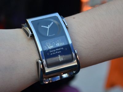
One of the major hurdles holding back today’s smartwatches is that they don’t look like something you’d actually want to wear. Pebble attempted to combat that concern with its Pebble Steel, but a startup from Finland is basing the entire concept for its watch on aesthetics—dubbing its Ibis as “smart jewelry” rather than a smartwatch.
MORE: Smartwatch Face-Off: Pebble vs. Sony SmartWatch vs. Galaxy Gear
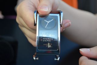
Creoir Ltd., which has previously designed mobile devices for companies such as Nokia, introduced its Ibis smartwatch concept at Mobile World Congress 2014. The watch that we saw during our demo wasn’t a working prototype, but it gave us a general idea of what the Ibis will look like when it launches. The wrist-worn device pairs a beautiful stainless steel band with an elegant curved watch face, which consists of a small LCD touchscreen situated below an analog clock. The watch is just a concept at the moment, but Creoir is working with a partner to brand it and bring it to market.
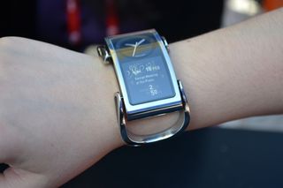
The band on our demo unit sported a slick chain-linked design reminiscent of jewelry and luxury timepieces. The Ibis felt a bit heavy to wear on our wrist, but it’s a welcome trade-off given its classy construction. In terms of design, the Ibis’ wristband appeared to be geared toward female shoppers, but Creoir says that users will be able to replace the watch face to use other bands as well.
MORE: Samsung Gear 2 vs Galaxy Gear: What's Changed?
The user interface is simple and stripped down since the watch offers basic functionality. The Ibis will be able to display notifications, text messages and calls from your mobile device, but it’s not meant to simulate a smartphone experience on your wrist. It will also function as a remote control for your phone, meaning you would be able to switch through music tracks by swiping left or right.
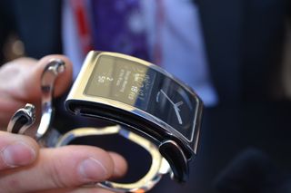
Like most smartwatches, the timepiece is capable of connecting to your handset via Bluetooth 4.0 and is equipped with an ambient light sensor, an accelerometer and an e-compass. Essentially, the Ibis offers functionality similar to that of the Pebble, except the Pebble platform is packed with a slew of third-party apps. Creoir’s approach is to simply forward notifications from your phone to your wrist rather than focusing on apps.
Sign up to get the BEST of Tom's Guide direct to your inbox.
Get instant access to breaking news, the hottest reviews, great deals and helpful tips.
Although the Ibis we saw wasn’t functional, we played with the UI on a separate watch-sized touchscreen. Creoir says the UI is based on Android with a custom skin, but the watch will be available with iOS devices as well. The home screen consists of your notifications presented in an amalgamation of cursive script text, which is an attractive and refreshing approach.
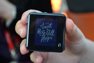
Since it doesn’t show message previews on the home screen, onlookers won’t be able to peer at your notifications when your watch lights up. You interact with the Ibis entire ly through touch, and swiping in all four directions reveals different notifications. For example, we swiped to the left to see email, to the right to see text message previews, and down to see upcoming meetings in our calendar.
There’s no telling when the Ibis will launch or how much it will cost, we’re expecting to see a premium price point to match its high-end design. While it won’t offer the array of features you’ll find on other smartwatches, such as the Gear 2’s ability to make phone calls, we’re still excited to see a smartwatch that puts style first.
Lisa Eadicicco was a staff writer and editor for Laptop Mag and Tom's Guide. Her articles have also appeared in MSN, AOL, The Independent, Time Magazine, and many more. She is now Senior Tech Correspondant for Business Insider, covering Apple products and other gadgets.
-
Rachelle2227 The only problem I have with these smart watches is they are clunky no matter how pretty you make them. This watch is lovely, but it looks like it bulges out a lot and will look weird on a small wrist, which I have. My watches have to be small so they look good on my wrist and under long sleeves, which I wear almost all the time. What I would like to see is two designs of each smart watch. One smaller so girls with smaller wrists would actually wear them. Also, though this is probably too soon, something that hugs the wrist closely.Reply
