Huawei Mate 20 Hands-on Review: A Notch Above
The Huawei Mate 20 proves that you can have a notch and make it look good. The triple cameras and 7-nanometer Kirin 980 CPU look good, too.
There was an air of mystery surrounding the Huawei Mate 20 when I got the chance to go hands-on with the device recently. The phone is launching alongside its attention-grabbing bedfellow, the Huawei Mate 20 Pro, and while that handset will arrive in myriad countries, the Mate 20 will be a little more limited in its scope.
If it does land where you live, however, that doesn’t mean that this is a phone that should be overlooked.There are a number of features here that steer away from what the Mate 20 Pro offers but while some of the design changes mask lower specs, they are sometimes for the better.
I would even go as far to say that the look and feel of the device is, whisper it, nicer than the more premium Mate 20 Pro. Here's my hands-on impressions so far of the Mate 20.
Huawei Mate 20 Cheat Sheet: What's New?
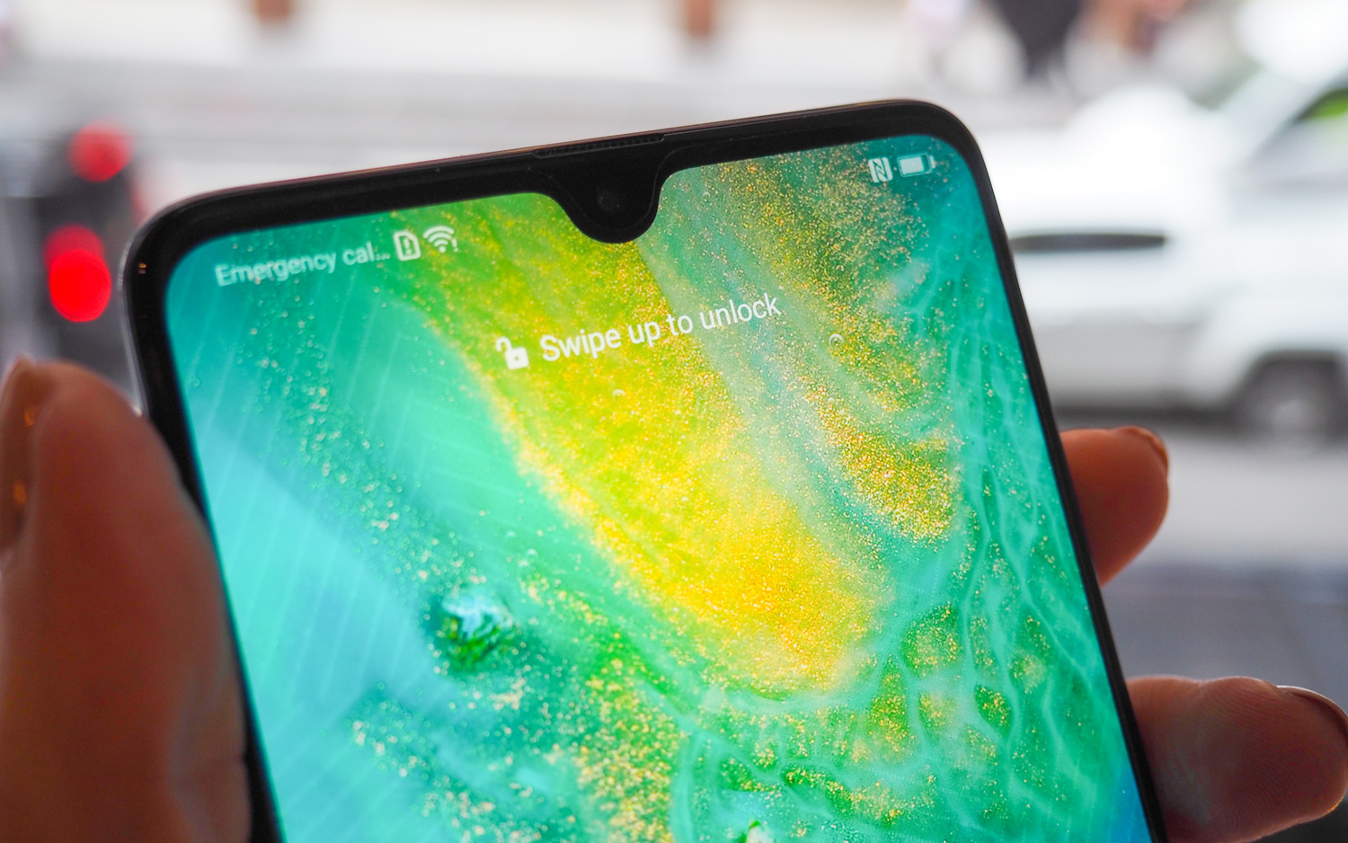
- The Huawei Mate 20 comes with a new ‘dewdrop’ shaped notch.
- Unlike the Mate 20 Pro, the Mate 20 comes with a 3.5mm headphone jack.
- The phone uses the Kirin 980 chipset, the first 7-nanometer chip on an Android phone
- Android Pie is the OS of choice, and Huawei’s EMUI 9.0 OS overlay has been streamlined.
- There is a triple camera setup on the back, in the shape of a square.
Design: Dewdrops and Hyper Optical Patterns
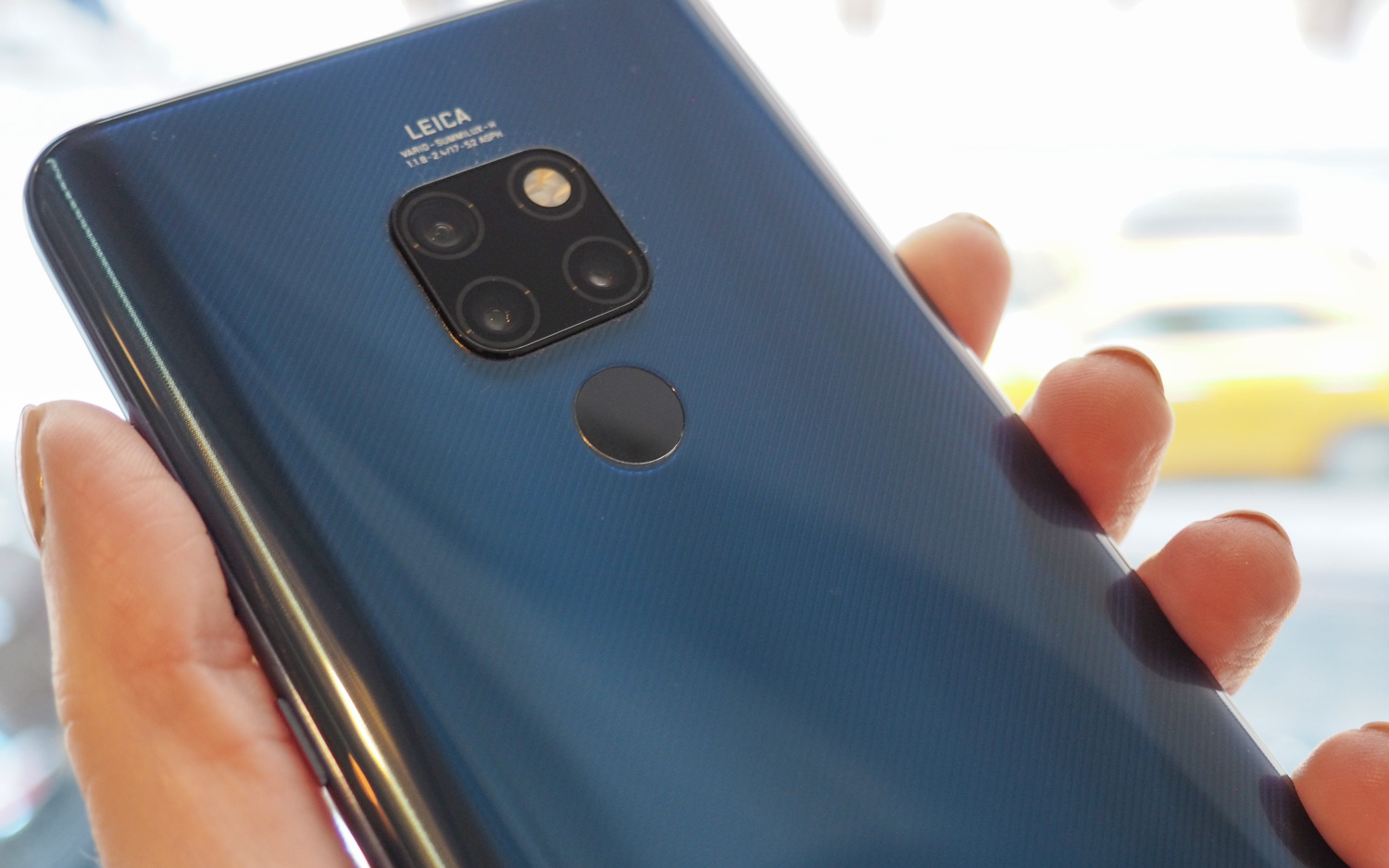
I love the design of the Huawei Mate 20… and I also love the design of the Huawei Mate 20 Pro. They are two of the best-looking handsets on the market right now but they tackle the look of a smartphone in a very different way.
While some of the design cues are more or less the same - the square camera array, color ‘on’ button - the Mate 20 does away with the curved screen and the reduced dewdrop-style notch is simply adorable. It sits atop the screen, a small droplet that compliments the screen, rather than branding it.
The lack of a curve on the screen does introduce a bezel on the device, but it’s a look that suits.
The Mate 20 I played with was the smooth Twilight version of the Mate 20, which did attract my fingerprints and was partial to a smudge or two, but there is another chassis variant called Hyper Optical Pattern Display.
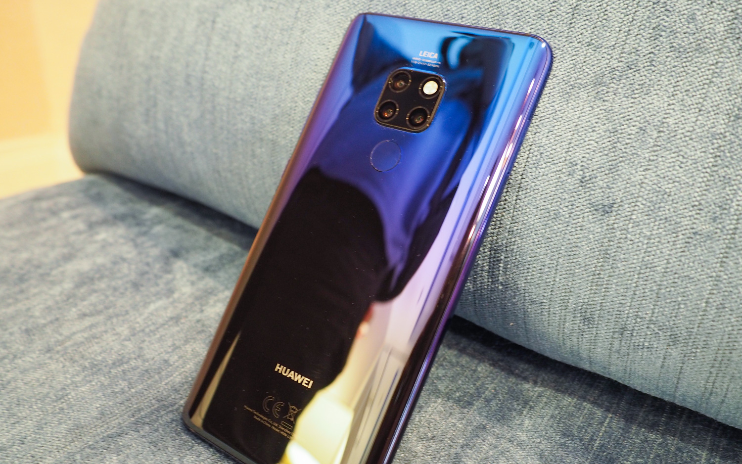
This adds some texture to the device, with the idea that it gives you better grip when holding the phone. There are ridges on the back of the chassis and it sounds like vinyl when you rub your nails across it. Run your finger over the back, however, and it just feels like smooth glass.
The other big form factor change compared to the Mate 20 Pro is the fingerprint sensor on the back. It’s not the prettiest of things but, ergonomically, it hits the right spot when gripping the device.
Huawei Mate 20 Specs
| Price | TBD |
| CPU | Kirin 980 |
| RAM | 4GB, 6GB |
| Storage | 128GB |
| Display | 6.53-inches LCD (2244 x 1080) |
| Rear cameras | 12-MP main (f/1.8), 8-MP telephoto (f/2.4), 16-MP (f/2.2) |
| Front camera | 24-MP (f/2.0) |
| Battery | 4,000 mAh |
| Water resistance | IP53 |
| Colors | Pink Gold, Midnight Blue. Emerald Green. Twilight, Black |
| Size | 6.2 x 3.03 x 0.33 inches (158.2 x 77.2 x 8.3 mm) |
| Weight | 6.7 ounces (188 grams) |
Display: Big, but not OLED
The Mate 20 packs a big display at 6.53 inches, compared to the Mate 20 Pro’s 6.39 inches. Those looking for OLED will be disappointed as this is an LCD panel with a resolution of 2244 x 1080, compared to the Mate 20 Pro’s luscious OLED with 3120 x 1440 pixels.
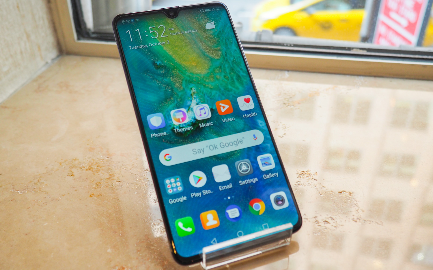
Because of the difference in notches and chassis, the ratio of the screen is also a little different - it has an 18.7:9 screen ratio, which is the same as the Huawei P20 Pro. The Mate 20 Pro comes with a 19.5:9 screen ratio, like the iPhone XS.
Battery: All-day endurance and super-fast charging
The Mate 20 has a slightly smaller battery than the Mate 20 Pro (4,000 mAh instead of 4,200 mAh) but it’s clear that you should at least get a whole day’s use out of this device. This is the same size battery as is found in the Note 9 and that impressed us when we tested it.
The 22.5-watt Super Charger should get your around 58 percent charge in 30 minutes. When it comes to wireless charging that clocks in at around 15 watts.
Camaras and chips: AI smarts and ultra close-ups
The big change here from the P20 Pro is that the monochrome lens is no more. Huawei prompted me to try the monochrome setting and try and tell the difference and I must admit it was pretty negligible. Still, it’s a lens photographers loved so it will certainly be missed on the device.
What you do get is a lens setup that’s not as powerful as what is seen on the Mate 20 Pro. You have a 12-MP f/1.8 main lens, an 8-MP f/2.4 telephoto with 2x optical zoom and a 16-MP f/2.2 ultra-wide-angle camera with autofocus.
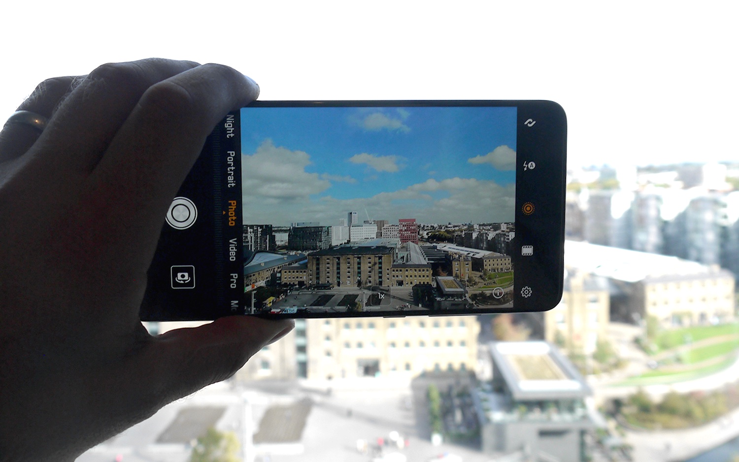
It’s a shame that the 3x optical zoom couldn’t be fitted on the Mate 20 but the 2x zoom worked well and the AI smarts made sure that pixelization wasn’t really a thing when zooming closer into a subject. Flip to the front and there’s a 24-MP f/2.0 lens.
Huawei has increased the amount of scenes the camera AI can recognize to a mind-boggling 1,500. It is fun to watch the camera roll through the scenes when you get close to an object or point it to the sky, it’s almost as if you can see the camera thinking what to do in front of your eyes - Huawei has called this tech Master AI 2.0.
A big draw of the camera actually has to do with the Kirin 980 chip (more on this in a bit). This chip allows for much more refined in-camera processing and allows real-time effects when recording video. This includes a bokeh effect that looked decent in our brief time with the phone.
The Kirin 980 chip that’s powering the Mate 20 can do tricks like this now because it uses something called dual neural processing units (NPUs). Like the iPhone XS’ A12 processor, this is a 7nm chip that can take the power up or down, depending on the task. The chip also allows some better power efficiency - check out the Huawei Mate 20 hands-on review for more on this.
EMUI 9.0: Streamlined and refined
I normally go for a purer Android experience but Huawei is insistent that it wants to make its EMUI interface work. It’s certainly made some small but significant changes that make the UI a lot more user friendly.
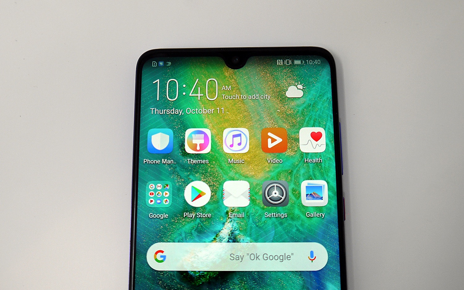
The big change here is that a lot of consolidation has happened. Where before you would find yourself wading through different menus or it would take two clicks instead of one to get to simple tasks, Huawei has refined this and knocked 10 percent out of the items listed in settings.
The speed of opening up apps has been improved, too, by 47 percent, when compared to the Mate 10.
It felt like a more refined experience, but we will have to try it in anger to get more of a rounded experience.
One nice touch is that Google Lens-like functionality has been added to the Mate 20. Using HiVision, you can now point cameras to landmarks, paintings and food, and get more information. The camera will also help you count your calories, just by shining your camera at the device it will estimate the size of the food for you and count calories off the back of that.
Of course, the software wouldn’t be complete without a big dollop of mindfulness - time management is now on the Mate 20. You get access to a usage dashboard, total time limit and something called ‘wind down’ mode, which will turn the screen to grey and minimize interruptions before bed.
Outlook
If you are looking for a pure Android phone, then the Mate 20 isn’t for you. It still uses a UI overlay that will be frustrating for some, but at least this time it has been streamlined.
Software aside, the look and feel of this phone is simply fantastic. Granted, you don’t get the curved look that’s on the Mate 20 Pro. And you'll miss out on in-screen fingerprint scanning.
But the Mate 20 boasts a headphone jack (still a big draw for phones), a dewdrop notch that’s one of the best we have seen and it’s packing impressive camera and computational power.
Sign up to get the BEST of Tom's Guide direct to your inbox.
Get instant access to breaking news, the hottest reviews, great deals and helpful tips.
Marc Chacksfield is Director of Shortlist Media and Editor-In-Chief of Shortlist. He's been a technology and entertainment journalist for 15 years and was previously UK Editor In Chief at Tom's Guide, TechRadar and Digital Camera World. He's also written for the likes of T3 and Tom's Hardware. In his spare time he tries to play guitar, PlayStation and supports Chelsea.
