Tom's Guide Verdict
Even with a striking design and stellar performance, the HTC U12+ can't measure up to top Android phones.
Pros
- +
Beautiful design
- +
Great performance
- +
Excellent cameras
Cons
- -
Frustrating buttons
- -
Below-average battery life
- -
Relatively dim LCD display
Why you can trust Tom's Guide
Powerful performance. Four amazing cameras. Damn near perfect design. HTC created a beautiful device with the U12+, which is almost better than it has any right to be.
But absolutely awful pressure-sensitive buttons and lackluster battery life prevent this phone from being a must-buy, and without carrier retail availability, the U12+ probably won’t threaten Samsung’s Galaxy S9.
Price and Availability
The U12+ is available to unlocked in the U.S. on HTC's website and Amazon. A 64GB version comes in Translucent Blue and Ceramic Black for $799, and a 128GB option in Translucent Blue is $849.
The phone is compatible with AT&T, T-Mobile and Verizon's networks, but will not be available to buy through a carrier.
Design: No. 1 stunner
As every smartphone maker under the sun follows the notch design trend set by Apple's iPhone X, it's refreshing to see a flagship phone in 2018 that goes its own way. What's troubling is how the buttons feel (hint: not like buttons at all).
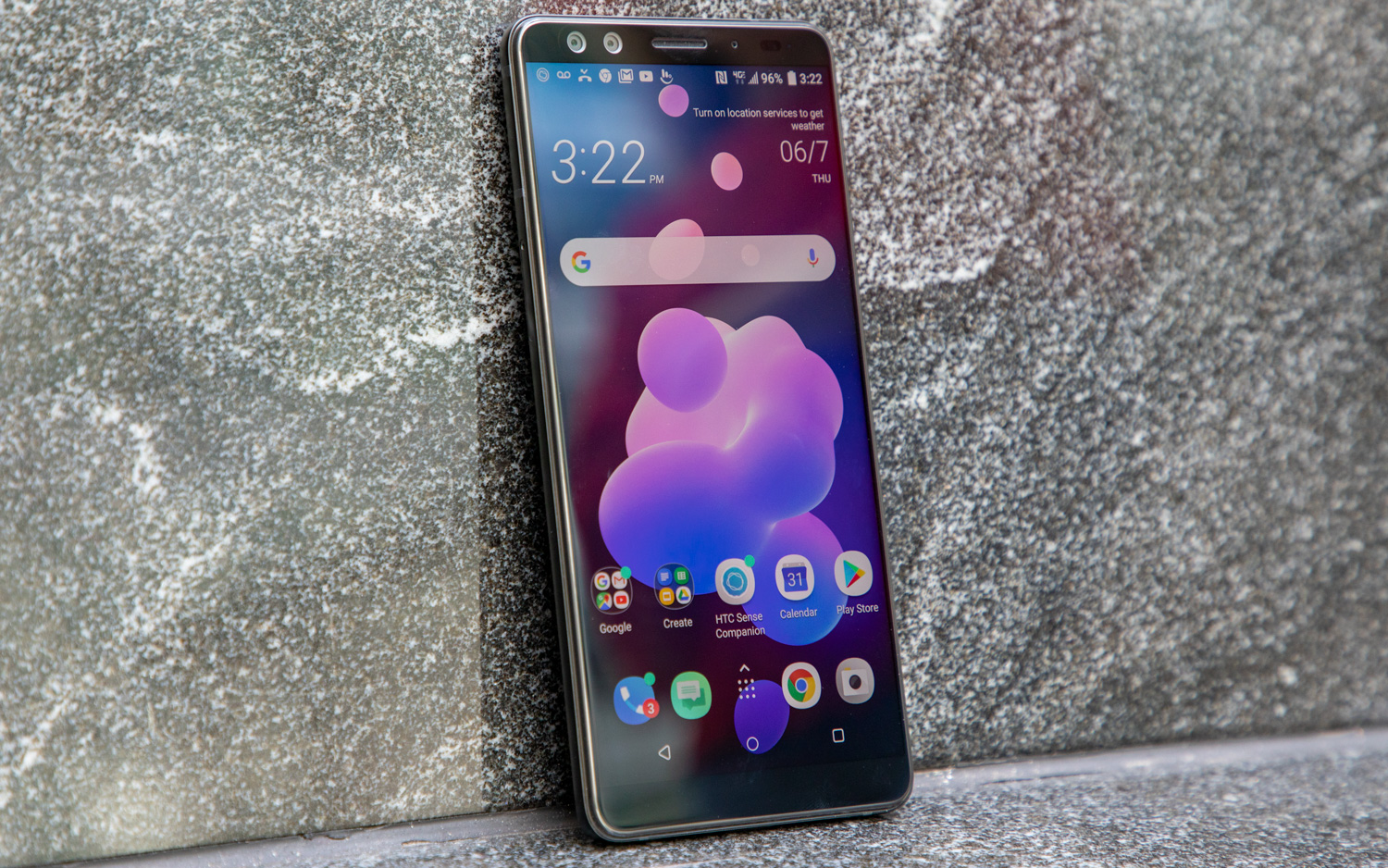
HTC's new flagship eschews a notch at the top of its screen in favor of slim bezels surrounding its Gorilla Glass-coated display. The screen's forehead houses the phone's earpiece and two front-facing cameras for face unlocking and portrait selfies. The chin is a little thick, given that it's unused by even a logo, but we can forgive the wasted space.
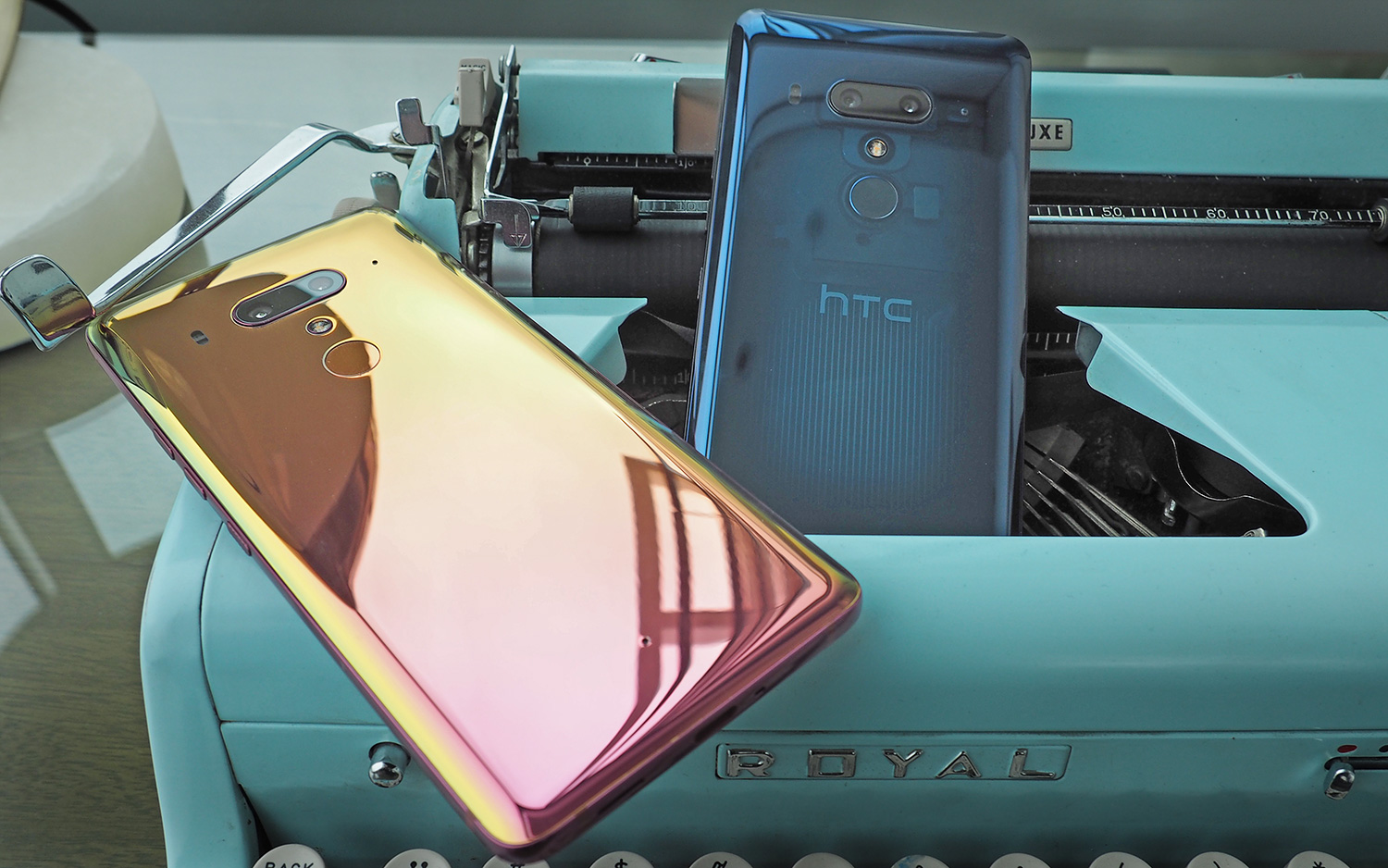
The U12+ really shines when you turn it over to admire the Liquid Surface design. The phone comes in three shades: Ceramic Black, Translucent Blue and Flame Red. The black option is forgettable, but the latter two are standouts.
The Translucent Blue HTC U12+ offers a glimpse into the phone's components. There's nothing else like this on the market right now.
For this review, I used the blue model, which is a transparent slate-cobalt color that offers a glimpse into the phone's components. There's nothing else like this on the market right now. The Flame Red, which isn't available in the U.S. yet, looks pink in some angles and gold in other light, just like fire.
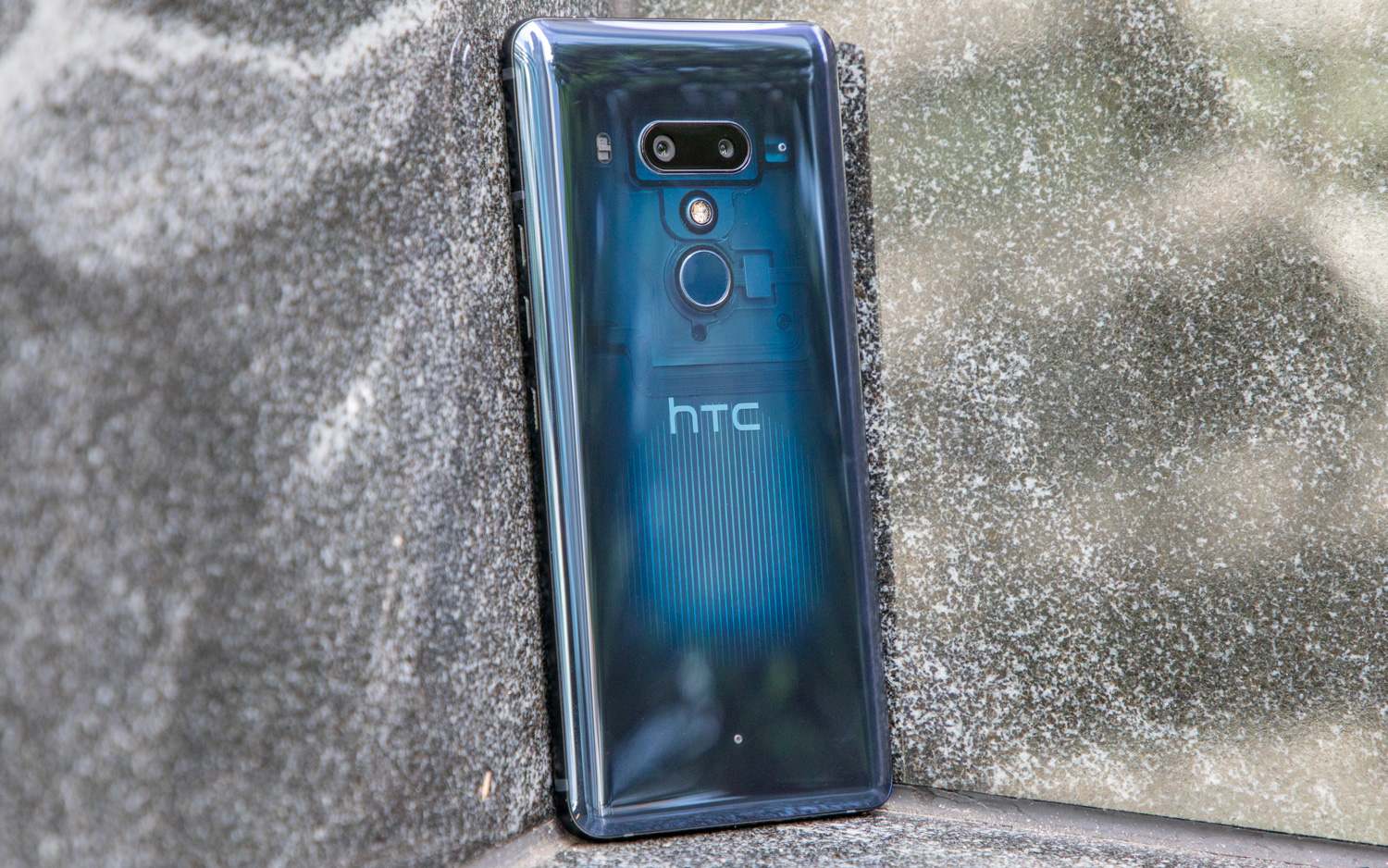
It’s refreshing to see that HTC is still trying to woo buyers with high design, even after Google acquired its smartphone-engineering team.
Who OK'd these buttons?
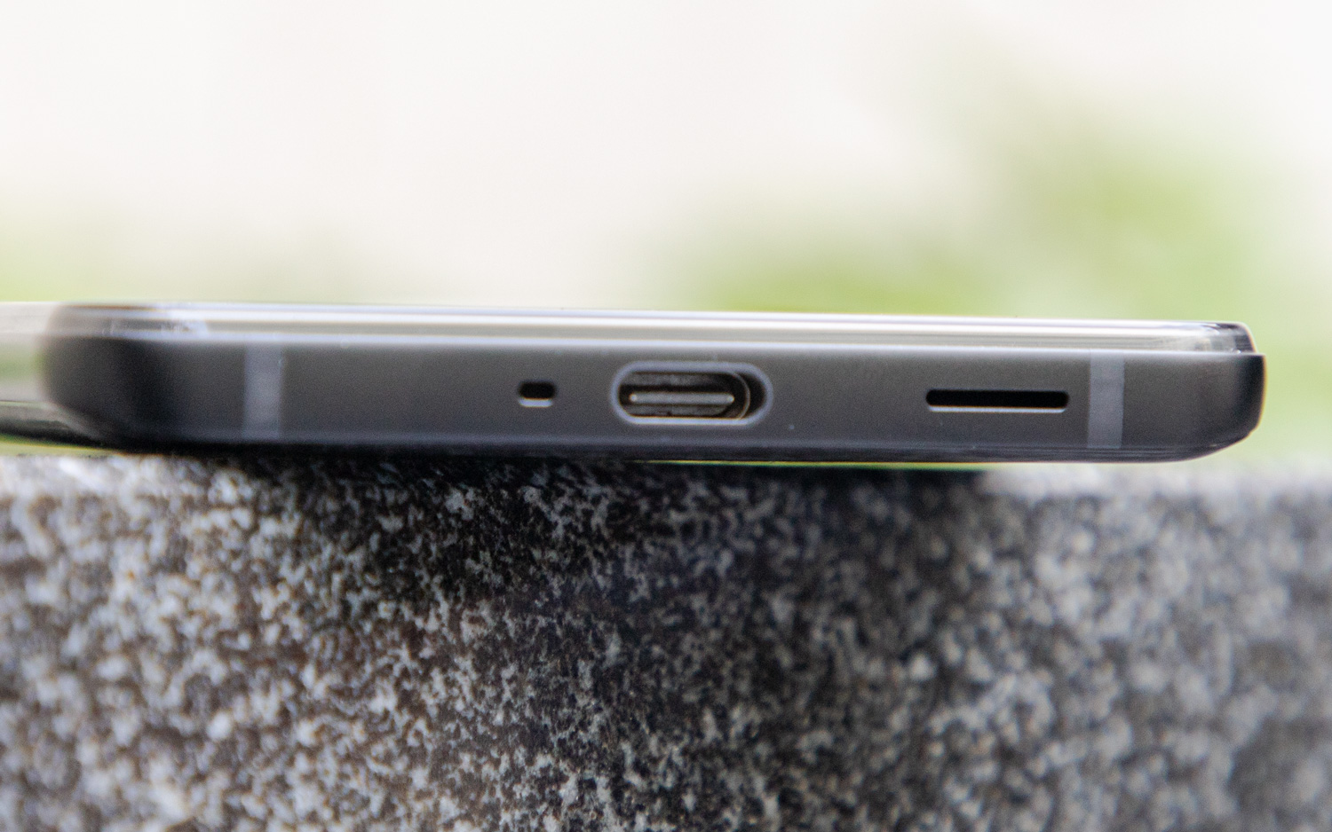
There's one major flaw in the phone's design, though. Its volume and power buttons look like mechanical buttons, but don't depress when you push them. You feel a click when you press down, but the buttons don't actually move, which is a disorienting sensation that I never got used to during my time with the U12+.
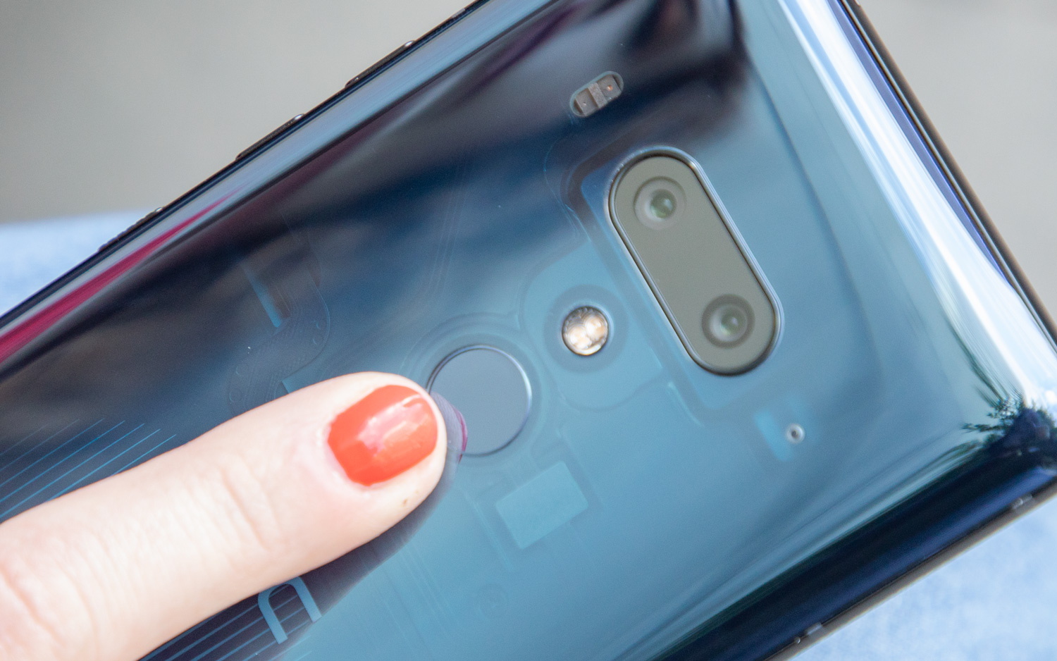
The power button is particularly sensitive to touch, so I would accidentally put the phone to sleep while trying to use the device's Edge Sense squeeze controls (more on those later). If HTC had chosen mechanical buttons instead of these, the U12+ would be one of the best phones of the year.
Display: No notch, but not great
Unfortunately, the U12+ fails to impress when you flip it over to use its 6-inch display.
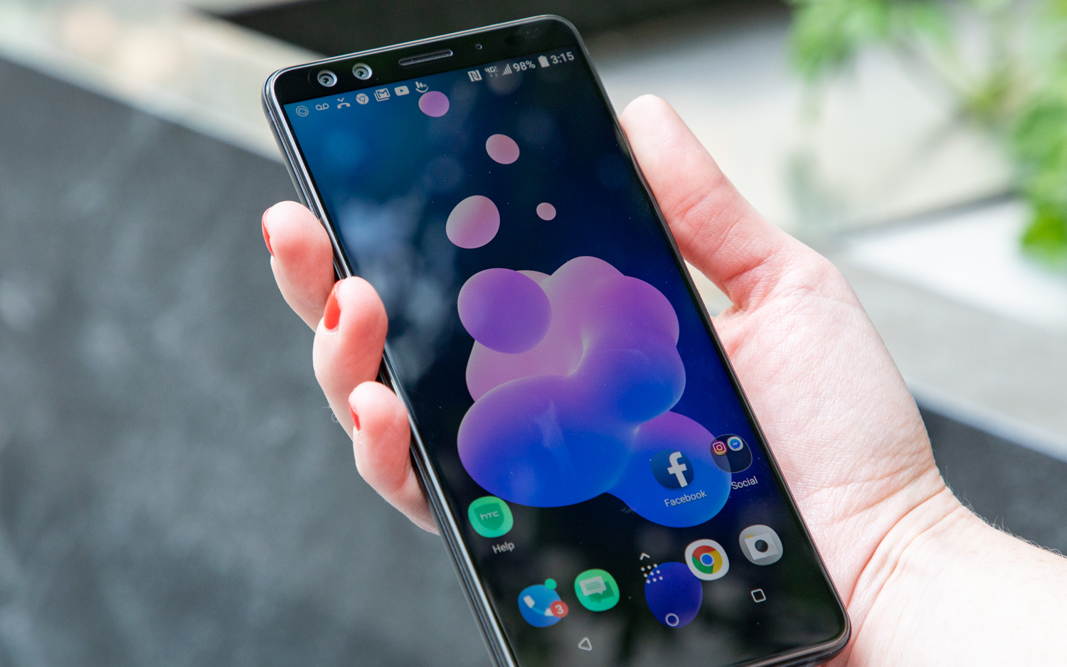
HTC's latest isn't as bright, rich or colorful as rival Android flagships, even those that also have LCD screens. In fact, this panel doesn't even match the one on last year's U11.
I streamed a trailer for the Halloween reboot on the S9+ and U12+ side-by-side and found the U12 was much dimmer, with brightness bumped up to the max on both displays. Michael's Halloween mask gleamed white on the S9+, and the black of night was much richer as he prowled the streets terrorizing Jamie Lee Curtis.
LCD panels tend to be brighter, even if their colors aren't quite as true to life. Yet the U12+ reached a peak brightness of just 389 nits on our light meter, far short of the U11 (512 nits), Samsung's Galaxy S9 (603 nits), Galaxy S9+ (630 nits) and the G7 ThinQ (a whopping 900 nits).
With brightness turned all the way up, the screen was visible in bright sunlight, but it wasn't as easy to read text or see the preview of an image in the camera app on the U12+ as on the G7 ThinQ, for instance.
The U12+ fares better when it comes to reproducing the sRGB color gamut, covering 131.9 percent compared with the 138.8 percent covered by the G7 ThinQ, which also sports an LCD panel. The Galaxy S9 and S9+, which both offer incredible OLED displays, cover 220 percent and 231 percent, respectively. The U12+ also offers a setting to switch between sRGB and DCI-P3 color profiles. You can also adjust the color range and saturation so that it's warmer or cooler depending on your preference.
MORE: 10 Reasons Android Beats the iPhone
The U12+'s display was true to life when it comes to color accuracy, with a Delta-E score of 0.27 (numbers closer to 0 are better). To compare, the U11 scored 0.34 and LG's G7 ThinQ scored 0.37.
Software: Your main squeeze
The U12+ is shipping with its own Sense UI layered over Android 8.0. Sense isn't radically different from stock Android, and HTC has ditched the Sense Companion voice-activated assistant it created to compete with Google Assistant in the U11. The U12+ supports Google Assistant and Amazon's Alexa.
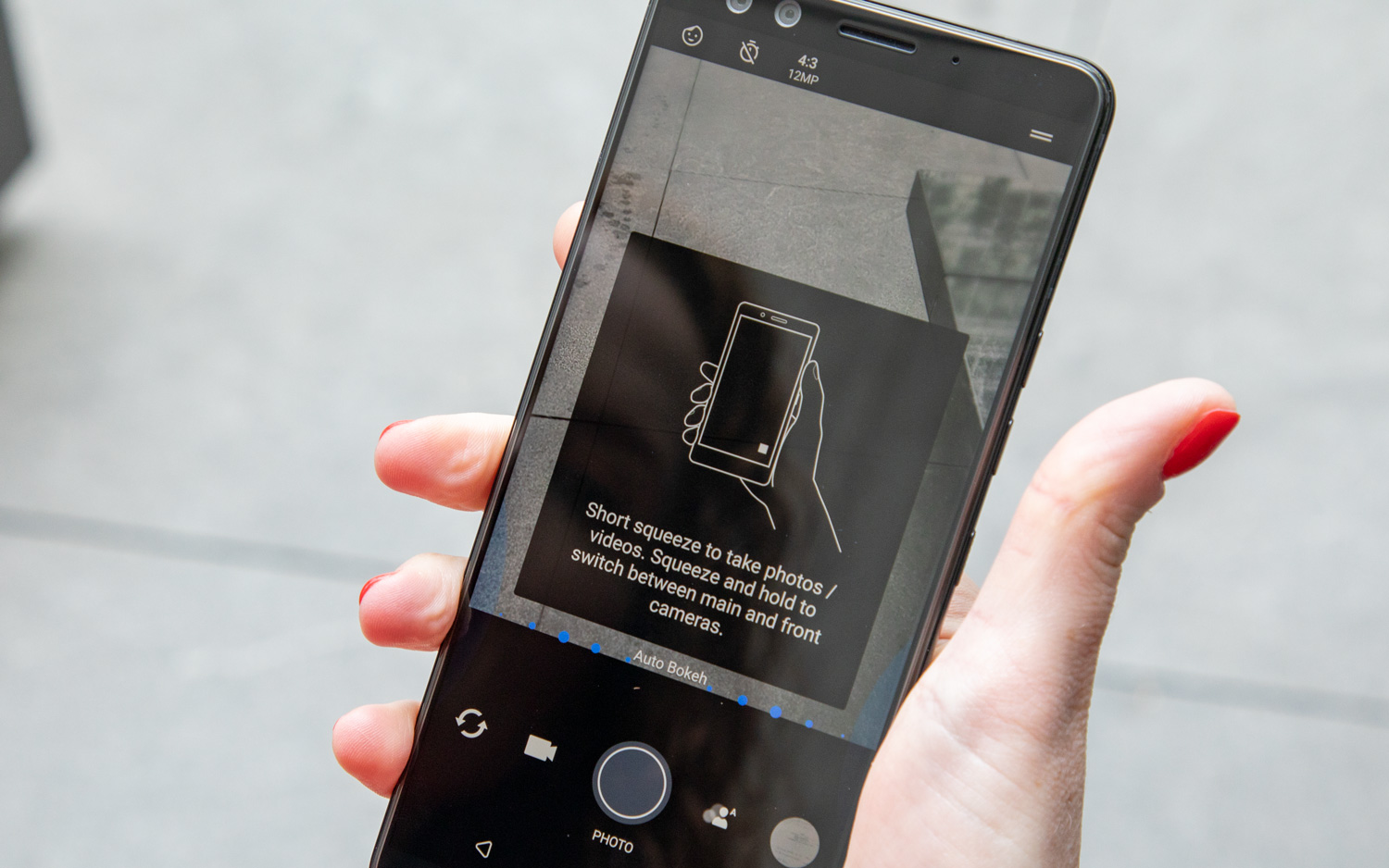
This time around, HTC is upping the ante with the second generation of Edge Sense, its squeeze-driven navigation tool.
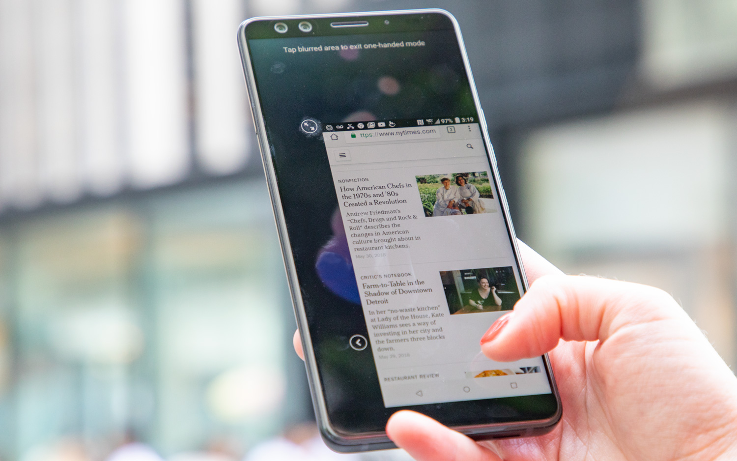
First, you set up your squeeze-force level — how hard you have to press to trigger an action — by squeezing your phone with your preferred pressure level three times. To test it, the device prompts you to squeeze to fill up a balloon, then release the pressure to launch it. You then test the double-tap feature, which pins a mini window to the bottom right or bottom left of the display for easier one-handed use.
I am torn over the usefulness of a squeezable phone. Some of the Edge Sense gestures are incredibly useful and others I never remembered to use.
Edge Sense's default settings are a short squeeze to launch the Camera app, a double tap on the side frame for one-handed mode and a holding gesture to keep your phone in portrait mode as you lie down to read. Most phones will automatically flip to landscape mode if you hold them sideways, but this Edge Sense gesture prevents that from happening. You can assign other actions for all but the holding gesture in Settings > Edge Sense.
MORE: Android Tips to Unlock Your Phone's Full Potential
I am torn over the usefulness of a squeezable phone. Some of the Edge Sense gestures, like keeping the phone in portrait orientation as I lay down to mindlessly browse the internet, were incredibly useful. Others, like squeezing to call up the Camera app, I never remembered to use.
Camera: Are four lenses overkill?
With two cameras in front and two on the back of the device, the U12+ is a capable shooter that offers crisp details in outdoor light. It's not the best smartphone camera you can buy, but it's near the top of the heap.
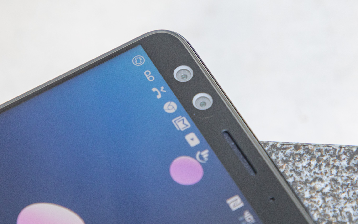
The 12-megapixel wide-angle main lens and 16-MP telephoto secondary shooter on the rear of the HTC U12+ create gorgeous, true-to-life shots, in both regular and portrait mode.
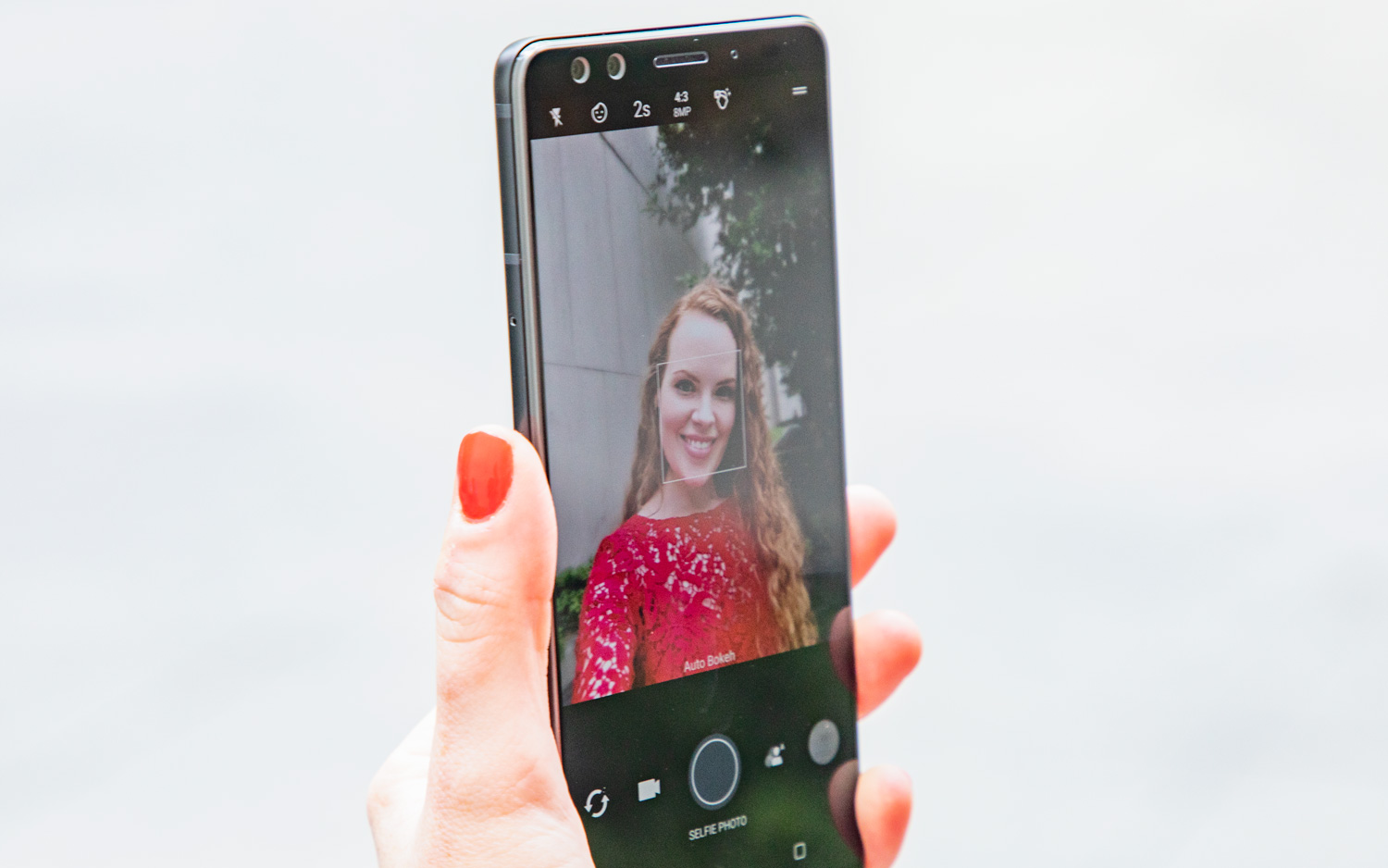
The bokeh effect, which blurs the background and brings the subject into focus, can be used in auto or manual modes, so the camera can do all the work or you can control the amount of blur. (These modes are also available in the front-facing camera.)
To see how the U12+ compares to similar phones, we pitted it against LG's G7 ThinQ, which uses artificial intelligence to optimize the camera settings depending on what you're shooting. In a shot of the New York skyline beyond Bryant Park, the U12+ was the clear winner. The color of the overcast sky was more true to reality; the contrast of the library against the sky was more pronounced; and you could more easily see the details in the blades of grass compared with the G7, which saturated the sky and lawn but failed to bring out the scene's details.
But the G7 edged out the U12+ in side-by-side shots of the same flower bed. The hot pink petals were more brilliant and the leaves more emerald in the G7's shot versus the U12+, though the U12+ image was slightly more accurate.
I prefered the U12+ to the Galaxy S9+, which also sports a dual-lens camera, when I shot a dripping ice cream cone outside my favorite sweets shop. The contrast of the honeycomb ice cream trickling down the pretzel cone and the richness of the chocolate were more evident in the U12+'s shot, compared with the S9+'s.
Two lenses create a better depth effect for front-facing portrait selfies, but it turns out you don't need two front-facing cameras to pull that off. The S9+, with its lone front-facing lens, did a better job of capturing the color of my hair and lipstick than the two lenses in the U12+.
Performance: Pretty great
The U12+ is more than just a pretty face. The device packs in powerful flagship performance, thanks to 6GB of RAM and the latest Snapdragon 845 processor. Over about a week of use, I found HTC's newest phone to be perfectly responsive, handily navigating multiple browser tabs, apps, maps, games and more.
As I traversed through fields, hid inside empty houses and picked off enemies on a mission to obtain more weapons in PUBG Mobile, the U12+ never stuttered. The phone did grow warm as I neared a half hour of play, but that was a sign I needed to stop defending my territory and head to bed.
The U12+ scored 4,562 on 3DMark's Sling Shot Extreme OpenGL ES 3.1, a test of graphics performance, just shy of Samsung's Galaxy S9+ score of 4,634. The U12+ exceeded the LG G7 ThinQ's performance (4,201).
On Geekbench 4, which measures overall system performance, the U12+ scored 9,014, besting the impressive score of 8,295 posted by the S9+. The U12+ also easily outscored the G7 ThinQ (8,566). Only the OnePlus 6 equipped with 8GB of RAM turned in a better score among Android phones.
MORE: The Best Cellphone Plans for Families and Individuals
In a real-world test of processing power, exporting a 2-minute 4K video file in Adobe Premiere, the U12+ took 3 minutes and 13 seconds. The device was faster than the Galaxy S9 (3:29) and the G7 ThinQ (3:16) but fell short of the Galaxy S9+ (2:32). No Android phone can quite match the iPhone X and its A11 Bionic processor here, as Apple's phone handles this task in 42 seconds.
HTC U12+ Specs
| Price | $799 (64GB), $849 (128GB) |
| Display (Resolution) | 6-inch (2880 x 1440) LCD |
| Rear Camera | 16-MP (f/2.6) main lens and 12-MP (f/1.75) wide-angle lens |
| Front Camera | Dual 8-MP (f/2.0) lenses |
| CPU | Snapdragon 845 |
| RAM | 6GB |
| Storage | 64GB, 128GB |
| microSD | Yes, up to 2TB |
| Battery | 3,500 mAh |
| Battery Life (Hrs:Mins) | 9:13 |
| Colors | Ceramic Black, Flame Red, Translucent Blue |
| Size | 6.16 x 2.9 x 0.38 inches |
| Weight | 6.63 ounces |
Battery Life: Underwhelming
Smartphone battery life is becoming a more important consideration for buyers, and this is where HTC continues to underperform compared with its competition. On the Tom's Guide Battery Test — continuous web surfing over T-Mobile’s LTE network — the U12+ clocked in at 9 hours and 13 minutes. That's 37 minutes less than the smartphone average of 9:50, which isn't going to cut it in 2018. The Galaxy S9+ lasted 10:59, and the smaller S9 is almost as good, at 10:52.
The U12+ doesn't even live up to its predecessor, the U11, which clocked in at 9:38. It does outlast LG's similarly priced G7 ThinQ, which endured for 8:35. HTC's latest release does support quick-charging, with a Quick Charge 3.0 cable included in the box that can juice up your phone from 0 to 50 percent in 35 minutes.
MORE: 5 Ways to Improve Your Android Phone's Battery Life
Wireless charging seems like a no-brainer for a flagship at this price, but unfortunately, the U12+ doesn't offer that, despite its glass back. If this phone had more impressive battery life, we could more easily overlook its other flaws.
Bottom Line
The U12+ reaches for a high bar with excellent cameras, powerful performance and beautiful design, but falls short where it matters for many potential buyers with frustrating buttons, underwhelming battery life and a duller-than-average display. The fact that it's not available to order through carriers and is only on sale online makes the U12+ an even tougher sell.
For just $40 more, you can snag Samsung’s Galaxy S9+, which sports similar specs (including 6GB of RAM, 64GB of storage and a Snapdragon 845 processor) with a larger, more brilliant 6.2-inch display. Plus, you'll get real buttons.
HTC's design and engineering teams helped create Google's best phones, and with that team headed off to Google to build future Pixels, it's tough to see where HTC’s mobile efforts go from here.
Credit: Tom's Guide
Caitlin is a Senior editor for Gizmodo. She has also worked on Tom's Guide, Macworld, PCWorld and the Las Vegas Review-Journal. When she's not testing out the latest devices, you can find her running around the streets of Los Angeles, putting in morning miles or searching for the best tacos.
-
darkomaledictus Can you please stop putting sensational titles in your notifications? Unless HTC is going out of business a review about their latest phone does not entitle a title : "HTC is toast: This is the last nail in their coffin".Reply
Starting to treat these articles like spam and will unregistered if it doesn't stop! -
franki.hauptle Those buttons must be really really bad for an otherwise outstanding phone to get 6/10. 30 minutes battery life is not a huge amount off the galaxy and as you said... The screen is more colour accurate but not as vibrant. The idea of the buttons sounds good. Perhaps the settings just need tweaking.Reply -
crazygreekdude Sounds to me that if you are hitting the power button while trying to user edge sense that is a You problem. This is clearly user error just like all the other reviewers who can not activate double tap using edge sense by lightly tapping. It's pressure sensitive so a tap doesn't work you need to press!Reply
Who holds their phone so far up that you are at the power button. What we really should be complaining bout is Samsung. The power button opposite sides of the volume rocker. Now that is bad design. Trying to adjust volume and accidentally pressing the power button at the same time because of its location.
