HTC U Hands-on: Is Its Beauty Just Skin Deep?
The upcoming HTC U is an absolutely gorgeous phone, but its mish mash of features leave us wondering if the overall product is less than the sum of its parts.
HTC quietly announced its most recent phone, the HTC U, less than a week after this year's CES to little fanfare. Now we finally got our hands on it here at MWC 2017, and we're not exactly blown away.
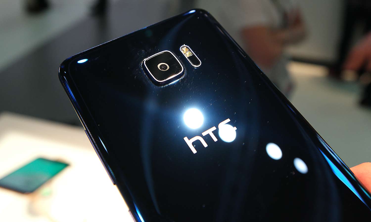
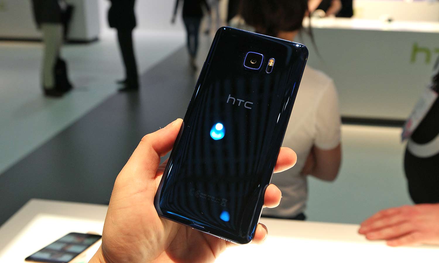
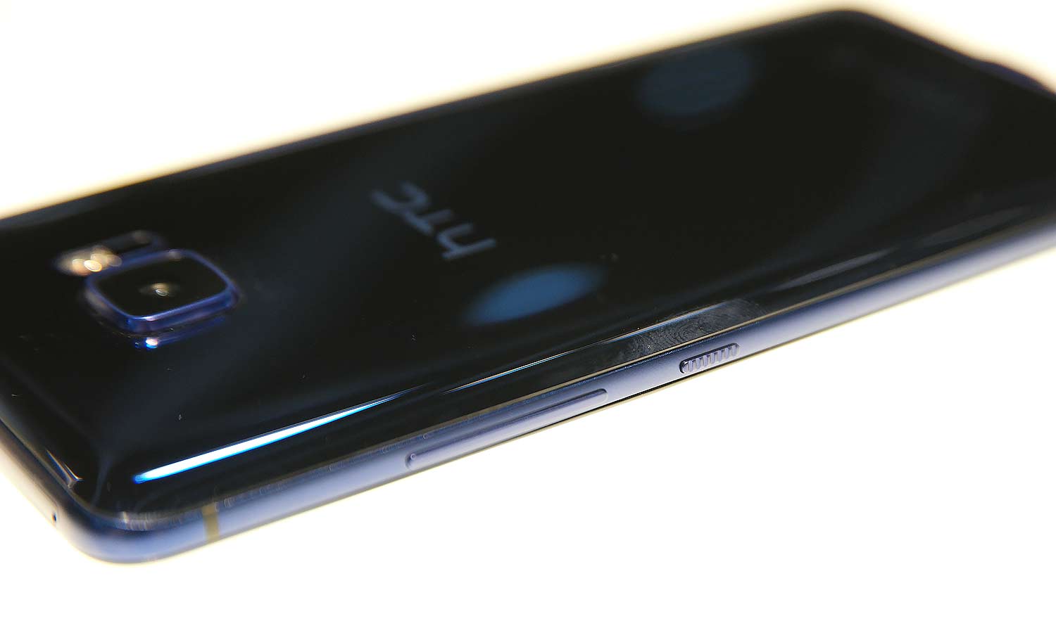
The first thing that strikes you is the U's "liquid metal' back that gives the rear of the phone a jewel-like sparkle. The white model shines with a pearlescent rainbow finish that seems to move as you look at, although I think the blue looks even better with a deep sapphire sheen that reminds you of the ocean.
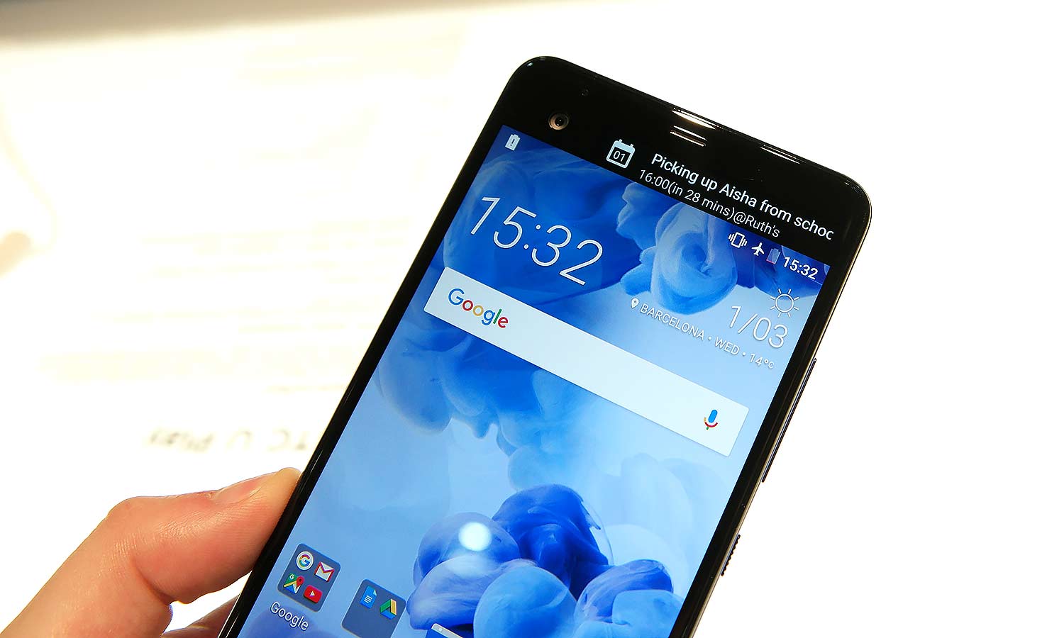
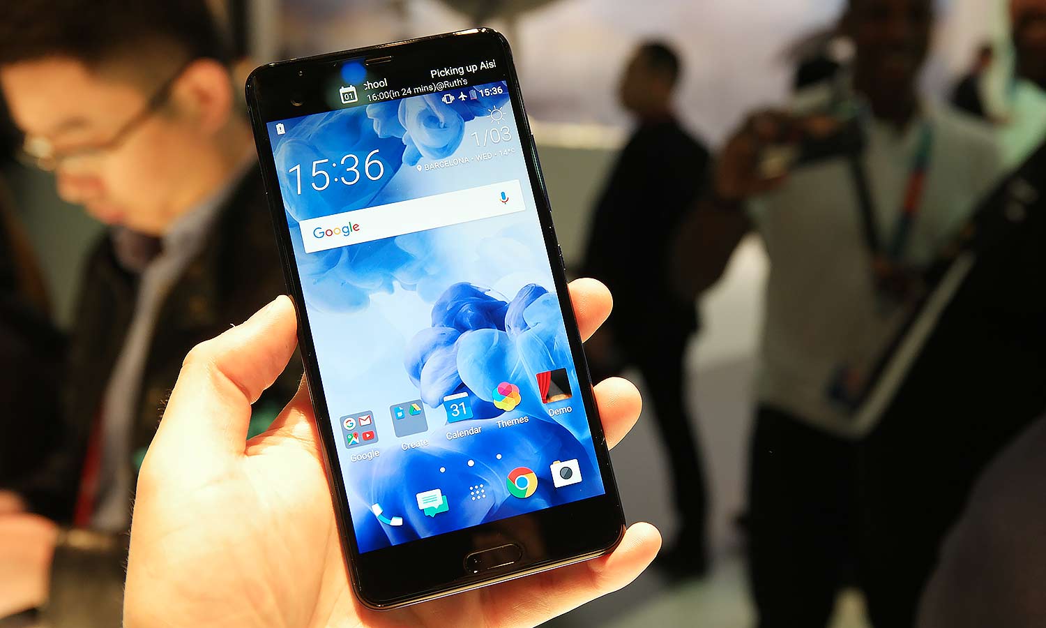
Since I was checking out the more premium U Ultra (there's also a standard U with a 5.2-inch screen), the next thing that caught my attention was the phone's small second screen, which is located above the main 5.7-inch display like it is on LG's V20. It's a nice feature for controlling things like music or or seeing the notifications from the U's built in digital assistant (more on that in a second), but it's hardly a feature that I'm desperate to have.
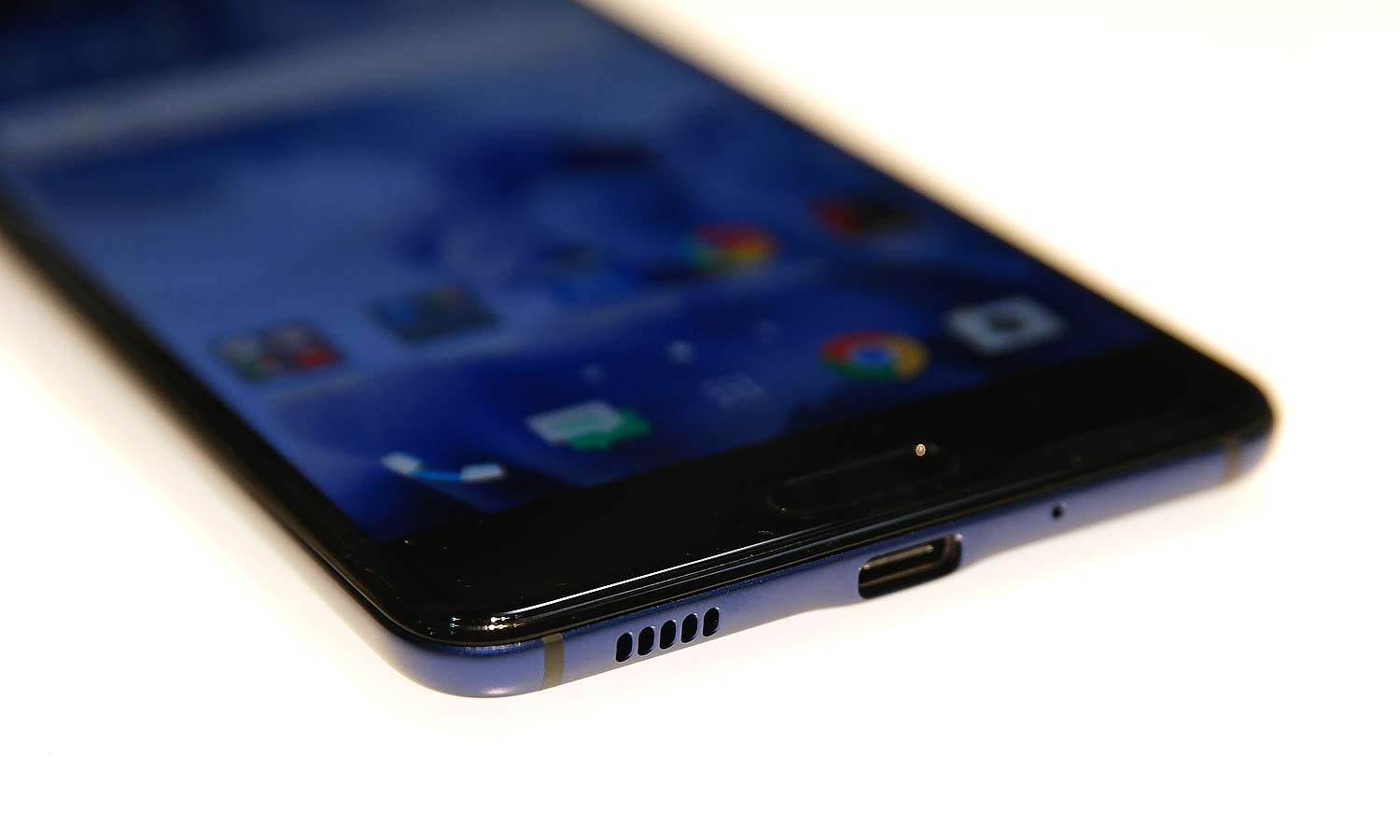
As for the rest of the phone, the Ultra sports a pretty beefy specs on par with other flagships phones (including the recently announced LG G6). You get a Snapdragon 821 CPU, 4GB of RAM, 64GB of built-in storage and a 3,000 mAh battery with Qualcomm QuickCharge 3.0 support. Those hoping for an even speedier Snapdragon 835 chip should probably wait for the Galaxy S8.
The one thing that I didn't get to test is HTC's new Sense Companion digital assistant. Like Siri, Alexa and others, it's designed to help keep track of appointments and learn from your behavior to supply you with handy information when you need it. However, those tips are the kind of things that take time, so that the phone can learn about you.
My big takeaway from my short time with the HTC U is how disjointed it feels. Sure, it's beautiful, but the rest of its features seem like slapdash recreations of highlights from phones that are already available, without any rhyme or reason why they are there. And with HTC's recent announcement that it will cut back on making mid-range handsets in order to focus on flagships, the U seems like a stepping stone to the rumored HTC 11.
While the HTC Sense Companion could be the feature that saves this phone, without the backing of a major tech leader like Google, Apple or Amazon, that's a big if. I guess we'll just have to wait for when we get to a chance to really put the U through its paces.
Sign up to get the BEST of Tom's Guide direct to your inbox.
Get instant access to breaking news, the hottest reviews, great deals and helpful tips.
Sam is a Senior Writer at Engadget and previously worked at Gizmodo as a Senior Reporter. Before that, he worked at Tom's Guide and Laptop Mag as a Staff Writer and Senior Product Review Analyst, overseeing benchmarks and testing for countless product reviews. He was also an archery instructor and a penguin trainer too (really).
