The Pixel 3's Design Is Not Worthy of Android
Google's Pixel 3 looks like the unholy child of an iPhone X and a Samsung Galaxy S9.
We will have to wait for the official release to confirm that this is the Google Pixel 3 but, looking at all the extremely clear photo and video evidence, there is only one molecule of salt left for doubting that this is it. And what a disappointment this is.

From a design point of view, the new Pixel 3 hardware is, at worst, terrible and, at best, not worthy of the clean, elegant design of Google’s Material design language that permeates Android Pie.
In fact, Google’s new phone looks like a Frankenstein hardware experiment made from design elements of the Samsung Galaxy S8/S9 and the iPhone X. There’s the big fat chin at the bottom, which practically no other flagship phone on Earth have now. And on the top there’s the Apple iPhone X signature notch, a design plague that is present in almost every flagship phone out there. Except this one looks much thicker than Apple’s and the rest.
MORE: Google Pixel 3 Release and Spec Rumors
Android Central’s executive editor Andrew Martonik has no problem with the notch. “Sure nobody actively wants a notch,” Andrew told Tom’s Guide via email, “but it's what we have to deal with right now as manufacturers figure out how to shrink bezels.”
But as Android Central writer Russell Holly says, “people who tell you notches are the future and you should just get used to it are wrong, and they should feel bad.” Holly argues that this is only a temporary patch until designers figure out a way to hide the front-facing camera without impacting image quality.
Notch Alternatives
The fact is that the notch is a lazy design solution (one that has been blessed by Apple and its iPhone X’s success). And the fact is that other designers at other companies have already figured out a way to have a full screen phone that reduces bezel to its minimum expression.

Other manufacturers have shown that notches are not the only solution to the “full screen” dilemma.
The Vivo Nex S is a flagship phone that eliminates the notch thanks to a pop-up camera and reduces the chin to its minimum expression while adding under the display fingerprint recognition. It’s a phone that feels from the future, according to our review, but that it is available today.
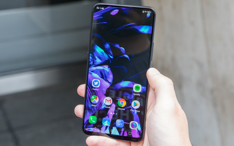
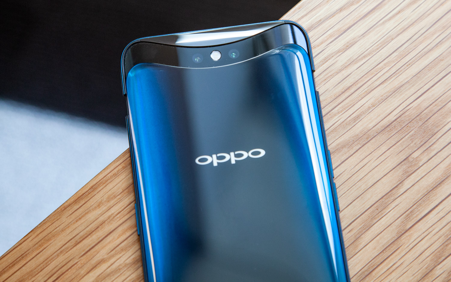
The Oppo Find X, which we just reviewed, also goes the pop-up camera route to deliver a full-screen design without bezels. But in this case the entire top of the phone rises from the body to reveal the front and back camera. It's one of the most stunning designs of the year, and the mechanism is surprisingly quiet.

Another example is the Meizu 16—a company once known for copying everything Apple does—uses the thinnest possible foreheads and chin for a perfectly balanced, symmetric, and elegant design (which perhaps is the reason why all preorders sold out within seconds in China).
And there’s the rumored Xiaomi Mi Mix 3, which looks like another phone from the future that will likely use a pop-up selfie camera as well. Like the Nex S, it has a thin chin and no notch.
MORE: Best Smartphones - Here Are the 10 Best Phones Available
Pixel 3 Reactions: Not good
The user comments about the Pixel 3 design are, as you may expect, not kind. Redditor on r/Android, who are well known to despise the notch perhaps because it’s become the symbol of Apple’s flagship influence in the Android world, have slammed it.
Here's one of many examples, talking about the leaked images and videos: “Google is leaking this on purpose now, so when this phone does finally come out, it doesn't completely sh*t the bed on arrival just based on its ugly look and lack of basic features. It's kinda laughable that this fugly abomination will be the same price as the Note 9.”
On Twitter the reactions have been pretty bad too. Take Windows Central’s senior editor Zac Bowen’s comment, for example: “Pixel 3 XL notch is so ugly the phone comes in the box backwards to hide its shame lol.”
At least the Pixel 3 reportedly supports wireless charging now, based on a new leak.
Martonik disregards the design complains arguing that he’s “far more interested in the improvements in the camera, which seem to be notable” and saying Google's “has never been about flashy hardware” anyway.”
Google's Design Philosophy
In an interview with Fast Company Design this spring, Google's head of industrial design, Ivy Ross, took pride in how the team under her command has successfully placed elegant and simple aesthetics at the core of Google’s hardware design philosophy—as much as the software design team has done the same with the user interface.
It is Ross herself who gives a reason as to why the Google Pixel 3 may have a fat notch and a chin:
“[T]here are some things that are technically capable of being invisible, and they should be invisible, and you should be able to access them in a simple, easy way. But some things can’t be invisible, they need to be shown, or sit somewhere. They should be aesthetic and beautiful and additive to the space. Not subtracting from the space.”
Why Copy Apple?
Ross is exactly right. Which is why it is so jarring to see this design. The notch objectively subtracts from the space—the screen that is the center stage for the user experience—as does the chin. They are not aesthetic or beautiful—and the fact is that, as demonstrated by other manufacturers, they can be avoided.
Google, had it wanted to do it, could have opted for an alternate solution that runs counter to what almost every other Android manufacturer is doing: copying Apple. And perhaps they have opted to do it because it was the easy solution to an specific engineering problem.
I’m sure that the phone, as Martonik points out, will perform as flawlessly as the previous Google flagships. The hardware and the software combination, as we know from the early reviews of stolen units, will offer the purest Android experience out there with amazing processor and camera performance to boot. Still, Android and design fans—myself included—were hoping for something different that didn’t look like another iPhone X clone.
The Google Pixel 3 will be a great phone, perhaps the best Android phone out there. But based on all of the leaks, it will not look the part.
Sign up to get the BEST of Tom's Guide direct to your inbox.
Get instant access to breaking news, the hottest reviews, great deals and helpful tips.
Jesus Diaz founded the new Sploid for Gawker Media after seven years working at Gizmodo, where he helmed the lost-in-a-bar iPhone 4 story and wrote old angry man rants, among other things. He's a creative director, screenwriter, and producer at The Magic Sauce, and currently writes for Fast Company and Tom's Guide.
-
Mocsab I was hoping for more from GOOGLE. The Notch is an ugly distraction that no matter what you do gets in the way of the user experience. it is shocking to me that someone who is supposed to know better would actually refer to their design as "beautiful". Butt Ugly is a better description.Reply -
jouten Samsung is currently the true stalwart of design. I pray that they don't succumb to the notch design! Resist The Notch!Reply -
bobdupuu Do we really need another article about the notch? If Google needs the notch to support the front facing camera, so be it. They could have let the notch run all the way across, but they captured the unneeded space for alert icons, etc. So all you whiners should go out and get one of those "cool" devices with the pop-up camera. What a "great" idea that is. I won't be holding my breath.Reply -
bobdupuu continued. I use for my wallpaper the animated Mars or Moon which has a completely black background. If I showed you my Pixel 2XL you could not even see any notch if there were one.Reply -
vannoodles This person does not know the difference between the Pixel 3 and the Pixel 3 XL. It's obviously just a hit piece. The Google Pixel 3 does NOT have a notch.Reply -
apothercy The Pixel 3 does not have a notch, only the XL does. That's a pretty tremendous argument and kinda means this article isn't worthy of the internet. Do a bit more research before blasting, and I'd update this to inform people that the base phone has no notch.Reply -
Mocsab Reply21258278 said:Do we really need another article about the notch? If Google needs the notch to support the front facing camera, so be it. They could have let the notch run all the way across, but they captured the unneeded space for alert icons, etc. So all you whiners should go out and get one of those "cool" devices with the pop-up camera. What a "great" idea that is. I won't be holding my breath.
if they let the notch run all the way across the top - it wouldn't be a notch. LOL
my question - when watching a movie or any video on a screen with a notch - what benefit does it give me to to have about 1/2 inch (or al ittle less) out of a portion of the screen (the notch) just to give the illusion that the screen is goes all the way to the edge of the phone - it isn't really - the only part of thej screen that does is on either side of the notch - with the Notch area missing cutting that part out of the viewable area of whatever you are watching - it is a horrible way to try to get an infinity screen
I agree with you about the pop up camera - just another moveable part that is bound to eventually break, get clogged or something. What is wrong with having a small black bar across the top for camera and sensors? Samsung has gotten it down to a very small amount of screen space - I don't even mind the chin - I find that it is easier to hold and use the phone in landscape mode if there is some additional space on each end that I can hold or touch without effecting what is playing on the screen. But that;s just me I guess.

