Google Home Hub Hands-On: A Worthy (and Cheaper) Echo Show Rival
Google's smart display has a 7-inch touchscreen and is powered by Google Assistant.
With two versions of Amazon's Echo Show, Lenovo's Google Assistant-powered Smart Display, JBL's Link View, and other smart speakers with screens now on shelves around the world, it was only a matter of time before Google came up with an answer. Enter the Google Home Hub.

At an Oct. 9 press event in New York, Google announced the Google Home Hub, a Google Assistant-powered smart speaker with a display. It's not, as the name might suggest, technically a smart-home hub (that is, it can't connect to smart devices that aren't Wi-Fi enabled). Rather, it's a touchscreen device that you can use to control your smart home, watch videos, or add a visual component to everything Google Assistant can do.
At the launch event, Google outlined a number of the device's most exciting features. For instance, Google Assistant can identify which household member is speaking to it based on their voice, and can show individual reminders and calendars.
And at only $149, it's almost $100 less expensive than the new Echo Show and the larger Lenovo Smart Display; it looks like it's going to be a great, affordable option for smart-home beginners.
MORE: Google Home vs. Amazon Echo: Smart Speaker Face-off

The first thing I noticed about the Home Hub was that it's tiny. While the Echo Show boasts a ten-inch screen, and Lenovo's Display comes in eight- and ten-inch options, Google's device is only seven inches. Rather than a large smart speaker with a screen, it looks very much like a tiny tablet on a stand. But it's very light, and something I'd feel comfortable bringing between my kitchen, bedroom, and living room.
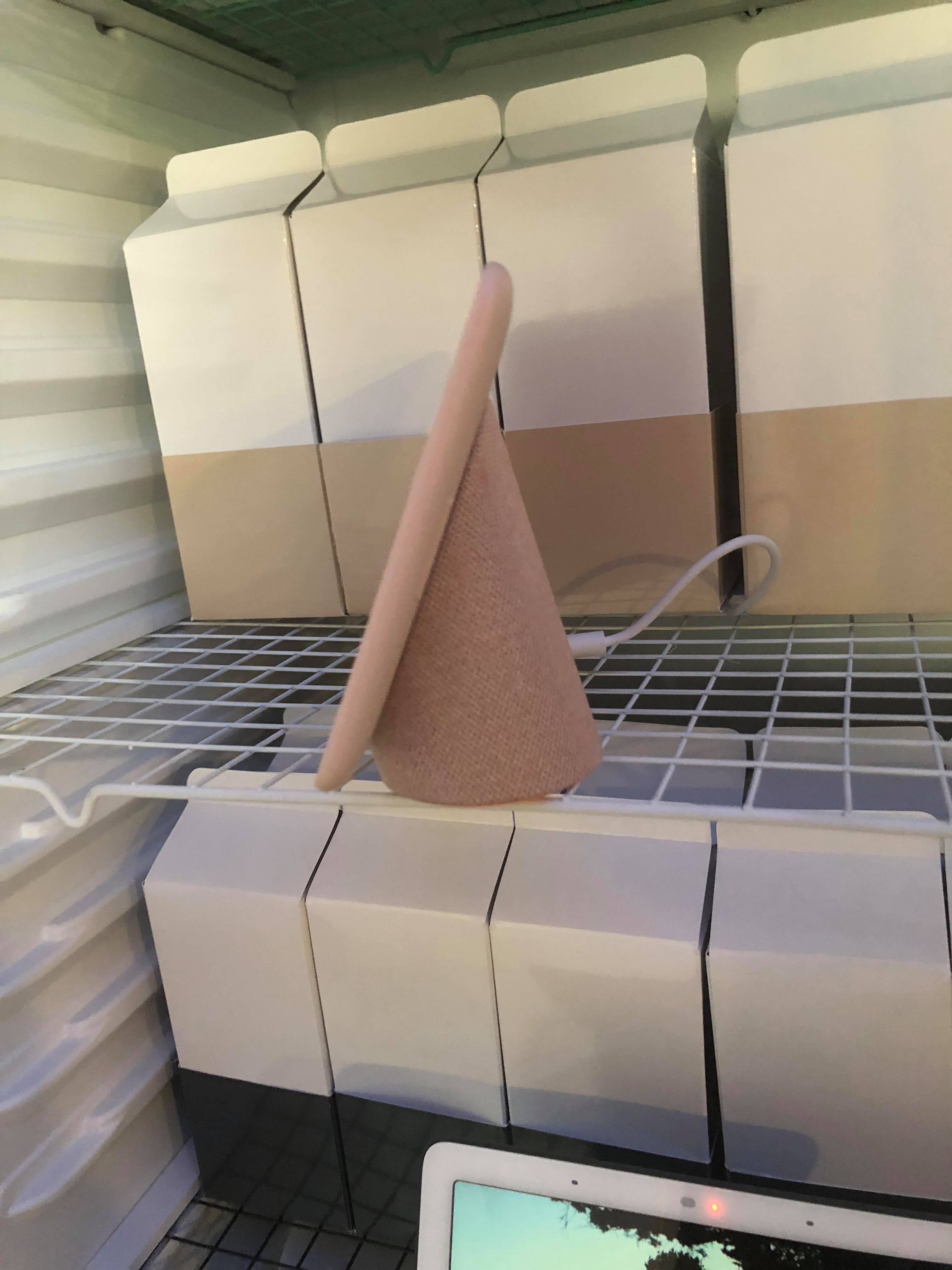
Size aside, it's an elegant device, and the mesh fabric back is reminiscent of the sleek, second-generation Echo Show. It comes in a variety of bright colors (chalk, mint, pink and charcoal), so it should be easy to fit into your home's decor.
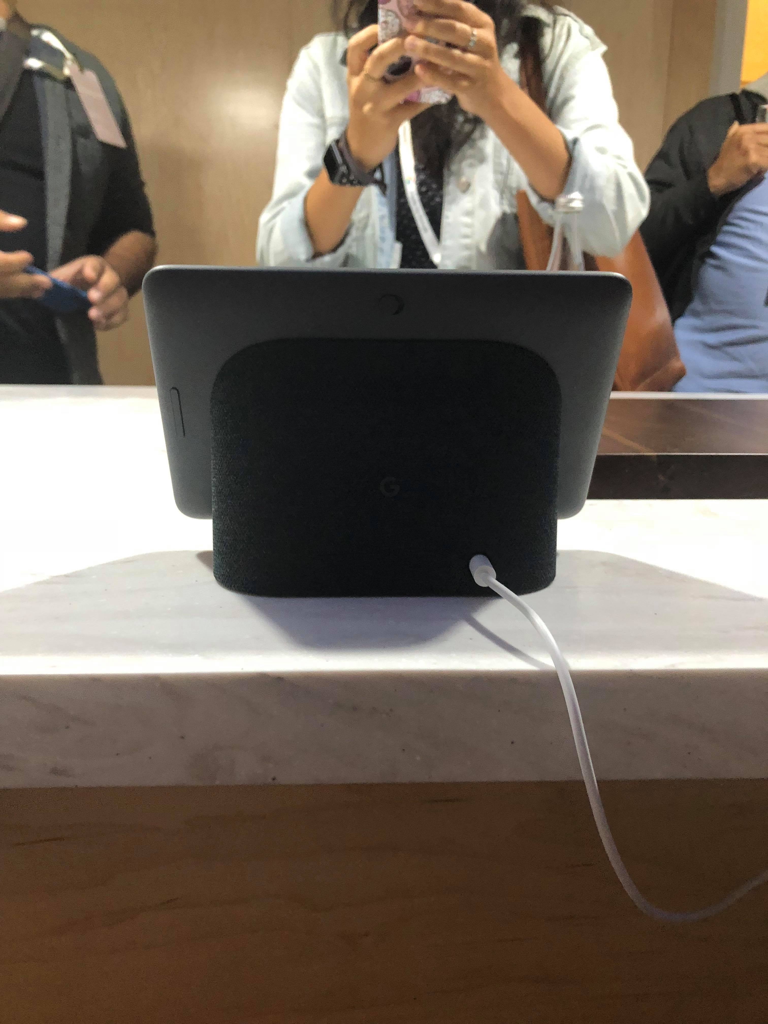
The device is powered by a single USB-C port in the back. A button on its upper backside turns the microphone on and off, and slides easily back and forth. Notably, there's no camera. That's a double-edged sword: You can't video chat with friends, but you also don't have to worry about snoops.
The screen looked pretty dim when I saw it for the first time. However, the Home Hub has a new feature called Ambient EQ that, when enabled, allows the device to tailor its display brightness and contrast to the light of its surrounding area. Once I turned this on, the screen brightened right up, and the glare all but disappeared. This is a welcome change from the Echo Show and Echo Spot, whose screens both kick back substantial glare.

That said, the screen is still small, with noticeable bezels. Watching movies on it felt a bit like watching movies on the back of an airplane seat, and I can't realistically see myself pulling up Netflix or Hulu on this device.
The display is easy to navigate. It's integrated with Google Photos, and cycles through an album of your choice as a screensaver when it's not in use. When you add a new photo, it'll be sent to the Display automatically. Google also said at the press event that only the best photos out of your album will be displayed.
I liked that I was able to operate this device as entirely a touchscreen. While it's nice to be able to navigate with Google Assistant, it's also nice to know that if I need to be quiet at night, or if it's early in the morning and I don't feel like chatting, I can silently swipe through the device. This isn't yet the case with the Echo Show, where you need to call up Alexa to get started.
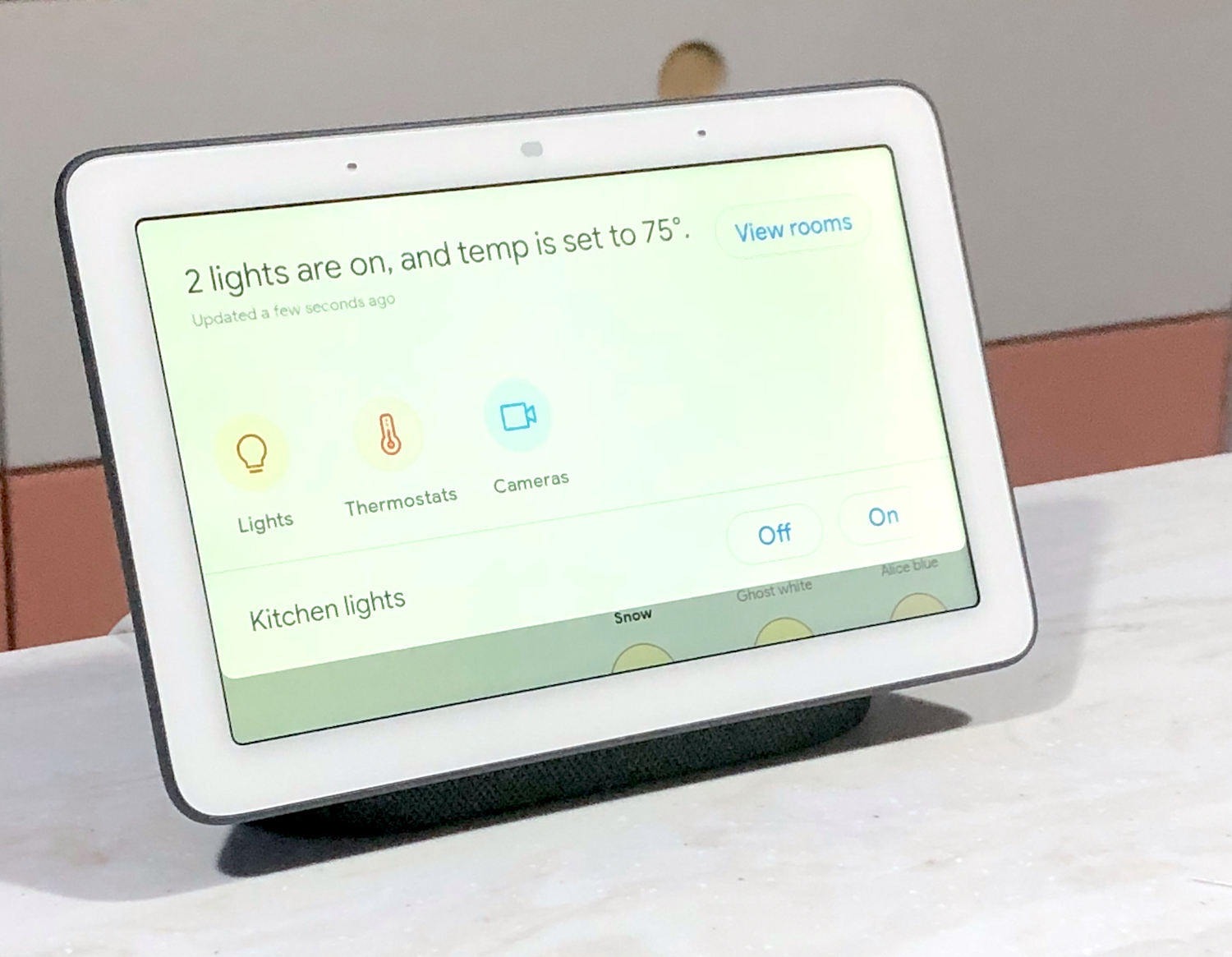
The screen was quick and responsive to my touch. I swiped back and forth through Google Photos. Swiping up from the bottom of the screen brings up a Settings menu, where you can adjust the device's volume and brightness, turn Ambient EQ on and off, and toggle Downtime, Google Assistant's Do Not Disturb mode.
Swiping down from the top brings you into Home View, an overview of your Smart Home. You can check which of your devices are on and off, and control them individually or in clusters. It doesn't look too different from most home-control apps, but it is the type of thing I can see being quite convenient, especially for people who don't carry their phone around the house.
MORE: Our Favorite Smart Home Gadgets and Systems
Finally, YouTube is much easier to access here than it is on the Echo Show. "Hey Google, play music" brought up a YouTube video immediately. "Hey Google, how do I make a smoothie?" did the same. Video-watchers will prefer this to the Echo Show, where you have to pull up YouTube in a browser and then manually search for the video you want.
A Home screen suggests various tasks for you to do, such as setting a timer, playing Google Play Music, or asking for the weather. It's a condensed version of the Explore tab in the Google Assistant app.
However, the Home Hub's audio left a bit to be desired, which isn't surprising, given the size of the device's speakers. While it wasn't hard to hear, it didn't quite fill the small room it was in, even at its loudest volume. Anecdotally, it certainly didn't seem to measure up to the full, booming sound of the new Echo Show, or of Lenovo's Smart Display.
Overall, this isn't an entertainment device. I wouldn't use it to blast music at a party, or to watch Netflix before bed. But if you're a new smart-home owner looking for a device that can group your smart devices in one place, help you cook, set reminders, and add a visual element to Google Assistant's tasks, Google's Home Hub is a smart, sleek, and affordable place to start.
Sign up to get the BEST of Tom's Guide direct to your inbox.
Get instant access to breaking news, the hottest reviews, great deals and helpful tips.
Monica Chin is a writer at The Verge, covering computers. Previously, she was a staff writer for Tom's Guide, where she wrote about everything from artificial intelligence to social media and the internet of things to. She had a particular focus on smart home, reviewing multiple devices. In her downtime, you can usually find her at poetry slams, attempting to exercise, or yelling at people on Twitter.
