How Big Is the Galaxy S8's Screen, Really?
With the advent of new extra-wide screens on the Samsung Galaxy S8, S8+ and LG G6, it's time to take a deeper dive into how much screen you're actually getting.
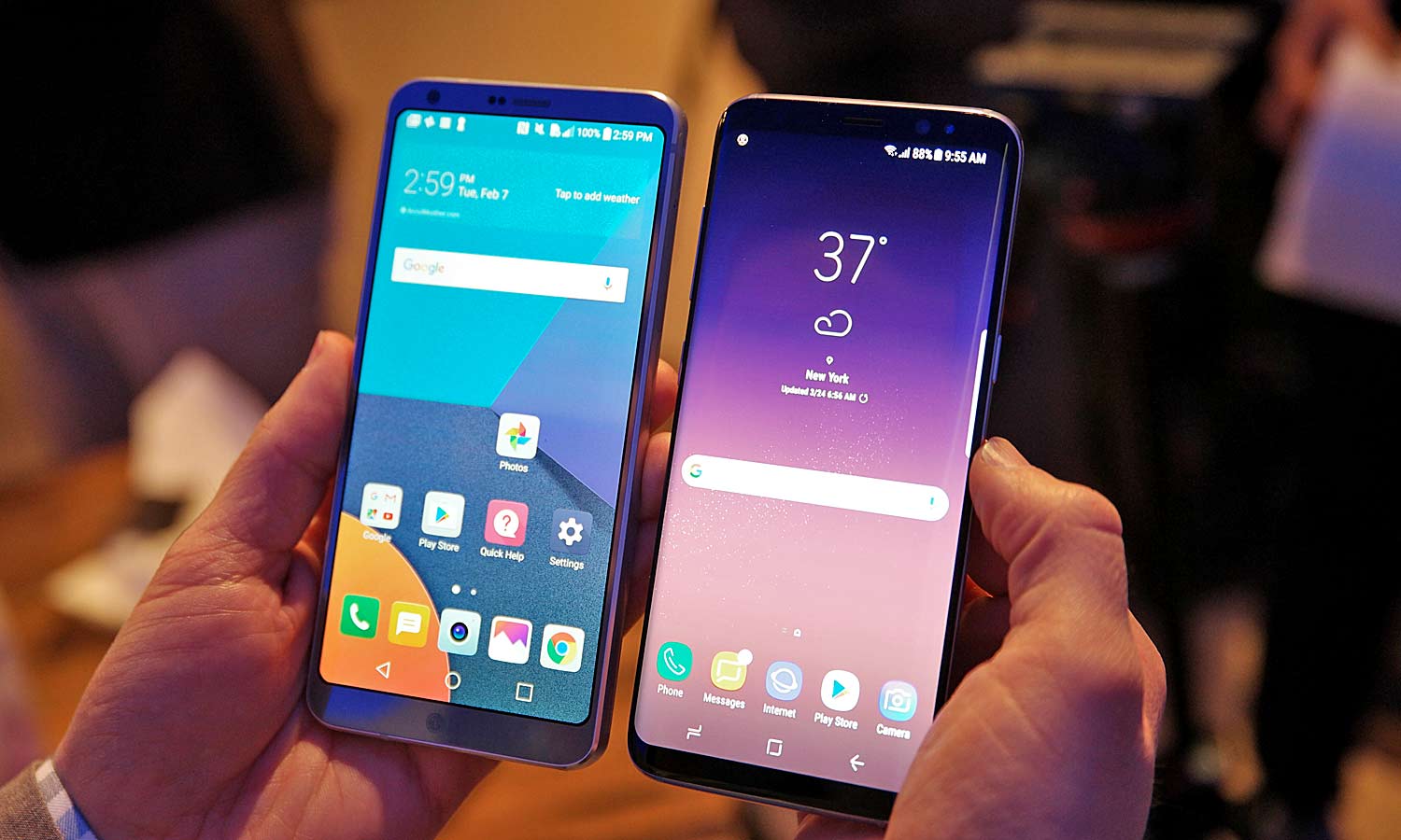
The Samsung Galaxy S8 and LG G6 are pioneering a new trend for smartphones: big screens that sport extra-wide aspect ratios. This change promises improved one-handed usability, more vertical screen real estate and immersive video watching.

However, these new screens also cause a problem when you try to compare them to phones that have more traditional displays with 16:9 aspect ratios: It’s difficult to figure out just how much extra screen space you’re getting. To answer that question for the Galaxy S8 and S8+, we crunched some numbers to help better illustrate the differences.
Who Offers the Most Screen Space?
| Phone | Screen Size (measured diagonally) | Aspect Ratio | Total Screen Area (square inches) | Body Size (inches) | Screen to Body Ratio |
| Galaxy S8 | 5.8 inches | 18.5:9 | 13.05 | 5.86 x 2.68 x 0.31 | 83.1% |
| Galaxy S8+ | 6.2 inches | 18.5:9 | 15.12 | 6.28 x 2.89 x 0.32 | 83% |
| iPhone 7 | 4.7 inches | 16:9 | 9.43 | 5.44 x 2.64 x 0.28 | 65.6% |
| iPhone 7 Plus | 5.5 inches | 16:9 | 12.96 | 6.23 x 3.07 x 0.29 | 67.7% |
| LG G6 | 5.7 inches | 18:9 | 12.75 | 5.86 x 2.83 x 0.31 | 76.8% |
| LG V20 | 5.7 inches | 16:9 | 14 | 6.29 x 3.07 x 0.30 | 72.5% |
| Google Pixel | 5 inches | 16:9 | 11 | 5.66 x 2.74 x 0.33 | 70% |
| Google Pixel XL | 5.5 inches | 16:9 | 12.96 | 6.09 x 2.98 x 0.33 | 71.4% |
| Huawei Mate 9 | 5.9 inches | 16:9 | 14.79 | 6.18 x 3.11 x 0.31 | 76.9% |
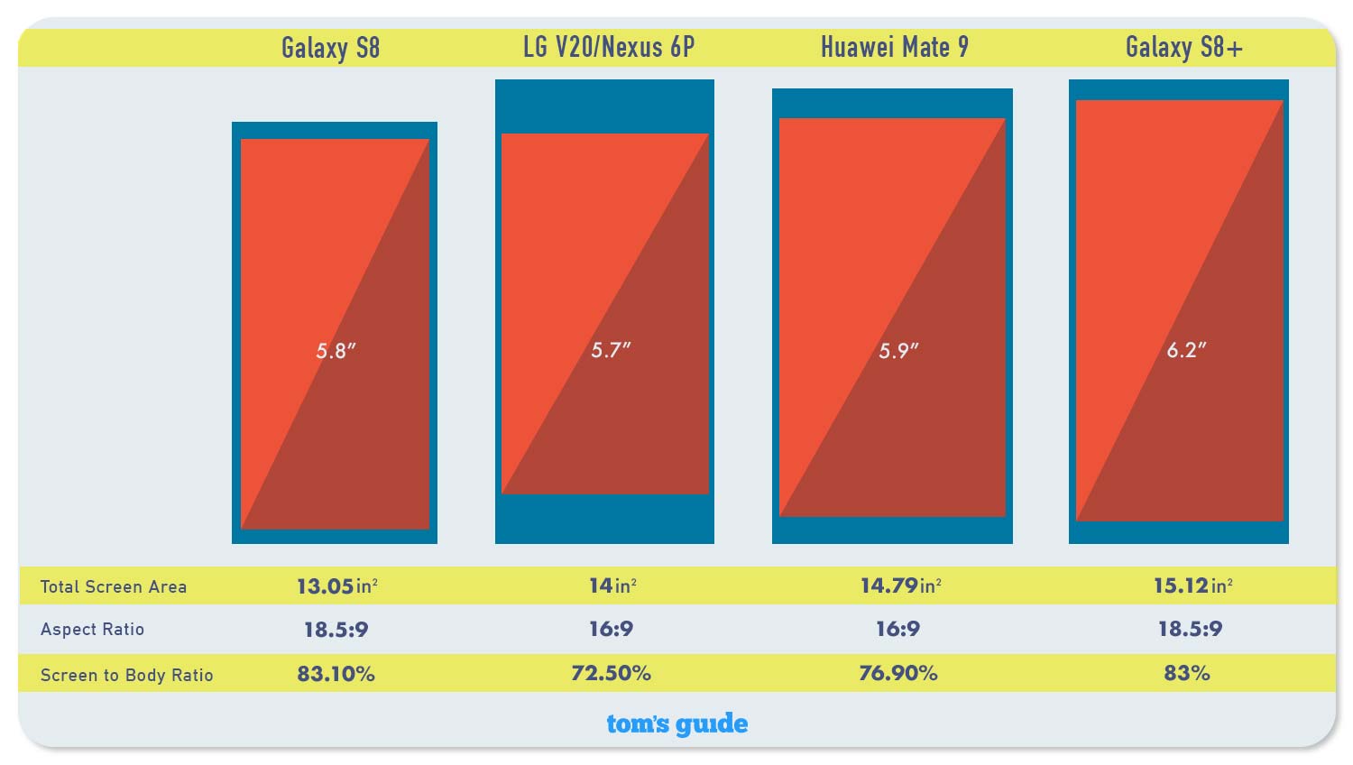
Looking at diagonal screen size (typically the dimension used when measuring displays), you might think that the Galaxy S8’s 5.8-inch display boasts more screen real estate than a 5.7-inch handset like the LG V20 or Nexus 6P. But that's not the case at all. While the S8's 18.5:9 aspect ratio is taller from top to bottom, it's also narrower. So, instead of looking at the diagonal measurement, we needed to figure out each screen’s total area. Thankfully, since we know each screen's diagonal length and its aspect ratio, total screen area is pretty easy to figure out.
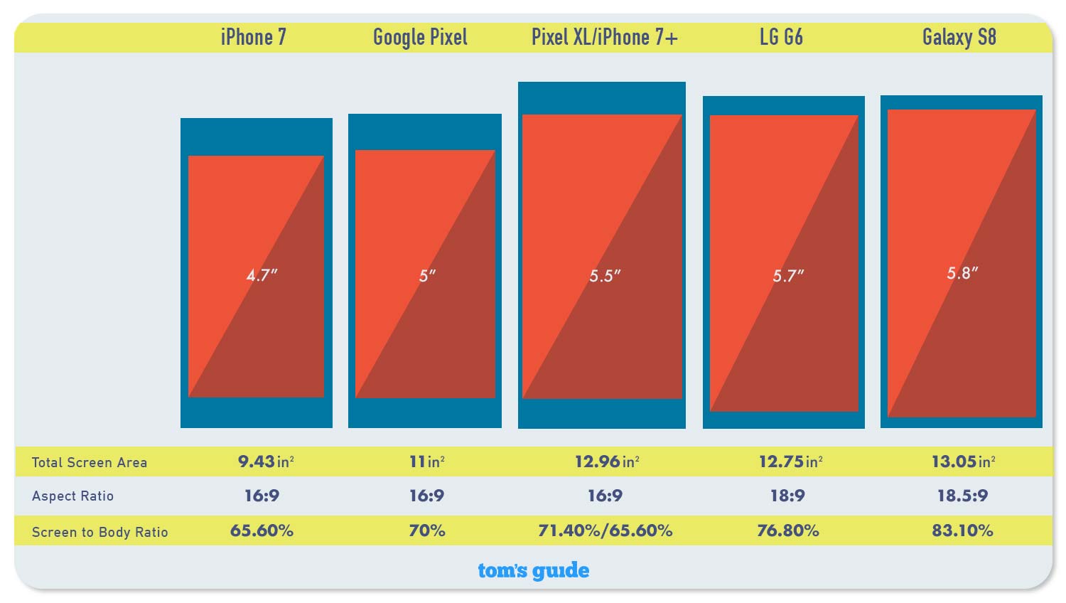
Next, let's compare the standard Galaxy S8 and a selection of its comparably sized competition. Technically, the S8 and G6 have screens with rounded corners, which affects overall screen real estate, but since those areas are so small, we've decided not to include them in our calculations.

From this chart, we can see that the S8 has a bigger screen than even phones that border on being called phablets, like the 5.5-inch Pixel XL and iPhone 7 Plus. What's more, with a body measuring 5.86 inches tall and 2.68 wide, the S8's body is significantly smaller than those on the Pixel XL (6.09 x 2.98 inches) and iPhone 7 Plus (6.23 x 3.07 inches).
However, the most shocking difference comes when you compare the S8 to the regular iPhone 7. At 2.64 inches wide, the iPhone 7 has essentially the same width as the S8. And while the iPhone 7 is a bit shorter at 5.44 inches, that's not nearly enough to make you feel good about it having a screen that's almost 30 percent smaller than Samsung's Galaxy S8.
Compared to the LG G6, the S8's screen is insignificantly larger. However, because LG’s phone doesn't feature curved edges like Samsung's new devices, you could argue that the G6 sports more usable screen area. And you don't get any of the image distortion or warping that you see on the S8, either.
Sign up to get the BEST of Tom's Guide direct to your inbox.
Get instant access to breaking news, the hottest reviews, great deals and helpful tips.
Now, we can move on to the larger end of the phone spectrum to see how the S8+ stacks up against its big-screen brethren.

With a total screen area of 15.12 square inches, the S8+ really is the new king of big-screen phones. It tops even the 5.9-inch Huawei Mate 9 and its 14.79-square-inch screen, which was previously my go-to recommendation for people who really wanted an immersive media experience. With a body measuring 6.28 x 2.89 inches, the S8+ is also way easier to hold and use one-handed than the 6.18 x 3.11-inch Huawei Mate 9.
At the end of the day, it's pretty clear this extra-wide-screen trend for phones is more than a gimmick. Both the Samsung Galaxy S8 and the LG G6 pack bigger screens in less space than ever before. Even though not every app fully supports these new 18:9 ratios, the worst thing that happens is that you're left with a couple small black bars and screens that still offer up as much space as their 16:9 counterparts. And with Google pushing app developers to take advantage of phones with larger aspect ratios, the extra-wide-screen experience is only going to get better.
Illustration Credit: Tom's Guide
Sam is a Senior Writer at Engadget and previously worked at Gizmodo as a Senior Reporter. Before that, he worked at Tom's Guide and Laptop Mag as a Staff Writer and Senior Product Review Analyst, overseeing benchmarks and testing for countless product reviews. He was also an archery instructor and a penguin trainer too (really).
-
Oldmikey15 I'm not sure about the new tall and narrow trend , I had look at a G6 in store comparing it to my G5 which I class as a medium sized phone and the G6 was even narrower , I might add , the G5 is the first and last smallish phone I will have , phablets are just easier to use for me.Reply
As an old fart with big fingers and ageing eyes , larger screens are preferable , so I'm not entirely sure any of these trendy new models will fit the bill.
I will look at the S8 plus , I'm not confident though.
I do like the rest of what both LG and Samsung have done on their new models with camera's and water resistance. -
Daekar3 Why go with the funky aspect ratio? Just put the tiny bezels on a 16:9 screen and be done. That's where the magic is coming from, not the stupid aspect ratio.Reply
