Tom's Guide Verdict
The Samsung Galaxy S10e packs great performance and a vivid display into a compact design for a very affordable price.
Pros
- +
Incredible display
- +
Delightful, compact design
- +
Super powerful
- +
Wireless PowerShare
- +
Headphone jack
Cons
- -
Cameras could be better
- -
OneUI is polarizing
- -
Battery life is so-so
Why you can trust Tom's Guide
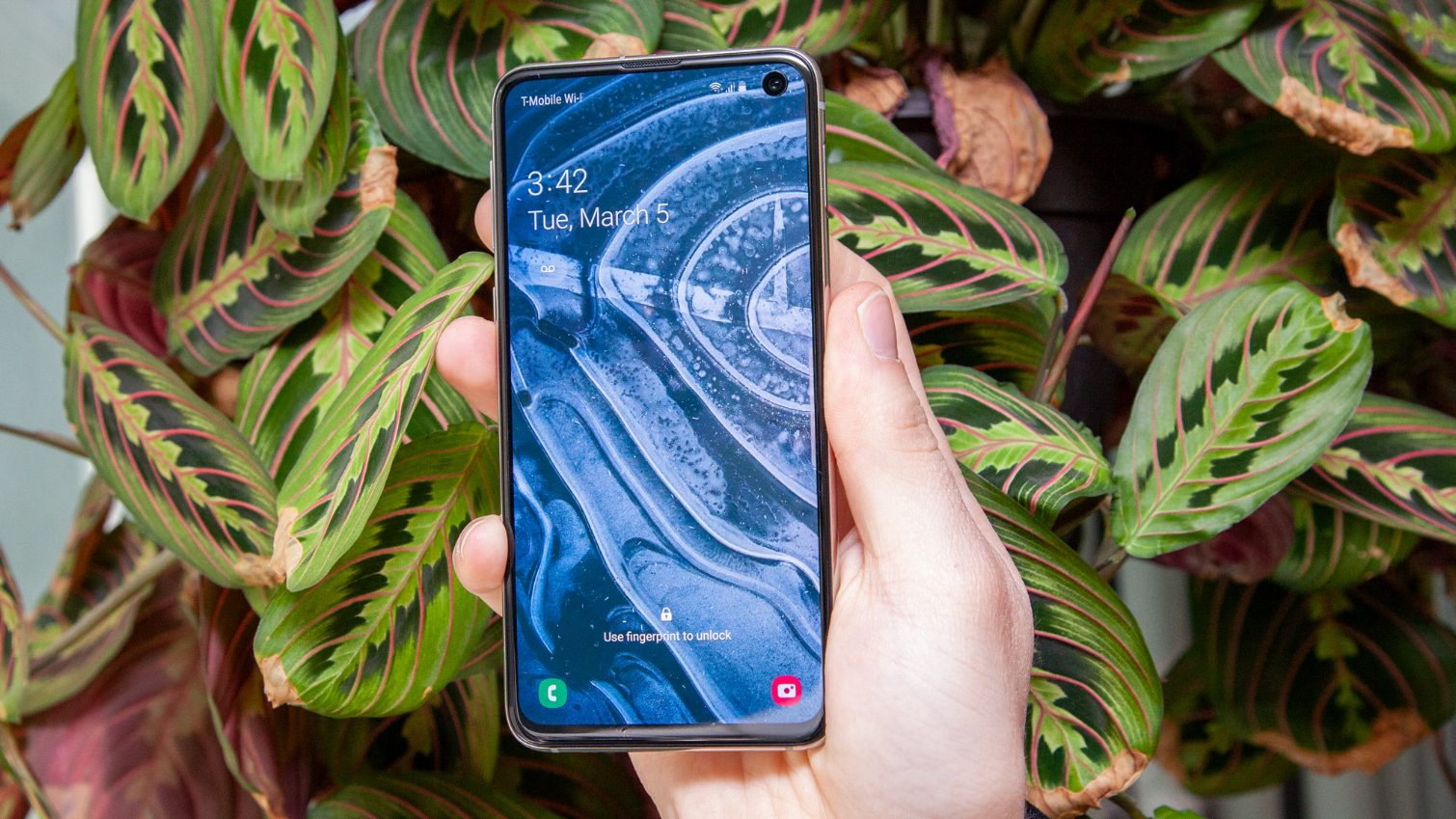
The Samsung Galaxy S10e delivers a premium experience for less money than you might expect, which is why it was one of our picks for the best Android phones out there. Of course now, it's been supplanted by newer devices. Regardless, you get a vivid 5.8-inch OLED display and a powerful Snapdragon 855 processor in compact design that's easy to use with one hand.
The Galaxy S10e includes dual rear cameras instead of the triple-lens arrangement found on the pricier S10 models, and lacks an in-display fingerprint sensor. But this is not a 'lite' device by any stretch. For the money, the S10e is still a good phone, even if it is getting a bit long in the tooth.
Samsung Galaxy S10e: Price and Availability
Now that the Galaxy S21 series has launched, the Samsung Galaxy S10e starts at $599 at Verizon, and for that you get 128GB of onboard storage and 6GB of RAM. Before the Galaxy S20 lineup came along, Samsung sold the S10e for $749, so that's quite the price drop, and you can save even more with eligible trade-ins at Samsung. You also might be able to find it for even cheaper on certain retailers, though stock is limited since the phone is from 2019. Our Samsung promo codes could help too.
This is one of the least expensive flagship phones you can get, though Apple offers the iPhone 11 for $699, and OnePlus continues to produce low-cost Android flagships like the $599 OnePlus 7T that compares quite favorably to the Galaxy S10 lineup (check out our OnePlus 7T vs Galaxy S10 comparison for more on that).
And it should be obvious, but high-end phones from 2020 will provide better performance. For example, the iPhone 12 mini costs just $699 and offers 5G and a whole host of improvements. If you want to stick with Android, Google has you covered with the Pixel 4a, Pixel 4a 5G, and Pixel 5, all of which hit different price points and provide experiences similar to, or better than, the Galaxy S10e.
Samsung Galaxy S10e: Specs
| Price | $749, $849 |
| Display (Resolution) | 5.8-inch Dynamic AMOLED (2160 x 1080) |
| Rear Camera(s) | 16-MP ultra-wide (f/2.2), 12-MP dual-pixel wide (ƒ/1.5, ƒ/2.4) |
| Front Camera(s) | 10-MP dual-pixel (ƒ/1.9) |
| CPU | Qualcomm Snapdragon 855 (North America); Exynos 9820 (International) |
| RAM | 6GB, 8GB |
| Storage | 128GB, 256GB |
| microSD | Yes, up to 512GB |
| Battery | 3,100 mAh |
| Battery Life (Hrs: Mins) | 9:41 |
| Colors | Prism Black, Prism White, Prism Blue, Flamingo Pink (except U.K.), Canary Yellow (except U.S.), Prism Green (except U.S.) |
| Size | 5.6 x 2.75 x 0.3 inches |
| Weight | 5.29 ounces |
Samsung Galaxy S10e: Design
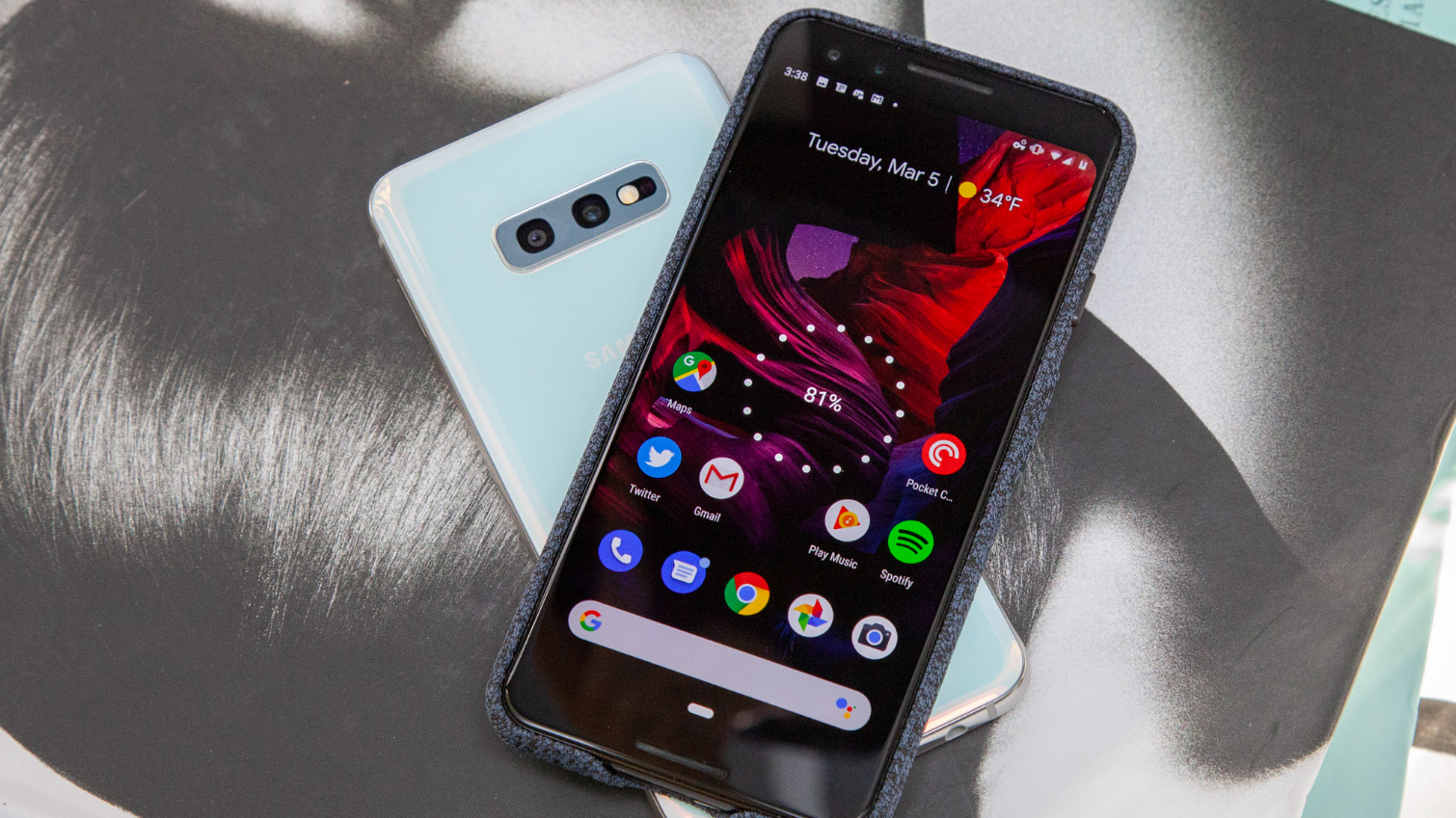
Even a year after it came out, the cheapest Galaxy S10 is also the smallest. At 5.8 inches, the S10e is tiny by modern standards. It's even smaller than the 5.5-inch Google Pixel 3, though because of the Galaxy's near-complete lack of bezels and placement of the front-facing camera inside the display, the S10e's screen manages to be slightly larger than that of Google's 2018 flagship. It's more akin to the Pixel 4a, since both offer very slim bezels and hole punch front cameras in small packages.
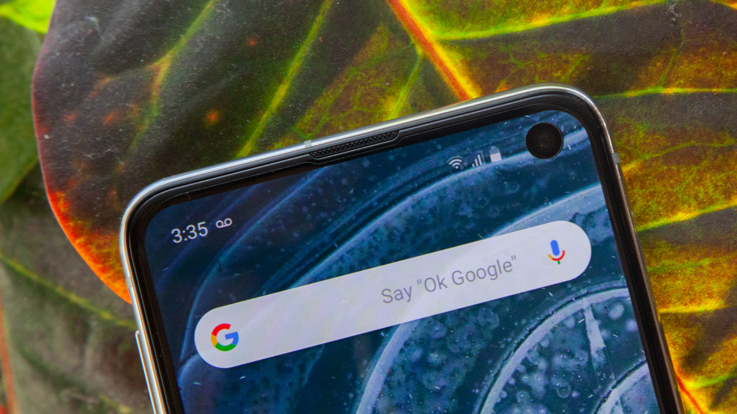
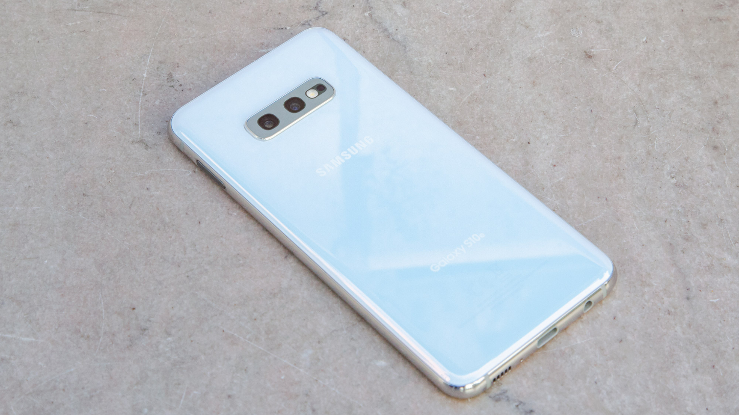
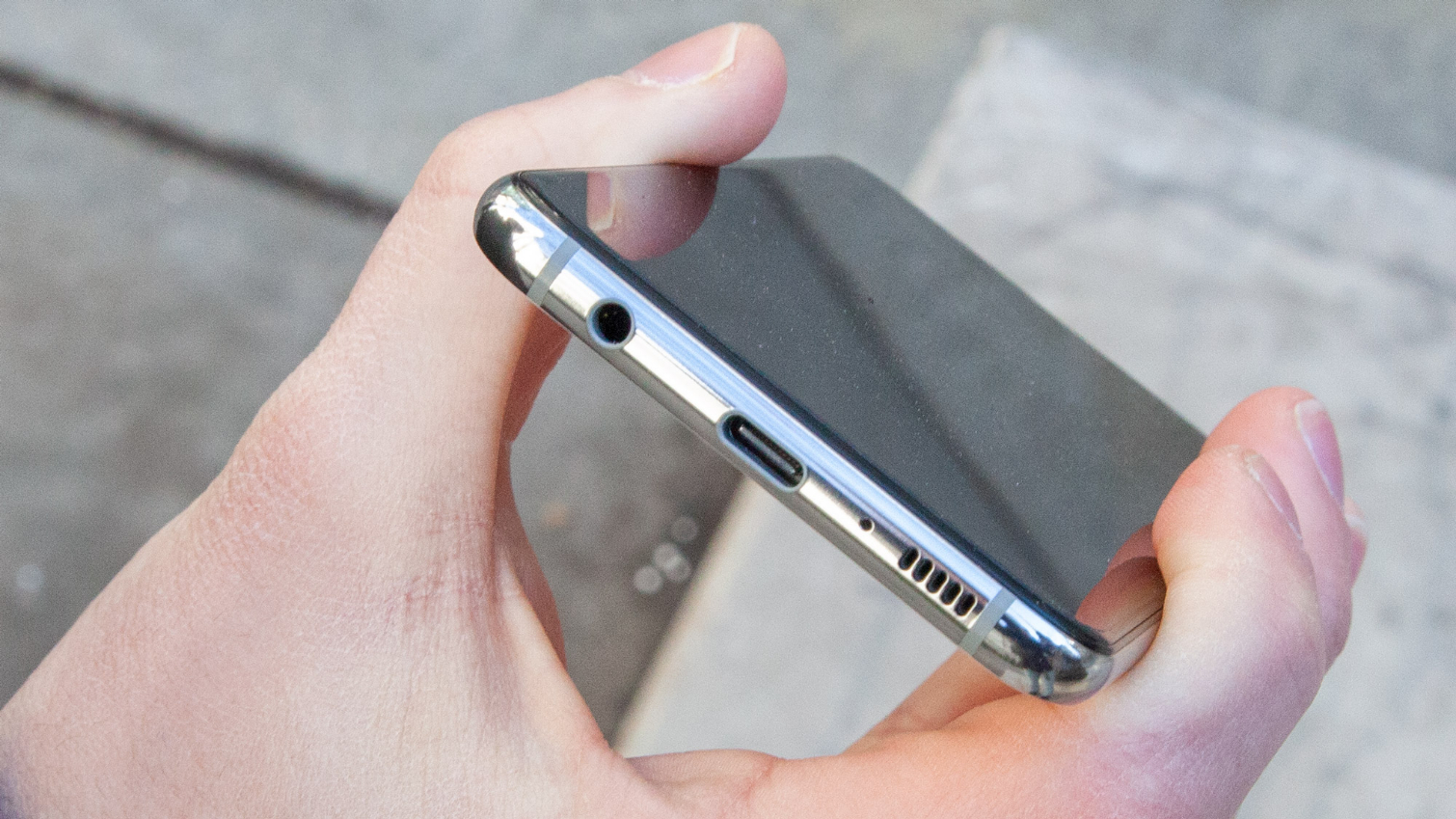
While the S10e carves a considerably smaller footprint than the other S10 models, it echoes the same aesthetics. The S10e's mirrored aluminum frame is sandwiched between two slabs of Gorilla Glass. The display glass is flat, while the back is subtly curved to provide comfortable grip. And on the bottom, you'll find a headphone jack — an increasingly rare and valuable feature among today's top smartphones.
Although the S10e's Infinity-O camera-in-display may be off-putting to some (I find it less egregious than the notch), there's a lot to like about the S10e's design. None of the fit and finish of the S10 and S10 Plus has been sacrificed in this entry-level Galaxy; the S10e feels like a premium product, only smaller. And the right customers will see its more pocketable and compact dimensions as a massive boon in an era of ever-growing flagships. Think less iPhone 11, more iPhone SE.
Size aside, the S10e's most notable deviation from the other models is its side-mounted fingerprint sensor. Samsung opted against using the in-display ultrasonic solution found in the S10 and S10 Plus, presumably to keep costs down. That's not necessarily a bad thing.
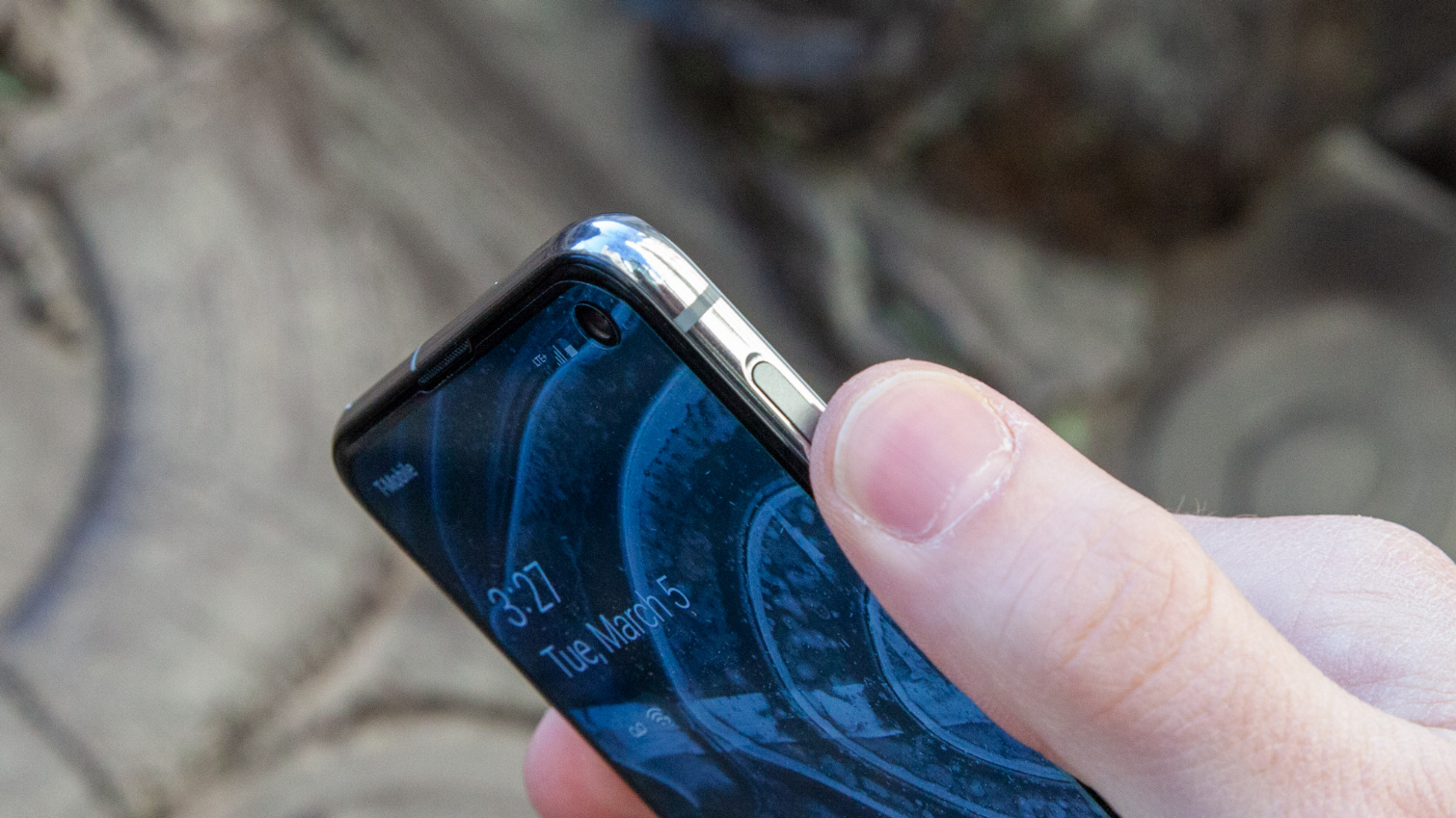
While the S10e's approach works as well as any conventional scanner, in practice it can be hard to locate, because the depression of the power key within the frame isn't well pronounced. This led to many failed presses initially, with the phone constantly reminding me to cover the entire button when applying my prints. Once I established muscle memory for the proper location, though, the success rate significantly improved.
People will love the S10e's pocketable size in an era of larger and larger flagship phones. Think less iPhone XR, more iPhone SE.
The S10e can also be quite a colorful phone, if you want it to be. There's a rainbow of Galaxy S10 Colors available, from vivacious Flamingo Pink to the stunning, pearl-like Prism White of our review unit. However, in true Apple fashion, the cheapest version of the S10 line gets some exclusive livelier flavors as well, like the invigorating Canary Yellow and the opulent Prism Green (neither of which is available for U.S. customers, unfortunately).
Samsung Galaxy S10e: Display
The Galaxy S10e's 5.8-inch Dynamic AMOLED display isn't quite as sharp as the QHD screens inside the larger S10 variants. However, because of the smaller proportions, everything still looks crisp, with no loss of quality at oblique viewing angles, and none of that dithered paper-like texture you sometimes get from poor-quality OLED panels.
Samsung's displays are unmatched in the space, and the S10e demonstrates why. With a peak brightness of 603 nits, the S10e blows away the 403-nit Pixel 3, equals the Galaxy S9 and is imperceptibly dimmer than the iPhone XS at 611 nits. Phones released since the S10e came out, including the iPhone 11 and Samsung's own Galaxy Note 10, are even brighter, though you won't have to squint to see the S10e's screen. That makes the tiny Galaxy handset perfect for outdoor use, even when the sun's beaming down on it.
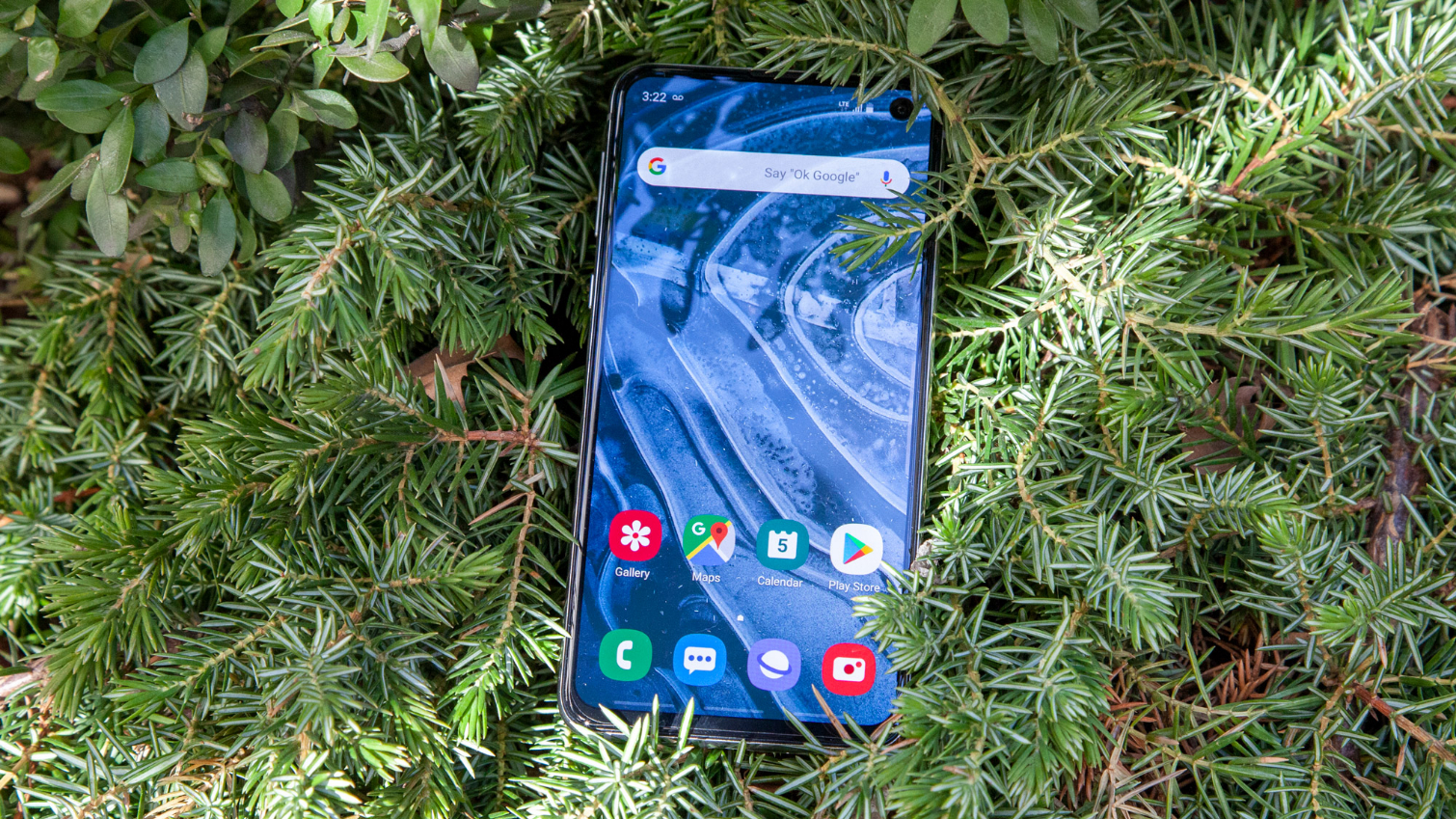
In a departure from previous Galaxy handsets, the S10e ships in a default state to a Natural color mode, which is more realistic and less saturated than the old Dynamic preset. That makes it punchier than the basic sRGB color space, and at least to my eyes, strikes closer to the DCI-P3 cinema spec, much like Apple's iPhones.
In this default state, the S10e covers 148 percent of the sRGB space. That's ahead of the iPhone XS' 123 percent, and those who prefer perkier colors shouldn't fear, as Samsung has included a Vivid option with the S10e that ratchets up those hues into the stratosphere. And no matter what profile you use, the S10e's screen comes HDR10+ certified for excellent contrast and visibility in shadows and highlights alike.
MORE: Samsung Galaxy S10 Plus Review
The S10e's Delta-E color accuracy score of 0.57 is a bit higher than what we've observed from other flagships, like the iPhone XS and Pixel 3 at 0.22 and 0.44, respectively. (Numbers closer to 0 are better.) Those results shouldn't faze you, though, as the S10e's panel still dazzles as well as any Samsung has ever produced. Watching Amazon's The Grand Tour on the small screen, I was mesmerized by the electric blue of Abbie Eaton's Porsche as she drifted it across a snow-blanketed meadow.
Samsung Galaxy S10e: Camera
The Samsung Galaxy S10e packs two cameras on the back — one 12-megapixel primary sensor with a variable aperture of either ƒ/1.5 or ƒ/2.4, and another 16-megapixel sensor mated to an ultrawide lens with a 123-degree field of view. On the front is a 10-megapixel, ƒ/1.9 lens.
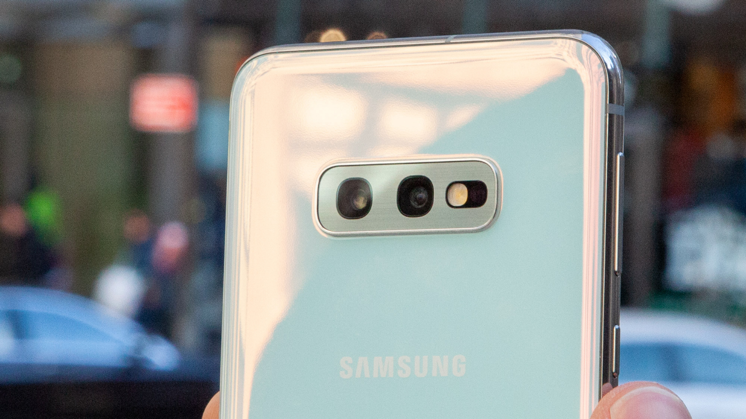
All of those cameras are also present in the S10 and S10 Plus, though those phones add a telephoto lens to the back as well with 2x optical zoom, which the S10e lacks. The S10 Plus also has a secondary depth sensor on the front of the device for more accurate bokeh effects in selfies.
The S10e's cameras aren't lacking in bells and whistles — which makes it all the more disappointing that the shots they produce are surprisingly inconsistent.
Still, with its dual rear cameras and bevy of creative shooting modes, the S10e is hardly under-equipped when it comes to photography tools. Samsung has pumped up its shallow depth-of-field Live Focus mode with stylish effects so you can add a dash of partial color or change the direction and pattern of the background blur after the fact. And the company's AI-based Scene Optimizer tech, which tunes settings based on subjects the camera identifies, can recognize 10 more scenes for a total of 30.
So it's clear the S10e's cameras aren't lacking in bells and whistles, then. And yet, the types of shots they produce are surprisingly inconsistent. Although the S10e's photography is solid across the board, there were almost always one or two missteps in every picture we took with the phone that held it back.
Take these shots inside a bar, for example. The Pixel 3 delivers a balanced photo with minimal noise, good white balance and sharp details. And almost none of those qualities came through in the S10e's attempt. I could live with most of the S10e's shortcomings here, but the yellow cast that pervades the frame is far too off-putting to make the image usable without some editing.
A similar story played out when we photographed a box of cupcakes. The S10e's food Scene Optimizer mode boosted the exposure and warmth of the scene far beyond what was necessary. The iPhone XS' attempt is simply more grounded in reality and also more precise, especially as you peer into the details, like the icing's texture.
Outside the iconic New York Public Library, the S10e clawed some favor back with this picturesque city scene. Samsung's software still dialed up the contrast and exposure to a level that will likely bother those who prefer more realistic shots, and the white balance is again a bit off (this time, it swings too far in the cool direction).
MORE: Galaxy S10 vs Pixel 3 Camera Shootout: Which Phone Wins?
However, there's a drama to the S10e's interpretation that the iPhone XS lacks, and if you were going to apply an artsy filter to either of these photos, you'd probably have to do less with what the S10e gives you.
I wish I could say the same about the S10e's portraits, but it seems Samsung still hasn't addressed the overall cloudiness of the photos its Live Focus feature produces. The S10e opts for a wider field-of-view with these kinds of shots than most other flagships, like the Pixel 3. And in the process, some detail is definitely lost; the S10e glosses over the texture of my skin and the fabric of my sweater, and struggles to determine the boundary of the foreground in the lower left corner of the frame.
One of the new Scene Optimizer modes introduced with the S10e is called Bright Night. Like Google's Night Sight feature in the Pixel 3, it's designed to improve visibility in super-low-light shooting conditions. At launch, however, Samsung is not allowing you to manually activate Bright Night; rather, it appears automatically in the appropriate conditions in the form of a moon icon, and you can turn it off with a tap. Samsung is reportedly changing this behavior in a future update.
Usability quirks aside, Bright Night doesn't quite rise to the level of Google's Night Sight. Putting aside some of the compositional differences between these photos, the Night Sight result is better all around, with more definition in the shadows, stronger color throughout and properly exposed highlights, especially pertaining to the ice patch on the road.
The S10e's 10-megapixel front-facing shooter doesn't impress, either. It delivered a washed out selfie that also wasn't quite as sharp as the Pixel 3's, even though no softening or beautification filters were applied in either case.
Smartphone cameras have only improved since the Galaxy S10e's spring release. Both the iPhone 12 Pro Max and Pixel 5 have come out since then and have raised the bar even further for mobile photography. The Galaxy S10e has a fine camera, but there are better options out there – see our rundown of the best camera phones for our top picks.
The S10e especially shines when gaming. Playing PUBG Mobile at fully maxed settings was no sweat at all for the phone.
Samsung Galaxy S10e: Performance
Armed with Qualcomm’s Snapdragon 855 system-on-chip — in North American models, at least — the Galaxy S10e was one of the most powerful Android phones you could buy when it debuted. Despite Snapdragon 865 devices hitting the scene in 2020 and 888 phones kicking off 2021, the S10e still compares favorably to other phones of its vintage.
Our review unit with 6GB of RAM topped 10,513 points on Geekbench 4, which tests overall system performance. That's much faster than any other Android we've tested, save for the Galaxy S10 Plus at 10,732. (The Plus comes with an extra 2GB of memory.) It even blows away the OnePlus 6T McLaren with its 10GB RAM, which turned in only 8,976 with last year's Snapdragon 845 silicon. Apple's A12 Bionic-equipped iPhone XS remains the flagship phone to beat at 11,420, but rest assured — the S10e isn't going to leave you wanting for more power.

The S10e especially shines when gaming. Playing PUBG Mobile at fully maxed settings was no sweat for the phone, as the framerate never dipped noticeably throughout my session. And arcade racer Asphalt 9 Legends — one of the most demanding titles on mobile today with its extensive lighting effects, motion blur and meticulously modeled cars — ran smoother on Samsung's device than on any other smartphone I've used yet.
The S10e's impressive showing on 3DMark's Ice Storm Unlimited graphics test bore this out, with a result of 5,616. That result easily tops the iPhone XS at 4,244, demonstrating that while Apple still leads in raw processing grunt, Samsung maintains an edge in graphics.
Expect fast LTE performance from the Galaxy S10. According to testing from Ookla Speedtest, the S10e averaged 49.18 Mbps, compared to just 33.17 Mbps for the iPhone XR.
Samsung Galaxy S10e: Battery
Samsung must have packed the Galaxy S10e to the absolute limit with battery power. At 3,100mAh, the handset's battery eclipses the 3,000mAh unit inside the Galaxy S9, even though the S9 was a slightly larger phone.
The S10e also charges wirelessly at a quicker rate than any Galaxy before it, thanks to Samsung's new 12W system. However, to get those speeds now, you'll have to pick up Samsung's new $99 Wireless Charger Duo Pad.
Despite the S10e's slight capacity advantage over the S9, the new handset couldn't beat its predecessor in our battery test. The S10e died after 9 hours and 41 minutes of streaming web pages using T-Mobile's LTE network, which is about an hour less than the S9's 10:52, but still better than the Pixel 3’s 8:27. The Galaxy S10 Plus, with its significantly larger 4,100mAh battery, lasted 12:35, while the Galaxy S10 (powered by a 3,400mAh battery) held out for 10:19. In other words, don't expect the battery life you get from other S10 models or from newer phones like the iPhone 11 (11:16).
However, the S10e can do something most other phones can't — it can wirelessly charge your other devices. Samsung's new Wireless PowerShare feature, found across the S10 lineup, transforms the S10e into a makeshift Qi induction pad, and it's tremendously easy to use. Simply switch it on via the Quick Settings toggles, flip the phone over and rest something on top of it, like your Samsung Galaxy Buds. And if you're worried about siphoning too much juice from your phone, don't fear; PowerShare automatically turns off once the phone has 30 percent battery left.
Samsung Galaxy S10e: OneUI software
Although Samsung's new Android interface, called OneUI, is quite a striking departure from the look and feel of the software on Samsung's older Galaxy handsets from the TouchWiz era. This is definitely a good thing.
Aesthetically, OneUI shares nothing with Google's design direction. The first thing you notice is the scaling — UI elements on the S10e are large and in your face by default, with big text, an emphasis on squircles and most interactions placed near the bottom of the display on every menu to maximize reachability.
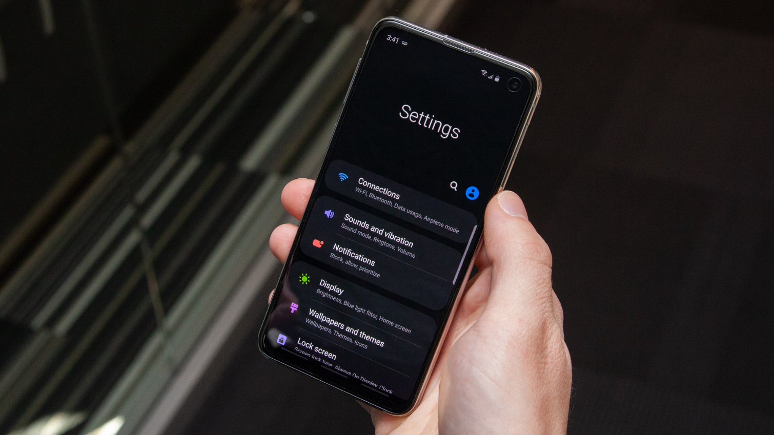
As a result, the S10e is easier to navigate with one hand than stock Android or iOS, which is good. But the cutesy icons and large on-screen buttons contained within the handset's tiny screen definitely has me feeling those "my first smartphone" vibes that Tom's Guide Editor-In-Chief Mark Spoonauer referenced in his S10 Plus review. It also doesn't help that the Infinity-O camera cutout necessitates a very thick status bar that eats into the display's real estate about as much (or possibly even more) than a notch would.
The S10e is a beautiful piece of tech, and it deserves an interface that feels as futuristic and advanced as its exterior. That said, there are some things I really like about OneUI. Samsung's gesture interface is one of the simplest and cleverest I've encountered yet, as the company has just replaced Android's traditional three-button navigation bar with three zones to swipe up and trigger those same functions. And OneUI's Night Mode is not only a bit more stylish and easier on the eyes, but also saves energy, too.
Samsung is rolling out its new OneUI 2.0 interface built on Android 10 to phones like the Galaxy S10e.
Samsung Galaxy S10e: Bottom line
The Samsung Galaxy S10e is a cheaper flagship phone that hits most of the same highs as its costlier siblings. You're still getting the same fantastic display, brisk performance, streamlined software and generous specs that make the S10 and S10 Plus great, only without some bells and whistles you don't really need (like the in-display fingerprint sensor).
Still, the S10e isn't perfect. In a pinch I'd turn to the cameras in the Pixel 4, iPhone XS or iPhone XR every time.
And those who are really conscious about battery life will likely want to spring for one of the larger S10 variants. But those phones also cost considerably more. The bottom line is that, for the price and size, the S10e is still a good little phone, but it's outmatched by newer devices, as you would expect. If you find a good deal on one, it's a decent option.
Editor's note: Since publishing, the iPhone 12 series and Google's slew of new Pixels came out. Other than the physical size of the Galaxy S10e, we prefer those phones in every regard.
Adam Ismail is a staff writer at Jalopnik and previously worked on Tom's Guide covering smartphones, car tech and gaming. His love for all things mobile began with the original Motorola Droid; since then he’s owned a variety of Android and iOS-powered handsets, refusing to stay loyal to one platform. His work has also appeared on Digital Trends and GTPlanet. When he’s not fiddling with the latest devices, he’s at an indie pop show, recording a podcast or playing Sega Dreamcast.
