Tom's Guide Verdict
Apple News Plus delivers a lot of magazines, but it needs refinements to search and a more consistent look.
Pros
- +
Extensive selection of 300-plus magazines
- +
Includes content from Wall Street Journal and Los Angeles Times
- +
Dynamic live covers
Cons
- -
Frustrating search functions
- -
Save Story feature from main News app is MIA
- -
Inconsistent display from magazine to magazine.
Why you can trust Tom's Guide
With the paid News+ service Apple added to its News app on iOS and macOS this week, you'll never need to look far for a magazine article again. But good luck trying to find things if you're looking for something specific.
Apple took the wraps off News+ this week at a special press event devoted to expanding the company's subscription services and then immediately launched News+ as part of the iOS 12.2 and macOS 10.14.4 updates. For $9.99 a month, News+ gives you access to more than 300 magazines, along with news articles from The Wall Street Journal and The Los Angeles Times. (In Canada, where News Plus also launched, you can access the Toronto Star.)
With News+, Apple hopes to convert the popularity of its News app — it's the No. 1 news app out there, the company says — into a recurring revenue stream. In exchange, users like you and me get to read articles from a wide variety of magazines without having to pony up for each one.
Does News+ deliver on its promised value? Here are some initial impressions after spending a day with Apple's new service.
Getting started with News Plus
One of the easiest things to do with News+ is sign up for it. Apple's latest iOS 12 and macOS Mojave updates add News+ to the app. On your iPhone or iPad, News+ lives in a tab at the bottom of the screen, while on your Mac, you'll find it just below the Today channel in the News app.
MORE: Apple News Plus Is the Antidote to Facebook’s Garbage
To sign up for News+, just click on the tab, and follow the on-screen instructions. The first month of News+ is free, so you've got 30 days to see if the extra content satisfies your nose for news.
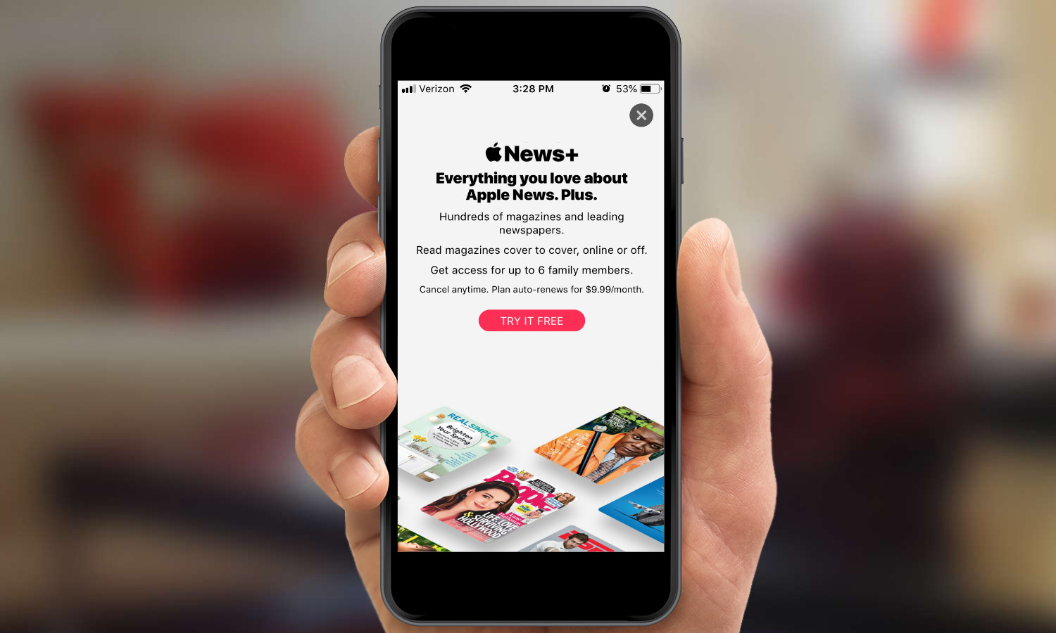
Another nice thing about News+: You only need to sign up once. I signed up for the service on my iPhone almost immediately after iOS 12.2 became available. Then, after upgrading to the latest version of Mojave on my MacBook Air, News Plus was already activated and waiting for me in the desktop version of the app.
There doesn't seem to be a lot of syncing between the iOS and Mac versions of News+, as different publications showed up in the My Magazines section of the respective apps. Perhaps that's a byproduct of Apple's privacy pledge with News+: The company says it doesn't track what you read, and it doesn't share anything with advertisers. Still, you would think this might be an instance where Apple’s Continuity features would provide a more seamless experience between desktop and mobile.
Finding your way around News Plus
I didn't sit down and count how just how many publications are included in News+ to confirm that Apple's 300-plus figure isn't just some idle boast. But the eyeball test confirms it's a lot, a feeling that becomes apparent when you try to find something to read.
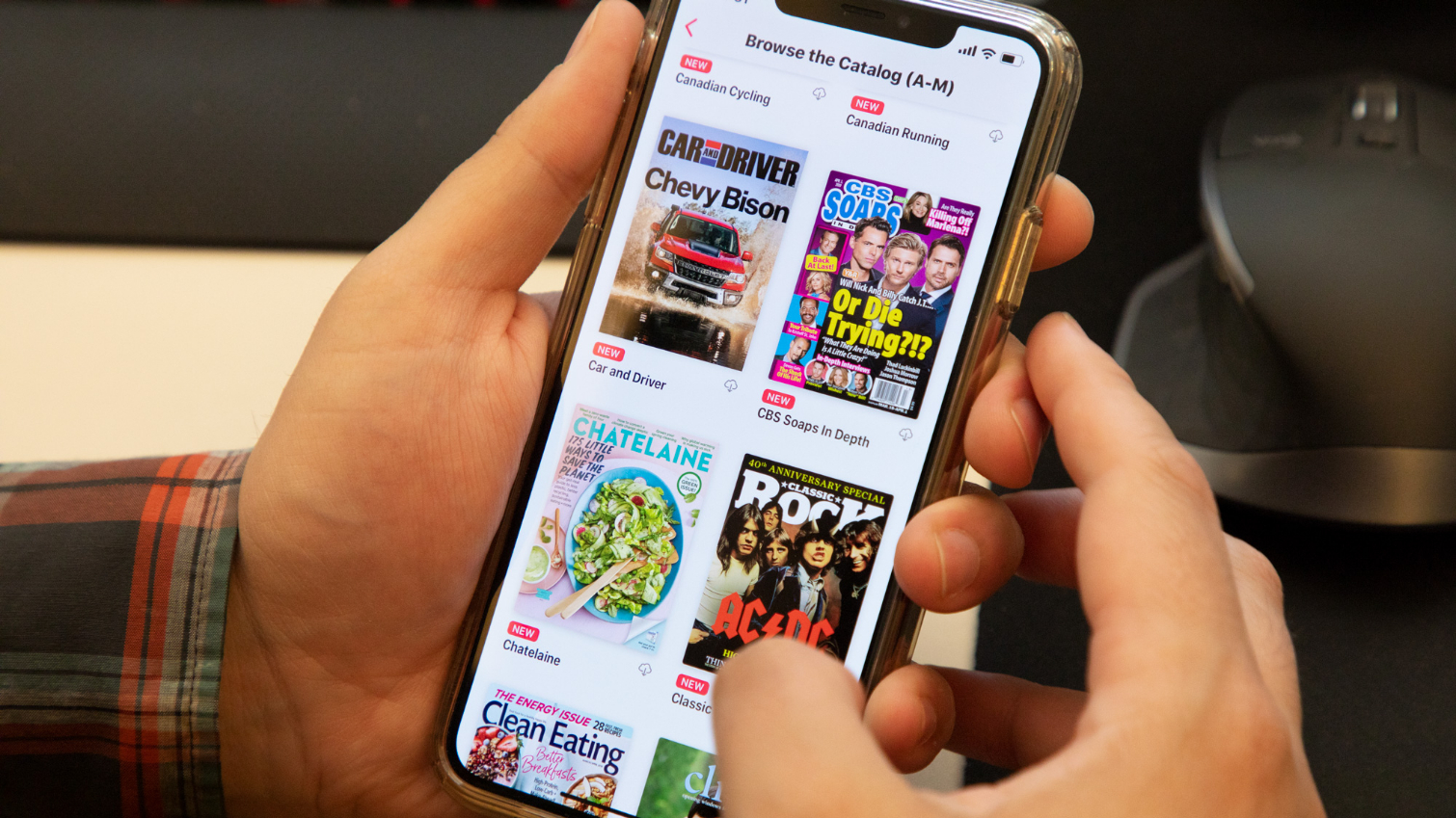
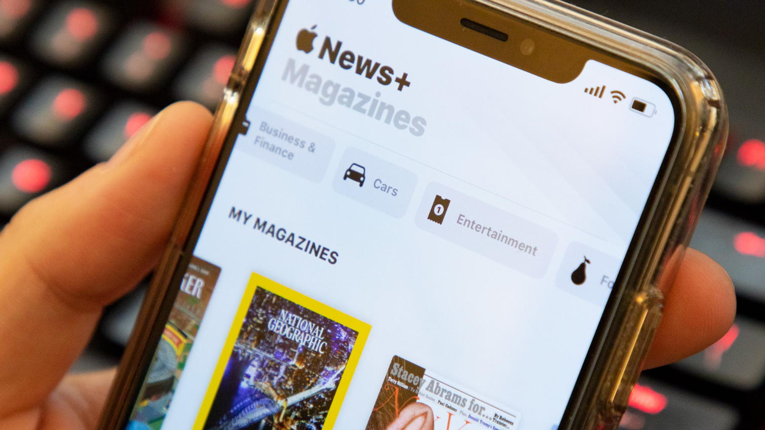
The first thing you'll see on the News+ screen is a side-scrolling menu that lets you browse Apple's selection of magazines alphabetically. You can also browse by topic (Cars, Entertainment, Sports, Health and so on), or select the Featured option for Apple's curated selection of magazines.
Apple's clearly trying to recreate the experience of wandering up to a newsstand and looking at the covers of magazines to see which ones grab the eye. It's not a bad approach, if you're in the mood to leisurely browse through a stream of covers. But if you want to find a specific magazine within the News+ tab, be prepared to give that scrolling finger a workout. There's no search field in the News+ tab for typing in a magazine title, so you've got to tap on Apple's catalog and scroll until you find what you're looking for. If you want to read something with a title that comes late in the alphabet — Variety, say — you're going to be searching past a lot of other letters. Even an A-to-Z side menu like the one that lets you jump ahead in your iOS Music library would help out a lot here. You can browse by category from the home screen, which reduces the number of covers you have to sort through a little bit.
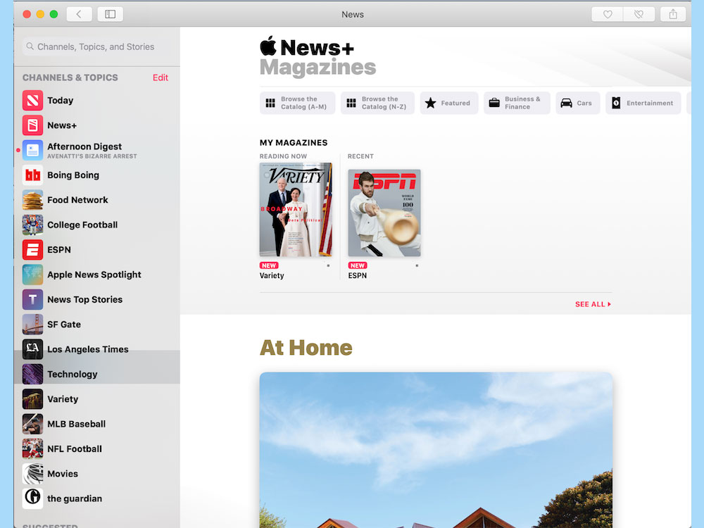
There is a method for more direct searches of News+ content, but it's not exactly intuitive. To find a specific title in News+ (without scrolling anyhow), head over to the Following tab directly to the right of the News+ in the News app. On that screen, there's a search field, and you can type in publication titles to bring up content from both News+ and the free News section. Heading to a tab titled "Following" to search for things behind a paywall wouldn't be my first instinct, but that's how Apple decided to handle things. (The desktop version of News+ handles things better — there's a persistent search bar in the upper left corner of the app.)
Below the browsing menu and list of categories, you'll find the My Magazines section, which contains the publications you're currently looking at, plus issues you've downloaded. (More on that below.) Keep scrolling down, and you'll wind up in News Plus' curated section, which features highlighted articles, magazines, and topics. These don't seem to correspond to any of the channels or topics you've selected in the regular news app. Right now, the first two curated items in News+ are an article on architect Frank Gehry and a selection of articles on modern parenting — interesting topics, sure, but not necessarily ones that are on my radar screen.
How News Plus is organized
The most frequently used section of News+ figures to be My Magazines, though to be truly useful, it's going to need a little fine tuning.
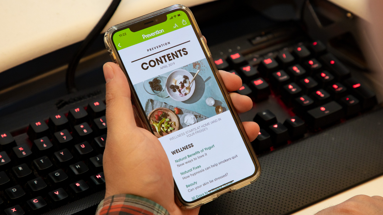
When I launched News Plus for the first time, My Magazines was already populated with the most recent issues of Sports Illustrated, The Atlantic and ESPN — almost certainly because I already had favorited those publications in the standard news app. Whatever magazine I started reading in News Plus — whether it was the latest Vanity Fair or the New Republic — would pop in My Magazines under Reading Now.
If I started reading something else, though, that issue disappeared, not even hanging around the My Magazines section. At present, it appears the only way to make a magazine stay in My Magazines is to download it from the cloud, something you do by tapping the cloud icon next to the cover. I couldn't find any way to designate a magazine as one of my favorites from within News+, so if I want to find a new issue or revisit an old one, I'm left with Apple's clunky search features. That seems like something Apple should improve, especially since personalization is a key part of the main News app's appeal.
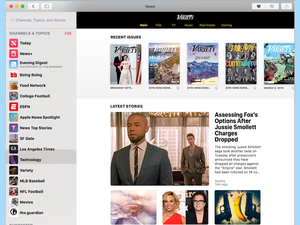
Speaking of back issues, when you're within a magazine in News+, just tap the magazine's title at the top of the screen. You'll see a list of previous issues for that title, and in some cases, you'll see current headlines and articles from that publication's website. Be warned, though, that archived issues are PDFs of the print issue (ads included!) that you'll have to pinch to zoom in on if you want to read an article. It's unclear at this point if that's the fate awaiting all back issues of magazines in News+ or they'll retain the mobile- and desktop-friendly design the current issues exhibit.
How the articles look
When it took the wraps off News+, Apple really touted the presentation aspects, which include dynamic covers in some cases. And it's a striking effect to see a cover of The Cut where Natasha Lyonne is spinning around or a National Geographic Cities cover with a shimmering view of Sydney Harbor at night. Most covers are fairly static, though, and articles are presented in a pretty straightforward way — text that you scroll through, punctuated by photos that you tap to enlarge.

Some of the visual impact may be lost on me, as my regular phone is an iPhone SE with a tiny 4-inch LCD screen. Things are decidedly more immersive when an article spans from one edge of the display to the other on one of Apple's more recent phones. Even so, some of my colleagues browsing issues of the New Yorker and Rolling Stone on an iPhone XS Max weren't blown away by the look of News+.

Select a current issue of a magazine, and you'll get a title page with a tappable table of contents. In most cases, there's no description for the article, so you'll just have to hope that the headline you're tapping on gives you a good idea of what to expect. From within the article, a Next button lets you skip ahead to the next story in an issue, while an Open button returns you to the table of contents.
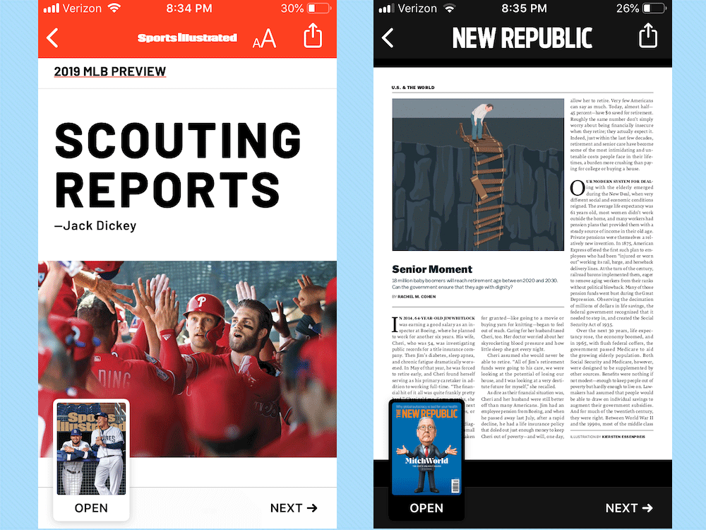
Be aware that some publications, such as New Republic, simply feature PDFs of their current issues instead of formats optimized for digital devices. The New Yorker splits the difference, with no table of contents and PDFs of ad pages from the print magazine interspersed between scrollable articles. It's possible that publishers will put more thought into their designs should News+ take off, but right now the look and feel of the service can be hit or miss from article to article.
I like the fact that News+ remembers where I left off if I abandon an issue and then resume reading it later, even if I've looked at other magazines in the meantime. You have the option of signifying that you love or hate stories, which will help fine-tune News+'s recommendations, and you can add many articles to your Safari reading list. At present, though, News Plus lacks the ability to save individual stories within the app — a feature you can use in the free section of News.
Outlook
Even after using News+, questions about Apple's paid news service remain. For instance, it's still unclear what you get from some of the publications like The Wall Street Journal. Multiple reports suggest Apple News+ customers will only see select news stories, while business coverage will be restricted to people already paying for a Journal subscription. I'm not sure that's true in practice — I've seen some WSJ business coverage in News Plus, but it's clear the stories showing are heavily curated.
The lines between what's free and what's paid also seem a bit blurred, even with the separate News+ tab. The Los Angeles Times is part of News+, but I've seen stories from that paper in both the free and paid sections of the app. (That I pay for a separate LA Times digital subscription has me wondering if I'm double-billing myself by sticking with Apple News+, but that's a discussion for another time.)
MORE: Apple News Plus Announced: 300 Magazines and Wall Street Journal for $9.99
Some questions we won't know the answer to until a few months from now — awkward timing if you're trying to decide whether to keep News+ beyond that 30-day free trial. For instance, how frequently is new content going to surface on News+? Will all back issues get the unappealing PDF treatment? We just aren't going to know until News+ has a few months of service under its belt.
It's clear right now that News+ remains a work in progress, with Apple definitely needing to refine its paid news service. I'd start by making magazines easier to track down within the News+ tab and by adding more visible personalization features before moving on to navigation and presentation. Lining up 300-plus publications is a noteworthy accomplishment and an important first step; now that Apple has given us plenty to read, it's important to present things in a format that makes reading more pleasurable.
Credit: Tom's Guide
Philip Michaels is a Managing Editor at Tom's Guide. He's been covering personal technology since 1999 and was in the building when Steve Jobs showed off the iPhone for the first time. He's been evaluating smartphones since that first iPhone debuted in 2007, and he's been following phone carriers and smartphone plans since 2015. He has strong opinions about Apple, the Oakland Athletics, old movies and proper butchery techniques. Follow him at @PhilipMichaels.
