Apps on the iPhone 8 Could Look Like This
Apple's iPhone 8 design might make it a bit more difficult to see certain things in your favorite apps.

Apple's design choice on the iPhone 8 could lead to an unsightly look for some apps, particularly if you're a fan of clean, simple interfaces.

Bloomberg, citing sources, reports that the iPhone maker won't hide the notch that dips into the top of the screen on its upcoming iPhone 8. So rather than create an artificial black box across the top of the screen, Apple will instead allow apps to stretch to the top of its screen and only lose space around the notch.
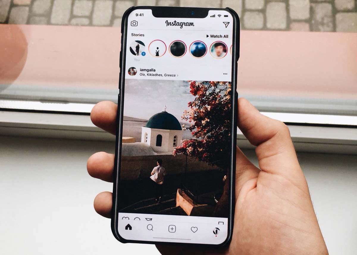
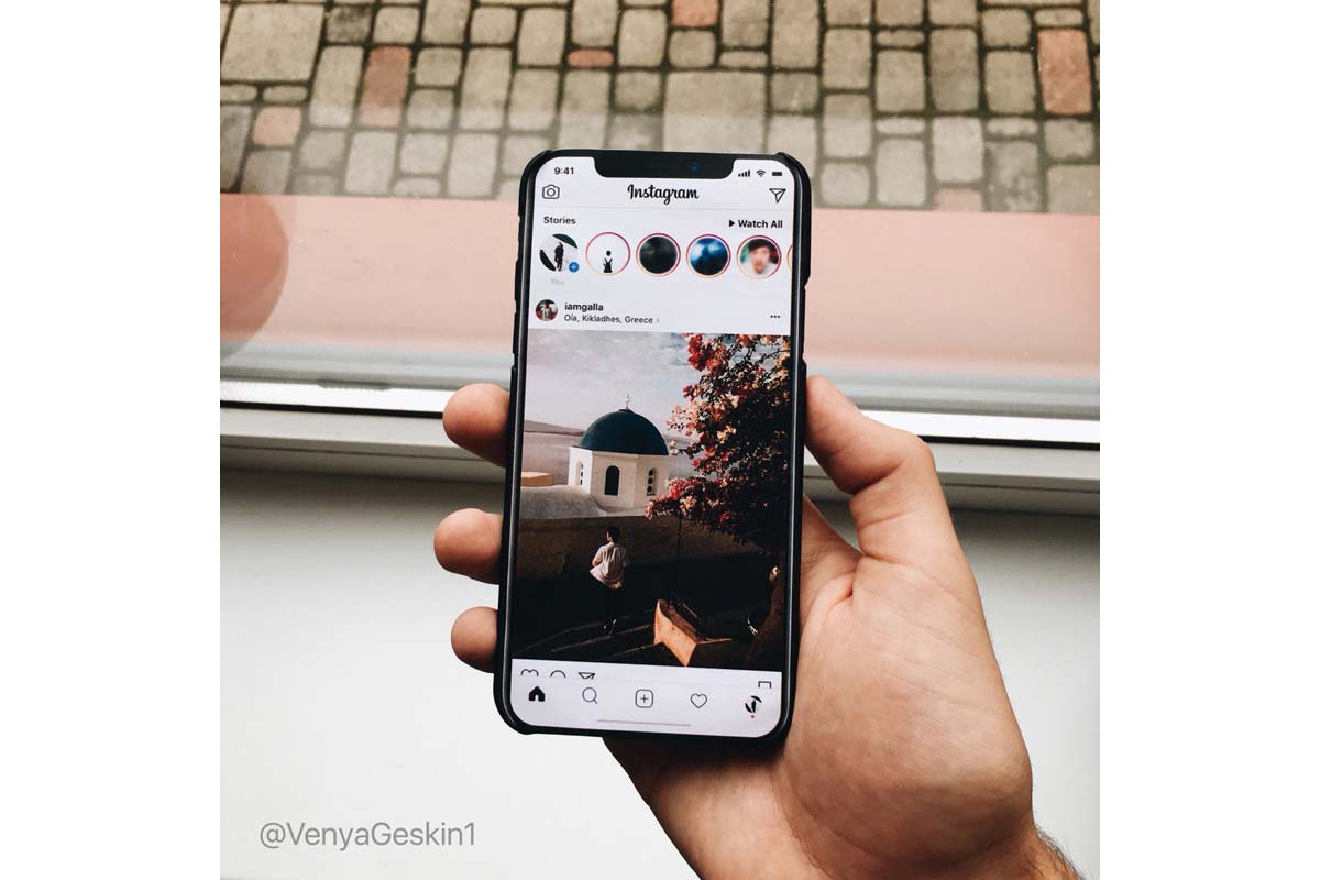
That could lead to a jarring look for some apps, particularly those with lighter backgrounds, if renders by mobile phone concept specialist Benjamin Geskin reflect how the iPhone 8 will handle apps. By the look of things, it appears that the top area of the phone will cut off your apps.
Over the last several months, speculation has mounted that Apple is working on a revamped design for its iPhone 8. That design will include a screen that stretches all the way across and all the way down its face, leaving small bezels all around. However, Apple also needed to find a way to include its earpiece and front-facing camera on the phone, reportedly opting for what's become known as the notch — a black area at the top that will house those features.
Samsung dealt with a similar problem in its Galaxy S8 and Galaxy Note 8 by increasing the size of its bezel at the top and stretching it across the screen. That creates a straight top bezel for the screen to sit under.
MORE: Here's Everything That's New in the iPhone 8
Apple, however, has apparently decided to let the iPhone 8's display stretch to the top. The notch itself doesn't go all the way from left to right.
Sign up to get the BEST of Tom's Guide direct to your inbox.
Get instant access to breaking news, the hottest reviews, great deals and helpful tips.
According to Bloomberg and Geskin, whose predictions were earlier reported on by BGR, app developers will need to make some modifications to their designs to accommodate the notch.
Geskin showed an example of how the feature might work in a mock-up that shows the time on the left side of the notch and battery and Wi-Fi information on the right. Below all that is the app. It's also possible that full-screen apps will need to move some components to accommodate the areas around the notch.
If nothing else, the feature could prove distracting, especially on apps with lighter or white color schemes, where the black notch could stick out.
Still, it's important to note that the notoriously secretive Apple hasn't commented on future software design plans and it's possible the company could opt for a more streamlined software choice. We'll find out for sure on Sept. 12, when Apple hosts its highly anticipated iPhone press event.
Don Reisinger is CEO and founder of D2 Tech Agency. A communications strategist, consultant, and copywriter, Don has also written for many leading technology and business publications including CNET, Fortune Magazine, The New York Times, Forbes, Computerworld, Digital Trends, TechCrunch and Slashgear. He has also written for Tom's Guide for many years, contributing hundreds of articles on everything from phones to games to streaming and smart home.
