Tom's Guide Verdict
There’s no reason to wait to install Apple’s latest mobile OS. iOS 9 is a stable update that adds welcome new features to your iPhone or iPad.
Pros
- +
Useful Back button for easy navigation between apps
- +
Improvements to Siri, Notes and Maps
- +
Multiple search tools.
Cons
- -
Proactive Assistant suggestions are of limited use
- -
News app feels pedestrian for iPhone users.
Why you can trust Tom's Guide
Any time you're about to install a major iOS update, there's always that moment of hesitation, where your finger pauses right above the Download and Install button as you ask yourself, "Do I really want to do this?" It's probably a question a lot of iOS 8 upgraders wish they had asked themselves a year ago at this time, when that 2014 update introduced a slew of problems, such as crashing apps and battery-life hits.
It's natural to fret that history might repeat itself with iOS 9, this year's update to Apple's mobile operating system. But you needn't worry: Switching to iOS 9 is the easiest iOS transition in some time and an upgrade in every sense of the word.
MORE: iPhone 6s and 6s Reviewed
A cynic might suggest that downloading iOS 9 is a no-brainer because there's not a whole lot of major additions to this iteration of iOS, and it's true that iOS 9 is not the major look-and-feel overhaul that, say, iOS 7 was. While iOS 9 introduces some noticeable new features and enhancements, Apple spent most of its energy working on under-the-hood improvements — the kind of changes you don't really notice until you take a step back and realize how smoothly everything's running.
But an iOS update would be a pretty dull affair if it offered little more than a more efficient battery and faster performance. Apple also made a series of tweaks that, when taken together, will help you better navigate the farthest reaches of your iPhone.
Interface
iOS 9's look hasn't changed much from its predecessor, save for a switch to the San Francisco font from Helvetica to match the Apple Watch's appearance. More significant is a change to the iOS' app switcher. Now, when you press the home button twice, open apps fan out to the left in a scrollable carousel reminiscent of the Cover Flow interface. That's a change from iOS 8, where open apps lined up one after the other in a scrollable list.
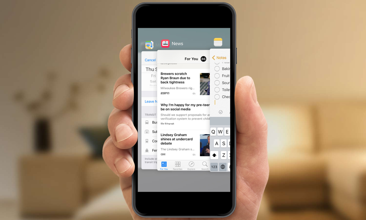
The new look for the app switcher means you'll be able to see only three of your open apps at any point in time, which may cramp some users' styles. I found switching apps to feel a little bit swifter in iOS 9; it's easy to flip through the carousel and find the app I want to use. I will, however, mourn the loss of the frequently used contacts that used to appear at the top of the app switcher. This helpful shortcut has been moved, joining one of iOS 9's more ballyhooed features, Proactive Assistant.
Get instant access to breaking news, the hottest reviews, great deals and helpful tips.
Proactive Assistant is Apple's attempt to make its iOS more contextually aware. Swipe to the right from your home screen, and you'll see a list of what Apple now calls "Siri suggestions." These include those frequently accessed contacts that used to appear on the app switcher, as well as apps installed on your phone.
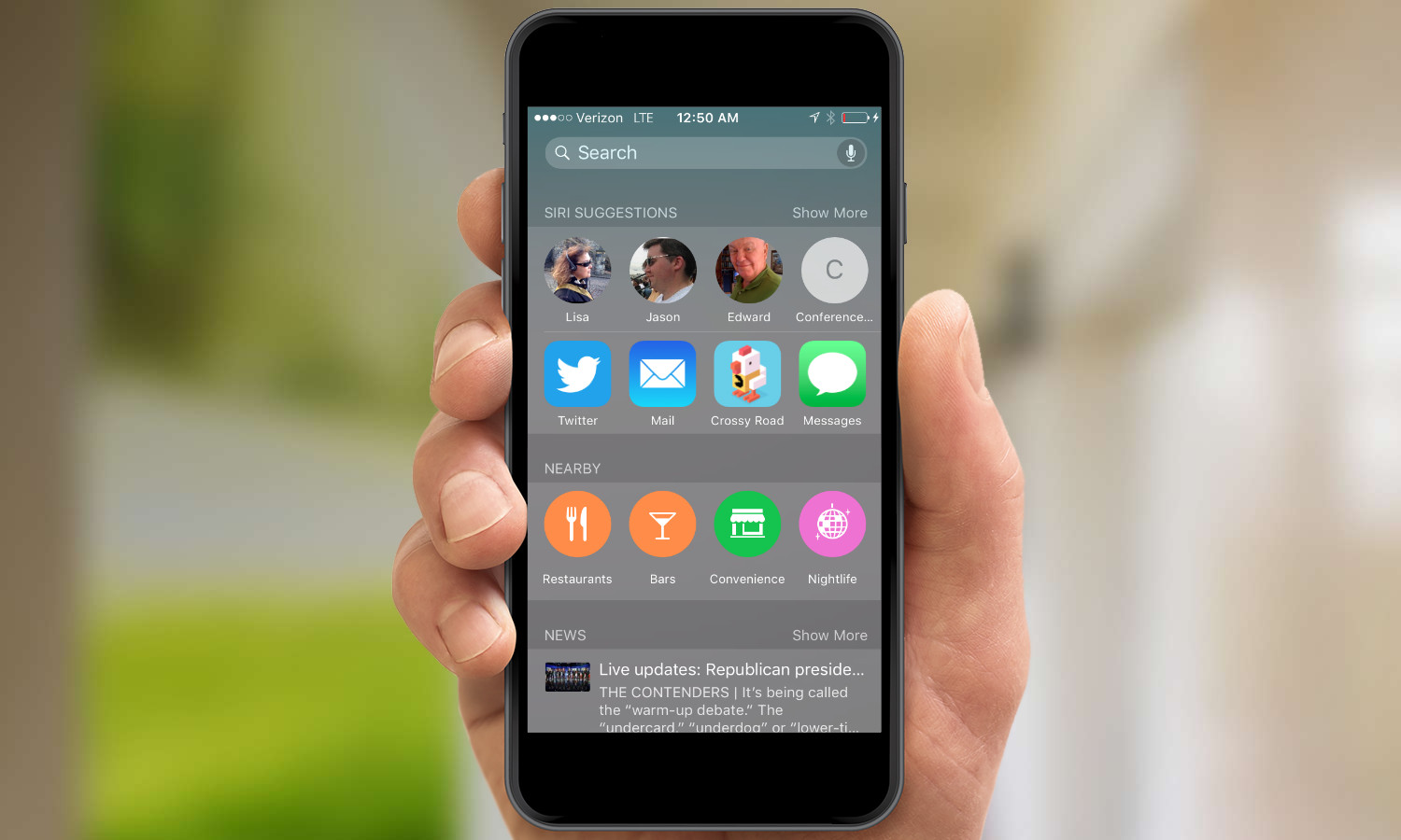
These selections go beyond the apps you use and the people you contact frequently, though — they also take context into account. For example, the Proactive Assistant knows that, during work hours, I'm likely to call either my boss or the office's conference-call line, so those contacts appear among Siri suggestions. Later that night or on weekends, my dad's contact info is likely to replace one of them. The same goes for suggested apps, which pop in and out depending on the time of day and when I've historically used them.
That's a pretty useful implementation of Proactive Assistant, especially as you get used to swiping right to access those suggestions, and presumably as the feature gets more accustomed to which people you talk to, what apps you use and when you do all this.

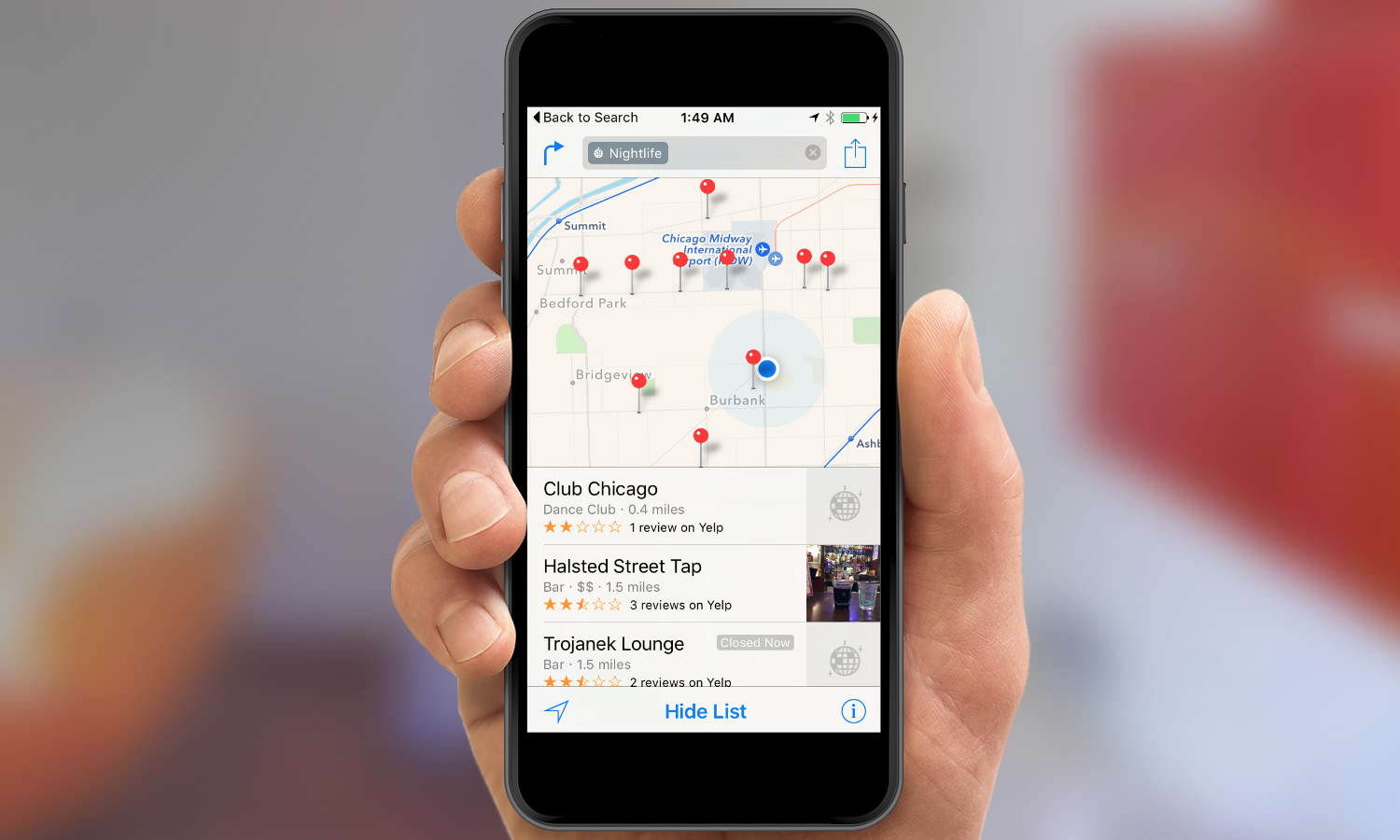
Less useful are the suggestions under Nearby, which highlight businesses close to your location that Proactive Assistant thinks you might be interested in trying. Again, these are tied to context — launch Proactive Assistant in the morning, and Nearby suggestions will include breakfast joints and coffee shops; at night, those change to restaurants serving dinner and bars. Tapping any suggestion will launch the Maps app, so you can get directions and find other information about this new discovery.
MORE: How to Download and Install iOS 9
It's a fine idea in theory, but I've yet to warm to Proactive Assistant's Nearby suggestions. The other day, I found myself on a layover around dinner time, and decided to see if Proactive Assistant had any suggestions about grabbing dinner at the airport. The Nearby suggestions turned out to be not very nearby at all — most were in other terminals, and others were outside the airport entirely. And the low Yelp ratings included with the suggestions implies that Proactive Assistant may know when you want to eat dinner, but it's still a little shaky on where to send you.
Proactive Assistant has been seen as a step by Apple to offer more of the context-aware information that Android users already get from Google Now. At this point in Proactive Assistant's very brief life, there's nothing here that's going to make Google Now devotees feel any pangs of envy, especially with more improvements to Google's intelligent assistant slated for Android M. The nicest thing to be said about Proactive Assistant is that the feature has plenty of room to grow.
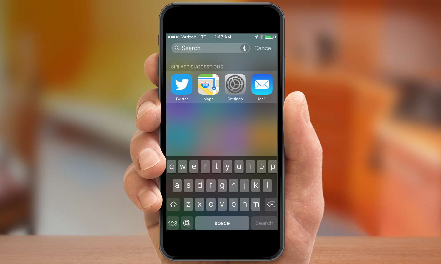
It will be very difficult to not find exactly what you're looking for in iOS 9. In addition to swiping right for suggested contacts, apps, nearby recommendations and some not-very-interesting news headlines, swiping down on your home screen produces a search bar and four suggested apps. Type in the search field, and iOS will show you apps, music, mail, messages and more that match your query.

Improved searches even extend to the Settings app, where Apple has added a search field. This is a welcome addition for anyone who's ever stared at a list of options in Settings and wondered where to find a particular function. Now, you can start to type "app" and get a shortcut to everything, from a way to restrict in-app purchases to controls over which apps can refresh their content in the background. It's a real time-saving addition.
Design
So if Proactive Assistant isn't the feature that will make you embrace an iOS 9-led future, what will? As evidenced by the revamped app switcher and multiple search methods, Apple clearly invested a lot of energy into making iOS 9 help you do things faster. Nowhere is that investment more evident than in the addition of Back buttons.

Let's say someone includes a link to a Web page in an email to you. Prior to iOS 9, you would click on that link, launching Safari; to get back to the message after looking at the page, you would have to quit Safari and relaunch Mail. But now, iOS 9 builds Back buttons when you jump between apps. That Web page will now include a Back to Mail link in the upper-left corner that returns you to the message where you started. I never realized what a drag it was to quit one app and go back to another until iOS 9's Back buttons saved me from having to do it anymore.
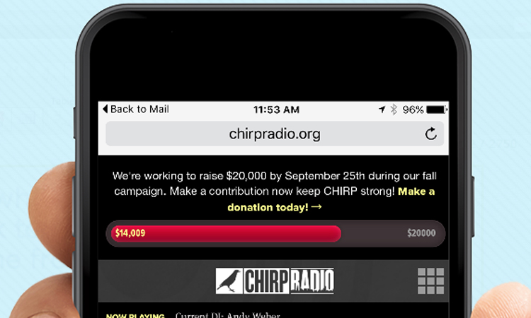
Apple has peppered iOS 9 with Back buttons. You'll find them in Calendar, Maps and Notes, just to name a few. It's not the sort of feature that brings down the house during an on-stage demo — if it's even shown at all — but it will make your life with iOS much better than it was before.
In another design tweak that will save users a lot of frustration, Apple made a subtle but significant change to the keyboard in iOS. Hit the Shift key, and the letter keys will alternate between uppercase and lowercase, providing a time-saving visual cue to let you know what style you're typing in.

Siri Surprises
Up until iOS 9, Siri and I have not really been on speaking terms. I might use Apple's voice-driven personal assistant to dictate the occasional text to my wife or set a reminder, but far too many of my past Siri interactions ended with me turning elsewhere for help when Siri served up an unhelpful list of Web search results.
That may well change with iOS 9, largely because Apple has taken great pains to make Siri interactions more conversational. For example, I can ask Siri for the score of the Oakland A's game, and she dutifully tells me about another disappointing loss; if I follow up by asking, "When do they play tomorrow?" Siri knows I'm still asking about the A's.
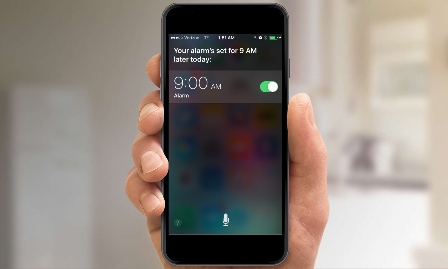
There are still struggles with Siri, which has a redesigned look in iOS 9 inspired by the colorful wavelengths that represent Siri on the Apple Watch. I asked Siri about the weather in Chicago for an upcoming trip and was told about the current conditions in the Windy City. "And what's the weather like tomorrow?" produced a response about the forecast in my current location of San Francisco, not in Chicago. Still, Siri is definitely getting smarter as context becomes more important. I'm particularly enamored with using Siri in the kitchen, where I can tell her to set a timer or ask for help with converting measurements when I'm elbow deep in a recipe.
The addition of voice training to iOS 9 should make Siri even more of a time-saver. The Hey Siri feature introduced in an earlier version of iOS let you issue hands-free commands to Apple's voice assistant. Now, with iOS 9, you can train Siri to recognize only your voice using a simple setup process. And it works well: My wife's cries of "Hey Siri" failed to stir my iPhone 5c to life.
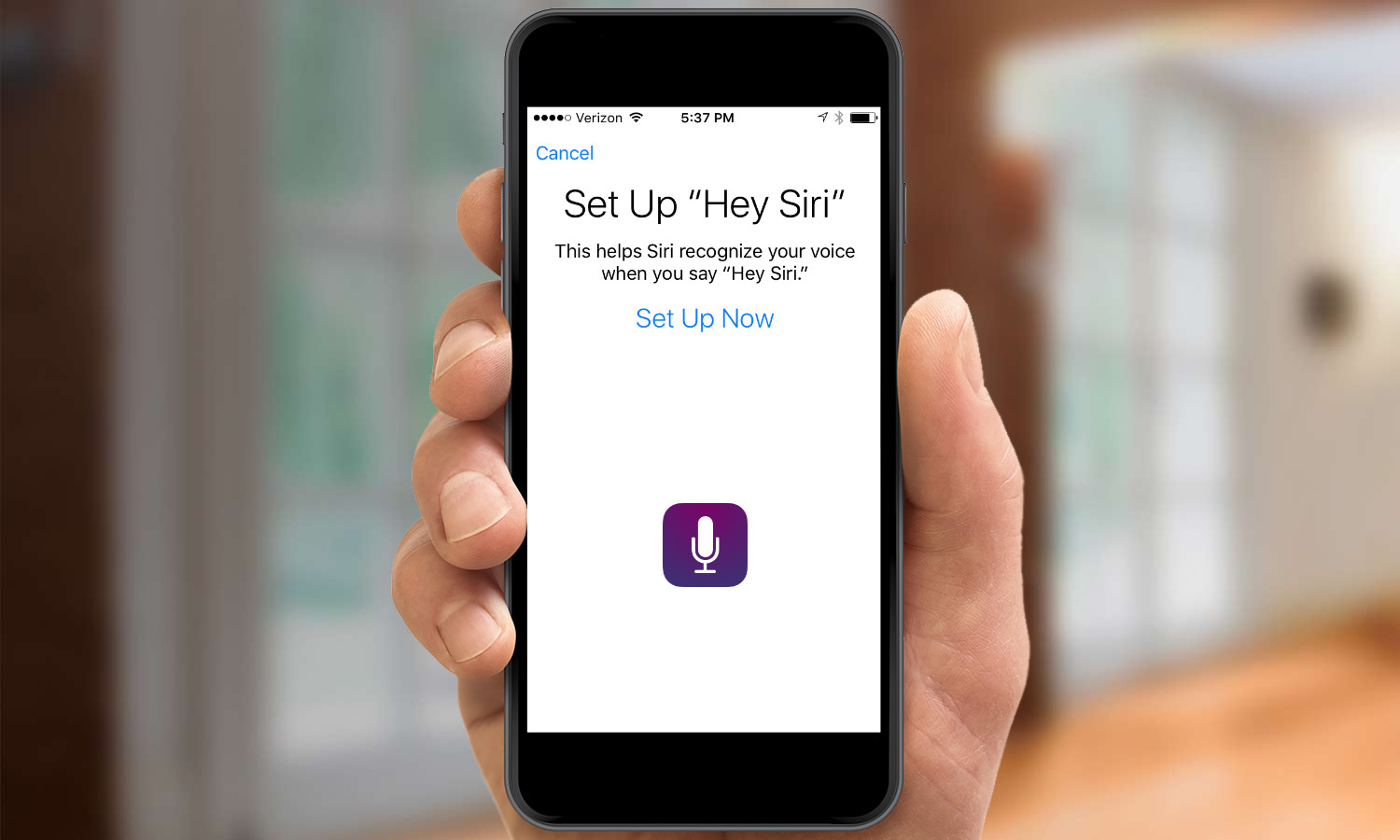
The feature has its limitations, since you can only make "Hey Siri" queries when your phone is plugged in, although that changes with the newer iPhone 6s and 6s Plus, which are always listening. As with many of the changes in iOS 9, not having to reach for a phone whenever you want to set an alarm, dictate a text message or open an app can be a time-saver.
What's New with Apps
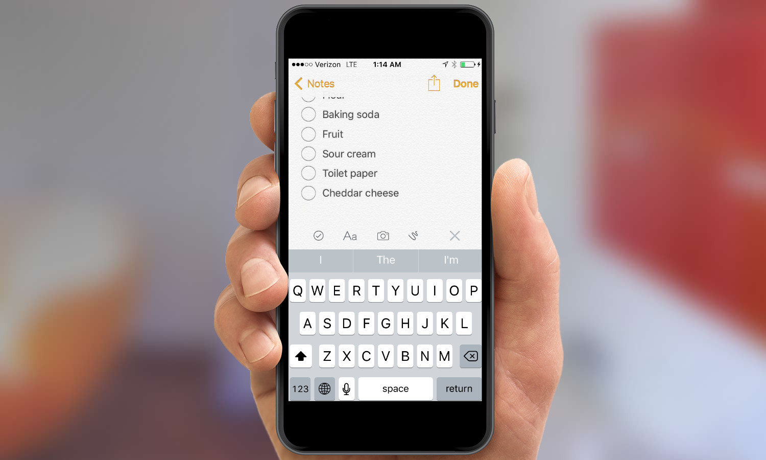
Speaking of iOS mainstays that have gotten a new lease on life, take a long look at the new Notes. Some people use iOS' built-in note-taker to jot things down largely because it's right there on the home screen and not because they have any great affection for it. That might change with iOS 9, thanks to some new capabilities that bring Notes a step closer to better third-party note-taking tools.
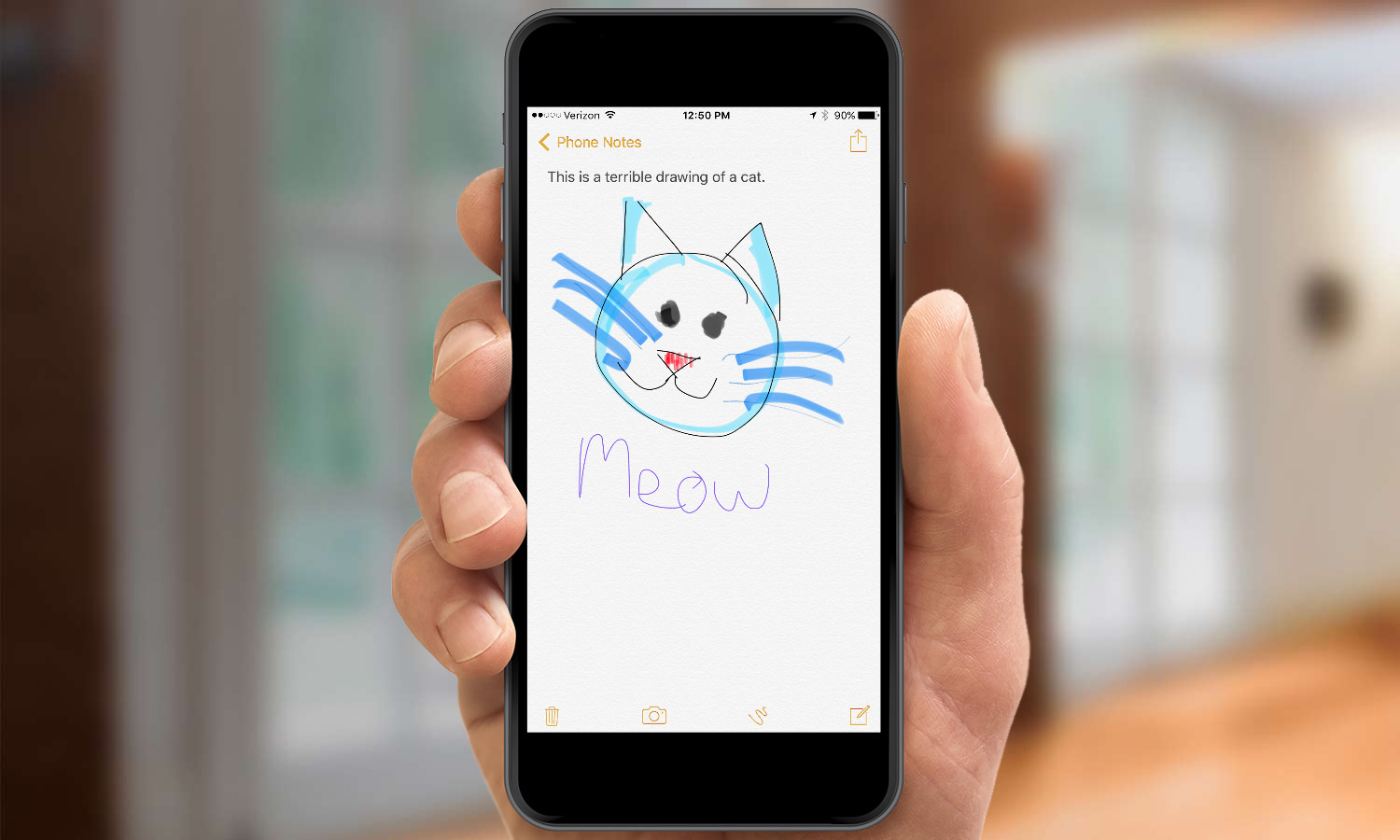
You can now insert rich content like maps, images and Web snippets — an ability that improves Notes' worth as a brainstorming tool. Drawing tools let you highlight text or even jot down a quick sketch. But for me, the best addition to Notes has been the ability to easily create checklists with actual checkable buttons. My iOS 8-running wife looks on with envy at my neatly ordered shopping lists.
Maps also gets a welcome change, if you happen to live in a city where the new public transit feature is offered. (Currently, those cities include Baltimore, Chicago, New York, Philadelphia, San Francisco and Washington, D.C., in the U.S.) As someone who prefers to let others do the driving, I enjoy having the option of selecting transit for directions in Maps. Apple has also done a good job of mapping out terminals and accounting for walking times on multimodal trips.
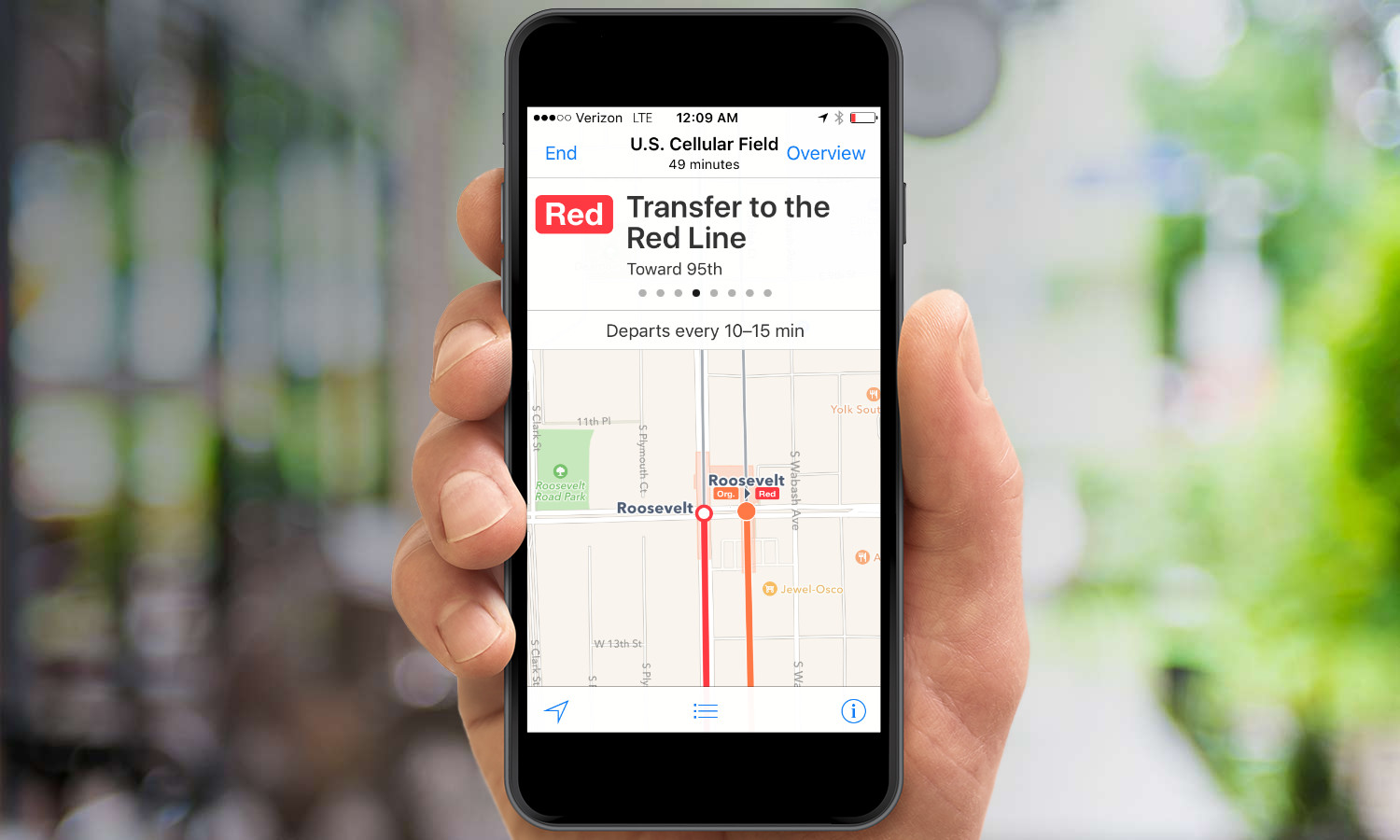
I have two minor complaints, however: I wish the transit feature included fare information, and Maps is apparently unaware that the San Francisco Bay area has a thriving ferry service, since that's never offered as a transbay option when I plot a trip from my East Bay home into San Francisco. (To be fair, ferry service seems to be a shortcoming in a lot of mapping services; Google Maps doesn't offer it, either.)
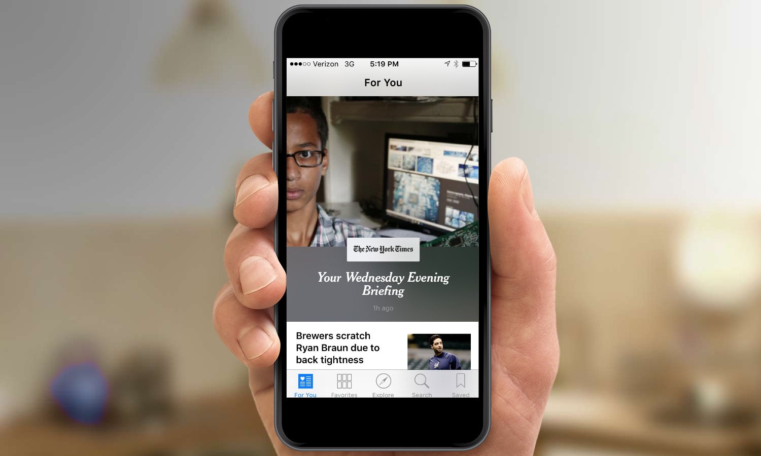
Less auspicious is the debut of News, at least in its iPhone implementation. News pulls down headlines from multiple sources and on topics you select, for a customized news presentation that Apple promises will be "a beautiful new way to stay informed." That's hardly the case on the iPhone, where headlines look drab, story descriptions are cut off and pictures appear as tiny thumbnails. (The lone exception: A New York Times daily news summary that features a big picture, but no other compelling reason to click on the article.) To be fair to News, it looks much more impressive on the iPad, where it does feel more like a customized daily news digest, and this app will probably evolve over time if Apple strikes deals with more publishers. On the iPhone, however, there's little that News does that a well-established third-party apps like Flipboard don't do with greater panache.
iPad Multitasking
Speaking of the iPad, iOS 9 introduces true multitasking to Apple's tablet line, with three new features. The Slide Over feature is also a nifty trick for iPad users. Pulling in from the right opens a panel where you can select an app to run in a smaller window that takes up about a third of the screen. That means you could have a Web page on one screen and Twitter or the News app on another; the larger of the two screens gets grayed out until you're ready to give it your full attention again.
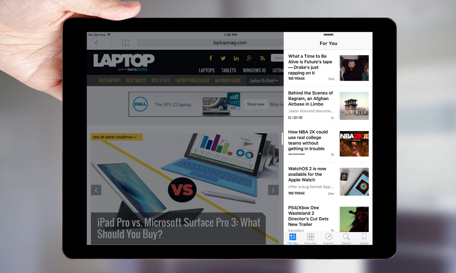
If you want to go full-on, two-screen mode, you simply pull the smaller window a little farther to go into iOS 9's new Split Screen mode. Either app can then call up the keyboard. It was painless to float back and forth between two apps with a single tap. Not all third-party apps support Slide Over or Split Screen yet. For instance, you won't find Netflix there, but I see this being a real boon to getting actual work done. iPad multitasking capabilities will breathe new life into your iPad, assuming you have a recent model that can support the new features. It makes iOS 9 a must-have for iPad users.
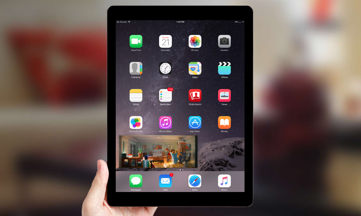
In the Video Player, a new icon appears on the bottom-right corner with two rectangles on top of each other. Tapping that turns what you're watching into a small, floating window that will stay with you and continue playing as you open other apps. The picture-in-picture window, which sits on any of the four corners, is easy to resize with a reverse pinch. Playback controls make it simple to go back to full screen, pause or stop the picture-in-picture mode. The end result: You can play the Lego Movie nonstop while writing an email, for example. I can't wait to see this feature integrated into third-party apps such as MLB or Netflix.
Performance
I've noticed very few lags in performance since upgrading to iOS 9. The biggest culprit has been Mail, which sometimes takes a bit to upload messages and occasionally displays attachments in a haphazard way. Quitting the app seems to solve both issues.
While upgrading iOS 9 hasn't hurt performance overall, I haven't noticed much in the way of speed improvements for my iPhone 5c. And our benchmark testing bears that out, with iOS 9 posting decent gains from iOS 9. Both an iPhone 6 and an iPhone 6 Plus running iOS 9 showed improved performance over their iOS 8-running counterparts in every test but one — results were flat in Geekbench, which measures processor, read/write and graphics performance. One thing we did notice during testing was that iOS 9 appears to read internal storage faster than iOS 8 did.
Battery
Apple says it spent a lot of energy figuring out how to save energy with iOS 9, cutting down on battery usage by making background technologies and apps run more efficiently. Some of that involves minor things, like using the iPhone's built-in sensors to know when it's lying face-down on a desk so that the screen doesn't have to light up when a notification comes in.
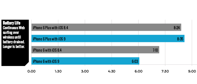
We didn't see that promised improvement in our battery testing. In our battery test, we recorded 8 hours and 35 minutes of battery life on an iPhone 6 Plus upgraded to iOS 9 — that's a modest improvement over the 8:24 we got from the same phone running iOS 8.4. However, battery life dropped on an iPhone 6 after we upgraded to iOS 9 — down to 6:03 from the 7:10 we recorded when the phone was running iOS 8.4.
That said, in my own anecdotal experience, I haven't noticed any change in battery life since I've been running iOS 9. Some days seem to eke out more battery life than others, but for the most part, my phone seems to perform as well as it did running iOS 8. And that's a good thing, since an iOS update normally means a noticeable hit on battery life.
MORE: Smartphones with the Longest Battery Life
The most practical change to battery life on iOS 9 has been the addition of a low-power mode, similar to what already exists on the Apple Watch. On those occasions where the formerly dreaded 20-percent power notification pops up, iOS 9 offers the option to switch to Low Power Mode, in which the phone will go to sleep more quickly, its screen will consume less power and background tasks like fetching mail or refreshing apps will occur less frequently or stop altogether.
The real-world benefits of Low Power Mode are noticeable right away. I turned it on at around noon one day — you can do so in Settings without waiting for a prompt from iOS 9 — when my battery was at 50 percent. I still had life on my iPhone 5c some 7 hours later, and that was after a day of regular tweeting, email fetching, Web browsing and even streaming a short video via Periscope. Those activities will eat away at battery life, but leaving your phone idle will not. Whenever I took my phone out of my pocket after a period of inactivity, it still showed the same percentage of remaining battery life as it had before.
Device Support
iOS 9 runs on the iPhone 4s and later, the iPad 2 and later and the fifth- and sixth-generation iPod touch. Those well-versed in the ins and outs of iOS compatibility will note that those are the exact same devices that supported iOS 8. That's likely not a coincidence, given Apple's focus on improving the overall mobile experience.
What has changed in the ensuing year is the size of the update. iOS 9 requires 1.3GB or so of free space to install — the exact size depends on the device you're using and which iOS you're upgrading from — while iOS 8 demanded nearly 4.6GB. That means you're likely to have to do less frantic deleting of apps and files to make this update fit on your iOS device.
Not every iOS 9-running device will support every feature, though. Most of the iPad multitasking features will only work on Apple tablets released since 2013, with the Split View feature only available for the iPad Air 2, iPad mini 4 and the still-to-ship iPad Pro. Only the forthcoming iPhone 6s and iPhone 6s Plus will support 3D Touch-inspired shortcuts and be able to take Live Photos, which add video and audio to your photos. That's understandable, though, as those are hardware-driven features. Still, if your iOS device runs iOS 9, you'll at least be able to view the audio and video effects of a Live Photo.
Bottom Line
The question any iPhone user should ask before upgrading to a new OS should be, "Will this improve my experience on this device?" Thanks to the myriad enhancements Apple has made just with navigating through the OS, coupled with ongoing tweaks to existing apps, the answer is a definitive yes for iOS 9. Normally, I advise people to wait for a minor update or two so that Apple can fully work out the kinks on any major OS update. There's no need to do that with iOS 9. This is an improved OS that's ready for prime time.
Philip Michaels is a Managing Editor at Tom's Guide. He's been covering personal technology since 1999 and was in the building when Steve Jobs showed off the iPhone for the first time. He's been evaluating smartphones since that first iPhone debuted in 2007, and he's been following phone carriers and smartphone plans since 2015. He has strong opinions about Apple, the Oakland Athletics, old movies and proper butchery techniques. Follow him at @PhilipMichaels.
