Android TV Suddenly Looks Much Better
Android O means a new look for the Android TV home screen. Here's what Google has planned for its smart TV platform.
A new version of Android will bring a new look to Android TV. Google is betting that the reorganized home screen will make it easier for people to figure out what to watch on their smart TVs, game consoles and set-top boxes.

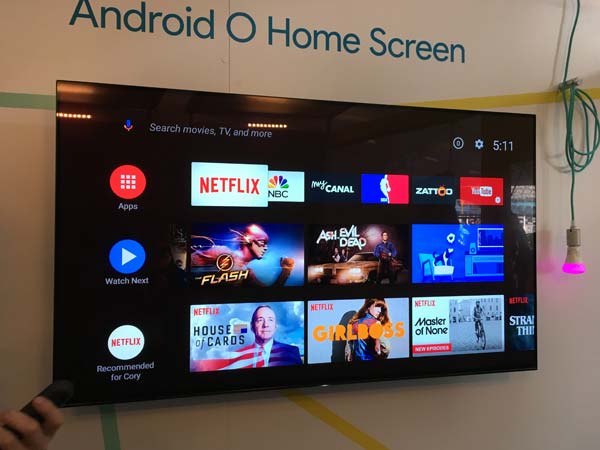
The redesigned home screen for Android TV, which will arrive as part of the Android O update later this summer, puts the emphasis on channels. Google says that movies and TV shows will be front and center with this new approach so that you can better find appealing programs.
In talking up the changes to Android TV, Google painted a rosy picture of its smart-TV platform, noting that Android TV activations have more than doubled in the past year. Still, it's hard to shake the feeling that Android TV has been pretty much forgotten in the three years since Google introduced the platform as a successor to the not-at-all-missed Google TV.
MORE: The Biggest Features in Android O
Google executives say they approached the Android TV redesign looking to tackle a couple of problems with the TV-watching experience in the age of binge-watching. For one thing, Google's research found that it's hard for viewers to come to grips with all the shows and movies that are available to them; for another, viewers no longer are drawn to programs just by seeing a poster or a title.
What's New with Android TV
The Android TV revamp aims to solve that first problem with a channel-based approach. Instead of showing a grid of apps that you have to dig into to find programming, TV shows and movies are now placed front and center.
Apps certainly still have a place in the new-look Android TV. The top of the interface displays your favorite apps for quick access. But just below those, a Watch Next field displays additional episodes of TV shows you've already watched, programs you've favorited and movies or shows that you started watching but have yet to finish.
Below those two rows, you'll find channels as Google has billed them. These are tied to apps, but they display specific programming that each app offers — Netflix's row, just to offer one example, might tout original shows like House of Cards or Master of None. The app maker gets to pick what shows get highlighted, which is one of the reasons Google is talking up this Android TV redesign at its developer conference.
Sign up to get the BEST of Tom's Guide direct to your inbox.
Get instant access to breaking news, the hottest reviews, great deals and helpful tips.
Android TV's best new feature may be previews on the home page. Scroll over a particular program and a short preview will play there on the home screen. In the demo I saw, that meant trailers for Hidden Figures and Fantastic Beasts and Where to Find Them, but again, app makers can pick what they highlight. A preview for NBA TV, for example, might show selected game clips.
At first glance, the new Android TV certainly seems like an improvement over Apple TV, which relies on a grid of apps to help you find what to watch. Apple has come out with a TV app that gathers up all the things you might want to watch in one place, but you still have to drill down to find that content. The Android TV redesign that puts programming front and center on the home screen.
Android TV is getting another feature as part of this redesign: Google Assistant will be built in, though that's a change Google first teased back in January. You'll be able to use voice-powered commands to find things to watch, and Google is promising that the conversational style of Assistant will translate to its TV platform. You'll be able to look at a list of movies, say "Play the 3rd one," and Google Assistant will be clever enough to know that you meant Deadpool since it was the third option listed.
We'll see just whether these new features breathe new life into Android TV once the Android O update arrives in a few months.
Philip Michaels is a Managing Editor at Tom's Guide. He's been covering personal technology since 1999 and was in the building when Steve Jobs showed off the iPhone for the first time. He's been evaluating smartphones since that first iPhone debuted in 2007, and he's been following phone carriers and smartphone plans since 2015. He has strong opinions about Apple, the Oakland Athletics, old movies and proper butchery techniques. Follow him at @PhilipMichaels.

