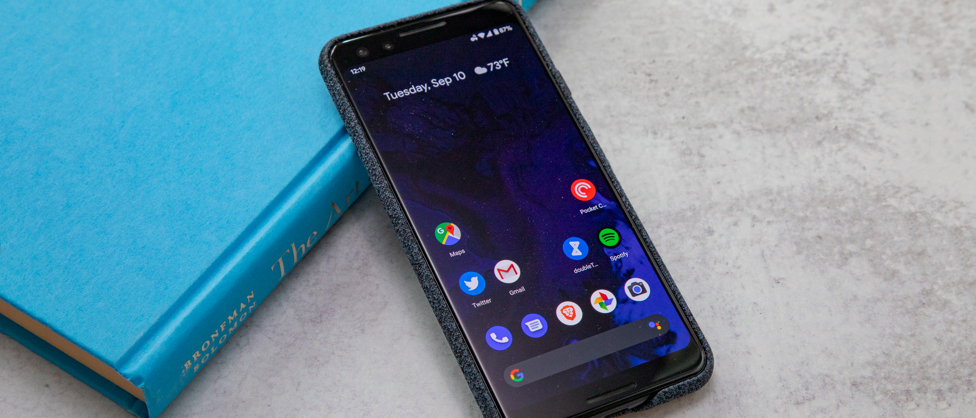
Tom's Guide Verdict
Don't feel left out if you can't get the Android 10 update on your smartphone yet. At this stage, Android 10 feels unfinished, though the location, privacy and notification enhancements are welcome.
Pros
- +
New location tools are helpful
- +
Smart Reply for all messaging apps
- +
Share Sheet improved
Cons
- -
Dark Theme is poorly integrated
- -
No more Android Auto phone view
- -
Live Caption isn't here yet
- -
New gestures decent but messy
Why you can trust Tom's Guide
Updated, Oct. 16: Google has announced plans to bring Android 10's Live Caption feature to its Pixel phone.
For better or worse, we're primed to expect the 10th version of something to be a pretty big deal. Blame it on our use of the decimal system. Whatever the cause, when news broke that Google has ditched Android's alphabetized dessert scheme for something a little more traditional, we sensed that the update would signal a new era for the world's most widely used mobile operating system.
As it turns out, Android 10 doesn't represent quite the leap forward its bombastic name forecasted. Sure, some requisite improvements have come to location sharing, privacy and the Digital Wellbeing suite introduced in Android 9 Pie. However, those are the kinds of tweaks you'd expect at this point in the life span of a mature platform: nice, but more or less table stakes.
No, Android 10's miscues pertain to the big stuff — those ambitious, hotly requested features, like Dark Theme and the entirely gesture-based navigation system. Lapses like those, plus the update's limited availability to just Pixel phones at the moment, unfortunately make the first numbered release of Android feel like a step back.
Navigation gestures: Useful yet frustrating
Yes, we've been here before, and there is a reason for your déjà vu. Google really did launch a new set of navigation controls with last year's Android Pie update, based mostly around gestures — well, sort of.
That scheme replaced the standard three-button approach with one pill-shaped home key that you could also swipe up on to reveal your recent apps or a complete app list, depending on how and where you performed the motion. Oh, and there was a back button in the mix too, but only sometimes.
It was a mess, albeit one you got used to. However, Google has new ideas in place for Android 10. While the changes address some of my issues with the old scheme, the new approach is still not perfect (or even as good as what some third-party Android phone makers, like OnePlus and Xiaomi, have cooked up).
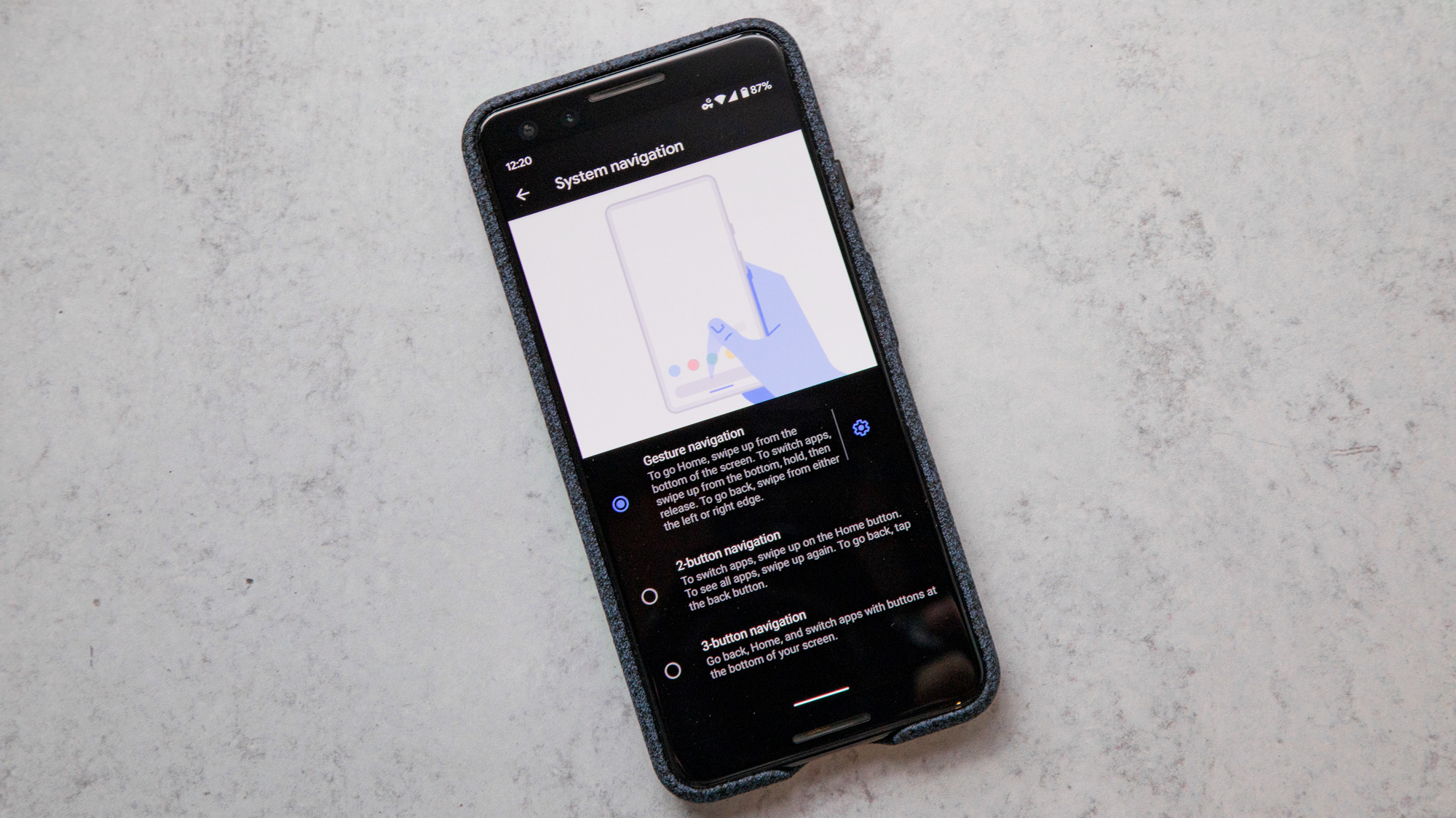
Android 10's new, fully gesture-based controls replace that oblong home button with a thin bar that takes up almost no space at the bottom of the screen. That's very good — after all, one of the prime benefits of using gestures for navigation is to free up the display real estate that a set of buttons would normally occupy.
You quickly swipe up on this bar to go home, swipe up longer and more deliberately to see all your apps, and swipe diagonally from the corners to summon your Google Assistant. Where things get interesting is when you want to go back; there's no back button, so you swipe inward from either side of the display.
The one thing I like about this approach is that it puts the back motion within reach no matter how you hold your phone. If you're right handed, you can swipe in from the right; if you're a lefty, it's more convenient to initiate the motion from the left edge.
The problems arise when you go to pull out an app's side menu. In every previous version of Android, you'd simply swipe in from the left side. But in Android 10, that action simply sends you back, likely closing the app. Of course, you can tap the hamburger menu icon directly to access those contents — though that kind of defeats the purpose, doesn't it?
MORE: 10 Reasons Android Beats the iPhone
I'll be honest: The swipe-to-menu gesture is something I always forgot I could do, so it never caught on with me. As a consequence, Google's adjustments here don't personally bother me too much or impact my habits. That said, I have to imagine it's an extremely frustrating change for those who have become used to the method.
And these flaws look even worse because one Android partner in particular, OnePlus, has devised a dead-simple solution to this conflict that Google evidently couldn't. On the beta Android 10 release on the OnePlus 7 Pro only gestures performed near the top of the display open slide-out menus; everywhere else, those swipes register as back motions.
It'd be great to see Google pick up on that common-sense fix, though history suggests that the company probably won't. Thankfully, for the time being, you can return to the old navigation methods via the system settings — that is, until they're likely deprecated in a future version of Android.
Dark Theme: Just not ready
The public clamor to dark-mode all the things has finally touched Android. That's good news if you find the standard, light interface too harsh on the eyes or if you own a phone with an OLED display and could use the battery-life savings.
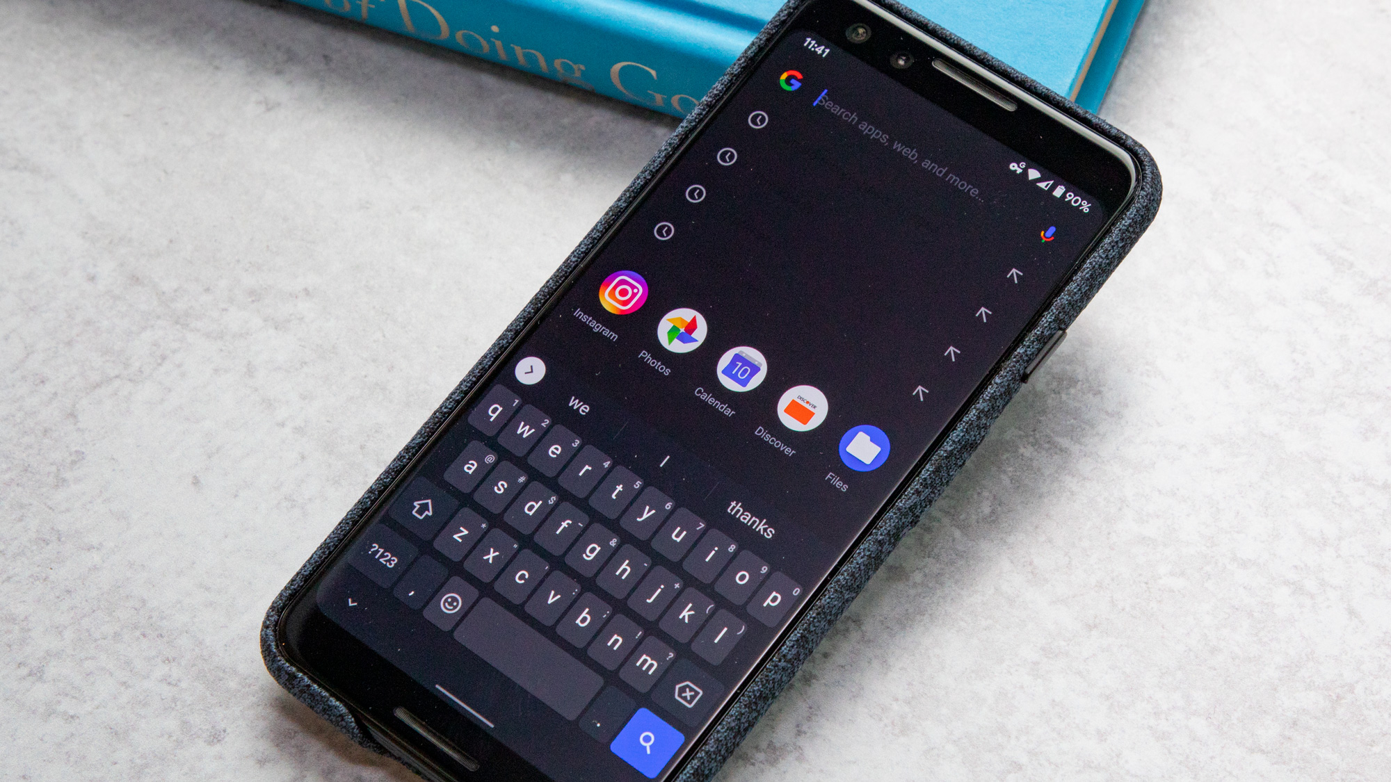
Unfortunately, though, Android 10's Dark Theme is easily the worst implementation of such a feature I've ever used.
There are many reasons for this, but the primary one is that Dark Theme, in its current incarnation, is unfinished. Many of Google's apps, like Maps and Gmail, still don't have accompanying dark modes of their own. And to make matters worse, even some of the ones that do support the feature don't follow the system-wide Dark Theme toggle in Android's display settings. For apps like Messages, you have to flip the switch separately — within the app itself.
The other issue is one of consistency. Android 10's Dark Theme never seems to know precisely how dark it should be. The Settings app and notifications opt for a fully black, lights-out background, while many of Google's apps adopt a dim bluish gray. Gboard has a few dark themes of its own, though they don't auto-toggle either, and none of them quite match the hue or darkness of the gray used in Google's own software.
MORE: 10 Reasons the iPhone Beats Android
Even the Google app itself doesn't have a dark counterpart yet, but when I tap the search bar on my Pixel 3's home screen, my recent searches appear as black text on a gray background. Yuck.
It's surprising Google would launch something as sweeping as a system-wide dark mode, which touches every aspect of the OS, without ensuring it's complete first. When I compare my experience using Android 10's Dark Theme to iOS 13's implementation of the feature, the difference is — please excuse the pun — night and day. Flipping that switch on an iPhone instantly transforms everything, including the stock wallpaper, to match the same aesthetic. Everything looks like it fits. Better yet, iOS 13 even gives you the option to keep the interface light during the day and dim it only at night, based on a custom schedule you set.
Perhaps one day Google will achieve that level of consistency. Before it can, there are loads of apps to update and kinks to iron out — like how dark apps still open with white splash screens. Until those issues get sorted, my Pixel 3 will remain bright, even as my MacBook Pro and Windows desktop have fully embraced the shadows.
Location, privacy and notifications: Simple yet effective tools
Location access is a tricky thing with smartphones. In recent years, Google and Apple have given users the power to control what apps can see them, and when and where. However, there's clearly still work to do. Fortunately, Android 10 is a step in the right direction.
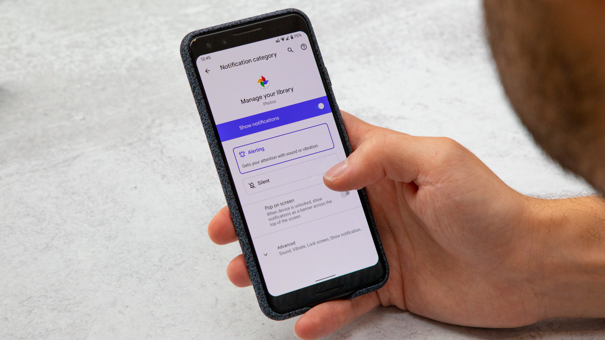
New for Android 10 is a set of three options for determining an app's level of location access: always, only while using the app and never. These aren't strictly novel; iOS has had some version of this for a few years now. But Google's implementation shines in what immediately happens after you upgrade your device to Android 10.
Use your phone as normal, and you'll get notifications that this and that app have just accessed your location in the background. The moment that happens, you'll have the option to change that behavior right then if you want to. And it's eye-opening. We're always told that software is pulling personal data, like our location, whenever it pleases. Up until now, though, it's never been easy for users to pinpoint precisely when that happens or how often certain apps are abusing the permission.
Android 10 alerted me when Lyft pinged my location at 2 a.m., even though I hadn't used that app in weeks. The OS notified me when Instagram and Snapchat retrieved location data, for similarly unknown reasons. And each time that happened, I was able to instantly shut that needless behavior down. It's easily my favorite thing about Android 10, one that surprised me but also offered peace of mind I never had before.
MORE: Top 7 Android 10 Features That You Should Try First
The new approach to notifications is similarly straightforward yet effective. Android Pie individually broke out every type of notification a given app could serve you, giving users fine control over which apps could bother them, when and precisely for what reason. Android 10 goes a step further by offering two notification types: alerting and silent. The latter offers a more discreet way to nudge you, without chiming and overtaking the top of your device's display. Better yet, silent notifications are broken out into their own grouping when you pull the shade down, and they're automatically deprioritized behind normal alerts.
Notifications for messaging apps, in particular, have been supercharged for Android 10. Google's Smart Reply feature — which delivers scarily appropriate responses in the company's built-in Messages and Gmail apps — has been expanded to pop up in quick-reply notifications from third-party chat clients, including Facebook Messenger and Signal. As far as improvements go, this one is a no-brainer. Smart Reply is a massive timesaver, though if you're unconvinced of its powers, you can still turn it off.
Sharing: Better, but still not best
Sharing links and images has always been a chore on Android, in large part due to the Share Sheet, that pane that pops up after you tap the share icon for certain media. In previous versions of the OS, the sheet would expand to a mess of names and apps, making it difficult to select the destination you wanted. Plus, it was laggy, so sharing options appeared before your eyes in real time, moving others over and adding to the frustration.
The new Share Sheet begins with a minimized list of individuals you usually share content with, followed by another list of frequently used apps. With this approach, you won't spend time hunting for contacts; the recipient you're likely seeking is up top and within reach. For links, the copy button is all the way at the top, which is pretty convenient as well. And everything within the sheet surfaces at the same time, so you'll no longer accidentally tap on one icon as it changes to another.
MORE: Best Android Camera Apps
The revised sharing experience is nice, though it still doesn't address the one problem I've always had with Android: the inability to copy and paste images, like you can with text. iOS, Mac and even Windows all allow you to do this. And while some Android apps, like Chrome, circumvent this problem with options to share images by long-pressing them, other apps, like Twitter, don't operate this way. So you have to save the picture first, then attach it — which is a bit too involved if you're quickly firing off a disposable meme you want to see once and never again.
Focus Mode: A break when you need it
Android's Digital Wellbeing suite remains mostly unchanged, as you'd expect given that Google only introduced it in Android Pie last year. Still, it gains one new feature: the easy-to-use Focus Mode.
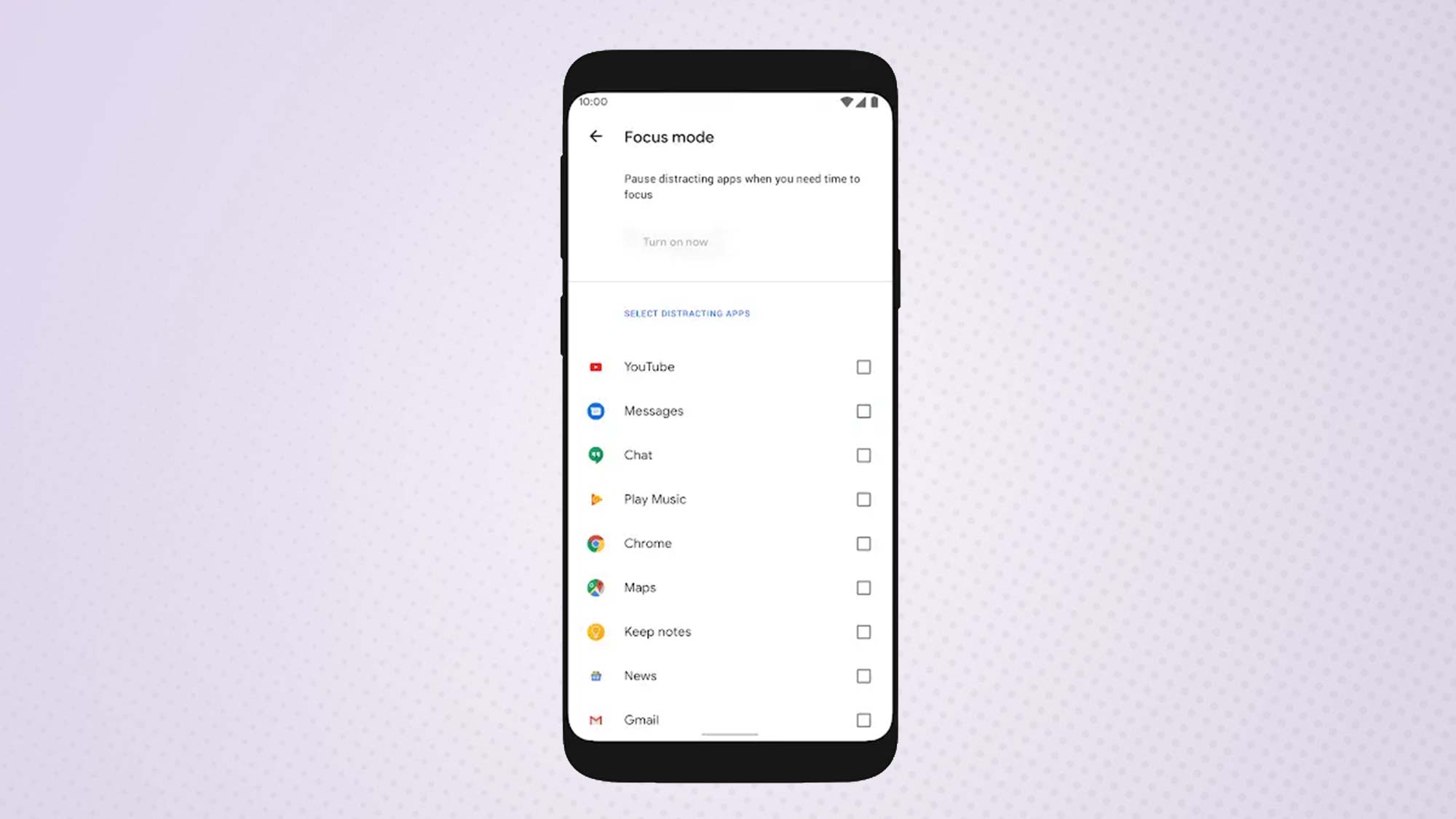
When Focus Mode is active, it simply disables apps you've added to a blacklist. The idea is that you'd activate Focus Mode when you can't afford to be distracted. Turning the feature on from Android's quick toggles instantly renders those especially time-sinking apps inaccessible.
MORE: Best Free Android Apps - The Most Useful, Essential Apps
As someone who never took advantage of Digital Wellbeing to begin with, I like Focus Mode because it promotes healthier phone-usage habits but isn't as complicated or invasive as scheduling Wind Down or App Timers. It's excellent for those moments when you realize your handset really is soaking up too much of your attention and you need a break right now.
What's not here: Live Caption, Bubbles, theming, mobile Android Auto
You may have noticed that this review has been surprisingly light on one of Android 10's most exciting new features: Live Caption. There's a good reason for this, though, as Live Caption didn't appear in Android 10's initial release and won't make it to all devices that run Android 10 even when it does come out.
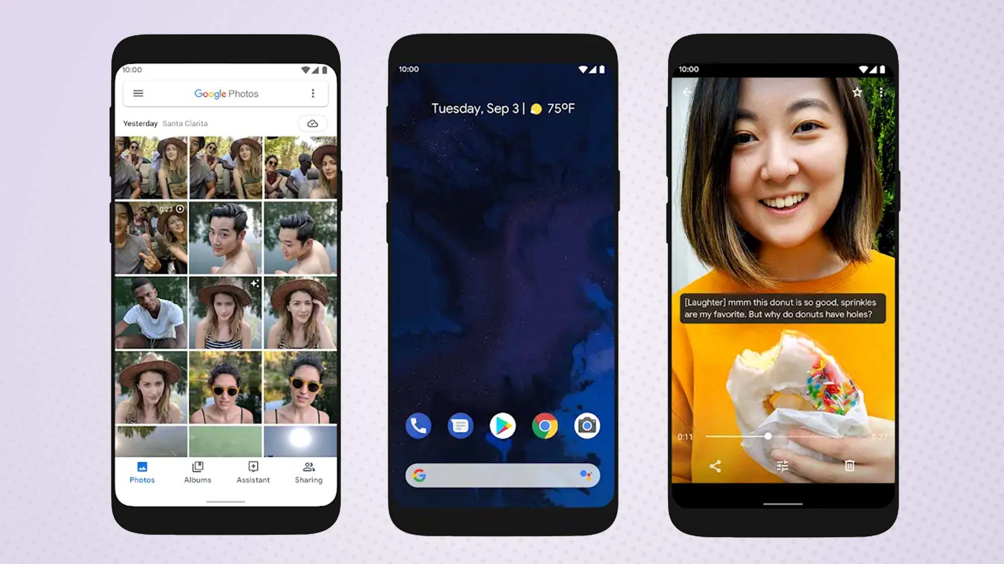
Live Caption leverages artificial intelligence to transcribe videos and images in real time. Because of this, the feature requires a lot of power. Google has confirmed that the Pixel 4 and Pixel 4 XL will be the first phones to support Live Caption when they ship Oct. 24, and the feature will role out to Pixel 3 and 3a phones before the end of the year. Beyond that, it's anyone's guess, though Google says it hopes to work with Android phone makers to bring Live Caption to other devices in 2020.
Similarly absent is Bubbles, a feature similar to Facebook's Chat Heads that places ongoing conversations in movable buttons at the edge of your display. Bubbles was present in some early Android 10 developer betas, but it has quietly disappeared in the months since; we're unsure if it'll ever return.
The same can be said for Android 10's custom theme feature, which allowed beta users to change the system-wide accent color to something besides the standard blue. Recently leaked screenshots of the Pixel Themes app suggest it will see release, likely alongside the Pixel 4. On the same token, it could very well end up being restricted to Google's phones, which would be quite disappointing, to say the least.
Will these features ever return, and if so, when? It's impossible to say, although their absence does leave Android 10 feeling a bit empty. One feature that certainly won't come back is the on-device Android Auto experience.
MORE: Android 10: Top Features, Release Date and How to Get It
In Android 10, the system's car interface is built in to the update, rather than housed within a separate app. That sounds great and seems long overdue, until you realize it's come at the expense of the Android Auto experience that was previously accessible through your phone's display. Owners of older cars, in particular, benefited from this feature, because it allowed users to mount their handset to their car's dashboard and have it act as a relatively smart, makeshift infotainment center that was almost the same as driving a vehicle with built-in Android Auto.
With Android 10, this functionality, alongside the dedicated Android Auto app, is being retired, in favor of a new Google Assistant-based Driving Mode that presents less visual information and primarily functions through voice control. Again, it feels like a step back — and an especially cruel one for drivers who would rather not shell out large sums of money on a new ride, just for easily accessible onboard navigation and media controls.
Availability
Right now, only Google's Pixels can get Android 10. OnePlus' more-recent phones, as well as Android One devices from the likes of Nokia and Microsoft, are likely to follow. (The OnePlus 7T is shipping with Android 10 pre-installed.) Beyond that, we'll probably be waiting months before the new software arrives for other devices.
For what it's worth, Samsung has announced a beta program that will bring Android 10 to Galaxy S10 models through a new version of its One UI interface, though it sounds like a full version of Android 10 won't be ready for Samsung's phones until early 2020.
Bottom line
Between Google's rethink of its navigation gestures and Dark Theme, Android 10 should have gone down as one of the biggest and best updates the platform's ever seen. Instead, I wonder if it'll be remembered as one of the most disappointing at launch.
Dark Theme, especially, could have used more time in the oven, considering that so many of Google's apps haven't yet been updated to accommodate the new feature. Some of Android 10's smaller enhancements, with respect to location access and Focus Mode, are certainly appreciated, though you get the sense they're hardly sufficient to sustain a yearly update on their own.
And then there's the problem of Android 10's limited availability. It's hardly encouraging that only Google's own phones get updates in anything resembling a timely manner. Then again, companies like Samsung, Huawei and OnePlus already implemented their own exclusive dark modes and gesture controls in their products years before Google finally got around to it. If you happen to own one of those phones, rest assured — at least right now, you're not missing much.
Adam Ismail is a staff writer at Jalopnik and previously worked on Tom's Guide covering smartphones, car tech and gaming. His love for all things mobile began with the original Motorola Droid; since then he’s owned a variety of Android and iOS-powered handsets, refusing to stay loyal to one platform. His work has also appeared on Digital Trends and GTPlanet. When he’s not fiddling with the latest devices, he’s at an indie pop show, recording a podcast or playing Sega Dreamcast.
