5 Things Google Needs to Fix in Android P Before it Launches
As great as Android P already is in beta form, it's still a work in progress. Here are five things we’d like to see corrected before the full release later this year.
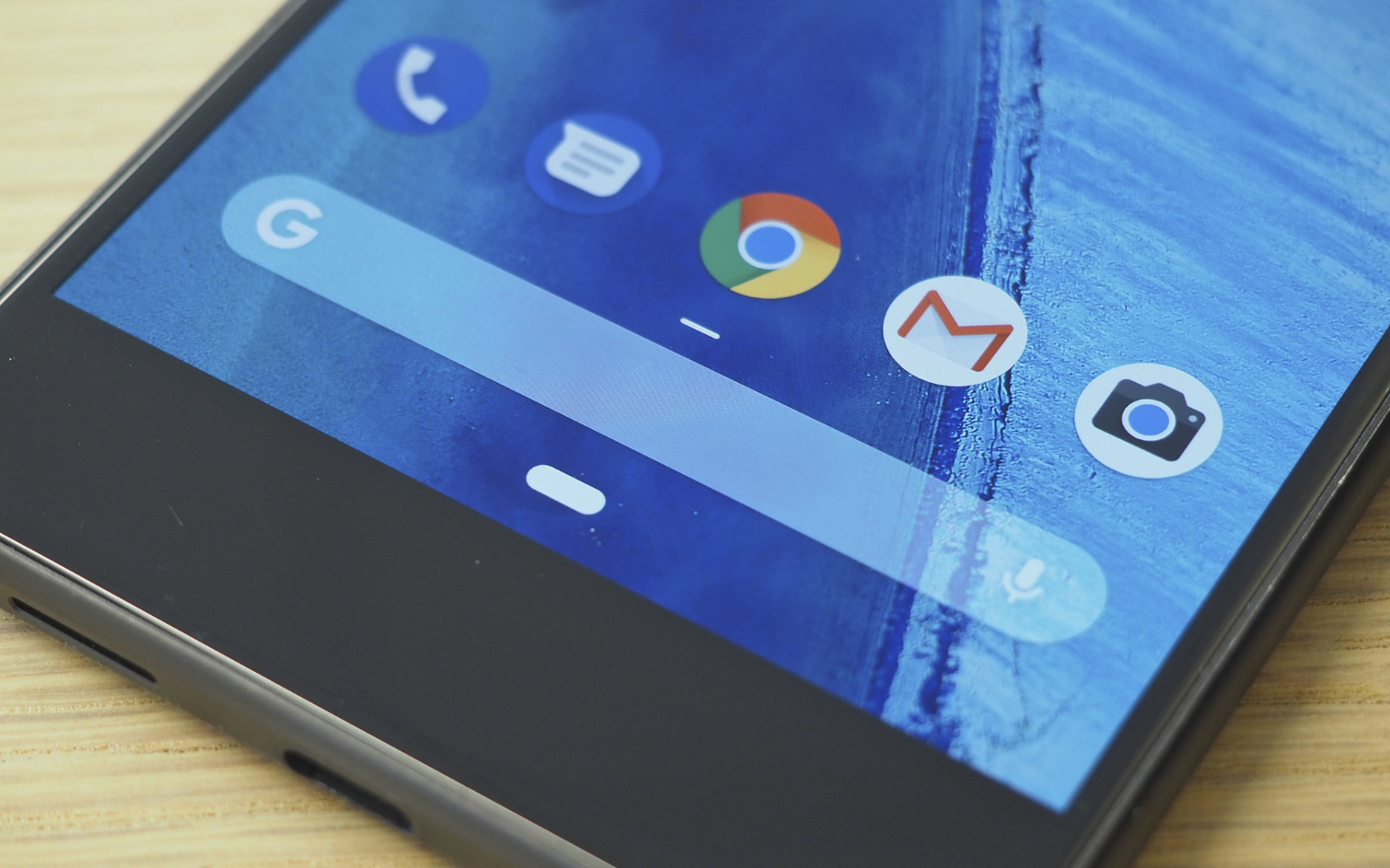
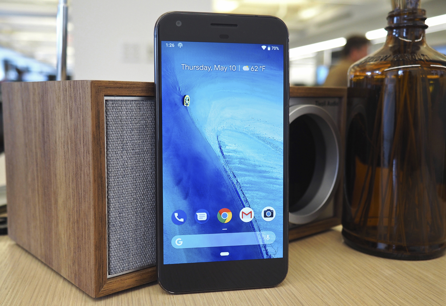
Android P is available to the public — well, in beta form anyway — and it’s receiving much deserved praise. Year after year, Google continues to find ways to make the world’s most popular mobile operating system even better. However, Android P might be its biggest step forward since Lollipop, thanks to major additions like new gesture-based navigation and clever AI resource management that will help your phone last longer throughout the day.
But of course, Android P is still a work in progress. And although it’s surprisingly stable and available on more handsets than any Android beta ever, Google and third-party manufacturers still have some work to do. Here are five things we’d like to see changed before the full release later this year.
Gestures on non-Pixel phones need work
Android P replaces Android’s classic three-button navigation bar with a single home button that can also reveal your recent apps or all the software on your phone, depending on how far you swipe up from the bottom of the screen. This isn’t unlike what Apple’s done with the iPhone X, and it’s something many users actually prefer now that they’ve come to grips with the change.
Here at the Tom’s Guide office, we’ve installed the Android P beta on two devices — a Pixel XL and Essential Phone. On the Pixel, the new gestures are a joy to use. On the Essential Phone, though, the experience is much more frustrating.
MORE: Google I/O Roundup: What's New with Google Assistant, Maps, Auto and More
The problem is that the devices interpret home button swipes differently. On the Pixel, you have to swipe up pretty high to reveal the app drawer, and a moderate swipe sends you to the recent apps screen. But on the Essential, those distances are much shorter. That makes it annoyingly easy to accidentally swipe too far and end up in all apps when you were aiming for your recents.
To be fair, this issue may not be Google's to fix, but rather a problem for individual phone makers on a per-device basis. However, it still needs to be corrected nonetheless. Android’s new gesture navigation will only catch on if it’s not too frustrating for users to adapt to. If it leads to a lot of unintentional actions, people will simply revert back to the three-button scheme, which remains an option in the Settings app.
Light or dark theme? Let the user decide
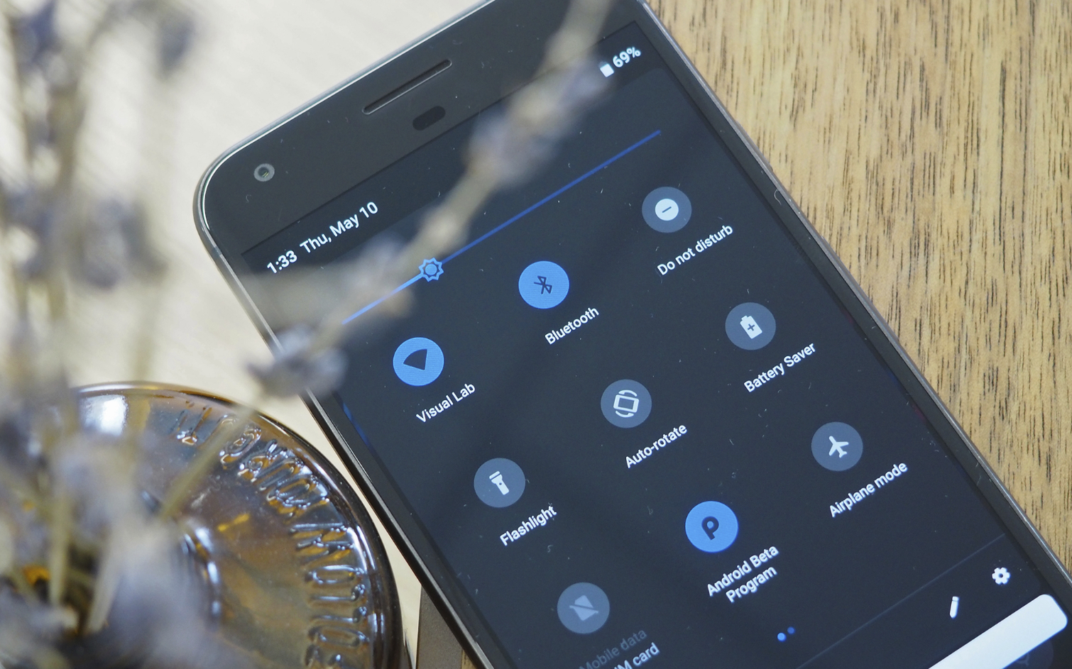
Google quietly introduced new light and dark themes in Android 8.1, which change automatically based on the color of your wallpaper. The feature was first exclusive to the company’s own Pixel phones, before it rolled out to AOSP (Android Open Source Project) and devices that run stock Android.
Those same themes return for Android P, where you can actually observe them affect the UI in more places, like the new volume controls. But wouldn’t it be nice if Google left it up to users to decide which theme they’d like to use, irrespective of their wallpaper? Third-party developers actually offer apps on the Play Store that force the system to stay light or dark regardless of wallpaper color. That means there's clearly a demand out there, and we think Google should take note.
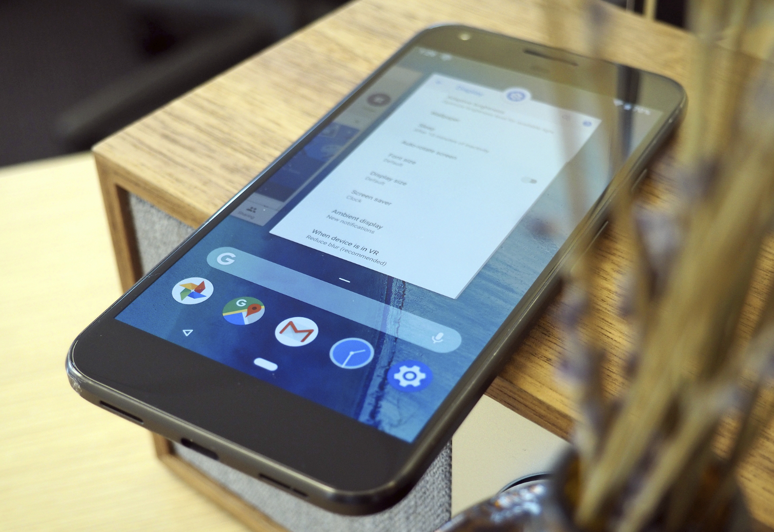
New navigation bar takes up same space
Apple did two things when it introduced gesture-based navigation in the iPhone X. Most notably, it settled upon an intuitive replacement for the tried-and-true home button. But the absence of that button also allowed on-screen content to dominate the front of the device in a way it never could before.
Android, on the other hand, has employed software navigation buttons since 2011. And that has encouraged phone makers to flirt with a variety of solutions to return some display real estate back to apps and media.
For example, Samsung lets users set the bar to automatically hide itself when it isn't needed, while Huawei and Honor provide the choice of a single, movable software button that rolls all the functionality of Android’s home, back and recent apps keys into one. Neither is particularly elegant, which is how we ended up with with Google’s new gesture-based system for Android P.
The new home button is endearingly simple to learn, but there’s still that issue of screen area. The space devoted to navigation in Android P’s is now weirdly empty most of the time, yet it’s still just as tall as it was back when there were three keys stashed down there, rather than one.
Of course, Android P will display back and rotation buttons only when needed, which complicates things. Google can’t completely get rid of that empty space and have on-screen content extend all the way to the bottom as it does on the iPhone X. But perhaps it could be flattened down a bit.
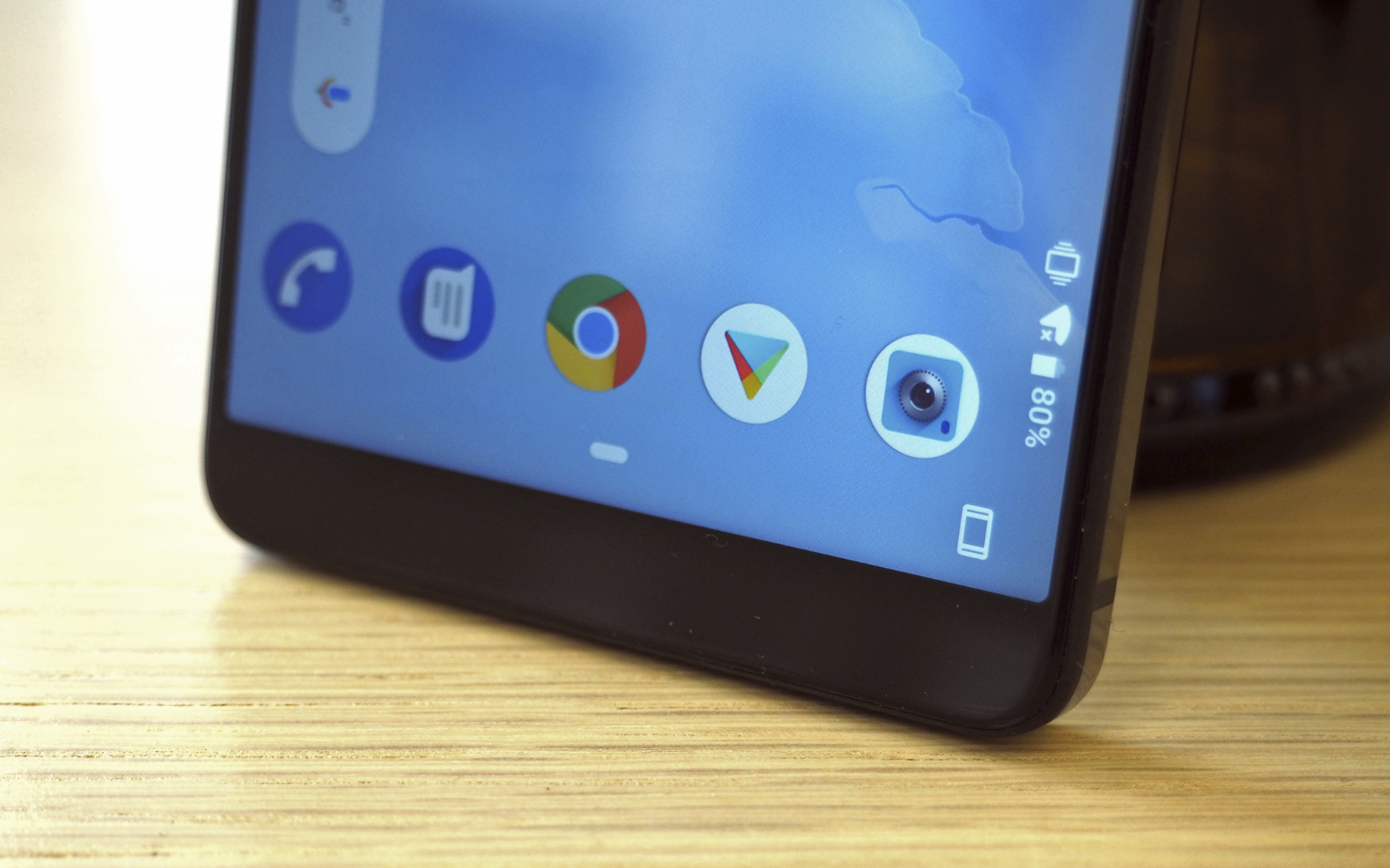
Gestures in landscape mode need streamlining
You didn’t have to be at Google’s I/O conference to hear the roar of applause when the company unveiled an obvious solution to a problem that has plagued smartphone users for far too long: How to rotate on-screen content manually, without having to rely on auto-rotate to do it for you.
Anyone who has ever used their phone while laying in bed sideways will surely appreciate Android P’s dedicated rotation button, which appears in the navigation bar when the device is oriented horizontally and auto-rotate is off. This allows users to decide for themselves whether they want to view content in landscape mode, which should lead to happier late nights and early mornings.
However, something interesting happens when using those new gesture controls in landscape. You can swipe left (or right, depending on which way you’ve flipped the device) from the home button to bring up recent apps, just as you’d expect. But you can’t swipe further to open the app drawer. Instead, you have to tap an arrow on the opposite corner to reveal the rest of your apps.
This is a nitpick for sure, but it’s strange that the home button doesn’t operate the same way depending on how the device is oriented. The app drawer arrow is a fixture of Android tablets that are commonly used in landscape mode, but the new home button can accommodate its duties now, so there’s no need for it anymore. Perhaps Google will address it as it fine tunes Android P.
Where did the camera shortcut go?
This too seems like an oversight, though it’s still an odd one. If you’ve installed the Android P beta, try launching the camera from the lock screen.
As of now, it can’t be done. Again, this might simply be a case of Google not enabling the feature in an early release. However, the omission is hard to explain, unless Google is looking to rework it for Android P and it’s just not ready yet. Quick launching the camera without having to apply a fingerprint or input a PIN code is something many users rely upon to snap pictures in a pinch, so let’s hope it makes a return.
Again, we’re at least three months away from the final form of Android P, so it’s too early to put Google through the wringer for not getting everything spot on right out of the gate. Still, these are issues that should — and in all likelihood will — be addressed before the public release. That’s what betas are for, after all.
Photo Credit: Adam Ismail/Tom's Guide
Sign up to get the BEST of Tom's Guide direct to your inbox.
Get instant access to breaking news, the hottest reviews, great deals and helpful tips.
Adam Ismail is a staff writer at Jalopnik and previously worked on Tom's Guide covering smartphones, car tech and gaming. His love for all things mobile began with the original Motorola Droid; since then he’s owned a variety of Android and iOS-powered handsets, refusing to stay loyal to one platform. His work has also appeared on Digital Trends and GTPlanet. When he’s not fiddling with the latest devices, he’s at an indie pop show, recording a podcast or playing Sega Dreamcast.
-
dallasbesty Andy Rubin, the creator, and co-founder of Android made what I was waiting for; a "white box" phone for Android. If the new team at Google writing Android P is optimizing it for Google's Pixel line of phones and going to leave other faithful manufacturers of Android phones floundering, that is going to spell trouble. Lt's just hope this is just a sign of it being in beta form and not a direction that will fragment the industry.Reply
Android phones outsell Apple phones 3 to 1. Let's hope the Android team at Google doesn't get short-sighted trying to make more money off of a new version of Android and their line of phones to the detriment of all the various phone alliances that have been made over the last 15+ years. -
jholme9 Last point... double-clicking the power button still brings up the camera. I don't notice any difference in functionality from Oreo in bringing up the camera from the lock screen.Reply -
cm7762 Yes, I think this is another step for Google to bring more features to the android market. I hope this will make work easy for the users.Reply
I am waiting for a new launch on Android P.
