Hands On: Android P Already Beats iPhone X in Beta
Thanks to intuitive new gestures and proactive features like Predictive Actions and App Slices, Android feels like Google is making smartphones smarter.
I just got my first taste of the new UI and some of the new features in Android P, and I can already say that it leapfrogs what Apple offers in the iPhone X.

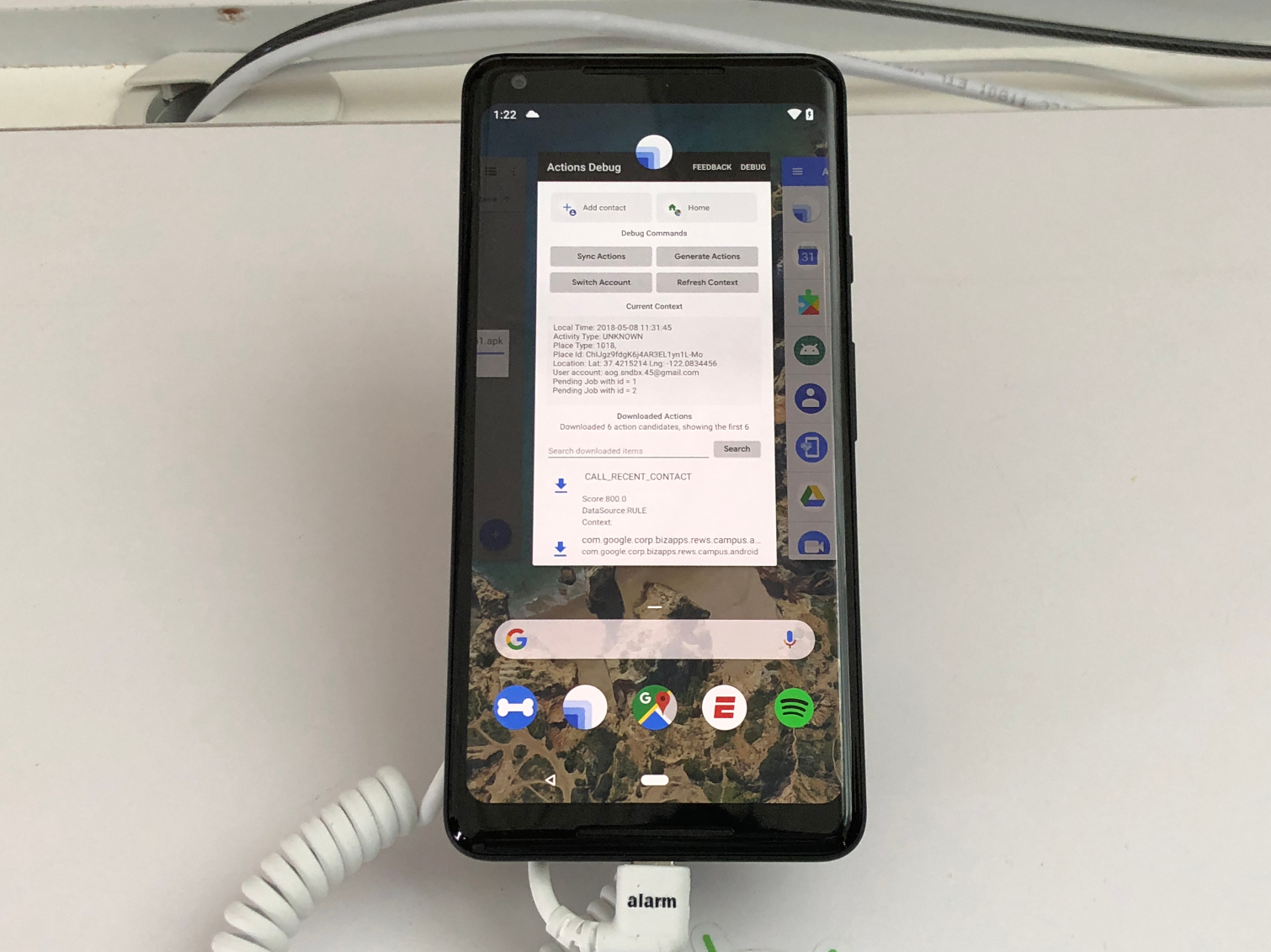
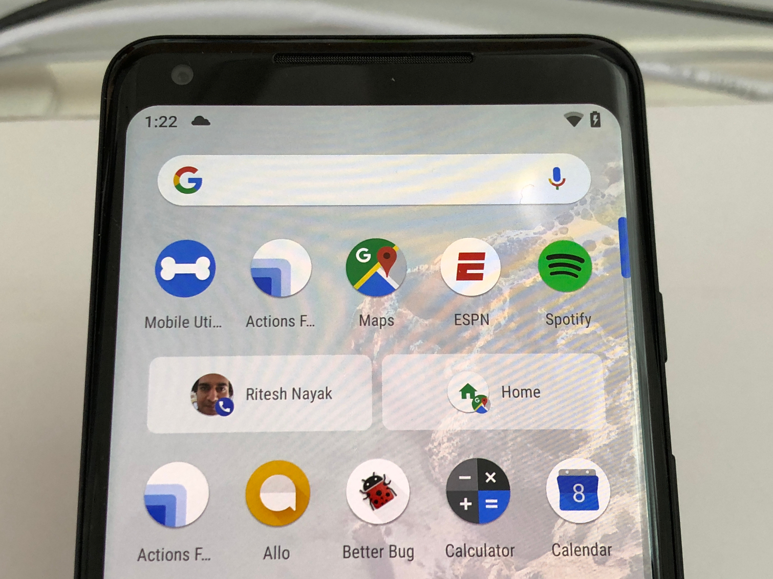
It starts with the new Home button, which isn’t really a button. It’s a slash that you can press, but if you swipe up, you’ll see your most recent apps in a card-like format. Below that you’ll see a Google search bar and below that there’s a row of icons for your most-used apps (based on Machine learning).
That sounds like a lot to cram on one recent apps screen, but it looks pretty streamlined and elegant. The iPhone X shows only your most recent apps in its view. Plus, dismissing apps is easier in Android P; you just swipe it away. On Apple’s phone you have to long press the app before you dismiss it, which is a waste of time.
MORE: Android P Features: What's New in Google's OS
The recent apps view on Android P is even interactive. You can select text right from within a thumbnail window and look up info or copy it. You can't do that in iOS.
If you swipe up once more from the recent apps view, you’ll see all of your apps, but that’s not all. Toward the top of the screen there will be two Predictive Actions shortcuts. On my demo Android P phone, one of the shortcuts surfaced a favorite contact to call (which you might do at a certain time of day) and a way to navigate directly home using Google Maps. So you don’t even need to open the apps.

Speaking of apps, the new App Slices feature seems pretty handy. Just start searching, and you’ll see some quick actions that pop up. For example, if you search for Lyft, you’ll be able to book a ride home from wherever you are. Or, if you search for Hawaii, you’ll see a shortcut to the Google Photos app with thumbnails of pictures you have taken.
MORE: How to Get the Android P Beta Now
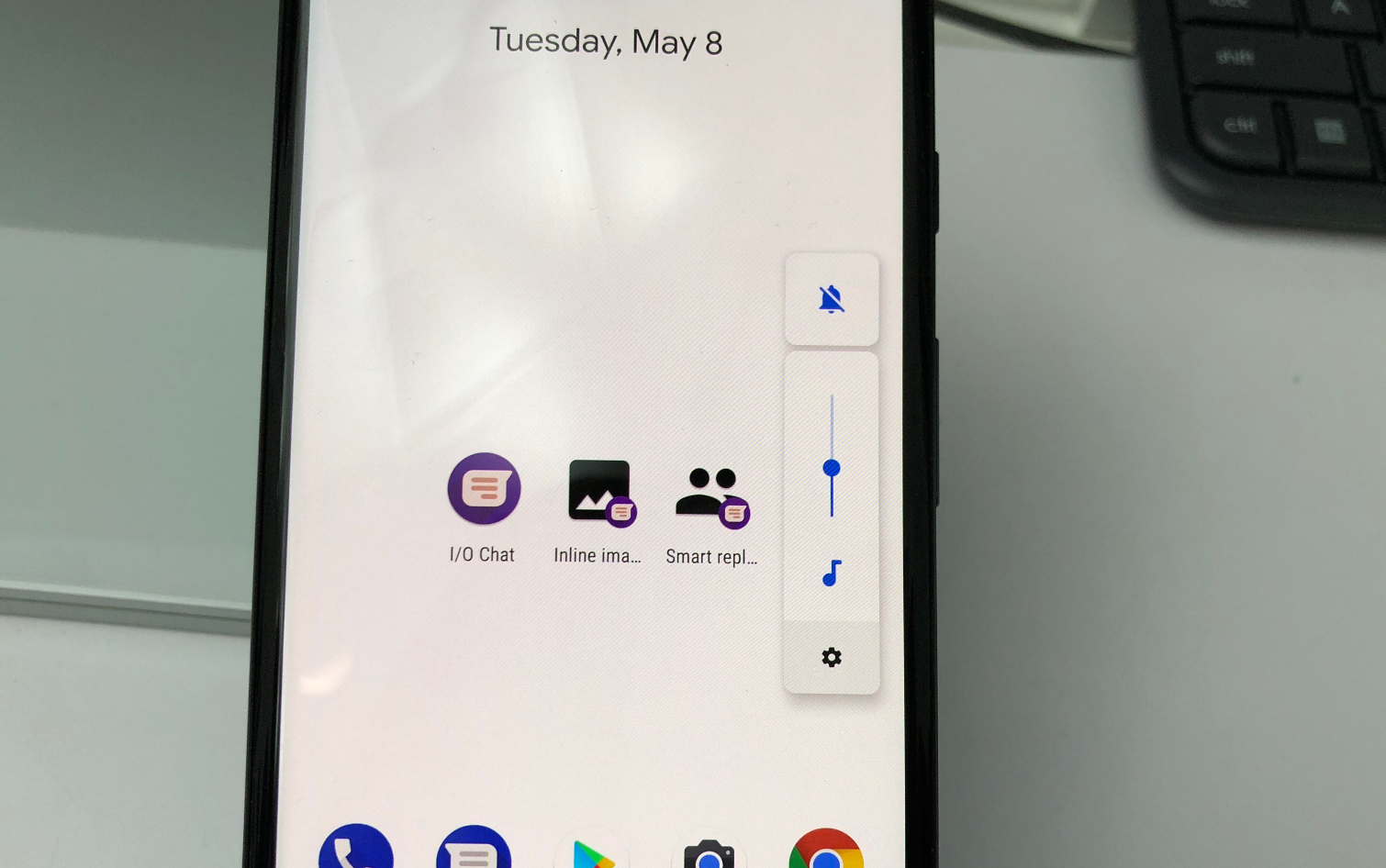
Other tweaks include a new volume control bar that pops up when you press one of the volume control buttons. From there, you can use a slider but also quickly toggle mute on and off with a button above the slider. The volume buttons will now default to adjusting the media volume settings, and not changing your notification sounds.

There are lots of Android P features that are more subtle but welcome, including Adaptive Battery for saving you juice. Your phone will learn what apps you use most often and cut down on CPU cycles when waking up apps.
Another welcome addition is a better Do Not Disturb mode; you just turn over your phone when you want to be more present, and notifications and calls will silence (except for your most important peeps).
Although it’s in beta, I think it’s safe to say that Android P is looking good so far. It’s more intuitive and also more proactive. Your move, Apple.
Photos Credit: Tom's Guide
Sign up to get the BEST of Tom's Guide direct to your inbox.
Get instant access to breaking news, the hottest reviews, great deals and helpful tips.
Mark Spoonauer is the global editor in chief of Tom's Guide and has covered technology for over 20 years. In addition to overseeing the direction of Tom's Guide, Mark specializes in covering all things mobile, having reviewed dozens of smartphones and other gadgets. He has spoken at key industry events and appears regularly on TV to discuss the latest trends, including Cheddar, Fox Business and other outlets. Mark was previously editor in chief of Laptop Mag, and his work has appeared in Wired, Popular Science and Inc. Follow him on Twitter at @mspoonauer.
-
mtxguy74 So to be clear here you are comparing an OS to a piece of hardware--the bias is pretty obviousReply -
Mark Spoonauer Hi, thanks for your comment. The Android P Beta is coming to lots of phones. It's now really up to Apple to up the ante for iOS 12.Reply20953075 said:So to be clear here you are comparing an OS to a piece of hardware--the bias is pretty obvious
-
m.frisken @MTXGUY74 How is that bias? The iPhone X UI is different from other iOS. They are just comparing the latest Android OS to Apple's flagship device's OSReply -
jonathan.figueroa.nic To be honest the new gesture control is a step backwards. Especially on the home screen. Recent apps (especially when you have 25+) is harder to scroll through to find what you want. There's no "Clear All" function anymore. Also to get to your app drawer to open an app (which is faster than scanning through your recent apps) you have to double swipe up or do a clunky look long swipe up. It's very disjointing. Also scrolling though apps with the home button being slid left and right is a double edge sword. It's slow for one and if you don't find the app you want your going to have to commit to opening one because once you stop it's going to open, like it or not. I understand the purpose of making the apps show 1 at a time like little pages (couldn't do the copy/paste any other way) but the cons outweigh the pros.Reply

