Android Auto Gets UI Tune-Up, Expanded Google Assistant Integration
Google's refresh for Android Auto launches today.

Android Auto is getting a new lick of paint. Google announced a sizable update today (Nov. 29) for the infotainment platform that figures to be one of the most significant Android Auto's ever seen.

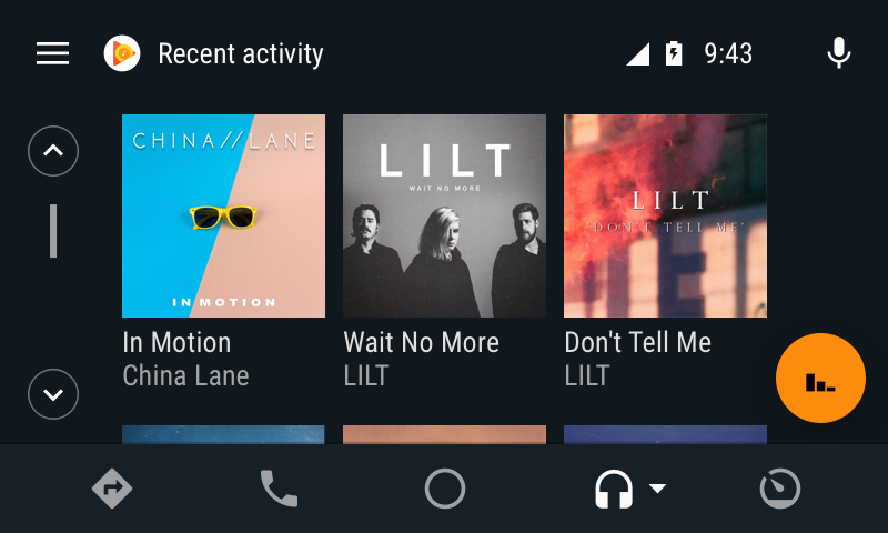
The changes are rolling out this week, and Google's aim here is to make it easier for drivers to access the content they're looking for. Android Auto users will be familiar with the current home screen experience: a vertical list of relevant information, like audio controls, weather forecasts and ETAs to predicted destinations. But starting with today's update, when you dive into a media app like Google Play Music, you'll find rich, large album artwork on the recent activity screen. It's designed to put your favorite tunes front and center so you can spend less time searching and more time driving.

Other menus and services have also been altered to serve up more contextual information, albeit in a safe and non-intrusive way. For example, you'll now be able to read text messages (as well as group MMS and RCS) through your vehicle's display, but only when stationary. And when you do have to hunt down that one song in your library, Google Assistant is now better equipped to help.
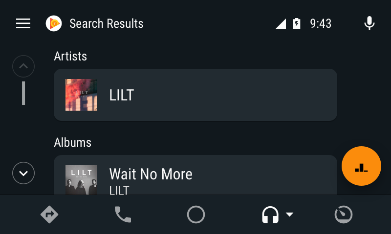
Google Assistant always had a presence in Android Auto. However, with the new update, it's been expanded to handle searching for media, too. The Assistant can help you find songs, albums, artists, playlists, podcasts or audiobooks, with a categorized list of results that make navigation simpler.
While these changes sound encouraging on paper, it's going to be some time before we really see Google's new vision for Android Auto take shape. That's because individual developers will have to update their apps to match the new interface. So far, iHeartRadio, Spotify, Google Play Music, Android Messages, Hangouts and WhatsApp already take advantage of it, and more are assuredly on the way.
MORE: Android Auto FAQ: Everything You Need to Know
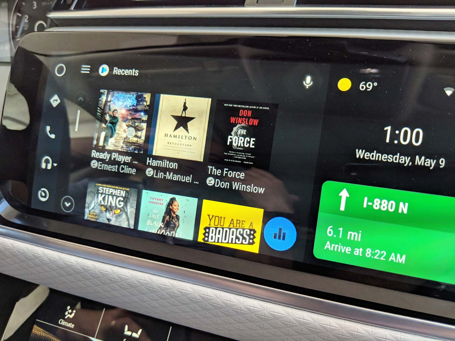
This redesign has been a long time coming, and we got our first look at it back in May at the Google I/O developers conference. At the event, Google showed off a pre-release version of the new Android Auto experience running on many different displays and form factors — from the extra-wide screen of the Range Rover Velar to the more vertical, tablet-like applications of newer Volvos.
Sign up to get the BEST of Tom's Guide direct to your inbox.
Get instant access to breaking news, the hottest reviews, great deals and helpful tips.
Down the line, Google wants Android Auto to respond to these different aspect ratios dynamically, with the additional display real estate being used to expand the amount of information shown on screen. Today's update doesn't get Android Auto quite there yet, but it's a sign that Google has reinvested in the platform, and wants to make it better by tailoring the experience to each and every vehicle on the road.
Adam Ismail is a staff writer at Jalopnik and previously worked on Tom's Guide covering smartphones, car tech and gaming. His love for all things mobile began with the original Motorola Droid; since then he’s owned a variety of Android and iOS-powered handsets, refusing to stay loyal to one platform. His work has also appeared on Digital Trends and GTPlanet. When he’s not fiddling with the latest devices, he’s at an indie pop show, recording a podcast or playing Sega Dreamcast.
