Tom's Guide Verdict
With Android 9 Pie, Google has gifted its OS with intelligent features that don't feel like gimmicks and produced a suite of tools to promote a healthy lifestyle.
Pros
- +
Better Recents interface
- +
Adaptive Brightness works well
- +
App Actions save you time
- +
UI tweaks make Android easier to use
- +
Digital Wellbeing promises helpful insights and solutions
Cons
- -
Gesture interface needs some fine-tuning
- -
Notification management can still be overwhelming
- -
Slices absent at launch
Why you can trust Tom's Guide
Android has always been about control, offering myriad ways for users to tailor their smartphone experience to their preference, even in granular ways. But that approach often flew in the face of simplicity and ease-of-operation for newcomers, and it's given Google's mobile OS something of a reputation for having a steep learning curve, with endless distractions and an overwhelming number of options and permutations.
Android 9 Pie signals a tonal shift by Google. This feels like the first version of Android explicitly designed to demand less of your time, not more — from its focus on combating digital addiction to a redesigned navigation scheme that relies on just one button to carry out an assortment of tasks.
Not every change achieves its intended purpose, but the end result is a more considerate experience for the devices we use more than any other every day. Android 9 Pie takes you where you want to go faster.
New gesture navigation
Android's shift to a gesture-based navigation system has been one of Pie's headline features, and for good reason. Since Android launched nearly a decade ago, the OS has employed three to four buttons to get around — home, back, recent apps and, during the early days, search. These were hardware keys until Ice Cream Sandwich folded them into software, and now they're being pared even further, to just one on-screen button.
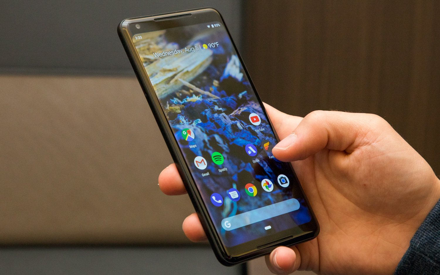
The new home button is pill-shaped and reacts the same way to presses and holds as it did before: You tap it to go home, or linger on it to call up Google Assistant. But now, in iPhone X-style fashion, Android's home button also encompasses the Recents screen and app drawer. A short swipe up from the bottom edge reveals the former, while a longer swipe will take you to the latter.
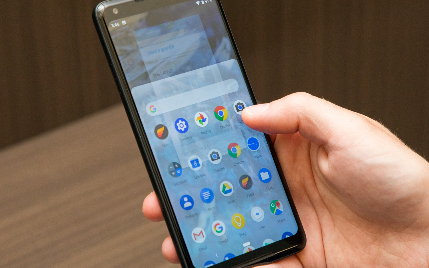
The back button now only appears on an as-needed basis, which is visually a bit strange. And rather than flipping to another app with a short swipe up, you can drag the home button left and right to scrub through previously used apps.
Overall, the new system doesn't take long to grasp. It even has one really clever feature in the way it deals with screen rotation. I almost always have my phone locked in portrait orientation, which only presents a problem when I'm watching videos. Android Pie will call up a rotation button to the right of the home button when I turn my phone, even when portrait lock is on. Tap the rotation button, and the screen rotates — but only for that app. The orientation returns to portrait when I arrive back at the home screen. Neat.
Overall, the new gesture controls don't take long to grasp.
I really do like Android Pie's new scheme, though it may be reassuring to know that if you don't take to it, you can always fall back on the old ways by going to System > Gestures and turning off "Swipe up on Home button."
There is one thing that bothers me about the new interface, though, and it almost negates the whole point of using gestures in place of buttons in the first place. Most Android phones that have adopted gesture controls also take the opportunity to slim down the area the navigation bar takes up, freeing more real estate for on-screen content. For example, OnePlus' dead-simple approach has no visual representation at all, while Motorola's is a thin line similar to what you'd find on an iPhone X.
MORE: 14 Biggest New Android Pie Features
Strangely, though, Android Pie's tack consumes just as much of the screen as the old trio of buttons did — meaning Google missed a real opportunity to deliver a more immersive full-screen experience. With smartphone displays getting progressively larger and bezels shrinking, this oversight isn't deal breaking, though it does feel somewhat unrefined.
Improved Recents screen
Changes to the Recents screen (or Overview, as some users call it) go hand-in-hand with Android Pie's new gestures. Unlike the vertically scrolling cards of previous Android versions, Pie adopts a right-to-left approach, with a search bar and list of suggested apps at the bottom, based on what the OS expects you'll use given your history.
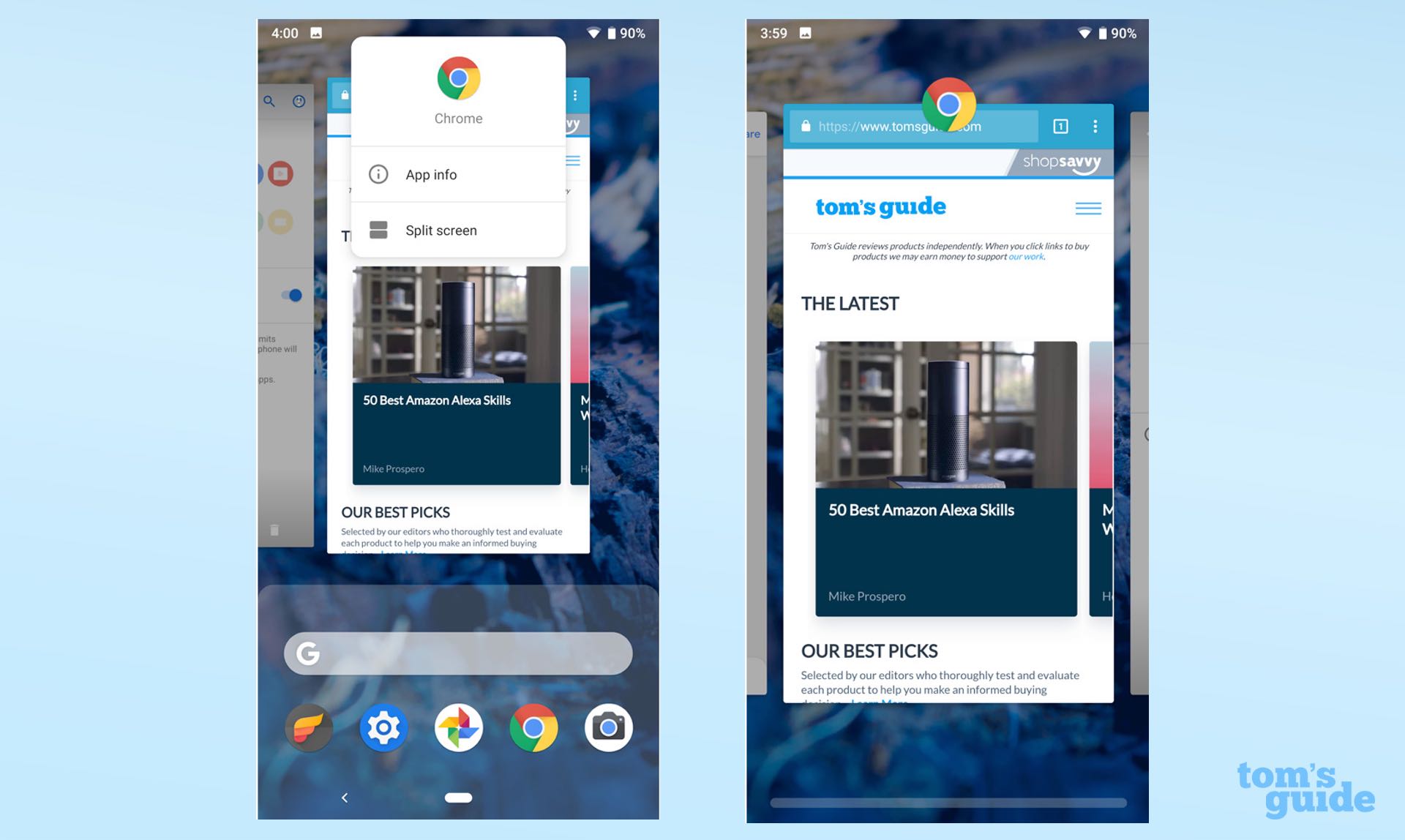
The upshot is a Recents screen that is considerably more versatile, and should save you some taps. Those who insist on regularly dumping their cache of apps will appreciate the presence of an "Clear All" button, revealed when you thumb all the way past the oldest app in your stream. And Google has smartly added copy functionality to the previews themselves, meaning you can long-press text in an app preview within the Recents screen, grab it, enter another app and paste it there.
The only potentially confusing change is the method for entering multiwindow mode. In Android Pie, you press and hold the app icon above the preview and tap "Split screen." It's simple enough, though the OS never explains the new behavior, so it could leave some users lost, at least initially.
Adaptive Brightness and Battery
Google has channeled the expertise of Alphabet's DeepMind AI research team, using machine learning to improve brightness management and battery life in Android. The initiative has produced two new features: Adaptive Brightness and Adaptive Battery
Adaptive Brightness may sound somewhat redundant, as smartphones have had automatic brightness since the beginning of time. However, a phone's auto-brightness feature adjusts brightness up and down based on some preset notion of what constitutes a visible display in a given condition. In contrast, Adaptive Brightness pays attention to your preferences and formulates its behavior based on that.
In other words, Adaptive Brightness actually encourages you to use the brightness slider, so it can learn what you like. That's particularly valuable for users who prefer a brighter screen on average, like yours truly. After repeated changes, the OS will get better at predicting how bright you want the screen to be in certain scenarios — and I'm pleased to say, it did exactly that in my experience.
My first day using Pie, Adaptive Brightness was hit or miss. By day two, it was doing a considerably better job at guessing. On a cloudy day, I watched the luminosity ramp up as the sun briefly revealed itself — and for the first time I can remember using a smartphone on automatic brightness, I didn't feel the urge to change it.
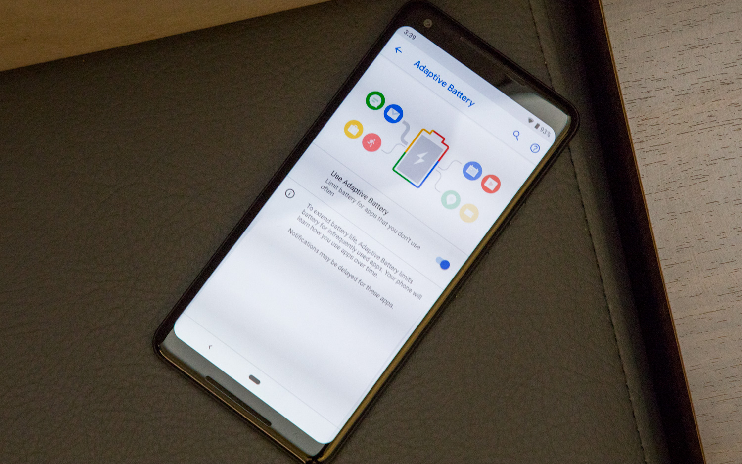
Adaptive Battery operates in a similar fashion, except it deals with the amount of energy consumed by apps, not your display. The feature monitors the software you like to use and when you use it; it then intelligently diverts background processes to the appropriate apps when you need them.
MORE: Siri Is Catching Up to Alexa and Google Assistant in an Important Way
Just like with brightness, it will take a bit of time before the battery tech has gathered enough information to make an informed decision about how to manage your phone's power. At the time of writing this review, I haven't noticed any major difference in battery life, though I've been using Pie only since the beginning of the week — so it'll take a bit more time to evaluate how well the second of Google’s AI-powered additions has fared.
Digital Wellbeing (Beta)
Likewise, it'll take some time before we really witness the value of Google's Digital Wellbeing initiative, because this new feature remains in beta. However, anyone running Android Pie on a Pixel device can easily opt in and give it a whirl, which is what we've done for this review.
The entire Digital Wellbeing suite lives inside the Settings app, and consists of three pillars: Screen Time, App Timers and Wind Down.
Screen Time presents you with a snapshot of your daily usage, broken into a pie chart that lists how much of your time all your apps have consumed. The feature also lists the number of times you've unlocked your phone, as well as the number of notifications you've received.
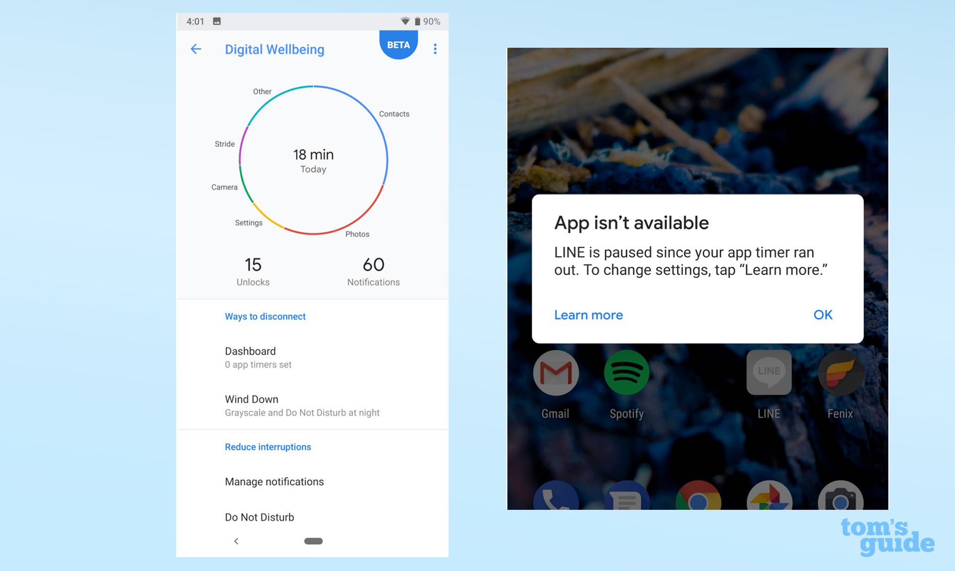
Tap into any app in the chart, and you get to drill down to view week-by-week usage. From there, you can set a time limit for the app in question, or tweak the number of notifications it sends you. That can be a bit challenging for apps that serve up a ton of alerts, like the Google app — though the freedom to silence the notifications you don't want has long been one of Android's strengths (and one that Apple is now copying with iOS 12).
MORE: How to Stop Pop-Ups in Chrome in Just 5 Easy Steps
I found the data offered by Screen Time interesting, but not profoundly eye-opening — and I suspect many users will feel the same. Mindfulness is always good, but I don't see myself returning to this data very often. However, it's easy to imagine parents paying close attention to the insights it provides on their kids' habits.
The data offered by Android Pie's Screen Time is interesting, but not profoundly eye-opening.
The more immediately useful tools are App Timers and Wind Down. Timers enforce daily limits for how long you spend in apps — when you've used it up, the icon turns to grayscale until the cycle begins anew. Wind Down paints your display in grayscale and automatically flips on Do Not Disturb at predetermined hours when you want to discourage usage — like, say, when going to bed.
MORE: iOS 12 vs. Android P: Comparing the New Features
As you might have noticed, much of what Google's doing with regards to wellness is also present in iOS 12, Apple's upcoming update for iPhones. However, one interesting difference I've noticed is that Android's App Timers do a better job of preventing usage than Apple's system, because Android doesn't allow you to easily bypass a limit once you've hit it. You actually have to go into the Digital Wellbeing Dashboard and turn the timer off to open the app again before the day is over. iOS 12 lets you override your Time Limit directly from the warning screen that you've run out of time. I imagine that difference will ultimately make Google's implementation more effective.
App Actions (and What About Slices?)
App Actions are like tiny commands that trigger apps, and can appear dynamically in different places around the Android UI — including search suggestions, the app drawer or even text selection.
Given that so much of Android Pie hinges on predictability, the idea is that actions will pop up when the system expects you'll need them. For example, I've kept the same Spotify playlist in heavy rotation on the way home from work for the last few days, so I wasn't terribly surprised to see it appear underneath my suggested apps one afternoon. Tapping it not only took me to the playlist in question, but began playing the first song. Pretty cool.
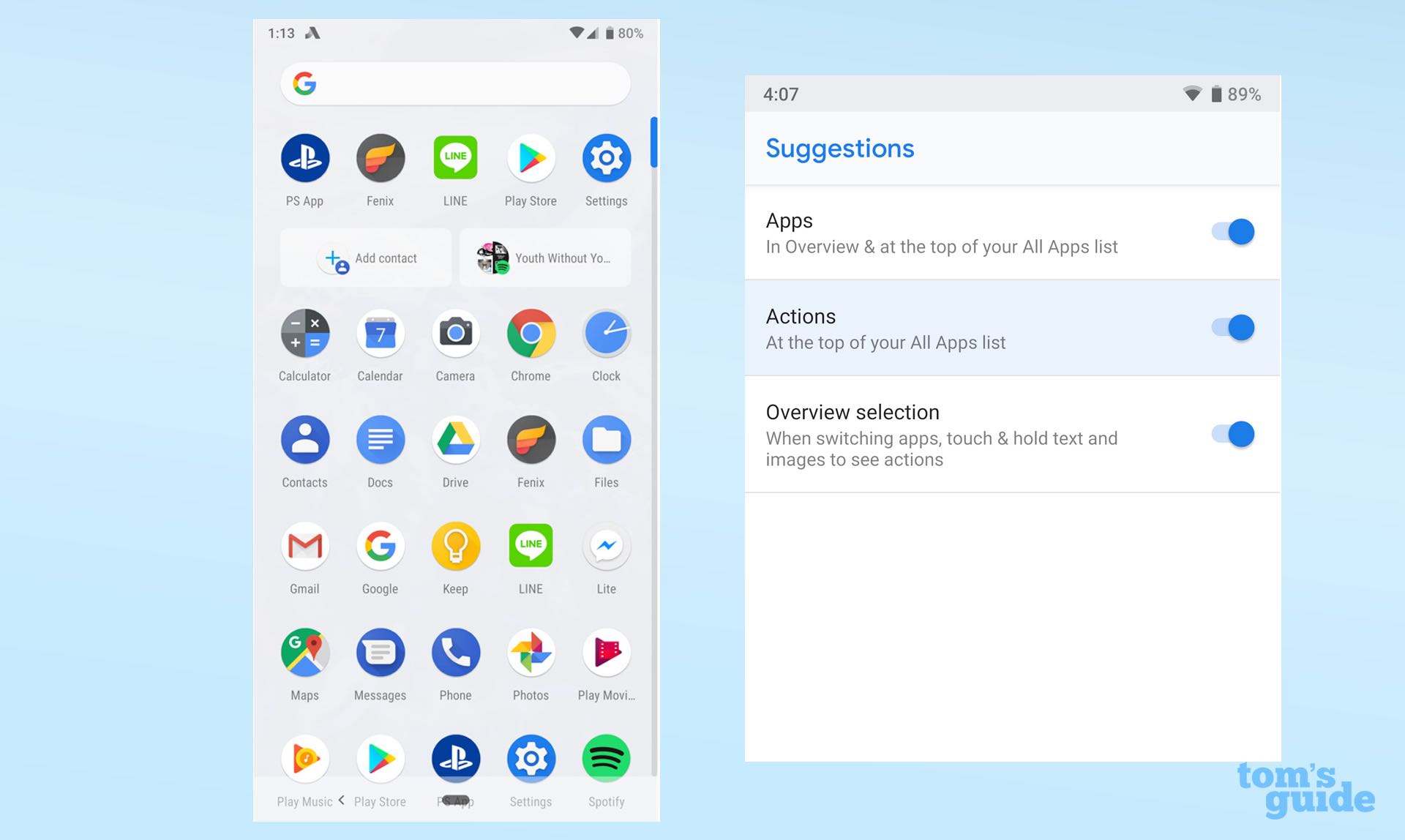
Although Actions work well with Android's built-in apps at present, third-party developers need to do some work to integrate them into their apps — so this is a feature that likely won't take off until Pie has had more time to reach users. Once that happens, we should also be getting Slices — a similar UI aspect that Google is actually still working on.
I've kept the same Spotify playlist in heavy rotation on the way home from work for the last few days. Android Pie's App Actions made it appear underneath my suggested apps.
However, Slices are a lot like App Actions, but typically larger, with more interactivity and options. Whereas an App Action for Lyft might just present itself as a button to call a car, a Slice could present distances, ETAs and prices, and give you choices between a few destinations — all appearing when you type "Lyft" in your phone's search bar.
At this point, there's no telling all the ways in which developers might use Slices, and the feature won't arrive on Android Pie until later in the fall. The potential is certainly there, but again, we'll have to wait a bit longer before we see if the developers rise to the task.
Shush and Do Not Disturb
Do Not Disturb has been a mainstay of Android for a while now, but it's been bolstered in Android Pie with a new feature called Shush. With Shush, you can lay your phone screen-side-down to automatically activate Do Not Disturb mode.
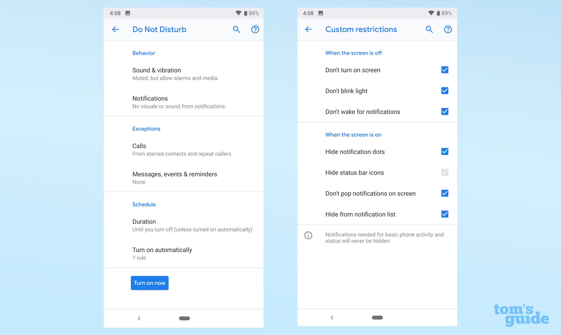
Apple has had a somewhat similar gesture on its iPhones for a while, though it would only mute and lock your phone. Do Not Disturb is a more comprehensive solution in Android Pie because it silences all visual interruptions as well as noises.
MORE: Best Android Browsers
New Volume and Screenshot UIs
Rounding out Android Pie's more notable features are a pair of small interface changes that fix some of the platform's more long-standing oversights. One of the first things loyal Android users will notice is that raising or lowering volume presents a vertical slider on the right side of the phone, unlike the horizontal element in previous versions.
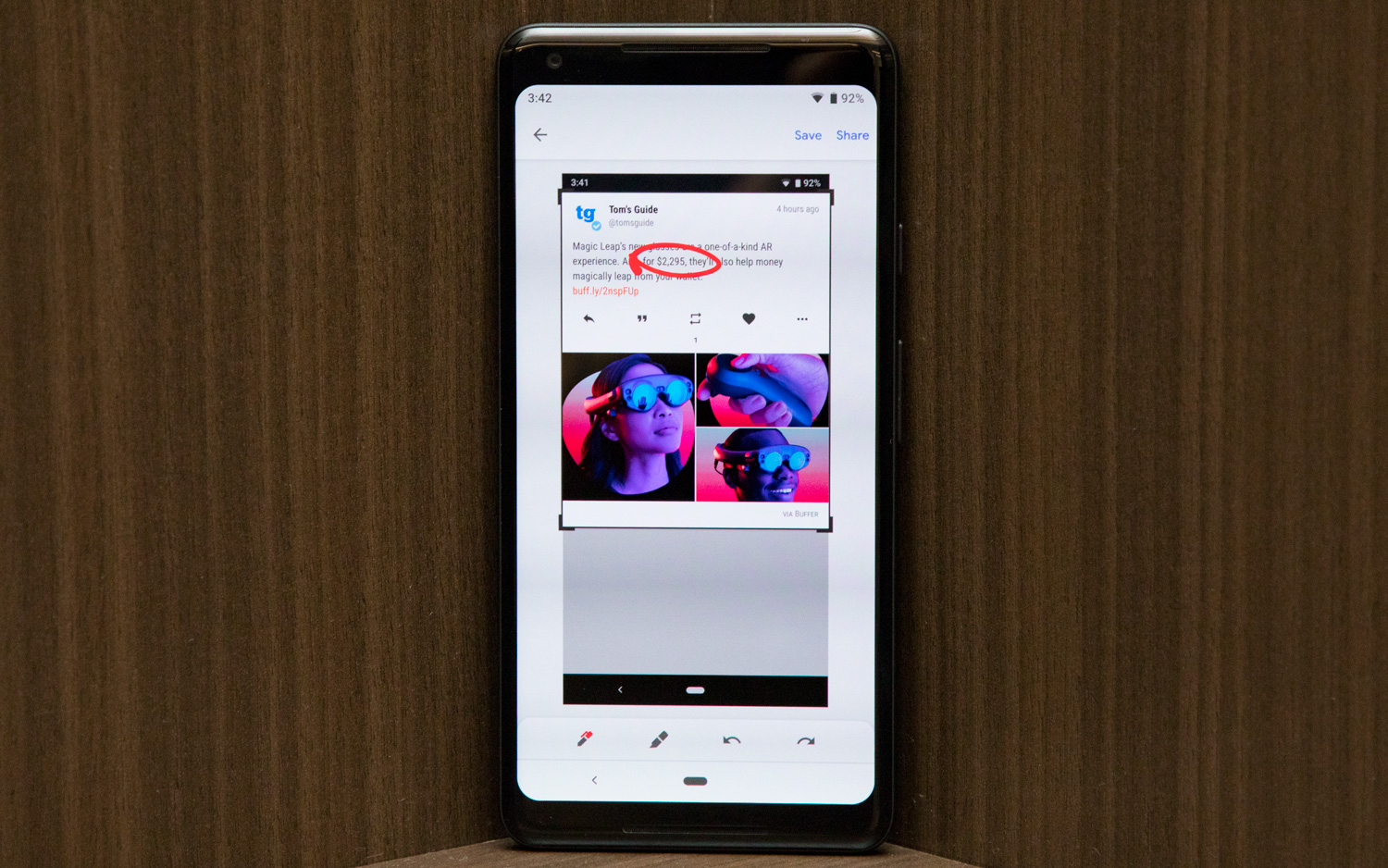
The bigger change, though, is that pressing the volume rocker now modifies media volume by default, rather than the volume of your ringer. As anyone who has inadvertently triggered an autoplay video in a meeting can tell you that that's probably for the best. As for the ringer, there's now a single on-screen button above the slider to let you toggle among on, vibration only or off.
Android Pie's handling of screenshots also borrows one of Apple's best ideas for iOS. Now, snapping a screenshot automatically produces a link to edit it, where you can quickly crop or mark up the image before saving it to your gallery or sharing it with friends.
Who Can Get Android 9 Pie?
It's always a toss up as to which devices will receive the latest version of Android and when the update will be available, but there's a very good reason why Pie might be adopted more quickly than its predecessors.
It's all thanks to Project Treble, Google's platform that separates core Android firmware from the front-end changes most manufacturers employ. Because of it, Google can push out updates that don't break the custom UI experiences offered by the likes of Samsung, OnePlus, LG and practically every other Android hardware maker.
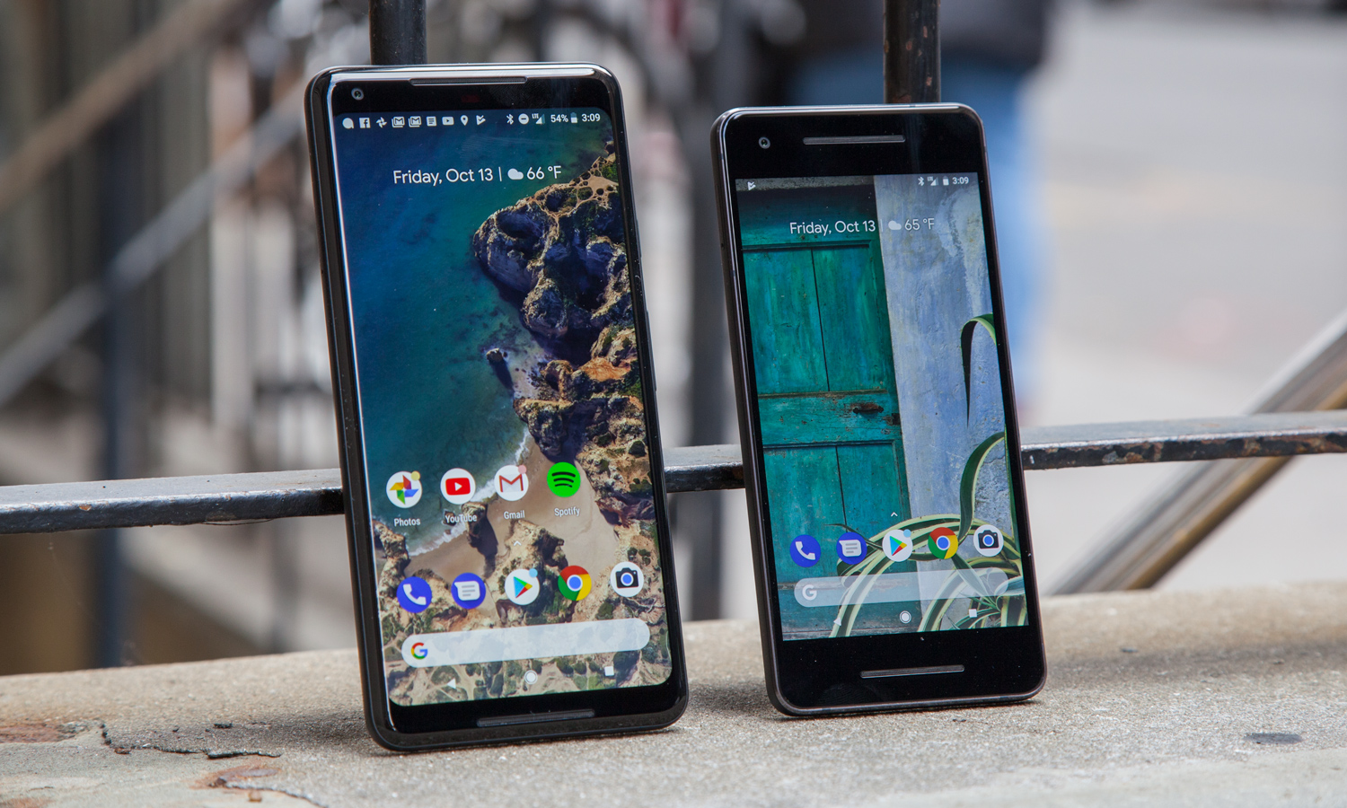
Project Treble is why the Essential Phone, OnePlus 6, Sony Xperia XZ2 and Nokia 7 Plus all got early support to run the Android P Beta earlier this year. And for that reason, we expect all devices included in the beta program to be among the first non-Pixel handsets to receive the public release of Android 9 Pie. (Essential actually pushed out its final software just hours after Google announced Pie availability for the Pixel and Pixel 2.)
That said, even if you have a Pixel, it may take a while before the over-the-air update reaches your device. Google typically rolls out new software in waves over a couple of weeks, and the only way to circumvent that is to manually push the update file to your phone through the use of a PC and the Android SDK. If you'd rather not wait, we have a guide that explains how to do exactly that.
Bottom Line
It's easy to say the latest version of Android is the best one. That's no disrespect to Google — rather, it's a testament to the strength of its OS. Every year, it becomes progressively more difficult to identify ways to improve the world's most popular mobile platform. And yet, Android 9 Pie represents yet another step forward.
We've still got a long way to go, but we've finally reached an era when the technology we rely on is gaining respect for our time. Digital Wellbeing is a nice gesture, but this philosophy extends far beyond that, to the way in which Android Pie leverages AI to suggest apps, keeps you humming along on a charge and even helps you see your screen in less-than-favorable conditions. You often hear about the negative ways in which our data is commodified, but at least in this instance, Google is employing it to make using its smartphones less frustrating.
As for things missing in Android Pie — and early suggestions for Android Q — I'd like to see Google refine its gestures, which aren't the most intuitive, nor the best for maximizing display space. Android's customizability with notifications is still unparalleled, but it can be quite overwhelming for users to wrestle with 15 toggles for all the different categories of alerts the Google app can provide. And Android Auto, once an exciting new frontier for the platform, has languished in recent years with slow animations and a bit of a head-scratching interface, while Apple's CarPlay soars.
But those are nitpicks. The fact of the matter is, Android is easier to live with than ever before, but no less powerful — and that's the greatest praise one could offer it.
Credit: Tom's Guide
Adam Ismail is a staff writer at Jalopnik and previously worked on Tom's Guide covering smartphones, car tech and gaming. His love for all things mobile began with the original Motorola Droid; since then he’s owned a variety of Android and iOS-powered handsets, refusing to stay loyal to one platform. His work has also appeared on Digital Trends and GTPlanet. When he’s not fiddling with the latest devices, he’s at an indie pop show, recording a podcast or playing Sega Dreamcast.
-
billsamuel3 Why does it seem like every technology "upgrade" makes things less user-friendly? With Android 9, they broke a very important feature - turning the main volume control all the way down so the phone will be silent and only vibrate. This feature was used very frequently when users went into meetings or other settings where the phone not making sounds was important. In Android 9, they took away most of the power of that setting and it now only works on incoming calls and not on the other sounds (like notifications) phones make. So now you have to turn your phone completely off or work with the Do Not Disturb feature which is not user-friendly. The default settings for it belie its name, because they allow for all sorts of disturbances so you have to spend time to reconfigure it to actually be what its name says it is. And it is hard to access since it isn't on the main Settings screen. I don't think they tested Android 9 in real life before they sent it out.Reply
