9 Common Photography Mistakes — And How to Fix Them
We sent our writer, an amateur photographer, out with a professional photographer to take pictures of the same subjects. Here are their photos and the lessons we learned.
If you're an amateur photographer, you've probably wondered how to get your pictures to look as good as the ones pros take. But there are a number of simple tricks you can use to improve your photos and reduce the amount of processing you need to do to them later.
I went around New York City on a cool, cloudy-ish February day with professional photographer Lin Pernille Kristensen. Most of her business comes from photographing weddings and bar mitzvahs, so she spends a lot of time making subjects look good. We compared our photos of the same subjects, and she told me where I messed up.
For this project, I used a Canon EOS 400D (Digital Rebel XTi) DSLR and an iPhone 6. The camera is no longer supported by Canon, but I suspect that I'm not the only one with an old DSLR. It's a 10.1-megapixel camera that still outperforms my iPhone, and allows for more specialized shots.
Kristensen used a Nikon D750. Though her camera is more sophisticated than mine and incorporates several years’ worth of improvements, the tips she gave me can apply to anything you shoot.
Basic Photography Terms: Cheat Sheet
First, some definitions are in order:
Focal length: An optical measurement that determines how much of what you see in front of you is captured by your camera's lens.
F-stop: This number describes how much light a lens lets in, as well as how much of the frame you want in focus. The lower the number (such as f/2.8), the more light gets in (which allows for shorter exposure times), but you’ll have a shorter depth of field. Objects exactly at the distance you’re focusing on will be sharp, but anything too far in front or behind will be blurry.
Sign up to get the BEST of Tom's Guide direct to your inbox.
Get instant access to breaking news, the hottest reviews, great deals and helpful tips.

Exposure time: This is how long the shutter stays open. The longer a shutter is open, the brighter an image will be. But if you leave it open too long, the picture will be washed out. Conversely, a short exposure will freeze movement, but if there's too little light, the picture will just look dark.

ISO: In the old days, this was known as "film speed." That was a measure of how sensitive the film was to light. Higher ISO means more light sensitivity, but the trade-off is grainier pictures. Lower ISO means a less grainier photo, but you’ll need to keep the shutter open longer to gather enough light.

For more detailed explanations of these terms, plus many others, please refer to our camera glossary.
Mistake No. 1: Failing to remove obstructions.
We took a shot of the Decker Building in Union Square. "Look at the stuff in the front of the building," Pernille Kristensen said. Often, in street scenes, amateur photographers will snap a photo of a building with cars and trucks in front of it. That's not a good idea, because it detracts from the actual subject of the photo (the building). Try to position yourself in a way that minimizes obstructions of the subject, and wait a minute for traffic to clear before shooting the photo, Kristensen suggested.
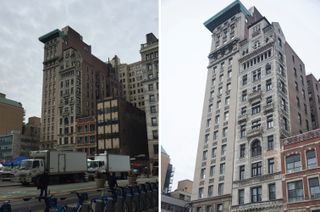
Another issue is the lines: Keep them straight and vertical. Sometimes, a camera lens (depending on its focal length) will make lines curve a bit. While the fish-eye effect can be used effectively, a slight one can make your picture of spectacular architecture look "off." This issue is more likely to occur with a wide-angle lens, Kristensen said. Use a 50-millimeter (or 50-mm-equivalent) lens if you want to avoid distortions.
Bonus tip: If you can get to a height where you are even with the middle floors of a building, it can lessen the small distortions caused by wide-angle lenses.
Mistake No. 2: Letting auto mode determine the ISO and f-stop.
We shot some pictures in the Union Square subway station to show what happens in dim fluorescent light. In my photo, the subway car is blurred and the photo is dim; I shot it with an ISO of 400, an f-stop (aperture) of f/4 and a shutter speed at 1/60 of a second. (Again, I had the camera set to auto mode.) The motion is visible, but the picture looks as though it were taken with a sepia filter.

Kristensen's shot is much lighter. She raised the ISO to 3200, and used a faster shutter speed of 1/160 of a second and a lower f-stop of f/3.5. She noted that, when trying to capture shots in dim light, it's better to use a shorter exposure time because it minimizes the blurring caused by a shaking camera. (Some additional graininess, however, is a trade-off.)
MORE: Best Waterproof & Rugged Cameras
Mistake No. 3: Using the built-in flash.
Often, if you try to take portraits in low light and your camera is in auto mode, it will turn on the flash by default. That doesn’t always result in the best photos. I took a shot of Kristensen using my Canon with the flash alternately on and off. In one photo, she’s in focus but the background is basically black.
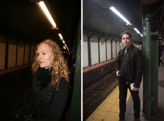
In the second shot, the background is more visible and looks more evenly lit, but there's some motion blur. The first shot was exposed at 1/60 of a second, while the second was 1/13 of a second — and the difference is obvious.
Here again, Kristensen used a high ISO, a low f-stop and a relatively fast shutter speed. She also got all of me in the picture, and avoided the use of a flash. At f/3.5, ISO 3200 and 1/160 of a second, the portrait looks sharp and focused on the subject. There is some additional graininess, but in this light, it’s not enough to detract from the image.
Mistake No. 4: Spooking the wildlife.
Wildlife needs a good zoom (telephoto) lens. "Birds move when you get close, so you want to get it [the shot] from as far away as you can," Kristensen said. Another important point is depth of field. This comes up a lot, but in taking pictures of subjects such as birds, it's even more crucial, as it allows the focus to be on the subject. As such, low f-numbers are key.

Kristensen's photo was taken at f/4.5 and ISO 200. (Exposure time matters a bit less in daylight shots, because the difference won't be so great between f-stops.)
MORE: Best DSLR Cameras
From a composition standpoint, there's the "rule of thirds." "You divide the picture into thirds, vertically or horizontally," Kristensen said, and put the subject near the intersection of where those lines meet. The sparrows are in the right third, with the focus on two in the foreground, drawing your attention there. The lines of the bench move left, toward a vanishing point, she said.
The same guidelines apply to shooting trees and flowers, which tend to be still. "Pick something to be the focal point of the image," she said. I chose that bunch of berries.
Mistake No. 5: Getting on food’s "bad side."
I took a shot of my chorizo muffin at Starbucks, in a room with low light. With the flash, the harsh shadows made my snack look singularly unappetizing, and even without the flash, the yellow pallor did the muffin no favors.
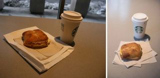
Kristensen rearranged the food on the table a bit, to get a better-composed shot. She recommended making sure the objects in the background are not in the picture. She also got rid of the paper bag that was doubling as a plate.
Here, given that the light was low, she raised the ISO to 1250. She also lowered the f-stop to 2.2, but that caused the Starbucks cup to be out of focus. If you want the entire meal to be sharp, then select a higher f-stop, but you’ll need to keep the shutter open longer. Because this is a still-life photo, it’s wise to use a tripod or stable platform where you can rest your camera.
The result: It may be a chorizo muffin, but it's a good-looking chorizo muffin.
Mistake No. 6: Being afraid of blur in action shots.
In Central Park, I took photos of bikers as they whizzed by, but my pictures don't really show that movement; the bikers are static, with little impression of how fast they are going. That was because my camera, left to itself, didn’t focus on any one thing.

"If you follow the subject, the background might blur, but that gives a sense of movement," Kristensen said. A small f-number allows for a faster shutter speed, and also keeps the attention on the moving biker because the other stuff is out of focus, she said. Sports photographers do this routinely, using long lenses to zoom in on a single player and letting the background blur. Another technique is to use a slower shutter speed and physically move the camera as the subject passes by.
Mistake No. 7: Relying on auto mode for dark interior shots.
Odds are, if you’re traveling to a tourist destination with a famous cathedral, you’ll want a good picture of a stained-glass window or the inside of the building. This is where using the camera's manual settings can be important, because oftentimes, the automatic settings will leave the flash on.

But as you can see from the shot I took of the window in St. Patrick's Cathedral, those automatic settings will not help. "It's dim because the flash won't reach that far," so the result is a dark picture, Kristensen said. The same thing happened when I shot the nave with the flash on. "The focus looks like it's on the [pews] in front," she said.
Here’s what Kristensen suggested. First, turn off the flash. Then, turn up the ISO and lower the f-stop, and let the light come in. Block out secondary lights from the frame. Keep exposures short, to minimize the shake. (Use a stationary object to steady your shot if the exposure time gets to more than about 1/40 of a second.)
Mistake No. 8: Fearing the abstract
Farmers markets present a lot of great photo opportunities. However, Kristensen said there are a couple of problems with the way I approached the pictures of the apples in one case, and the radishes in the other.

"Pick one fruit to be the center of the photo," she said. "Go a bit more abstract." She also moved the green apple around a bit to show its best side — again, "posing" a photo. On the radishes, she got closer in, and made use of the colors and patterns for a less literal view.
Mistake No. 9: Letting your selfies go to the dark side.
Selfies are one type of shot where the smartphone outshines the DSLR. My selfie is pretty clear and was relatively easy to do. Still, you should beware of background objects "growing" out of your head, and think about the light source.

If you are backlit (for instance, if a window or the sun is behind you), faces may appear to be in darkness. Or, the flash might come on, creating harsh shadows. “In terms of the most flattering light, face towards your light source as directly as possible,” she said.
