Tom's Guide Verdict
Adobe Photoshop Elements 2018 remains the best choice for beginners and experienced users, but some of its new features could use refinement.
Pros
- +
New Auto Select works well
- +
Good balance of features for beginners and experienced users
- +
Helpful Guided Edits
Cons
- -
New Auto Curate not always accurate
- -
Slideshow is very basic
Why you can trust Tom's Guide
The newest version of Adobe's consumer-friendly image-editing software comes with both a new name and a host of new features. Not only did Photoshop Elements 2018 get a performance boost, but the new program can also now automatically scan your photos and pick the best ones (in the organizer or for a slideshow) and can open closed eyes. Plus, four new guided edits can help you master tricky techniques.
Like its predecessor, Elements 2018 is designed to help you grow your image-editing skills, while providing enough manual controls for more-experienced users. Best of all, the program still costs less than $100.
System Requirements
Windows
1.6GHz or faster processor with SSE2 support
Microsoft Windows 7 with Service Pack 1, Windows 8 or Windows 10 (64-bit versions only)
4GB of RAM
5GB of available hard-disk space to install applications; additional 2GB to download all optional content
1280 x 800 display resolution (at 100 percent scale factor)
Microsoft DirectX 9- or 10-compatible display driver
DVD-ROM drive (for installation from DVD)
Internet connection required for product activation and content download
Mac OS
64-bit multicore Intel processor
Mac OS X v10.11 through macOS v10.13
4GB of RAM
5GB of available hard-disk space to install applications; additional 2GB to download all optional content
1280 x 800 display resolution (at 100 percent scale factor)
DVD-ROM drive (for installation from DVD)
Internet connection required for product activation and content download
Auto Curate: Finding (most of) your best pics
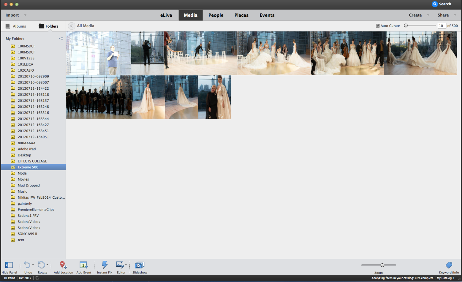
Designed to speed the process of identifying your best pictures, Auto Curate — located in the Organizer component of the software — automatically analyzes your images based on a number of criteria, including quality, composition and focus. The software also takes into account facial recognition, Smart Tags (a feature that automatically or manually labels subject matter, such as dog, automobile) and other parameters. The latter attempts to intelligently include people who are important to you, adding an emotional component to the curated collection of photos.
A slider allows you to choose how many photos are selected, with a minimum of 10 and a maximum of 20,000. By default, images are analyzed when they are imported into the Organizer. You have to wait until the initial analysis is completed in the background before you can run the Auto Curate and see the results. If you click Auto Curate too soon, you get a message saying, "Auto curation is in progress. Try again later." Only when this analysis is complete can you click Auto Curate to see the culled results.
You just click a button and decide whether you want to use Auto Curate, and Elements will select a theme, an opening slide and a music track and put it all together.
It took about 3.5 minutes for Elements to analyze 917 JPEG and Raw photos on my year-old MacBook Air that has 8GB of RAM. Unfortunately, the software does not indicate when the initial analysis has been completed, so you need to keep clicking the Auto Curate check box until the message no longer appears. It would be helpful to have an alert to let you know when the auto curation is complete. The good news, however, is that once the initial analysis is completed, narrowing down the group to the "best" images is almost instantaneous.
Auto Curate can be used on a folder or other collection of images. Importantly, though, you can also use various filters (for automobiles, specific people or people in general, star ratings, etc.) to narrow the group of photos that is analyzed.
Like any process driven by machine intelligence, Auto Curate produced some hits and some misses. For example, Elements selected an overexposed image of a person for its top 10 (see below) while ignoring a second, almost identical image that was properly exposed. Other times, Auto Curate selected underexposed images when properly exposed ones were available. At one point, the software asked if I was happy with the curated selections; I clicked No, and I hope that it will make better choices as more Auto Curate sessions are performed.
One-Click Slideshow: Basic but effective
The automatic image selection also works with the enhanced, one-click Slideshow feature. Creating a slideshow with this new, one-click method is super simple; just click a button and decide whether you want to use Auto Curate, and Elements will select a theme, an opening slide and a music track and put it all together.
Of course, you can change the various components: Choose a different theme, change the title slide (see screenshot below), add additional slides and captions, or replace the soundtrack with another supplied by Elements or from MP3 files on your computer. Although you may want to change a few (or more) aspects of the slideshow segments selected by the software, the automated process gives you a good head start.
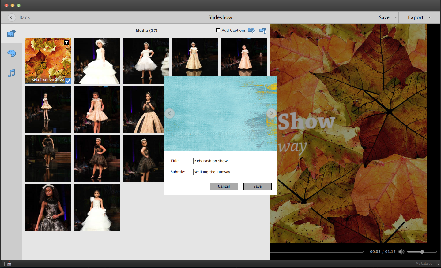
Unfortunately, the Slideshow feature is pretty basic, so if you want to have more control over transitions or fading the soundtrack, it's best to look elsewhere. (Photodex ProShow Gold is a great slideshow/multimedia program, although the desktop version is available only for Windows. The web version is cross-platform, though.)
Here's a sample slideshow that I made using Auto Curate; I changed the title slide and the music to better fit the images.
Open Closed Eyes: Picasso-like
Building on tools for facial-feature adjustment tools such as "Turn frowns upside down" (which allows you to transform frowns into smiles), Elements 2018 is now equipped to substitute opened eyes for closed ones. It's a problem we've all experienced — when a subject blinks at the exact time you click the shutter.
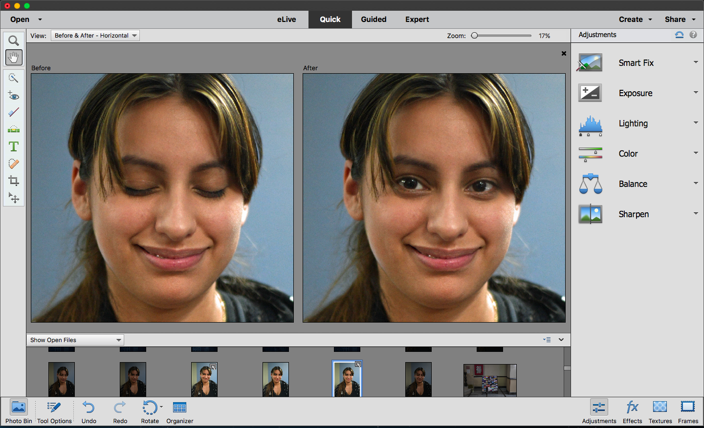
Elements suggests pictures from which to grab a substitute pair of eyes, but the results are generally at little bizarre, as seen in the screenshot below.
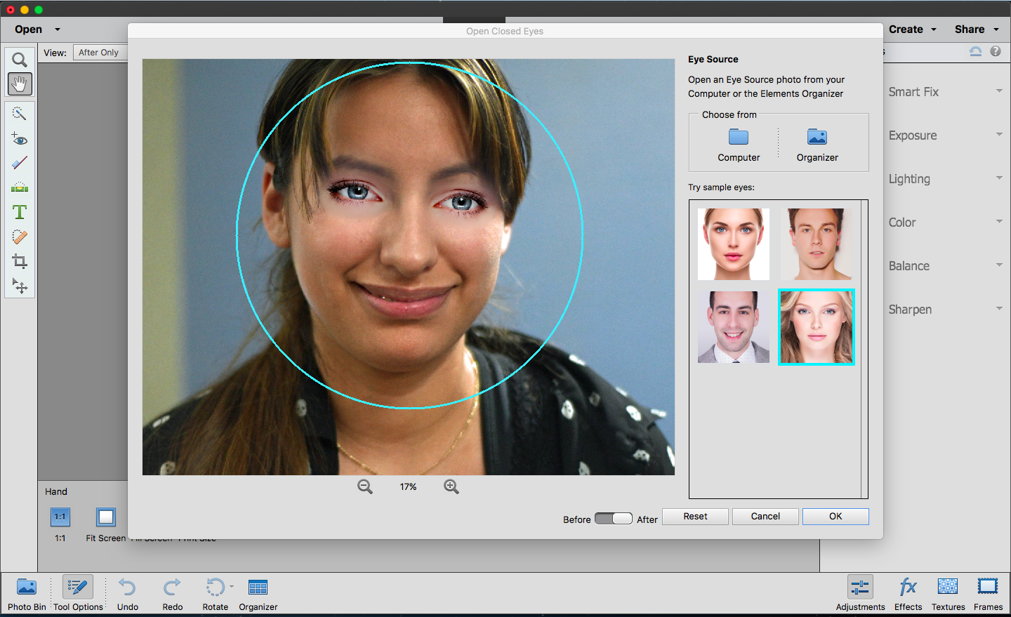
It's best to find the same subject in a similar pose. That shouldn't be too difficult if you've taken a couple of consecutive snaps of the same person, because the lighting, pose and other parameters should be the same. I took several pictures for this purpose, asking the subject to keep her eyes closed in one shot and opened in the other. This produced much better results, as seen below. It would be nice to have additional tools, including one to adjust the eye placement, because they don't always align perfectly.
Auto Selection: Helpful, but needs refinement
As with previous versions, Adobe Photoshop Elements 2018 is equipped with various selection tools, including the Magic Wand, Lasso Tool and Selection Brush Tool, each with its own level of difficulty and accuracy. The new Auto Selection feature is the easiest of them all. Basically, you just have to draw a box around the object you want to select, and Elements does the rest. You can even select multiple objects or subjects in the same image.
Guided Edits are very handy for those who are new to photo editing or want to learn a new technique.
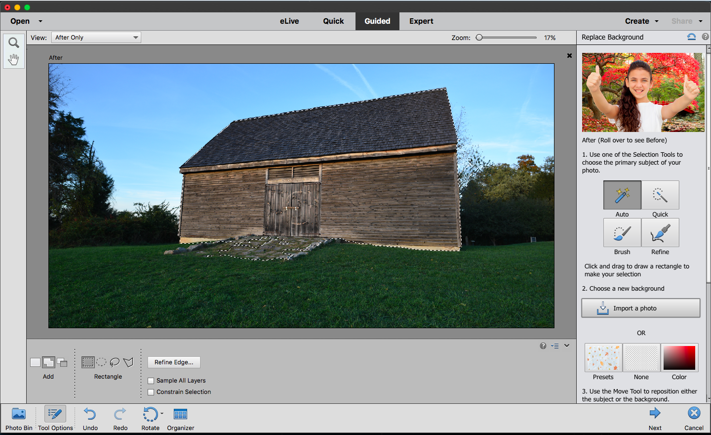
Auto Selection is not perfect, though, and requires extra attention when you have more-complex subjects, such as a person with flyaway hair or a building with foliage adjacent to the structure's straight edge. When the subject is not well-delineated against its background, you may have to tweak the selection by adding or subtracting parts of the image, which isn't all that difficult but may be time-consuming.
Auto Selection worked fairly well in selecting the barn in the picture below. But you can see that it also selected some of the stones in front of the building, as well as some foliage along the right edge of the structure. The Add tool allowed me to ultimately add the rest of the stones to the selection; the Remove tool was used later to eliminate the foliage on the right edge from the selection.
Guided Edits: Handy
Guided Edits are integrated, step-by-step guides that take you through various tasks. They're very handy for people who are new to photo editing or want to learn a new technique. For the 2018 version of Elements, four options have been added: Replace Background, Double Exposure, Artistic/Shape Overlays and Watercolor.
Replace Background
Of the four new Guided Edits, the most useful one is Replace Background. Using one of the selection tools (including the new Auto Select), this guide walks you through the process of selecting a subject and replacing the background. It's a good learning tool, as are many of the other Guided Edits, so you can perform the same task without help in the future.
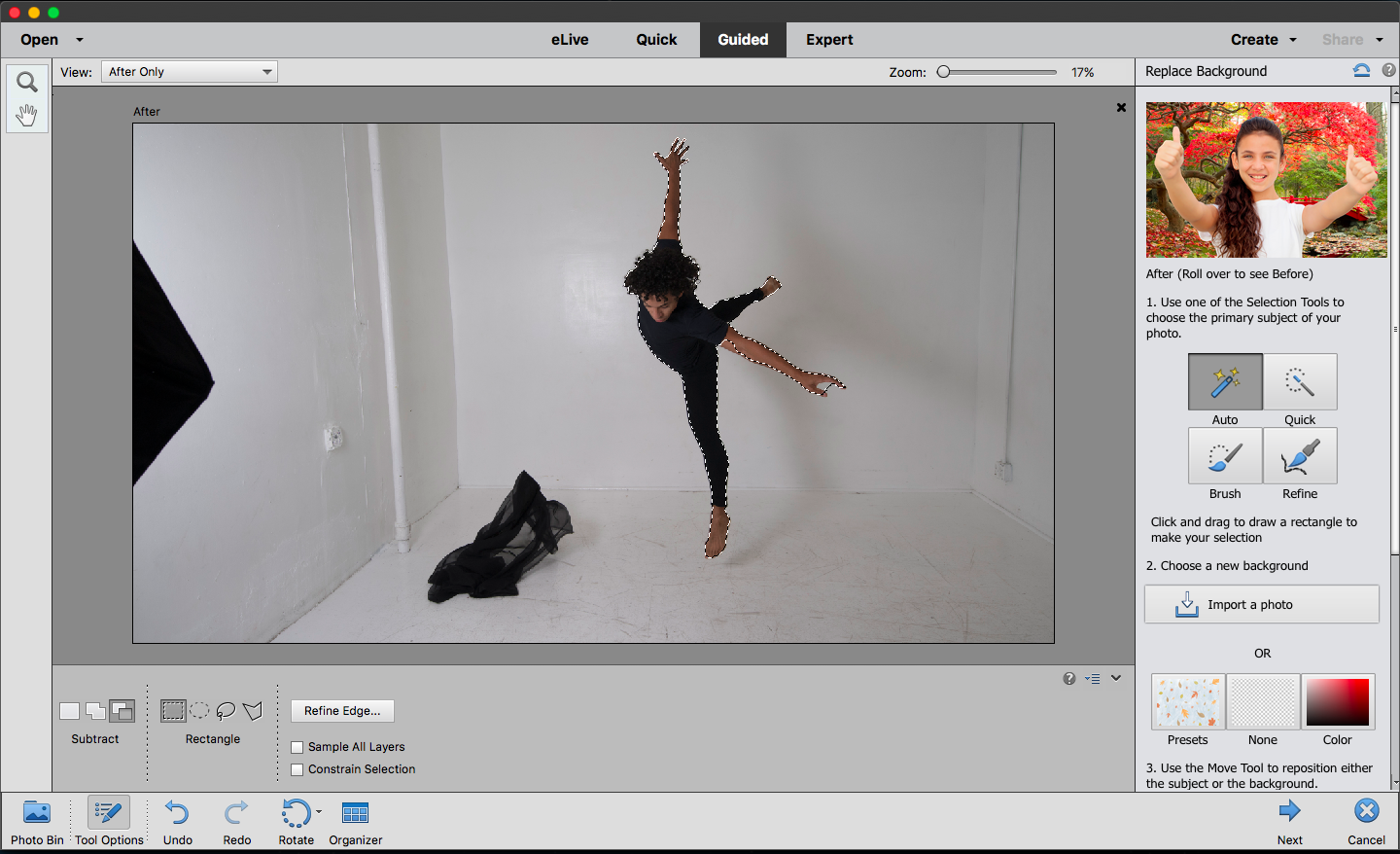
To test Replace Background, I chose a photo of a dancer against a white background and a sunrise shot.
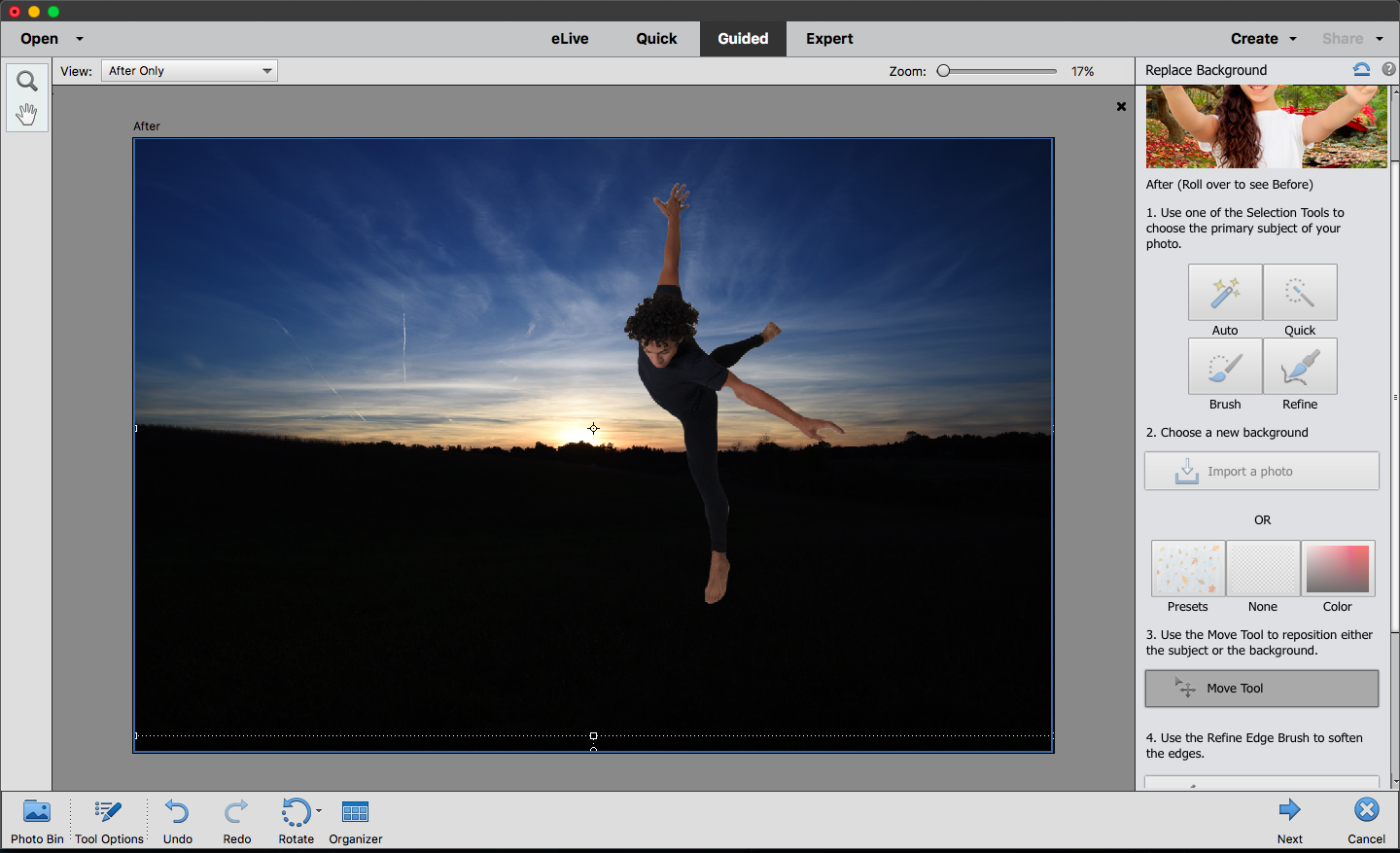
I used Auto Select to select the dancer; while the selection was extremely accurate (in large part thanks to the contrasting, plain background), I had to adjust two very small areas around his hands. But the touch-up was quick and simple. Adding the new background was one-click easy, as was adjusting the position of the dancer using the move tool.
Double Exposure
This Guided Edit, which places two images (one over the other) in a single frame, is easy to use and a quick way to add a bit of creativity to your images.
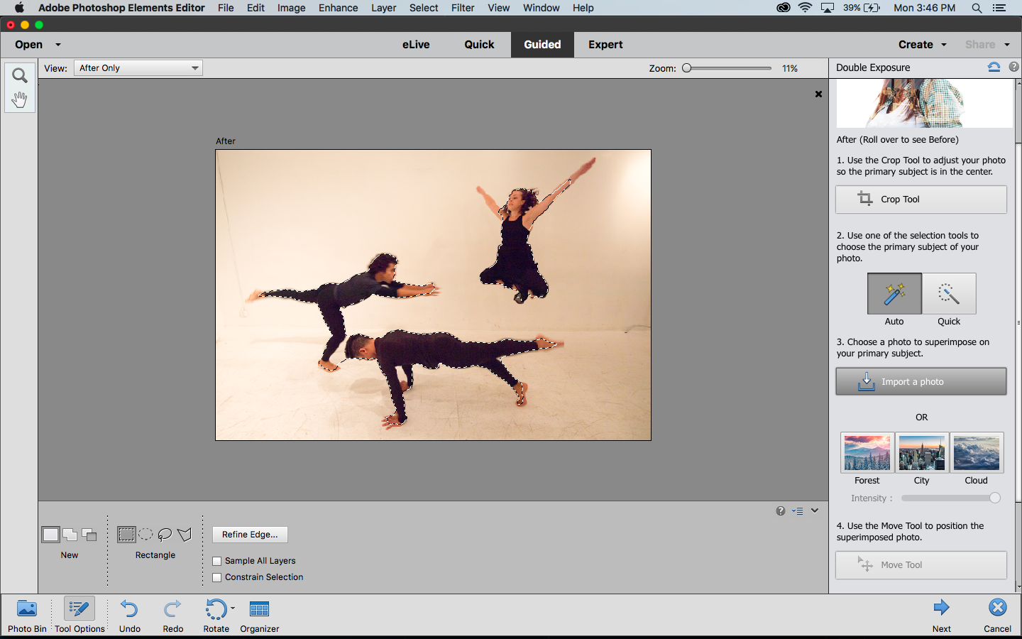
You choose a base photo, select your main subject (or leave the full image intact) and then add another image — either one of your own photos or a sample photo from Elements — atop the first. From there, you can adjust the intensity and position of the second image.
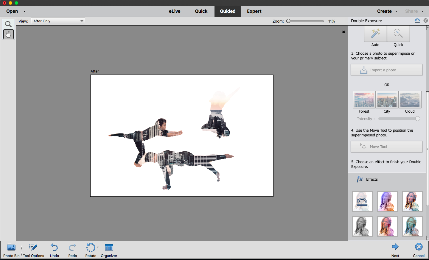
I chose an image with three dancers and used Auto Select to select all three of them. Then I added one of Elements' cityscapes as the second photo to make this somewhat interesting composition.
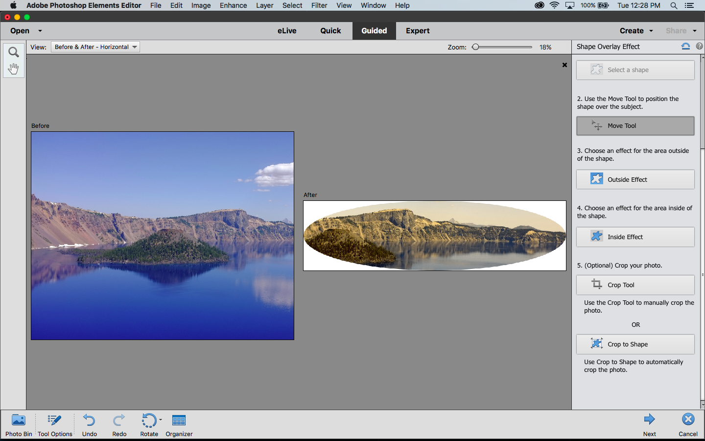
Artistic/Shape Overlay
This isn't one of the most interesting Guided Edits, but the Overlay option will be useful for scrapbookers or those who like to print unusually shaped images. You don't have to crop the image to the shape (you can have a semitransparent overlay and add an effect to the rest of the image). Still, I had fun cutting out a portion of a landscape and applying a sepia-like effect.
Watercolor
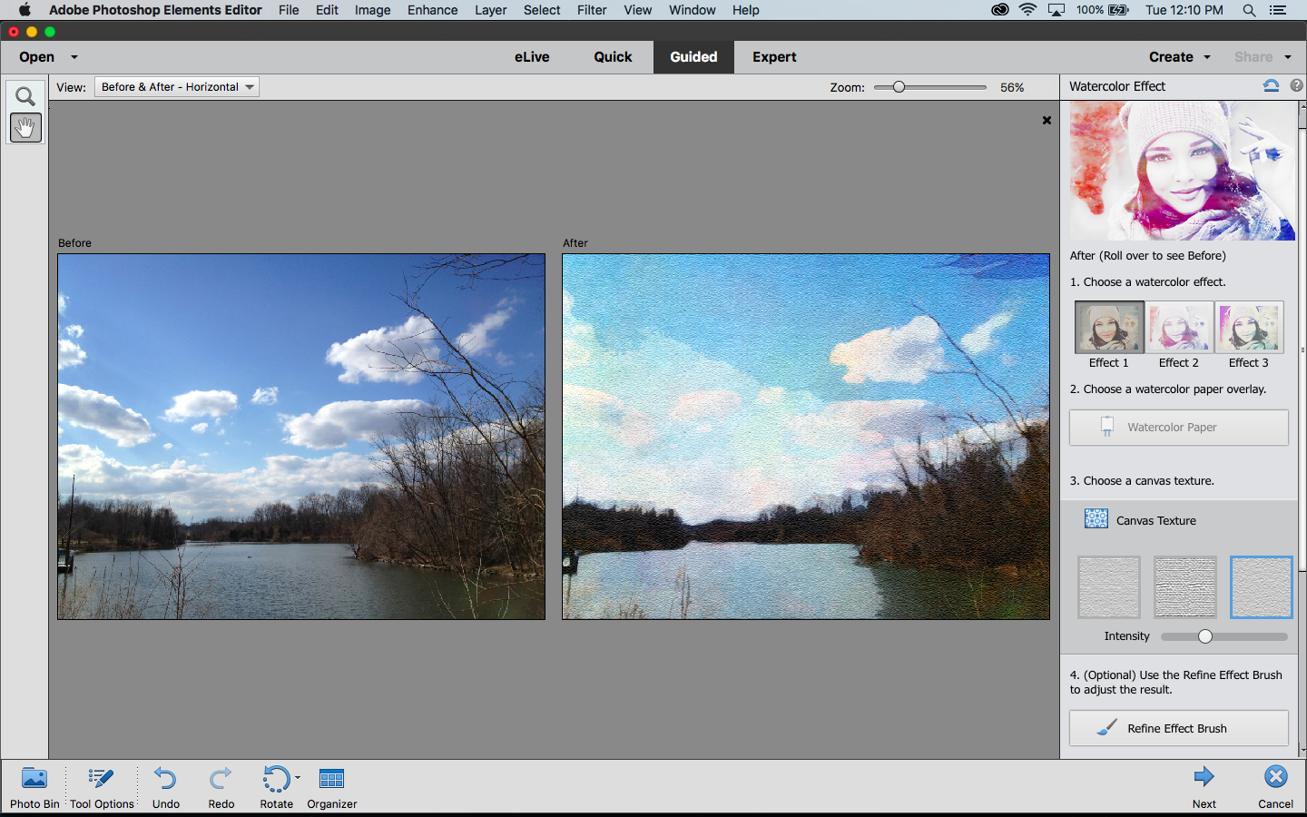
This new feature applies a painterly watercolor effect to images. I wasn't thrilled with the results, because they didn't look like what I think of as watercolor paintings. Although you have a few options to choose from (three color or black-and-white filter effects, six watercolor paper overlays, and a trio of canvas textures), I think there should be more choices. But it's quick and easy, and you can add text if you'd like.

Bottom Line
Among photo-editing programs selling for less than $100, Adobe Photoshop Elements 2018 remains at the top of our list. This program does a great job balancing ease of use, educational components and advanced editing tools. If you're in the market for your first, or a new, image-editing program, then Adobe Photoshop Elements 2018 may be right for you. However, if you already own Elements 15, you may want to think twice about upgrading until the automated features have been perfected.
Credit: Tom's Guide
Theano Nikitas is a freelance journalist and photographer. She's been writing about photography for more than 20 years, contributing countless reviews of cameras, lenses, accessories and software packages to Tom's Guide. Her work has also appeared in dozens of other magazines and websites, including CNET, DPreview, PopPhoto, Professional Photographer and Shutterbug.

