How to Salvage Photos Gone Horribly Wrong
Not everybody has time to learn photography 101. Here’s how to make the best of bad images after the damage has been done, with software.
Brightness and Contrast for Dark Images
Lighting conditions for any photo session are seldom perfect, making brightness and contrast problems one of the most frequently seen issues in consumer photography. Brightness is essentially the total amount of light (or white) in a pixel, while contrast is the difference in brightness between various pixels. Since brightness and contrast are so closely related, they’re usually adjusted together (usually brightness first, and then contrast).
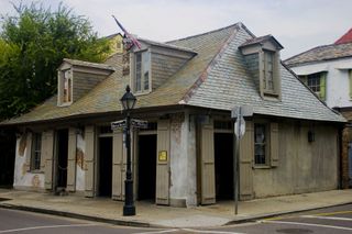
The image below shows problems with brightness, where the overall darkness of the image makes it difficult to see details.

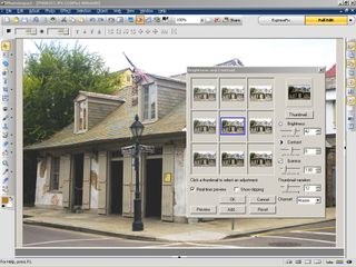
Of course, how much to brighten an image is an issue of personal preference, but tools such as a Histogram can help (more on this later). It’s usually best to brighten an image in increments, such as by six or 12 points. One the brightness is close to what you have in mind, you can then fine tune by increasing or decreasing the brightness one point at a time, until the brightness looks correct.

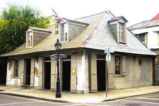
Once brightness was applied to this photo, it looked somewhat faded, which is an issue easily corrected with a contrast adjustment. I increased the contrast by 36 points, which brought out details and even made the street signs more legible.

Sign up to get the BEST of Tom's Guide direct to your inbox.
Get instant access to breaking news, the hottest reviews, great deals and helpful tips.
Current page: Brightness and Contrast for Dark Images
Prev Page How to Salvage Photos Gone Horribly Wrong Next Page Color Adjustment for Bluer Skies-
superhighperf how about fixing the photo that was in the cover?Reply
http://media.bestofmicro.com/adjustment-saturation-tuning,0-4-178852-2.jpg
bait and switch article ?!?!?!?! -
As a professional VFX artist, I have to say that this article is a little on the juvenile side. Some of the "after" photos contain less information than the "before" photos. You never want to clip information in your photograph, and always want even exposure. Never underestimate a good matte for affecting only certain portions of your image. Furthermore, a good levels adjustment never hurt, and can always add some "punch" to your image.Reply
-
The article text provides a reasonable introduction to basic photo editing, but the "fixed" photos are perfect examples of what happens when a beginner goes way, way overboard. It's too bad because the miserable "after" photos significantly undermine the credibility of the article.Reply
-
mediv42 Why do people insist a bluer sky or greener trees make a better picture? Isn't the point of photography to capture what actually is, not whimsically change it to what you want it to be? Sure I understand if you underexposed the photo, or your white balance is off or whatever, but shouldn't the goal generally be what the subject actually looked like?Reply -
idisarmu This reminds me of the millions upon millions of teenage girls who see a picture of themselves and say, "Oh noes!!! ACNE!" *cries for hours and then suddenly has epiphany* "WAIT! I've GOT IT! I'll just crank up the brightness and make the picture black&white! THANK YOU COMPUTER!"Reply -
AARRGGHHH idisarmuThis reminds me of the millions upon millions of teenage girls who see a picture of themselves and say, "Oh noes!!! ACNE!" *cries for hours and then suddenly has epiphany* "WAIT! I've GOT IT! I'll just crank up the brightness and make the picture black&white! THANK YOU COMPUTER!"Reply
Black and White hides zits? That IS an epiphany.
I enjoyed the article.
