What Makes Photoshop So Expensive?
Why does the upcoming Adobe Photoshop CS5 cost $600? We tested out its features to find out what you’re paying for.
Introduction
There are plenty of free image-editing tools: Windows Live Photo Gallery, Paint.NET, iPhoto for Mac, and the list goes on. There are also specific photo-handling and management packages like Apple’s Aperture and Lightroom (also from Adobe). Commercial packages like Paint Shop Pro and Xara Xtreme are packed with features. Still, Adobe Photoshop manages to keep its $600-odd price tag year after year. Creative Suite 5 (CS5), Adobe’s pricey pack of multimedia software that will be out this summer, is no exception. We got an invite to review the beta version and checked it out to see what you get in Photoshop CS5 and why the features keep the product so expensive.
Everything is going 3D this year, including Photoshop CS5. The new 3D features are only in the extended version, but they let you turn 2D objects and text into 3D models, apply textures and materials to them, control the lighting, and render them with Adobe’s Ray Tracer. Both versions have the new tools for working with raw images and high dynamic range (HDR), painting into images, selecting awkward areas, removing unwanted areas as if they’d never been there (it really is that good), and moving people in your images around like puppets. They also use your graphics processor to accelerate not just 3D effects but the task of picking colors, previewing crops, and resizing brushes, which are things that used to take just enough time to get frustrating.
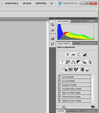
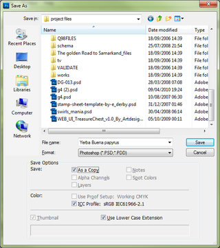
Adobe touts 30 "new" features in Photoshop CS5, although there are some we definitely count as improvements. They are less about the big-name features that justify the cost and more about dealing with minor irritations that are so frustrating you begrudge the cost of software no matter how powerful it is. Some defaults are now more sensible, while other changes improve the way you work with common tools. You can now delete all the empty layers in an image at once or close all the images you have open without saving, adjust the fill or opacity of multiple layers at once, drag a file into an open PSD to add it as a layer, and use Save As to have Photoshop suggest the folder in which you saved images last so you spend less time navigating folders. Being able to swap quickly between different sets of panels is handy, too.
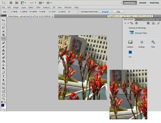
Two of the smaller features introduced by popular demand are particularly useful (although again they’re the kind of thing that made you glad you bought Photoshop rather than justifying the price). If your image is at an angle, you can straighten it with the Ruler tool by just dragging along a line that’s supposed to be horizontal and click Straighten. This works very well and it’s much easier than juggling a slider until an image looks straight (as in Photo Gallery).
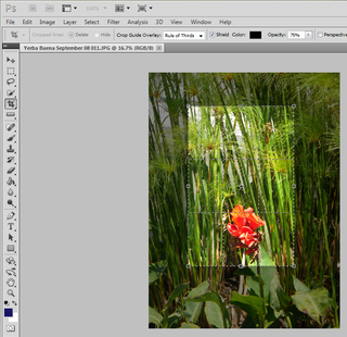
When you’re cropping an image, you can now see a grid over the selection or a three-by-three grid that lets you use the "rule of thirds" to compose the image. Placing the interesting elements in your image at the intersections or along the lines of the three-by-three grid where the viewer’s eye naturally falls is one of the easiest ways to perk up an image, and while you can do it by eye, it’s convenient to have the lines.
Sign up to get the BEST of Tom's Guide direct to your inbox.
Get instant access to breaking news, the hottest reviews, great deals and helpful tips.
Current page: Adobe Photoshop CS5 Review - Worth the Price? - Tom’s Guide
Next Page Photoshop CS5 Selection Tools - How They Work - Tom’s GuideMary Branscombe is an experienced freelance journalist, editor and author, who has been writing for more than three decades. Her work has appeared in The Financial Times, The Guardian, Tom's Guide, and many more. She has also written several novels — including the Cassidy At Large technomysteries — and two IT guides alongside her writing partner, Simon Bisson.




-
mitch074 Nice. Photoshop sure is quite the package.Reply
However, I wonder why, along with all the tools you cite, there is no mention made of the Gimp...? After all, it is available on Windows, Mac and Linux, it doesn't cost a dime, and it also includes:
- HDR effects (in script-fu): Tone Mapping and Exposure Blend
- painting effects (programmable brushes)
- GEGL (yes, 3D in Gimp)
- lens correction
Now, all of these aren't as advanced nor are they as easy to use as the Photoshop versions, but they are here and they work. For free. -
marybranscombe Mitch - to fit in as much information about Photoshop CS5, I only had room to mention a tiny fraction of all the image editing tools out there ;) I'm quite a fan of Paint.Net and Irfanview, personally...Reply -
mitch074 Paint.NET, iPhoto, WL Photo Gallery are not exactly professional-grade applications - while the Gimp (with colour profile management capabilities, layers-based approach, programmable filters, vector graphics capabilities, advanced stylus management, etc.) is, actually, used by some professionals... And a direct competitor to Photoshop.Reply
Thus why I found its absence (Paint.NET isn't quite there yet, it does have the merit of being free for use -but not open source- ) a bit surprising. -
Traciatim "Digital SLRs let you save files not just as JPEGs but in a RAW . . . "Reply
So does my point and shoot from 2002 . . . and (I believe all new) Interchangeable Lens Digital Cameras, and lots of point and shoots available today. You could have just said "Many Digital Cameras" rather than implying that Digital SLRs do something that other cameras don't, which is not true. -
marybranscombe Traciatim - true, but 1) the CS5 emphasis is very much on the DSLRs judging by the minimal list of cameras covered by the cusotm lens correction (and Adobe refers to only 275 cameras whose RAW formats are supported) and 2) my feeling is usually that point and shoot cameras with small lenses and sensors tend to need the in-camera processing to deliver good imagesReply -
cadder Photoshop is the ultimate consumer image editing tool. There are lesser tools sold by Adobe that will do for most people with digital cameras, and they are a lot less expensive- Photoshop Elements and Photoshop Lightroom. Of course Gimp and Irfanview are much cheaper options than that for the average person too.Reply -
anthropophaginian If it was for sale for half-price $300, I doubt sales would double. The same universities and design companies would buy it, but it would still be out of many consumers' price range. At this price range, with spreading of costs the time saved and final quality of the product will justify the price.Reply
...Also you're paying for the ostentatious value. -
punditguy Student discount FTW! Adobe Creative Suite Design Standard, $299 at Amazon. Won't be available until June 30, though...Reply -
Tomsguiderachel Traciatim"Digital SLRs let you save files not just as JPEGs but in a RAW . . . " So does my point and shoot from 2002 . . . and (I believe all new) Interchangeable Lens Digital Cameras, and lots of point and shoots available today. You could have just said "Many Digital Cameras" rather than implying that Digital SLRs do something that other cameras don't, which is not true.I would argue that most point and shoots today do not offer RAW. And, most interchangeable lens cameras ARE DSLRs (not all).Reply


