Forget iPhone X Clones: These Designs Actually Excite
At Mobile World Congress, the hub of innovation in smartphones, every device looks vaguely similar. But they don’t have to, and the solution lies in the details.
BARCELONA — It’s easy to dismiss the vast majority of smartphones as monolithic slabs of metal and glass, and this year’s Mobile World Congress did little to dispel that cynicism.
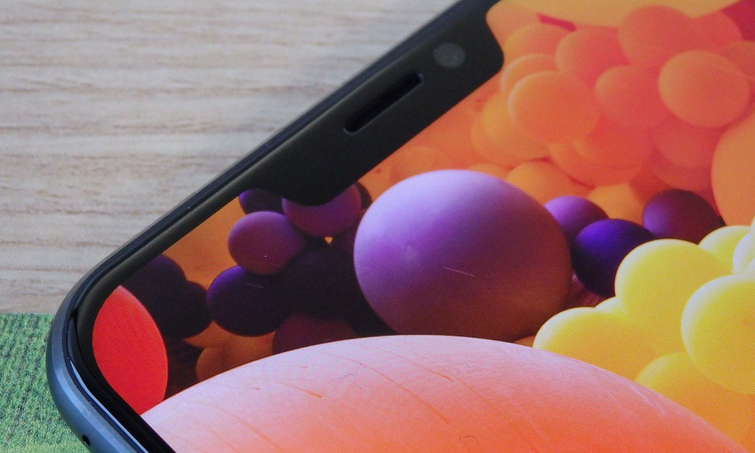
Take Samsung’s Galaxy S9, for example — the device LG and Huawei seemingly moved out of the way for, so it could have the Barcelona spotlight all to itself. Like the Galaxy S8 before it, the S9 charms. The Infinity Display is still perhaps the best expression we’ve seen yet of the 18:9 aspect ratio, and it serves a practical purpose as well, in terms of comfort and one-handed use.
But the Galaxy S9 is almost distinguishable from last year’s model, and, thanks to those never-ending S9 leaks, the world knew it was going to be months ago.
A lot of times, the problem of derivativeness in design stems from a lack of alternative solutions. This has especially been the case with the ascendancy of wider displays, which consume more of a phone’s surface area. Less empty space on the front means designers have to find another place for the fingerprint sensor — so it goes on the back, because, with the exception of Vivo and its X20 Plus UD phone, we haven’t quite reached the whole under-the-screen thing just yet. Collectively, most companies ultimately end up in the same place.
MORE: The 8 Weirdest Smartphones You Can't Buy Yet
Sometimes though, being derivative is the goal. And what new phones from this year’s MWC better exemplify that than Asus’ ZenFone 5 and 5Z? These are two devices (really one with a processor difference) that wholeheartedly copy the iPhone X-style notch. Not out of necessity, mind you — as the ZenFone 5 doesn’t have a depth-sensing camera capable of 3D facial recognition that needs all that space — but out of fashion.
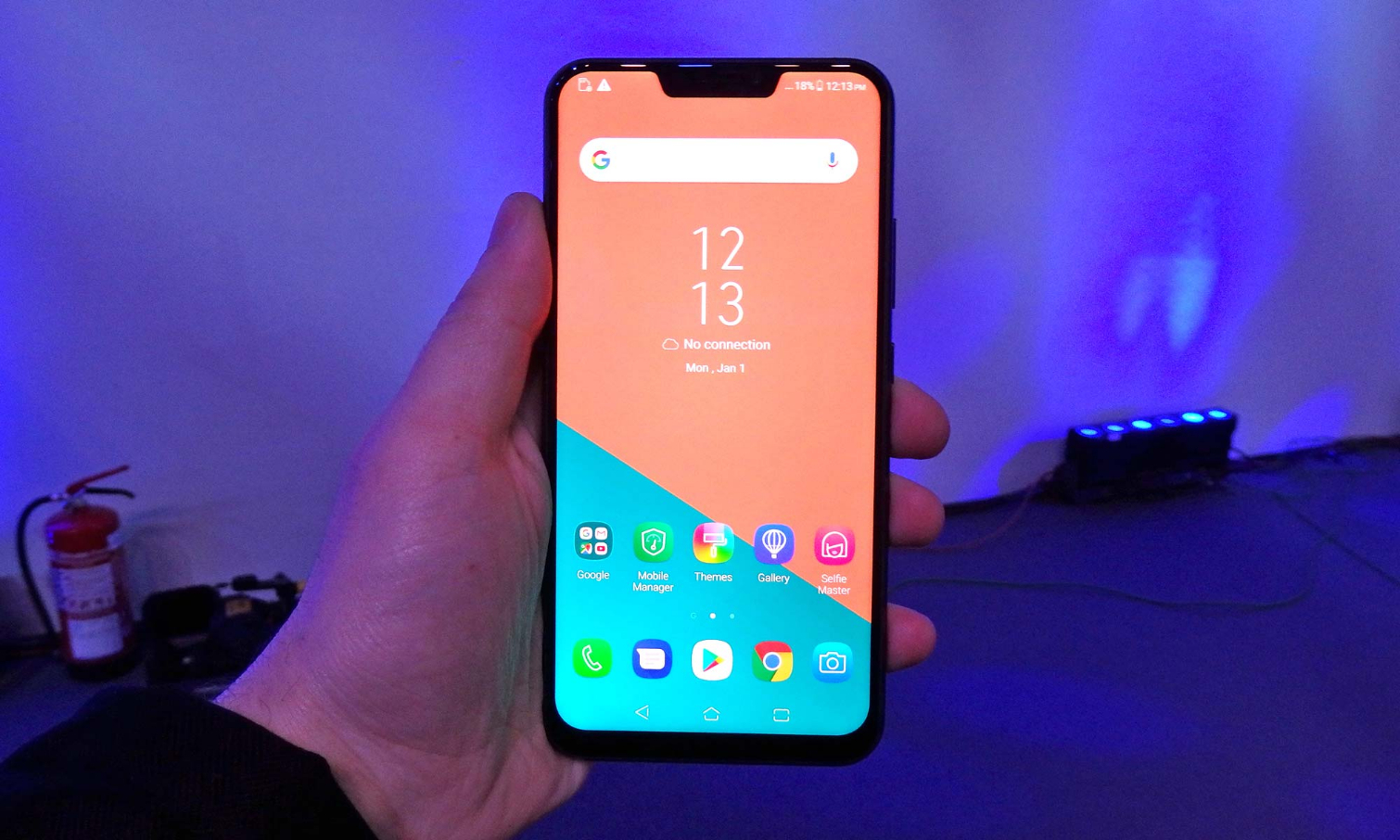
The notch is a design limitation that came to define the world’s most expensive phone, and now Asus has adopted it purely to associate itself with it, though not without first bragging during the new ZenFone’s unveiling that the notch on its phone was smaller than the iPhone X’s. The ZenFone 5 even mimics the iPhone X’s dual camera orientation — vertically, on the upper-left corner of the backside.
The notch is a design limitation that came to define the world’s most expensive phone, and now Asus has adopted it purely to associate itself with Apple.
No matter how phone makers arrive at it, the result always seems to be sameness. But those warring against the trend find success in unlikely ways.
Sony has been criticized — and rightfully so — for doing very little to advance its own mobile design language over the last several years. But it was also one of the only longtime producers of Android smartphones that had an identity in the space, which is hard to establish when just about all your competitors are using the same OS, with the same stock apps.
It found a way forward with the Xperia XZ2 and, more specifically, the XZ2 Compact. While other smartphones are skewing slimmer and harder, the newest Xperia flagships are rounder and softer. While others offer a selection of black, white and/or silver and gold and/or rose gold, the new Xperia phones include two different sea green-esque hues, a very light pink and another that can best be described as “foundation.”
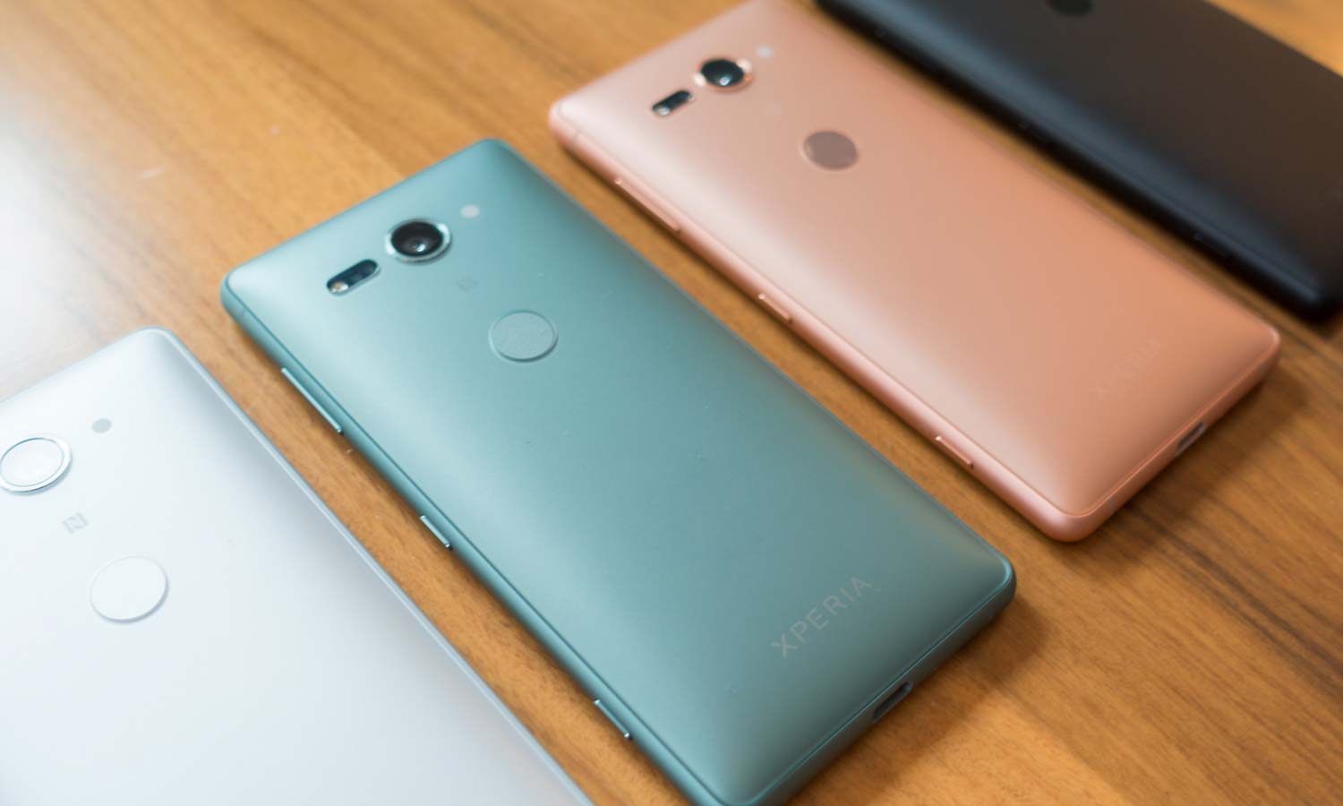
Just the existence of the XZ2 Compact is rebellious. Extra wide screens promise larger displays in smaller frames, but most companies aren’t taking advantage of that benefit. Polycarbonate-clad smartphones that have any flagship aspirations are shunned in this industry. Yet Sony built a tiny, plastic phone powered by a Snapdragon 845 and 4GB of RAM. (And to specify, this is nice plastic. The kind of plastic that feels better than cold, slippery aluminum.)
In another wing of the MWC convention center, there was a different unusual-looking phone, albeit one that disappointed us before. Essential suffered a corporate exodus, released a $700 handset with an abysmal camera, and failed so awfully at living up to its astronomical hype that the company was forced to cut the MSRP of its introductory product by 30 percent almost immediately after it launched. And then it quietly rose from its ashes, thanks to a series of helpful camera software updates and settling on a bargain price.
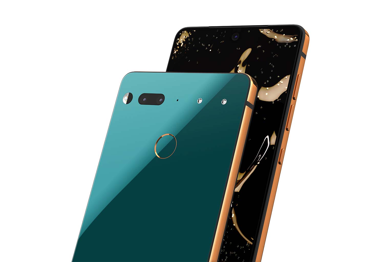
In terms of design, the Essential Phone was always pretty — personally, I prefer it to the iPhone X. But lots of smartphones are just pretty, and with the release of Ocean Depths and Copper Black, Essential’s two new limited edition colors, it’s made something that also demonstrates the value of trying something new.
I can’t remember the last phone I’ve seen in person that looks as good as Essential’s does in green.
I can’t remember the last phone I’ve seen in person that looks as good as Essential’s does in green. And when you factor in the cocktail of ceramic and titanium that the company employed for its hardware, the device becomes even more special. As competitors try to use current design buzzwords to shape the future, Essential is already working with a whole new vocabulary.
In highlighting these two examples, I’m not trying to say that progress isn’t being made elsewhere. Google’s Pixel 2 pair is jarringly contradictory, with the larger XL seemingly getting the entirety of the company’s attention, at least from a design standpoint. But the subtle powder-coated finish of both devices delights you the first time you hold it, because it diverges from the preconception of what metal should feel like.
It’s easy to forget the 18:9 aspect ratio trend is only just a year old, though it may feel as though it’s gone one for much longer. Who is to say what the phones at MWC 2019 could look like, what crazy manufacturing processes they could incorporate and what quirky colors they could be offered in?
Whatever form they take, I hope their designers exhibit the confidence to try something new. And that doesn’t mean a complete reimagining; sometimes, it can just mean green plastic.
Image Credits: Tom's Guide
Sign up to get the BEST of Tom's Guide direct to your inbox.
Get instant access to breaking news, the hottest reviews, great deals and helpful tips.
Adam Ismail is a staff writer at Jalopnik and previously worked on Tom's Guide covering smartphones, car tech and gaming. His love for all things mobile began with the original Motorola Droid; since then he’s owned a variety of Android and iOS-powered handsets, refusing to stay loyal to one platform. His work has also appeared on Digital Trends and GTPlanet. When he’s not fiddling with the latest devices, he’s at an indie pop show, recording a podcast or playing Sega Dreamcast.
