Tom's Guide Verdict
The reMarkable 2 refines the tablet built for writers with a super-thin elegant design that impresses.
Pros
- +
Amazingly slim design
- +
Faster stylus input
- +
Excellent writing feel
- +
Longer battery life
- +
Writing to text translation
Cons
- -
More expensive than an iPad
- -
No apps
- -
Latency lags behind iPad Pro
Why you can trust Tom's Guide
Unlike the iPad and other tablets, the The reMarkable 2 ($279 to start) is a slate where writing comes first. Made for writers and those who prefer a digital paper screen, like you get with the best kindles, the reMarkable 2 is made for people (like myself) who love to actually write, and want to bring handwriting into the digital era.
The reMarkable 2 is so (pardon the pun) remarkable because of its amazing redesign, which slims down and moves from plastic to metal. On top of that, a really neat handwriting-to-text conversion trick (added to the reMarkable line after the original reMarkable was released) make it a lot more capable.
- The best Chromebooks for kids
- Laptop vs. Chromebook: What’s best for you?
And just recently, reMarkable added a new way to read on the tablet with Read on reMarkable, a Chrome extension that turns posts into Ebooks you can read later. This reMarkable 2 review will show that while the tablet doesn't have the broad overall appeal of an iPad or Amazon Fire tablet, it's still one of the best tablets, especially for the person in your life who has stacks and stacks of notebooks.
In the months that passed since this review was originally published I've come to find the reMarkable 2 as an essential gadget of my day to day.
reMarkable 2 review: Cheat sheet
- The reMarkable 2 offers a natural-feeling writing experience
- It's much thinner and lighter than before
- This tablet doesn't run Android, so don't expect any apps
reMarkable 2 review: Release date and price
OS: Codex
CPU: 1.2 GHz dual core ARM processor
Storage: 8GB
Memory: 1GB
Display: 10.3-inch, 1,872 x 1,404 digital paper
Marker: 4,096 levels of pressure sensitivity
File support: PDF and ePUB
Wireless: 2.4GHz and 5GHz Wi-Fi
Battery: 3,000 mAh
Battery life (rated): Up to 2 weeks
Size: 9.7 x 7.4 x 0.2 inches
Weight: 14.1 ounces (0.88 pounds)
At launch the reMarkable 2 was sold exclusively through remarkable.com in a $399 bundle that knocked $137 off by throwing in the regular Marker stylus, polymer weave Folio case and $19 express shipping for free.
Nowadays, the reMarkable 2 is available for purchase from the company's website at a price starting at $279. The Marker is $49 and the Folio is $69. The Marker Plus with its eraser end is $50 (normally $99) and Book Folio cases are $69 off, discounted to $80 for the leather cases and $30 for the polymer weave folio.
reMarkable 2 review: Design
When I took the reMarkable 2 out of the box, I was hit by a wave of shock. "How could this thing be this slim and gorgeous?" my brain asked. First, and most notably, the white plastic bezel has been ditched for a machined aluminum body that has to be held in your hands to be believed. The reMarkable 2 is so thin, in fact, that it's thinner than my pencils and the reMarkable 2's Marker stylus.
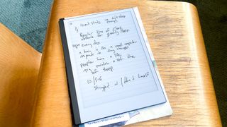
The original reMarkable was already slim and unique, at 10.1 x 6.9 x 0.3 inches, but the reMarkable 2 is thinner, at 9.7 x 7.4 x 0.2 inches. And while the 0.89-pound reMarkable 2 is slightly heavier than the 0.77 pound reMarkable 1, I would never refer to it as anything but "lightweight." The reMarkable 2 is also thinner and lighter than the 10.2-inch iPad (9.8 x 6.8 x 0.3 inches, 1.1 pounds).
On a video call with friends, I held the reMarkable 2 up towards my webcam, with its spine pointing at the screen, and I heard at least three different sets of oohs and ahhs.
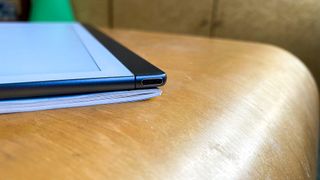
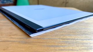
Making things even better, the reMarkable 2 ditches the stiff power/wake button from the first reMarkable for a very clicky little power button on the top of the spine. You'll find the USB-C port used for charging the reMarkable 2 on the opposite side of the tablet. Yes, while the iPad is still stuck on the Lightning connector, the reMarkable 2 managed to ditch the terrible microUSB for the reversible port of the present.
reMarkable 2 review: Display
The reMarkable 2's monochrome 10.3-inch (1,872 x 1,404) proprietary CANVAS display has a 226 DPI density that won't win a fight with the 264-ppi iPad, but that's OK. The iPad needs a sharper resolution for watching video, which you can't do on the reMarkable 2. This tablet only supports ePUB and PDF files.
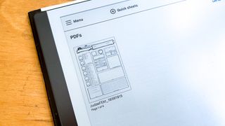
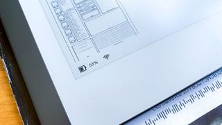
While the duo-tone Dungeons and Dragons character sheet I imported to the reMarkable 2 looks super crisp, images I moved over from PDFs don't look as clear. Again, that's not a huge burden. I've tested Kindles and other e-readers with digital paper for years, and I've never expected them to be great for image quality.
Reading PDFs on the reMarkable 2's display, I've seen crisp-enough letters, though I can see pixelation when I look at anything I write on the panel. That's less of a problem, though, and more something I consider "room for improvement."
When I used the Chrome extension "read on reMarkable" to send a blog post to my reMarkable 2, I did realize that I wished the slate offered some kind of lighting, for when you want to read in the dark. But when the reMarkable is this thin and light, I can excuse the lack thereof, which would have probably made it bulkier.
reMarkable 2 review: Writing experience
There is nothing like the reMarkable 2 (and the reMarkable 1) when it comes to writing. The reMarkable tablets offer a natural writing feel that's much closer to the feeling of using a pencil or pen on paper than any gadget I've used before.
It's so natural and fun to write with the reMarkable 2 that I switched to it for a series of professional (product briefings) and personal (Dungeons and Dragons) meetings. And found myself more able to focus on what I was doing while I wrote on the reMarkable 2, rather than if I had used an app for taking notes.
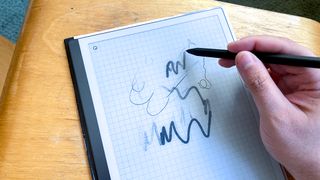
This is so much better than what the iPad offers, because pressing the Apple Pencil against the iPad's glass screen doesn't actually feel anything close to writing on paper with a pen or pencil. Samsung looks to offer a similar feeling with the Galaxy Tab S7, and we're looking forward to comparing how the writing experiences feel.
The reMarkable 2 also packs a ton of templates, and the ability to write in layers (ala Photoshop). This way you can craft a map on graph paper, organize your work week in the Dayplanner template or even build a movie in the three blank storyboard templates. I just wished that the date section in the dayplanner was a little larger for my handwriting.
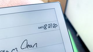
And you just keep writing and writing, turning the virtual page to the left to unlock another blank sheet. As someone who's had more notebooks than he'll ever know, and seen pages fade, tear or get lost, one notebook to hold them all sounds like a much better place to "collect" my thoughts.
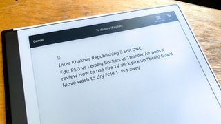
And once you're done, your notes don't just live in the tablet. They sync to the reMarkable apps on Android, iOS, macOS and Windows 7 and later. There's also an option to convert your handwriting to text, which I've seen work in varying degrees of accuracy.
When I used the reMarkable for taking notes during a remote briefing, I wasn't really looking while I wrote, and my notes were practically illegible at times. Still, I prefer the ability to edit the text later — as you can email your transcribed texts to yourself — which helped me share my notes with all my team.
When it's time to write, you have 6 virtual inking tools to choose from: a ballpoint pen (my standard) the Fineliner (which has a thinner tip that looks like the Pilot Precise pens), a marker, a pencil, a mechanical pencil, a highlighter and a paintbrush. If you're wondering how the pencils differ, the regular pencil lets you create shading by writing with the side of the Marker tip on the page.
Some tools, like the pen and marker let you draw in black, gray or white, while the pencils only let you write in black. All instruments, minus the highlighter, allow you to choose between small, medium and large for the size of your writing.
reMarkable 2 review: Performance
The 1.2 GHz dual-core ARM processor in the reMarkable 2 allows for prompt and snappy speeds when you're moving between apps. I don't think that's the key difference maker, though, as the reMarkable 2 moved at speeds that felt more confined by the refresh rates of digital paper.
The reMarkable 2 offers a 21 millisecond latency, improving on the tap-to-screen inking time of the original reMarkable (55ms). Both the iPad Pro and the Samsung Galaxy Tab S7 offer 9ms latency for their pen input, which will be a goal for the reMarkable to chase. But with its digital paper screen, I'm not sure how close they can get.
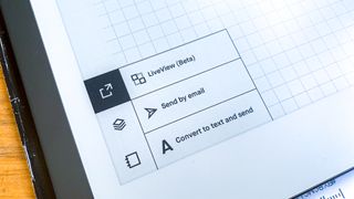
Oh, and the reMarkable 2's handwriting to text conversion took about 8 seconds per page with my chicken-scratch, which felt a little longer than I'd like.
reMarkable 2 review: Battery life
After a week of use, for an hour or less a day, the reMarkable 2's battery is currently at 53%. This matches up with the company's claim of getting 2 weeks of usage on a single charge. This is a huge leap forward from the reMarkable 1, which only lasted 3 to 4 days on a single charge.
reMarkable 2 review: Markers and Folio cases
You can either get the reMarkable 2 with the regular Marker stylus (currently free, discounted from $49) or the $50 Marker Plus (currently discounted from $99), which is the one I've become accustomed to during my testing.
What do you get for $50? Well, it's black and not white, it's 27% heavier at 19 grams (vs 15 grams) and its flat half works as an eraser, though you have to lift the butt of the Marker Plus off the screen for the content to be erased. Otherwise, you'll need to tap twice (once to open the tools menu and a second to select the eraser) to erase any mistakes.
If you get the reMarkable 2 with the regular Folio, the polymer-weave sleeve that it slides into, don't make the same mistake I did with the little space for the Marker at the top. When I removed the Marker, its replaceable tip didn't come back out with it, and now I can't find it.
And, having used both, I'd rather spend the extra $30 to $80 for the Book Folio case, which is basically a protective dust jacket that the reMarkable 2 magnetically attaches into.
reMarkable 2 review: Verdict
The reMarkable 2 is one of those gadgets you never knew you needed until you use it. An infinite digital notebook that offers the feeling of writing on paper, but stores your notes in the cloud and even converts your handwriting into editable text, anything other than reMarkable would have been a misnomer.
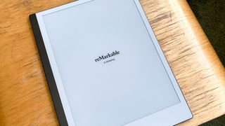
And this reMarkable 2 review shows how it earns that name even more than the original model, packing its big screen into a thinner, sleeker design. Yes, you could save $70 with the iPad and gain a color screen, many more apps and the ability to watch Netflix. But the reMarkable 2 serves a completely different purpose, and does it better than any other tablet we've ever seen.

Henry is a managing editor at Tom’s Guide covering streaming media, laptops and all things Apple, reviewing devices and services for the past seven years. Prior to joining Tom's Guide, he reviewed software and hardware for TechRadar Pro, and interviewed artists for Patek Philippe International Magazine. He's also covered the wild world of professional wrestling for Cageside Seats, interviewing athletes and other industry veterans.
-
COLGeek These might be better questions of the maker of the device, rather than a TG reviewer. I suggest heading over to https://remarkable.com/ to ask.Reply -
coloanne Replyadmin said:The reMarkable 2 improves on the most unique tablet you've ever seen.
reMarkable 2 review: The ultimate tablet for writers : Read more
I have been using mine for about a month and I think the EPUB support deserves a more prominent mention. This makes it a good reader for DRM-free books like those from O'Reilly press.
As far as "apps" go, that's actually kind of a selling point. I've replaced half a dozen notebooks (daily pages, work status and to/dos, work project notes, home project notes, notebooks for 2 classes I'm in) and the blank books I keep around to back up those 6 categories. I'm able to play tic-tac-toe and hangman, I can export crosswords to it, and I haven't had to see one ad or do one oauth exchange.
Now, what I would like to see is the ability to add user templates. I would also like to be able to choose to display my epub in a smaller frame and leave a margin for note.

