Tom's Guide Verdict
Get iOS 13 for welcome new features like Dark Mode and Sign In with Apple as well as solid updates to the existing Photos and Maps apps.
Pros
- +
Sign in with Apple protects your privacy
- +
Dark Mode
- +
Vastly improved Maps and Photos apps
- +
Small improvements across multiple apps
Cons
- -
Reminders app has gotten needlessly complex
- -
Use of long press complicates deleting apps
Why you can trust Tom's Guide
Update, Sept. 24: Apple has released iOS 13.1, which addresses many of the bugs in the initial iOS 13 release while also enabling new features.
iOS 13 is a big update. There are two major changes that will change the way you use your iPhone — Dark Mode and Sign in with Apple — and Apple gives some long-time apps impressive overhauls in Photos and Maps. Other tweaks are going to need a little bit more time to come into their own.
Overall, it's a solid effort that figures to become an even more vital upgrade, especially now that Apple is rolling out subsequent point updates to iron out some of the kinks. (iOS 13.1, released less than a week after iOS 13's initial debut stamps out a lot of bugs and enables some features not available with the original update.) Here's a closer look at what you get with iOS 13 and whether or not you should take the plunge now or wait.
iOS 13: What devices are supported
Before we talk about iOS 13's features, let's make sure you've got an iPhone capable of running the new software. iOS 13 works on the iPhone 6s and later, as well as the iPhone SE and 7th-generation iPod touch. If you're buying one of Apple's new iPhones — the iPhone 11, iPhone 11 Pro or iPhone 11 Pro Max — iOS 13 is already preinstalled, so the question of Update to iOS 13 or Not has been answered for you.
The iPhone 6, iPhone 6 Plus and iPhone 5s were all able to run iOS 12, but that support ends now that iOS 13 is here. Those devices are now at least five years old, and Apple likes to make sure that supported devices are still capable of running most of the new features, so it's understandable why these older phones are being left behind. (Just be glad you're not running Android, where software upgrades become few and far between after two years of use.)
"Hey," you may be crying out, "what about my iPad?" Your software update is available separately, my tablet-using friend, as your days of sharing a mobile OS with the iPhone have come to an end. Apple offers a separate version now, iPadOS, which arrived at the same time as iOS 13.1. You'll get a lot of the same features here, plus a few iPad-specific additions involving things like multitasking support, home screen improvements and the ability to use a mouse with your tablet.
iOS 13 Dark Mode: Embracing the darkness
These days, every operating system worth its salt is offering some variation on a dark theme in which the black text and light background are flipped around. It's ideal for when the lights are low, and on some phones — particularly those with OLED screens — it eases the strain on your battery. Plus, some people think darker themed screens just look cool.
Well, Dark Mode has come to the iPhone with iOS 13. And you know what? The darker screen looks pretty cool.
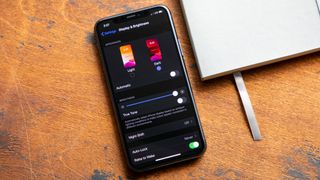
I confess to being a Dark Mode skeptic, chalking up the clamor for this feature to people with a heightened appreciation for aesthetics. But then I learned that Dark Mode actually fits in nicely with how I use my iPhone.
Because I like to work at the same time as my colleagues on the opposite side of the country, my alarm goes off at Stupid O'Clock each morning in California. With the lights out, I spend a few moments in bed, going through email, checking headlines and getting a sense of what the day ahead holds for me.
In our pre-Dark Mode era, the light streaming from my phone's display would sometimes disturb my wife, forcing me to either build a pillow fort so I could look at my iPhone or risk a drowsily muttered curse.
I was a Dark Mode skeptic, but it fits in nicely with how I use my iPhone.
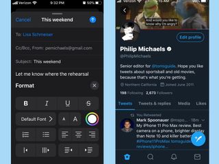
With Dark Mode enabled, I can get caught up on the day ahead without bothering my wife, at least when I'm using apps that support the feature. That's the built-in iOS 13 apps, naturally, and a few third-party options like Twitter that have already added Dark Mode features of their own. Other apps will have to add support for iOS 13's Dark Mode, something that's likely to happen in rapid order now that iOS 13 is widely available.
Apple's made it dead simple to manage Dark Mode. Just go into Settings and head for the Display & Brightness section. I've set Dark Mode to turn on automatically at sunset, switching back to iOS's light view once the sun is up. You can customize your own Dark Mode schedule or just turn on the feature forever.
Dark Mode also works in conjunction with Night Shift, the iOS setting that can adjust the color of your screen to more warmer colors in the evening, easing the eye strain caused by blue light. Dark Mode complements the ambient lighting True Tone feature on newer iPhones, too.
iOS 13 Sign In with Apple: A welcome new privacy feature
Opening up a new app on your iPhone these days occasionally puts you in the position of having to either create yet another mobile account to monitor or log in with your credentials from Facebook, Google or elsewhere. The latter method is convenience, but you're still left considering whether the privacy trade-off is worth it.
iOS 13 introduces a new way to sign into an app or a website on your phone that balances convenience and privacy. Sign In with Apple lets you use your Apple ID account to log in, verifying your sign in either with Face ID on newer iPhones or Touch ID if you'd prefer to use a fingerprint reader. All you're providing upon sign in is your name and email address, and even that latter piece of information can be disguised.
Using Sign in with Apple in iOS 13 is ridiculously easy.
Sign In with Apple gives you the option of hiding your email address by using Apple's email relay service instead. In this scenario, Apple creates a unique, random email address and forwards any communications sent out by the app or website to your actual email.
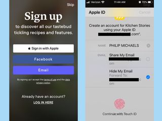
This is another one of those features where app makers will have to build in support to their current offerings. A handful, including Kayak, Fretello and Kitchen Stories supported the feature when iOS 13 launched Sept. 19, and signing into those services with iOS 13's new feature is ridiculously easy. Tap the Sign In with Apple option, and a pop-up menu asks you to confirm, along with the option of sharing your email address or having Apple whip one up for you. You can turn off mail forwarding by heading to Settings, tapping your name, and selecting Password and Security where you manage apps that are using your Apple ID.
It's early days yet, but I expect this will be one of the most popular additions to iOS 13 if it's embraced by lots of app makers. Who wouldn't want more control over what personal details they're sharing with other people?
iOS 13 Photos: The best app overhaul
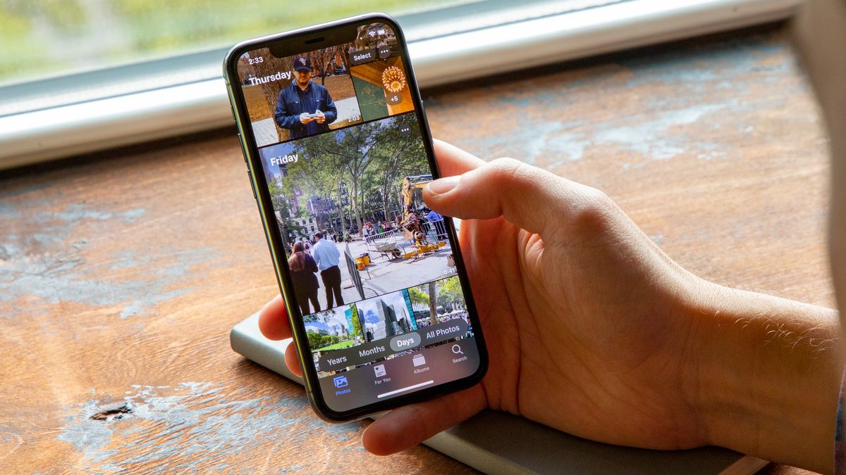
I haven't spent a lot of time in the Photos app of past versions of iOS because I've found the interface has gotten a little cluttered, making it hard to find the photo I'm looking for on occasion. Apple's previous efforts to make Photos more engaging — improved search tools here, new ways of surfacing old photos there — just haven't landed with me. iOS 13's take on Photos, though, is much more welcoming. And it's all thanks to the addition of a strip of options above the redesigned Photos tab.
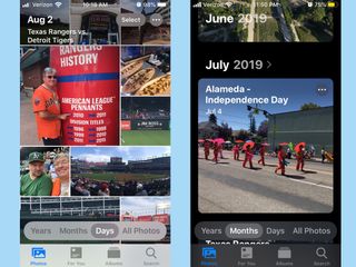
Apple now gives you the option of organizing Photos into Days, Months or Years. (There's also an All Photos view, but it's the sprawling look at every image you've got stored on your phone that I've found so off-putting in the past.) Days is my favorite look, as it weeds out duplicate pictures of the same subject and other clutter like screenshots to just highlight best shots you've taken in a given day, organized in an appealing collage.
If you've shot videos or Live Photos, those will play as you scroll by (thankfully, with the sound off). You can even have Photos play a dynamically assembled movie of a particular day's shots.
The Months and Years views have their charms, too. Months groups your photos together into collections of single events — a bunch of photos I took of my town's Independence Day parade are in one collection while a family vacation to Paris are in another.
Years surfaces photos that you took around this same time in previous years — a baseball game I went to four years ago in Chicago currently highlights the 2015 collection — and if you linger on the Years view, photo highlights from a given year will cycle through. It's a very thoughtful way of finding photos you may have forgotten you've even taken.
Photographic improvements don't end with curating photos. You've also got new editing tools at your disposal in iOS 13, including the ability to adjust a picture's vibrance and white balance and you can control the intensity of adjustments, too. If you want to see how your editing decisions are affecting a particular area of your shoot, you can pinch to zoom in. And most of the editing changes you can make to photos are applicable to videos as well.
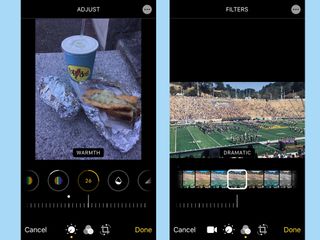
I love the compactness of my iPhone SE, but that 4-inch screen does not lend itself to a lot of photo editing. Still, I was able to use iOS 13's editing tools to touch up a shot of a hot dog that had too much of a bluish cast for my taste. And after trimming an overly long video of a marching band, I also fine-tuned its exposure and experimented with some filters. Fortunately, iOS 13 features nondestructive video edits so I could go back to the original when my edits got a little excessive.
iOS 13 Maps: A nice update
iOS 13's changes to Maps have been in the making for a while. Apple has spent more than a year rebuilding its map, with more accurate details — not just the big things like roads and highways, but also paths, trails and airports too. The company says it drove more than 4 million miles in its effort to make the Maps app a better way to get around.
Look Around is similar in Street View in Google Maps, but I find Apple's approach more immersive and easier to scroll around.
Did that effort pay off? For me, it did, because I happen to live in California, which is one of the states where Apple's new master map is available. The company says the improved map will roll out across the whole country by the end of the year, but there's a chance that it won't be available in your area now that iOS 13 has arrived.
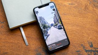
Another Maps feature that Apple is implementing in stages is Look Around, which gives you a high-resolution ground-level look at the area you're looking up in Maps. It's similar to the Street View in Google Maps, though I find Apple's approach more immersive and easier to scroll around. I've already used Look Around to confirm that I was in the right spot of a meeting even when the directions weren't so clear, but again, I live in the Bay Area, where Look Around is already available. Expect Apple to build this feature out over time, too.
Apple has made two other additions to Maps that are available to everyone. Favorites lets you store frequently searched locations, saving you the trouble of having to type in the same search term over and over again. I find it particularly helpful for looking up the closing times for businesses I frequent but whose operating hours I haven't committed to memory.
Similar to Favorites, Collections also lets you store places in Maps, and I've been using that tool to research an upcoming business trip, gathering all the places I need to be into one folder. I imagine Collections will make Maps a much more vital tool when it comes to planning trips.
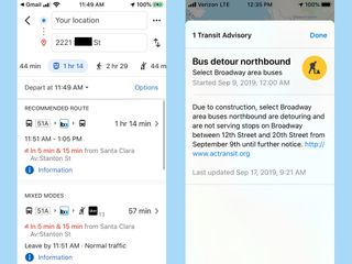
If you take a lot of public transit like I do, you'll appreciate that Maps now shows actual arrival and departure times for buses, trains and other transit options — not just the scheduled time. You can also be alerted if there's going to be slowdowns along the way.
iOS 13 Reminders: Hit-and-miss improvements
The Reminders app also got an overhaul, though I don't think it's as successful as the improvements to Photos and Maps. My preferred method of interacting with Reminders is just to create one using Siri, but Apple seems to think I should be spending more time in Reminders, adding additional details to my to-dos.

A quick toolbar now appears when you create a reminder, allowing you to add a date, location or image to your task. But I've found that adding more specifics like exact times for a reminder require you to drill down into an interface that's not always easy to scroll through. (Apple uses a scroll wheel to set the time for reminders, and scrolling to information below it causes you to sometimes inadvertently edit the time of your reminder.)
Apple lets you add attachments, photos and web links to reminders, which makes this built-in app more competitive with third-party tasks managers, but overkill if all you want to do is remind yourself to pick up eggs on the way home.
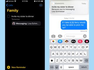
There is one addition to Reminders that I appreciate. You can now tag people in a reminder so that interacting them with Messages will trigger whatever reminder you've tagged. Texting my wife is not the most intuitive way to remind myself about upcoming appointments, but it does ensure that an important to-do won't escape my attention.
iOS 13 long press shortcuts
Be prepared for some changes in how you interact with your phone in iOS 13. iPhones running iOS 13 use standardized long presses to bring up shortcuts and additional commands similar to the Haptic Touch features introduced with last year's iPhone XR.
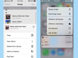
The long press can bring up some handy commands — press on a song title in the Music app, and you'll have the option of viewing other tracks from that album or adding the song to a playlist; long-pressing an email brings up more standard features like a preview of the email along with different response options.
Some third-party apps support long presses, some don't — the MLB At Bat app has schedule and scoreboard info for my favorite team. Discovering what exactly the feature can do will require some exploration on your part.
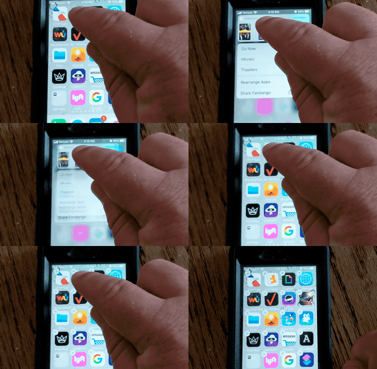
But the addition of long presses across iPhones changes one iOS behavior you may have gotten used to over the years — deleting apps. You used to take care of that by long-pressing on an app until it began to shake like a bowl full of about-to-be-deleted jelly. Now that long press simply brings up a list of shortcuts. You've got to keep pressing until the apps start shaking, and that's a delay that's going to take some getting used to.
Performance, battery life and Siri
Apple is promising under-the-hood improvements in iOS 13, such as smaller app sizes, thanks to a new way of packaging apps. Those same apps are supposed to launch faster, too, and while I haven't noticed that improvement in my testing, my iPhone SE certainly hasn't slowed down any since I installed iOS 13.
More importantly, I haven't seen a sudden drop in battery life that an OS update can sometimes introduce. Since my SE is on the older end of the spectrum of supported phones, I think that bodes well for other devices upgrading to iOS 13.
I don't know if the Siri assistant has gotten any smarter this time around, though Apple has taken pains to fine-tune the Shortcuts feature introduced last year. That app is now built into iOS 13. The new iOS 13.1 update improves Shortcuts even further by letting shortcuts run automatically depending on the conditions you set.
I like that Siri now chirps a helpful "Done" when it's carried out a shortcut, and it sounds a little more natural, too, even if it stumbles on the occasional word. (Reading a text message back to me from my daughter's teacher, Siri pronounced "notebook" as if it were two separate words, so some improvement's still needed.)
Other iOS 13 features
If I list every change that's in iOS 13, we'll be here until the iOS 14 beta rolls around. Suffice it to say, there are a number of changes that some people will find useful (the Health app can now track menstrual cycles) and others I can't imagine ever having a need for (Messages now includes a host of Memoji stickers).
If you've got an iPhone with a TrueDepth front camera, you'll find three new Animojis and new ways to customize your Memoji by adding things like makeup and piercings. Anyone who's used Find My Phone or Find My Friends will find those tasks merged into a single app, with the promise that the new iPhone 11 models will be able to one day take advantage of their U1 chips to better pinpoint the locations of other U1-equipped devices.
These are the additional changes in iOS 13 that caught my eye.
Voice Control: Head to Accessibility in the Settings app, and you can turn on Voice Control, which lets you control most of your iPhone's functions with the sound of your voice. I was able to use Voice Control to open apps, dictate a note and even navigate a web page using numbered labels to select areas on a web page. Voice Control didn't always hear me clearly, and it will take some effort to learn the feature's specialized commands, but this has a real potential to improve iPhone accessibility.
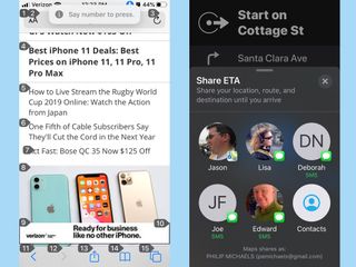
Sharing your arrival time with friends: Another great addition to Maps that also expands Message's feature set is Share My ETA, now available to everyone with the release of iOS 13.1. Get directions to a location in Maps, and you'll have the option to tap on a Share ETA button. A window feature frequently accessed contacts will pop up, and by selecting one, you can send them a message letting them know when you're set to arrive; they'll also get updates if you run into any delays.
Better Wi-Fi controls: When I've been out and about with my iPhone, occasionally, I'll get a new notification that there's an accessible public Wi-Fi network near by. The notifications are pretty fleeting and appear too inconsistently to rely upon at this point, but it's clear Apple wants to make it easier to find a Wi-Fi network without having to dig into Settings. An even better approach lives in Command Center — long press on the Wi-Fi icon, and a list of available networks now pops up.
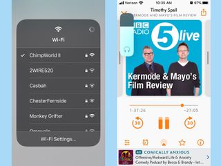
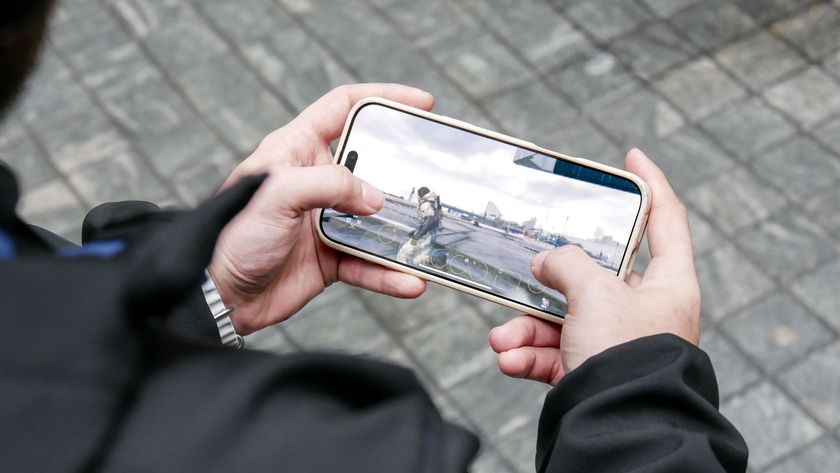
Volume Control: I like to play the occasional game, whether it's PUBG Mobile or something a bit more casual. What I'm less crazy about is when I go to adjust my iPhone's volume, and a volume overlay appears in the middle of the screen, obscuring my view of the game. iOS 13 moves the volume control to the side of the screen and turns it into a slide that you can adjust with your finger instead of having to press on volume controls.
Should you upgrade to iOS 13?
Whenever someone asks about whether to upgrade to a new version of iOS, I always hesitate a little. While the features and enhancements Apple adds with each major release are enough to justify an upgrade, sometimes, you'll want to wait, just to make sure that the bugs are all ironed out. Reports about iOS 13 suggested many, many bugs — I escaped most of them, since I used the iOS 13 beta to test the update, and beta testers were already on iOS 13.1 by the time the main iOS 13 arrived Sept. 19.
Now that iOS 13.1 is available to everyone, I think it's safe to upgrade, as the new version irons out most — though not all — of the those initial release kinks. Plus, you get new features, too. Still, extremely cautious users may want to give it a day or two to make sure that any show-stopping bugs are well and truly killed by iOS 13.1 before they take the plunge. For the most part, though, you can upgrade with confidence at this stage.
Bottom Line
The improvements to Photos and Maps would be enough to justify an update to iOS 13. But Apple seals the deal with welcome enhancements like its more private approach to app sign ins and a well-implemented dark mode. Apart from some minor quirks that you'll likely get used to as time goes by, iOS 13 gets a lot of things right in the name of improving your iPhone experience.
Philip Michaels is a Managing Editor at Tom's Guide. He's been covering personal technology since 1999 and was in the building when Steve Jobs showed off the iPhone for the first time. He's been evaluating smartphones since that first iPhone debuted in 2007, and he's been following phone carriers and smartphone plans since 2015. He has strong opinions about Apple, the Oakland Athletics, old movies and proper butchery techniques. Follow him at @PhilipMichaels.
