Windows 11 Start menu: Here’s everything that’s new
Take a tour through the new Start Menu on Windows 11
Of all the changes found in Windows 11 (which is rolling out now) the biggest and most visible might be the revamped Start Menu. With a new home on the taskbar and a redesigned layout of apps and functions, Windows 11 has reimagined, and perhaps improved, this essential piece of the Microsoft experience.
The Start Menu is like the master control panel for your PC. It's where you go to find the apps that you might not have already on your desktop or pinned to the taskbar, and it's where you'll find quick access to the settings menu and power controls.
- The best laptops right now
- Windows 11 availability: When it's coming and how to get it early
- Plus: Windows 11 will run Android apps — here’s how
The individual elements of the Start Menu may not be as advanced or detailed as you might want in a specific situation, but it's a good starting point, and provides a quick portal to the tools you need at any given moment.
In Windows 11, Microsoft is making some big changes to the Start Menu. The layout has changed and the features that are included have been streamlined for a cleaner, hopefully more intuitive, user experience.
There's still a lot we don't know about the new Start Menu. But looking at the videos and images from the Microsoft Windows 11 event, we can glean some interesting details about what's new, what's different, and what stays the same in the Start Menu.
And with all this info, you'll be able to understand if the new Start Menu is something you need immediately, or something you can wait for. Now that Windows 11 is beginning to roll out, check out our Windows 11 review to learn more about the update — and see if we recommend downloading it now (or waiting).
Wait, where is my Start Button?
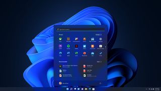
In Windows 11, the default home of the Start Button is in a different place than in past versions of Windows. Instead of having a static position in the lower left corner of the screen, the Start button and menu will have a more central location, in the middle portion of the taskbar running along the bottom of the screen.
Sign up to get the BEST of Tom's Guide direct to your inbox.
Get instant access to breaking news, the hottest reviews, great deals and helpful tips.
If you prefer the left-oriented layout, it looks like you'll be able to move the Start Button back to that position. And, as always, you can open this menu with a tap of the Windows key.
Anatomy of the Start Menu
The new Start Menu has a much cleaner look than before, and the shift from the corner to the center of the screen could offer some interesting improvements in how efficiently you can navigate the apps and files that are found there.
But with change comes some confusion, and until we can actually use a final version of the new Windows 11, our best information on the new Start Menu may be the images from the announcement itself.
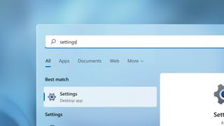
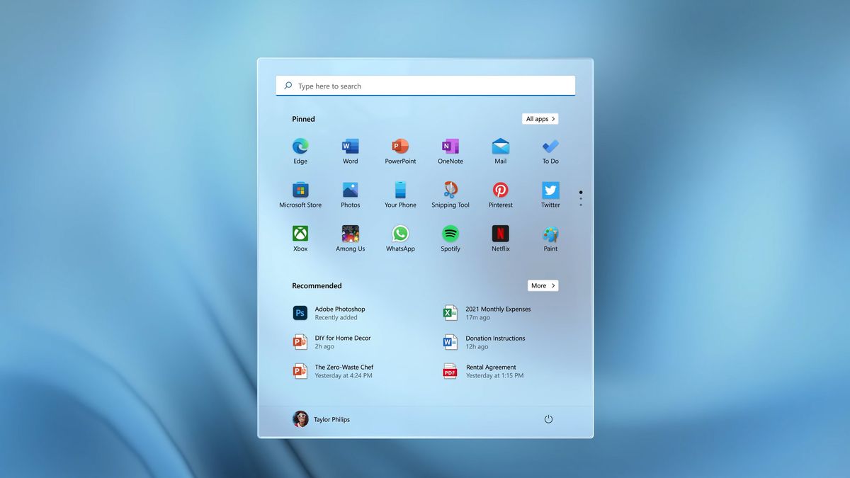
Search bar
At the very top of the Start Menu is a search bar. The function for this should be pretty self-explanatory, letting you input text to search through all of the apps and files on your machine, as well as pulling up information from the web and relevant results from the Windows Store.
Judging by the detail shown in Microsoft's preview video, it looks as if the search results start populating as soon as you start typing, with a search results interface that lets you quickly sort between Apps, Documents, Web results and other positive hits.
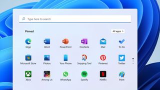
Pinned apps
The next item down is a collection of icons for all of your pinned apps. The fact that this specifies pinned apps should mean that we're looking at a list of frequently used apps curated by the user, not generated automatically by the system.
That change gives a lot of menu real estate to the specific apps you want to have there, letting you customize the start menu to be perfect for you and your needs.
Along the top of this pinned app menu, we see a button for All Apps. Past versions of the start menu had a long scrolling list of all apps and programs installed on the machine, and this could be how you access a similar menu in Windows 11.
Interestingly enough, there are three dots alongside the pinned apps icon panel. The position and design for this so far unidentified element suggests that it will let you have multiple sets of pinned apps, cycling between them with a click.
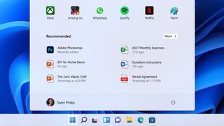
Recommended
The next big section on the Start Menu is labeled Recommended. It looks to be made up of automatically generated recommendations for the apps and files you are most likely to need.
The specifics of how these items are selected hasn't been shared with the public, so it could be based on anything from frequently used apps to files that are routinely opened at the same time of day.
User account
Along the bottom of the Start Menu is a profile picture, identifying the active user account. Clicking on this will probably give you the option of signing out, switching users or locking your system.
Power
And in the lower right-hand corner of the Start Menu is a power icon. If it's anything like Windows 10, clicking on this icon will pull up options to shut down or restart the machine, or just put it in sleep mode.
So long, Live Tiles
When Microsoft launched Windows 8 back in 2012, it added Live Tiles, which replaced static app icons with a grid-like menu of dynamic squares that could show icons, photos, or real-time information from within a given app. Live Tiles stayed on for Windows 10, with some tweaks to make them more usable.
But it looks like this real-time functionality has been removed from the Start Menu and rebranded as Widgets, with the return of icons on the Start Menu. And while Live Tiles could be visually interesting, the busy interface they created wasn't always easy to navigate. The automatic organization of tiles could be confusing, and the dynamic aspects of tiles made for a very visually cluttered menu.
Other Start Menu feature changes
According to the listed specifications for Windows 11, the Start Menu is also losing the ability to create named groups and folders of apps. Pinned apps and sites won't migrate over from Windows 10 when you upgrade, so be prepared to redo some of your customizations.
Also interesting to note, the new Start Menu is not resizable, a feature that has been offered since the advent of Windows 8. This may change going forward — I could see menu and icon sizes being important accessibility features that are added down the road — but for now it's one size fits all.
- Best Windows laptops
- More: What is TPM? And why you need it for Windows 11
Brian Westover is currently Lead Analyst, PCs and Hardware at PCMag. Until recently, however, he was Senior Editor at Tom's Guide, where he led the site's TV coverage for several years, reviewing scores of sets and writing about everything from 8K to HDR to HDMI 2.1. He also put his computing knowledge to good use by reviewing many PCs and Mac devices, and also led our router and home networking coverage. Prior to joining Tom's Guide, he wrote for TopTenReviews and PCMag.


