PS5 video shows the gorgeous user interface we want
This PS5 menu design presents the info you want in a beautiful shell.
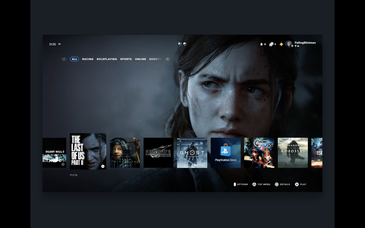
When the PS5 finally launches at the end of this year, the first thing gamers will likely see is its main menu. This is an important part of the PlayStation experience that some people may overlook, which is why we're happy to see this slick new concept videos that shows what the PS5 UI should look like.
- PS5 news and rumors
- PS4 Pro review
- More PS5 news: PS5 graphics breakthroughs revealed by top developers
Paweł Durczok has showed us what the PS5’s UI could look like, thanks to a new video shared by user paulo1manso on Reddit (via T3).
[Video] This is the best PS5 UI concept I've seen so far! (more in comments) from r/PS5
It looks similar to the existing cross-shaped menu we have on the PS4, and to the original one from the PS3. However the big images and larger tiles make better use of the space, with large chunks of the menu moving out of the way when you select a game or app. The R1 and L1 buttons let you switch between windows devoted to different genres, which we can see being useful for when you know you want to play a certain kind of game, but need to see what’s in your collection before you make up your mind.
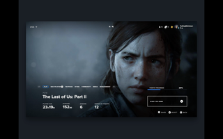
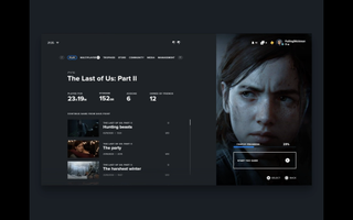
The sub-menus, which Durczok’s design demonstrates with The Last of Us 2, shows basic stats like playtime, trophy progress, how much storage space it’s taking up on your SSD, how many add-ons you have downloaded and how many of your friends also own the game.
It also shows a user loading a specific save file from the game, rather than going into an in-game menu or just resuming from the last session that was played. This could be handy if you decide you want to retry something from an earlier save, or if you’re playing two different game campaigns at once, perhaps one by yourself and the other in co-op.
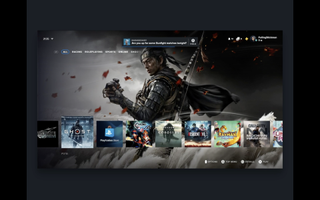
In a second video, we can see how navigating between the square tiles looks. Each one comes with a big background image rather than sticking to whatever wallpaper you’ve currently got applied. The image below also shows a notification pop-up, complete with a timer bar at the bottom showing how long you have to acknowledge it before it disappears.
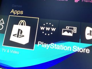
Some alleged actual leaks have appeared for the PS5’s menu. Below is the one posted on Slashleaks in January, which bears a little resemblance to Durczok’s design but mostly looks like the existing PS4 menu.
Sign up to get the BEST of Tom's Guide direct to your inbox.
Get instant access to breaking news, the hottest reviews, great deals and helpful tips.
On the whole, Durczok’s concept looks great, but this isn’t official, as much as we hope it was. Sony’s actual menu is likely to be more visually constrained than this, even if it offers the same kind of options. But we'll know for sure what the PS5 interface looks like when the console arrives this holiday season.

Richard is based in London, covering news, reviews and how-tos for phones, tablets, gaming, and whatever else people need advice on. Following on from his MA in Magazine Journalism at the University of Sheffield, he's also written for WIRED U.K., The Register and Creative Bloq. When not at work, he's likely thinking about how to brew the perfect cup of specialty coffee.
