New Apple Car renders reveal amazingly ugly EV Apple would never make
God we hope the Apple Car doesn't look like this
Update: Apple has reportedly brought Ford veteran Desi Ujkashevic on board, suggesting Apple Car development might be back on track.
We’ve heard the rumors, read the reports and speculated about the executive comings and goings, but the Apple Car is still something of a mystery. We don’t have any concrete information on what it will do or what the car will look like, several years after work supposedly began.
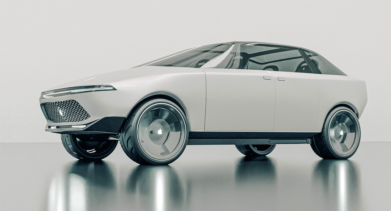
So people try to fill in the gaps, and the latest is an interactive 3D model built by Vanarama. And it looks… horrible. I really hope the actual car doesn’t look like this 80s-looking monstrosity, because if it does Apple will have zero chance of making our best electric cars list.
Vanarama claims that this model has been built using official Apple patents, to try and gauge an idea of what the interior and exterior of the Apple Car will look like. But I really hope it doesn’t look like this, seeing as how it looks like a cross between a Tesla Cybertruck and an ‘80s VW Golf.
Neither of which are particularly nice looking cars. No matter how much Tesla and Elon Musk may try to sell the Cybertruck’s weird-boxy aesthetic. Frankly it’s the absolute last thing Apple would produce in the 21st century.
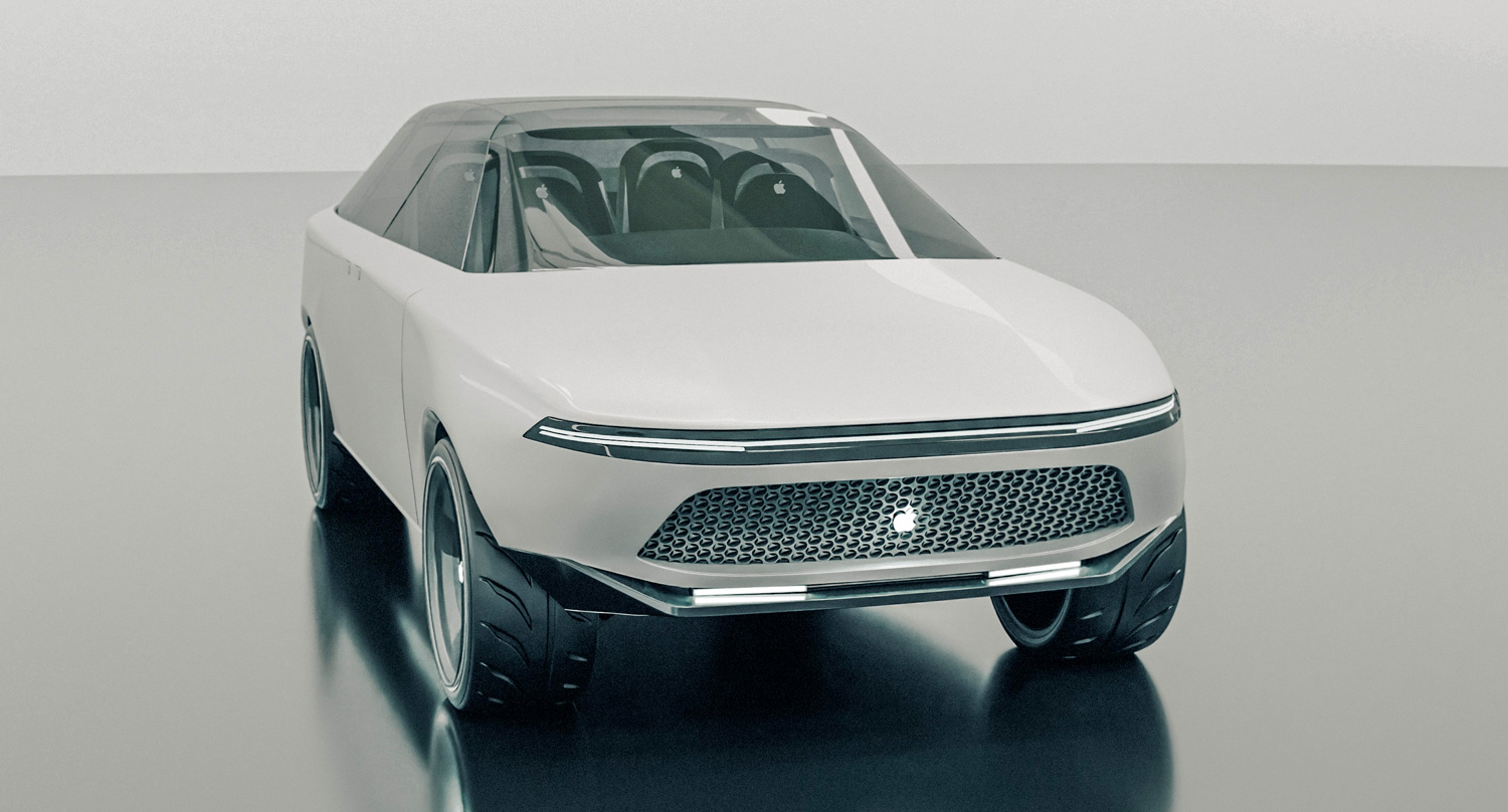
Among the bizarre design choices: this render includes door handles modeled after the iPhone’s side buttons, coach doors (also known as suicide doors for their known safety risks), and a large Mac-style mesh grill at the front.
Considering everything we’ve heard about the Apple Car suggests it’ll be electric, the grill makes the least sense of all. Electric cars don’t need the same level of air flow as the internal combustion engine, and the components that do are much lower down on the chassis.
So EV grills are lower down, smaller and generally more discreet, meaning this enormous concept grill is basically redundant. It doesn’t even have an aesthetic factor going for it, because it is one of the worst-looking things about the car.
Sign up to get the BEST of Tom's Guide direct to your inbox.
Get instant access to breaking news, the hottest reviews, great deals and helpful tips.
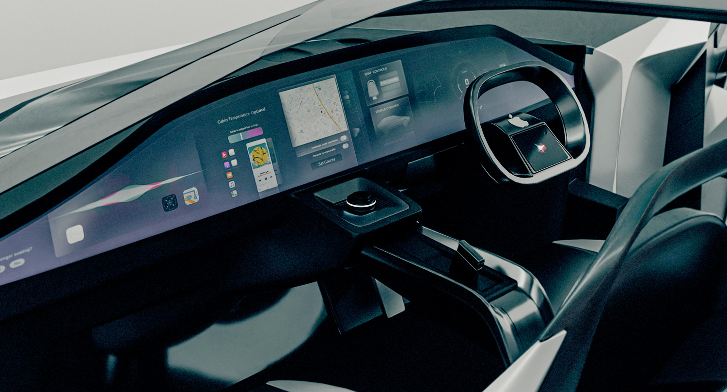
Inside, at least, things make a little more sense. There’s a large seamless display on the front dash, which isn’t that much more extreme compared to some of the more premium electric cars hitting the market. The Mercedes EQS Hyperscreen doesn’t look hugely different, and similarly extends across almost the entire dash.
The steering wheel doesn’t sit quite right with me, seeing as how it’s so empty, but it evokes a feeling like Tesla’s infamous Yoke steering — albeit with a more circular wheel shape the majority of drivers will be familiar with. We could do without the dedicated Siri screen in the wheel, though. That’s what the massive infotainment screen should be for.
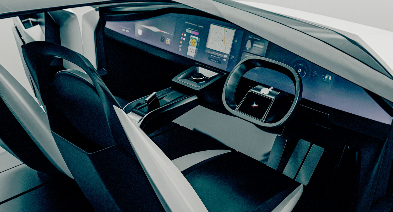
The handbrake is a novel idea, and the gear shifting dial isn’t something you see particularly often, but they are rather nice touches. Weirdly, though, these concepts appear to have three pedals — suggesting it’s a manual transmission. Barring that one concept from Jeep, electric car powertrains don’t come with a gearbox. It’s not entirely correct to say they’re automatic, but there’s no tangible difference from a driving perspective.
It’s another indicator that Vanorama forgot that the Apple Car is heavily rumored to be a battery-powered vehicle, and it has me doubting whether this concept really is based on Apple patents after all.
Concept renders also show off the ability to swivel round the front seats by 180 degrees. That would make sense if the rumors of the Apple Car being autonomous turn out to be true, since you don’t need to watch the road in a car that is capable of driving itself.
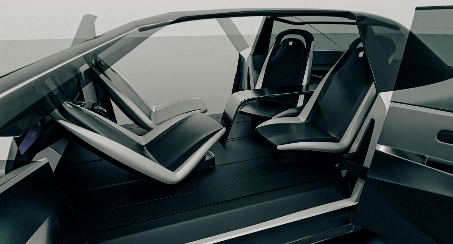
However, the interior looks very sterile, and the lack of any fabric (even carpeting) makes it feel like a bus or some other form of public transportation. Leg room appears to be an issue too, and should the front passengers turn their chairs around, they may well be knocking knees with the people in the back. Which is not ideal.
Plus, there’s an awful lot of Apple logos scattered around the car. Apple is not one for being so in your face with its branding, usually preferring to focus on using its designs to catch peoples’ eyes. The final Apple Car may feature an Apple logo or two, but not the 11 featured on this concept.
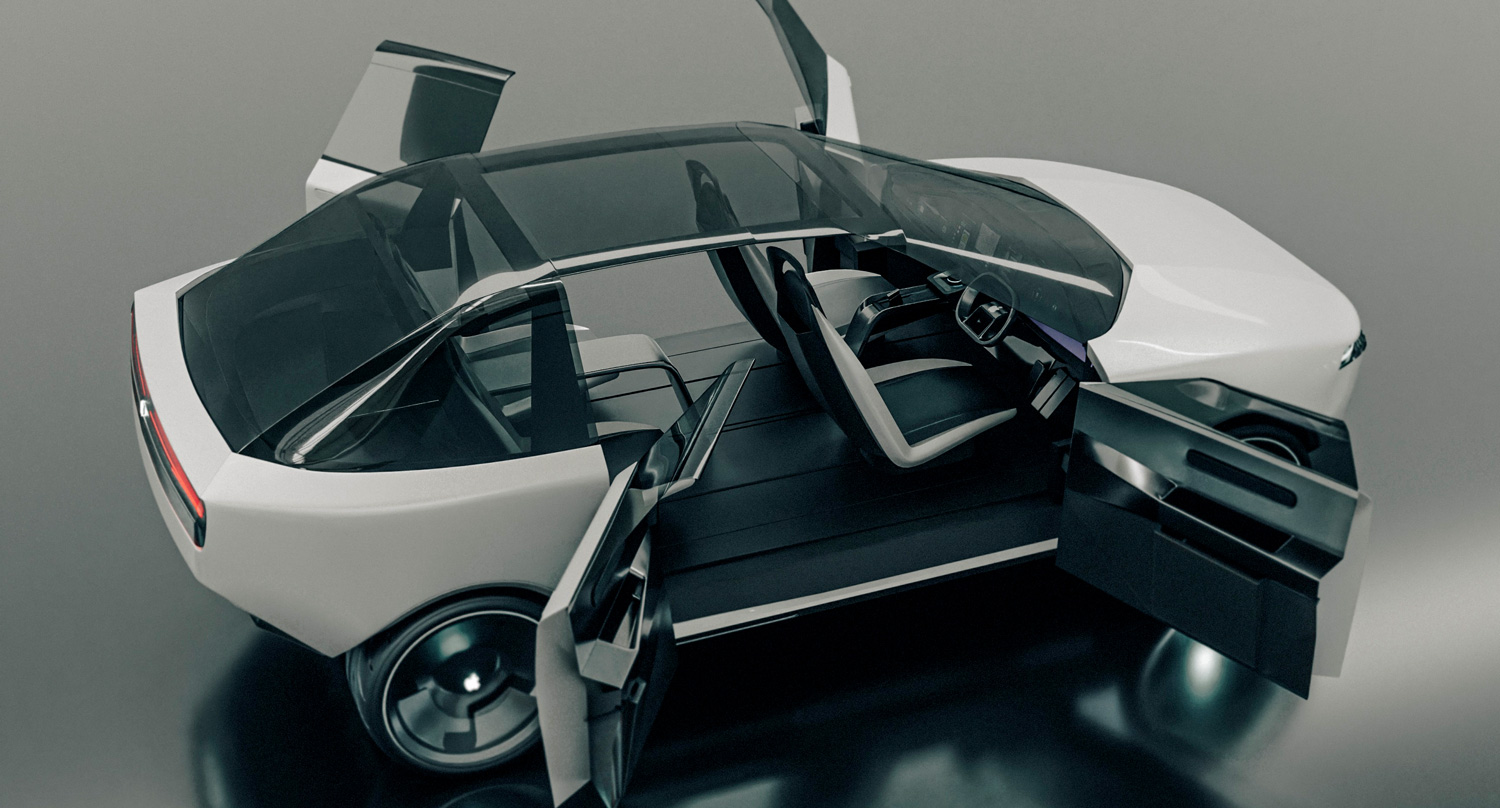
Thankfully the Apple Car isn’t going to look anything like this. Not only is this car ugly as sin, it’s completely contrary to Apple’s general design philosophy. This is a company that’s known for making sleek and stylish products, not boxy monstrosities.
More to the point, this design doesn’t even match up what we do seem to know about the Apple Car. Here's hoping the next batch of renders look somewhat attractive.

Tom is the Tom's Guide's UK Phones Editor, tackling the latest smartphone news and vocally expressing his opinions about upcoming features or changes. It's long way from his days as editor of Gizmodo UK, when pretty much everything was on the table. He’s usually found trying to squeeze another giant Lego set onto the shelf, draining very large cups of coffee, or complaining about how terrible his Smart TV is.
