iOS 15 update makes this big change in response to user complaints
Apple's been listening to iOS 15 beta feedback — and that's good news
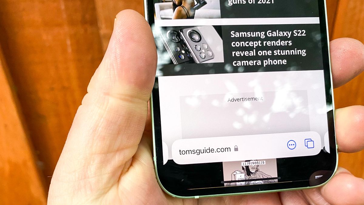
I think it's safe to say that of all the changes introduced in iOS 15, the new look in Safari has proven to be the most divisive. I should know — I've been one of the people doing the complaining.
If you haven't given the iOS 15 beta a spin, here's the issue in a nutshell. Apple is making sweeping changes to its browser, not just in iOS 15, but also in iPadOS 15 and macOS 12 Monterey. The goal has been to streamline Safari's look, and on the iPhone, that means moving the tab bar down to the bottom of the screen.
- iOS 15 beta review: What we think so far
- The best iOS 15 hidden features
- Plus: I’m bummed that iOS 15's coolest feature just got delayed
There's some method to Apple's apparent madness, as the relocated toolbar is easier to reach when you're using your iPhone with just one hand, particularly if you've got a phone with a larger screen. But as pointed by iOS 15 Safari detractors — clears throat awkwardly — that tab bar placement can take some getting used to. At times, it can also get in the way of your browsing, and it can be a challenge to access.
If you've voiced similar complaints, Apple has heard your cries and has decided to do something about it. In iOS 15 beta 6 for developers — which will be released as a public beta soon enough — you get the option to return the tab bar to the top of the screen. Even if you do keep the tab bar where Apple intends it to be, a redesign in the beta makes the bottom tab bar appear below page content.

This isn't the first time Apple's made tweaks to Safari during the iOS beta process. Earlier updates have returned the share button to the tab bar and made it easier to reload pages. Apple also streamlined the search interface, and kept the field for entering URLs and search terms closer to the keyboard.
Some may see this as a setback for Apple — a mighty tech giant tried to make a change and its users rebelled! — but this is actually how betas are supposed to work. A company introduces a new feature, users test out the feature, and then the company adapts the feature based on their feedback. In the case of Safari, that means giving users not ready for such a sweeping change to the browser's look to go back to old layout, while other people can have the tab bar at the bottom of the screen if that's what they prefer.
How to change the location of the tab bar in iOS 15 Safari
If you count yourself among the people who wish to turn back the clock on iOS 15 Safari's new look, here's how to get the tab bar moved to the top of the screen.
Sign up to get the BEST of Tom's Guide direct to your inbox.
Get instant access to breaking news, the hottest reviews, great deals and helpful tips.
1. In Safari, tap the "Aa" button in the tab bar to bring up a list of settings.

2. Tap Show Top Address Bar.
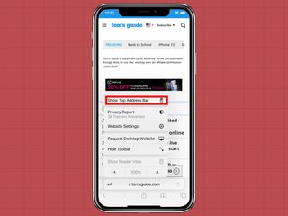
3. The tab bar will relocate to the top, and all is right with the world again. Just repeat the steps to bring the tab bar back to the bottom of the screen.
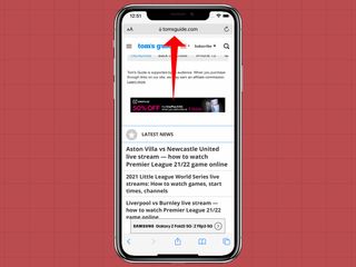
There's another way to change the location of the tab bar. You do so in the Settings app.
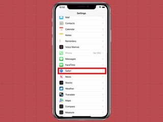
1. From Settings, scroll down and select Safari.
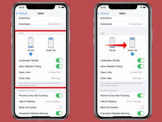
2. On the Safari settings page, scroll down to the Tabs selection and select Single Tab for a more traditional look to Safari.
iOS 15 Safari outlook
Adding the option of changing the tab bar's location addresses one of the biggest complaints people had with the iOS 15 beta, so it's a smart move by Apple to accommodate users who preferred the old look.
So will I be making the switch back to the way things once were? I'm not so sure. Since I've been using iOS 15 since the first developer beta dropped, I'm kind of getting used to the tab bar being located at the bottom of the screen. My finger no longer immediately roams to to the top of the browser at any rate. And Apple's right that the streamline tab browser is easier to operate with one hand when it's at the bottom.
Who knew? Sometimes all it does take is time to get used to a new feature. And if that doesn't work, there's now a setting for that.
Philip Michaels is a Managing Editor at Tom's Guide. He's been covering personal technology since 1999 and was in the building when Steve Jobs showed off the iPhone for the first time. He's been evaluating smartphones since that first iPhone debuted in 2007, and he's been following phone carriers and smartphone plans since 2015. He has strong opinions about Apple, the Oakland Athletics, old movies and proper butchery techniques. Follow him at @PhilipMichaels.

