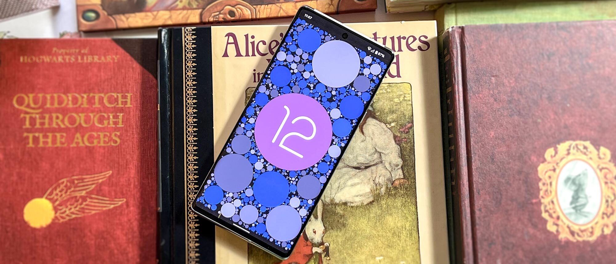
Tom's Guide Verdict
Android 12 has landed for Pixel phones, with the update for other mainstream phones to come in the next few months. The highlight is Material You, a new design language that caters itself to your tastes by theming itself based on the colors in your wallpaper. Privacy is also another major feature in Android 12, from the Private Compute Core to the Privacy Dashboard.
Pros
- +
Fresh Material You design language and theming system
- +
Strong focus on privacy
- +
New Game Dashboard
- +
Plenty of other useful tweaks and features
Cons
- -
Material You dependent on third-party developers
Why you can trust Tom's Guide
• New lock screen
• A new theming system
• Quick Settings visual overhaul
• More compact notification shade
• New Settings menu
• Conversation widgets
• Thicker volume and brightness sliders
• More responsive notifications
• New privacy dashboard
Android 12 shows that mobile software has come a long way since its inception. What once started off as an upstart to challenge Apple’s iOS in the dawn of the modern smartphone, Android has since grown into its own. Lately, Google has abandoned the public dessert codenames — to the chagrin of many, myself included — and focused on making Android a more mature operating system. That’s very much in evidence in Android 12.
But with Android 12, Google also has taken one of the operating system’s core tenets to the extreme. Since basically the beginning, Android has been all about customization and making the phone feel like yours. Contrast this to Apple’s singular vision for iOS, which has only recently added some more personalization features in iOS 14 and iOS 15.
This year, Google redesigned the whole OS from the ground up with the new Material You design language. An evolution of the Material Design we’ve seen over the last several years, this new direction takes a focus on you and molds its color palette to your wallpaper. But Android 12 isn’t all about a pretty veneer. Google has also taken a stance on privacy.
Android 12 is a return to something that really drew me to the OS in the first place. For the first time in a long while, Android is fun again. I’ve spent the better part of this year running the developer previews and betas on a Pixel 5, and now that the update has officially landed, I can finally write a full review. And with the Pixel 6 now available, Android 12 has an even better chance to shine.
Android 12 review: Personalization to a new degree
Android 12’s highlight feature is Material You, a design language that caters itself to you. The secret is that the system now pulls out complementary colors based on your wallpaper and themes itself with them. Your Quick Settings, the Settings menu, Gboard, Messages, and many more apps get tweaked.
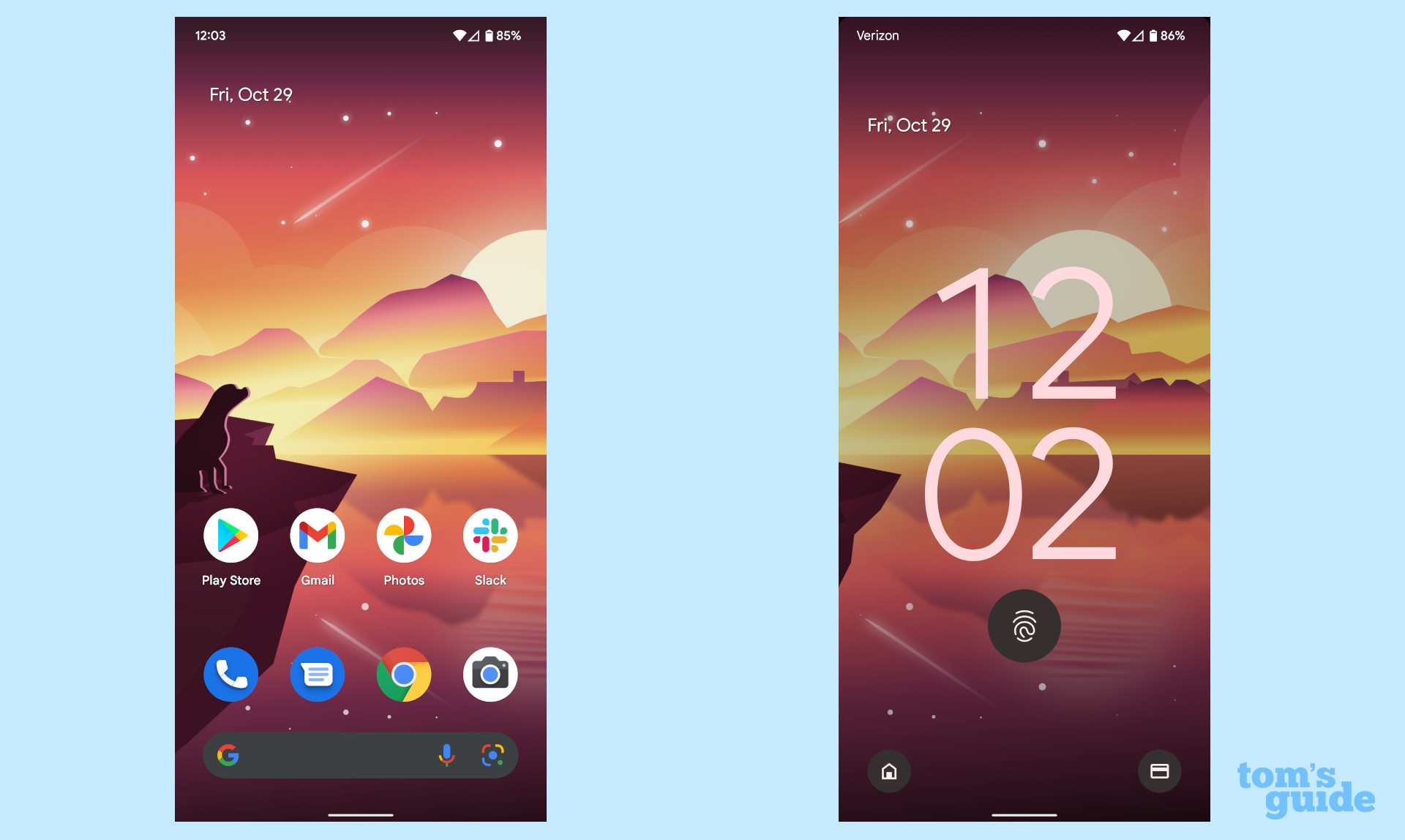
But let’s say you don’t like the color that Android picked. You can head into the Wallpaper & Personalization section in Settings and choose from a selection of other colors that the system picked out. There’s also a predetermined selection you can opt for.
Material You is the biggest facelift Android has gotten since Material Design debuted on Android 5.0 Lollipop in 2014. Seven years in the making, Material You definitively establishes an Android design scheme and, for better or for worse, it’s made itself the de facto look for the operating system. What phone makers like Samsung or OnePlus do with their Android 12 skins might differ from this new vision, but stock Android shrugs off the function-over-form mentality that we’ve seen for a very long time; we could also see that reflected in minimalist skins like Asus’ ZenUI and Motorola’s MyUX.
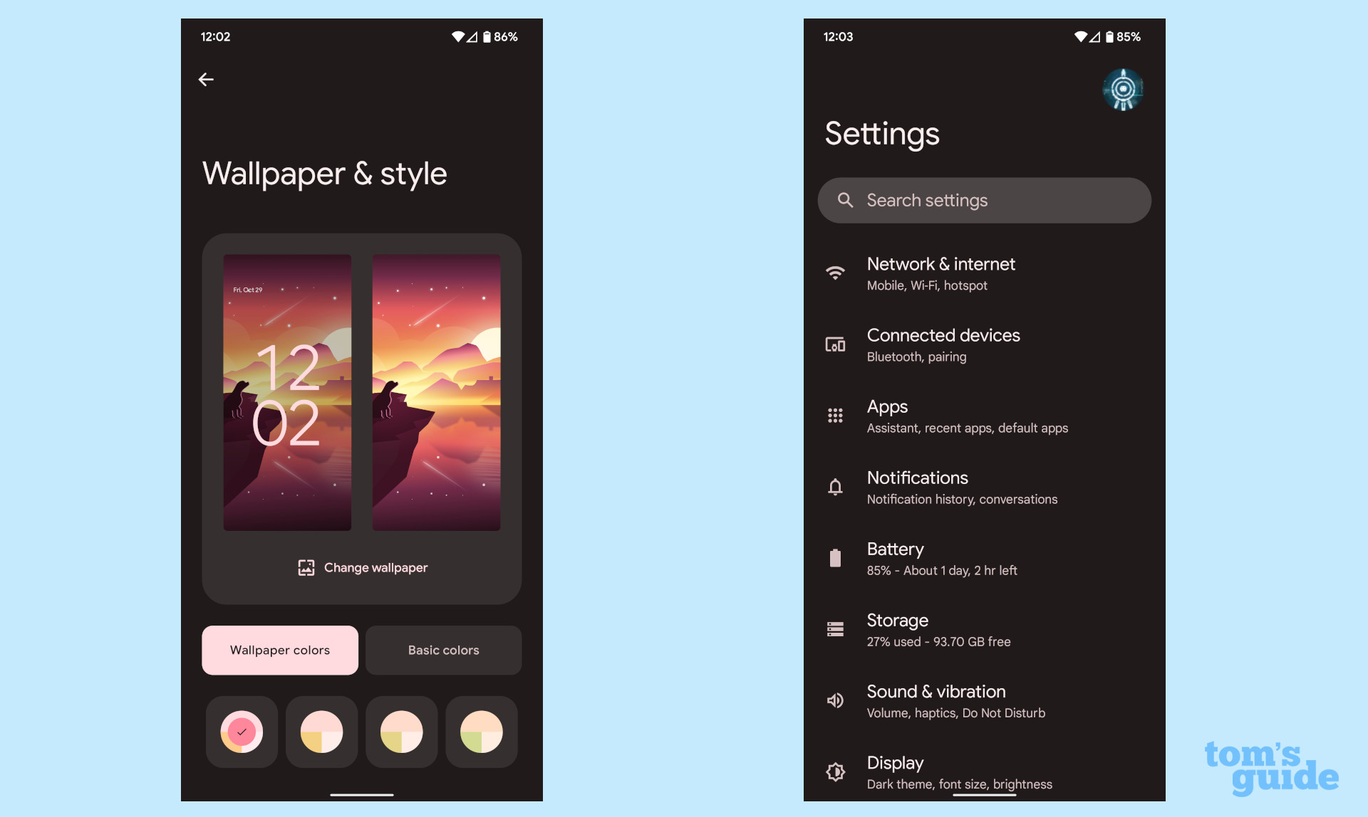
Everything is different in Android 12, even sliders, Quick Settings toggles and the volume bar. Android 12 is all about roundness, and some might not like it. We saw the early beginnings of this switch back in Android 11. But it’s amazing how fast you adapt — even when you look back to Android 10, the blocky design already looks old and outdated. All hail the rounded corners, which even extend to the notification shade (which has a slick, smooth animation that transitions into the Quick Settings).
With the Android 12 facelift came some new widgets, like new clock and weather options. All of these elements spell the core of what Material You is all about: a more personalized, accessible Android. Material You goes beyond just the theming engine, though; it is a core set of principles that define a new direction for Android and Google apps.
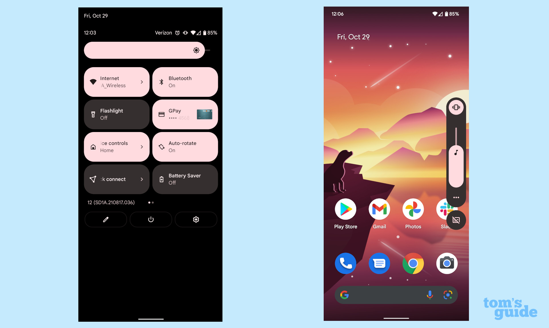
After spending months with the new design scheme, I love Material You. Once you get the theming options figured out — notably, picking one of the preset options if you love your wallpaper and hate the colors the system suggests — it’s a wonderful experience that reminded me of why I love Android. While iOS does a lot of things right, it’s hard to make an iPhone feel like yours. Widgets and the App Library have helped, but they’re a far cry from what Android now offers.
Android 12 review: Bigger focus on privacy
Privacy has become a big deal in recent years, and Android historically hasn’t had the best reputation in this regard. From apps constantly tracking you to the sheer amount of data that Google collects from each device, Android is a far cry from a private system.
At the core of Android 12 is the Private Compute Core (PCC) and Privacy Dashboard. The latter is pretty self-explanatory and I’ll come back to it in a minute. It’s the PCC that interests me — it’s essentially a separate partition that Google uses to house the data it needs to train the AI functions like Now Playing and Enhanced auto-rotate. The information stored here never leaves your device.
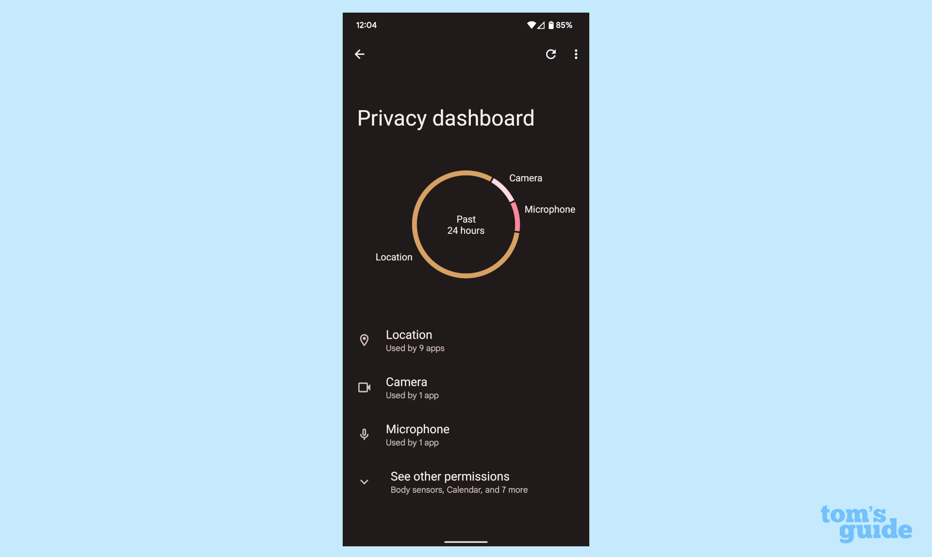
Private Compute Core is Google’s workaround for keeping your data private while also providing the best AI features for your Pixel. If anything, it’s long overdue and I’m glad to see it here in Android 12. But it also goes hand-in-hand with the Privacy Dashboard, which is a more user-focused addition to Android 12. Here, you can see which apps have called on various permissions — notably location, camera, and microphone. It’s basically a tell-all for what your apps are doing in the background.
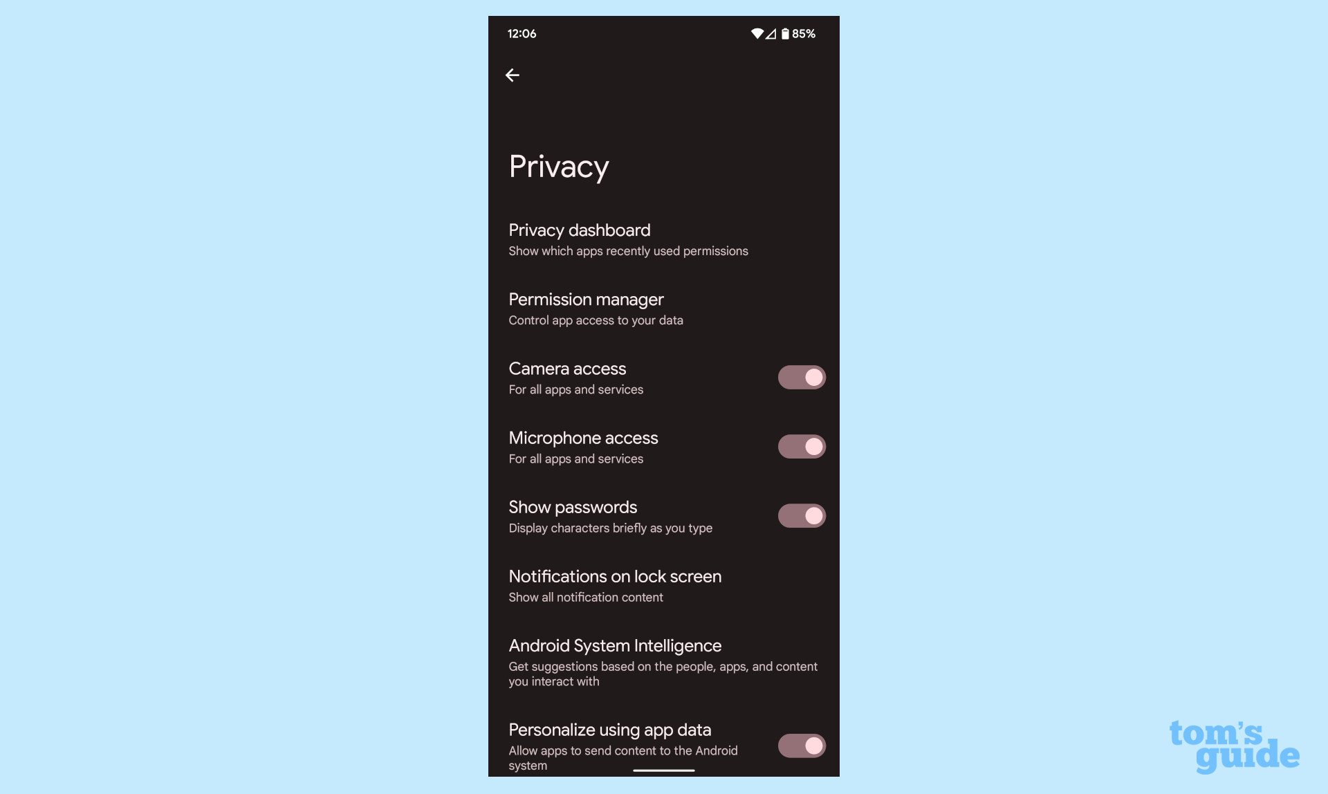
The Privacy settings now include individual toggles for the camera and microphone that turn those features off entirely for all apps. Until now, you'd have had to toggle the camera and microphone off for every app one at a time. You can also add camera and mic toggles to the Quick Settings to quickly enable or disable them. And finally, Android will now show an indicator in the top corner of your screen when an app is accessing the camera and/or microphone, a la iOS.
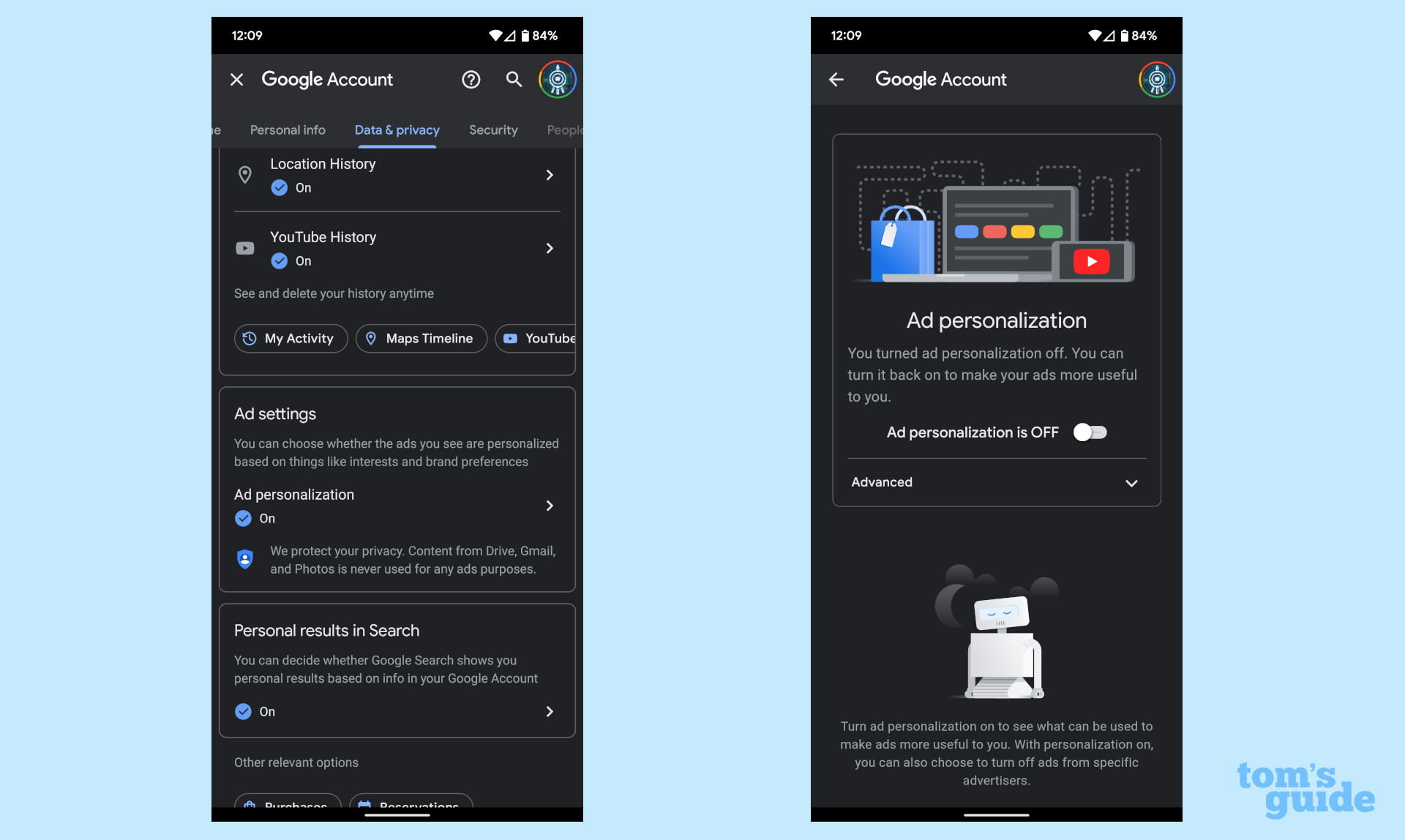
What remains lacking in Android 12 is an easy way to tell apps to not track you, similar to iOS’ App Tracking Transparency initiative. Granted, you can still do something akin to that in Android. Simply head to Settings > Google > Manage your Google Account > Manage your data & privacy > Ad personalization, which you can toggle off or edit. It’s by no means as simple or straightforward as Apple’s method, though.
All of the new Android 12 privacy and security features won’t compensate for bad habits. The adage of staying careful still holds true — don’t sideload apps you don’t trust and beware apps from the Play Store that ask for permissions you don’t want to grant. At least Android 12 lets you choose if you want an app to have precise or approximate location access now.
Our security expert Paul Wagenseil has already broken down the new privacy and security stuff for Android 12 and the Pixel 6 (where the line between the two is a bit muddy). You can read more about the Android 12 privacy and security upgrades if you’d like.
Android 12 review: Making notifications even better
One of Android’s core strengths is notifications. Simply put, the OS handles them far better than anything Apple has ever done, thanks to Android’s intelligent grouping and easily actionable items. Even better, notifications don’t just disappear from your lockscreen when you unlock the phone — this is something that drives me absolutely insane on an iPhone.
WIth Android 12, notifications have not only gotten prettier (read: rounder), but smarter as well. Apps updated for Android 12 can no longer use what’s called a notification trampoline, which is effectively a stall while the app loads. This has led to the system hanging for a brief moment while the app opens. In my experience, this has been most noticeable with Discord. But now, apps can no longer call the startActivity() intent inside a notification item. Android 12 addresses the notification trampoline delay with a cleaner, more responsive experience, sometimes with significant results.
So while the new notification shade design and animations are pretty, just know that there’s a lot going on under the hood to ensure that everything gets grouped and surfaced properly and that notifications are basically immediately responsive (assuming the developer has updated the app for Android 12).
Android 12 review: Game Dashboard, universal device search and more
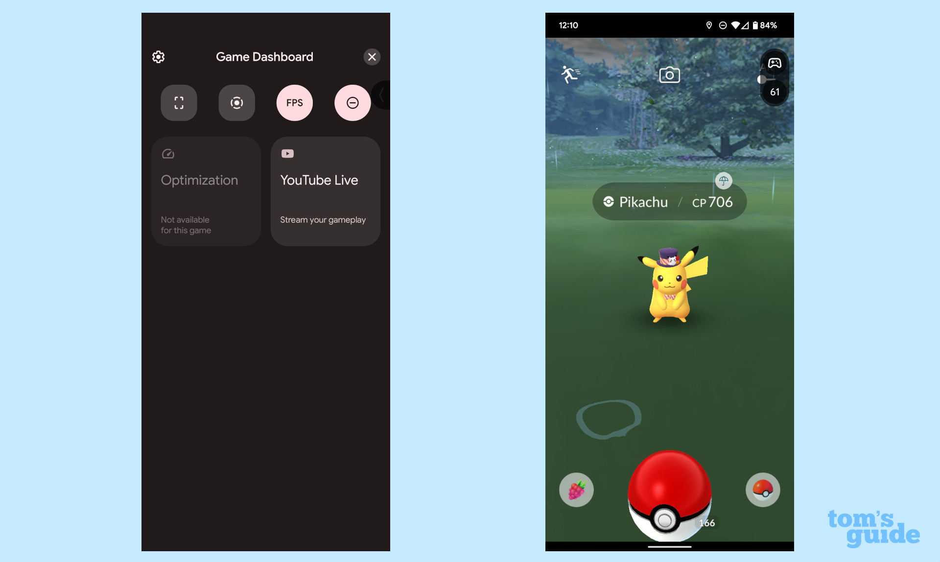
With Android 12, Google finally got the memo that people play games on their phones. Stock Android has a dedicated gaming mode. Called Game Dashboard, it features some nice options, including a framerate counter, YouTube Live streaming shortcut, optimization for some games, and shortcuts for screenshots or screen recording. Whenever you’re in a game, you’ll see a little arrow from which you can access these options. I’d like to see options for Twitch and Discord, but at least Game Dashboard has some solid features from the outset.
Android 12 also introduces universal device search similar to what Apple offers in iOS 15. This is different from the Google search bar widget. It allows you to search your phone for files, contacts, and apps. Third-party launchers have had things similar to this for a while, but now it’s baked into the Pixel Launcher. Word has it that this will open to third-party launchers with a new API.
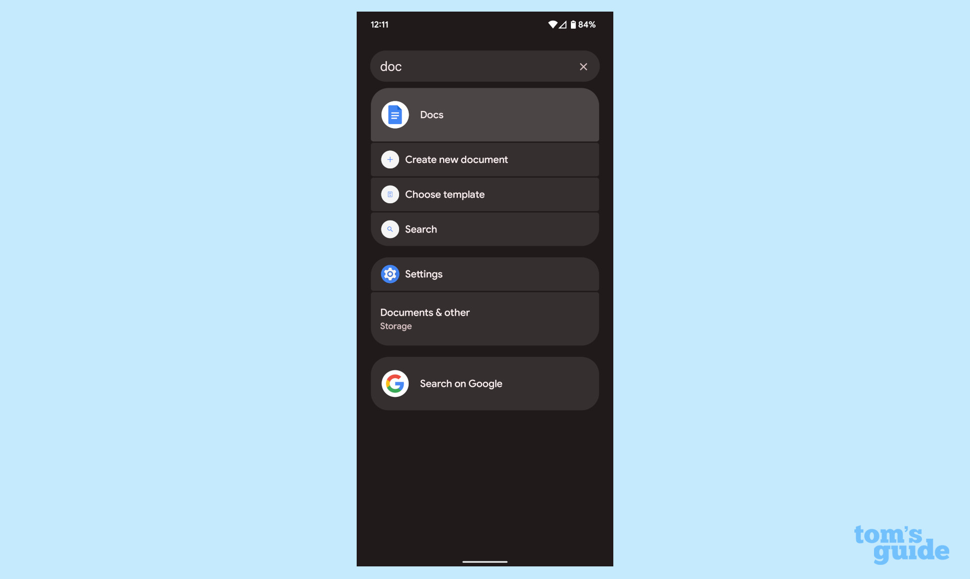
Universal device search is still a bit behind Spotlight on iOS 15, where you can also do web searches, find apps in the App Store, and even get results in Maps. I’d like to see Google copy this outright. Just give us a one-stop shop for searching the web, Maps, the Play Store, Drive (and open to other apps like Dropbox) and the phone itself. This is just the start and Google could really expand upon it in Android 13 and beyond.
We get a lot of new, smaller features in this update, too, the most important of which I’ll briefly summarize. Android 12 now has a one-handed mode built in, letting you better use your phone with — you guessed it — one hand. Picture-in-picture windows now fit the rounded aesthetic, versus the sharp corners of the past.
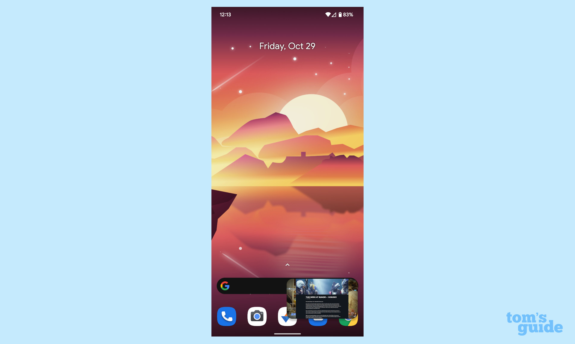
Google has finally addressed one of the most longstanding parts of Android, the Open With dialog box. While this has been beneficial for establishing default apps, it’s long annoyed me with links — Amazon is especially an issue. But in Android 12, Verified Links can tell your phone what app to open, based on the URL itself. It’s a small thing, but boy do I love it.
Native scrolling screenshots have finally landed in Android. This lets you screenshot more than just what you can see on your screen. This is great for people who want to snag a long conversation or web page. Another feature we saw in the betas, Enhanced auto-rotate uses the front-facing camera to detect when you’re laying on your side and disable auto-rotate. This is a huge boon for people who read their phones in bed.
Android 12 has a whole host of even smaller features and tweaks, so I encourage you to play around with the update on your phone to see what’s new. And if you’re not using a Pixel, expect other phone makers like Samsung and OnePlus to add their own stuff as usual.
Android 12 review: Android 12L
On March 7, Google officially released Android 12L. While it doesn't mean much for phones, it's got a lot in store for tablets and foldables. There's a new UI that uses the screen real estate effectively, and now Android has a dedicated taskbar.
It might be a sign that Google intends to take big screens seriously again, which it hasn't for a very long time.
Android 12 review: Issues
We didn't come across any notable issues while trying out Android 12. However as with all new software, bugs and side effects can happen.
Currently, the only widespread issue we've encountered with Android 12 is that it may be causing severe battery drain on Google Pixel phones. These are currently the only phones with Android 12 available by default, so we may see more phones and more problems down the line.
Android 12 review: Google System Updates
Aside from system upgrades, Google tends to update small parts of the Android experience via the Play Store and Play Services frameworks. Usually, these are fairly minor, but the March one proved to be rather substantial.
The Google System Update for March 2022 added some improvements to the play-as-you-download feature, where you can start playing games as they download in the background. Google also says it upgraded the download process to streamline it, as well as adding several developer-focused stuff for ads and such.
This update is separate from a monthly security patch or Pixel feature drop. This is available to most Android phones out there, even ones not running Android 12.
Android 12 review: Verdict
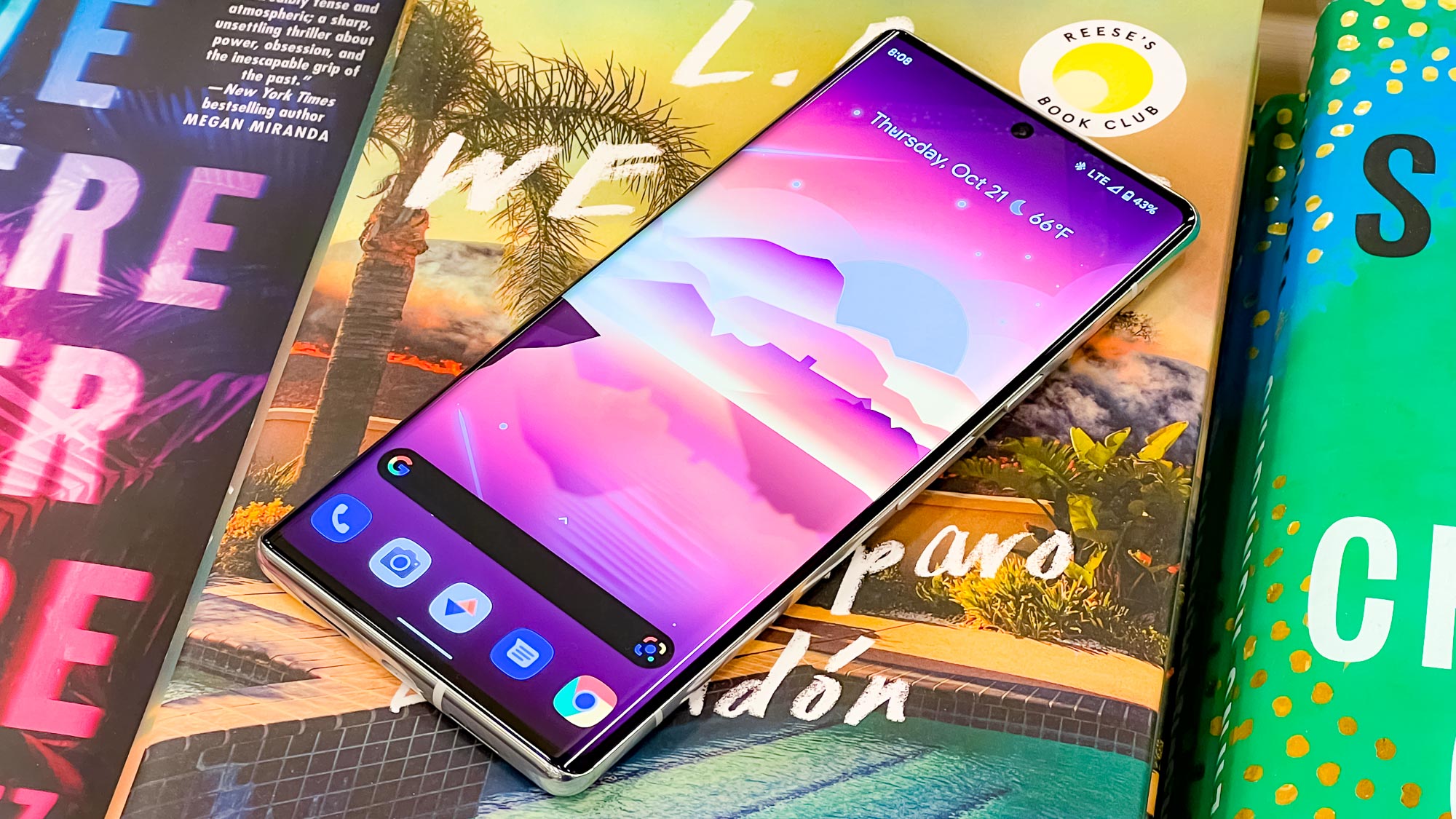
Android 12 is a big update, complete with a whole new look and focus on privacy. Google went all out to make the new version appeal to more people, especially with the Material You theming system. While the rounded aesthetic is a bit extreme in some places, I think Android is in a good spot visually.
Of course, there’s always room for improvement. I want to see universal device search expand to something akin to iOS’ Spotlight. Game Dashboard could grow to include Twitch integration and a tie-in to Discord for game status — the Discord voice overlay is still possible, but it could be better for gamers.
Over the next year, Google is set to drop more Android 12 features, especially for Pixels. We’re already looking toward Android 12L, which is introducing an optimized UI for foldable phones and tablets. That has led to speculation that Google is readying its own Pixel Fold (though rumors of that have fizzled out).
I definitely recommend updating to Android 12 when you can. It’s a worthy update and I think you’ll enjoy all of the new features.

Jordan is the Phones Editor for Tom's Guide, covering all things phone-related. He's written about phones for over six years and plans to continue for a long while to come. He loves nothing more than relaxing in his home with a book, game, or his latest personal writing project. Jordan likes finding new things to dive into, from books and games to new mechanical keyboard switches and fun keycap sets. Outside of work, you can find him poring over open-source software and his studies.
-
Dave 9 What on earth were they thinking with smaller drag down seetings menu? I had all the buttons i wanted right there, on the first page, now i lost a whole row... And now the ugly fat brightness slide, urghh...Reply
