3 biggest Android 12 features iOS 15 needs to steal
These 3 things are what iOS 15 needs to do to match Android 12
We’ve already heard a lot about Android 12, and news about iOS 15 is around the corner. For the last couple of years, the two operating systems have grown remarkably similar, though there are still key differences that set them apart. Where one is strong, the other isn’t far behind.
I’ve already talked at length about what I think iOS does better than Android and what I think Android does better. I consider myself platform-agnostic, meaning that I switch between both regularly. But after Google took the wraps off Android 12 and I got my hands on it for myself, I couldn’t look at iOS 14 the same way.
- Android 12 beta hands-on: This is huge
- Everything you need to know about Android 12
- Plus: AirPods Max refresh could be coming — but there's a catch
After using Google's new OS for my Android 12 hands-on beta review, there are three things I want iOS 15 to copy. No shame, Apple should just take what Google has done right and add its own spin on it to match with the iOS core philosophy. With these things in mind, the iPhone 13 could truly be a remarkable device with software to take on the best that Android has to offer.
Notification shade
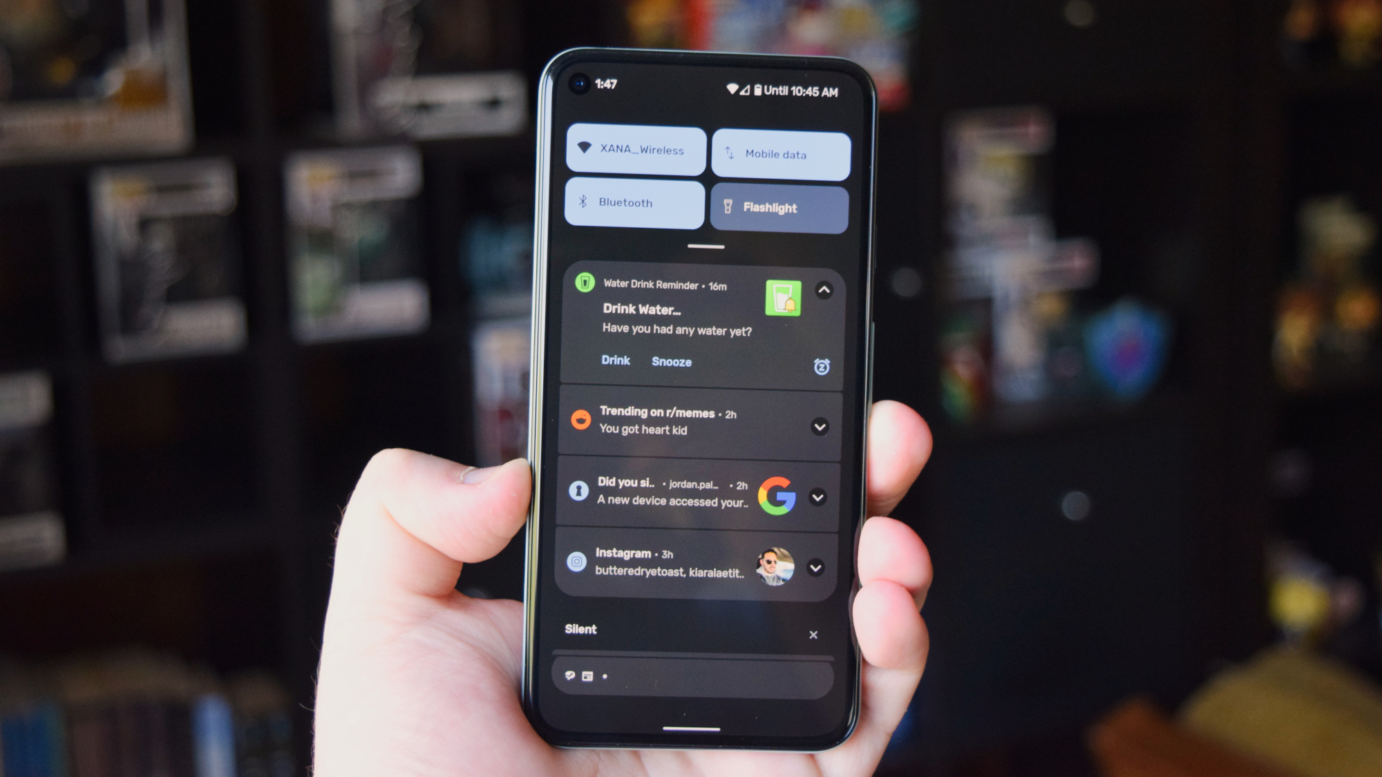
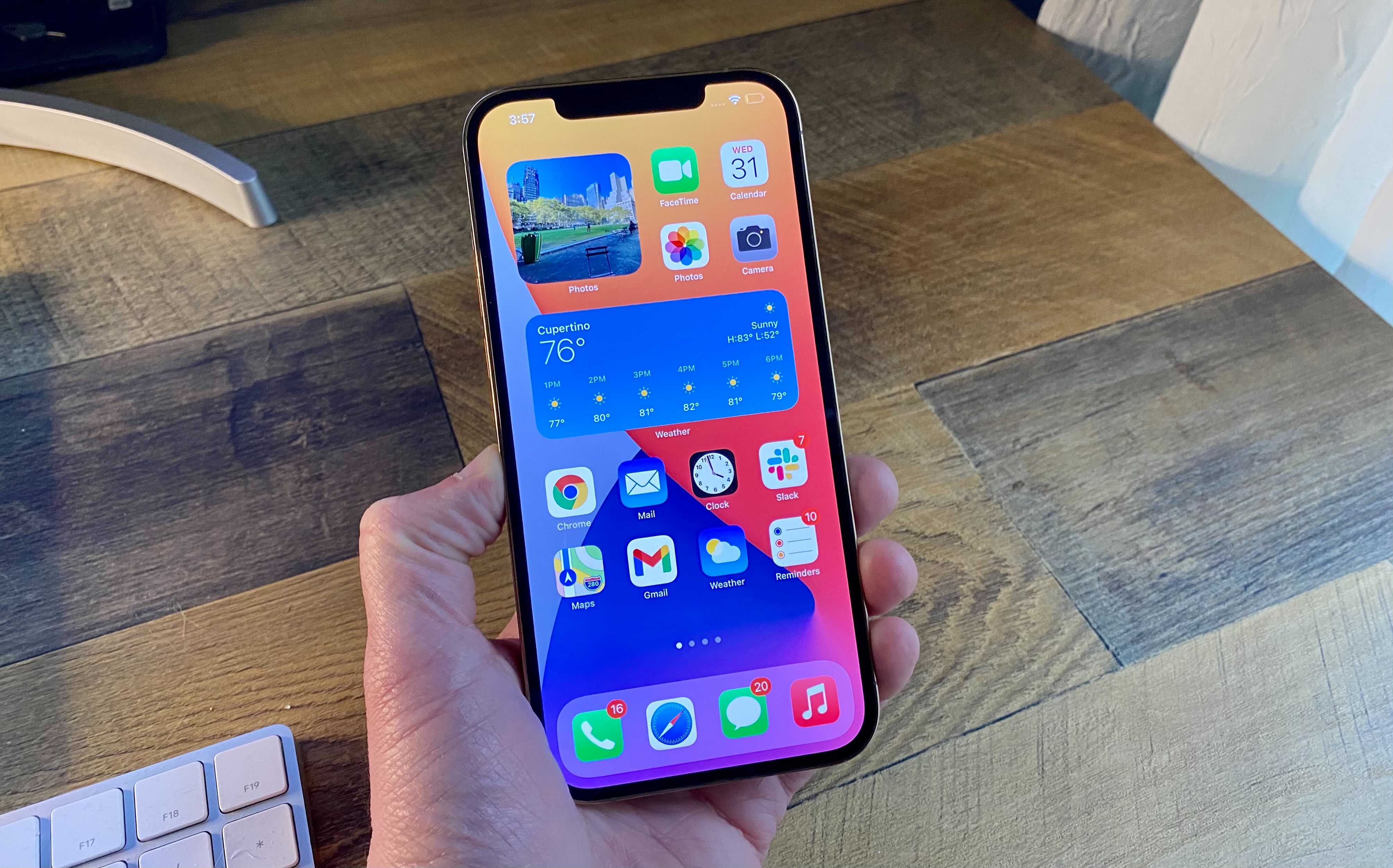
I’ve railed on how iOS implements notifications, mostly because it’s not good when compared to the notification shade on Android. Not only is it sometimes awkward to reach all the way to the left corner of the screen — for fear that you’ll activate either the Control Center or Search — but the tap gesture on the back of the phone is wildly inconsistent on the iPhone 12 Pro I use.
Managing notifications on Android is a breeze. Whether I’m clearing junk mail, replying to Signal messages, or getting info about news headlines or the weather, I do all of my notification triage in the shade itself. That’s not to mention how Google groups things into Conversations, Notifications, and Silent to help you stay apprised of what’s going on. It helps you stay organized and see what the important things are.
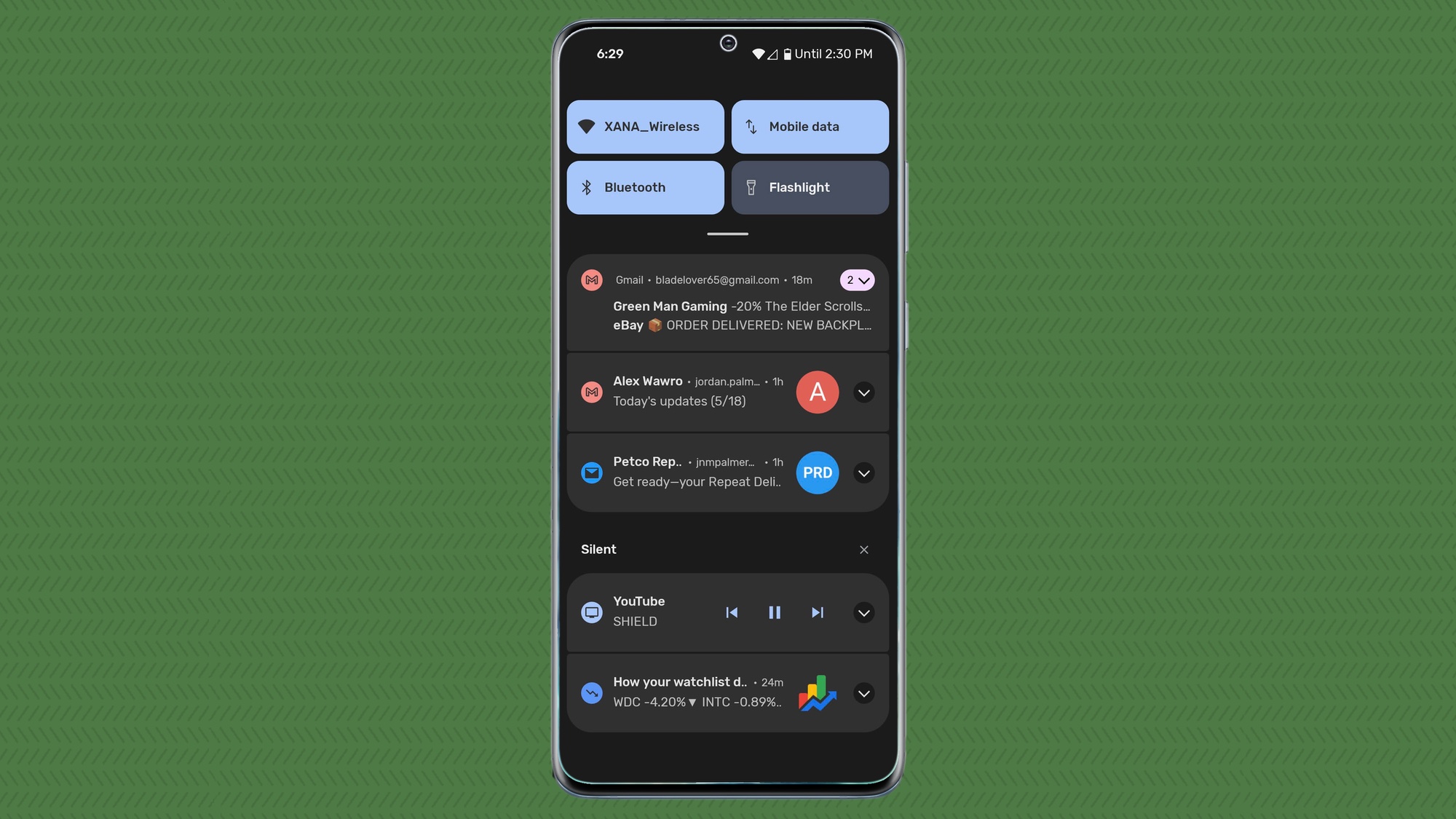
Managing notifications on iOS is clunky and Android 12 has smoothed out the process even more than before. Receiving the deluge of notifications on the Pixel 5 running the Android 12 beta is even easier to deal with than Android 11.
Google has refined the notification shade and Apple could take some serious cues from it. Pulling down what amounts to the lock screen is no longer helpful and the company needs to do better about how it sorts incoming items. And for the love of all that is holy, a Clear All button that is always present and works for all items in the Notification Center would be nice, Apple.
Sign up to get the BEST of Tom's Guide direct to your inbox.
Get instant access to breaking news, the hottest reviews, great deals and helpful tips.
Quick Settings
This one might be a point of contention, but Quick Settings is certainly superior to iOS’ Control Center. While they both accomplish the same things, accessing Quick Settings is a lot smoother than the Control Center and it has the added bonus of being tied to the notification shade. This means that you can access your Quick Settings toggles and media controls while also seeing or acting upon your notifications.
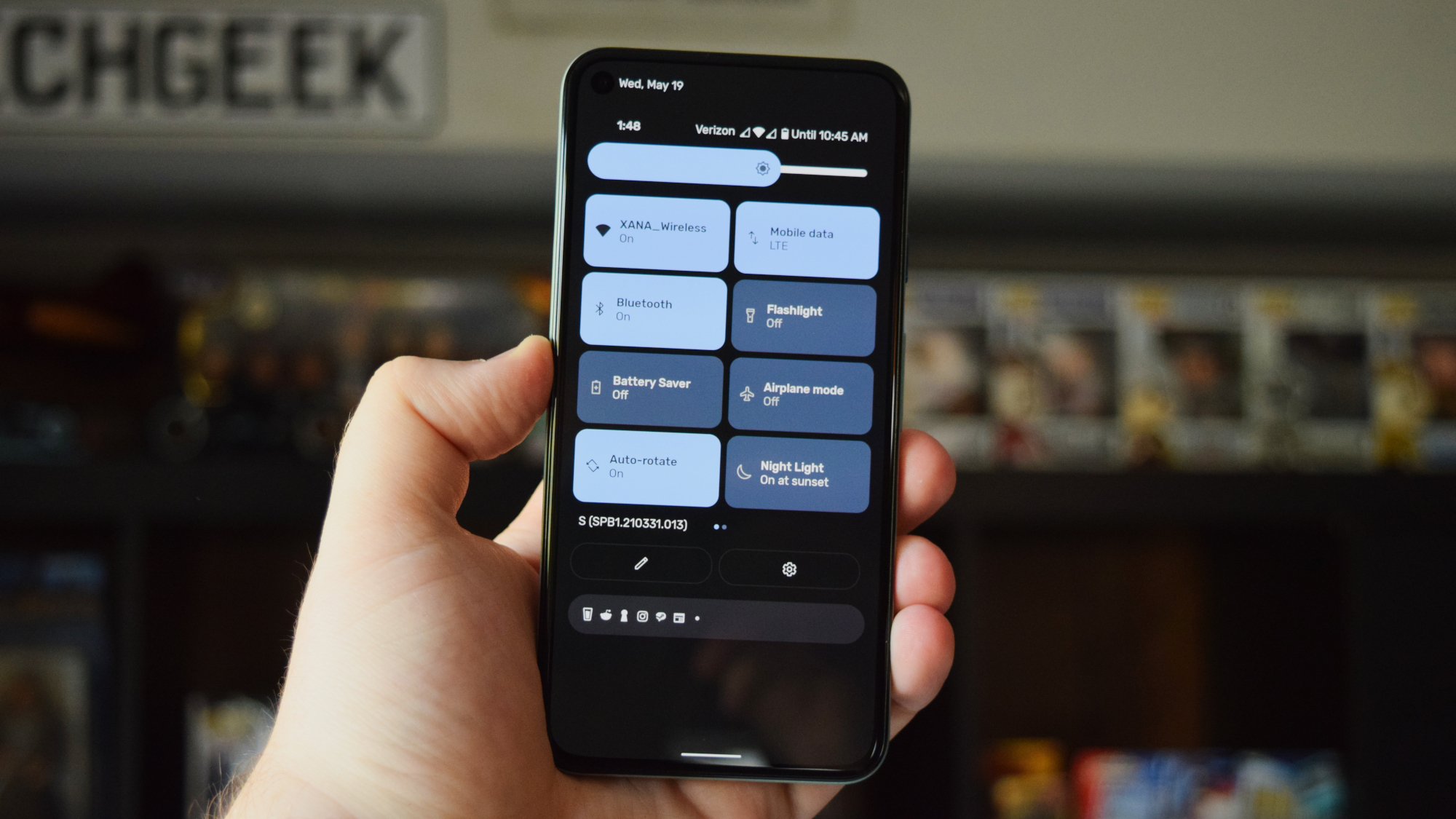
In Android 12, Google has changed the Quick Settings menu to feature larger toggles and it will eventually include buttons to manually and temporarily disable camera and microphone permissions for apps that are using one or both of those. That is something that iOS simply cannot do efficiently, forcing you to dive into the Settings menu to revoke permissions.
The amount of things you can toggle in Quick Settings far supersedes what Control Center allows you to do. In Android 12, Quick Settings is also getting access to Home controls and Google Pay, outstripping the Control Center even further.
It’s long past time for Apple to rethink and potentially redesign the Control Center.
Customizability
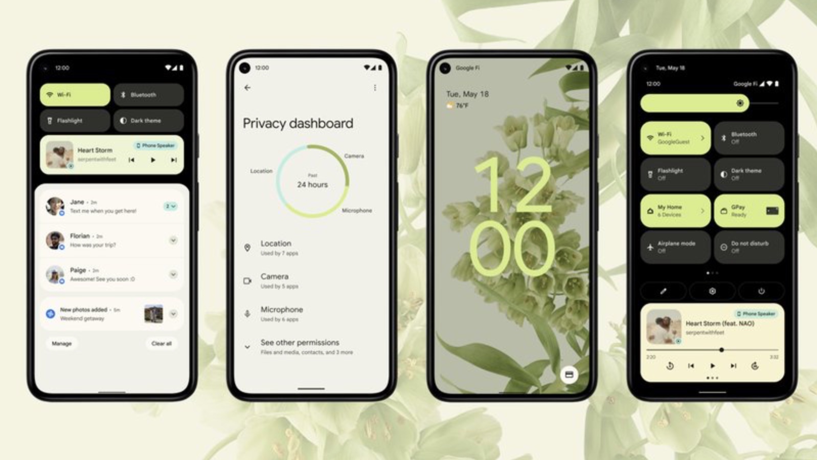
This one has been around for years uncounted, since Android has almost always let you customize things to your liking versus being locked to Apple’s vision on iOS. Both have improved in recent years, especially iOS 14, but Android 12 is taking things one step further with Material You.
Android lets you make your phone feel like something unique to you, but Material You goes beyond that. Now more than ever, the focus is on you, the user, and what you want, and Android will adapt to that.
The biggest example of this is the new color theming system. Android will pull out one of the colors from your selected wallpaper and apply it system-wide. You’ll see the color change in the widgets, Quick Settings, and other places. So if your wallpaper has some blue in it, the system will pull that out and apply it, offering something complementary to what you already have.
iOS is comparatively locked down, though you can customize some things. But Android offers so much more personalization and iOS could easily implement more design changes so that users can make their iPhones feel more like their own.
iOS 15 vs Android 12: Outlook
Android 12 is the biggest change to the OS since Lollipop back in 2014. Google isn’t holding back, taking its refinements in the last few years and turning it all up several notches. If Apple isn’t careful, iOS 15 could fall behind Android 12 in terms of features and functionality. Say what you will about either platform, but Apple could take some pages from Google’s book and we’d all be better for it.
We’ll have to see what Apple has planned for iOS 15 when WWDC 2021 kicks off June 7. It’s possible that the company is already one step ahead of us, as we've already heard some iOS 15 rumors around notification improvements and other upgrades.
Android and iOS will never be the same and that’s fine — it’s actually good. But there’s a difference between being on opposite sides of the same coin and taking advantage of things the other does well.
- iOS 15: What we know so far
- How to use SOS emergency features on iPhone, Android and smartwatch

Jordan is the Phones Editor for Tom's Guide, covering all things phone-related. He's written about phones for over six years and plans to continue for a long while to come. He loves nothing more than relaxing in his home with a book, game, or his latest personal writing project. Jordan likes finding new things to dive into, from books and games to new mechanical keyboard switches and fun keycap sets. Outside of work, you can find him poring over open-source software and his studies.
