Tom's Guide Verdict
The Nothing Phone (2) is a striking device that commands attention with its Glyph Interface. But it till comes up short in the camera department, especially compared to the less expensive Pixel 7a.
Pros
- +
Fresher-looking Nothing OS 2.0 experience
- +
More customizations with Glyph Interface
- +
Snappy performance
- +
Stylish and premium design
Cons
- -
Higher price than original Nothing Phone
- -
Subpar low-light camera performance
Why you can trust Tom's Guide
The Nothing Phone (2) wants to fight against an ugly truth about today's smartphones. With the exception of the best foldable phones, today’s smartphone designs are fairly predictable. Phones are slabs, fashioned together with glass and metal trim bezels. Gone are the days when people in public would stop me and ask what phone I was using.
But Nothing, the company started up by OnePlus founder Carl Pei and the maker of the new Nothing Phone (2), is making design an integral focus with its devices. The Nothing Phone (1) that came out last year was a budget-minded smartphone highlighted by a refreshing design language that stood out with its eye-catching Glyph Interface lighting system. And the Nothing Phone (2) looks to continue that.
Most notably, the new phone rocks the same transparent design that lets you see inside of it while its Glymph Interface has been expanded to provide even more lighting effects with notifications. There’s even a shiny new Sony IMX890 sensor behind the Nothing Phone (2)'s main camera, which should help to erase our memory of last year’s underwhelming camera performance.
U.S. consumers couldn't enjoy the Nothing Phone (1) as it never went on sale here. But the Nothing Phone (2) has arrived in this country, so my Nothing Phone (2) review looks at whether this midrange handset offers more than just a pretty face.
Nothing Phone (2) review: Specs
| Starting price | $599/£579/AU$1,049 |
| Display | 6.7-inch OLED (2412 x 1080, 394ppi) |
| Refresh rate | 120Hz |
| Chipset | Snapdragon 8 Plus Gen 1 |
| RAM | 8GB/12GB |
| Storage | 128GB/256GB/512GB |
| Rear cameras | 50MP (f/1.88) main; 50MP ultrawide (f/2.2) |
| Selfie camera | 32MP (f/2.45) |
| Battery | 4,700 mAh |
| Charging | 45W wired, 15W wireless |
| Size | 6.38 x 3 x 0.33 inches (162.1 x 76.4 x 8.6 mm) |
| Weight | 7.09 ounces (201.2 grams) |
| Colors | White, Dark Grey |
Nothing Phone (2) review: Price and availability
For all the hype around the original Nothing Phone, it didn’t do squat to help foster brand awareness here in the U.S. outside of the fanbase community. Luckily, the company’s moving in the right direction by officially making the Nothing Phone (2) available for purchase stateside for the first time, alongside the U.K. and other European markets. However, there’s still no official word about the Nothing Phone (2) being available at wireless carrier stores — instead, you'll have to buy the device straight from Nothing.
Nothing charges $599 for the base model Nothing Phone (2), which gives you 8GB of RAM and 128GB of storage. If you need extra memory and capacity, the 12GB/256GB and 12GB/512GB models are available for $699 and $799, respectively, in your choice of either white or dark grey.
Nothing Phone (2) review: Design
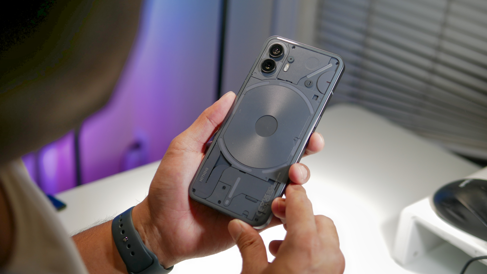
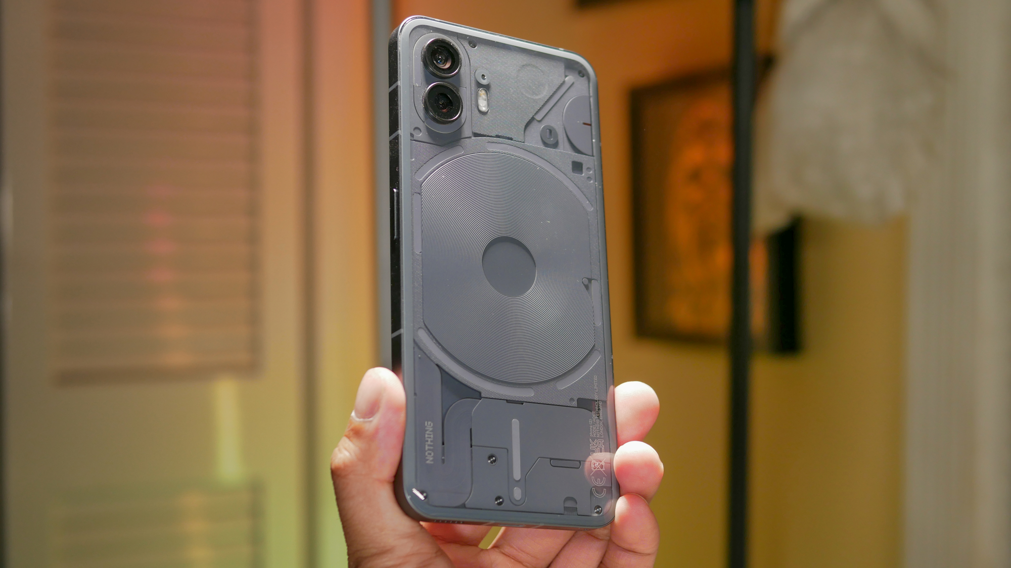
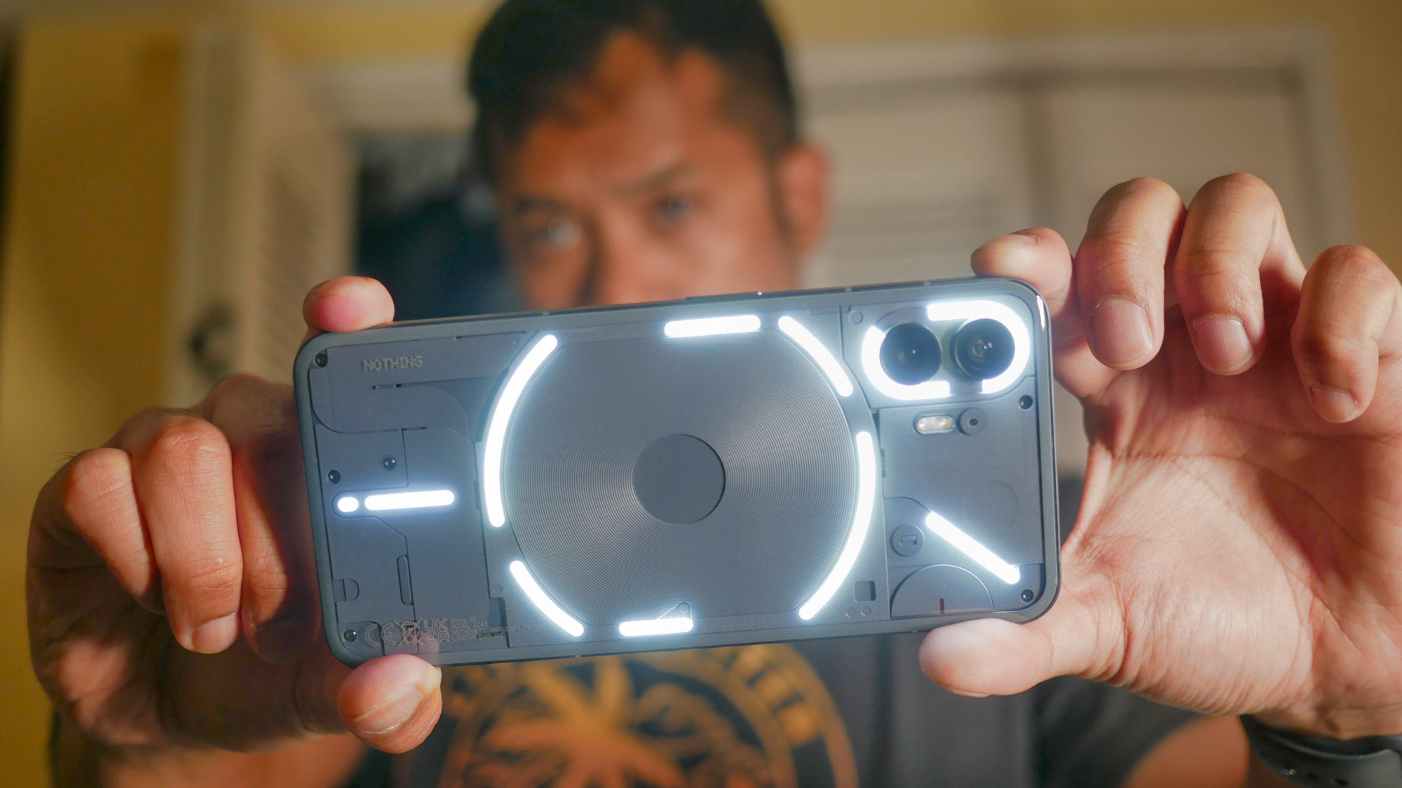
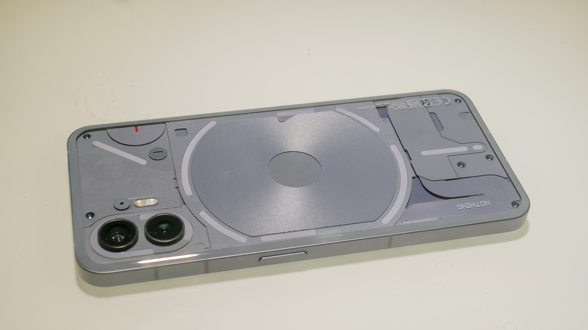
If there’s one absolute reason why you should buy the Nothing Phone (2), it has to be the phone's stylish design. Even though I didn’t get the chance to check out last year’s model, I can’t tell you enough how the new phone's transparent design is always a topic of conversation whenever I whip it out in public.
Technically, though, the Nothing Phone (2)’s bigger in every way over its predecessor — down to its overall size (6.38 x 3 x 0.33 inches) and weight (7.09 ounces). For a smartphone that’s similar in size to my iPhone 14 Pro Max, I was surprised by how much easier I found it to use one-handed. Not only is the Nothing Phone (2) surprisingly lightweight, but small details like how the edges of the glass on the back curve around the edges, lend to making for a comfortable feel in the hand.
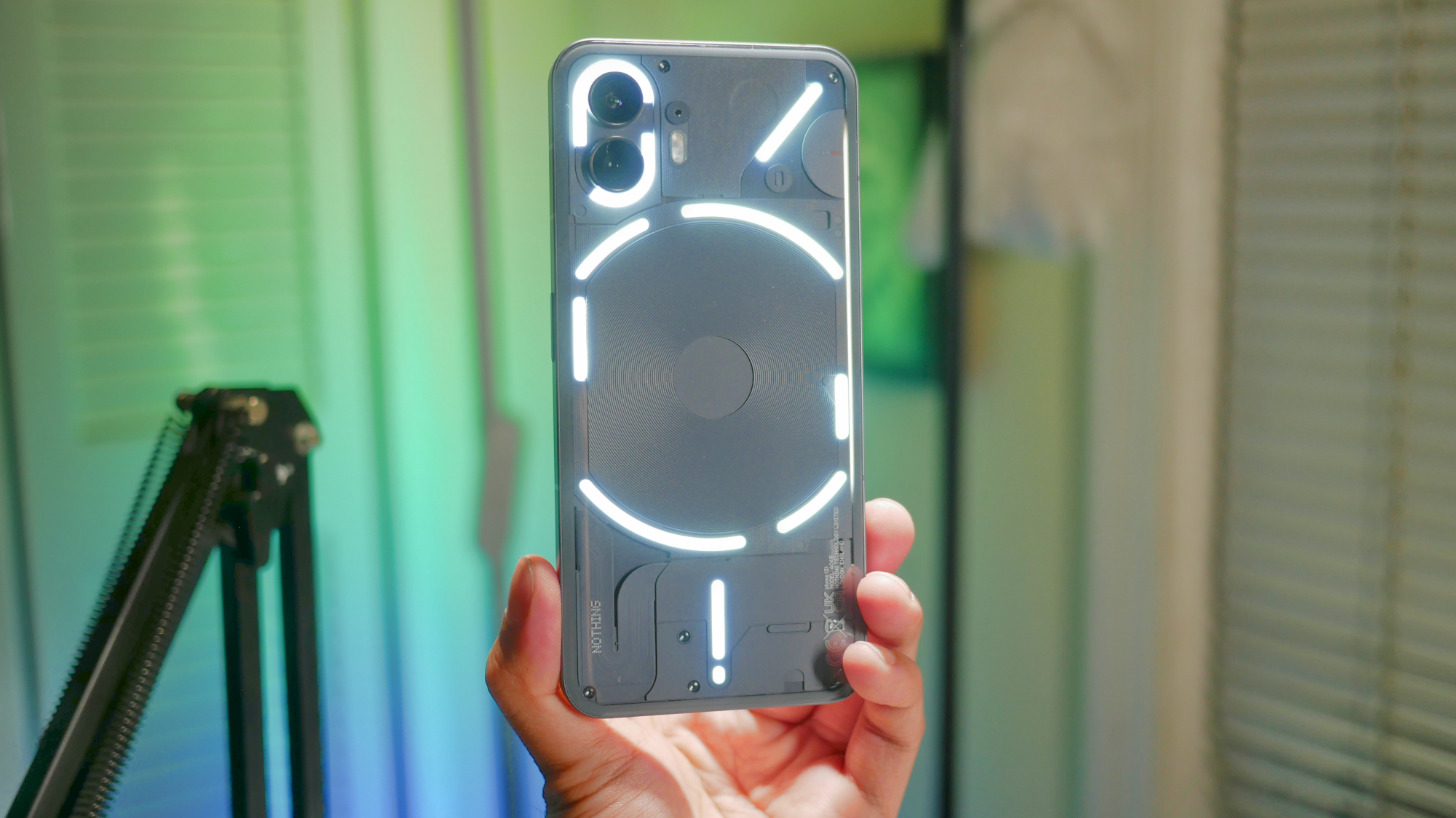
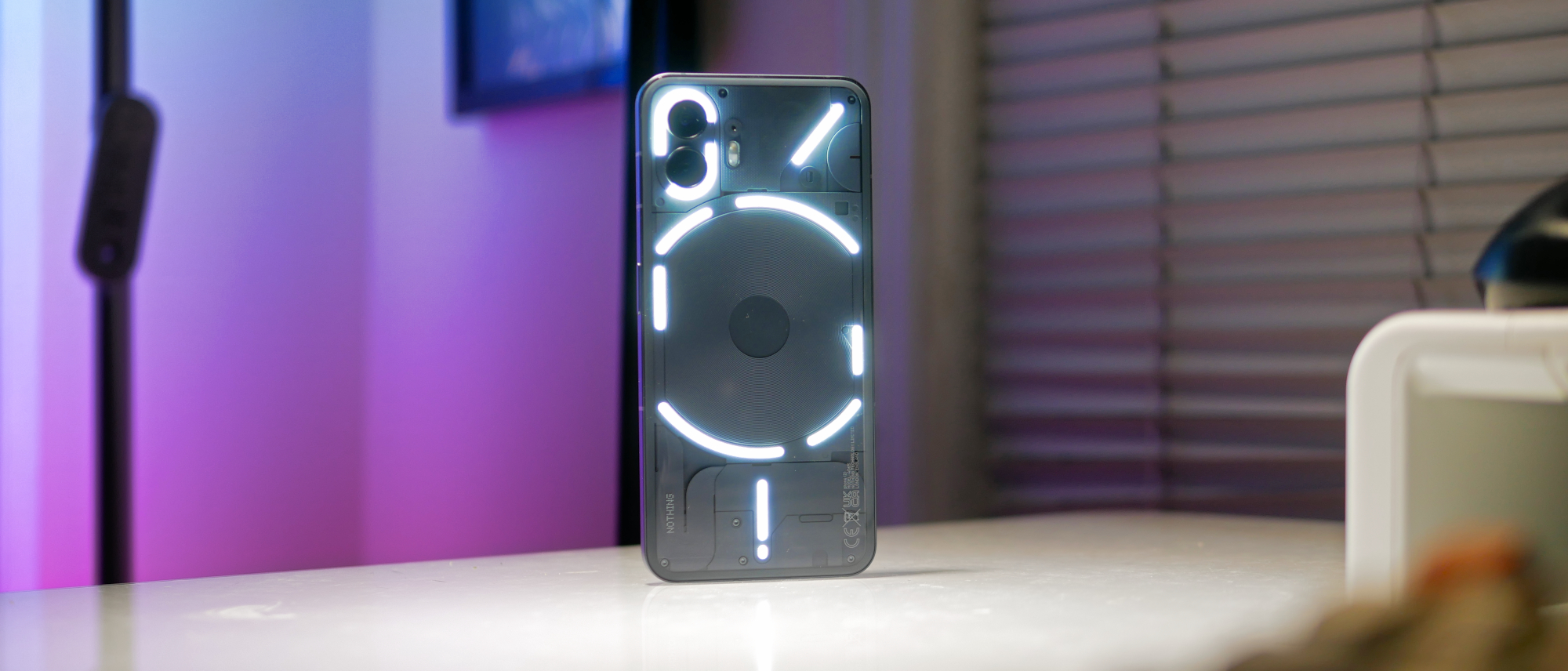
The look of the Nothing Phone (2) manages to garner even more attention thanks to the Glyph Interface on the back of the phone. This time around, the LED strips have been divided up into smaller sections to give users more options for distinguishing notifications on the phone. Just as before, the Glyph Interface lights up for phone calls, notifications, and other features.
New this time around is support for third party integration, which opens up other useful features. For example, the Nothing Phone (2) will show a progress timer with the lights to indicate the amount of time left before an Uber ride arrives to pick you up. It’s useful in the sense that these notifications are on the discreet side, rather than forcing me to constantly unlock the phone to check. Uber provides the only third party support out of the gate, but I anticipate more to follow.
While I do appreciate some of the other minor details put into the Glyph Interface, like creating custom ringtones with the Glyph Composer, I was hoping for the lights to have more of a presence outside of notifications. There are just a handful of light patterns I can remember to indicate to me what they are, which is why I wish Nothing could’ve added a splash of color to distinguish them more — or perhaps the option to display some kind of random lighting effect while using the phone. I think it would help to draw even more attention to this feature and the phone itself.
Nothing Phone (2) review: Display
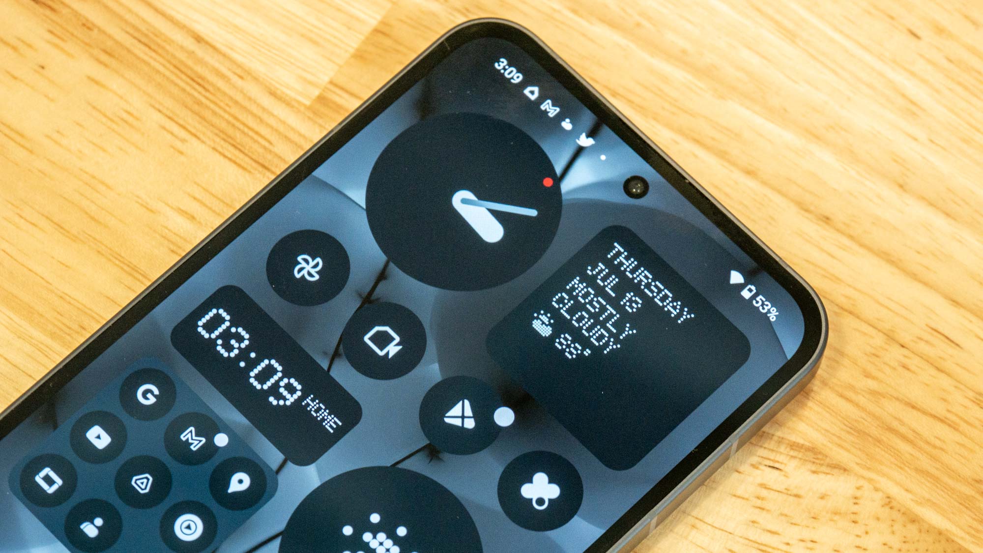
There’s a larger 6.7-inch OLED display slapped into the Nothing Phone (2), offering a resolution of 2,412 x 1,080 pixels. That’s up from the Nothing Phone (1)'s 6.55-inch panel.
Details on that 6.7-inch screen look crisp, thanks to its 394 ppi (pixels per inch) pixel density. Colors have a fair amount of punchiness to them, though thankfully, they're not as over-saturated as other phones with AMOLED displays I’ve tested like the Samsung Galaxy S5 from way back.
| Row 0 - Cell 0 | Max brightness | sRGB | DCI-P3 | Delta-E (lower is better) |
| Nothing Phone 2 | 960 nits | 145.5 (Alive) / 108.5 (Standard) | 103 (Alive) / 76.8 (Standard) | 0.05 (Alive) / 0.13 (Standard) |
| Pixel 7a | 1,024 nits | 129.8 (Adaptive) / 111.7 (Natural) | 91.9 (Adaptive) / 79.1 (Natural) | 0.05 (Adaptive) / 0.11 (Natural) |
| iPhone SE (2022) | 596 nits | 114.7 | 81.2 | 0.21 |
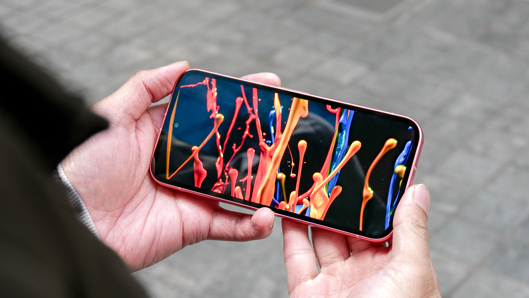
Watching videos is a treat on the Nothing Phone (2), especially with its smooth 120Hz refresh rate and wide viewing angles. Other favorable details that I like include the display’s skinny bezels and tiny punch hole cutout for the front-facing camera. However, I did find it challenging to see the screen outdoors whenever the sun was out — so I frequently had to shade it with one hand.
While it's not the brightest display I've seen, its 960 nits of peak brightness is still surprisingly good for a phone in its price range. It's better than the iPhone SE's (2022) reach of 596 nits and comes very close to the 1,024 nits achieved by the Pixel 7a.
Nothing Phone (2) review: Software
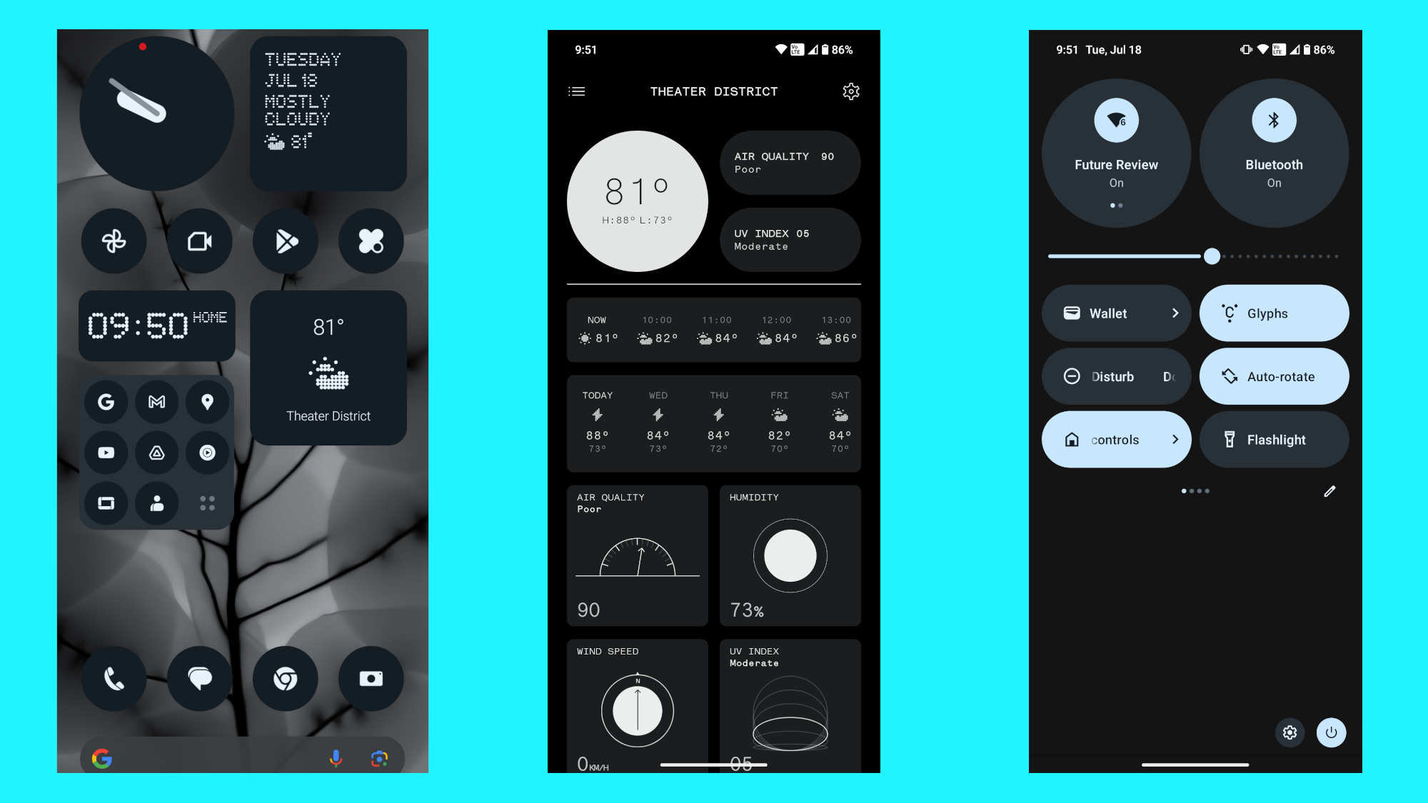
As much as the design and flashy Glyph Interface reels people in, I actually found the software to be the most underrated thing about the Nothing Phone (2). Like seriously, I have to applaud Nothing for taking the focus back to Android’s diverse customization. It’s a refreshing take that makes my all-time list of best looking Android skins.
Nothing OS 2.0 still retains the same minimalist aesthetics as before, but I love how the new Nothing widgets help to distinguish this skin. These widgets add to the phone’s visual identity with their dot matrix-like compositions — the clock and weather widgets, in particular, serve as great examples thanks to their clean fonts and monochrome icons.
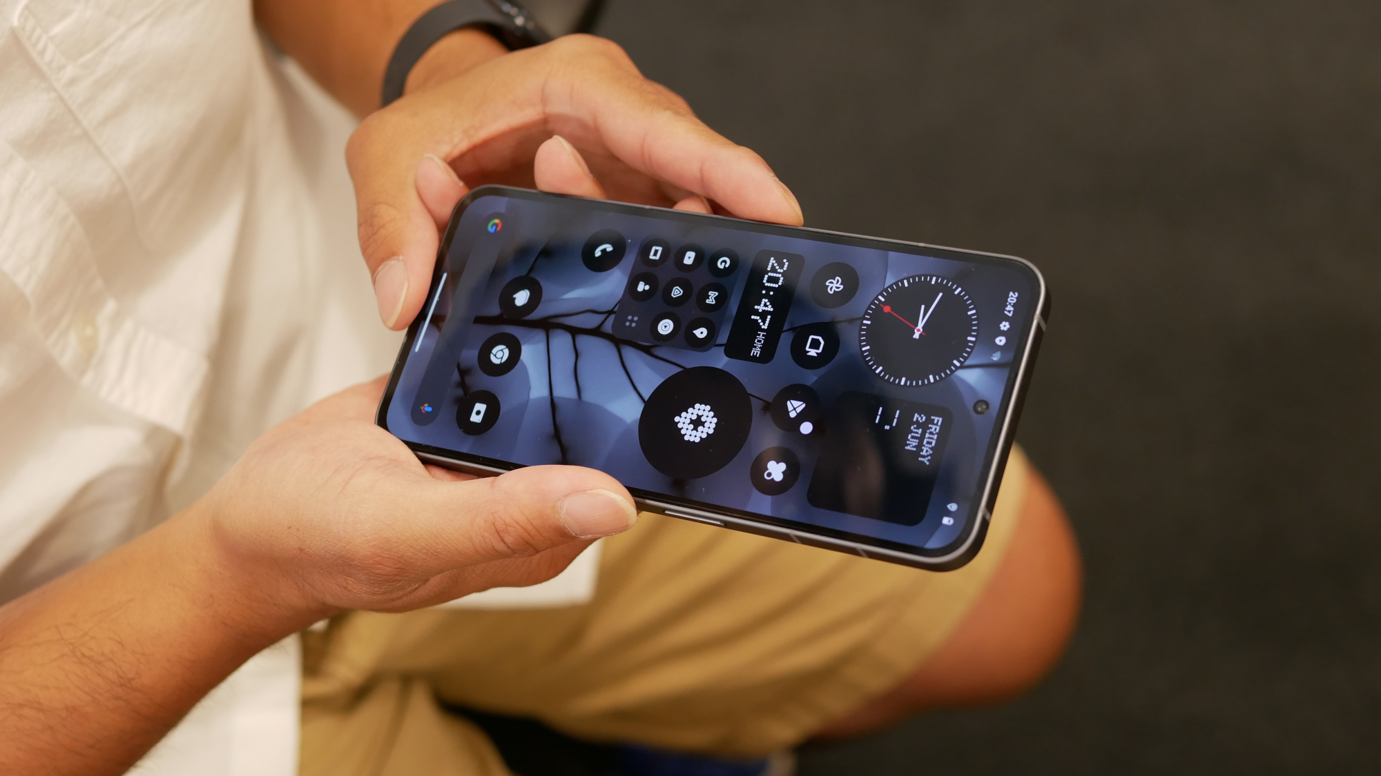
It’s a gorgeous interface running on top of Android 13. Unlike some other Android phone makers that tack on additional software features — I'm thinking of that shortcut ticker found on Samsung’s One UI — Nothing keeps it simple and straightforward. Anyone who’s not acquainted with Android can easily figure things out on the Nothing Phone (2).
Nothing promises to offer up to three years of Android software updates, which should get the Nothing Phone (2) up to Android 16, along with four years of security updates.That amount of support is shorter than what Samsung offers for phones like the Galaxy A54, but it's probably sufficient for most users.
Nothing Phone (2) review: Cameras
After an underwhelming camera performance with the Nothing Phone (1), expectations have been understandably high for the Nothing Phone (2) to make up ground in this area. This year’s rear camera array consists of a 50MP f/1.88 main camera paired with a 50MP f/2.2 ultrawide lens. On paper, that setup is very similar to what the Nothing Phone (1) offered, though the main camera is now powered by a newer Sony IMX890 sensor.
Nothing touts the phone’s advanced 18-bit Image Signal Process (ISP) system, which supposedly will help to gather more data for better dynamic range performance, but after my Nothing Phone (2) vs. Google Pixel 7a camera faceoff, I wasn’t convinced that the new hardware was enough to make Nothing's latest handset a best camera phone contender.
I will say that the Nothing Phone (2) does nice work when shooting conditions are ideal. As an example, take the photo I captured above of the New York Public Library on a sunny day. The Nothing Phone (2)'s effort holds up against the Pixel 7a’s shot. Even though the Nothing Phone (2) tends to lean on a warmer production, it still captures good details worth sharing on social.
The same can be said about the 50MP ultrawide camera on the Nothing Phone (2). Its 114-degree field of view captures more of the scene without forcing me to step back, making it perfect for capturing a group of people without having them all squeeze together to stay in the frame. Just like the main camera, however, it doesn’t have as wide of a dynamic range as the Pixel 7a, losing details in the shadows as a result.
Moving on to portrait mode, I wasn’t initially happy with what the Nothing Phone (2) produced. Edges weren’t properly identified, which caused some areas around a person to be out of focus — and vice versa.
After downloading an update to Nothing OS 2.0.1, the Nothing Phone (2) did a better job of applying that out-of-focus effect to the background with my portrait shots. I still think it looks too unrealistic with the aperture wide open at f/0.95, but bringing it to f/5.6 helped to tone things down.
Unfortunately, there’s very little headway in making the Nothing Phone (2) a strong performer under low light. As you can see above compared to the Pixel 7a, details are severely lost due to the underexposure of the shot. It’s a smeary mess that looks more like a painting than an actual photograph.
Over on the video side, the Nothing Phone (2) caps at 4K 60FPS — putting it into the same league as other midrange smartphones. I found the Nothing Phone (2)'s video capture to be competent enough, thanks to how its optical and electronic stabilization kept the footage smooth. Yes, there are some minor micro jitters when I compare it against the Pixel 7a, but for the most part, Nothing's phone handles video nicely when there’s adequate lighting around.
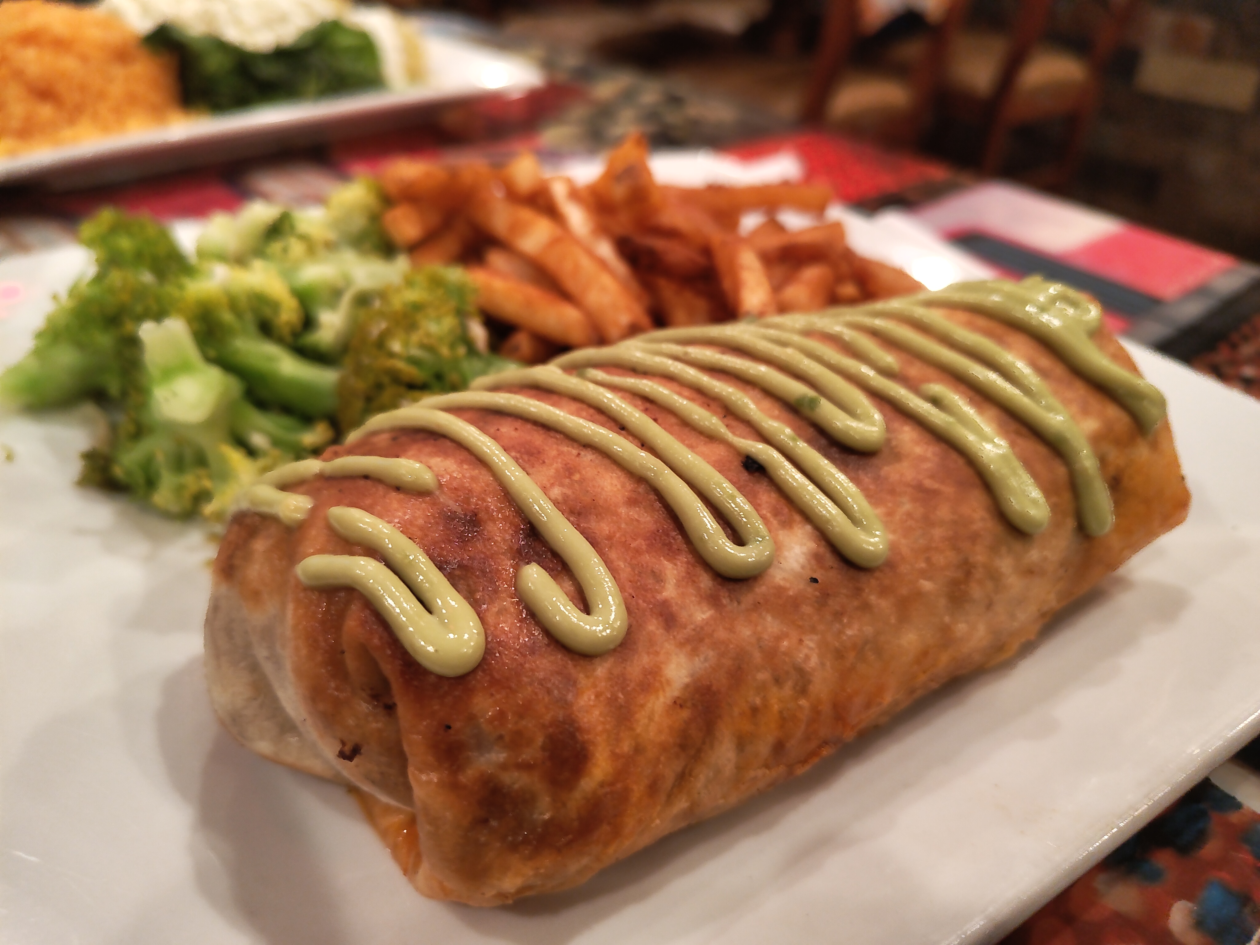
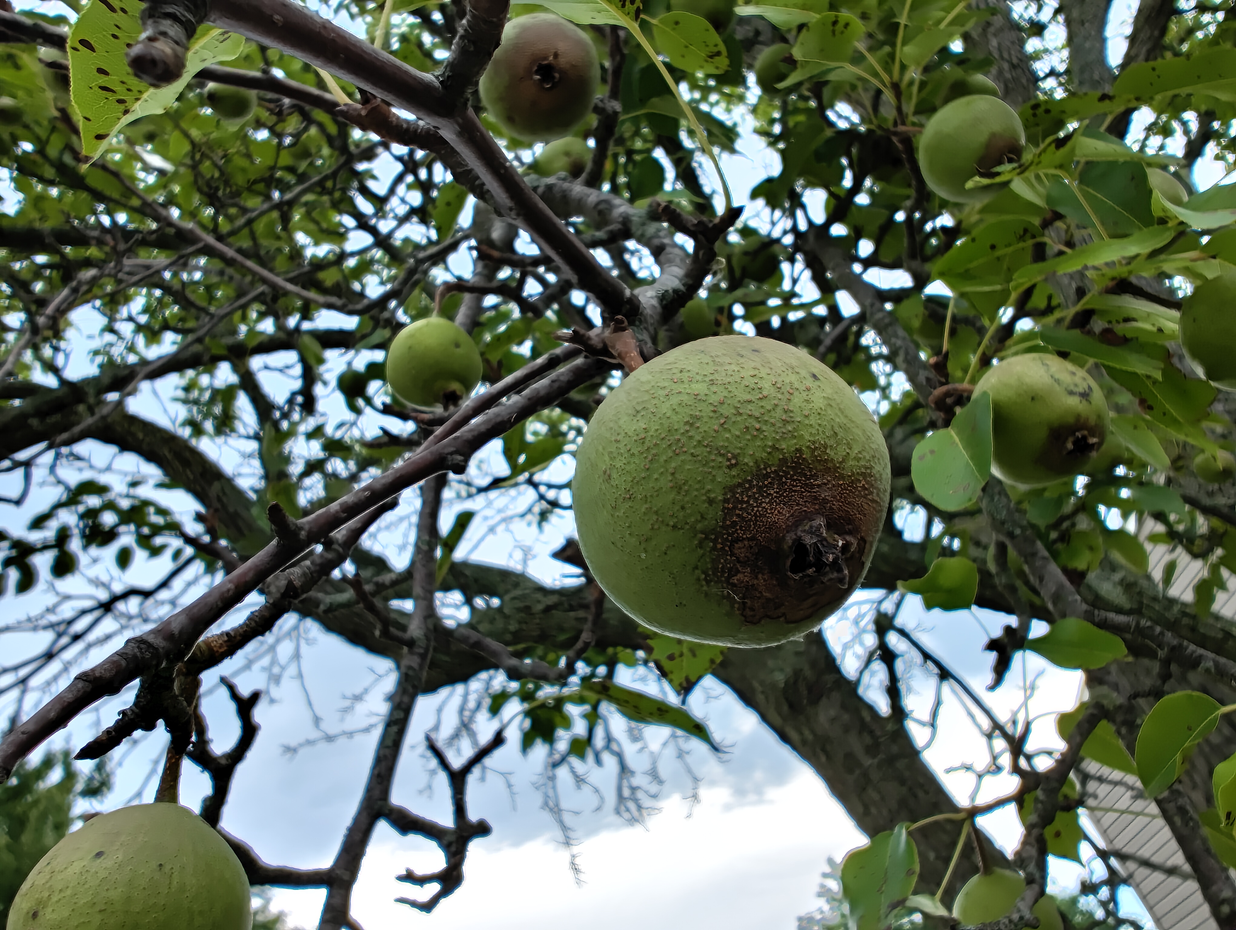
Overall, I'm not saying that the Nothing Phone (2) is a terrible camera phone. Low light is its biggest weakness. If you don't shoot a lot of content under those conditions, I think it’s a suitable camera phone that can get the job done — even more if you have photo editing skills to enhance the quality of its photos. Nevertheless, I was hoping for better results in this area to match its closest rival in the Pixel 7a.






Nothing Phone (2) review: Performance
During my time testing out the Nothing Phone (2), I found it to be wickedly fast for a midrange phone. Oftentimes, Nothing's phone felt more snappy than the Pixel 7a with everyday operations like launching apps, sending emails, browsing the web, and navigating around the interface.
Synthetic benchmark tests I ran also indicate the boost in performance over the Nothing Phone (2)'s predecessor. I’m really happy to see that my review unit is powered by a Qualcomm Snapdragon 8 Plus Gen 1 chip paired with 12GB of RAM, which shows increased performance in tests like GeekBench 5.5 and 3DMark Wildlife Unlimited.
| Nothing Phone (2) | Nothing Phone (1) | Google Pixel 7a | |
| Chipset/RAM as tested | Snapdragon 8 Plus Gen 1 / 12GB | Snapdragon 778G Plus / 8GB | Tensor G2 / 6GB |
| Geekbench 5 (single-core/multi-core) | 1,176 / 3,918 | 823 / 2,993 | 1,018 / 3,065 |
| 3DMark Wild Life Extreme Unlimited (score / frames per second) | 9,834 / 58.9 | 2,882 /17.3 | 6,855 / 41.1 |
| Adobe Premiere Rush (Mins:Secs) | 0:46 | 0:56 | 1:52 |
It's also worth noting that the Nothing Phone (2) outperformed the Pixel 7a in a real-world test, in which we have Adobe Premiere Rush transcode a video clip. Nothing's phone beat the Pixel 7a by 10 seconds, a pretty impressive result for a midrange device.
Visually, the Nothing Phone (2) exhibits fluid motions and snappy responses, which I think can also be attributed to the display’s 120Hz refresh rate. Even with gaming, I was also impressed by how it handled rendering the sprawling world map in Age of Origins without exhibiting much lag whenever there were dense battles happening on screen.
Nothing Phone (2) review: Battery life and charging
Due to its increased size over its predecessor, the Nothing Phone (2) is accompanied by a larger 4,700 mAh battery under the hood. I found it to perform better than average with my real world use, where the battery indicator remained above the 25% mark on most nights before bedtime. That’s pretty good in my opinion, given how much of a battery drain it is playing Age of Origin.
| Phone | Chipset | Battery size | Battery life (Hrs:Mins) |
| Nothing Phone 2 | Snapdragon 8 Plus Gen 1 | 4,385 mAh | 14:21 (120Hz) |
| Pixel 7a | Tensor G2 | 5,500 mAh | 10:05 (60Hz) |
| iPhone SE (2022) | A15 Bionic | N/A | 7:38 |
Its performance in our battery benchmark test is impressive, reaching a time of 14 hours and 21 minutes. For reference, the Pixel 7a reaches 10 hours and 5 minutes running the same test — while the iPhone SE (2022) lags behind at a sluggish 7 hours and 38 minutes.
Nothing didn’t just make the battery bigger this time around, but it also improved the phone's charging speed as well. That’s because the Nothing Phone (2) now supports 45W wired charging, up from its predecessor’s 33W charging; wireless charging also gets a boost up with 15W support.
Nothing Phone (2) review: Verdict
Good looks can only get you so far. That’s where I see the Nothing Phone (2) — a striking slate that upends the norm by flaunting a transparent design paired with glowing lights. Nothing’s approach in making its smartphone a device to be reckoned with has been nothing short of frenzied, but it needs more than good looks to charm consumers into snatching it up.
While I’m bummed by the camera’s shortcomings with low-light situations, I’m also questioning the decision to increase the phone’s price. Sure, it’s a first time offering here in the U.S. with a $599 entry, but it’s actually a price hike over its predecessor — like in the U.K., where the original launched at £399, while the successor now costs £579. That’s a big increase that puts it into premium midrange territory.
I’m sure you could live with the Nothing Phone (2), but it’s hard to overlook how the Google Pixel 7a costs $150 less at $449. That’s a big difference, especially for a phone that has an inferior camera to the Pixel's, along with shorter software support.
The Nothing Phone (2) certainly has a sense of style, but it's ultimately not enough if you're looking for more substance.
More from Tom's Guide
- Forget iPhone 15 — this new iPhone Vision concept is simply stunning
- Google Pixel 8 rumors: Everything we know so far
- 11 years later, people may be starting to like Apple Maps
| Phone | Chipset | Battery size | Battery life (Hrs:Mins) |
| Nothing Phone 2a | MediaTek Dimensity 7200 Pro | 5,000 mAh | 15:00 (120Hz) |
| Nothing Phone 2 | Snapdragon 8 Plus Gen 1 | 4,385 mAh | 14:21 (120Hz) |
| Pixel 7a | Tensor G2 | 5,500 mAh | 10:05 (60Hz) |
| iPhone SE (2022) | A15 Bionic | N/A | 7:38 |

John’s a senior editor covering phones for Tom’s Guide. He’s no stranger in this area having covered mobile phones and gadgets since 2008 when he started his career. On top of his editor duties, he’s a seasoned videographer being in front and behind the camera producing YouTube videos. Previously, he held editor roles with PhoneArena, Android Authority, Digital Trends, and SPY. Outside of tech, he enjoys producing mini documentaries and fun social clips for small businesses, enjoying the beach life at the Jersey Shore, and recently becoming a first time homeowner.
