Tom's Guide Verdict
The Microsoft Surface Duo 2 offers better performance and cameras than the original. But foldable devices like Samsung's Galaxy Z Fold 3 offer a better full-screen experience than this dual-screen device.
Pros
- +
Big boosts to processor and cameras from the first Surface Duo
- +
Optimized apps take advantage of both screens
- +
Elegant design
- +
Thin body
Cons
- -
More expensive than first Surface Duo
- -
Full-screen experience marred by separate display panels
- -
Camera bump juts out from phone
- -
Prominent bezels
Why you can trust Tom's Guide
Starting price: $1,499
Screen size: Dual 5.3-inch AMOLED (1344x1892) with 8.3-inch full-screen mode (2688x1892)
Refresh rate: 90Hz adaptive
CPU: Snapdragon 888
RAM: 8GB
Storage: 128GB | 256 GB | 512GB
Rear camera: 12MP wide (f/1.7); 16MP ultrawide (f/2.2); 12MP telephoto (f/2.4)with 2x optical zoom
Front camera: 12MP (f/2.0)
Battery size: 4449 mAh
Size: 5.7 x 3.6 x 0.43 inches (closed): 5.7 x 7.3 x 0.21 inches (open)
Weight: 10 ounces
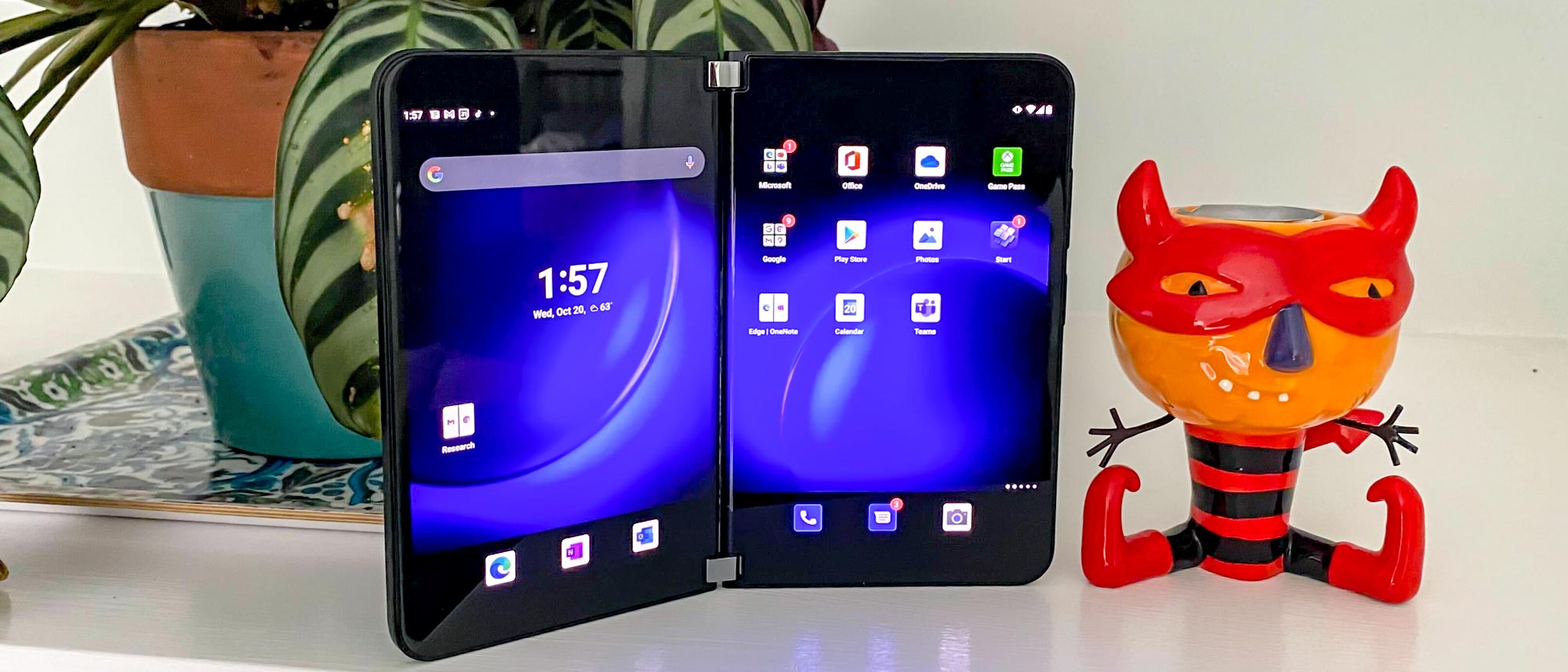
The Microsoft Surface Duo 2 looks to right some of the original dual-screen device's wrongs by modernizing some of the phone's specs. Gone is the aging processor, replaced by a current Snapdragon 888. There's 5G connectivity, too, and multiple cameras this time around instead of a single lens that pulled double duty for both selfies and sweeping vistas.
These changes at least get the Surface Duo 2 in the same ballpark as other flagships, though some of Microsoft's design decisions keep it from competing with the best foldable phones from Samsung. There's also the lingering debate over who actually needs a phone with expandable screens and whether Microsoft's approach is the way to go. This Microsoft Surface Duo 2 review looks at how this latest phone tackles those questions.
- Microsoft Surface Pro 8 review: Microsoft's latest 2-in-1
- These are the best Android phones
Microsoft Surface Duo 2 review: Price and release date
The Microsoft Surface Duo 2 goes on sale Oct. 21, with a starting price of $1,499 for the 128GB model. Upgrading to 256GB of storage costs you an additional $100, and there's a $1,799 512GB version that's listed as out-of-stock at Microsoft as of this writing.
To put the Surface Duo 2's price in context, it's $300 cheaper than the starting price of the Samsung Galaxy Z Fold 3, but $500 more than Samsung's other flip phone, the Galaxy Z Flip 3. The Flip was the first foldable phone to cost less than $1,000, and the Surface's price proves that dual- and flexible-screen devices remain a premium item.
We haven't heard which phone carriers will be offering the Surface Duo 2, but we'll update this review with that information as it becomes available. The phone is available unlocked through both Amazon and Best Buy.
Microsoft Surface Duo 2 review: Design
Whatever misgivings people had about the specs on the original Surface Duo, there were few complaints about the build quality on that phone. So it's good to see that Microsoft isn't trying to reinvent the wheel (if wheels can unfold to reveal dual screens).
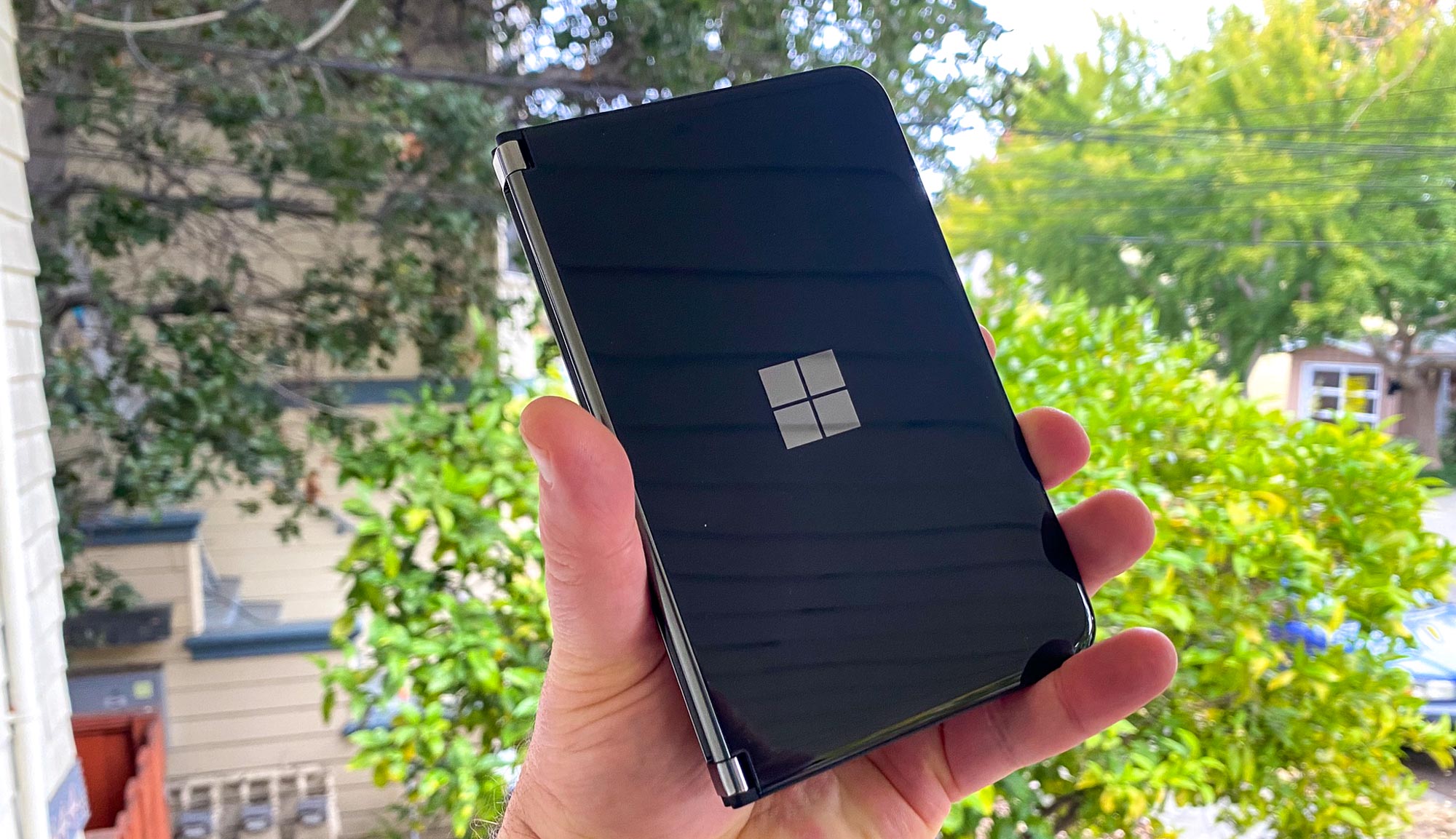
Like its predecessor, the Surface Duo features two glass panels that come together on a pair of very sturdy hinges located at the top and bottom of the phone. Because the edges of the Surface Duo 2 are so smooth, opening the phone takes a little practice — I had my best success placing my thumbs on both side of the Duo and pulling apart — but once it's open, those hinges keep the screen in place. They're also flexible enough to keep the Surface Duo 2 open in different positions, including a tented view for watching videos and with the panels open a full 360 degrees so that they're lined up flat against each other.
I tested the Obsidian version of the Surface Duo 2 and that black surface really picks up fingerprints, so keep a cloth handy. You can also get the Surface Duo 2 in Glacier.
The front of the phone features a Microsoft logo. Because that's a simple square, I'll occasionally forget which side is up and try to open the Surface Duo from the wrong side. The back is smooth, too, save for a rather prominent camera bump.
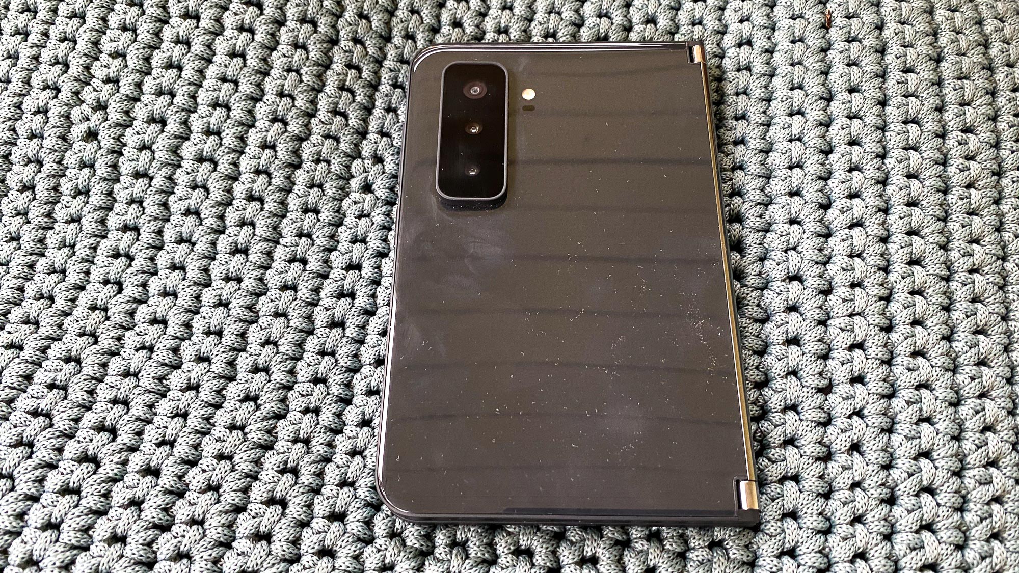
If the Surface Duo 2 has a design flaw, it may well be that bump which sticks out farther than most phones. When I try to slip the Surface Duo 2 into the pocket of my jeans, that camera bump usually gets caught, requiring me to do a little bit of wiggling to get everything to fit.
Then again, the Surface Duo 2 isn't the sort of phone one easily slips into one's pants pocket. At 5.7 x 3.6 x 0.43 inches when closed, this device is meant to live in a coat pocket or a purse.
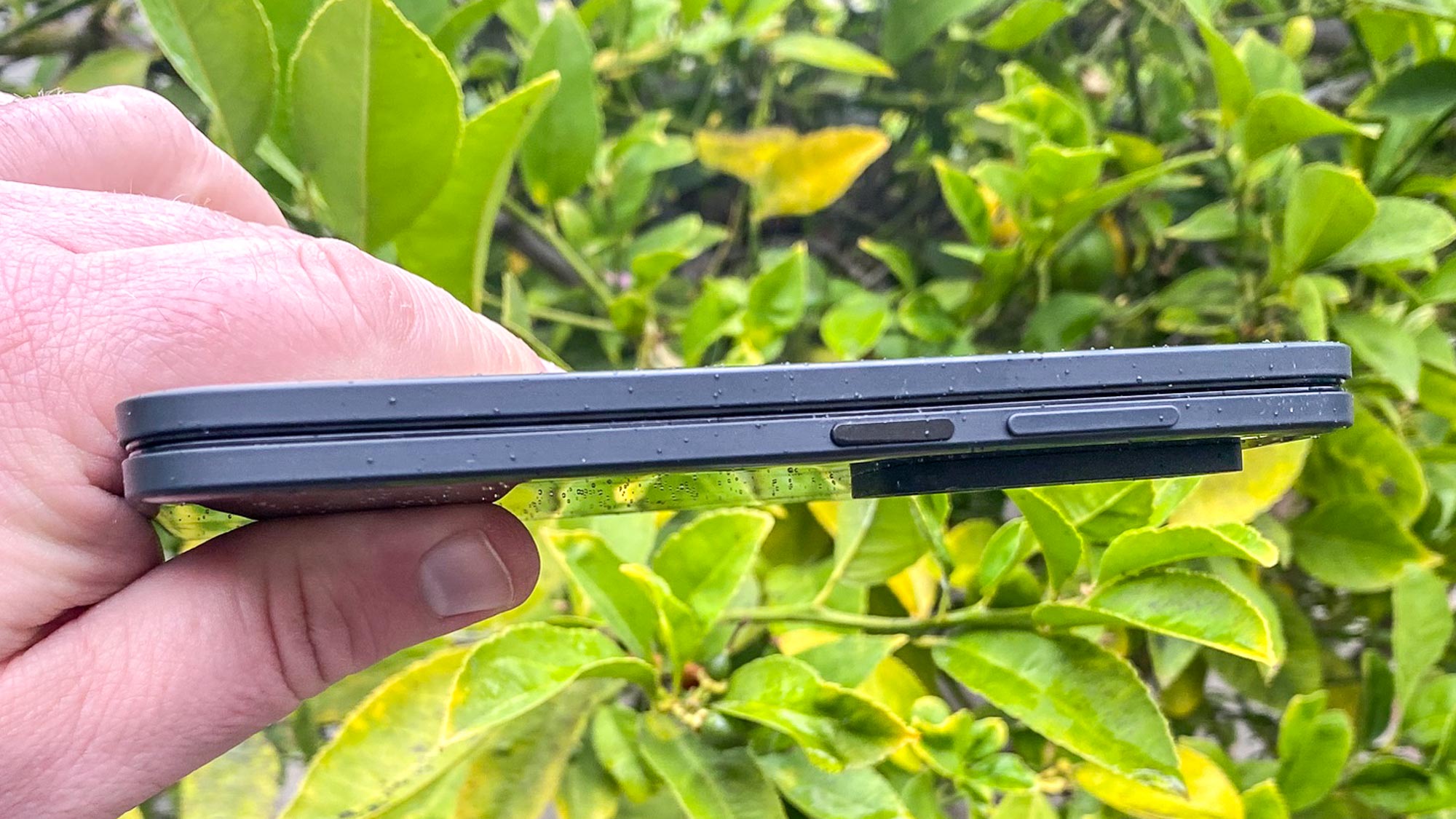
Open the Surface Duo 2 up and the width expands to 7.3 inches while the phone itself is a mere 0.21 inches thin. If you've got the specs of the original Surface Duo handy, you'll notice that's a little thicker than before. There's no official explanation why, but the original phone was to thin to support NFC coils for tap-to-pay support, and this new version now offers that.
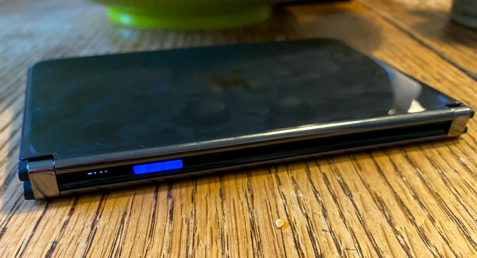
Microsoft came up with a neat little trick for the hinge area when the Surface Duo 2 is closed. That's where Microsoft has put a glance bar that lights up when you've got incoming calls and text messages. My complaint here — the glance bar doesn't remain lit so if you weren't looking at your phone, you'll miss the notification. The glance bar also lights up as you charge the phone to show you what percentage of charge the Surface Duo has.
Unlocking the phone is as easy as using the fingerprint reader embedded in the power button on the right side of the phone (the same panel that contains the camera array). I found the fingerprint reader to be fairly accurate and far enough removed from the volume rocker to avoid accidental touches.
Microsoft Surface Duo 2 review: How it compares to Galaxy Z Fold 3
It's impossible to talk about the Surface Duo 2 without comparing it to Samsung's Galaxy Z Fold 3, currently the best foldable phone available. The two phones take different approaches — the Galaxy Z Fold 3 opens up to reveal a continuous 7.6-inch display while the Surface Duo 2 brings together to separate panels for an 8.3-inch work area. But both these devices are offering the same value proposition — get a tablet-sized screen in a device that's compact enough to carry around.

Because the Surface Duo 2 offers more screen when opened, it's much wider than the Galaxy Z Fold 3. But Samsung's phone is taller and thicker, even when it's opened.
Microsoft Surface Duo 2 review: Display
As I've mentioned, the Surface Duo 2 is a dual screen phone so that 8.3-inch workspace is actually two separate 5.8-inch AMOLED panels each offering 1344 x 1892 resolution. When the phone's open, that resolution is boosted to 2688 x 1892.
Both panels off 90Hz refresh rates, and while that's not the 120Hz variable refresh rate that the Galaxy Z Fold 3 boasts, it still means pretty smooth scrolling.
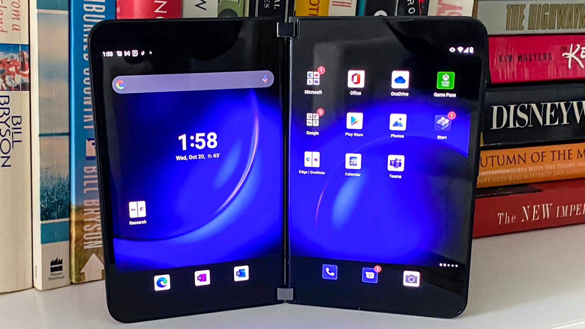
The twin displays on the Surface Duo 2 are fairly bright, hitting 672 nits on a light meter. That outshines the 424-nit result from the Galaxy Z Fold 3's interior display, though it's not as bright as phones like the Galaxy S21 Ultra (821 nits) and the iPhone 13 Pro Max (1.038 nits when Adaptive Brightness is enabled).
Colors felt a little muted when I watched the Dune trailer on YouTube until I cranked up the brightness. That's when the sands of Arakis took on more golden hue. Likewise, the Nightmare Before Christmas on Disney Plus benefitted from maxing out the display so that the creatures of Halloween Town weren't obscured by shadows.
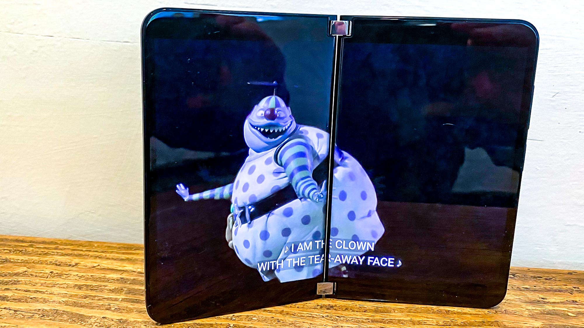
It was watching those videos that really cemented my chief gripe with the Surface Duo 2. You're really not watching videos on an 8.3-inch display. Rather, your best viewing experience comes when you watch a video on either one of the 5.8-inch panels, and that's not as expansive as you might think, particularly given the rather thick bezels surrounding the viewable area of the display.
Oh, you can drag an app to the middle of the Surface Duo 2 and expand it into a full-screen mode that stretches across both panels. But there's a gap between the two screens, and while Microsoft says it's not as prominent as it was on the original Duo, that still means a long strip running through the middle of Jack Skellington's face that wouldn't be there on a more conventional display.
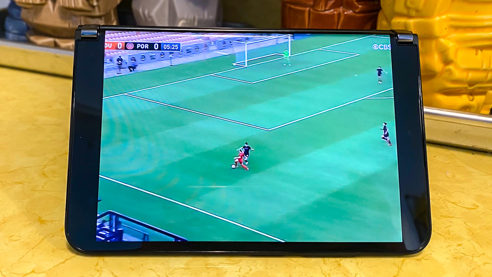
Some apps, like YouTube, are optimized for the Surface Duo's 2 screens, though this means that the video appears on one panel while thumbnails of other videos appear on the other. Your best best for watch videos is to swivel the two screens into a tent mode and watch your program on one of the screens. Even then, the unconventional aspect ratio of the Surface Duo displays can lead to some odd stretching and cropping. A soccer match I streamed on Paramount Plus, for example, had its edges trimmed off when viewed in full-screen mode.
Microsoft Surface Duo 2 review: Dual-screen experience
If the Surface Duo 2 isn't ideal for watching videos or gaming — and it's not unless those apps have been optimized for a dual-screen device — then what is Microsoft's smartphone good for? The answer is the same as it was for the original Surface Duo — multitasking.
The best use case for the Surface Duo is to run two apps side by side on each of the phone's panels. That way, you can keep a note-taking app open while researching topics in a mobile browser, or you can have a chat app while referencing a document from Microsoft's Office suite of apps.
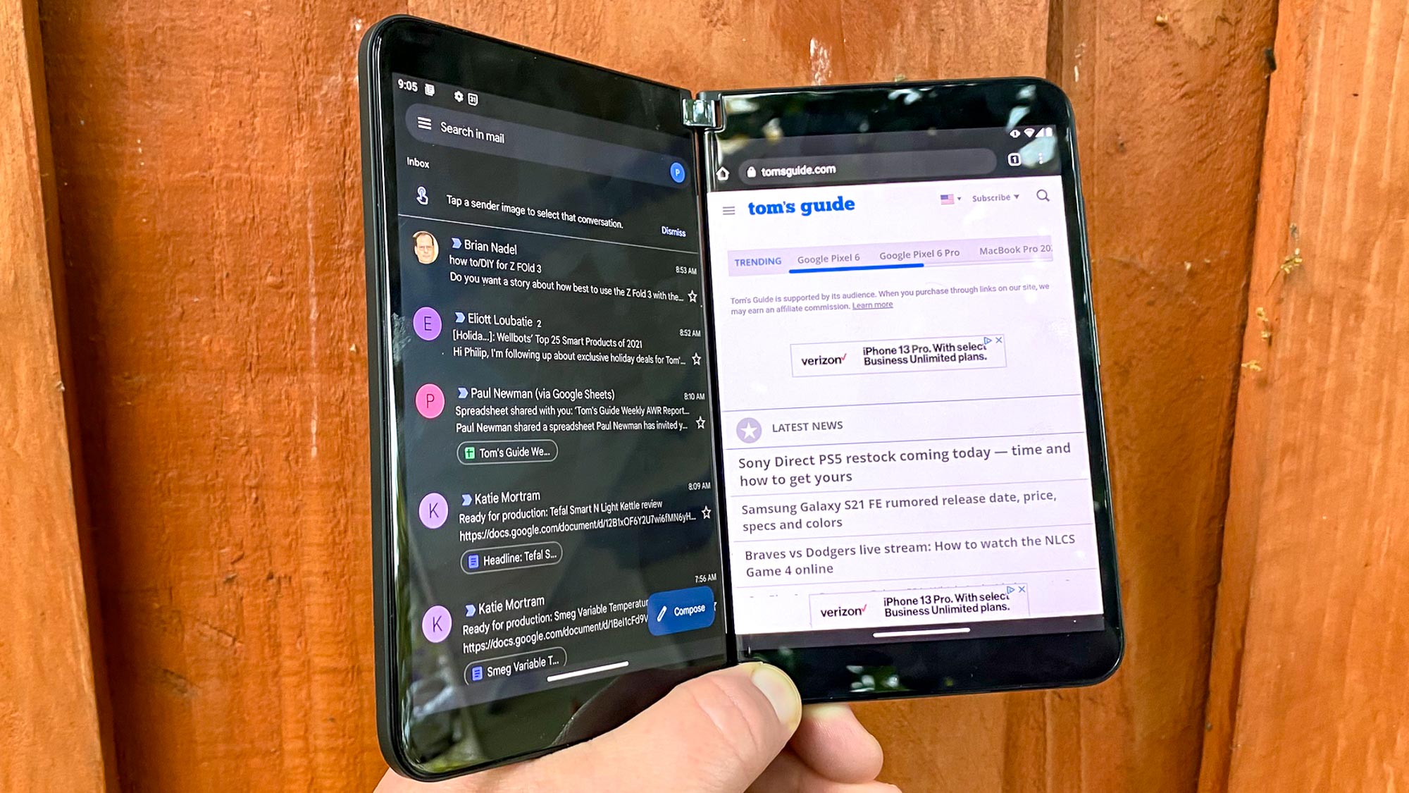
As before, the Surface Duo 2 supports app pairs, in which you can tie together two apps to launch at the same time when tapped. My Surface Duo review unit featured a pre-assembled pair of Microsoft OneNote and the Edge browser, but I was able to easily set up one of my own with Gmail and Chrome, just by pressing and holding one of the app icons and then selecting Group to pick its pair.
App pairs should make it easy to jump into whatever work you need to perform on the Surface Duo 2, though the feature remains a bit glitchy. When I was using the phone for awhile and went to launch an app pair, sometimes the app tied to the left panel of the phone wouldn't appear, while the right panel did. The missing app would show up in the recently used apps tray, but not on the display itself. Quitting apps or restarting the phone would address the problem, but it seems like a pretty annoying glitch.
You can access apps in full-screen mode by grabbing the bottom bar that you normally use to exit an app and dragging it over to the middle of the two screens. (If you want to switch which panel an app appears on, just keep dragging until the app shows up over there.) If the app hasn't been optimized, it will expand to fill up both screens, which gives you a bigger work area, albeit one with that aforementioned gap running down the middle where the two panels meet. I'll take the visible crease on the Galaxy Z Fold 3 over that, thank you very much.
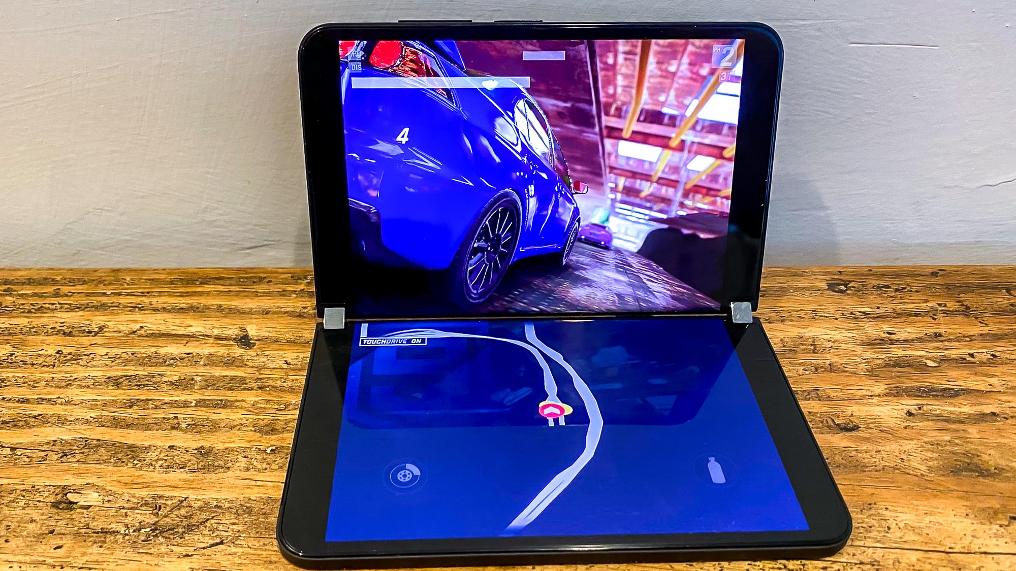
Fortunately, there are optimized apps for the Surface Duo 2 that take advantage of both panels simultaneously. In Teams — yes, Microsoft's video chat app has a prominent role on this phone — you can see a video of your fellow meeting participants on one screen and the presentation on the other. Editing photos from the Camera app puts the controls on a different screen from the image so that you can clearly see the changes as they're being made.
Third-party apps have been optimized, too, and Microsoft includes a few bundled onto the Surface Duo 2. TikTok is present, with one screen showing videos in full screen mode while the other offers previews. Gameloft's optimized several games like Asphalt 9, which puts the controls on the bottom panel when you're holding the Surface Duo in portrait orientation. The experience is OK, through having the controls so removed from the game display takes a little getting used to.
If there's an issue here, it's that there's no way of knowing which apps are optimized for the Surface Duo 2's screens and which ones aren't, short of dragging them to the middle of the device and finding out which ones open in both panels and which merely expand to fill up the entire 8.3-inch workspace.
Microsoft Surface Duo 2 review: Cameras
Your days of getting by with just a lone 11MP camera for all your photos as you had to on the Surface Duo are over. The Surface Duo 2 turns to a more conventional triple lens setup, with a 12MP wide camera serving as the main lens. To that, add a 16MP ultrawide angle shooter and a 12MP telephoto lens supporting a 2x zoom. Those aren't world-beating specs, but they at least allow the Surface Duo 2 to compete on more level footing with the best camera phones.
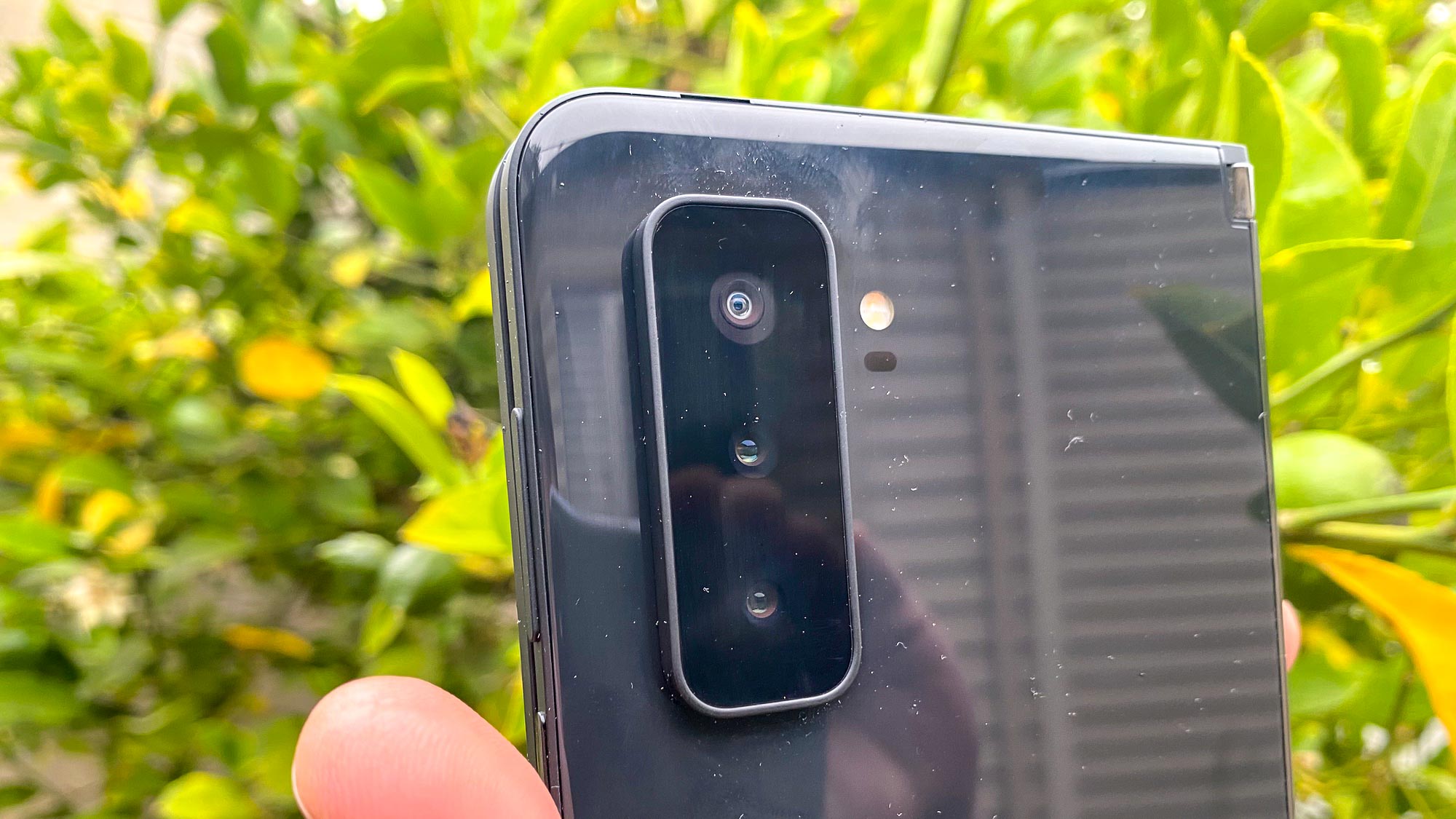
In addition to the hardware changes, you get a dedicate night mode along with low-light and HDR multi-frame photo capture. In other words, Microsoft has put together a far more capable camera phone — at least on paper.
The results in the real world look pretty good, too. While this shot of a fountain and the mosaic behind it is a little dark in the Surface Duo 2's rendering, it's a much better treatment than what the Galaxy Z Fold 3 produced, as Samsung's foldable phone over-exposed the scene. Other colors, like those ferns in the foreground are excessively brightened; the Surface Duo 2's shot tackles those plants with more realistic tones.
Switching to the ultrawide angle lens on both phones to bring in more of the background, this time it's the Galaxy Z Fold 3 that makes the scene look a little dark than it was. As a result, the Surface Duo 2 makes those gray, brown and silver tiles look a lot more distinct and the shimmer in the blue tiles behind the sunflowers is more apparent.
You can't really see it in this side-by-side comparison but the Galaxy Z Fold captured more of the surrounding scene — those lamps are almost completely contained in the Samsung picture, while the Surface Duo 2 cuts them out. That's because Samsung's phone offers a wider field of view on that particular camera — 123 degrees vs. 110 degrees on the Surface Duo 2.
To test out the Surface Duo's zoom lens, I stood across the room and zoomed in at 2x on a bookshelf to see if the titles came through clearly. They really didn't — there's some noticeable distortion i you focus in on the book titles, and the entire image is pretty dark. Things look much brighter in the Galaxy Z Fold 3's shot, and text is crisp and legible.
Indoors, we see how the phones approach the remnants of a pizza my daughter and her friend tore into. (The wine bottle in the background is mine, concerned onlookers.) The Surface Duo 2 produced more natural looking colors, but at the expensive of a rather dull looking image. In contrast the Galaxy Z Fold 3 cranked up the warmth — almost excessively so — but the pizza looks a little more appetizing in the latter shot.
The Surface Duo 2's promised improvements in low-light photography don't really show up in this instance. Perhaps the orange lights illuminating the Halloween decorations on our porch overwhelmed the Surface Duo, but everything is bathed in that light. The Galaxy Z Fold 3's shot is more balanced, and although there's an orange tints from the lights, the skeletons and skulls don't look like they're coated in Tang.
Turning to portrait mode, the Surface Duo 2 does a credible job with this picture of my daughter. The background blur is certainly stylish, though it did catch some of her shoulder on the right. But the picture is well lit even though we took it in a shadow. The Galaxy Z Fold 3 produced a much darker photo that washed out features like the freckles on my daughter's face.
As for the Surface Duo 2's 12MP front camera, it didn't touch the beam of sunlight hitting my face as I snapped a selfie. The result is an interestingly lit shot that makes my face look a lot ruddier than it actually is. The colors on the Samsung photo are more balanced, even if you have the same problem with overly aggressive face-smoothing that we saw in portrait mode. (Note that this comparison uses the under-display camera on the Galaxy Z Fold 3, which typically takes more disappointing shots in our experience.)
Taken altogether, the photos produced by the Surface 2 Duo are fairly decent — nothing that will challenge the best camera phones, but certainly better than what the original Surface Duo produced with its only camera.
Microsoft Surface Duo 2 review: Performance
When the original Surface Duo arrived, it featured a Snapdragon 855 system-on-chip at a time when other leading phones had already moved on to the Snapdragon 865. That meant a gap in performance between those phones and the Surface Duo — not an easy thing to swallow when you've paid four-figures for a phone.
The Surface Duo 2 does not repeat that mistake. Microsoft has turned to the same Snapdragon 888 chipset found in the top Android devices, including the Galaxy Z Fold 3. Microsoft augments that silicon with 8GB of RAM.
In terms of benchmarks, that translates to performance that's close to what you'd expect from phones with similar specs. On Geekbench 5, the Surface Duo 2 posted single- and multicore scores of 1,008 and 3,384, respectively. That's a little behind the 1,107 and 3,418 results we got with the Galaxy Z Fold 3, but it's not the sort of performance gap you're likely to notice. The same can't be said of the iPhone 13 Pro Max and its A15 Bionic chip, which blows away the competition with respective GeekBench scores of 1,720 and 4,549.
The Surface Duo fared better in graphics testing, where it produced nearly 34 frames per second on the 3DMark Wild Life test. The Galaxy Z Fold 3 came in at 33 fps.
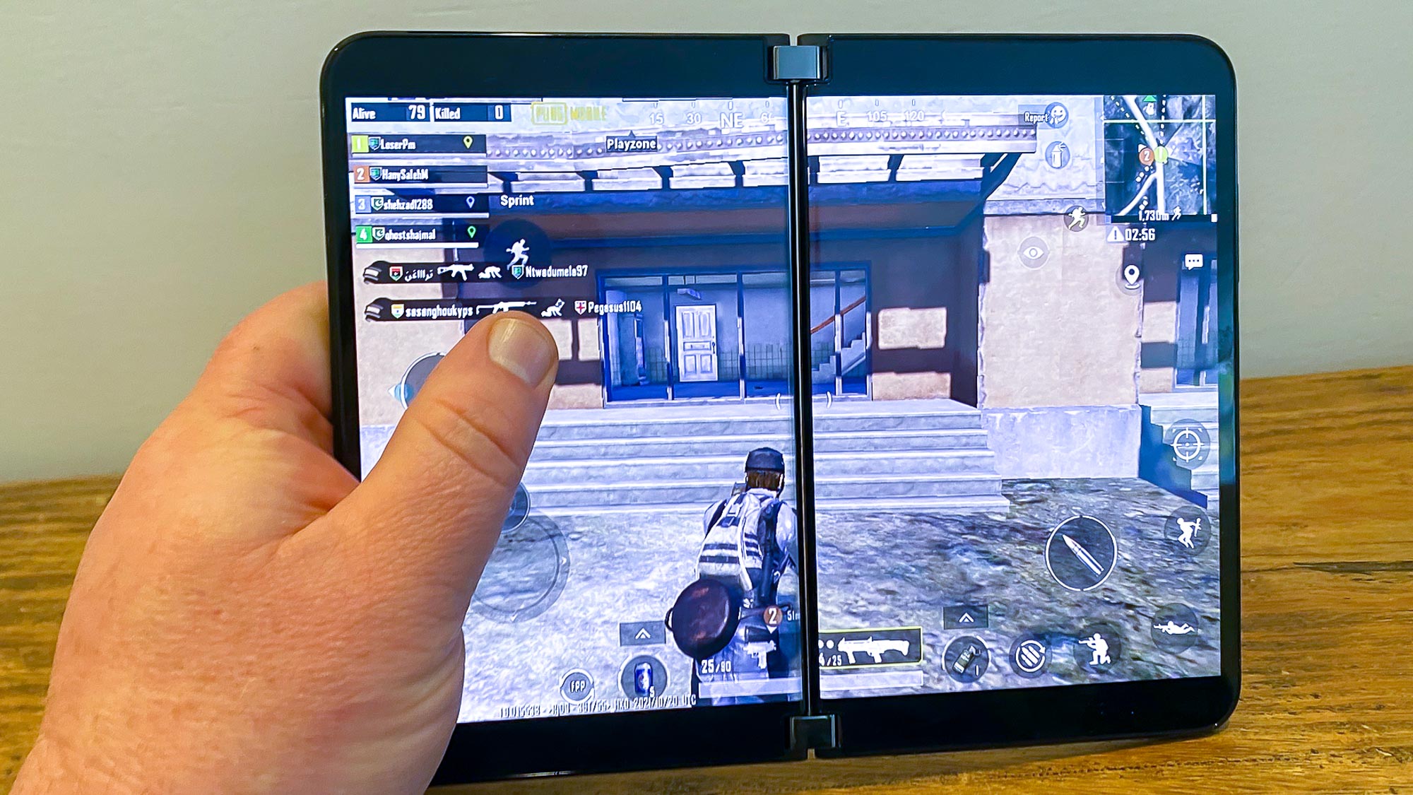
Apps run smoothly on the Surface Duo 2 and graphics look sharp enough in demanding games like Asphalt 9 and PUBG Mobile. I did notice a slight lag when launch apps not stored in memory — particularly with app pairs when the first app would launch on the right screen and there would be a brief pause before the second app launched on the opposite panel.
Using a top-of-the-line chipset does more than just improve the Surface Duo 2's performance relative to other Android devices. The Snapdragon 888 means there's 5G connectivity in this model, something the original Surface Duo lacked. Microsoft's spec sheet lists support for both mmWave and sub-6GHz 5G, so if you've got 5G coverage in your area, you should be able to connect to the faster networking standard.
Microsoft Surface Duo 2 review: Battery life and charging
To handle those two screens and the power demands of 5G, Microsoft outfitted the Surface Duo 2 with a 4,449 mAh battery, quite the leap up from the 3,577 mAh power pack in the original Surface Duo. That didn't translate to much of an improvement in battery life when we put the Surface Duo 2 through our battery test, in which we have the phone surf the web continuously at 150 nits until it runs out of power.
We first tested the Surface Duo 2 with only one of its screen active — the 9 hour and 47 minute result is just about average for a smartphone. Making both screens active reduced the phone's battery life to 7 hours and 38 minutes. That drop of just over two hours is consistent with how the original Surface Duo performed when we tested that phone.
Anecdotally, the Surface Duo 2 packs enough power to get through most days, though particularly intensive rounds of testing caused the battery level to drop noticeably.
While the Surface Duo 2 supports 23W charging speeds, Microsoft doesn't include a charger with the device — just a USB-C cable. I happened to have a 21W charger lying around, and that boosted the Surface Duo 2's battery from 76% to 82% after 15 minutes. That may not seem like much, but it can be useful for topping off the phone's battery in a pinch.
Microsoft Surface Duo 2 review: Software and special features
The Surface Duo 2 runs on Android 11 — a significant decision by Microsoft, since it gives Surface Duo users access to the vast array of Android apps though the Play Store. But Android 12 is now out, and Microsoft is non-committal about when that update will come to its dual-screen device, saying only that it will work with Google on the issue.
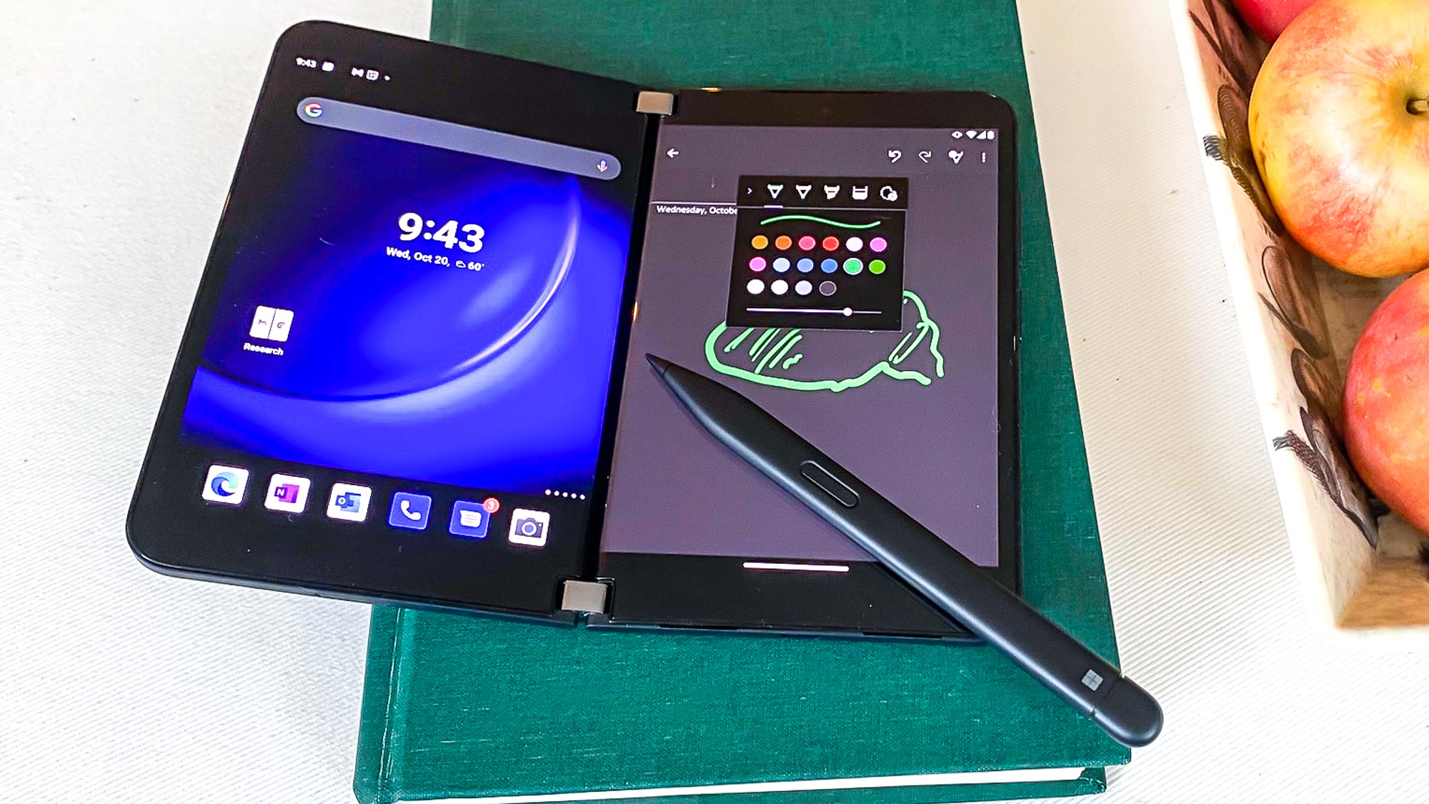
You can use Microsoft's $129 Surface Slim Pen 2 with the new Surface Duo for drawing in OneNote, diagramming things on the whiteboard in Teams and other sketching and note-taking tasks. I didn't find the pen to be an essential add-on for the phone, but if you do get it, you'll also want to pick up a $65 Surface Duo 2 Pen Cover, which attaches to your phone.
With the Pen Cover, the Slim Pen 2 can magnetically attach to your phone while also charging so that your stylus will always be at the ready. Whether that's worth another $195 on top of the Surface Duo 2's price tag is another question altogether.
Microsoft Surface Duo 2 review: Verdict
To Microsoft's credit, the Surface Duo 2 addresses many of the complaints we had about the company's original dual-screen phone. The specs are more in line with the premium price, the cameras are much improved, and dual-screen multitasking is a definite productivity booster.
But the reason people turn to bigger phones is for the expanded tablet-like work area. Because the Surface Duo 2 uses two separate displays, it really doesn't offer that experience; rather, it's just two 5.8-inch screens that are woking in tandem most of the time.
For people who want to run apps side by side that will be enough to make the Surface Duo 2 an intriguing option. But if you're looking to lose yourself in the expansive flow of an uninterrupted screen, the Surface Duo just doesn't provide that — not with the approach Microsoft has taken.
Philip Michaels is a Managing Editor at Tom's Guide. He's been covering personal technology since 1999 and was in the building when Steve Jobs showed off the iPhone for the first time. He's been evaluating smartphones since that first iPhone debuted in 2007, and he's been following phone carriers and smartphone plans since 2015. He has strong opinions about Apple, the Oakland Athletics, old movies and proper butchery techniques. Follow him at @PhilipMichaels.
-
Mark Stinson I had the Surface Duo 1 up until yesterday. I had it for about 8 months. It works. It is nice having a second screen (or a wide screen if you open it up and use it that way). Functionally, I have no serious complaints.Reply
But, I think every review should strongly emphasize that the Duo (1 or 2) is enormously fragile. I have had a dozen cell-phones in my life, and as careful as you are with them, sometimes things will happen. They will slip from a pocket, or a dog will knock them off a table, etc. The Surface Duo is like a glass bottle. Your drop it...even once, and it is very likely to break.
The design prevents the use of any real protective case. Yes, you can glue the provided rubber strip around its edge. But, the thing is entirely made of glass. The screen and back surface: glass. So, my first break, I was getting down onto the floor, and the phone fell 1' onto a wooden surface. shattered the back panel. The phone still worked, but it did not close properly, and did not seem to always know whether it was open or closed, or which screen I was using.
The second (and final) drop was yesterday. Getting out of the car, it fell from my pocket, and more of the back panel shattered. Now the screens won't come on, and it is essentially done.
If you are a person who carries your phone in your pocket, or who is even mildly active, seriously re-consider getting this phone. It is fragile.
The Surface Duo 2 is made of the same materials as the Surface Duo 1, so I see no reason why it would be any less fragile to even the slightest impact.
Mark
